UFO sightings have fascinated humanity for decades, sparking intrigue, debate, and scepticism. Data availability has allowed researchers, enthusiasts, and curious individuals to explore patterns in these sightings in recent years. From the United States to other regions worldwide, a UFO sighting map offers unique insights into the times, locations, and shapes most commonly reported.
Related posts:
- Our Amazing Tableau GDPR Compliance Guide
- 10 Amazing Tableau Healthcare Dashboard Examples
- Unlock Insights with These 7 Powerful Tableau COVID Dashboards
- 7 Amazing Help Desk Dashboard Examples
- 5 Amazing Hotel Dashboard Examples to Elevate Your Hospitality Operations
- 9 Life Saving Patient Dashboard Examples
In this post, we showcase five examples of UFO sightings maps that shed light on these mysterious phenomena. Each example leverages different techniques and data to create compelling visualizations, whether highlighting specific hotspots, analyzing seasonal patterns, or categorizing sightings by shape and description. These maps make data more accessible and fuel the ongoing fascination with the unknown.
Table of Contents
# 1 UFO Sightings Maps – UFO Trends in USA
This UFO sighting map visualization provides a comprehensive breakdown of the United States’ self-reported sightings for 2016. The layout includes various visual elements and charts illustrating different aspects of the sightings data.
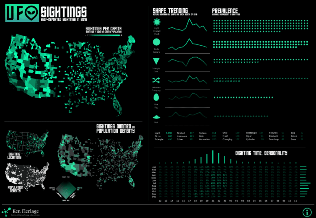
On the left, two maps show the geographic distribution of sightings per capita. The top map of UFO sightings in the world presents sightings across U.S. counties, highlighting areas with the highest sightings per capita. Below it, another alien sightings map dims sightings based on population density, allowing viewers to see where sightings are high relative to population concentration. This approach highlights areas where sightings may be statistically significant compared to local population sizes.
To the right, the Shape Trending section uses line charts to show the frequency of different UFO shapes observed monthly. Each line chart represents a specific shape, such as circles, triangles, ovals, and disks, with trends revealing shape popularity over time. Next, a dot matrix chart visualizes the Prevalence of each shape by symbol, where each symbol represents a specific shape and the number of sightings associated with it.
At the bottom right, a heatmap chart titled Sighting Time, Seasonality indicates the hourly and monthly distribution of sightings, showing peaks during particular months and times, which helps identify seasonality and time-related trends. This alien sighting map visualization uses maps, line charts, dot matrix charts, and heatmaps to provide a multidimensional view of UFO sightings data.
#2 UFO Sightings Maps – UFO Sightings
This UFO sighting map visualization provides a detailed overview of UFO sighting trends in the USA. It uses multiple charts to analyze various aspects of sightings, including the frequency, timing, shape types, and geographic distribution.
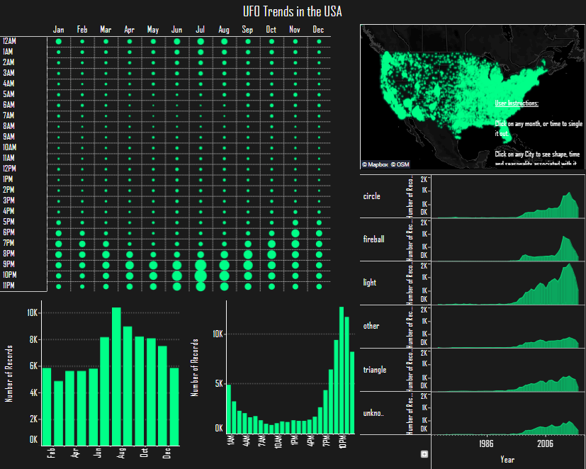
On the left side, a dot matrix heatmap shows the distribution of sightings by month and hour of the day. Each dot represents the intensity of sightings, with larger dots indicating a higher frequency at specific times. This reveals peak sighting hours in the evening, especially around summer months.
In the bottom-left corner, a bar chart displays the number of sightings by month, with a noticeable increase during summer, peaking in July and August. Next to it, another bar chart shows sightings by hour, indicating that sightings are most frequent between 8 PM and 11 PM.
On the right, an alien sighting map highlights the distribution of sightings across the United States, with a higher concentration in specific regions. Adjacent to this map of UFO sightings worldwide, individual line charts show trends in UFO shapes over time, including circles, fireballs, and triangles. These line charts allow viewers to observe how frequently specific shapes were reported from 1986 through 2016.
This alien sightings map visualization combines heat maps, bar charts, a geographic map, and line charts to provide a comprehensive view of UFO sightings. It makes identifying patterns across time, location, and sighting characteristics easy.
#3 UFO Sighting Maps – Unidentified: 30 Years of UFO Sightings
This visualization of UFO sightings worldwide presents a detailed analysis of sighting patterns over time, season, and daily hours. At the top, a UFO sighting map highlights reported sightings globally, showing concentrated areas of activity, primarily in North America and parts of Europe. This alien sightings map emphasizes where UFO sightings have been reported most frequently, providing a comprehensive map of UFO sightings worldwide.
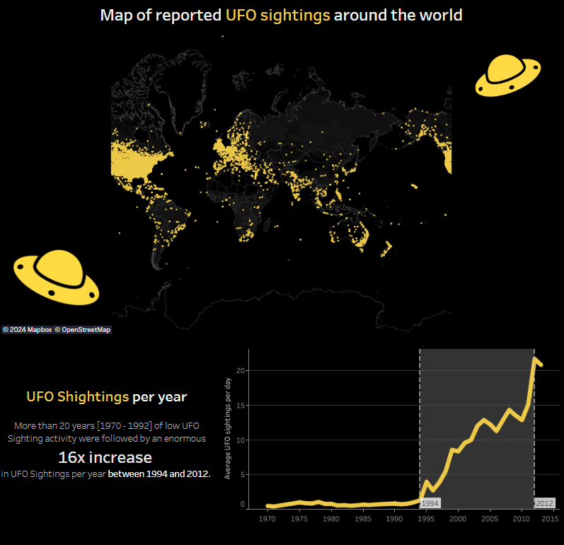
A line chart below the alien sighting map illustrates the trend of UFO sightings per year. It indicates a significant increase in sightings beginning in the 1990s, with a sharp 16x increase between 1994 and 2012. This historical trend line offers insight into how reports of UFO sightings have surged over recent decades.
Further down, a line chart shows seasonal trends, with sightings peaking between June and October, aligning with summer months in the Northern Hemisphere, where people spend more time outdoors. This seasonal spike suggests that warmer months contribute to higher sighting reports.
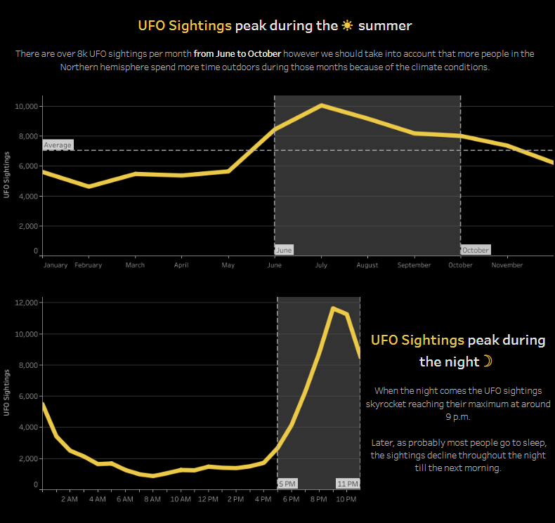
Finally, a line chart examines sightings by time of day, showing that UFO sightings peak around 9 PM, likely because more people are outside in the evening. This set of visualizations, including a world map and line charts for annual, seasonal, and hourly trends, offers a comprehensive view of UFO sighting patterns over time and location.
#4 UFO Sightings Maps – UFO Sightings
This UFO sighting map visualization thoroughly explores UFO sighting data, examining patterns by time, location, shape, and possible explanations from government sources. It uses a variety of charts and layouts to display trends and provide insights into the prevalence and nature of reported sightings.
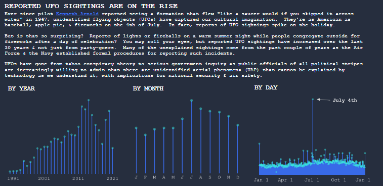
At the top, a text introduction outlines the rise in UFO sightings since the famous 1947 Kenneth Arnold sighting, establishing the cultural significance of these reports in American history. The visualization then breaks down sightings into categories, each using a specific chart to illustrate trends.
The “By Year,” “By Month,” and “By Day” sections use line charts to show the increase in sightings over time, peaking in recent years. Monthly trends indicate that UFO sightings are most frequent in July and August, aligning with summer when outdoor activity is high. The daily trend highlights a significant spike in sightings around July 4th, likely due to increased outdoor activity and fireworks displays.
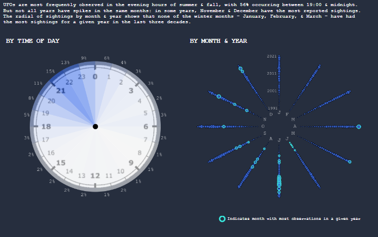
In the “By Time of Day” section, a radial clock chart displays sighting frequencies across 24 hours, showing that sightings peak between 9 PM and midnight. This suggests that more sightings occur after dark, possibly due to the visibility of lights in the night sky.
For seasonal and long-term trends, the “By Month & Year” radial chart uses a spoke design to illustrate which months had the most yearly sightings over the past few decades. This unique layout allows viewers to see that summer months typically experience more sightings each year.
The visualization also examines the shapes of the reported UFOs. A bar chart labelled “By Shape” lists common UFO shapes, such as lights, circles, and triangles, with the most frequent shapes highlighted in colour. The accompanying “By Shape & Year” radial charts display these shapes over time, allowing viewers to identify which are commonly reported across different years.
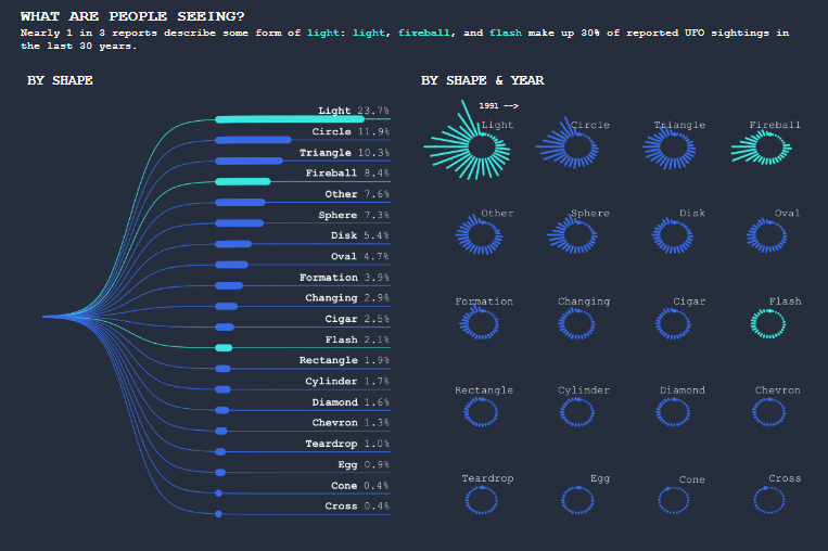
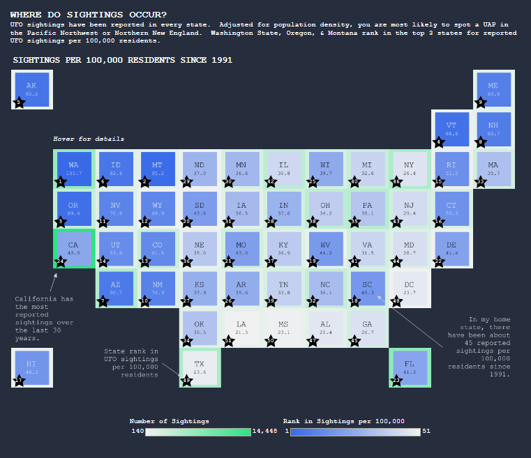
The “Where Do Sightings Occur?” section uses a tile map of the United States to show sighting frequency by state, adjusted for population density. States in the Pacific Northwest and Northern New England, such as Washington, Oregon, and Maine, have higher sightings per capita, making them hotspots in this alien sightings map. This map of UFO sightings in the world emphasizes regional patterns and highlights areas where sightings are most prevalent relative to the population.
At the bottom, the visualization delves into government responses to UFO sightings. It summarizes findings from a recent U.S. government report on unidentified aerial phenomena (UAP), which provided several possible explanations, including airborne clutter, natural phenomena, U.S. secret projects, adversary technology, and an “Other” category that leaves the extraterrestrial hypothesis open.
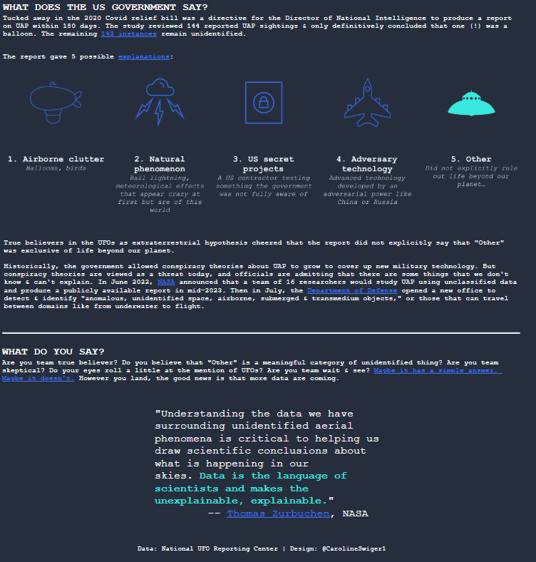
Finally, a section titled “What Do You Say?” encourages viewers to consider their stance on UFOs, sparking curiosity and scepticism. A quote from NASA’s Thomas Zurbuchen underscores the importance of scientific investigation into these phenomena, framing the data as a bridge between mystery and explanation. This alien sighting map visualization effectively uses line charts, radial and bar charts, and maps to view UFO sightings across multiple dimensions comprehensively.
#5 UFO Sighting Maps – UFO Sightings Exploration Map
This UFO sighting visualization provides a global perspective on UFO sightings, using a world map, heatmap, and word cloud to illustrate data related to sighting locations, times, and descriptions. The primary feature is an alien sighting map, presenting a map of UFO sightings worldwide, with sightings concentrated in areas such as North America and parts of Europe. Each green dot on this UFO sighting map represents a sighting, allowing viewers to identify geographic hotspots where sightings have been reported most frequently.
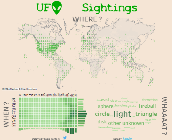
Below the map, a heatmap displays the distribution of UFO sightings by month and year. This chart shows seasonal and annual trends, indicating when sightings peak. Larger squares represent months with higher sightings, allowing users to observe how sightings fluctuate over time.
To the right, a word cloud represents the types of UFOs reported, with terms like light, circle, and triangle appearing larger, indicating their frequency among sightings. This word cloud effectively shows the diversity of shapes and forms described in these sightings, highlighting the most common descriptions.
Overall, this visualization combines an alien sightings map, a temporal heatmap, and a descriptive word cloud, offering an engaging look at UFO sightings worldwide.
Through these five examples of UFO sightings maps, we gain a deeper understanding of global patterns and trends associated with these mysterious encounters. Each visualisation provides a fresh perspective on UFO phenomena, from heatmaps showing seasonal peaks to an alien sighting map pinpointing specific locations. These maps are valuable tools for researchers and enthusiasts, allowing them to explore historical and recent sighting data. They foster a data-driven approach to understanding what has traditionally been a subject of speculation. Whether you’re a dedicated UFO researcher or intrigued by the unknown, these examples demonstrate how data visualization can make sense of complex phenomena. Ultimately, each alien sightings map brings us one step closer to unravelling the mystery of these unexplained encounters and offers an engaging view into the map of UFO sightings in the world.


