A well-designed telco dashboard provides telecom companies with a clear view of critical performance metrics, customer behaviour, and emerging trends. From monitoring mobile and 5G penetration to evaluating product performance and managing customer churn, telco analytics empowers leaders to make informed, strategic decisions. With telco data analytics, organizations can enhance customer experiences, maximize resource efficiency, and achieve sustainable business growth.
This post highlights seven impactful dashboards tailored to diverse business needs. These examples illustrate how analytics for telcos can streamline operations, improve performance, and enable data-backed strategies. Whether you’re a telecom executive, product manager, or network planner, these dashboards provide valuable insights to keep your organization agile and future-ready. Discover how these tools can transform telecom operations and give you a competitive edge.
Table of Contents
#1 Telco Dashboard – Executive Summary
This telco dashboard provides a comprehensive overview of key performance indicators (KPIs) for account development as of a specific date (04-Sep-2021), with year-over-year comparisons. It leverages telco analytics to present critical metrics such as Monthly Recurring Charges (MRC), mobile and wireline performance, mobile penetration, and account base trends through various data visualizations.
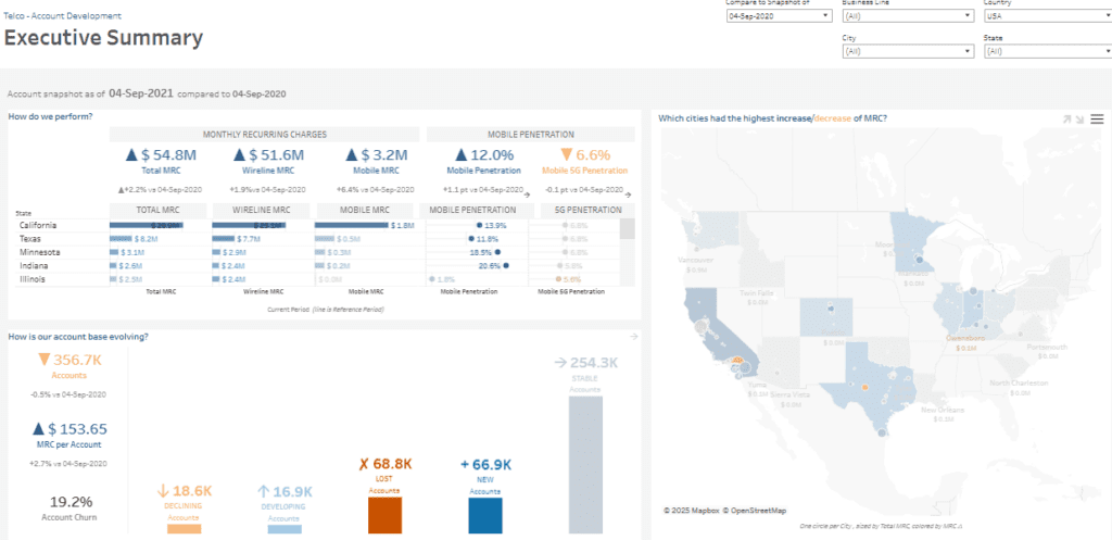
The telco data analytics dashboard uses several chart types, including:
- KPIs with trend indicators (e.g., total MRC, wireline MRC, mobile MRC) show changes compared to the previous year.
- Bar charts for state-level MRC breakdowns.
- Maps to visualize the geographic distribution and changes in MRC across U.S. cities.
- Stacked bar and categorical charts to display account changes (new, lost, and stable).
Analytics for telcos empowers telecom executives, regional managers, and account development teams to assess performance, identify areas of growth or decline, and drive strategic decisions. It helps pinpoint underperforming regions, monitor customer churn, and optimize resources to boost mobile penetration. This enhances strategies for market expansion, product focus, and account retention.
#2 Telco Dashboard – Accounts
This telco dashboard focuses on account dynamics, providing a snapshot of account movements as of 04-Sep-2021, with comparisons to the previous year. It highlights how accounts transitioned between statuses and business lines, including wireline, mobile, and wireline+mobile. Key metrics include new, developing, stable, declining, and lost accounts.
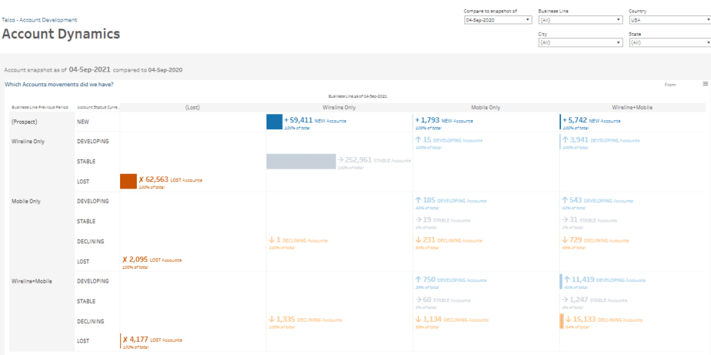
The telco analytics dashboard uses matrix-style tables and performance indicators to display account changes by business line. Metrics such as new, stable, developing, and lost accounts are colour-coded and categorized to clarify shifts in the customer base. Arrows and icons indicate trends in growth, decline, or account loss.
This telco data analytics solution is critical for telecom account managers, sales strategists, and business line analysts. It allows them to track account growth, assess customer churn, and determine which product lines require strategic adjustments. By leveraging analytics for telcos, they can make data-driven decisions on customer engagement, product development, and sales efforts. Identifying regions with high numbers of developing or declining accounts can prompt targeted actions to address service improvements, pricing, or marketing strategies, ultimately enhancing customer retention and business performance.
#3 Telco Dashboard – Account Churn
This telco dashboard offers a comprehensive view of account churn. It showcases actual churn rates, total accounts, and new and lost accounts as of 04-Sep-2021 and compares them to the previous year. The 19.2% churn rate is a key metric, with data segmented by business lines and states. The dashboard also highlights churn risk, enabling stakeholders to focus on areas needing immediate attention.
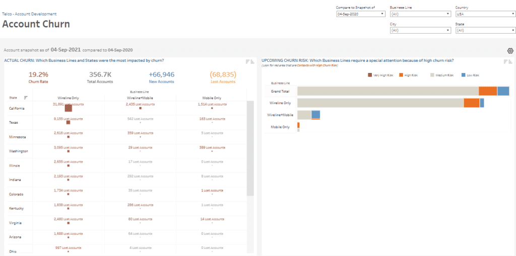
The telco analytics dashboard presents data through various visualizations:
- Tables displaying lost accounts by business line (wireline only, mobile-only, wireline+mobile) and state, offering detailed churn insights.
- Bar charts illustrating churn risk levels (low, medium, high, and very high) by business line to guide strategic interventions.
- Performance indicators summarizing critical figures, including churn rates and net account movements.
This telco data analytics tool is ideal for telecom executives, customer experience managers, and retention specialists. It enables them to analyze churn’s impact across business lines and regions. By leveraging analytics for telcos, they can prioritize at-risk areas, implement targeted churn reduction strategies, and enhance customer engagement. These insights help safeguard revenue, support business stability, and improve customer retention efforts.
#4 Telco Dashboard – Mobile Penetration
This telco dashboard offers an overview of mobile penetration trends as of 04-Sep-2021, focusing on account growth and regional performance. The data reveals a 12.0% mobile penetration rate, an increase of 1.1 percentage points from the previous year. Additionally, the dashboard highlights 43.0K mobile accounts, marking a 9.9% rise over the same period.
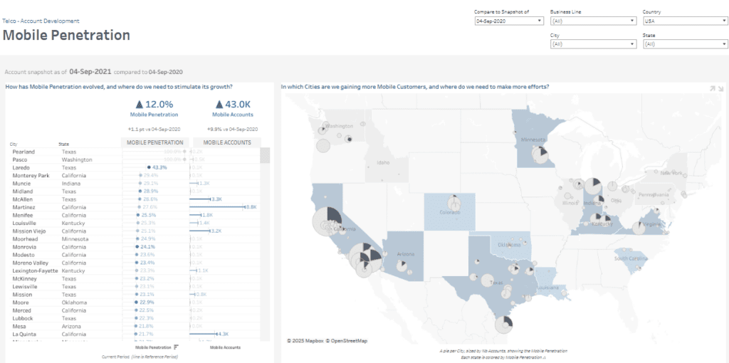
This telco analytics tool presents insights through various visualizations:
- Tables rank cities and states by mobile penetration and account numbers, clarifying regions with the highest customer growth.
- Pie charts on a map depict the geographic distribution of mobile accounts, allowing users to pinpoint key markets and regions requiring additional focus.
- Performance indicators summarizing essential metrics like penetration rates and account growth.
These telco data analytics enable telecom product managers, sales strategists, and regional planners to evaluate mobile service performance. They can identify high-growth areas and determine where marketing or infrastructure upgrades are necessary. With analytics for telcos, businesses can guide investments, improve resource allocation, and implement strategies to enhance mobile service adoption in less competitive areas.
#5 Telco Dashboard – 5G Penetration
This telco dashboard highlights mobile 5G penetration as of 04-Sep-2021, with a comparative analysis against the previous year. It shows a penetration rate of 6.6%, a slight decline of 0.1 percentage points. Additionally, the dashboard reveals 2.9K mobile 5G accounts, providing insights into regional adoption and areas where further effort may be needed to drive growth.
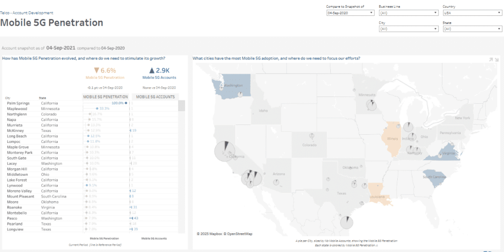
The telco analytics dashboard employs various visualizations to present this data effectively:
- Tables listing cities and states with mobile 5G penetration percentages and account numbers offer a ranked performance breakdown across regions.
- Geographical maps display the distribution of mobile 5G accounts through pie charts that reflect the number of accounts. These maps help users identify adoption hotspots and target areas for improvement.
- Performance indicators summarizing key metrics like penetration rates and account growth.
This telco data analytics tool is designed for telecom network planners, business development teams, and regional managers. By leveraging these analytics for telcos, stakeholders can evaluate market performance, prioritize investment in infrastructure and marketing, and focus resources on areas with low 5G adoption. These data-driven insights facilitate strategic planning to expand 5G services and enhance competitive positioning in key markets.
#6 Telco Dashboard – Product Mix
This telco dashboard comprehensively analyses product mix penetration across different age groups as of 04-Sep-2021. It highlights key business lines, including wireline and mobile services. The data reveals a wireline penetration rate of 98.8% and a mobile penetration rate of 12.0%. Additionally, there are 43.0K mobile accounts and 352.5K wireline accounts.
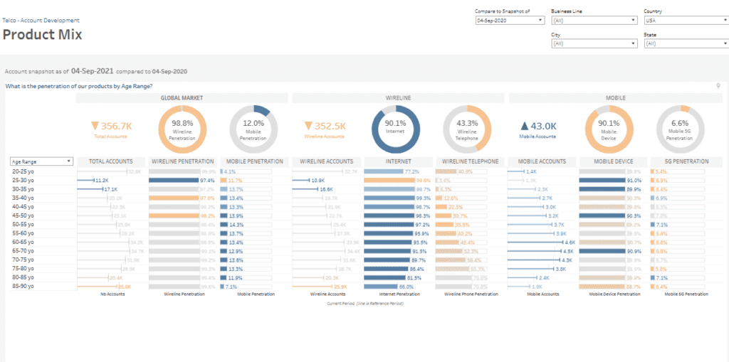
The telco analytics dashboard uses various visualizations to deliver insights:
- Bar charts segmented by age range, showcasing total accounts, wireline and mobile penetration, and service-specific penetration rates (internet, telephone, mobile devices, and 5G).
- Doughnut charts summarizing overall market penetration for services like wireline, mobile devices, and 5G.
- Performance indicators highlight key metrics such as account totals and wireline and mobile services penetration rates.
This telco data analytics tool supports telecom marketing teams, product managers, and customer analysts by providing insights into product performance across demographics. By utilizing analytics for telcos, stakeholders can pinpoint high-growth segments, customize marketing strategies, and refine product offerings. These data-driven insights enable effective decision-making to enhance product adoption, strengthen market positioning, and meet customer needs across different age groups.
#7 Telco Dashboard – What If
This telco dashboard provides a “What If” analysis, allowing users to evaluate the potential gains from converting accounts to a combined wireline and mobile service offering. It presents an account snapshot as of 04-Sep-2021, with data on existing accounts and their Monthly Recurring Charges (MRC). Wireline-only accounts dominate at 313.7K, with mobile-only accounts at 4.2K and wireline+mobile at 38.8K. The dashboard simulates estimated gains, showing that a 1% conversion increase could result in 3,137 new converted accounts and a $222K MRC boost.
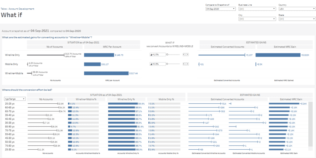
The telco analytics dashboard features:
- Bar charts comparing account numbers, MRC per account, and estimated conversion gains across service categories.
- Sliders and metrics enable scenario adjustments to simulate conversion efforts and visualize resulting gains.
- Age-segmented charts illustrate conversion opportunities and estimate MRC increases by demographic group.
This telco data analytics tool supports telecom executives, sales planners, and product managers in strategizing service bundling efforts. By leveraging analytics for telcos, users can identify target customer segments, optimize conversion strategies, and forecast revenue growth. The insights help prioritize marketing initiatives and resource allocation to maximize profitability through increased service adoption.
These seven telco dashboard examples showcase how telecom companies can leverage telco data analytics to thrive in a dynamic industry. Each dashboard solves a business challenge, whether increasing service penetration, reducing churn, or boosting conversions. Through analytics for telcos, decision-makers can uncover growth opportunities, manage risks, and enhance customer satisfaction. By utilizing actionable insights, businesses can remain adaptable and responsive to changing market demands. Telco analytics drives better resource allocation, optimized service offerings, and stronger customer engagement. Investing in these data-driven tools positions your organization for long-term success and growth. By embracing analytics solutions, telecom companies gain the strategic advantage necessary to stay ahead of the competition in an ever-evolving market.