Some chart types sound tasty — Tableau Waffle charts are one of them!
This post will take a deep dive into Tableau waffle charts, discussing their use case, their unique strengths, and, of course, how to build one.
Table of Contents

Data Source
If you want to download the data and follow this tutorial, please download the file below.
The structure of the file is the following:
| ticker | ticker symbol of the company |
| name | name of company |
| variable | assetsc = current assets assetsnc = non-current assets equity liabilitiesc = current liabilities liabilitiesnc = non current liabilities |
| value | monetary value of variable in USD |
| Calanderdate | date of financial statements |
What do Tableau waffle charts do?
Tableau waffle charts are used to show a proportion. This can be any percentage, but it is best to be something with a significant range — Anything that hovers around 1% all the time would be a poor use case. They shouldn’t be used for more than three categories; otherwise, your audience will struggle to interpret them.
Why use a Tableau waffle chart?
So, why use a Tableau waffle chart if a bar chart can show the same information more efficiently? One answer is their unique look. A tableau waffle chart can spice up your report if you realize you use too many bar charts. There’s something beautiful about a grid of neatly arranged units coloured in an orderly fashion. If you use them tactically, you can alleviate your audience’s boredom or loss of engagement.
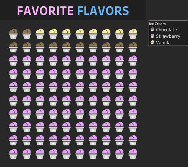
We aren’t limited to using just squares. You can use whatever shapes you want.
This leads to another point about Tableau waffle charts—if you use a unique shape, they become more graphic, making them great for infographic publications. For example, this one is about ice cream.
Here are some quick words before we build a Tableau waffle chart…
How you build it ultimately depends on what kind of data structure you’re working with. Some people have data sets with many rows, while others have aggregate data and must be scaffolded to 100 rows minimum. Some people have a numeric ID field for rows; others need to use the Index() function to generate the row numbers. Some people will have their variables nested in a single column; others will have them in their columns.
Therefore, you should focus on the concepts, not calculations:
1. We need at least 100 rows of data.
2. At least one of the rows needs to have the metric you’re using to colour the chart.
3. We use row ids to create a 10×10 grid of columns and rows.
4. We use fixed LODs or table calculations to grab the metric and bring it into a row-wise granularity for a conditional comparison to colour the squares.
The Calculations
There are eleven calculations, and a parameter are used to create the Assets Waffle chart. Three are for the chart itself, which is respectable. Two are due to our particular data structure. So at least six are essential — That’s not TOO bad for a custom chart.
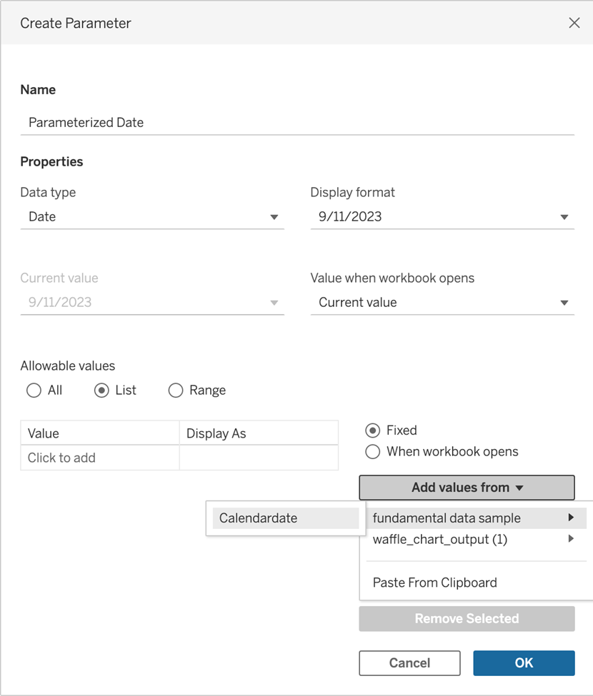
Create a date parameter to allow us to view our waffle chart interactively according to the date.
Index
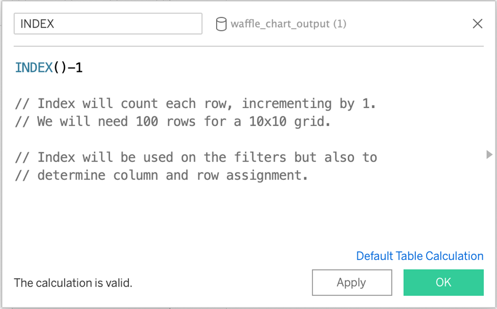
This will generate row numbers we can use to create a 10×10 grid.
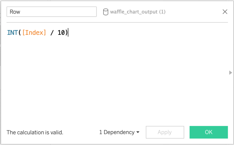
Row
This will determine the row number based on the index value.
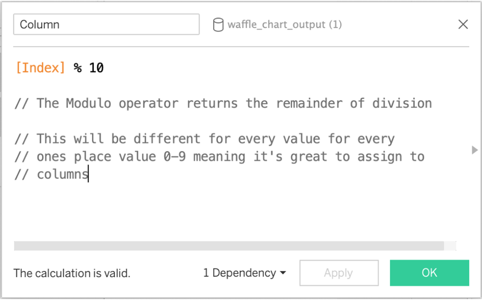
Column
The modulo % operator returns the remainder of the division, meaning each value of 0-9, 11-19, etc., will be assigned a different position (along a column).
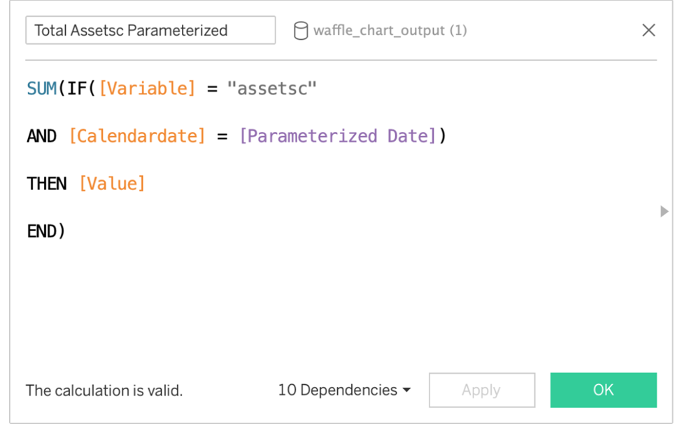
Total Assetsc Parameterized, Total Assetsnc Parameterized
We need a calculated field for these metrics due to our data structure, as these aren’t their own column but are nested in a column called “Variable.” They’re parameterized for interactivity.
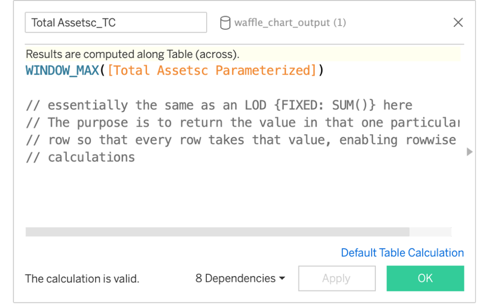
Total Assetsc_TC, Total Assetsnc_TC.
TC stands for table Calculation. These are used to return that single row value for every row. Having the value for every row will make it helpful in comparing each square and determining the colour later.
(Note: This isn’t necessary if you aggregate your data and then scaffold it to have 100 rows. But for more realistic data you may be pulling from a database, this is likely necessary).
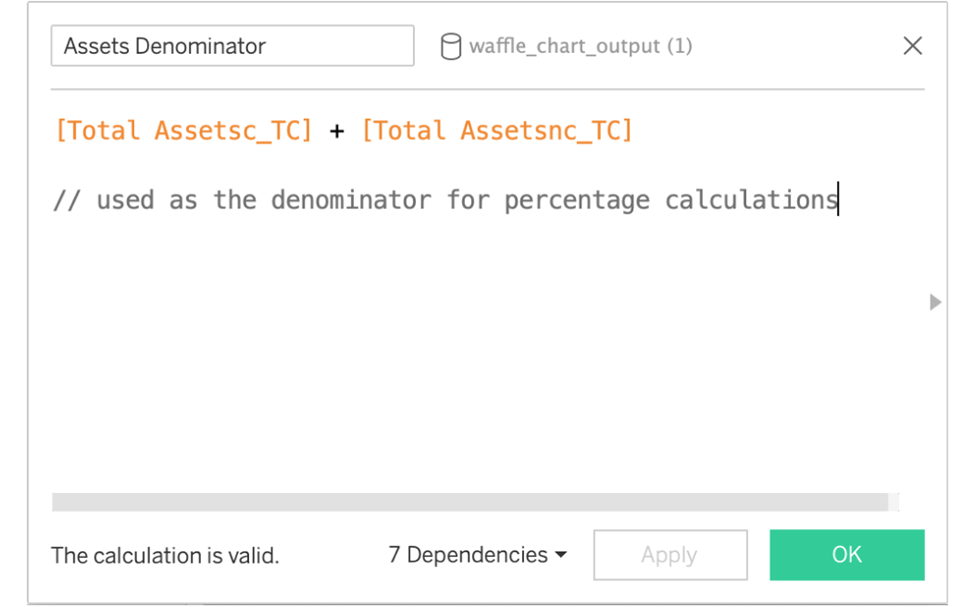
Assets Denominator
This is the denominator we use to create the percentage values. Add up the two asset classes to get the total assets for the denominator.
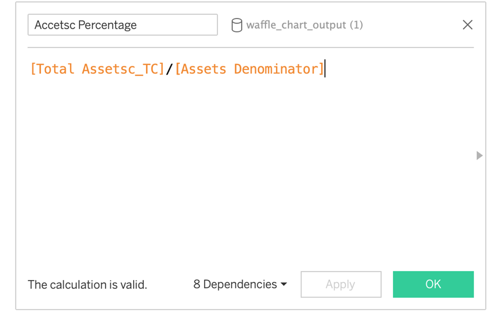
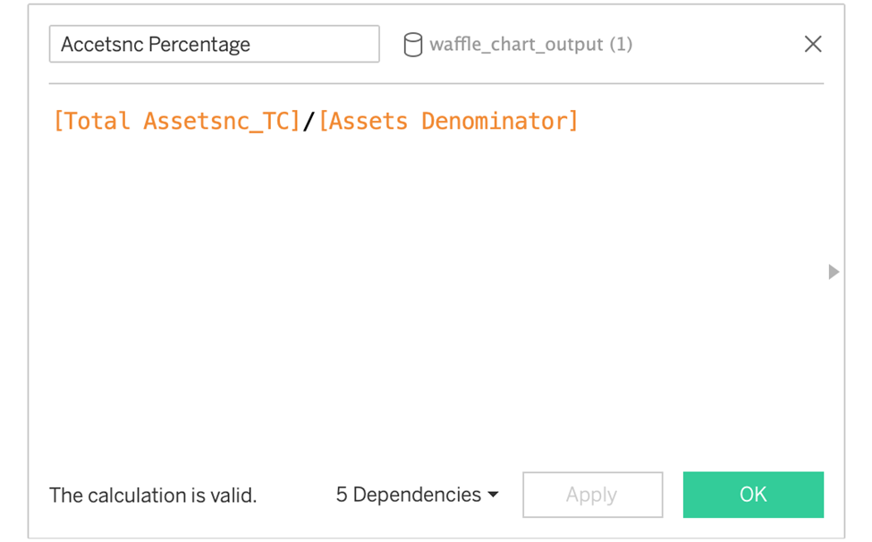
Percentage metrics: Assetsc Ratio, Assetsnc Ratio
These are the percentage values we will use to determine the square color and display in the chart’s title.
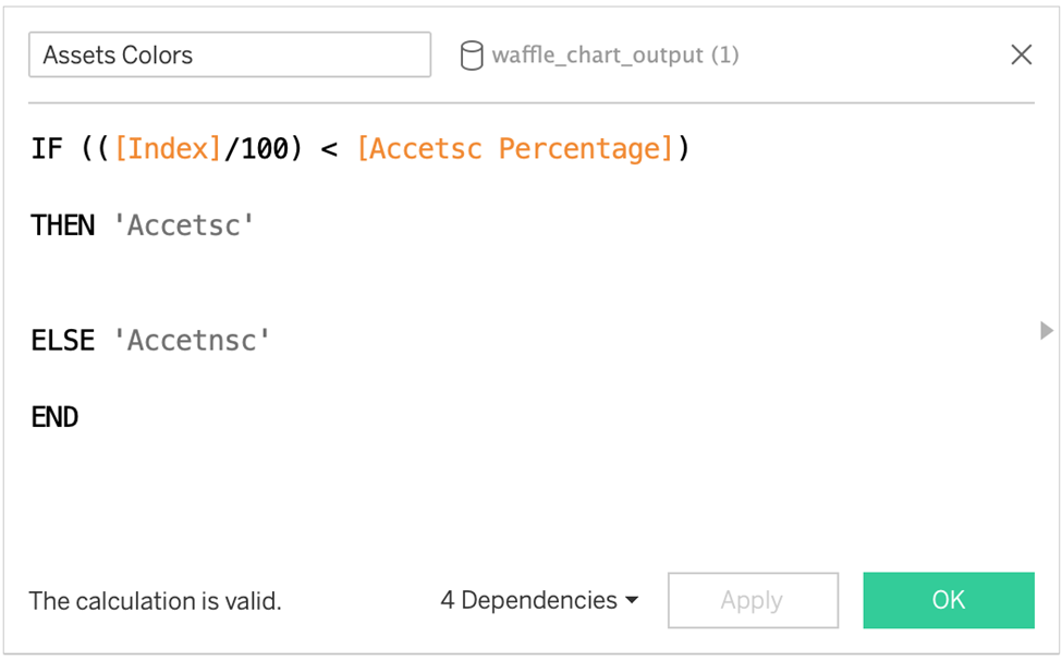
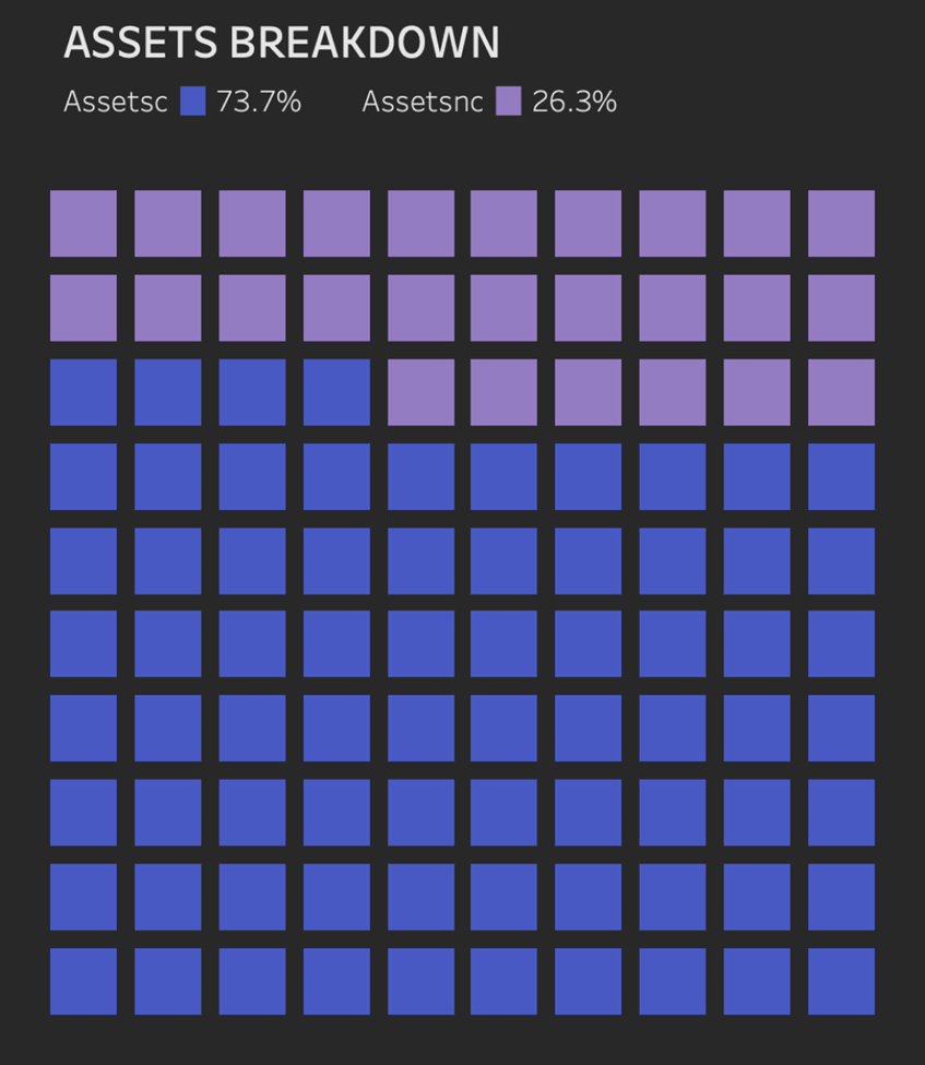
Assets Colors
They are used to determine the colour of the squares. Colour the squares if the square as a percentage value (Index/100) is less than or equal to the percentage for the first asset class, Assetsc.
Here, we only have two asset classes, so anything that doesn’t fit the first condition will be coloured for the other asset class, Assetsnc.
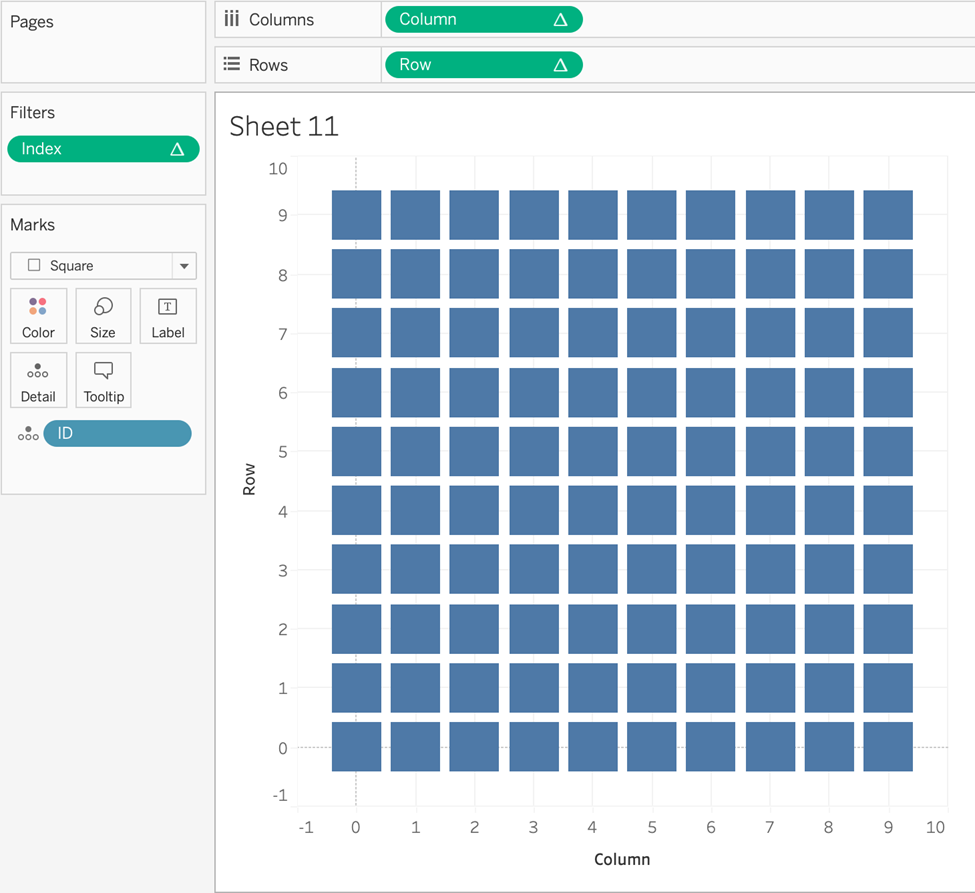
Create the View
- Drag ID to Marks.
- Index to Filters. Compute using ID. Filter for values 0-99. This will give us the 100 marks we need.
- Drag Column to Columns shelf. Compute using ID.
- Drag the Row to the Rows shelf. Compute using ID.
- Change Mark type to Square.
Further Enhancements
1. Drag Assets Colors to Color. Compute using ID.
2. Assetsc Percentage to marks. Compute using ID.
3. Assetsnc Percentage marks. Compute using ID.
4. Add the Assets Ratio and Assetsnc Percentage values to the chart title.
5. Remove all gridlines, axis rulers, and hide headers.
So… after 11 Calculated Fields and a parameter, we have a wonderful-looking Waffle Chart! What a feast… (Well, for the eyes at least!)
We are nearly done!
I hope you didn’t get lost in there. Remember the concepts. We needed an index, which helped determine the column and row of each unit. We required our metrics to be on a row-wise level so we could return the percentage calculations, and then we coloured the squares based on whether the square value was less or equal to the percentage.
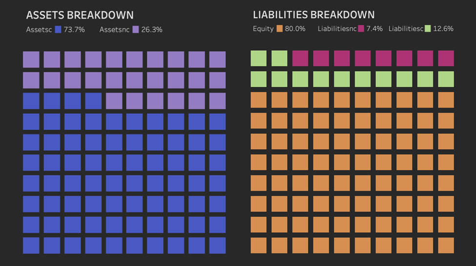
Ready for More? Continue with Liabilities
The steps and calculations for the Liabilities chart are precisely the same, with one exception. We have three metrics in the Liabilities, so we will have one extra calculated field for the Total, TC(Table Calculations), and Percentage fields. So that will be 13 Calculated fields, but they are precisely the same as what we did for the Assets. Here are the screenshots.

Note that we had a third class in that colour calculation for liabilities. The concept at play was the same as with the assets, however.
Like before, beautify the chart by removing gridlines, axis rulers, and hiding headers. Add the percentage labels to the title for enhanced interpretability.
And that’s how you build a Tableau waffle chart!
There is nothing else to add here except that we hope you use your new ability to create a waffle chart in that one particular spot where you think you could use a bit of variety. That is an exciting way to show a company’s balance sheet that is intuitive and colourful!
Other Advanced Tableau Advanced visualization tutorials
Want to see other possibilities in Tableau? Other tutorials on Tableau advanced visualization can be found here. Or read our blog for additional articles on Tableau for finance, marketing, sales or Tableau best practices.