This blog showcases ten exemplary Tableau UFC dashboards designed to inspire and inform enthusiasts, analysts, and professionals. These dashboards offer insights into UFC stats, from fighter earnings and title histories to performance metrics and winning methods.
Whether you are a fan, coach, or data analyst, these examples highlight the power of Tableau MMA analytics to transform complex data into clear, actionable insights, driving a deeper understanding of the sport.
Table of Contents
Affiliate Disclosure: Some of the links on this blog are affiliate links, which means if you click on them and make a purchase, we may receive a commission at no extra cost to you. This helps support our blog and allows us to continue to create content for you. We only recommend products and services we genuinely believe in; all opinions expressed here are ours. Thank you for being so supportive!
The Tableau public has curated these great Tableau UFC dashboards; we do not take credit for their creation.
#1 *Interactive* UFC – Tale of the Tape
UFC Tale of the Tape Dashboard
This Tableau UFC dashboard comprehensively summarizes a fight between Jon Jones and Alexander Gustafsson. It showcases detailed UFC statistics and performance metrics for each fighter, thoroughly analyzing their bout. This dashboard is designed for UFC enthusiasts, analysts, and commentators who seek in-depth insights into fight dynamics and individual fighter performances.
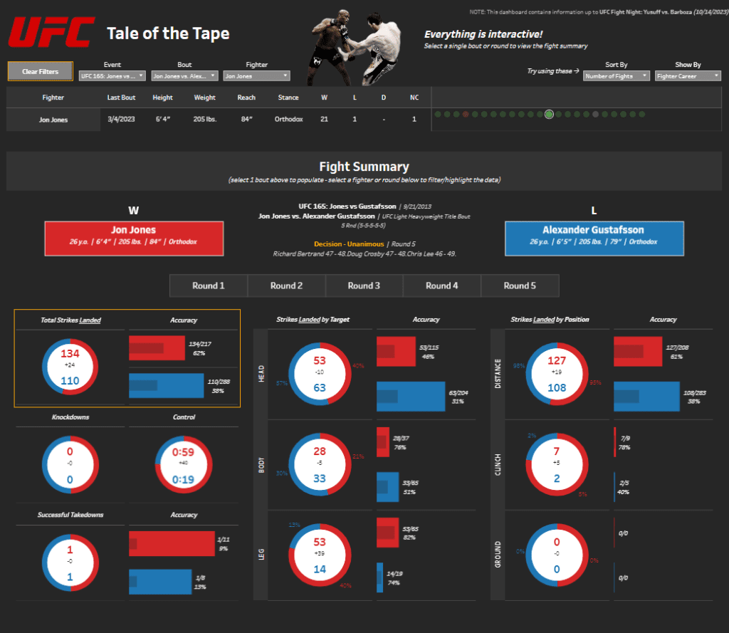
Components and Charts:
- Fighter Information and Filters:
- The top section allows users to filter fights by event, bout, or fighter. It displays vital details such as the last bout date, height, weight, reach, and stance for each fighter, offering a quick overview of their physical attributes and fighting style.
- Fight Summary:
- The middle section summarizes the fight outcome, noting that Jon Jones won by unanimous decision after five rounds. It includes judges’ scores and significant moments from the fight, providing a concise narrative of the bout.
- Total Strikes Landed and Accuracy:
- This section features circular charts comparing the total strikes landed by each fighter. The red and blue segments represent Jon Jones and Alexander Gustafsson, respectively. The charts also display the accuracy percentages, highlighting Jones’s higher accuracy rate.
- Knockdowns and Control:
- Circular charts show the number of knockdowns and control time for each fighter. This data gives insights into the fighters’ dominance and ground control during the match.
- Successful Takedowns and Accuracy:
- This part of the dashboard uses circular charts to present takedown statistics, indicating the number of successful takedowns and the accuracy of these attempts.
- Strikes Landed by Target and Position:
- Detailed charts break down the strikes landed by target (head, body, leg) and position (distance, clinch, ground). This provides a granular view of each fighter’s striking strategy and effectiveness in different combat scenarios.
Target Audience:
This Tableau MMA dashboard is ideal for:
- UFC Fans and Enthusiasts: Individuals interested in detailed UFC stats and analysis to enhance their viewing experience.
- Sports Analysts and Commentators: Professionals need comprehensive data to provide informed commentary and analysis during broadcasts or articles.
- Trainers and Fighters: Coaches and athletes looking to study opponents’ fighting styles and performance metrics for strategic planning.
- Data Analysts and Statisticians: Those who analyze MMA analytics for patterns, trends, and performance insights.
Overall, this UFC Tale of the Tape dashboard is a powerful tool for anyone interested in the intricacies of mixed martial arts. It offers a deep dive into the performance metrics that define each fight.
#2 How MIXED are the MARTIAL ARTS in the UFC?
UFC Mixed Martial Arts Analysis Dashboard
This Tableau UFC dashboard provides an in-depth examination of the varied fighting techniques utilized by UFC fighters from 1993 to 2021. Analyzing the mix of striking, grappling, and submission strategies offers valuable insights into the evolution of mixed martial arts in the UFC. This comprehensive dashboard is designed for UFC fans, analysts, trainers, and fighters interested in advanced MMA analytics.

Components and Charts:
- Overview and Background:
- The top section delivers a brief explanation of MMA in the UFC, highlighting the predominant fighting styles and the purpose behind the analysis. This establishes a foundational understanding for interpreting the data.
- Scatter Plot of Fighting Techniques:
- The primary visual is a scatter plot displaying the average strike, takedown, and submission attempts per fight for individual fighters. Each dot represents a fighter, and its size correlates to its win/loss ratio. This chart is divided into quadrants that categorize fighters based on their balance of striking and grappling techniques.
- Distribution of Fighting Styles:
- Percentages above the scatter plot illustrate the distribution of fighters across different fighting styles, such as high strike and low takedown/submission attempts. This quick reference helps users identify predominant trends among UFC fighters.
- Interactive Data Filters:
- Users can interact with filters to customize the data view based on weight class and UFC era. Sliders also allow fine-tuning the displayed range of strike and takedown/submission attempts, enabling a focused analysis.
- Interpretation Guide:
- An explanatory guide is included to help users understand the scatter plot, including the significance of dot sizes and their placement within the chart’s quadrants. This ensures accurate interpretation of the data.
This UFC analytics dashboard is a valuable resource for anyone seeking a deeper understanding of how mixed martial arts techniques are applied and evolved in the UFC.
#3 Offense and Defense of Top UFC Fighters
Offense and Defense of Top UFC Fighters Dashboard
This Tableau UFC dashboard compares the top fighters in each weight division based on offensive and defensive stats. The dashboard presents a clear visualization of striking and takedown metrics, providing insights into the performance of UFC fighters across different weight classes. This dashboard is handy for UFC fans, analysts, coaches, and fighters interested in detailed UFC analytics.

Components and Charts:
- Quadrant Charts for Each Fighter:
- A quadrant chart represents each top-ranked fighter in the weight divisions (Flyweight to Heavyweight). These charts compare striking accuracy, striking defense, takedown accuracy, and takedown defense. Each square within the quadrant is sized according to its specific stat, providing a clear and concise visual comparison.
- Statistical Breakdown:
- The top section of the dashboard includes a legend explaining the metrics: striking accuracy (percentage of strikes landed), striking defense (percentage of opponent strikes that did not land), takedown accuracy (percentage of takedowns landed), and takedown defense (percentage of opponent takedowns that did not land). This ensures users can easily interpret the visual data.
- Fighter Comparison Across Weight Classes:
- The dashboard is organized by weight classes, allowing users to compare fighters within the same division. Each class displays the champion and the top four ranked fighters, making it easy to see how their offensive and defensive stats compare to their peers.
- Visual Clarity and Design:
- The quadrant charts represent the four metrics using color-coded squares (yellow, red, blue, and teal). This color differentiation enhances visual clarity, allowing users to grasp each fighter’s strengths and weaknesses quickly.
Overall, this UFC statistics dashboard is a powerful tool for anyone interested in understanding the offensive and defensive capabilities of top UFC fighters. It provides a clear and detailed visualization of key performance metrics, making it invaluable for fans and sports professionals.
#4 UFC Khabib vs Conor
Comprehensive UFC Fighter Performance Dashboard
This Tableau UFC dashboard delivers an intricate analysis of fighter performance metrics, showcasing a comparison between Khabib Nurmagomedov and Conor McGregor. It highlights various aspects of their fighting techniques, making it an essential tool for those deeply invested in MMA analytics.

Detailed Components and Visualizations:
- Radar Charts:
- The central feature of the dashboard is the dual radar charts. Each chart represents the performance metrics of one fighter, with axes for body, head, leg strikes, submissions, clinch, control, and takedowns. The radar charts provide a multifaceted view of each fighter’s strengths and vulnerabilities, allowing for a side-by-side comparison.
- Performance Metrics Bars:
- Below the radar charts, performance bars offer a summarized view of key statistics, such as the number of strikes to different body parts, submission attempts, clinch work, control time, and successful takedowns. These bars are colour-coded for clarity and provide an immediate visual summary of each fighter’s capabilities in specific areas.
- Fight Summary Section:
- The dashboard includes a detailed summary of the bout, covering aspects like event details, rounds, the winner, and the method of victory. This section contextualises the performance metrics by linking them to the fight outcome.
- Interactive Elements:
- The dashboard features interactive drop-down menus that allow users to select different fighters for comparison. This functionality makes the dashboard adaptable to various matchups, providing tailored analysis for fights.
#5 UFC
Comprehensive UFC Fighter Performance Dashboard
This Tableau UFC dashboard delivers an intricate analysis of fighter performance metrics, showcasing a comparison between Khabib Nurmagomedov and Conor McGregor. It highlights various aspects of their fighting techniques, making it an essential tool for those deeply invested in UFC analytics.

Detailed Components and Visualizations:
- Performance Metrics Bars:
- Below the radar charts, performance bars offer a summarized view of key statistics, such as the number of strikes to different body parts, submission attempts, clinch work, control time, and successful takedowns. These bars are color-coded for clarity and provide an immediate visual summary of each fighter’s capabilities in specific areas.
- Fight Summary Section:
- The dashboard includes a detailed summary of the bout, covering aspects like event details, rounds, the winner, and the method of victory. This section contextualizes the performance metrics by linking them to the fight outcome.
- Interactive Elements:
- The dashboard features interactive drop-down menus that allow users to select different fighters for comparison. This functionality makes the dashboard adaptable to various matchups, providing tailored analysis for other fights.
#6 UFC 244 – MASVIDAL vs DIAZ: FIGHTER HISTORY
Fighter History Dashboard: Masvidal vs. Diaz
This Tableau UFC dashboard provides an in-depth historical analysis of Jorge Masvidal and Nate Diaz’s fighting careers, focusing on their fight outcomes over time. It is a comprehensive tool for those interested in UFC stats and MMA analytics, showcasing the performance trends of these two fighters.

Components and Charts:
- Timeline Bar Charts:
- The dashboard features two main bar charts, one for each fighter. These charts display the duration of each fight (in minutes) along the timeline from 2004 to 2020. Each bar is color-coded to indicate the outcome of the fight: green for wins, red for losses. This visual representation allows users to track Masvidal and Diaz’s career progression and performance over the years.
- Win and Loss Filters:
- On the right side of the dashboard, interactive filters sort the fight outcomes by decision, KO/TKO, and submission. These filters help users focus on specific wins or losses and offer a detailed view of the fighters’ performance in different scenarios.
- Fighter Profiles:
- The left side of the dashboard includes profiles of both Jorge Masvidal and Nate Diaz, displaying their fight records (wins, losses, and draws) along with images. This section gives a quick reference to their career statistics.
- Fight Time Analysis:
- The bar charts also highlight the fight time, providing insights into how long each bout lasted. This can help identify patterns in the fighters’ stamina and endurance over their careers.
#7 UFC Title Fight History
UFC Title Fight History Dashboard
This Tableau UFC dashboard offers a comprehensive visual representation of the history of title fights across different weight divisions in the UFC. It highlights the success and failure rates of title defenses for both men’s and women’s divisions over the years, providing a clear view of championship trends and fighter performance. This dashboard is ideal for those interested in UFC stats and MMA analytics.

Components and Charts:
- Gantt Chart:
- The primary visual element is a Gantt chart displaying the timeline of title fights from 1997 to the present. Each bar represents a title fight, color-coded to indicate whether the title defense was successful (gold) or unsuccessful (black). This chart helps users quickly identify patterns and trends in title defenses across different weight classes.
- Division Breakdown:
- The chart is divided into men’s and women’s divisions, listing each weight class (e.g., Flyweight, Bantamweight, Featherweight) along the y-axis. This division allows users to focus on specific categories and compare title defense success rates within and between weight classes.
- Temporal Analysis:
- The x-axis represents the timeline from 1997 to 2017, providing a historical perspective on how title defenses have evolved. This temporal analysis helps identify periods of dominance by certain fighters or shifts in competitive dynamics within divisions.
#8 The MMA Career Earnings of Nate Diaz
Nate Diaz’s MMA Career Earnings Dashboard
This Tableau UFC dashboard provides a detailed analysis of Nate Diaz’s career earnings in mixed martial arts, offering insights into his financial performance across various fights and methods of victory. It is an essential tool for those interested in UFC stats and MMA analytics, providing a comprehensive look at how Diaz’s earnings have evolved.

Components and Charts:
- Earnings Overview:
- At the top, the dashboard presents key figures such as total career earnings ($4.89M), average earnings per fight ($195,640), and average earnings per minute ($14,156). A line graph shows the peak earning year (2016) when Diaz earned $2.69M.
- Income Breakdown:
- A bar chart breaks down Diaz’s sources of income, highlighting show earnings, fight of the night bonuses, win bonuses, submission of the night bonuses, Reebok sponsorship, knockout of the night bonuses, performance of the night bonuses, and fight week incentive pay. This detailed breakdown offers insights into the revenue streams contributing to Diaz’s earnings.
- Minute Earnings to Win It:
- This section uses horizontal bars to display Diaz’s per-minute earnings for various fight outcomes, such as significant decision wins, rear-naked choke wins, and doctor stoppages. Each bar is color-coded to indicate the city where the fight took place, showing where Diaz earned the most per minute.
- Weight and Earnings Comparison:
- A scatter plot at the bottom of the dashboard compares Diaz’s earnings per minute against his opponents’ weight advantages. The plot highlights his most lucrative fights, particularly those against McGregor and Masvidal, where Diaz earned significantly above his average rate.
This UFC analytics tool provides a clear and interactive way to explore Nate Diaz’s MMA career’s financial success, making it a powerful resource for fans and sports professionals.
#9 Ultimate Fighting Championship
Characteristics of a UFC Winner Dashboard
This Tableau UFC dashboard comprehensively analyses the characteristics that contribute to a fighter’s success in the UFC. It offers detailed insights into the attributes of top male and female winners, making it an essential tool for those interested in UFC stats and MMA analytics.

Components and Charts:
- Top 10 Female Winners Bar Chart:
- The left side of the dashboard features a horizontal bar chart listing the top 10 female UFC fighters with the most wins. Amanda Nunes leads the chart with 13 wins, and Jessica Andrade with 11 wins. This chart provides a clear visual of the leading female fighters in terms of victories.
- Top 10 Male Winners Bar Chart:
- A similar horizontal bar chart on the right side displays the top 10 male UFC fighters with the most wins. Donald Cerrone tops the list with 23 wins, and Dustin Poirier with 18 wins. This chart highlights the most successful male fighters in the UFC.
- Winner Statistics:
- The rightmost section presents key statistics of average winners, including average age (29.3 years), average height (178.2 cm), and average reach (182.9 cm). It also shows the average age, height, and reach differences between winners and their opponents, providing insights into the physical attributes that may contribute to a fighter’s success.
- Winners by Age Histogram:
- The bottom section features a histogram showing the distribution of winners by age. The peak age range for winners is between 28 and 32 years, indicating the prime age for peak performance in the UFC. This chart helps identify the age at which fighters are most successful.
#10 UFC – Winners
UFC Winners Dashboard
This Tableau UFC dashboard comprehensively analyses the top UFC fighters across various weight classes, highlighting their win statistics. It offers detailed insights into the methods of victory, making it an essential tool for those interested in UFC stats and MMA analytics.

Components and Charts:
- Top UFC Fighters Bar Chart:
- The left side of the dashboard features a horizontal bar chart listing the top UFC fighters with the most wins. Donald Cerrone leads the chart with 23 wins, followed by Michael Bisping, Georges St-Pierre, and Demian Maia, each with 20 wins. This chart provides a clear visual representation of the leading fighters regarding victories.
- Win Method Treemap:
- The right side of the dashboard includes a treemap that breaks down the methods of victory. It categorizes wins by KO/TKO, submission, doctor stoppage, and points. Each category is proportionally sized to reflect the number of wins achieved by that method. This treemap allows users to quickly see the most common methods of victory among top fighters.
- Weight Class Filter:
- The top section of the dashboard features interactive buttons for selecting different weight classes, including strawweight, flyweight, bantamweight, featherweight, lightweight, welterweight, middleweight, light heavyweight, heavyweight, open weight, and catchweight. This filter allows users to narrow the data to specific weight classes for more focused analysis.
This UFC analytics tool provides a clear and interactive way to explore the win statistics and methods of victory for top UFC fighters, making it a valuable resource for both fans and professionals in the sport.
Conclusion: Harnessing the Power of Tableau UFC Dashboards
The 10 Tableau UFC dashboards showcased in this blog exemplify the potential of data visualization in enhancing our understanding of mixed martial arts. By providing detailed insights into UFC stats, fighter performance, and historical trends, these dashboards are invaluable tools for enthusiasts, analysts, and professionals alike. Utilizing the capabilities of Tableau MMA analytics, these visualizations turn complex data into actionable insights, fostering deeper engagement and strategic decision-making in the sport. Explore these dashboards to unlock the full potential of UFC analytics and elevate your appreciation and analysis of the sport.