This blog explores nine practical examples of improving Tableau tables, demonstrating how small changes can transform standard tables into powerful tools for data interpretation.
Related posts:
Table of Contents
#1 Tableau Tables Best Practice – Offset Headers from the Body
The Tableau table compares two versions of a Tableau table, demonstrating how visual design improvements can enhance clarity and aesthetics. The table represents a basic business summary detailing three key metrics: Segment, Sales, and Profit. The segments listed are Consumer, Corporate, and Home Office, each paired with their respective sales and profit figures.

Old Table (Bad Design)
The initial Tableau table example lacks sufficient visual distinction between the header and the body. The header row, containing column names (Segment, Sales, and Profit), blends in with the rest of the table, making it harder to differentiate between the header and the data. Additionally, the alternating shaded rows for the data body might create unnecessary visual noise.
New Table (Better Design)
The improved Tableau table enhances readability by introducing an apparent offset between the header and the body. The header row is visually distinguished through a subtle background color and bold text, making it stand out. The body rows are presented uniformly, removing the alternating shades, which reduces distraction and allows the viewer to focus on the data.
This transformation emphasizes clarity, structure, and a professional appearance, aligning with Tableau table best practices for effective data communication in dashboards or reports.
#2 Tableau Tables Best Practice – Use Subtle Dividers Instead of Heavy Gridlines
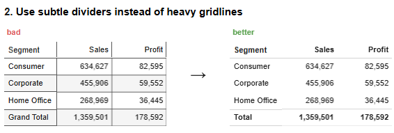
The Tableau table illustrates a comparison between two versions of a Tableau table, highlighting how the application of design principles can elevate clarity and presentation. The table summarizes key business metrics across different segments—consumer, Corporate, and Home Office—and includes a grand total row summarizing overall sales and profit.
Old Table (Bad Design)
The initial Tableau table relies on heavy gridlines to separate rows and columns, creating a rigid and cluttered appearance. The excessive use of borders distracts viewers from the actual data and reduces readability. The Grand Total row is visually indistinct, making it difficult for users to identify the summary information quickly.
New Table (Better Design)
The improved Tableau table replaces the heavy gridlines with subtle dividers, achieving a cleaner, more modern aesthetic. The header row is distinct, with bold text to guide the viewer’s focus, while the Grand Total row stands out with emphasized formatting. These changes improve the overall usability and align with Tableau table best practices by prioritizing clarity and minimizing visual distractions.
This redesign demonstrates compelling Tableau table examples, showcasing how subtle yet impactful adjustments enhance data interpretation in dashboards or business reports.
#3 Tableau Tables Best Practice – Right Align Numbers and Headers and Left Align Text And Headers
The Tableau table compares two versions of a Tableau table, emphasizing how alignment techniques can enhance readability and visual appeal. The table presents a business summary across three segments: Consumer, Corporate, and Home Office, with an additional Total row summarizing overall sales and profit.

Old Table (Bad Design)
The original version of the Tableau table shows inconsistencies in alignment. The numeric values under Sales and Profit are left-aligned, making it harder to compare figures across rows at a glance. Similarly, the text in the Segment column and the header row lack proper alignment, creating a disorganized and unpolished appearance. These misalignments make it more difficult for viewers to interpret the data efficiently.
New Table (Better Design)
The updated Tableau table adheres to alignment best practices. Numeric values in the Sales and Profit columns are right-aligned, allowing for easier comparison of numbers. Text in the Segment column and headers are left-aligned, which improves legibility and creates a clean, professional layout. These changes follow Tableau table best practices, enhancing the table’s overall readability and usability.
This example showcases how proper alignment transforms a cluttered layout into a clear and compelling Tableau table, demonstrating how attention to design can significantly improve data communication.
#4 Tableau Tables Best Practice – Select Appropriate Level Of Precision
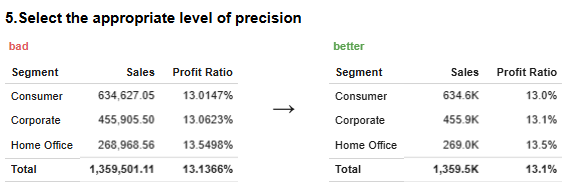
The Tableau table illustrates a comparison between two versions of a Tableau table, focusing on the importance of selecting the appropriate level of precision to improve data clarity and usability. The table summarizes business performance metrics, including Sales and Profit Ratio, across three segments: Consumer, Corporate, and Home Office, along with a Total row that aggregates overall values.
Old Table (Bad Design)
The original Tableau table uses unnecessary precision, displaying numbers with too many decimal places. For instance, Sales figures include cents, and the Profit Ratio is shown with up to five decimal places. This excessive precision clutters the table, making it harder for viewers to interpret key information quickly. The over-detailed data distracts from the broader insights the table is intended to convey.
New Table (Better Design)
The improved Tableau table adopts best practices by rounding numbers to an appropriate level of precision. Sales figures are shortened to thousands (e.g., 634.6K), and the Profit Ratio is rounded to a single decimal place (e.g., 13.0%). This streamlined format makes the data more digestible and enhances the table’s visual appeal. These adjustments align with Tableau table best practices for clear and concise data representation.
This example highlights how effective design choices can transform overly detailed Tableau table examples into polished, easy-to-read dashboards.
#5 Tableau Tables Best Practice – Guide Your Reader With Space Between Rows and Columns
The Tableau table compares two versions of a Tableau table, highlighting the impact of spacing on readability and organization. The table summarizes key business metrics—sales and Profit—across three segments: Consumer, Corporate, and Home Office, with a Total row providing aggregate values.

Old Table (Before Improvement)
The initial Tableau table lacks adequate spacing between rows and columns, resulting in a compact and dense layout. This cluttered appearance makes it challenging for viewers to follow rows or differentiate columns at a glance, hindering quick data interpretation.
New Table (After Improvement)
The improved Tableau table incorporates best practices by introducing sufficient spacing between rows and columns. This added space allows the data to breathe, creating a clean and organized presentation. The Total row is also visually distinct, enhancing its role as a summary. These enhancements guide the reader’s eye smoothly through the table, facilitating easier focus on the data.
This redesign exemplifies effective Tableau table examples, demonstrating how simple adjustments like spacing can transform cluttered layouts into clear and user-friendly tables.
#6 Tableau Tables Best Practice – Remove Unit Repetition
The Tableau table compares two versions of a Tableau table, focusing on how removing repetitive units can enhance clarity and streamline data presentation. The table contains critical business metrics, including Sales and Profit, across three segments: Consumer, Corporate, and Home Office, along with a Grand Total row.

Old Table (Bad Design)
The initial Tableau table uses repetitive units such as “$” for each data point in the Sales and Profit columns. This redundancy creates unnecessary visual clutter, detracting from the overall readability and making it harder for viewers to focus on the data. Additionally, the column headers lack concise labelling, which could confuse readers.
New Table (Better Design)
The improved Tableau table follows best practices by removing redundant units from individual data points. Instead, the “$” sign is included once in the column headers, clearly indicating the unit for all figures in that column. This approach significantly reduces visual noise while maintaining clarity. Additionally, the segments are labelled more concisely, and the Grand Total row is visually emphasized for better distinction.
This redesign aligns with Tableau table best practices, demonstrating how small yet effective changes can transform cluttered layouts into polished Tableau table examples, improving both readability and overall user experience.
#7 Tableau Tables Best Practice – Highlight Outliers
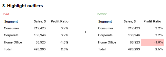
The Tableau table compares two versions of a Tableau table, focusing on how highlighting outliers can improve data analysis and interpretation. The table showcases vital business metrics, including Sales and Profit Ratio, across three segments: Consumer, Corporate, and Home Office, along with a Total row that aggregates the values.
Old Table (Bad Design)
The original Tableau table does not visually differentiate outliers, presenting all data uniformly. For instance, the negative Profit Ratio for the Home Office segment (-1.0%) is displayed in the same way as the positive values. This lack of emphasis makes it difficult for users to identify anomalies or critical points within the data quickly.
New Table (Better Design)
The improved Tableau table follows best practices using conditional formatting to highlight outliers. The negative Profit Ratio (-1.0%) for the Home Office segment is shaded in red, drawing immediate attention to the anomaly. This simple but effective visual cue helps viewers quickly focus on areas that require further investigation. The layout remains clean and consistent, with the outlier seamlessly integrated into the design without causing clutter.
This redesign demonstrates practical Tableau table examples, showcasing how highlighting outliers can make data insights more accessible while adhering to Tableau table best practices for clarity and usability.
#8 Tableau Tables Best Practice – Group Similar Data and Increase White Space
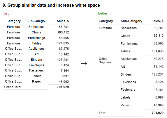
The Tableau Table compares two versions of a Tableau table, focusing on the organization of similar data and using white space to improve clarity and readability. The table breaks down sales figures by category and sub-category, such as Furniture and Office Supplies, and concludes with a Total row aggregating the sales.
Old Table (Bad Design)
The original Tableau table repeats the category name (e.g., Furniture, Office Supplies) for each sub-category, creating unnecessary redundancy and clutter. This repetition wastes space and makes the table harder to read and interpret. The insufficient white space between categories and sub-categories further contributes to a dense and visually overwhelming layout.
New Table (Better Design)
The redesigned Tableau table groups similar data by category, displaying the category name once for all related sub-categories. This approach removes redundancy and creates a cleaner structure. Adding white space between categories enhances readability, allowing the viewer to distinguish between different groups quickly. The Total row is also more visually distinct, improving the table’s overall organization.
This redesign adheres to Tableau table best practices by effectively grouping related data and incorporating white space. It is an example of transforming cluttered Tableau table examples into polished and user-friendly dashboards for improved data communication.
#9 Tableau Tables Best Practice – Add Visualizations When Appropriate: Sparklines, Bar Charts, Heatmaps
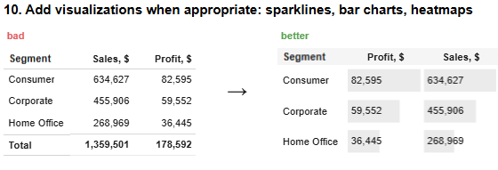
The Tableau table compares two versions of a Tableau table, demonstrating how integrating visual elements like bar charts can enhance data interpretation. The table provides a breakdown of Sales and Profit figures across three segments: Consumer, Corporate, and Home Office, along with a Total row summarizing the data.
Old Table (Bad Design)
The initial Tableau table presents data in a standard tabular format, relying solely on numerical values to convey information. While functional, this layout lacks visual aids to help users quickly identify patterns or relative differences between values. Without graphical elements, it is more challenging for viewers to grasp trends or compare data points effectively.
New Table (Better Design)
The improved Tableau table incorporates visualizations such as horizontal bar charts and numerical data for Sales and Profit. These bar charts provide an immediate visual representation of the magnitude of each value, allowing users to assess differences across segments quickly. For example, the bar charts make it easier to see that the Consumer segment significantly outperforms the Home Office segment in both metrics. The layout remains clean and organized, with the visual elements seamlessly integrated into the table.
This redesign aligns with Tableau table best practices, illustrating how visual enhancements can transform static Tableau table examples into dynamic and insightful dashboards that improve data accessibility and comprehension.
By implementing these nine strategies, you can elevate your Tableau tables from primary data displays to insightful visualizations. Focusing on design elements such as alignment, spacing, and visual cues aligns with Tableau table best practices, enabling you to create tables that present information and facilitate deeper understanding and informed decision-making.


