When embarking on a new Tableau supply chain management project, starting with a solid foundation of inspiration is crucial. Instead of reinventing the wheel, exploring proven supply chain dashboard Tableau examples can provide invaluable insights and creative ideas.
This blog showcases 12 outstanding Tableau supply chain dashboards demonstrating best practices in supply chain analytics. These examples will inspire you and guide you in creating effective, data-driven dashboards that enhance decision-making and optimize supply chain operations. Dive in to see how leading organizations leverage Tableau for supply chain excellence.
Table of Contents
Affiliate Disclosure: Some of the links on this blog are affiliate links, which means if you click on them and make a purchase, we may receive a commission at no extra cost to you. This helps support our blog and allows us to continue to create content for you. We only recommend products and services we genuinely believe in; all opinions expressed here are our own. Thank you for being so supportive!
These great supply chain Tableau dashboards have been curated from Tableau public, we do not take credit for their creation.
#1 ABC Shipping Logistics
The ABC Shipping Logistics Dashboard is an advanced Tableau supply chain tool that provides comprehensive insights into various metrics. This dashboard is crucial for supply chain managers, logistics coordinators, and data analysts, who must monitor and optimize shipping operations effectively. By visualizing critical logistics data, the dashboard aids in data-driven decision-making and strategic planning.
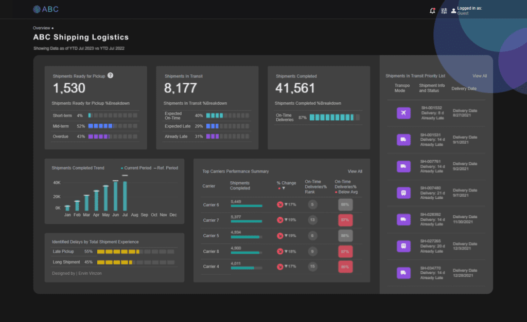
Purpose and Usage
This Tableau supply chain dashboard tracks and analyzes multiple shipping metrics, providing a detailed overview of shipments ready for pickup, in transit, and completed shipments. It also includes information on shipment delays, top carrier performance, and a prioritized list of shipments in transit. This information is essential for optimizing shipping processes, reducing delays, and improving overall supply chain efficiency.
Key Users
- Supply Chain Managers: Utilize the dashboard to monitor shipping trends, analyze carrier performance, and develop strategies for improving delivery times and reducing costs.
- Logistics Coordinators: Gain insights into shipment statuses, identify potential delays, and ensure timely delivery of goods using Tableau supply chain analytics.
- Executives: Review high-level supply chain metrics to inform strategic decisions and ensure the organization meets its logistics goals.
Chart Types and Layout
The ABC Shipping Logistics Dashboard employs a variety of chart types to present data effectively:
- Bar Charts: Display metrics such as the trend of shipments completed and identified delays by total shipment experience, facilitating easy comparison and identification of trends.
- Gauge Charts: Represent shipment statuses, providing a quick visual indicator of key performance metrics.
- Summary Cards: These cards present vital metrics such as shipments ready for pickup, shipments in transit, and shipments completed, offering a quick snapshot of essential logistics statistics.
Positive Aspects
The ABC Shipping Logistics Dashboard offers several positive aspects:
- Comprehensive Insights: Provides a holistic view of crucial shipping metrics, allowing users to understand various aspects of logistics operations and trends.
- Interactive Elements: Users can filter data points to drill down into specific segments, making the analysis more relevant and actionable.
- Visual Clarity: Various chart types enhance data visualization, making complex information understandable.
Benefits of a Supply Chain Analytics Course in Tableau
Taking a supply chain analytics course in Tableau can significantly benefit professionals aiming to create similar visualizations. These courses provide:
- Structured Learning: Step-by-step guidance on building supply chain analytics Tableau dashboards, covering everything from data preparation to advanced visualization techniques.
- Hands-On Practice: Interactive exercises that reinforce learning by allowing users to apply concepts in real time.
- Best Practices: Insights into best practices for data visualization, ensuring that the dashboards are practical and aesthetically pleasing.

The ABC Shipping Logistics Dashboard is invaluable for organizations seeking to understand and optimize their supply chain operations. By leveraging Tableau supply chain dashboards’ comprehensive insights and interactive features, logistics professionals can make informed decisions that enhance operational efficiency and drive organizational success. A supply chain analytics course in Tableau equips analysts with the skills and knowledge to create impactful visualizations, driving data-driven decision-making in their organizations.
#2 Supply Chain Network Optimization Demo
The Hub and Spoke Network Dashboard is an advanced Tableau supply chain tool that provides comprehensive insights into an optimized station network with incremental hub addition. This dashboard is essential for supply chain managers, logistics coordinators, and data analysts, who must monitor and maximize transportation routes effectively. By visualizing critical logistics data, the dashboard aids in data-driven decision-making and strategic planning.

Purpose and Usage
This Tableau supply chain dashboard tracks and analyzes various logistics metrics, including weighted distance, number of hubs, and connectivity between manufacturing facilities, proposed hubs, and destination markets. The information provided is crucial for optimizing supply chain networks, reducing transportation costs, and improving overall logistics efficiency.
Chart Types and Layout
The Hub and Spoke Network Dashboard employs a variety of chart types to present data effectively:
- Map Visualization: This visualization shows the geographical distribution of manufacturing facilities, proposed hubs, and destination markets, illustrating the network connectivity and routes.
- Summary Cards: These cards present critical metrics such as weighted distance and the number of hubs, providing a quick snapshot of essential logistics statistics.
- Interactive Filters: Users can customize the view by adjusting the number of additional hubs, selecting specific manufacturing facilities, proposing hubs, and selecting destination markets.
#3 Procurement Spend Analytics Dashboard
The Spend Analytics Dashboard is an advanced Tableau supply chain tool that provides comprehensive insights into an organization’s spending patterns. This dashboard is essential for procurement managers, finance analysts, supply chain managers, and executives who must monitor and optimize spending effectively. By visualizing critical expenditure data, the dashboard aids in data-driven decision-making and strategic planning.

Purpose and Usage
This Tableau supply chain dashboard tracks and analyzes various spending metrics, including total spend, active vendors, new vendors, and spend per vendor. It provides detailed insights into the top vendors and categories contributing to total spend. This information is crucial for optimizing procurement strategies, identifying cost-saving opportunities, and improving overall financial efficiency.
Key Users
- Procurement Managers: Utilize the dashboard to monitor vendor performance, analyze spending trends, and develop strategies for cost reduction using Tableau supply chain analytics.
- Finance Analysts: Gain insights into spending patterns, identify areas of overspending, and ensure budget adherence using Tableau for the supply chain.
- Supply Chain Managers: Track spending across different categories and vendors to ensure efficient supply chain operations with logistics and analytics.
- Executives: Review high-level spending metrics to inform strategic decisions and ensure the organization meets its financial goals.
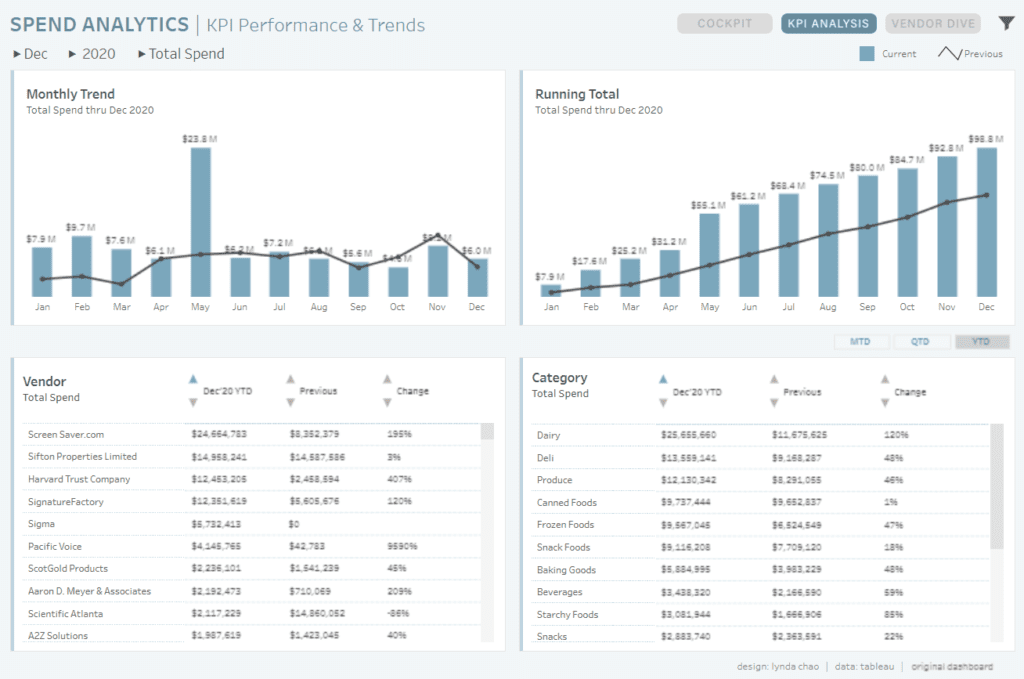
Chart Types and Layout
The Spend Analytics Dashboard employs a variety of chart types to present data effectively:
- Bar Charts: Display metrics such as top vendors and categories, facilitating easy comparison and identifying significant spending areas.
- Line Charts: Illustrate monthly trends and running totals, showing spending patterns over time and helping to identify fluctuations.
- Summary Cards: These cards present vital metrics such as total spend, active vendors, new vendors, and spend per vendor, providing a quick snapshot of essential financial statistics.
- Pareto Charts: Highlight the vendors and categories that account for most of the total spend, supporting the Pareto principle (80/20 rule) in spending analysis.

#4 Supply Chain: Inventory Management Analysis
The Supply Chain Analysis Dashboard is an advanced Tableau supply chain tool that provides comprehensive insights into inventory metrics and projected sales. Supply chain managers, logistics coordinators, procurement specialists, and data analysts must monitor and optimize supply chain operations effectively. By visualizing critical inventory and sales data, the dashboard aids in data-driven decision-making and strategic planning.
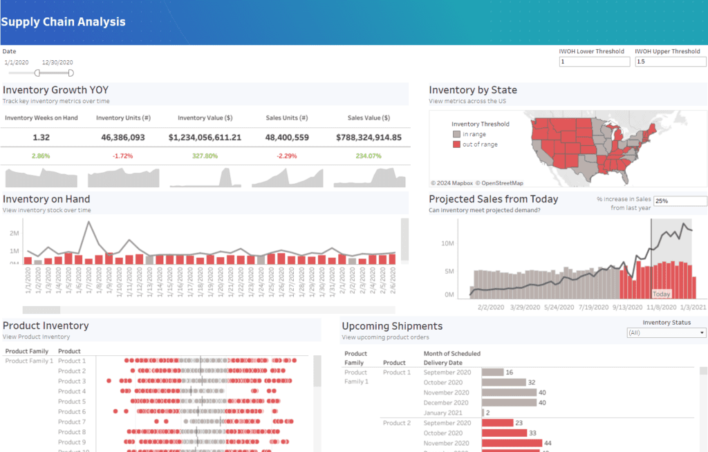
Purpose and Usage
This Tableau supply chain dashboard tracks and analyses various supply chain metrics, including inventory growth year-over-year (YOY), inventory on hand, inventory by state, and projected sales from today. It provides detailed insights into product inventory and upcoming shipments. This information is crucial for optimizing inventory management, forecasting demand, and ensuring supply chain operations run smoothly.
Chart Types and Layout
The Supply Chain Analysis Dashboard employs a variety of chart types to present data effectively:
- Line Charts: Illustrate inventory on hand and projected sales trends, showing fluctuations over time and helping to identify patterns.
- Bar Charts: Display metrics such as inventory growth YOY, clearly comparing different inventory metrics.
- Map Visualization: Shows inventory by state, highlighting geographical distribution and inventory thresholds.
- Dot Plots: Represent product inventory across various product families, offering a detailed view of stock levels.
- Summary Cards: These cards present vital metrics such as total spend, active vendors, new vendors, and spend per vendor, providing a quick snapshot of essential financial statistics.
#5 Supply Chain: Inventory Management Analysis
The SLA Shipping Scorecard Dashboard is a comprehensive Tableau supply chain tool that provides detailed insights into order shipping performance and SLA compliance. It is essential for supply chain managers, logistics coordinators, and data analysts who must monitor and optimize shipping operations effectively. By visualizing critical logistics data, the dashboard aids in data-driven decision-making and strategic planning.

Purpose and Usage
- Track SLA Compliance: The dashboard tracks the percentage of Service Level Agreements (SLA) missed and highlights orders that are outside SLA.
- Analyze Shipping Details: This function shows orders by shipping class and whether they were within or outside the SLA limits.
- Geographic and Temporal Analysis: The dashboard includes geographic distribution of orders by state and order trends over time, such as orders per week.
Key Users
- Supply Chain Managers: Utilize the dashboard to monitor shipping performance, identify areas of improvement, and develop strategies for reducing SLA breaches using Tableau supply chain analytics.
- Logistics Coordinators: Gain insights into the distribution of orders and SLA compliance to ensure timely delivery and efficient logistics operations.
- Data Analysts: Analyze logistics data to uncover patterns, correlations, and predictive insights that can drive supply chain initiatives and support data-driven decision-making.
Chart Types and Layout
- Map Visualization: Displays the geographic distribution of orders by state, helping to identify regions with high or low order volumes.
- Bar Charts: These are used to show the number of orders within and out of SLA by shipping class and the number of products for orders out of SLA.
- Line and Area Charts: Illustrate order trends, such as weekly orders, providing a temporal view of shipping performance.

In conclusion, the SLA Shipping Scorecard Dashboard is invaluable for organizations seeking to understand and optimize their shipping operations; by leveraging Tableau supply chain dashboards’ comprehensive insights and interactive features, supply chain professionals can make informed decisions that enhance operational efficiency and drive organizational success. A supply chain analytics course in Tableau equips analysts with the skills and knowledge to create impactful visualizations, driving data-driven decision-making in their organizations.
#6 Spending Dashboard
The Spendings Dashboard is an advanced Tableau supply chain tool that provides comprehensive insights into an organization’s spending patterns. This dashboard is essential for procurement managers, finance analysts, supply chain managers, and executives who must monitor and optimize spending effectively. By visualizing critical expenditure data, the dashboard aids in data-driven decision-making and strategic planning.

Purpose and Usage
This Tableau supply chain dashboard tracks and analyzes various spending metrics, including year-to-date (YTD), YTD-1 spending, and year-over-year (YoY) spending growth. It provides detailed insights into the top vendors and categories contributing to total spending, spending by subsidiaries, and spending by department. This information is crucial for optimizing procurement strategies, identifying cost-saving opportunities, and improving overall financial efficiency.
Key Users
- Procurement Managers: The dashboard monitors vendor performance, analyses spending trends, and develops cost-reduction strategies.
- Finance Analysts: Gain insights into spending patterns, identify areas of overspending, and ensure budget adherence using Tableau supply chain analytics.
- Supply Chain Managers: Track spending across different categories and vendors to ensure efficient supply chain operations.
- Executives: Review high-level spending metrics to inform strategic decisions and ensure the organization meets its financial goals.
Chart Types and Layout
The Spendings Dashboard employs a variety of chart types to present data effectively:
- Bar Charts: Display metrics such as top vendors, spending by subsidiaries, and spending by department, facilitating easy comparison and identification of significant spending areas.
- Line Charts: Illustrate the spending trend over time, showing spending patterns across different periods and helping to identify fluctuations.
- Pareto Charts: Highlight the distribution of spending, showing how a small number of vendors account for a large percentage of total spending, supporting the Pareto principle (80/20 rule).
- Summary Cards: These cards present vital metrics such as total spend, YTD spending, and YoY growth, providing a quick snapshot of essential financial statistics.
#7 Procurement and Accounting
The Supply Chain Analytics Dashboard is a powerful Tableau supply chain tool designed to provide detailed insights into various metrics within the supply chain. This dashboard is essential for supply chain managers, logistics coordinators, procurement specialists, and data analysts, who must monitor and optimize supply chain operations effectively. By visualizing critical supply chain data, the dashboard aids in data-driven decision-making and strategic planning.

Purpose and Usage
- Track Variance Codes: The dashboard tracks occurrences by variance code, helping identify and analyze supply chain discrepancies.
- Analyze Item Rankings: It provides a ranking of items based on occurrences, allowing users to focus on high-impact items.
- Monitor Analyst Performance: The dashboard details analysts’ performance, showing the number of occurrences they handle and their efficiency.
Key Users
- Supply Chain Managers: Utilize the dashboard to monitor variance codes and item occurrences, developing strategies to mitigate issues using Tableau supply chain analytics.
- Logistics Coordinators: Gain insights into the distribution of occurrences and performance by analysts to ensure efficient logistics operations.
- Data Analysts: Analyze supply chain data to uncover patterns, correlations, and predictive insights that can drive supply chain initiatives and support data-driven decision-making.
Chart Types and Layout
- Area Charts: Display occurrences by variance code over time, visually representing trends and spikes.
- Bar Charts: Used to show item rankings by occurrences and detail by analysts, facilitating easy comparison and identification of critical items and performance metrics.
- Dot Plots: Represent outliers by day, helping to identify and analyze anomalies within the supply chain.

#8 Inventory Management
The Inventory Management Dashboard is a comprehensive Tableau supply chain tool designed to provide detailed insights into various inventory metrics within an organization. It is essential for supply chain managers, logistics coordinators, procurement specialists, and data analysts who must monitor and optimize inventory operations effectively. By visualizing critical inventory data, the dashboard aids in data-driven decision-making and strategic planning.
Purpose and Usage
- Track Inventory Metrics: The dashboard tracks sales, transactions, products, buyers, and expiring this week, providing a holistic view of inventory performance.
- Analyze Department Performance: It breaks down sales by department, showing which areas are performing well and which need attention.
- Monitor Product Expiration and Damage: The dashboard includes metrics on product expiration dates and the percentage of damaged products by department, which is crucial for managing inventory quality and reducing waste.

Chart Types and Layout
- Line Charts: Display metrics such as sales, transactions, products, and buyers over time, providing a clear view of trends and performance fluctuations.
- Scatter Plot: Illustrates products by expiration date, helping identify products nearing expiration to manage inventory turnover.
- Bar Charts: Show the percentage of damaged products by department, highlighting areas that may require quality control improvements.
- Icon Visualization: Represents sales by department, using intuitive icons to identify different departments easily.
Positive Aspects
- Comprehensive Insights: A detailed view of crucial inventory metrics allows users to understand various aspects of inventory management and trends.
- Interactive Elements: Users can filter data points to customize the analysis, making it more relevant and actionable for specific needs.
- Visual Clarity: Various chart types enhance data visualization, making complex logistics and analytics data easily understandable.
- Optimization Focus: This focus highlights key inventory metrics such as expiration dates and damaged products, helping organizations identify improvement areas and optimize inventory strategies.
#9 Supply Chain Map
The Supply Chain Map Dashboard is an advanced Tableau supply chain tool designed to provide comprehensive insights into the logistics and routes of shipments. This dashboard is essential for supply chain managers, logistics coordinators, procurement specialists, and data analysts who monitor and optimize shipment routes effectively. By visualizing critical logistics data, the dashboard aids in data-driven decision-making and strategic planning.

Purpose and Usage
- Track Shipment Routes: The dashboard tracks incoming and outgoing shipment routes, providing a clear view of the supply chain network.
- Analyze Geographic Distribution: It displays the geographical distribution of shipments domestically and internationally.
- Monitor Shipment Volume: The dashboard includes metrics on the number of shipments by origin and destination, helping to identify key shipment routes.
Chart Types and Layout
- Map Visualization: Displays shipment routes across the globe, distinguishing between domestic and international routes using different colours.
- Bar Charts: Show the number of shipments by origin and destination, allowing for easy comparison and identification of critical routes.
- Interactive Filters: Users can customize the view by selecting specific routes, origins, and destinations to highlight.
#10 Ground Transportation Executive Board
The Ground Transportation Executive Board Dashboard is a comprehensive Tableau supply chain tool that provides detailed insights into sales and performance metrics across different transportation modes. This dashboard is essential for supply chain managers, logistics coordinators, procurement specialists, and data analysts who must monitor and optimize transportation operations effectively. By visualizing critical transportation data, the dashboard aids in data-driven decision-making and strategic planning.

Purpose and Usage
Chart Types and Layout
- Bar Charts: Display metrics such as top carriers and sales by consignee state, facilitating easy comparison and identification of top performers and key regions.
- Monthly View Charts: Illustrate sales trends over time, providing a temporal view of performance and helping to identify fluctuations and trends.
- Summary Cards: Present critical metrics such as total sales, providing a quick snapshot of essential financial statistics.
Positive Aspects
- Comprehensive Insights: A detailed view of key sales metrics across different transportation modes allows users to understand various aspects of transportation performance and trends.
- Interactive Elements: Users can filter data points to customize the analysis, making it more relevant and actionable for specific needs.
- Visual Clarity: Various chart types enhance data visualization, making complex logistics and analytics data easily understandable.
- Optimization Focus: This section highlights key carriers and consignee states, helping organizations identify areas for improvement and optimize transportation strategies.
#11 Supply Chain Shipping Analytics
Overview of the Supply Chain Shipping Analytics Dashboard
The Supply Chain Shipping Analytics Dashboard is an advanced Tableau supply chain tool that provides detailed insights into order shipping performance and lag times. This dashboard is essential for supply chain managers, logistics coordinators, procurement specialists, and data analysts who must monitor and optimize shipping operations effectively. By visualizing critical logistics data, the dashboard aids in data-driven decision-making and strategic planning.

Purpose and Usage
- Track Lag Time and Order Count: The dashboard tracks lag time and order count by category and order type, providing a clear view of performance across different segments.
- Analyze Order Performance: It highlights the percentage of orders over the target, total orders, lag time, and orders over the target, offering insights into shipping efficiency.
- Monitor Geographic Distribution: The dashboard includes metrics on the number of orders exceeding target by state, helping to identify regions with performance issues.
Chart Types and Layout
- Dot Plots: Display metrics such as lag time and order count by category and order type, facilitating easy comparison and identification of key performance areas.
- Line Charts: Illustrate lag time by week, providing a temporal view of performance and helping to identify fluctuations and trends.
- Summary Cards: Present key metrics such as percentage of orders over the target, total orders, lag time, and orders over the target, providing a quick snapshot of essential statistics.
- Map Visualization: Shows the number of orders exceeding the target by state, highlighting geographic performance differences.
#12 Supply Chain Executive Scorecard
Overview of the Ground Transportation Executive Scorecard Dashboard
The Ground Transportation Executive Scorecard Dashboard is a comprehensive Tableau supply chain tool that provides detailed insights into sales and performance metrics across different transportation modes. This dashboard is essential for supply chain managers, logistics coordinators, procurement specialists, and data analysts who must monitor and optimize transportation operations effectively. By visualizing critical transportation data, the dashboard aids in data-driven decision-making and strategic planning.
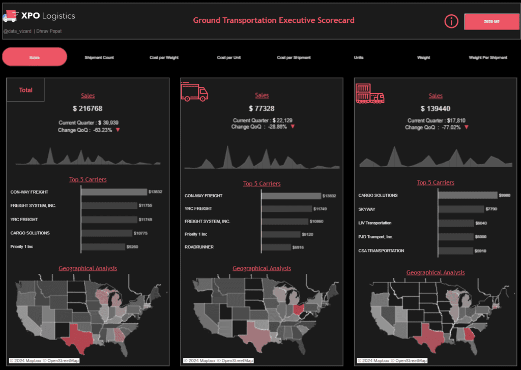
Purpose and Usage
- Track Sales Metrics: The dashboard tracks total sales and breaks them down by transportation mode—Truck and Rail—providing a clear view of performance across different segments.
- Analyze Carrier Performance: It highlights the top five carriers for each transportation mode, offering insights into which carriers contribute most to sales.
- Monitor Geographic Distribution: The dashboard includes metrics on sales by state, helping to identify key markets and regions with the highest sales.
Chart Types and Layout
- Bar Charts: Display metrics such as top carriers and sales by state, facilitating easy comparison and identification of top performers and key regions.
- Line Charts: Illustrate sales trends over time, providing a temporal view of performance and helping to identify fluctuations and trends.
- Map Visualizations: These show a geographical analysis of sales distribution across different states, highlighting key regions for logistics and analytics.
Benefits of a Supply Chain Analytics Course in Tableau
Stuck on where to start with your next supply chain management Tableau dashboard project? Check out a course at datacamp.com, which provides
- Structured Learning: Provides step-by-step guidance on building supply chain analytics dashboards, covering data preparation to advanced visualization techniques.
- Hands-On Practice: Interactive exercises reinforce learning, allowing users to apply concepts in real-time scenarios.
- Best Practices: Insights into best practices for data visualization ensure that dashboards are practical and aesthetically pleasing, enhancing decision-making and operational efficiency.

The Ground Transportation Executive Scorecard Dashboard exemplifies how Tableau supply chain dashboards can transform logistics and analytics. By providing detailed, interactive, and visually engaging insights, this dashboard supports supply chain professionals in optimizing their operations and achieving strategic goals.
We hope that inspired you for your next Tableau supply chain dashboard project!
Exploring these 12 Tableau supply chain dashboard examples can significantly streamline your project by providing proven design and functionality ideas. Leveraging these dashboards can help you implement best practices in supply chain analytics, ensuring your Tableau supply chain management project is both practical and innovative. Drawing inspiration from these examples, you can create impactful dashboards that drive data-driven decisions and optimize your supply chain operations. Embrace these insights to elevate your supply chain strategies and achieve operational excellence with Tableau supply chain dashboards.