In this blog entry, we are bringing our series on Tableau Style Templates to a close. This concluding post will explore various chart styles, including treemaps, pie charts, donut charts, label bar charts, heatmaps, rank trends, stacked bar charts, stacked area charts, and bubble matrix charts. Part 1 and Part 2 can be found by clicking on the links.

Table of Contents
Tableau Style Template – Treemap
Treemaps visually represent hierarchical data through nested rectangles, each corresponding to a tree branch. Every primary component or “parent” is depicted by a larger rectangle, subdivided into smaller rectangles to represent the sub-branches or “children”. The area of the rectangles assigned to the leaf nodes is determined proportionally based on a specified data dimension. This way, each level of the hierarchical data is effectively encapsulated within corresponding geometric shapes, facilitating an intuitive understanding of the data’s structure and composition.
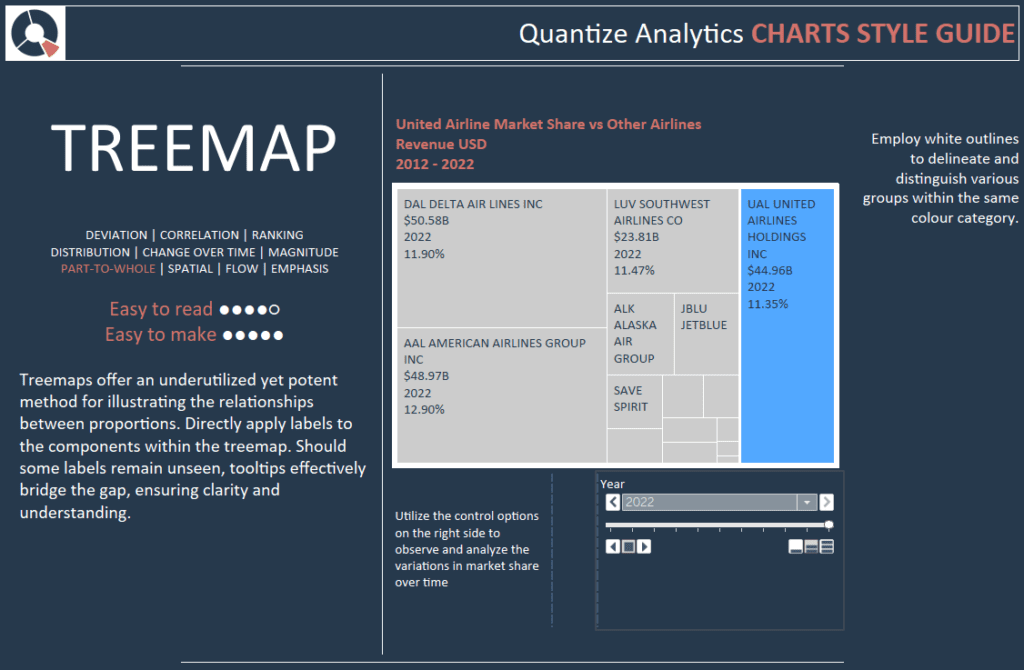
Treemaps offer an underutilized yet potent method for illustrating the relationships between proportions. Directly apply labels to the components within the treemap. Should some labels remain unseen, tooltips effectively bridge the gap, ensuring clarity and understanding.
Utilize the control options on the right side to observe and analyze the variations in market share over time. Employ white outlines to delineate and distinguish various groups within the same colour category.
Tableau Style Template – Pie Charts
A pie chart is a circular graphical representation designed to showcase numerical proportions through distinct slices or sections. Each slice’s arc length—its central angle and overall area—is crafted to visually represent a proportionate quantity of the whole. The chart’s design, resembling a sliced pie, aids in providing a quick visual comparison of different parts to the full. Though the traditional pie chart is widely recognized, various presentation styles and variations are available to address diverse data visualization needs and preferences.
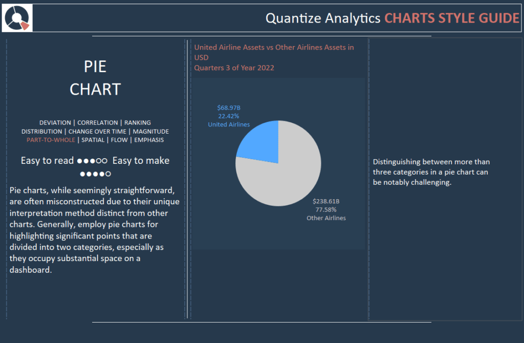
While seemingly straightforward, pie charts are often misconstructed due to their unique interpretation method distinct from other charts. Generally, pie charts highlight significant points divided into two categories, especially as they occupy substantial space on a dashboard.
Distinguishing between more than three categories in a pie chart can be challenging.
Tableau Style Template – Donut Charts
With its filled centre, a pie chart can sometimes lead viewers to mistakenly judge slices based on their perceived area relative to the whole pie. In contrast, a donut chart, characterized by its hollow centre, subtly shifts the viewer’s attention towards the arc length of each segment. This design helps reduce misconceptions stemming from area-based judgments and offers a clearer perspective on each segment’s proportion to the whole.
An added advantage of the donut chart is its central void. This space can effectively display additional data, annotations, or labels, enhancing the chart’s informative value without overcrowding the visual.
In a donut chart, each segment represents distinct portions of the data. The utilization of different colours for each detail aids in quickly distinguishing between them, streamlining the viewer’s comprehension and interpretation of the information presented.
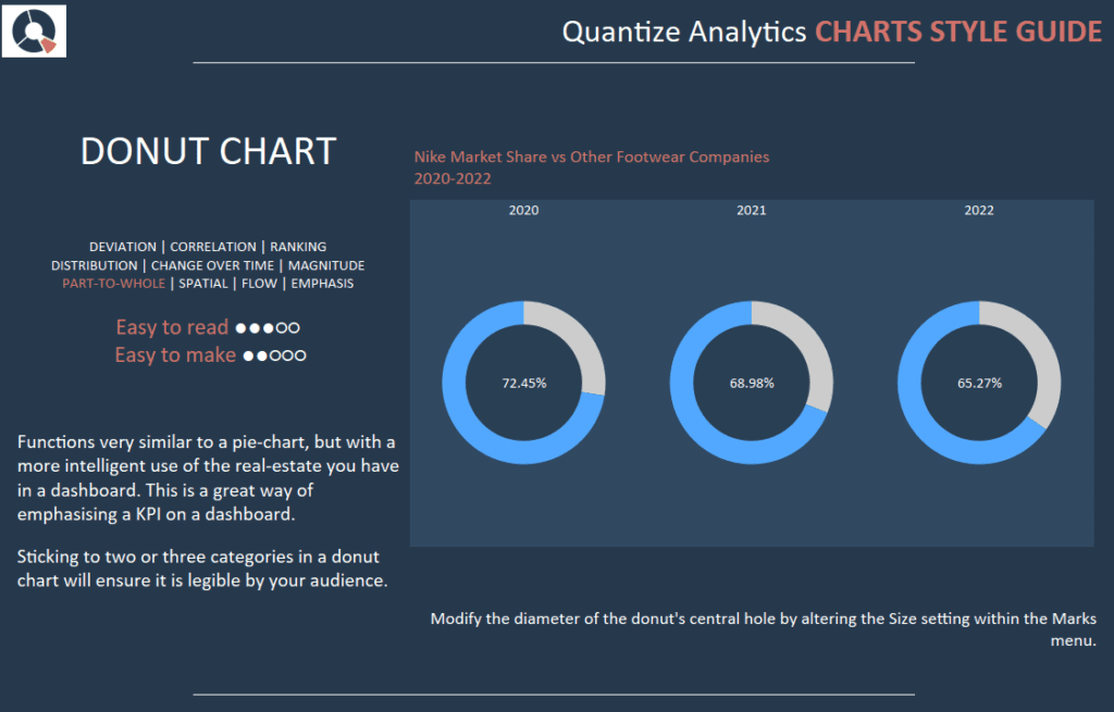
It functions very similar to a pie chart but with a more intelligent use of your real estate in a dashboard. This is an excellent way of emphasising a KPI on a dashboard.
Sticking to two or three categories in a doughnut chart will ensure it is legible to your audience.
Modify the diameter of the donut’s central hole by altering the Size setting within the Marks menu.
Tableau Style Template – Label Bars
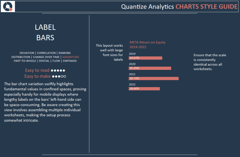
The bar chart variation swiftly highlights fundamental values in confined spaces, proving especially handy for mobile displays where lengthy labels on the bars’ left-hand side can be space-consuming. Be aware creating this view involves assembling multiple individual worksheets, making the setup process somewhat intricate.
Ensure that the scale is consistently identical across all worksheets.
This layout works well with large font sizes for labels.
Tableau Style Template – Heatmap
A heatmap, or heat map, serves as a data visualization tool where values within a data set are represented through various colours. The spectrum of colours—from cool to warm or vice versa—enables the viewer to immediately discern patterns, with the colour intensity signifying the magnitude of the value.
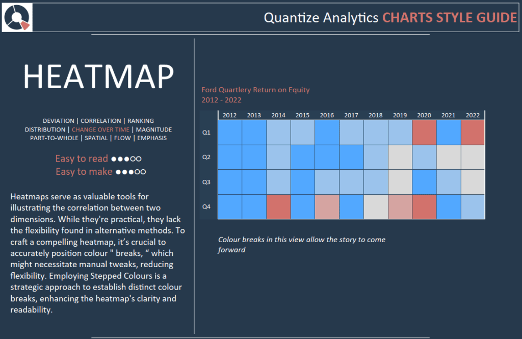
Heatmaps serve as valuable tools for illustrating the correlation between two dimensions. While they’re practical, they lack the flexibility found in alternative methods. To craft a compelling heatmap, it’s crucial to accurately position colour ” breaks, “ which might necessitate manual tweaks, reducing flexibility. Employing Stepped Colours is a strategic approach to establish distinct colour breaks, enhancing the heatmap’s clarity and readability.
Colour breaks in this view allow the story to come forward
Tableau Style Template – Rank Trend (Bump Chart)
A Bump Chart is a unique variation of a line plot specifically designed to visualize and analyze shifts in rank over time. It is particularly effective when the focus is on comparing relative positions, performance, or rankings of multiple entities or observations over a period rather than on their absolute values.
Each line in a Bump Chart represents a distinct category, and its vertical position at any given point or time reflects its rank at that moment. This visual arrangement allows for the easy tracking and comparison of ranking changes among the various categories, offering clear insights into their relative standing or performance dynamics over time. The straightforward, intuitive display of a Bump Chart makes it a valuable tool for effectively communicating the evolution of rankings in a dataset to viewers, facilitating their understanding and interpretation of the underlying trends and patterns.
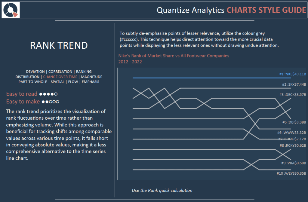
The rank trend prioritizes the visualization of rank fluctuations over time rather than emphasizing volume. While this approach is beneficial for tracking shifts among comparable values across various time points, it falls short in conveying absolute values, making it a less comprehensive alternative to the time series line chart.
To subtly de-emphasize points of lesser relevance, utilize the colour grey (#cccccc). This technique helps direct attention toward the more crucial data points while displaying the less relevant ones without drawing undue attention. Use the Rank quick calculation.
Tableau Style Template – Stacked Bar Chart
The stacked bar chart, or stacked bar graph, enhances the conventional bar chart by displaying numerical values across not just one but two categorical variables. In this visual representation, each bar of a typical bar chart is subdivided into smaller segments or sub-bars, with each segment representing a different level of the second categorical variable. These sub-bars are stacked on top of each other within each primary bar, seamlessly integrating multiple data layers into a single visual structure.
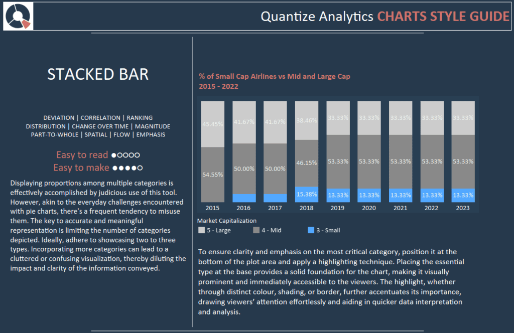
Displaying proportions among multiple categories is effectively accomplished by judicious use of this tool. However, akin to the everyday challenges encountered with pie charts, there’s a frequent tendency to misuse them. The key to accurate and meaningful representation is limiting the number of categories depicted. Ideally, adhere to showcasing two to three types. Incorporating more categories can lead to a cluttered or confusing visualization, thereby diluting the impact and clarity of the information conveyed.
To ensure clarity and emphasis on the most critical category, position it at the bottom of the plot area and apply a highlighting technique. Placing the essential type at the base provides a solid foundation for the chart, making it visually prominent and immediately accessible to the viewers. Through distinct colour, shading, or border, the highlight further accentuates its importance, drawing viewers’ attention effortlessly and aiding in quicker data interpretation and analysis.
Tableau Style Template – Stacked Area
A Stacked Area Chart, also called a Stacked Area Plot, is an extension of the basic Area Chart, featuring multiple areas stacked atop one another. This design enables the comparison of the cumulative total and the contributions from individual sections over a specified time.
In this visualization tool, different data series or categories are represented by various colours or shades, with each series corresponding to a different area on the chart. These areas are stacked, forming a whole that illustrates the aggregate of all data series, while the individual areas themselves depict the proportions of each series within the total.
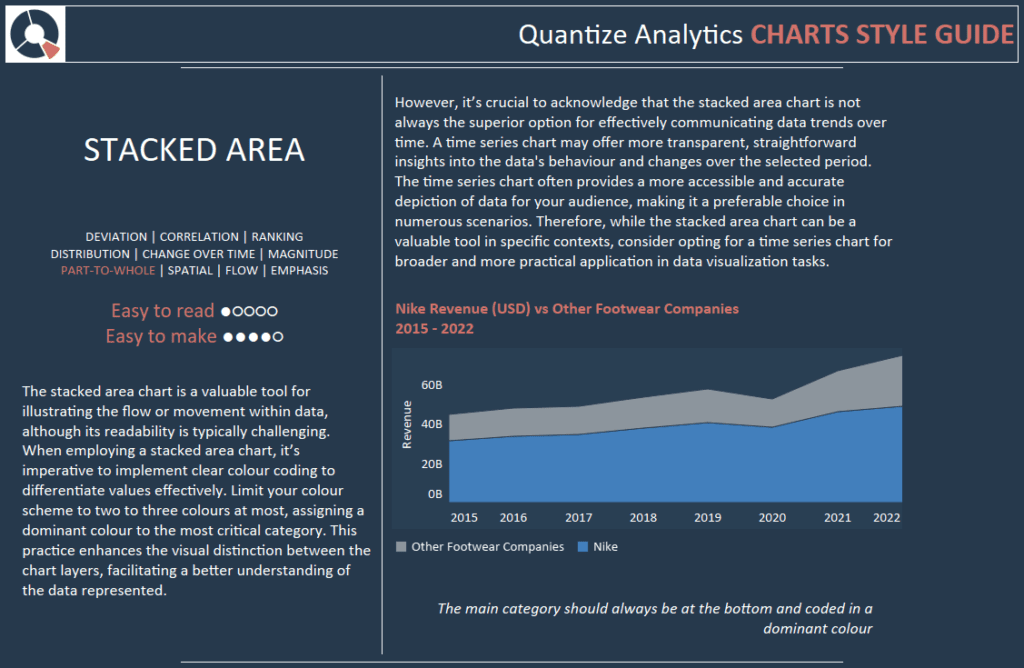
The stacked area chart is a valuable tool for illustrating the flow or movement within data, although its readability is typically challenging. When employing a stacked area chart, it’s imperative to implement clear colour coding to differentiate values effectively. Limit your colour scheme to two to three colours at most, assigning a dominant colour to the most critical category. This practice enhances the visual distinction between the chart layers, facilitating a better understanding of the data represented.
However, it’s crucial to acknowledge that the stacked area chart is not always the superior option for effectively communicating data trends over time. A time series chart may offer more transparent, straightforward insights into the data’s behaviour and changes over the selected period. The time series chart often provides a more accessible and accurate depiction of data for your audience, making it a preferable choice in numerous scenarios. Therefore, while the stacked area chart can be a valuable tool in specific contexts, consider opting for a time series chart for broader and more practical application in data visualization tasks.
Tableau Style Template – Bubble Matrix
A Bubble Matrix is a data visualization tool that displays information in a two-dimensional grid format, utilizing both sizes and colours to represent data values. The matrix consists of a defined number of rows and columns, with each cell containing a bubble whose characteristics convey specific information.
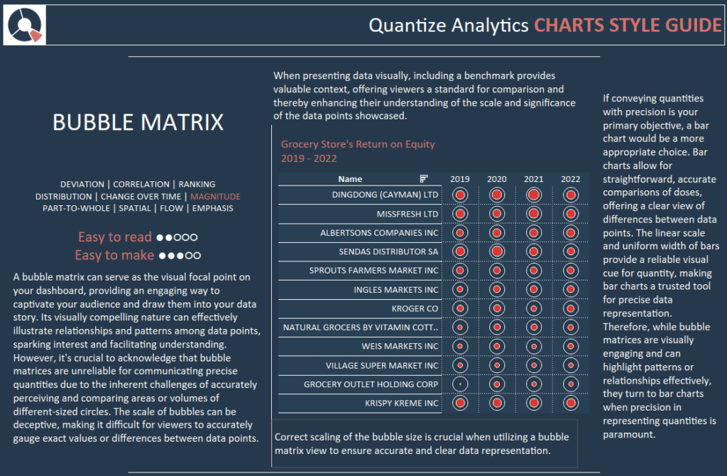
A bubble matrix can serve as the visual focal point on your dashboard, providing an engaging way to captivate your audience and draw them into your data story. Its visually compelling nature can effectively illustrate relationships and patterns among data points, sparking interest and facilitating understanding.
However, it’s crucial to acknowledge that bubble matrices are unreliable for communicating precise quantities due to the inherent challenges of accurately perceiving and comparing areas or volumes of different-sized circles. The scale of bubbles can be deceptive, making it difficult for viewers to accurately gauge exact values or differences between data points.
When presenting data visually, including a benchmark provides valuable context, offering viewers a standard for comparison and enhancing their understanding of the scale and significance of the data points showcased.
Correct scaling of the bubble size is crucial when utilizing a bubble matrix view to ensure accurate and precise data representation.
If conveying quantities with precision is your primary objective, a bar chart would be a more appropriate choice. Bar charts allow for straightforward, accurate comparisons of doses, offering a clear view of differences between data points. The linear scale and uniform width of bars provide a reliable visual cue for quantity, making bar charts a trusted tool for precise data representation. Therefore, while bubble matrices are visually engaging and can highlight patterns or relationships effectively, they turn to bar charts when precision in representing quantities is paramount.
Conclusion
As we conclude our series on Tableau style guides, this final instalment has provided insights into various chart styles, enhancing your data visualization toolkit. We’ve navigated through the nuances of treemaps, pie charts, and donut charts, along with label bar charts, heatmaps, rank trends, stacked bar charts, stacked area charts, and bubble matrix charts. Each chart style offers unique visual representations to aptly convey data stories, catering to diverse analytical needs and audiences. With this comprehensive understanding, you can select and implement the most effective chart styles that resonate with your data narrative, ensuring clarity, engagement, and insightful communication in future Tableau projects. Happy visualizing!