This tutorial will cover building a Tableau Shape chart quickly and easily. Specifically, how to utilize shapes to imitate a bar chart.

Why would we use a Tableau Shape Chart?
One benefit of using a more bespoke visualization tool such as a Tableau shape chart is that this would attract attention from your audience. However, in saying that, there are risks too. Like, will your audience understand and interact well with a Tableau shape chart? Does the visualization help lift the report, or does it clash with the overall style?
The decision to use any bespoke visualization over a traditional one will depend on your audience, the needs of the report, as well as your own personal taste.
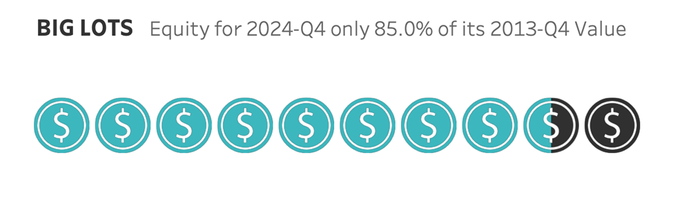
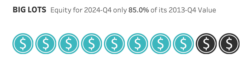
Keeping that in mind, we will use a Tableau shape chart to compare Big Lots’ equity for the Year. 2022-Q4 with the Year 2013-Q4 value as a percentage.

The Basic Concept of a Tableau Shape Chart
A Tableau shape chart is just a set of shapes that reference a metric. In this tutorial, we will use ten shapes, highlighting a portion to express a percentage. Since we are discussing equity, we will use this coin as our shape:

Data Structure for a Tableau shape chart
You need at least as many rows in your data as you use for total shapes. If you’re using ten shapes, you need at least ten rows! Or if you have multiple categories (e.g. US, Japan, China), you need enough rows for 10 * each category (10*3 = 30).
If your data doesn’t have enough rows, you will need to create padding in extra rows by using a cross-join or self-union (you may wish to look up data densification in Tableau).
This tutorial assumes you do not need data densification, which is likely the case if you are connecting to a database.
Tableau shape chart calculated fields
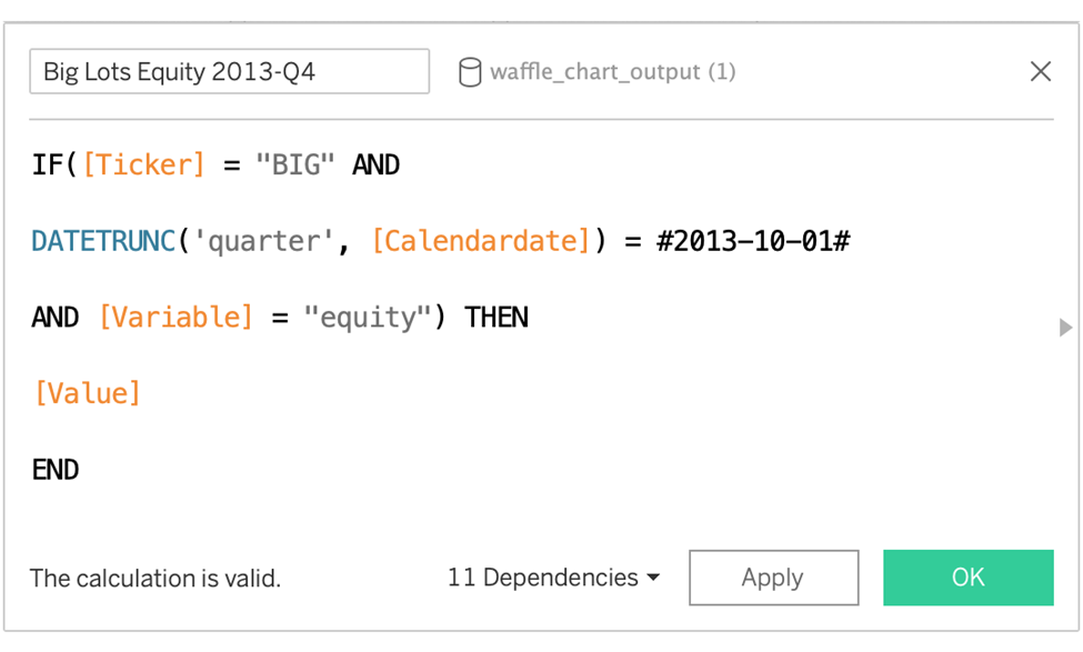
Big Lots Equity 2013-Q4
This is the metric for 2013 Q4. Values are nested in a single column so we need to pull them out according to the proper variable (equity) and the proper date.
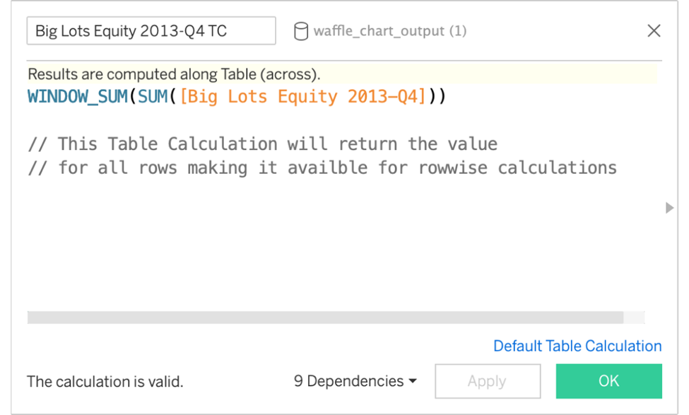
Big Lots Equity 2013-Q4 TC
This will return the value above but for each row, making it available for row-wise calculations.
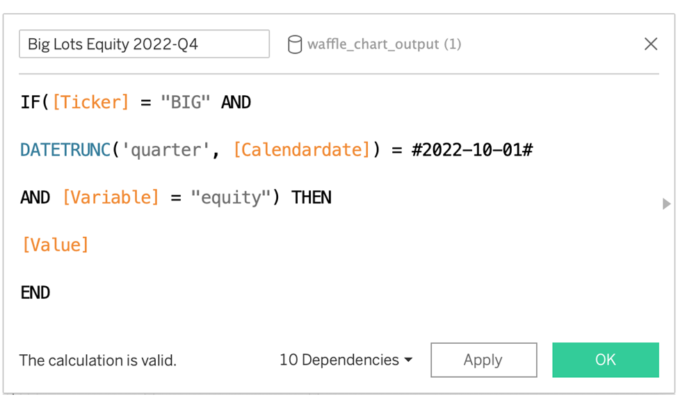
Big Lots Equity 2022-Q4
The metric for 2022 Q4. This will be compared with the value for 2023-Q4.
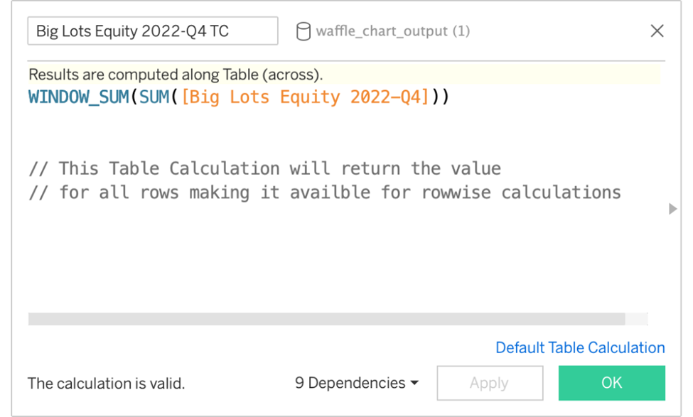
Big Lots Equity 2022-Q4 TC
Returns the value for each row. Similar to the table calculation for 2013-Q4.
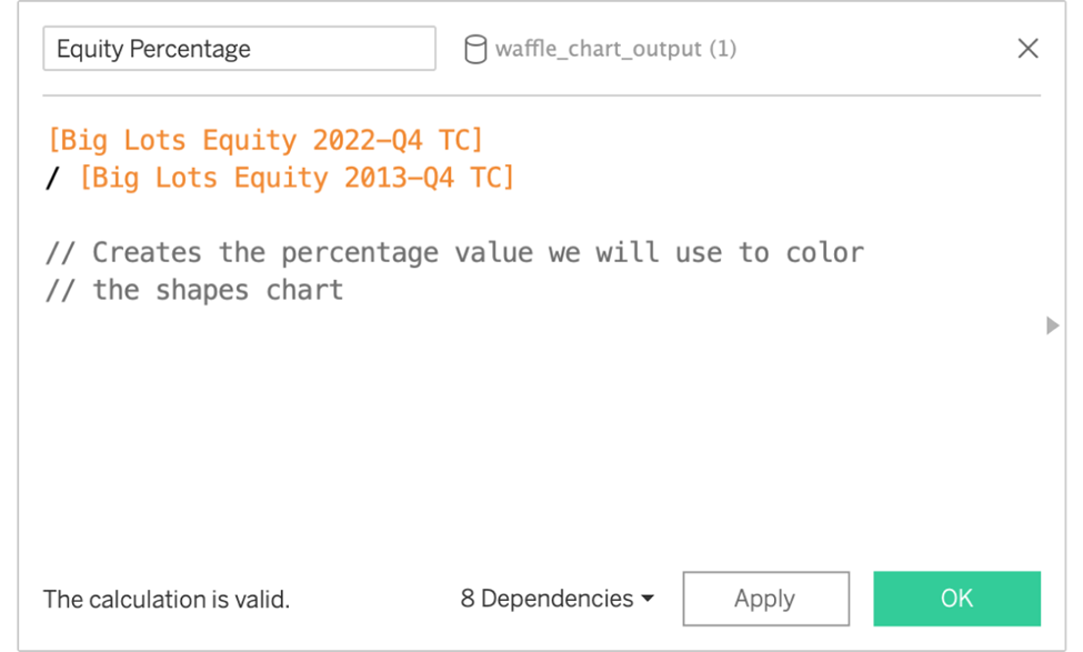
The next step is the equity percentage.
This is the percentage that 2022 Q4 made up compared to the 2013 Q4 value. This will be used to color in our shapes.
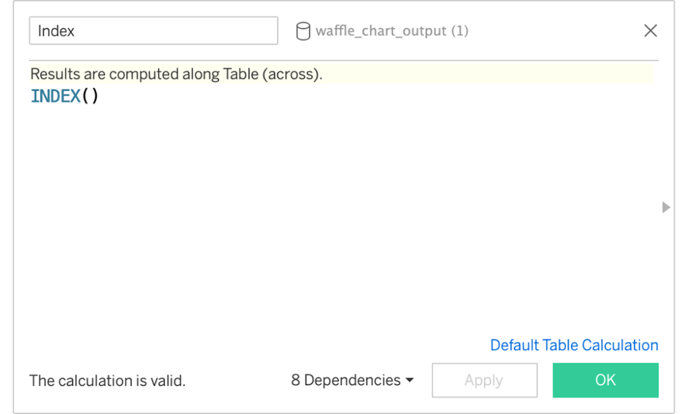
Now, the index for our Tableau shape chart
This will assign a value that increments by 1 to the shapes.
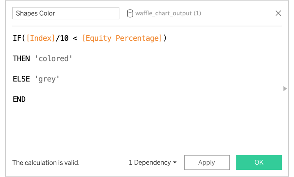
Moving on to the shapes, colour
This will determine which shapes are coloured.
Building the Tableau shape chart
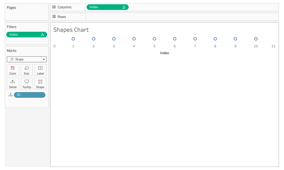
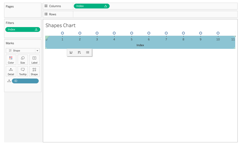
1. Drag ID to Marks.
2. Drag the Index to Columns.
3. Select the dropdown for Index and choose Compute Using >> ID.
4. Change the chart type to Shape.
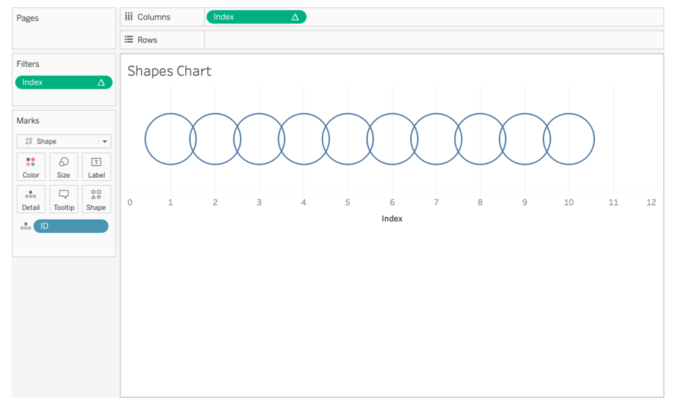
5. Holding down the command key (on a Mac), click on the Index pill (on the Columns) and drag it to Filters. Filter for Index values 1-10 to get ten rows.
6. Increase the size of the canvas. Click on the axis, which will highlight it in blue. Hover over the bottom edge so that a resize cursor appears. Click and drag it down.
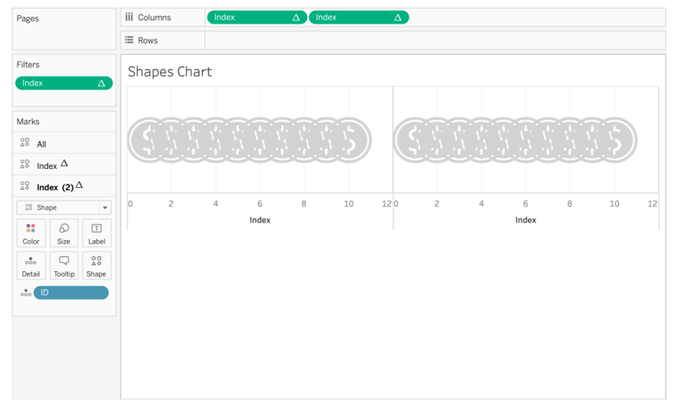
Now that the canvas is resized, we can see our marks more clearly.
7. Change the mark type to Shape. Find the coin. Resize it to a proper size.
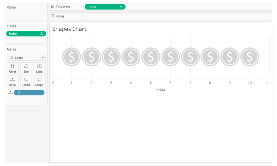
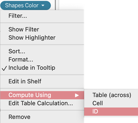
8. Drag Shapes Color to Color on the Marks card. Select the dropdown and Compute Using ID.
Now you have a Tableau shapes chart!
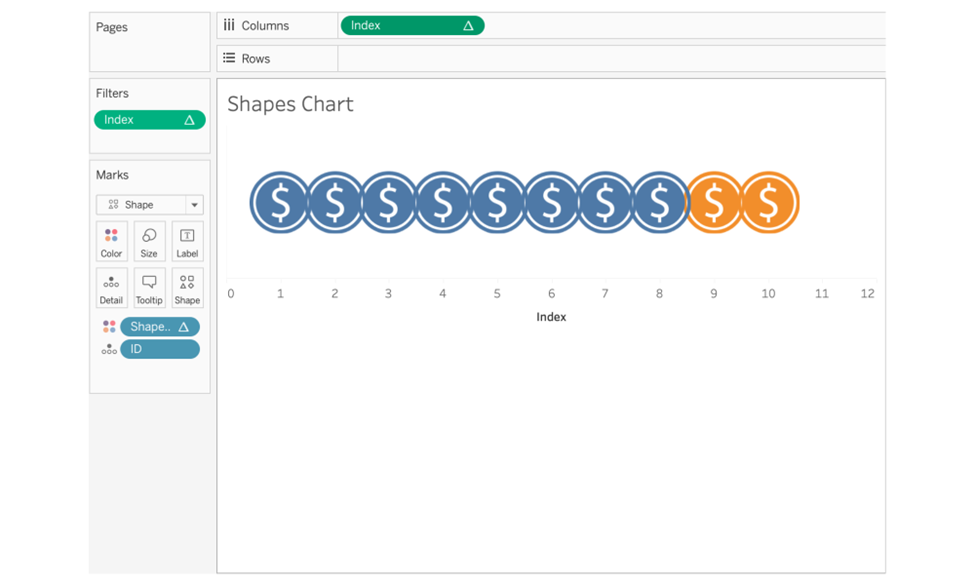
9. Right-click the Axis and deselect “Show Header”
10. Format the chart by changing colored coins to #3CB7BE and grey ones to #303030. Set to None all row dividers, column dividers, column grid lines, row grid lines, axis rulers, and zero lines.
11. Add an informative title.
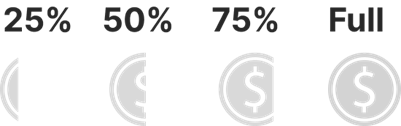
Partial Fill for More Accuracy
Notice that our metric was 85%, but we only shaded 8 coins! In the above image, showing a partial shape was impossible.
Keep in mind that these equity values are on the scale of billions. It would be nice to mitigate rounding errors. We can improve the chart by adding partially filled coins to the Tableau Repository > Shapes folder. You may make smaller granularities if you wish.
Additional Calculated Fields
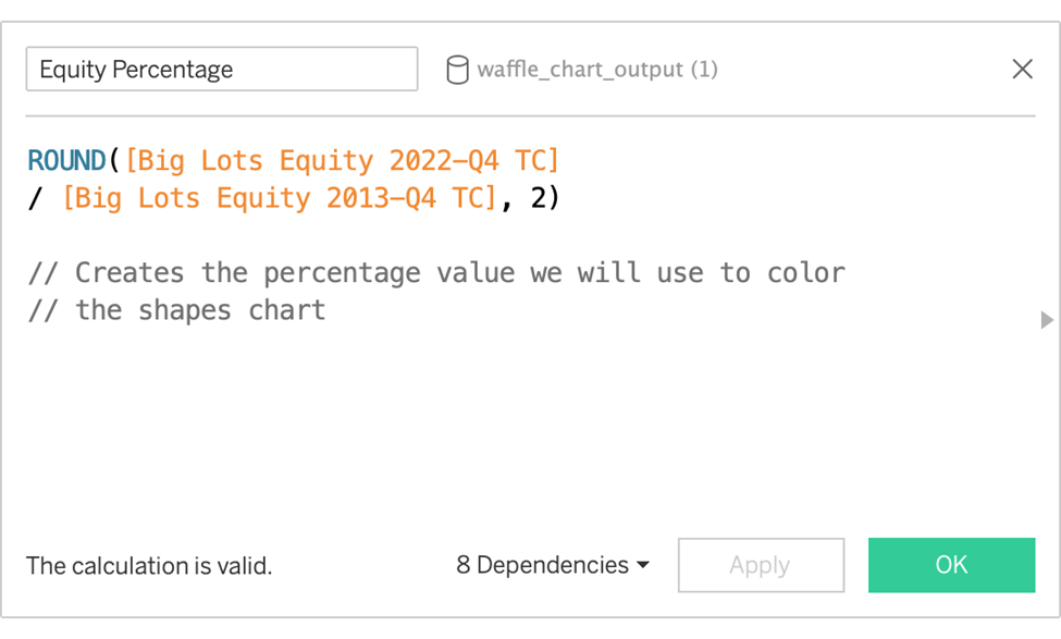
Equity Percentage
The same field as before, wrapped in ROUND(), rounded to the 2nd decimal place. Rounding is optional, but it seems to help when our metric hovers near the thresholds defined above. ( 84.245 rounds to 84.25, 84.45 should be 84.5, etc).
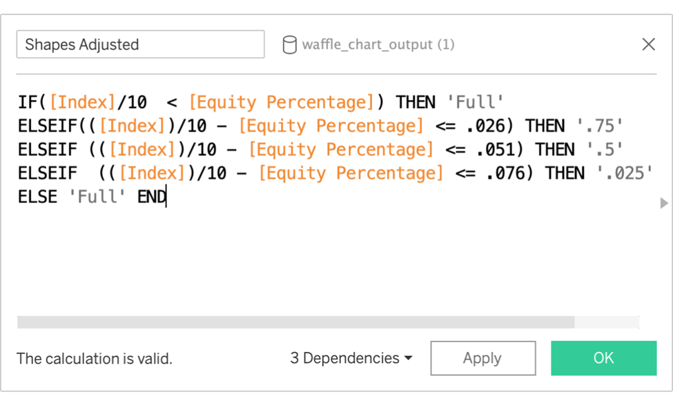
Shapes Adjusted
This will determine which shapes are used according to the leftover amount. Note: Tableau seems to have difficulties comparing float types produced from the ROUND() function, so we had to add a .01 offset for each bracket.
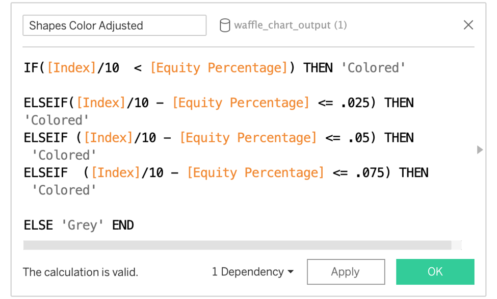
Shapes Colour Adjusted
The conditions we check for are the same, but this calculation assigns “Grey” or “Coloured” to match the particular instances where it’s a remainder or a full shape. The two ELSEIF conditions in the middle (.025, .05) should be deleted as they are redundant.
Duplicate the Index — Holding down the cmd key on a Mac, click on.
Build the Chart
1. Add another Index pill to the 2nd position on the column’s shelf.
2. Click on the Index pill in the 2nd position on the Columns shelf. This will update the Marks card to that pill.
3. Drag Shapes Adjusted to the Shape mark. Compute using “Id”.
4. Click on Shape and find the new coin shapes you added. Assign the proper shapes to match the fill values.
5. Drag Shapes Color Adjusted to the Color mark. Compute using “Id”. Assign the proper colour to the colored shapes & the grey shapes.
6. Click the first Index pill to update the Marks card. Colour the shapes the same grey to match the grey assigned to the other Index pill.
7. Select the dropdown pill for the second Index Pill, and choose “Dual Axis.” Select the header again and deselect “Show Header.”
Your improved shapes chart should now have a partial fill that matches the percentage more closely.
Take it one more step by formatting the title and adding the percentage to the title.