Welcome to our blog series, where we unveil 13 innovative Tableau sales dashboard examples. In the rapid rhythm of today’s business landscape, mastering your sales data is critical. Tableau’s robust data visualization tools offer an optimal pathway.
Embark with us on this analytical expedition as we harness the power of Tableau retail dashboard examples to animate your sales data.
(These dashboards are curated from Tableau Public; while we do not claim ownership of these dashboards, our goal is to delve into various applications for sales dashboards within Tableau.)
Disclosure: This post may contain affiliate links, meaning I get a commission if you decide to make a purchase through my links, at no cost to you.
If you want to see other posts in this series, we have Tableau dashboards for marketing, finance and healthcare.
Table of Contents
#1 Tableau Sales Dashboard Examples – Sales Funnel Dashboard
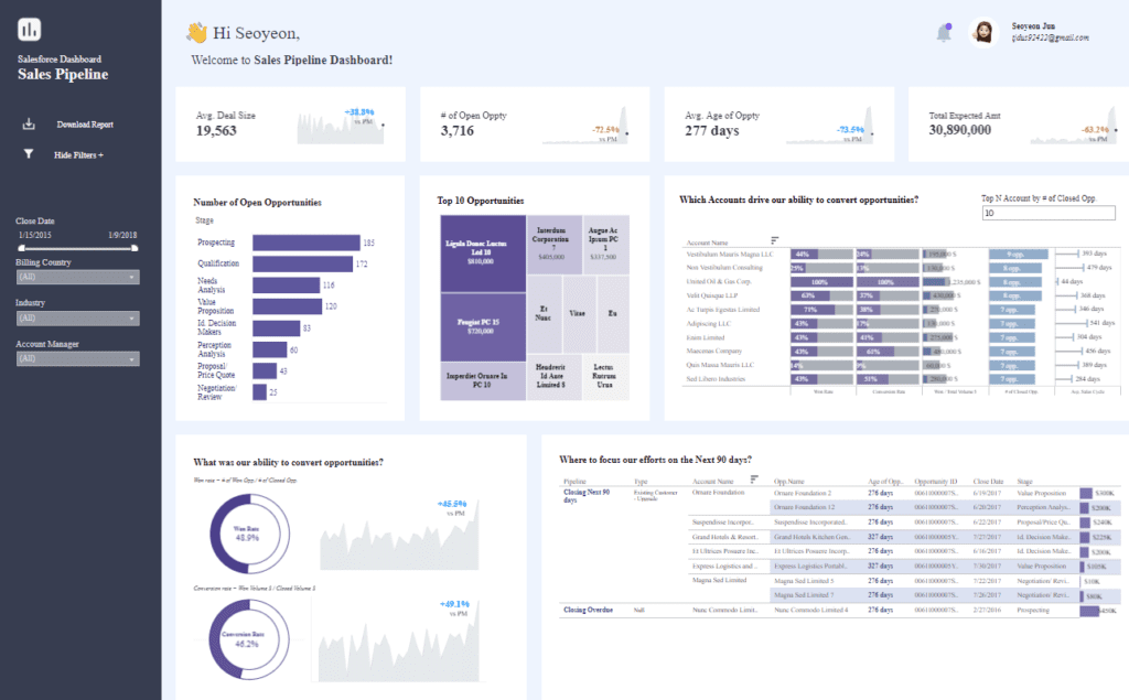
Description of the Dashboard
This Tableau sales dashboard example is meticulously crafted to showcase an array of sales analytics in Tableau, depicting a comprehensive view of a sales pipeline typically sourced from a CRM system. This Tableau sales analytics dashboard is segmented into various parts for enhanced user experience:
- Greeting: The dashboard warmly welcomes the user, adding a touch of personalization to the analytics experience.
- Key Metrics: It features pivotal sales dashboard examples in Tableau, such as average deal size, the volume of open opportunities, the median age of these opportunities, and the aggregate expected revenue, offering an instant snapshot of current sales dynamics.
- Opportunities Breakdown: A pivotal component of Tableau sales dashboard ideas, it enumerates open opportunities at each funnel stage, like Prospecting and Qualification, mapping out the vitality and focus areas of the sales process.
- Top Opportunities: This Tableau sales dashboard example highlights the top-tier accounts by potential revenue, aiding in prioritizing sales initiatives.
- Account Conversion: An integral Tableau sales analytics feature that tabulates accounts with high conversion efficacy, this helps pinpoint robust versus tenuous customer relations.
- Opportunity Age and Status: This segment delves into the lifespan and progression phase of the most significant closed opportunities, providing valuable insights into the sales cycle’s duration and productivity.
- Conversion Rate Analysis: The dashboard exhibits a pie chart and an evolutionary graph representing win and conversion rates, quintessential for evaluating the potency of sales methodologies over time.
- Future Planning: A strategic sales analytics Tableau component, advising prospective focal points for the coming quarter based on prevailing pipeline trends and closure data.
Utility of the Dashboard
The effectiveness of Tableau sales dashboard examples lies in its ability to streamline sales pipeline management. It facilitates:
- Performance Tracking: Swift evaluation of KPIs to determine the sales pipeline’s health.
- Prioritization: Isolating urgent deals and stages, ensuring judicious resource distribution.
- Strategic Planning: Harnessing data-powered insights to sculpt forthcoming sales approaches and concentration zones.
- Trend Analysis: Continually monitor conversion and success rates to refine strategies and boost sales achievements.
- Account Management: Deciphering the most profitable accounts and understanding their propensity to convert is vital in fortifying customer bonds.
Potential Users of the Dashboard
- Sales Managers: To supervise team outcomes, steer the sales cohort, and formulate tactics grounded in live data.
- Account Executives: To govern personal pipelines, prioritize client engagement, and concentrate on the most lucrative prospects.
- Marketing Team: To appraise campaign impacts and discern the contribution of marketing maneuvers to the sales pipeline.
Types of Charts
- Bar Chart: Displayed in the section labeled “Number of Open Opportunities,” where each bar represents the count of opportunities at different stages of the sales process.
- Line Chart: Used in the sections “What was our ability to convert opportunities?” and also showing the trend of “Ave. Age of Oppty” (Average Age of Opportunity), which tracks changes over time.
- Pie Chart: Present in the “Conversion rate” section, showing the distribution of outcomes (Win Rate and Conversion Rate) as a part of the total.
- Table: Seen in multiple areas like “Top 10 Opportunities” and “Which Accounts drive our ability to convert opportunities?” Tables are used here to list detailed data such as company names, opportunity values, stages, and more.
- Donut Chart: A variation of the pie chart, visible in the “Conversion rate” section, focusing on the core metrics surrounded by a ring that segments the data visually.
#2 Tableau Sales Dashboard Examples – Superstore Sales Overview Dashboard
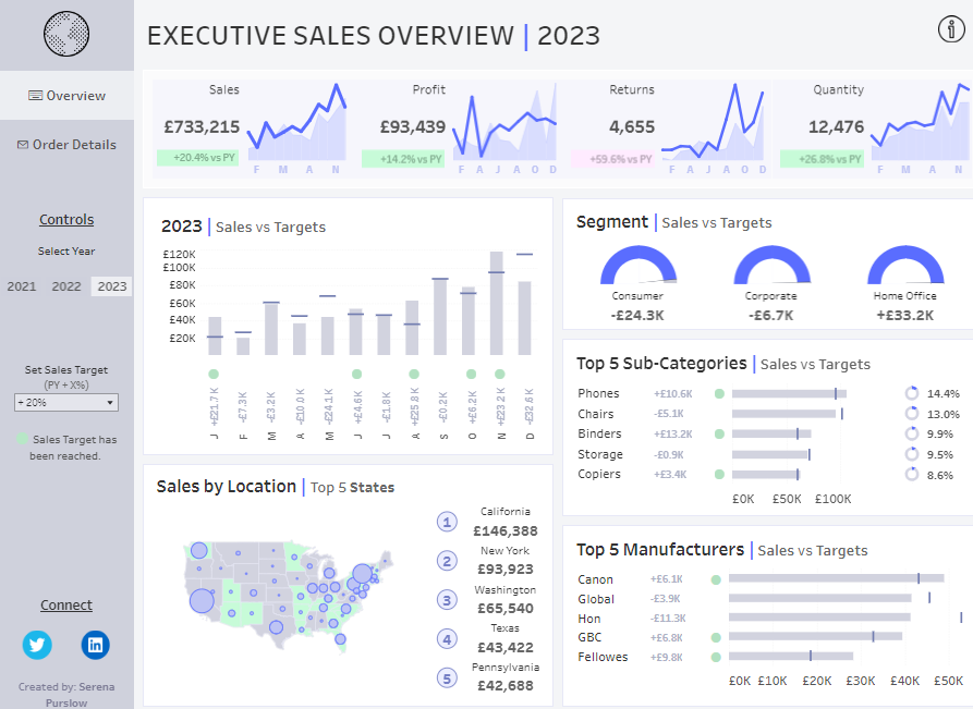
Description of the Dashboard
This Tableau sales dashboard example provides a comprehensive executive sales overview for the year 2023, including a range of insightful sections:
- Sales Metrics: This Tableau sales dashboard showcases metrics like sales, profit, returns, and quantity alongside trend data and year-over-year percentage changes, offering an at-a-glance view of performance dynamics.
- Sales vs. Targets: Incorporating sales dashboard examples in Tableau, a bar graph compares monthly sales figures against set targets, highlighting achievement levels.
- Segment Performance: Utilizing Tableau sales analytics, gauge charts detail sales compared to targets across various market segments—Consumer, Corporate, and Home Office—shedding light on segment-specific performance.
- Sales by Location: The dashboard features a geographic visualization reflecting the top 5 states by sales volume, an essential aspect of sales analytics in Tableau for regional analysis.
- Product and Manufacturer Analysis: Bar graphs within this Tableau sales dashboard ideas segment illustrate the leading five sub-categories and manufacturers about sales targets, emphasizing areas of product strength.
Utility of the Dashboard
The utility of this Tableau Sales Dashboard Examples is multifaceted:
- Performance Monitoring: Offers a concise overview of business performance against crucial metrics.
- Target Tracking: Facilitates monitoring of sales progress relative to established targets, a vital component of Tableau sales analytics.
- Market Segmentation: Assists in discerning the performance of different market segments, an advanced feature of sales analytics Tableau.
- Geographical Insights: The map offers revenue generation insights by location, instrumental in strategizing at the regional level.
- Product Focus: Determines the impact of various products and manufacturers on sales targets, integral to managing inventory and supply chain operations.
Potential Users of the Dashboard
- Chief Sales Officer (CSO) or Sales Director: Employs Tableau sales dashboard examples to obtain a holistic view of sales performance, informing strategic decision-making.
- Product Managers: Leverages the dashboard to evaluate product performance and strategize marketing and production across regions.
- Market Analysts: Utilize the dashboard to analyze market trends, evaluate segment performance, and generate targeted marketing and sales strategies.
Types of Charts
- Line Chart: Displayed in the top row for metrics such as “Sales,” “Profit,” “Returns,” and “Quantity,” showing trends over the months.
- Bar Chart: Visible in the “2023 | Sales vs Targets” section, where each bar represents sales achieved in a month compared against set targets, with markers indicating whether the target has been met.
- Donut Chart: Used in the “Segment | Sales vs Targets” for each segment (Consumer, Corporate, Home Office), showing the shortfall or surplus against sales targets in a circular format.
- Horizontal Bar Chart: In the “Top 5 Sub-Categories | Sales vs Targets,” where each horizontal bar shows the sales volume for each sub-category against its target.
- Map with Bubble Overlay: Seen in the “Sales by Location | Top 5 States” section, where bubbles of varying sizes represent the sales volume across different states.
#3 Tableau Sales Dashboard Examples – Sample Superstore – Market Basket Analysis
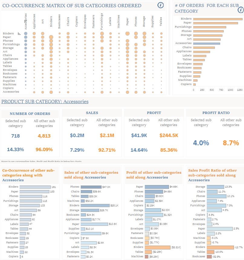
Description of the Dashboard
This Tableau sales dashboard example delineates a focused analysis on the co-occurrence matrix of product sub-categories within orders. Key features include:
- Co-Occurrence Matrix: Essential to Tableau sales dashboard ideas, this matrix visualizes the relationships between product sub-categories, with dot sizes representing the frequency of co-occurrence in orders.
- Individual Product Analysis: Delving into sales dashboard examples in Tableau, the dashboard provides granular statistics for a chosen sub-category, ‘Accessories’. It compares the number of orders, sales, profit, and profit ratio to all other sub-categories.
- Related Sub-Category Performance: Expanding on Tableau sales analytics, additional bar graphs illustrate sales, profit, and profit ratio for related sub-categories when bundled with Accessories.
Utility of the Dashboard
The value of this dashboard, showcasing sales analytics in Tableau, manifests in its capabilities to:
- Identify Cross-Selling Opportunities: Leveraging the co-occurrence matrix offers insights into product pairings, a pivotal aspect of the sales analytics tableau for enhancing cross-selling strategies.
- Performance Analysis: This Tableau sales dashboard example yields an in-depth examination of specific product sub-categories, which is crucial for evaluating sales performance and profitability.
- Strategic Decision Making: The dashboard’s data on sales and profit ratios are instrumental in shaping financial strategies for each sub-category, informing pricing and marketing decisions.
Potential Users of the Dashboard
- Sales Analysts: Utilize this tableau sales dashboard examples to dissect buying patterns and product synergies, which is valuable for crafting bundle offers or promotions to boost order values.
- Inventory Managers: Employ sales analytics tableau to fine-tune inventory by understanding product purchasing trends.
- Product Managers: Draw on tableau sales analytics to pinpoint product line strengths and weaknesses, guiding development and discontinuation decisions anchored in performance metrics.
Types of Charts
- Bubble Matrix: Displays the frequency of co-occurrence between product sub-categories with varying bubble sizes.
- Horizontal Bar Chart: Shows the number of orders for each sub-category.
- Stacked Horizontal Bar Chart: Represents the distribution of sales, profit, and profit ratio for products sold along with accessories.
- Tabular Data: Presents numeric data clearly, such as number of orders, sales, and profit.
- Percentage Bar Chart: Visualizes profit ratios for various sub-categories, indicating performance metrics as percentages.
#4 Tableau Sales Dashboard Examples – Customer Lifetime Value
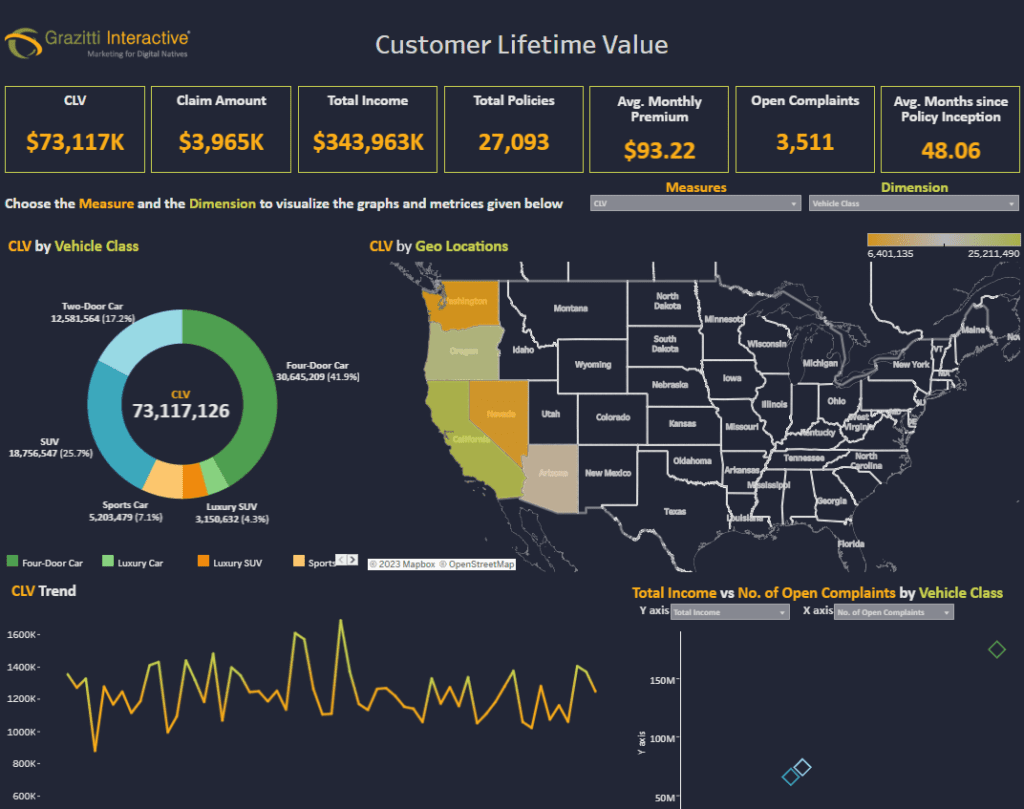
Description of the Dashboard
The dashboard presents data on Customer Lifetime Value (CLV) for a business, presumably in the automotive or insurance industry:
- Key Metrics: Displays CLV, claim amount, total income, total policies, average monthly premium, open complaints, and average months since policy inception.
- CLV by Vehicle Class and Geo Locations: Provides a breakdown of CLV by types of vehicles and by geographic location across the United States.
- CLV Trend: A line graph shows the trend of CLV over time.
- Total Income vs. No. of Open Complaints by Vehicle Class: A scatter plot compares the total income to the number of open complaints categorized by vehicle class.
Utility of the Dashboard
This dashboard would be beneficial for:
- Risk Assessment: Understanding the relationship between CLV, claim amounts, and complaints to assess risk and profitability.
- Geographic Strategy: Analyzing CLV by location to tailor marketing and service strategies to different regions.
- Trend Analysis: Monitoring the trend of CLV to measure the long-term value generated from customers and the effectiveness of retention strategies.
- Revenue Management: Comparing income against open complaints to identify potential customer satisfaction or product performance issues.
Potential Users of the Dashboard
- Chief Financial Officer (CFO) or Finance Manager: To oversee financial health related to customer value and revenue streams.
- Customer Relationship Managers: To better understand customer segments and strategize on improving lifetime value.
- Risk Management Officers: To evaluate and mitigate risks associated with claims and complaints and to understand their impact on the company’s income and customer satisfaction.
Types of Charts
- Donut Chart: Displays “CLV by Vehicle Class,” segmenting customer lifetime value by different types of vehicles.
- Choropleth Map: “CLV by Geo Locations,” with states colored differently based on customer lifetime value metrics.
- Scatter Plot: “Total Income vs. No. of Open Complaints by Vehicle Class,” plotting total income against the number of complaints for various vehicle classes
#5 Tableau Sales Dashboard Examples – Retail – POS – Point of Sales Dashboard
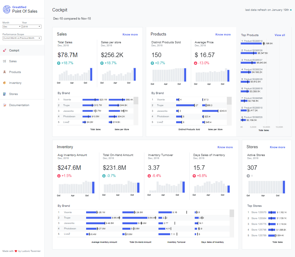
Description of the Dashboard
The dashboard provides a comprehensive view of a retail business’s point of sale (POS) data:
- Sales: Shows total sales and sales per store for December 2018, with a comparison to the previous year, including a breakdown by brand.
- Products: Lists the number of distinct products sold, the average price, and a breakdown of sales by brand.
- Inventory: Displays average inventory amount, total on-hand amount, inventory turnover, and days of inventory sales, again with a breakdown by brand.
- Stores: Provides data on active stores and highlights the top stores by sales.
Utility of the Dashboard
The dashboard is helpful for:
- Sales Tracking: Monitoring sales performance across different periods and by brand to inform sales strategies and production.
- Product Analysis: Understanding product performance regarding variety sold and pricing to decide stock levels and pricing adjustments.
- Inventory Management: Assessing inventory turnover and days inventory sales to optimize stock levels and reduce holding costs.
- Store Performance: Comparing performance to identify high-performing stores and those requiring additional support or evaluation.
Potential Users of the Dashboard
- Sales Managers: To gauge overall sales performance and plan for future sales initiatives.
- Inventory Managers: To manage inventory efficiently and minimize costs associated with excess stock or stockouts.
- Retail Store Managers: To understand their store’s performance in the wider business context and benchmark against top-performing stores.
Types of Charts
- Bar Chart: Displays various metrics, such as sales totals and average inventory amounts, using horizontal bars to represent data across different categories and brands.
- Line Chart: Used to show trends over time for metrics like sales per store, depicted with lines across different months.
- Table: Provides a structured display of data, such as the “Top Stores” and “Top Products,” listing specific numerical values and related details in a tabular format.
#6 Tableau Sales Dashboard Examples – U.S. Recorded Music Sales Volumes by Format
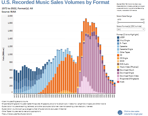
Description of the Dashboard
The dashboard displays the U.S. Recorded Music Sales Volumes by Format from 1973 to 2022. It uses a stacked bar chart to represent sales volumes for music formats such as LP/EP, Vinyl Single, 8-track, Cassette, CD, Download Single, and more. Each colour in the bar chart corresponds to a different format, showing the evolution of music format popularity over time.
Utility of the Dashboard
This type of dashboard is useful for:
- Trend Analysis: Understanding how consumer preferences for music formats have changed.
- Market Research: Assisting industry stakeholders in identifying which formats gain or lose market share.
- Strategic Planning: Informing decisions on where to invest in production, distribution, and marketing efforts based on the popularity of music formats.
Potential Users of the Dashboard
- Music Producers and Labels: To decide which formats to release new albums on based on current trends.
- Market Analysts: To analyze trends in the music industry and forecast future changes.
- Retailers and Distributors: To stock the music formats currently in demand and phase out those declining in popularity.
Types of Charts
- Stacked Bar Chart: This chart uses vertical stacked bars to represent the total sales volumes, with each segment of the bar depicting sales from different music formats such as LP/EP, CDs, and digital downloads, allowing for comparison of how each format contributes to the total over the years.
- Color Coding: Each format type is represented by a distinct color, which helps in quickly identifying and differentiating the contribution of each music format over the decades.
#7 Tableau Sales Dashboard Examples – Gaming Revenue
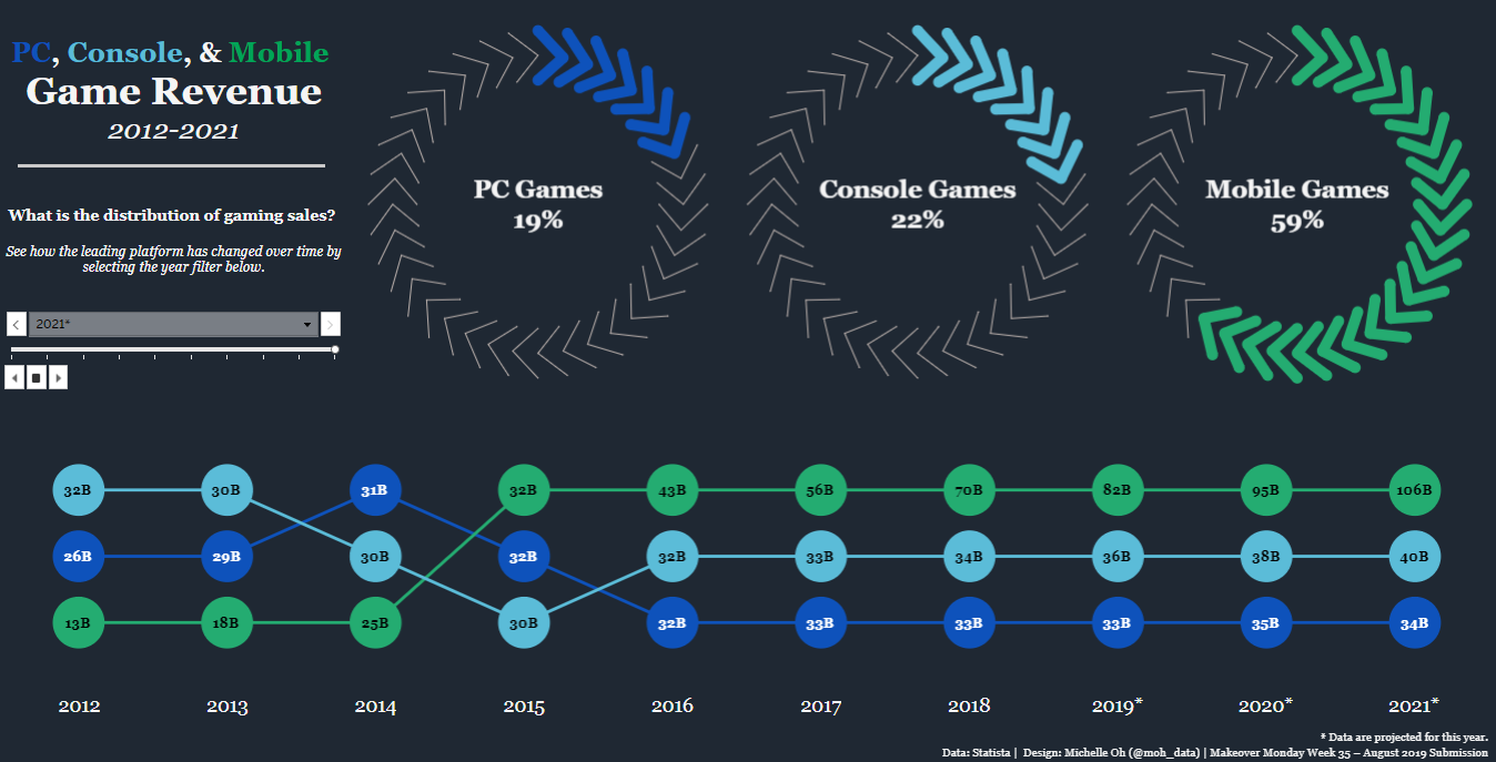
Description of the Dashboard
The dashboard visualizes the game revenue from 2012 to 2021 across three major platforms: PC, Console, and Mobile. It features a line chart tracking the annual revenue for each platform, with specific revenue figures at each point. Surrounding this chart are three circular diagrams that indicate the percentage distribution of sales across the platforms. Mobile Games occupy the largest share at 59%, Console Games at 22%, and PC Games at 19%.
Why It Would Be Useful
This dashboard provides a clear and concise historical revenue trend in the gaming industry, allowing for quick analysis of growth areas and shifting market dynamics. It’s beneficial for understanding consumer behavior over time, tracking the rise of mobile gaming, and comparing the performance of different gaming platforms.
Who Could Use This Dashboard
- Market Strategy Analysts: To analyze gaming market trends and advise which platforms have growing or shrinking revenue streams.
- Financial Planners in Gaming Companies: To allocate budgets and forecast revenue based on historical performance and market share trends.
- Product Managers at Game Development Studios: To strategize which platforms to prioritize for game development based on revenue potential and market trends.
Types of Charts
- Rank Chart: Displays the annual revenue figures for PC, console, and mobile games, ranked across the years with each platform represented by a unique color.
#8 Tableau Sales Dashboard Examples – Sales Territory Dashboard
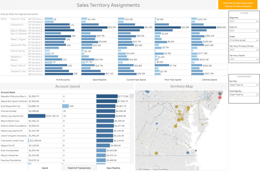
Description of the Dashboard
This dashboard is focused on sales territory assignments, providing detailed insights into sales metrics across different territories:
- Territory Management: Lists sales representatives along with their respective territories and performance metrics like the number of accounts, open pipeline, current year spend, prior year spend, and lifetime spend.
- Account Spend: Shows individual account names with corresponding spend amounts, the number of transactions, and open pipeline values.
- Territory Map: A geographic map visualizes the distribution of sales data, presumably with the size of the dots representing the open pipeline size by location.
Utility of the Dashboard
The dashboard would be helpful for:
- Sales Performance Tracking: Evaluating the performance of sales representatives in different territories.
- Resource Allocation: Assisting in allocating resources based on territory sales potential and current pipeline.
- Strategic Planning: Guiding strategic planning for territory management and account prioritization based on spend and sales activity.
Potential Users of the Dashboard
- Sales Managers: To oversee the distribution of sales territories and to manage the performance of sales teams.
- Account Executives: To monitor their portfolios and identify key spending accounts.
- Sales Operations Analysts: To analyze sales data for optimizing sales territories and improving overall sales efficiency.
#9 Tableau Sales Dashboard Examples – Sales Summary
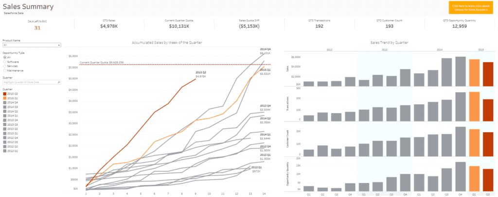
Description of the Dashboard
This dashboard appears to be a sales summary that provides an overview of a company’s sales performance. Key elements include:
- Time-Sensitive Sales Data: Displays days left to the end of the quarter (EoQ), quarter-to-date (QTD) sales, and the current quarter quota.
- Performance Metrics: Shows the sales quota difference, number of transactions, customer count, and opportunity quantity for the quarter.
- Sales Accumulation Graph: A line graph presents accumulated sales by week of the quarter, highlighting progress towards the sales quota.
- Sales Trend by Quarter: A bar graph shows sales trends over multiple quarters, with a secondary axis tracking the number of transactions, customer count, and opportunity quantity.
Utility of the Dashboard
The dashboard is helpful for:
- Performance Tracking: Assessing how sales are tracked against targets throughout the quarter.
- Sales Analysis: Analyzing sales trends over time to understand seasonal patterns or the impact of sales initiatives.
- Data-Driven Decisions: Providing a data foundation for strategic decisions related to sales and marketing efforts.
Potential Users of the Dashboard
- Sales Managers: To monitor team performance against sales quotas and guide strategy.
- Financial Analysts: To forecast revenue and adjust financial projections based on current sales trends.
- Marketing Managers: To evaluate the effectiveness of marketing campaigns and promotions in generating sales and opportunities.
#10 Tableau Sales Dashboard Examples – Sales Forecast Dashboard
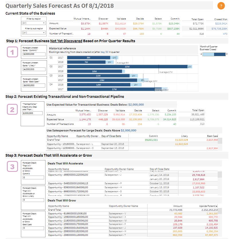
Description of the Dashboard
The dashboard provides a comprehensive overview of a company’s quarterly sales forecast as of a specific date, in this case, August 1, 2018. It is divided into three main steps:
- Step 1: Forecast Business Not Yet Discovered: Based on historical data from previous quarters, it projects potential sales that have not yet been identified.
- Step 2: Forecast Existing Transactional and Non-Transactional Pipeline: Breaks down current opportunities into those below and above a specific deal value, showing expected values for each stage of the sales process.
- Step 3: Forecast Deals That Will Accelerate or Grow: Identifies deals with the potential to close faster or increase in size, offering a forecast based on different scenarios like commit, likely, and best case.
Utility of the Dashboard
The dashboard is useful for:
- Sales Forecasting: Providing detailed predictions to help manage expectations and plan for future resources and targets.
- Pipeline Management: Allowing for an analysis of current and potential future sales, aiding in prioritization and focus.
- Opportunity Identification: Highlighting deals with the potential for acceleration or growth can be critical for achieving sales targets.
Potential Users of the Dashboard
- Sales Directors: To oversee the sales pipeline and adjust team strategies accordingly.
- Financial Planners: To use sales forecasts for budgeting and financial planning.
- Account Managers: To focus on the most promising deals and manage their accounts more effectively.
#11 Tableau Sales Dashboard Examples – Sales Growth Dashboard
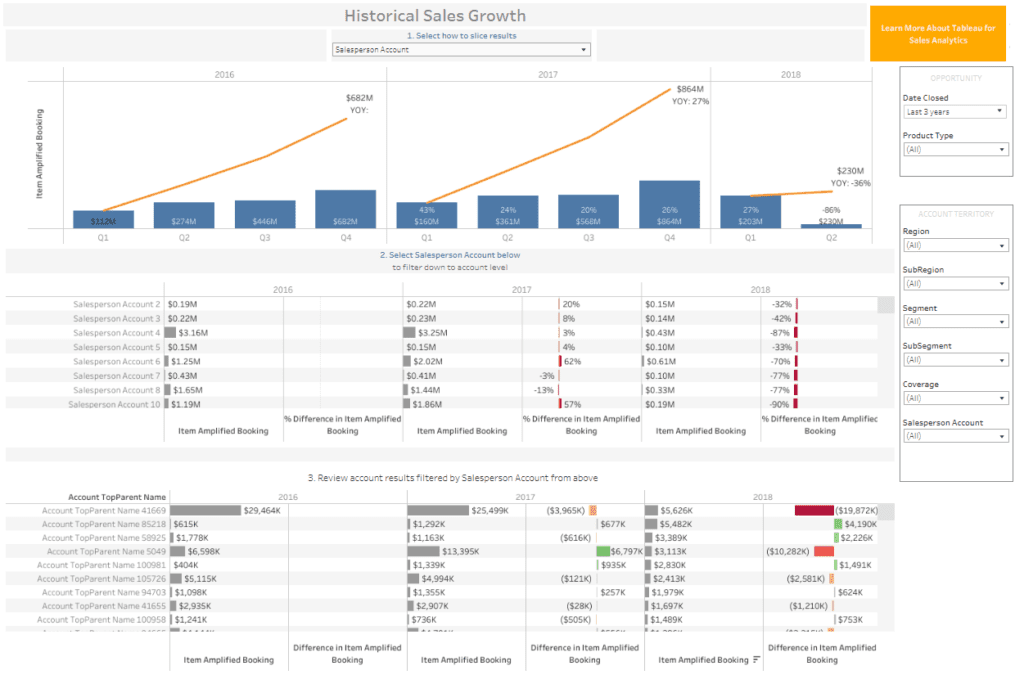
Description of the Dashboard
The dashboard presents historical sales growth, breaking the data by quarters over multiple years. It includes:
- Year-over-Year Growth Chart: An orange line graph overlaying blue bars representing the item amplified booking for each quarter, indicating growth trends.
- Salesperson Performance: A table listing sales figures for individual salespeople, with the percentage difference in item amplified booking from one year to the next.
- Account Review: A section that allows for the review of account results, filtered by the salesperson’s account, showing the booking amounts and differences in item amplified booking.
Utility of the Dashboard
The dashboard would be helpful in:
- Trend Analysis: Observing sales performance over time and identifying trends.
- Performance Evaluation: Assessing individual salesperson contributions to overall sales figures.
- Account Management: Reviewing and managing accounts based on performance and growth.
Potential Users of the Dashboard
- Sales Managers: To assess team performance and individual contributions and to set future sales targets.
- Account Managers: To monitor their accounts’ health and growth and strategize on account retention and expansion.
- Business Analysts: To analyze long-term sales trends and provide insights for strategic planning.
#12 Tableau Sales Dashboard Examples – Quota Attainment
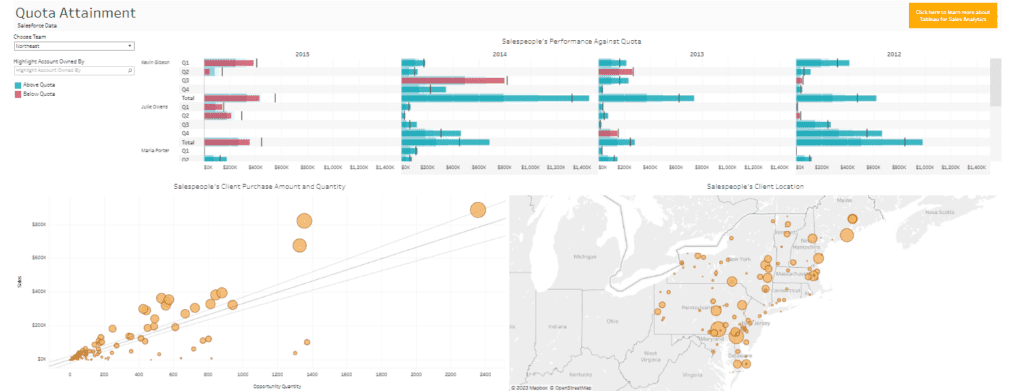
Description of the Dashboard
This dashboard visualizes sales data focused on quota attainment. It has several components:
- Salespeople Quota Bars: Bar graphs show individual salespeople’s performance against their sales quotas for each quarter, colour-coded to indicate whether they are above or below quota.
- Client Purchase Amount vs. Opportunity Quantity: A scatter plot correlates the number of opportunities with the client purchase amounts, likely indicating the efficiency or value of sales efforts.
- Salespeople’s Client Location: A geographic map illustrates the locations of clients associated with the salespeople, with the size of the circles presumably indicating the scale of sales or opportunity density in those areas.
Utility of the Dashboard
The dashboard would be helpful to for
- Performance Tracking: Monitoring salespeople’s performance about their quotas is crucial for sales management and motivation.
- Sales Analysis: Correlating sales efforts with actual sales to evaluate sales efficiency.
- Client Distribution Insight: Understanding clients’ geographic distribution can inform regional sales strategies and resource allocation.
Potential Users of the Dashboard
- Sales Managers: To track individual and team performance against quotas and to identify areas for coaching or improvement.
- Territory Managers: To analyze geographic sales data for better territory planning and client engagement strategies.
- Business Development Executives: To identify trends in opportunity quantity and client purchases for strategic planning and forecasting.
#13 Tableau Sales Dashboard Examples – Sales Market Share
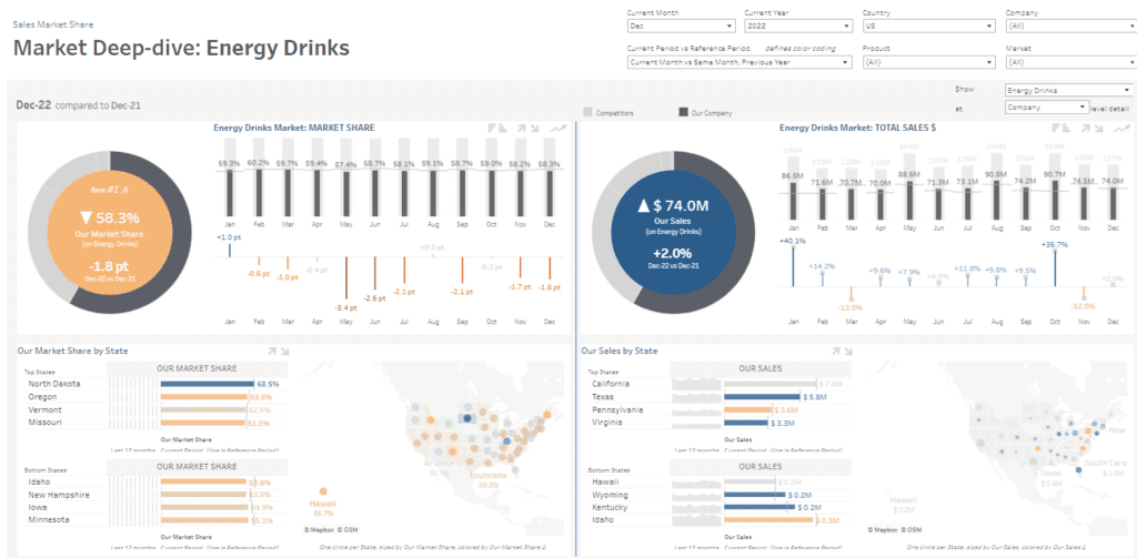
Description of the Dashboard
The dashboard is a detailed analysis of market share and sales for energy drinks. It features:
- Market Share Overview: A pie chart and a trend line chart showing the monthly market share, with comparative percentage points from the previous year.
- Total Sales Overview: A doughnut chart and a trend line chart for total sales in dollars, with monthly data points and year-over-year percentage changes.
- Market Share by State: A horizontal bar chart and a colour-coded map that shows the market share by state, distinguishing top and bottom states based on performance.
Utility of the Dashboard
The dashboard would be helpful for:
- Market Positioning: Tracking market share to understand the company’s position relative to competitors.
- Sales Performance: Monitoring sales trends to assess the effectiveness of sales strategies and campaigns.
- Regional Analysis: Evaluating state-by-state performance to identify strong markets and areas needing improvement.
Potential Users of the Dashboard
- Marketing Managers: To strategize brand positioning and tailor marketing campaigns based on regional market share insights.
- Sales Directors: To assess overall sales performance and direct resources to states with high growth potential or to address underperformance.
- Business Analysts: To evaluate market trends, forecast future sales, and provide strategic insights to the company’s leadership.
Through our exploration of 13 different examples, we’ve seen how they cater to many sales analysis needs—from real-time performance tracking to predictive analytics for strategic planning. The ability to customize and drill down into the specifics of sales data with Tableau empowers teams to make informed decisions, adapt to market changes swiftly, and ultimately drive sales growth. Whether you’re a sales veteran or new to the field, incorporating Tableau dashboards into your analytical arsenal can lead to richer insights and a more robust sales process. As the sales landscape continues to evolve, integrating such advanced analytics will be the keystone of successful sales strategies.
If you want to see more Tableau sales data examples, check out our blog.