Related posts:
- Building an Amazing Tableau Diverging Bar Chart in 5 Minutes
- Tableau Candlestick Charts in an Easy 7 Minutes
- 10 Minute Tutorial For a Great Tableau Shape Chart
- Create a Fantastic Tableau Radar Chart in 5 Minutes!
- How to make a Radical Tableau Radial Time Series Chart
- How to Make an Amazing Tableau Marimekko Chart
Table of Contents
Data For Tableau Rounded Bar Chart Tutorial
To follow along with this tutorial, download the data below
What is a Tableau Rounded Bar Chart?
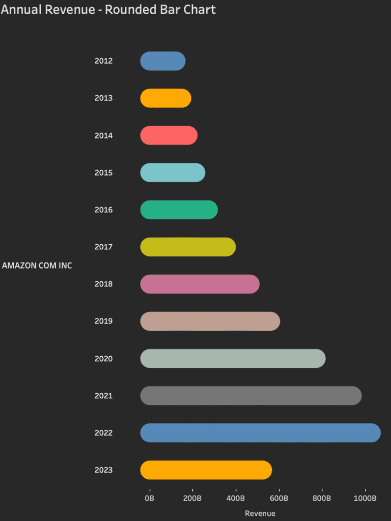
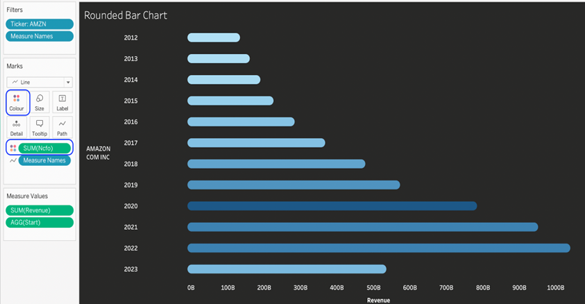
Tableau Rounded bar charts are a variation of a standard rectangle bar chart. They are visually appealing, and you can optionally use the line ends to emphasise the stat and the end of the bars if desired. Here is an example of a great Tableau Rounded Bar Chart that visualises annual revenue over a decade.
Let’s Make A Tableau Rounded Bar Chart!
Connect to your data source and locate the dimensions and measures needed to build your base visualisation.
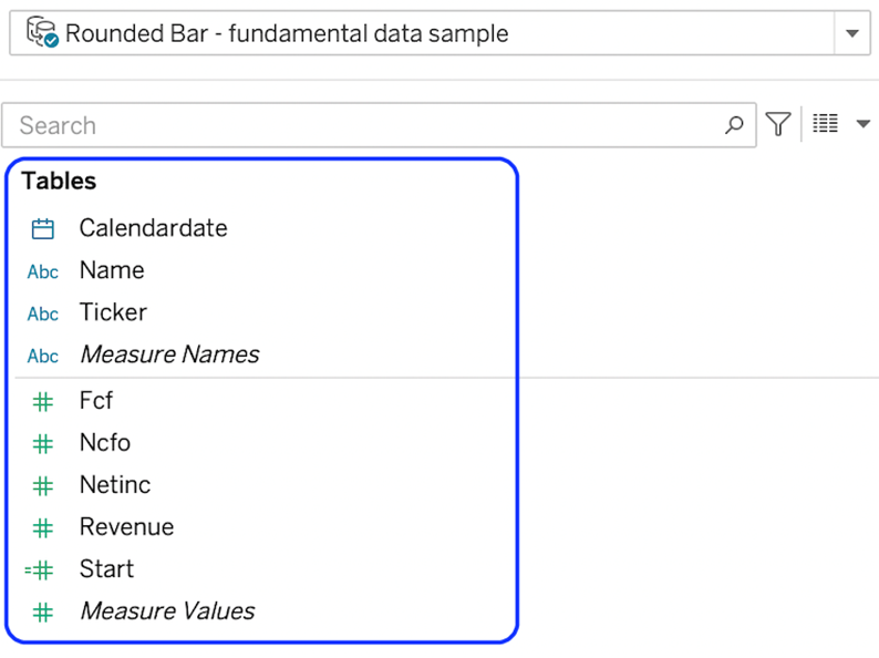
In this case, we will build a Tableau Rounded Bar chart to show one company ticker’s revenue values for individual years. We will need:
The Ticker and Name dimensions and The Revenue measure.
Firstly, we will start by building out the base of the visualisation. Here, the base is a standard bar chart using the dimensions we are interested in. We want to look at revenue for the Amazon ticker by the year.
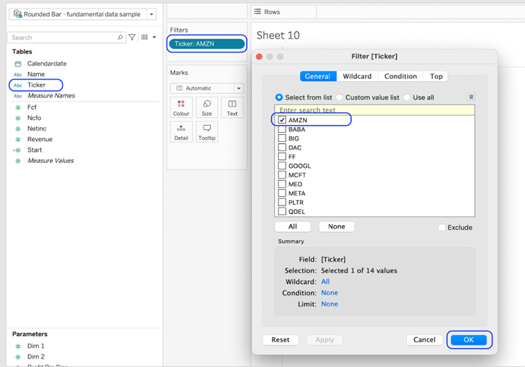
Add the ticker to the filters shelf and select AMZN
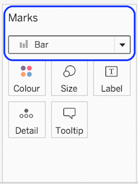
Change the mark type to Bar.
Drop the Revenue measure into columns and the name and calendar date dimensions into rows.
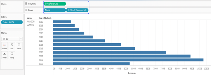
Next, we will create the start and end points of the bar. These marks are circles representing zero, which is the start, and revenue, which is the end. We will connect these points in a later step.
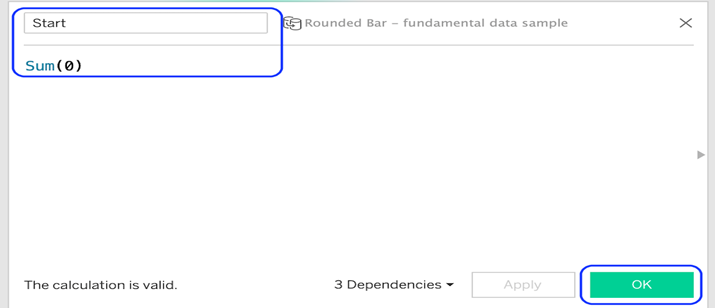
Create a calculated field called Start with the formula sum(0)
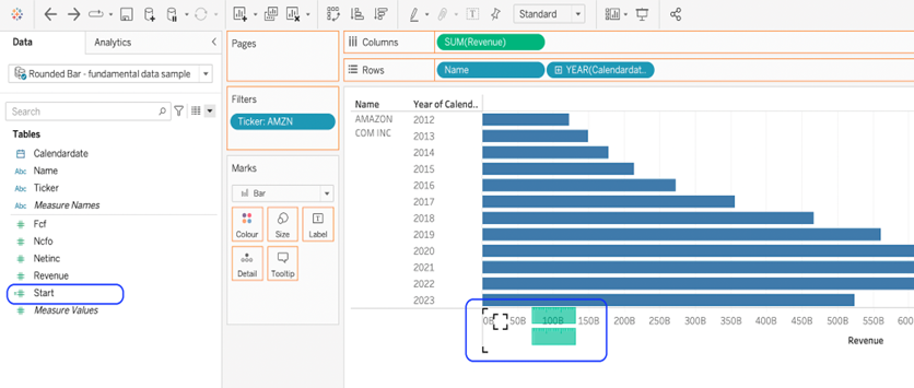
Drag the Start calculated field onto the revenue axis.
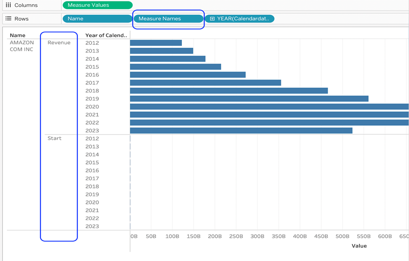
This will add measure names and measure values objects into the viz. We need to remove measure names from the rows shelf.
Change the mark type to the line. This draws a line between our start dimension at the zero point and the revenue at the endpoint. At this point, Tableau doesn’t know when to start and stop the line, so all start and end points are joined together.

We need to drag measure names to the path card to connect the points within the ticker and year on the row.
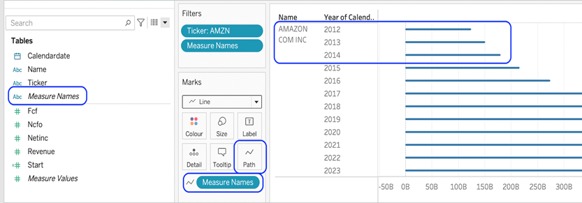
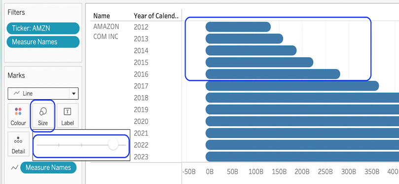
Next, we can format our chart to make it more visually appealing. You can apply your formatting as needed, but for this Tableau Rounded Bar chart, I have increased the thickness of the line to show the rounded edges.
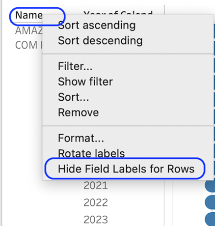
Now, we can hide the column header names.
Here are some further adjustments that we can make to add to our Tableau Rounded Bar Chart;
- Make the rows taller.
- Hide the grid lines and zero lines.
- Hide the column and row dividers.
- Format the text for the ticker name and year
- Format the axis and rename the axis title.
- Change the colour fill for the sheet
- Change the worksheet title
Finally, you can change the colour of the bars to give a more dynamic look. You can see below I have given two different versions. The colour is based on each different year, so we can easily visualise year to year on the rounded bar chart.
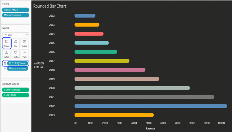
The bar’s colour is based on a second continuous measure, so each bar has a gradient of the same hue found on the value of the second measure.
Congratulations! You’ve done it!
Well, you completed your quick and easy Tableau Rounded Bar chart! I hope you can add this to your skill set in creating visualisation for clients and projects in the future.
For more on making Tableau data visualisation charts, head to our blog to read and learn more. Quantize Analytics offers complete services in Tableau best practices, Tableau advanced visualizations and Tableau applications for marketing, finance and sales.


