Welcome to our latest blog post, where we dive into the dynamic world of Tableau retail dashboards examples. In today’s data-driven retail environment, having a retail analytics dashboard that tracks performance and provides actionable insights is indispensable for any retail business aiming to thrive. Whether you’re a small boutique or a large retail chain, understanding customer behavior, optimizing inventory levels, and enhancing sales strategies are all critical aspects that can be managed more effectively with the right analytics tools.
In this post, we’re excited to showcase 11 retail dashboard examples that exemplify how advanced data visualization and analytics can transform retail management. Each instance has been carefully selected to illustrate different aspects of retail operations—from sales performance and customer insights to inventory management and financial health.
These dashboards are not just tools but game changers that provide real-time insights into every facet of the retail process, enabling businesses to make swift, informed decisions that drive growth and improve customer satisfaction. Whether you’re interested in adopting Tableau retail dashboards or exploring various examples, you’ll find inspiring examples that demonstrate the power of integrating comprehensive data analytics into retail operations.
Affiliate Disclosure: Some of the links on this blog are affiliate links, which means if you click on them and make a purchase, we may receive a commission at no extra cost to you. This helps support our blog and allows us to continue to create content for you. We only recommend products and services that we genuinely believe in, and all opinions expressed here are our own. Thank you for your support!
For other posts in this series, check out examples of sales, marketing, healthcare, and finance dashboards.
Table of Contents
Stay tuned as we explore each retail sales dashboard in detail, discussing its key features, the specific retail challenges it addresses, and how it can be implemented to achieve optimal results in a competitive marketplace. This is your ultimate guide to understanding and utilizing the retail dashboard Tableau and retail store performance dashboard to their fullest potential.
These dashboards are curated from Tableau public, I do not take credit for these dashboards.
#1 Tableau Retail Dashboard Example – Retail Dashboard | Regional Comparison
Purpose and Users
The primary purpose of this retail sales dashboard is to provide a quick overview of sales performance, profit, and other critical business metrics across various regions. It is segmented into sections for different areas, such as Queensland, New South Wales, Western Australia, and Northern Territory, each displaying specific data relevant to the region. Users of this retail dashboard Tableau can range from regional managers looking to monitor local performance to corporate executives analyzing overall company health across multiple areas. Analysts might also use this Tableau retail dashboard to derive insights and recommend actions based on trends and data comparisons.
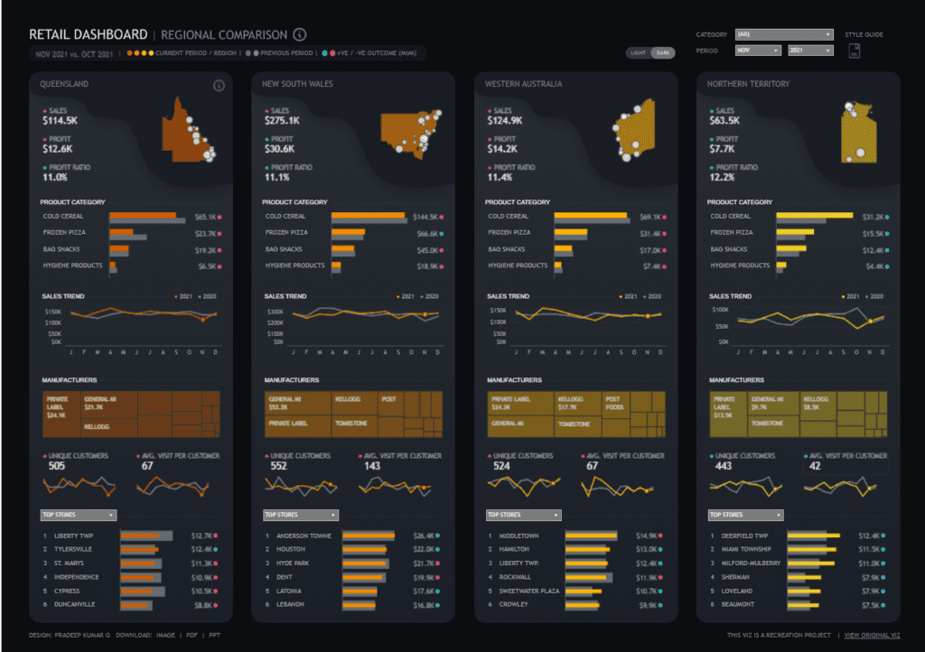
Chart Types and Layout
The dashboard utilizes a variety of chart types, which include:
- Bar Charts: These are used to compare sales and profits across top stores in each region and to display product category sales.
- Line Graphs: Employed to depict sales trends over the months for two consecutive years, providing a clear visual representation of growth, decline, or stability.
- Heat Maps: These are used in the ‘Manufacturers’ section to compare the contribution of different manufacturers to the region’s sales.
- Numeric Indicators: These show absolute figures such as total sales, profit, profit ratio, unique customers, and average visits per customer, giving straightforward insights into the performance metrics.
Positive Aspects
- Clarity and Organization: The Tableau retail dashboard is well organized, making it easy to navigate and quickly compare different data types.
- Comparative Analysis: The side-by-side layout for different regions allows quick visual comparison across critical metrics, enhancing decision-making.
- Detailing: Each region’s section is detailed with specific metrics that can cater to users looking for a snapshot and those needing a deeper dive into the data.
Negative Aspects
- Information Overload: While comprehensive, the retail store performance dashboard contains many data points, which can be overwhelming at first glance and might require a learning curve to derive the most benefit.
- Color Scheme: Using similar shades of orange and yellow across various charts might lead to visual confusion. A more contrasting color palette might help distinguish data more clearly.
- Lack of Interactive Elements: From the dashboard, it’s not apparent whether the dashboard includes interactive elements like filters or drill-down capabilities, which are crucial for users looking to explore data more granularly.
#2 Tableau Retail Dashboard Examples: Retail Analytics Dashboard
Usage and Users
This retail analytics dashboard is designed to serve multiple layers within a retail organization. Marketing teams can use it to observe the effects of different discount strategies on sales. In contrast, sales managers can monitor order amounts and transaction activities to adjust targets and plan accordingly. Additionally, financial analysts might leverage this retail sales dashboard to assess the profitability of various discount tactics and their impact on overall sales revenue.

Chart Types and Layout
The retail dashboard Tableau employs several types of visual representations:
- Line Graphs: These show trends, such as changes in recent order amounts and discount percentages.
- Bar Charts: Used to compare order amounts across different locations and visualize customer segmentation by discount levels.
- Donut Chart: This chart displays the breakdown of rewards membership status among customers, indicating the proportion of members versus non-members.
- Scatter Plots: Depict customer segmentation by discount, providing insights into customer preferences and discount utilization.
Positive Aspects
The dashboard’s strength lies in its clear, structured layout and ability to provide detailed analytics at a glance. Interactive elements such as filters for location, customer segments, and coupon flags enhance the user experience by allowing customized data views according to specific needs or questions. This Tableau retail dashboard exemplifies how retail dashboard examples can effectively integrate data for strategic analysis.
Negative Aspects
Despite its comprehensive analytics, the retail store performance dashboard might be slightly overwhelming due to the dense packing of varied data visualizations. This can complicate the user’s ability to grasp key insights quickly. Additionally, the similar color schemes used across different charts might lead to visual confusion, potentially slowing down the data analysis process.
#3 Tableau Retail Dashboard Example: Retail Transaction Dashboard
Usage and Users
This retail analytics dashboard is tailored for various stakeholders within a retail company. Store managers, regional directors, and marketing teams can leverage this tool to track sales performance and make informed decisions based on real-time data. Financial analysts and operational managers may also find this retail sales dashboard invaluable for forecasting and resource allocation by analyzing sales trends and consumer purchasing behaviors.

Chart Types and Layout
The dashboard uses a range of chart types to present data:
- Line Graphs: Display the revenue trend for various states, allowing for easy visualization of sales over time and identification of any notable trends or anomalies.
- Bar Charts: Illustrate the top cities by revenue, clearly showing which locations are performing best.
- Numeric Displays: Show key figures like total transactions, total items sold, and total revenue, offering a snapshot of overall sales health.
Positive Aspects
One major strength of this retail store performance dashboard is its clean, organized layout, facilitating quick data comprehension and usability. The diverse data representation styles cater to different analytical needs, from deep dives into specific metrics to broad overviews of sales performance.
Negative Aspects
However, the dashboard could potentially suffer from a lack of interactivity, as it doesn’t appear to allow users to drill down into deeper layers of data directly from this view. The similar color palette across different charts could also lead to visual monotony, potentially making prolonged analysis more strenuous.
In conclusion, this Tableau retail dashboard is a powerful analytical tool. It provides essential sales insights that can help drive strategic decisions in a retail context. Its design effectively balances detail with usability, though some enhancements could increase interactive capabilities and visual engagement.
#4 Tableau Retail Dashboard Example: Sales Overview
Usage and Users
This retail sales dashboard is designed for multiple users within a company and is particularly useful for sales managers, product managers, and executive teams. Sales managers can use the dashboard to track sales trends and the performance of different product categories against set targets. Product managers might analyze the data to adjust product development and marketing strategies based on sales performance. Additionally, executive teams could leverage this information to assess overall business health and make informed decisions about resource allocation and strategic priorities.

Chart Types and Layout
The retail dashboard Tableau incorporates a variety of chart types to present a comprehensive view of sales data:
- Bar Charts: These are used to depict sales by segment over time, providing a clear visualization of trends and growth in consumer, corporate, and home office segments.
- Line Graphs: Used to show year-over-year sales growth and target achievement rates across product categories such as phones, storage, and machines.
- Control Panels: Include interactive elements that allow users to customize the view by choosing different time ranges or fiscal year starts, which enhances the dashboard’s usability.
Positive Aspects
The dashboard’s strength lies in its highly organized and interactive layout, allowing easy navigation and data interpretation. Color coding helps quickly identify which products are meeting their sales targets and which are not.
Negative Aspects
One potential drawback is the density of information presented, which might overwhelm users unfamiliar with data-intensive interfaces. Additionally, the use of multiple chart types and data points requires users to spend time understanding each element before deriving insights, which could delay decision-making.
#5 Tableau Retail Dashboard Example: Retail Dashboard
This retail dashboard Tableau is a central tool for monitoring sales, quantity, orders, customer metrics, and profit margins, presented in an easily digestible format.
Usage and Users
This retail sales dashboard is tailored for multiple stakeholders within a retail company. Store managers and regional directors can utilize the information to optimize sales strategies and manage inventory more effectively. Marketing teams can analyze customer retention rates and order values to tailor promotions and improve customer engagement strategies. Financial analysts use this retail store performance dashboard to monitor profitability and operational efficiency, ensuring the business remains competitive and financially healthy.

Chart Types and Layout
The Tableau retail dashboard employs a variety of chart types to display data:
- Line Graphs: Used to show trends over time for sales, quantity sold, and profits, allowing users to identify patterns and anomalies quickly.
- Bar Graphs: Represent customer retention rates across different segments, clearly showing loyalty trends.
- Donut Chart: This chart shows the percentage of returned orders versus not returned orders, offering a snapshot of customer satisfaction and product performance.
- Heat Maps: Utilized to display sales by month and sub-category, which helps identify which products are performing well during specific times of the year.
Positive Aspects
The dashboard’s strength is its clear, structured layout, which provides a holistic view of essential metrics. Its interactive elements, such as dropdown menus for filtering data by region, country, or city, enhance the user experience by allowing for tailored data analysis.
Negative Aspects
One potential drawback is the density and arrangement of information, which could overwhelm users unfamiliar with data-rich interfaces. Using similar color shades in graphs may also lead to confusion, making it harder to distinguish between different data points quickly.
In summary, this Tableau retail dashboard example is vital for effectively managing and strategizing within a retail business. It combines critical data points in a user-friendly format, although some aspects of design and data presentation could be streamlined for better clarity and quicker insights.
#6 Tableau Retail Dashboard Example: Retail Point of Sales Dashboard
This Tableau retail dashboard, titled “Cockpit,” integrates various data visualizations to provide an overview of sales by brand, inventory status, and store performance for December 2018 compared to November 2018.
Usage and Users
This retail dashboard Tableau is designed explicitly for retail managers, operational directors, and business analysts within a retail company. It enables these users to monitor performance, identify trends, and make informed decisions to enhance business operations. Retail managers can utilize this retail sales dashboard to evaluate sales figures across different brands and stores, adjust marketing strategies, and optimize stock levels. Operational directors might use the dashboard to oversee overall business health and strategize on broader company objectives. In contrast, business analysts can analyze the data to forecast trends and advise on potential improvements.

Chart Types and Layout
The retail store performance dashboard employs several types of visual representations, including:
- Bar Charts: Display sales totals and sales per store, making comparing performance across different periods and brands easy.
- Line Graphs: Used minimally to represent trends in inventory turnover and days of inventory, providing a glance at operational efficiency.
- Numerical Indicators: Show critical figures such as total sales, average price, and inventory amounts, highlighting critical metrics at a glance.
- Tables: List top products and top stores by sales, offering a detailed breakdown of high performers.
Positive Aspects
The dashboard excels at providing a clear, structured overview of crucial metrics, which is essential for quick decision-making. Its interactive components, such as the ability to drill down into specific data points, enhance user engagement and the dashboard’s practical utility.
Negative Aspects
However, the information density and similar visual styling across different data sets can potentially overwhelm users, making it difficult to distinguish between metrics quickly. The predominance of blue tones might also lead to visual fatigue, suggesting that a more varied color scheme could improve readability and user focus.
This Tableau retail dashboard example offers a powerful tool for detailed sales and inventory analysis within a retail business, supporting strategic decision-making with comprehensive data integration. Its effectiveness could be enhanced by simplifying some visual elements and introducing more distinct color coding to aid in data differentiation.
#7 Tableau Retail Dashboard Example: Retail Dashboard
This retail analytics dashboard facilitates data-driven decision-making by illustrating key performance indicators such as total customers, average units per customer, sales revenue, and average transaction price.
Usage and Users
This retail dashboard Tableau is essential for multiple stakeholders within a retail organization. Marketing managers can use the data to assess customer engagement and buying habits, optimizing marketing strategies accordingly. Sales managers might utilize the retail sales dashboard to track monthly sales performance and adjust sales tactics to meet targets. Financial analysts could use it to analyze profit trends and the effectiveness of pricing strategies. At the same time, operations managers might focus on the geographical distribution of sales to optimize logistics and distribution.

Chart Types and Layout
The Tableau retail dashboard employs a variety of chart types to represent data effectively:
- Bar and Line Graphs depict monthly sales distribution and transaction prices over time, helping to identify trends and seasonal fluctuations.
- Geographical Heat Map: This shows sales distribution across different regions, visually representing market penetration and regional sales performance.
- Waterfall Chart: Illustrates profit distribution across different categories, clearly identifying profitable and unprofitable segments.
- Horizontal Bar Charts: Detail the contribution of significant cities to overall sales, highlighting areas with the highest revenue generation.
Positive Aspects
The dashboard’s comprehensive approach combines multiple data visualization techniques to provide a holistic view of the organization’s sales dynamics. Its interactive elements allow users to drill down into specifics, enhancing the utility and user engagement.
Negative Aspects
However, the complexity of the retail store performance dashboard and the sheer volume of information presented might overwhelm some users, potentially obscuring key insights. The similar color schemes used across different charts could also lead to visual confusion, making it difficult for users to differentiate between data sets quickly.
In summary, this retail dashboard offers potent insights into various aspects of retail operations, supporting strategic decisions across the organization. It effectively balances detailed data presentation with functional design, although some aspects could be simplified to improve clarity and ease of use.
#8 Tableau Retail Dashboard Example: Online Retail Dashboard
These retail dashboards provide a visual overview of key business metrics, including total customers, products, sales revenue, average transaction price, and quantities sold. They are tailored to assist different users within a retail organization in monitoring, analyzing, and strategizing based on real-time data.
Usage and Users
The retail analytics dashboards cater to various stakeholders within an online retail company. Sales managers use them to track sales performance and product popularity across different regions. To tailor their marketing strategies, marketing teams analyze customer purchasing patterns and regional sales data. Operations managers might use the retail sales dashboard to manage inventory more effectively based on the quantities sold. Financial analysts rely on these retail dashboard examples for revenue tracking and cost analysis, ensuring the business remains profitable.

Chart Types and Layout
Both Tableau retail dashboard examples utilize the following:
- Geographical Maps: Visualizing sales and quantity distribution across locations helps identify high-demand areas.
- Bar Charts: Displaying top locations and products gives a quick insight into which areas and items perform best.
- Line Charts: Tracking daily sales and quantities trends, helpful in spotting daily performance fluctuations.
- Tables: Listing detailed customer purchases, enhancing transparency and enabling detailed customer behavior analysis.
Positive Aspects
The dashboards offer comprehensive and detailed data visualization, which helps in quick decision-making and easy comparison across various metrics. The interactive design of these retail dashboard Tableau examples allows users to drill down into specific data points for more granular analysis.
Negative Aspects
However, the complexity of data presented in the retail store performance dashboard might be overwhelming for new users or those unfamiliar with data-heavy interfaces. Also, the similar visual presentation styles across different charts might make it difficult for users to quickly distinguish between various data sets, potentially slowing down the data interpretation process.
These dashboards are valuable tools for detailed insight into sales and quantity metrics, supporting strategic decisions across the organization. They effectively combine data presentation with functional design, although some aspects could be streamlined to improve clarity and user engagement.
#9 Tableau Retail Dashboard Example: Retail Transactions | State Comparison
This Tableau retail dashboard is handy for businesses that analyze regional performance metrics, understand market dynamics, and adjust strategies based on geographic sales data.
Usage and Users
This retail dashboard Tableau is invaluable for different roles within a retail organization. Regional managers can use it to oversee sales performance and set targets for their respective areas. Sales analysts might analyze the data to forecast future sales trends and determine the effectiveness of current sales strategies. Marketing teams can evaluate the impact of promotional activities across different states and optimize their marketing campaigns accordingly. Operations managers could utilize the data to manage inventory distribution efficiently based on sales velocity and geographical demands.

Chart Types and Layout
The retail store performance dashboard utilizes a variety of chart types and data representations:
- Geographical Heat Maps: These maps show sales distribution across cities within states, visually representing market penetration and sales concentration.
- Bar Charts: Used to display comparative sales figures, orders, quantities sold, and discounts between the current and previous months.
- Heatmaps (Time-Based): These display sales activity by weekday and hour, offering insights into peak sales periods, which can help plan staff shifts and marketing activities.
Positive Aspects
The dashboard provides a clear, organized view of complex data sets, facilitating quick comprehension and decision-making. Using varied chart types enhances data visualization, making it easier to identify trends and anomalies at a glance.
Negative Aspects
However, the dashboard’s dense information layout and similar visual design across different states can make it challenging to differentiate between the data sets quickly. Using only two colors in heatmaps may also limit the depth of analysis at first glance, potentially requiring further drill-down for detailed insights.
This retail analytics dashboard efficiently supports strategic decision-making by providing comprehensive insights into sales performance across multiple regions. It blends detailed data presentation with functional design, though some aspects could be enhanced to improve usability and data distinction.
#10 Tableau Retail Dashboard Example: Retail Analytics Suite
Usage and Users
This retail analytics dashboard is handy for a corporation’s senior executives, sales managers, and marketing professionals. Executives can quickly grasp overall business health and identify improvement or adjustment areas. Sales managers can utilize detailed sales and volume data to align sales strategies with market demands. At the same time, marketing professionals can analyze regional sales data to tailor marketing campaigns more effectively to different demographics and regions.

Chart Types and Layout
The retail dashboard Tableau incorporates several types of data visualizations:
- Line Charts: Used to display trends over time, providing a clear view of sales volume changes throughout the year.
- Geographical Heat Maps: Show the distribution of sales volume across various regions, highlighting areas with higher or lower sales activities.
- Bar Charts: Illustrate volume by state, allowing quick performance comparison across regions.
- Detailed Lists: Include breakdowns of sales by product and channel, offering insights into the most effective items and sales avenues.
Positive Aspects
The retail sales dashboard excels in presenting complex data in a visually engaging manner that simplifies decision-making. Its interactive elements allow users to drill down for more granular insights, enhancing its utility for strategic planning. Integrating various data types (sales, geographical, product, and channel) provides a holistic view of the business landscape.
Negative Aspects
However, the retail store performance dashboard’s high information density might overwhelm users unfamiliar with data-rich interfaces. The use of similar colors in different charts could lead to confusion, making it difficult to distinguish between data sets at a glance. Additionally, the sheer volume of data presented may require significant interpretation time, potentially slowing the decision-making process.
This Executive Summary dashboard is a robust tool for monitoring and analyzing business performance across multiple dimensions. It combines detailed data presentation with practical functionality, though improvements could be made in its visual hierarchy and color coding to enhance user experience and data readability.
#11 Tableau Retail Dashboard Example: Sales Dashboard
This retail analytics dashboard is meticulously crafted to monitor total sales, profit, customer count, order volume, and product performance. It is designed to help businesses optimize their sales strategies and operational efficiency based on real-time data.
Usage and Users
This retail dashboard Tableau is versatile and invaluable for various stakeholders within a retail organization. Sales managers can analyze overall sales performance and track sales by region or category to adjust their strategies accordingly. Marketing professionals utilize the data to understand consumer behavior and the effectiveness of different marketing channels. Financial analysts gain insights from profit analysis and payment method trends, aiding financial resource management. Additionally, operations managers can employ shipping methods and return status data to streamline logistics and enhance customer satisfaction.
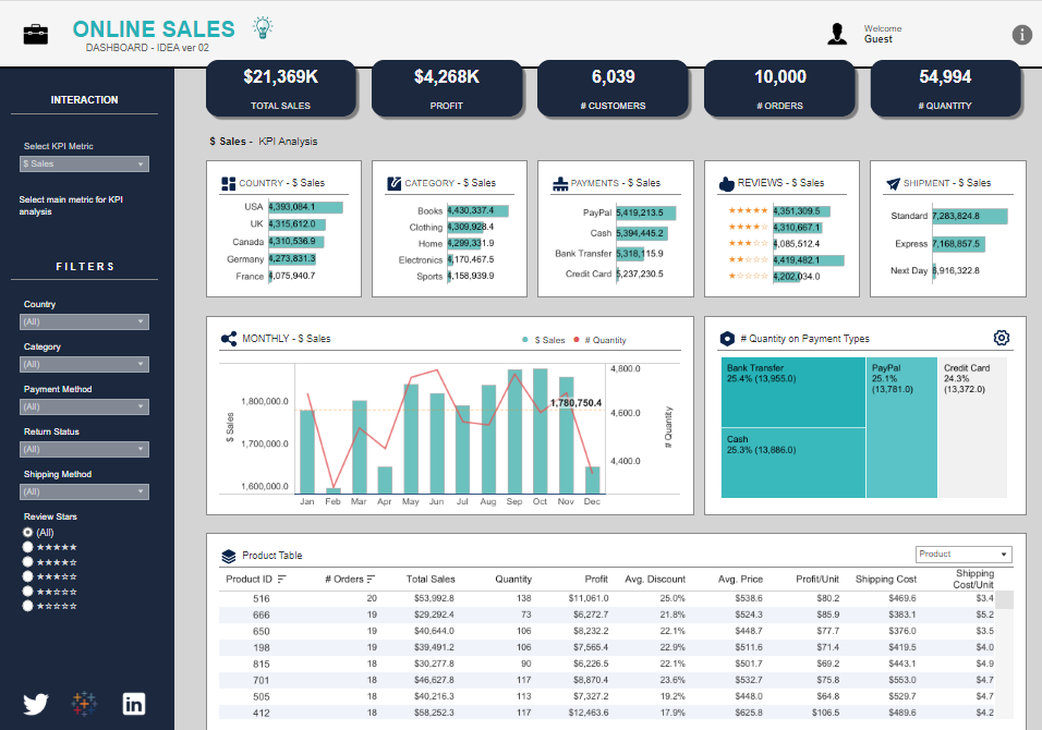
Chart Types and Layout
The retail store performance dashboard utilizes a diverse array of chart types and data representations:
- Bar and Line Charts: These charts are pivotal for visualizing sales trends over the months and analyzing sales distribution by payment type.
- Tabular Data: This format displays detailed product data, including orders, sales, quantity, and profitability.
- Numerical Indicators: These indicators show crucial statistics such as total sales, profit, customer count, and order quantity.
- Segmentation Charts: These charts provide a breakdown of sales data by country, category, payment method, and customer reviews.
Positive Aspects
The dashboard presents data cleanly and organized, facilitating quick comprehension and decision-making. Its interactive components, such as country, category, and payment method filters, allow users to customize the data view for targeted analysis.
Negative Aspects
However, the dashboard might suffer from information overload due to the high density of data points presented in a single view, potentially overwhelming users unfamiliar with complex data interfaces. Additionally, using similar color schemes across different charts could lead to visual confusion, making it difficult to differentiate between data sets quickly.
Overall, this Tableau retail dashboard example is a powerful tool for detailed sales analysis, supporting strategic decisions across multiple departments of a retail organization. While it provides comprehensive insights, enhancing its user interface to simplify navigation and improve data distinction could further optimize its effectiveness.
Conclusion
In conclusion, the effectiveness of retail dashboards in today’s competitive market cannot be overstated. Each Tableau retail dashboard example we’ve explored demonstrates just how crucial detailed analytics are to the success of any retail business. By effectively utilizing these retail analytics dashboards, companies can gain a comprehensive understanding of their operations, enabling them to make informed decisions that anticipate customer needs and drive significant business growth.
These retail dashboard examples are more than mere visual representations of data; they are strategic assets that provide actionable insights, optimize performance, and enhance customer satisfaction. For any retail organization aiming to stay ahead of the curve, investing in these sophisticated analytics tools is a step towards securing a future where data-driven decisions lead to undeniable success.
We hope that the Tableau retail dashboard examples showcased have inspired you to consider how integrating a retail sales dashboard into your strategy could revolutionize how you view your operations and impact your bottom line. Remember, in the fast-paced world of retail, being equipped with the right information at the right time is not just an advantage—it’s a necessity.