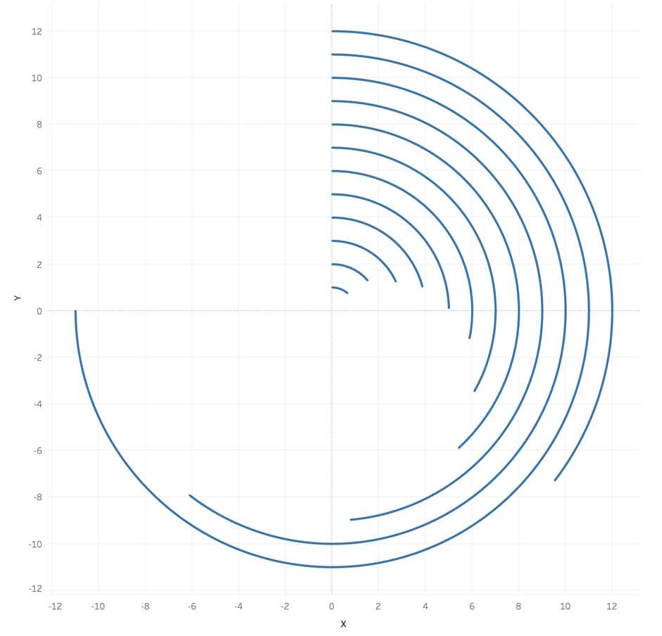
What is a Tableau Radial Rounded Bar Chart?
A Tableau Radial Rounded Bar Chart is a standard rectangle bar chart variation. The bars are arranged radially instead of on a straight axis. A Tableau Radial Rounded Bar Chart is visually appealing and you can optionally use the line ends to emphasise the stat and the end of the bars if desired.
In building this we will use internal data densification which does not require access to the data source.
Let’s create a Tableau Radial Rounded Bar Chart!
- Connect to your data source and locate the dimensions and measures that are needed to build your base visualisation for the Tableau Radial Rounded Bar Chart.
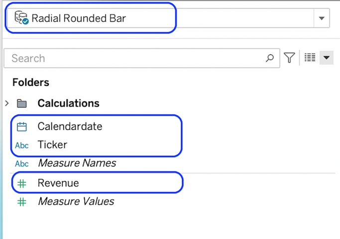
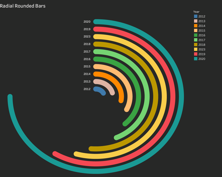
In this case, we will build a Tableau Radial Rounded Bar Chart to show revenue values for individual years. We will need:
- The Ticker dimensions.
- The Calendar Date dimension.
- The Revenue measure.
We need to use internal data densification to create more marks so we can show them in the radial.
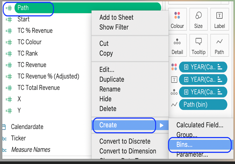
Create a calculated field. Use any dimension in your dataset.
Path
IF [Ticker] = “AMZN” THEN 0
ELSE 360
END
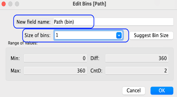
Create a bin from the path objects. Set the bin size to 1.
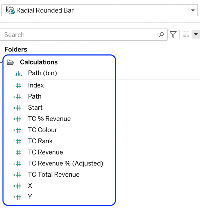
Next, we will create some calculations to make the shapes in our viz work properly. Use the names and calculations below to create them.
IndexINDEX()-1
TC RevenueWINDOW_SUM(SUM([Revenue]))
TC Total RevenueWINDOW_SUM(SUM([Revenue]))
TC Percentage[TC_Revenue]/[TC_Total Revenue]
TC Revenue % (Adjusted)
[TC_Percentage]/WINDOW_MAX([TC_Percentage])*270/360TC_RankINDEX()
X
SIN(RADIAnS([Index]*[TC Revenue % (Adjusted)]))*[TC Rank]
Y
COS(RADIANS([Index]*[TC Revenue % (Adjusted)]))*[TC Rank] At the end, you should have this calculation:
With the calculations made, we can start to build our view out. We will do this in 2 parts. 1) build out the basics of the viz structure and then 2) adjust our table calculations so that our bars are calculated correctly.
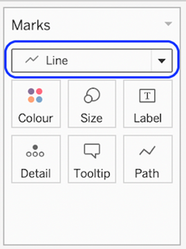
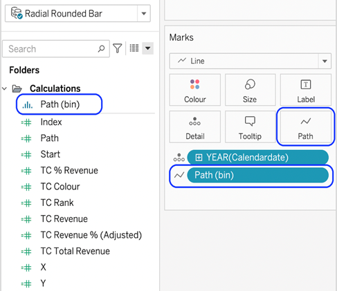
On a blank worksheet change the mark type to line.
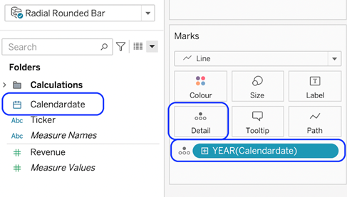
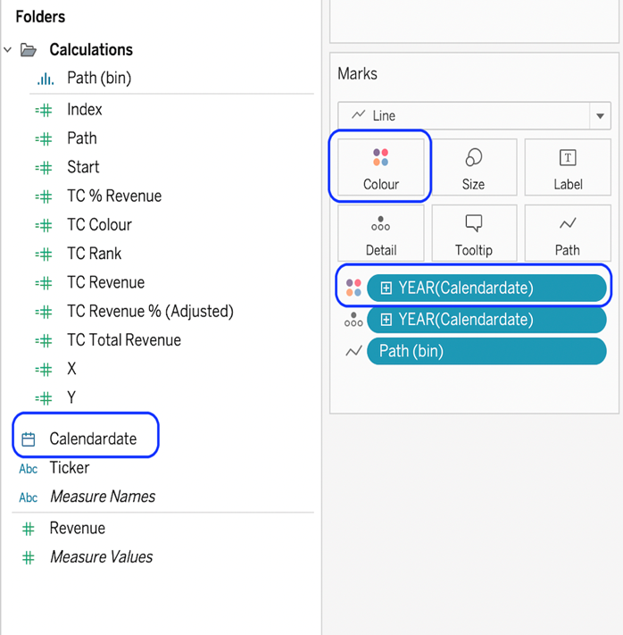
Drag the dimension to be used for each bar into the detail card. We want a bar per year, so we use the year of the calendar date.
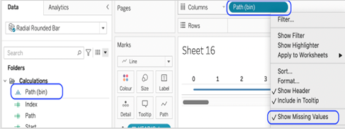
Drag the Path(bin) object onto columns and select Show Missing Values
Drag the Path(bin) object from the columns shelf onto the path card.
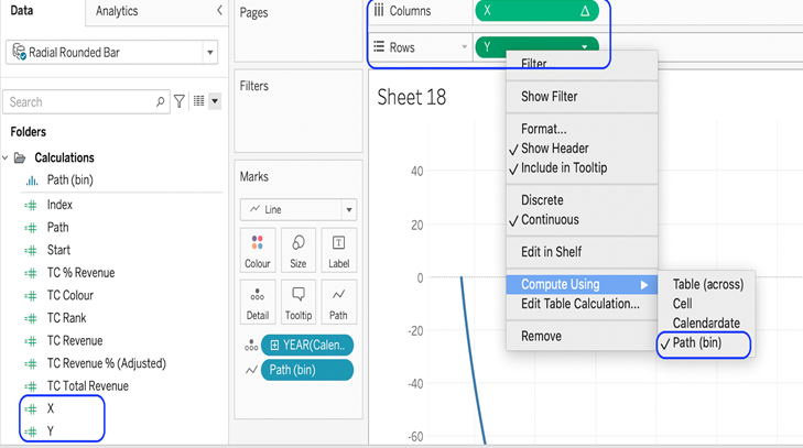
Finally, for part 1, drag X to columns and Y to rows. Compute both to use Path(bin)
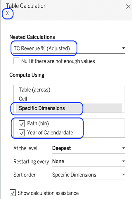
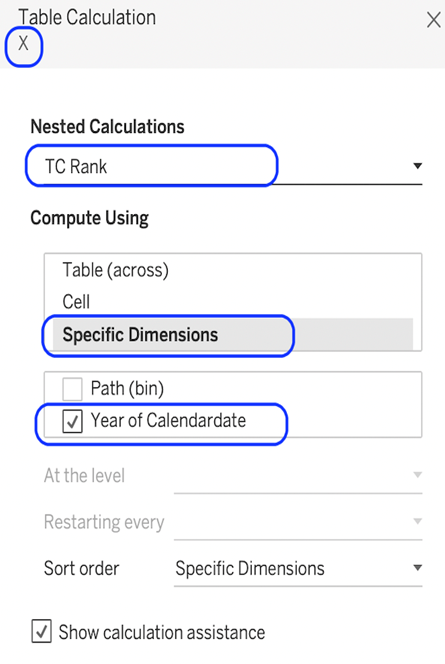
Now, we need to configure our nested table calculations, so the curves work correctly. The X and Y object calculations have several nested table calculations which all need to be specified individually to get the curves to work.
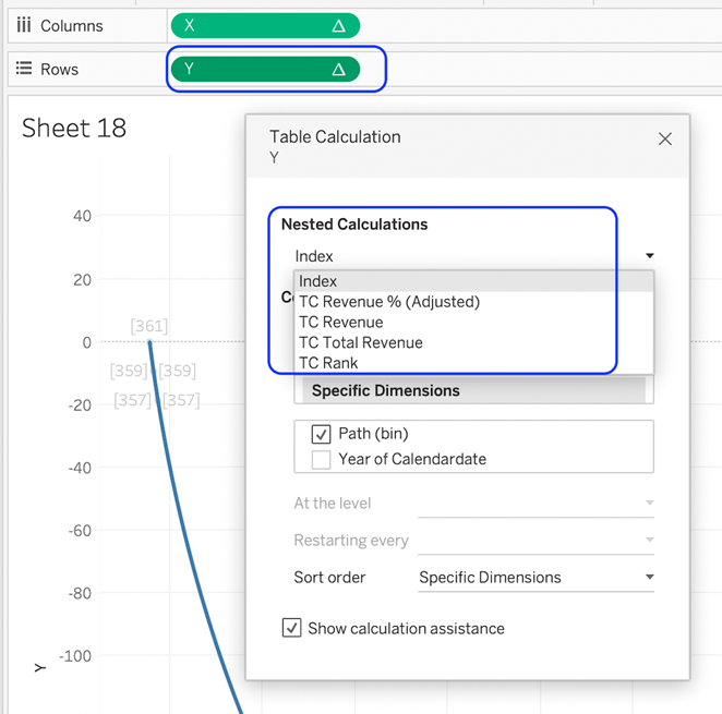
Follow these settings for each nested calculation. The compute using, objects ticked, and the order of the items in the checklist all need to match the examples below. You can move the items in the list by dragging and dropping them. You can pick the next nested calculation when you are ready, from the list at the top.
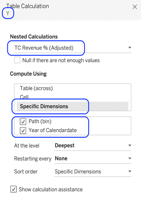
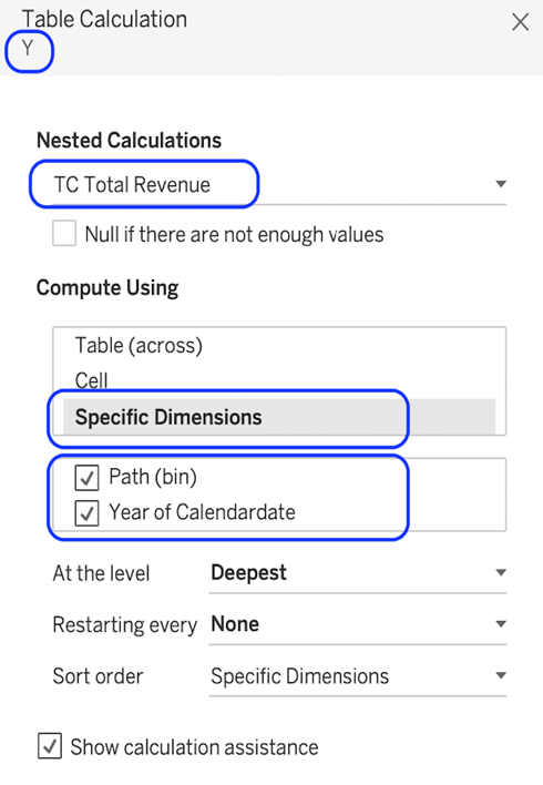

Do the same for the X-axis object.

You should now have the radial bars.
Now we just need to clean up the sheet and add some context as desired.
Add the year object to the colour.
Remove all gridlines and borders.
- Hide both X and Y axes.
- Adjust the size as desired.
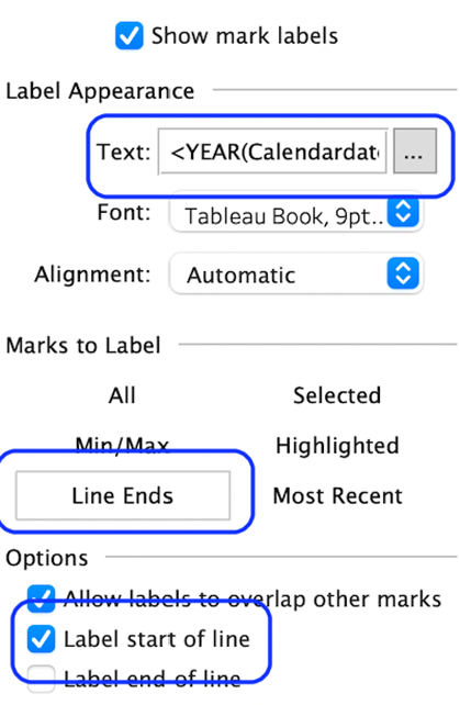
- Label the start of the bars with the selected dimension.
- Add a title.
- Change the background colour.
- Add it to a dashboard.
Congratulations! You’ve completed your Tableau Radial Rounded Bar Chart!
Well done on completing your Tableau Radial Rounded Bar Chart in record time! Hopefully, you can add this to your Tableau visualisation tools in the future.
For more on learning about how to create in Tableau, head over to our blog. For more on Tableau consulting to help your company deliver successful Tableau and data projects for finance, marketing and sales head over to our website.