Tableau Radial Charts have become tremendously popular in recent years. They’re fun, flashy, engaging, and compact. Most standard charts have a radial version, including a stacked bar chart. In this tutorial, we will introduce its radial counterpart — a radial stacked bar chart in Tableau.
Related posts:
- Building an Amazing Tableau Diverging Bar Chart in 5 Minutes
- Tableau Candlestick Charts in an Easy 7 Minutes
- 10 Minute Tutorial For a Great Tableau Shape Chart
- Create a Fantastic Tableau Radar Chart in 5 Minutes!
- How to make a Tableau Jitter Chart in 10 minutes
- How to Make an Amazing Tableau Marimekko Chart

What are Tableau Radial Charts?
Tableau Radial charts can transform X and Y (Cartesian) coordinates into polar coordinates of a unit circle. Trigonometric functions such as Radians, Pi, Sine, and Cosine are almost always used in Tableau radial charts.
Note: It is essential to have the correct data structure to follow this tutorial. There are two requirements:
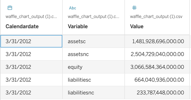
1. Variables and values need to be nested in a single column. See this screenshot for an example:
2. You must have a Path variable with two values (0 and 1) for each row. Whatever data you start with, it needs to be duplicated so that it has a Path variable with two values.
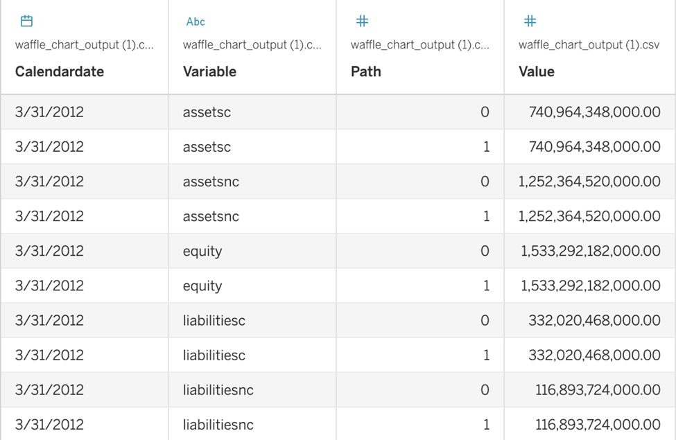
In this tutorial, we join our data to a CSV file to densify the rows. This CSV file only has one column (Path) with two rows:

To densify your data using the CSV file, access your data connection and double click the logical table (to bypass the relationships interface and access the join interface). Drag and drop the file to the right, and create a calculated join, which is a Left Join on 1=1.
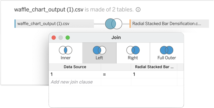
Now that your data are joined in this way, each row will be duplicated and have a Path Value of either 0 or 1.
How to make the Calculated Fields for Tableau Radial Charts
Index
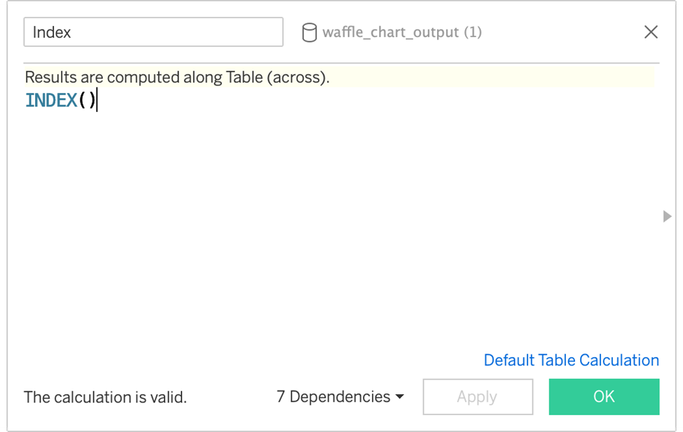
Used to determine angular placement
Index (Window Max)
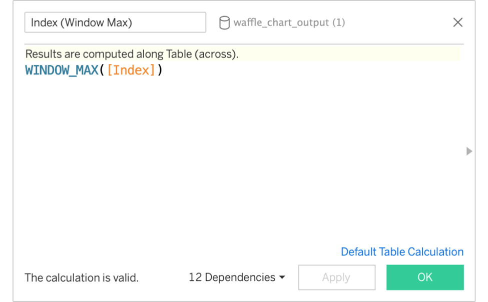
Used to determine total Marks in view (to determine the spacing between each mark)
Stacked Bar (Start)
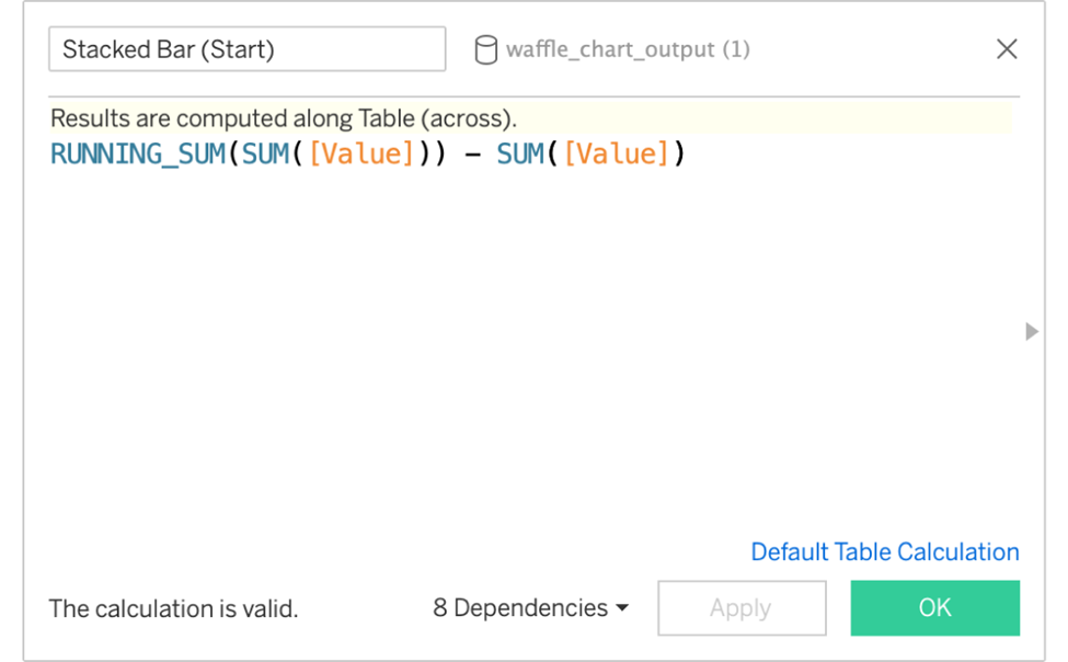
The start of each bar should be where the previous one leaves off.
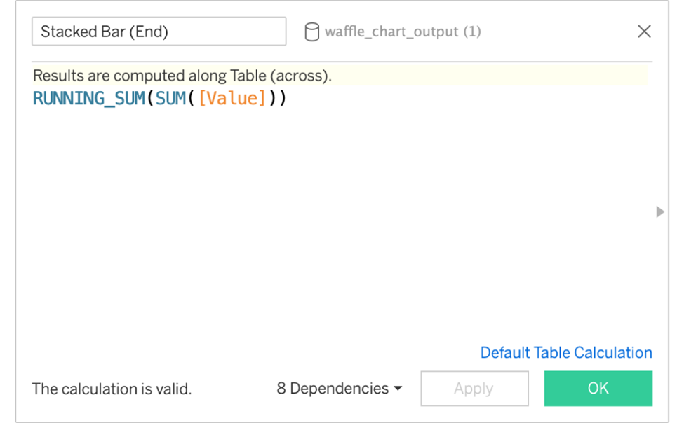
Stacked Bar (End)
The end of each bar is based on where it started and its value.
X-Start
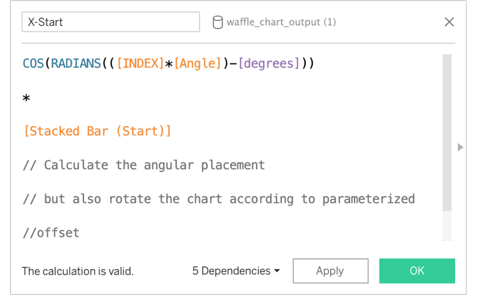
Translates the bar’s start x coordinate into polar coordinates.
X-End
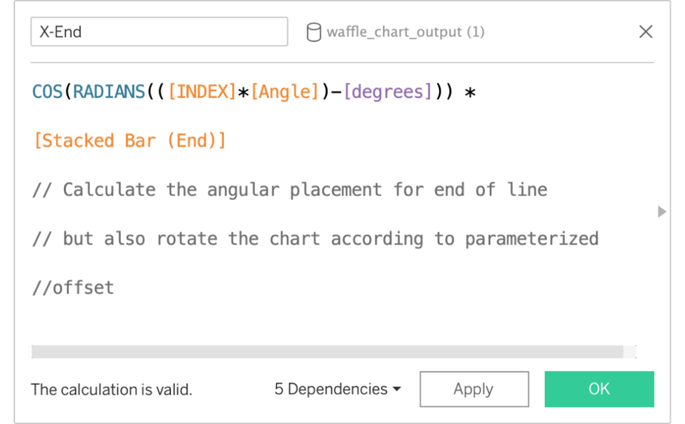
Translates the bar’s end x coordinate into polar coordinates.
Y-Start
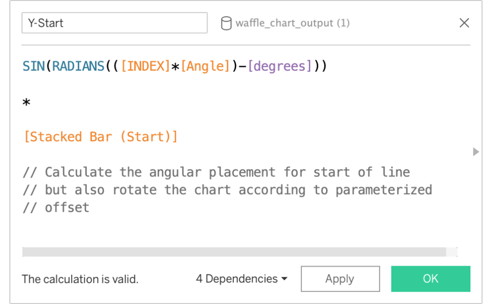
Translates the bar’s start y coordinate into polar coordinates.
Y-End
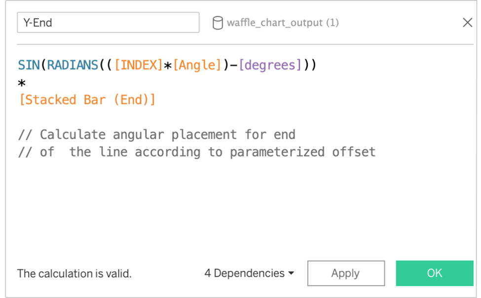
Translates the bar’s end y coordinate into polar coordinates.
Stacked Bar Size This is purely optional for Tableau Radial Charts. It is a customized calculation based on the variables in the view. It will help the chart look better by sizing the bars differently so that bars close to the origin are thin and bars further away are wider (creating a fanning-out effect).
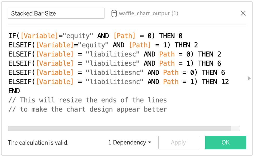
Let’s build Tableau Radial Charts that are stacked and show Equity, Liabilities, and liabilitiesnc for Amazon.
STEPS:
1. Drag the Calendar Date to the Marks Card. Convert it to Quarter and make it Discrete.
2. Drag Variable to the Marks Card.
3. Drag Path to the Marks Card.
4. Drag Ticker to the Filters Shelf. Select any corporation. We chose Amazon (AMZN)
5. Drag Variable to the Filters Shelf. Select Equity, liabilitiesc, liabilitiesnc.
6. Drag Calendar Date to the filters shelf. Filter out some data so the chart isn’t too crowded. We choose to filter from 01/10.2018 to 06/30/2023.
7. Drag X to the Columns Shelf
8. Drag Y to the Rows Shelf.
At this point, it’s a fundamental view. It will soon change as you adjust the computation for the X and Y calculations, however.
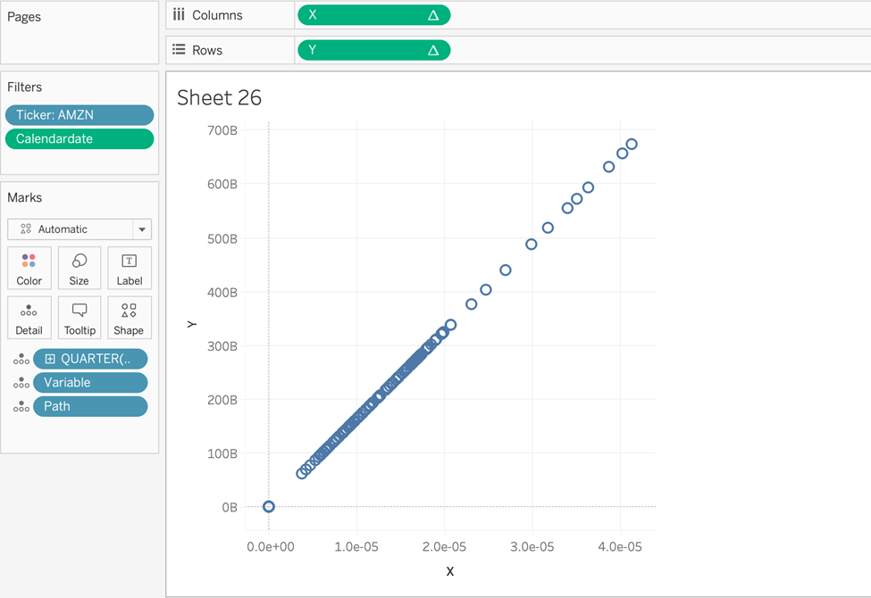
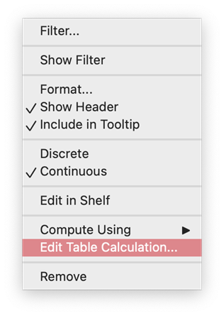
9. Hover over the X Pill and select the dropdown option “Edit Table Calculation.” Pay attention to the two areas outlined in Red. We will use both areas for the two areas outlined in Red. We will use both areas to determine how our X and Y values are computed.
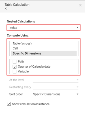
10. For Both the X and Y Pills, Edit the Nested Calculations as such:
For Index, select Specific Dimensions >> Quarter of Calendardate.
For Index (Window Max), select Specific Dimensions >> Quarter of Calendardate.
For Stacked Bar (Start), select Specific Dimensions >> Variable.
For Stacked Bar (End), select Specific Dimensions >> Variable.
The view will update with a cool spiral:
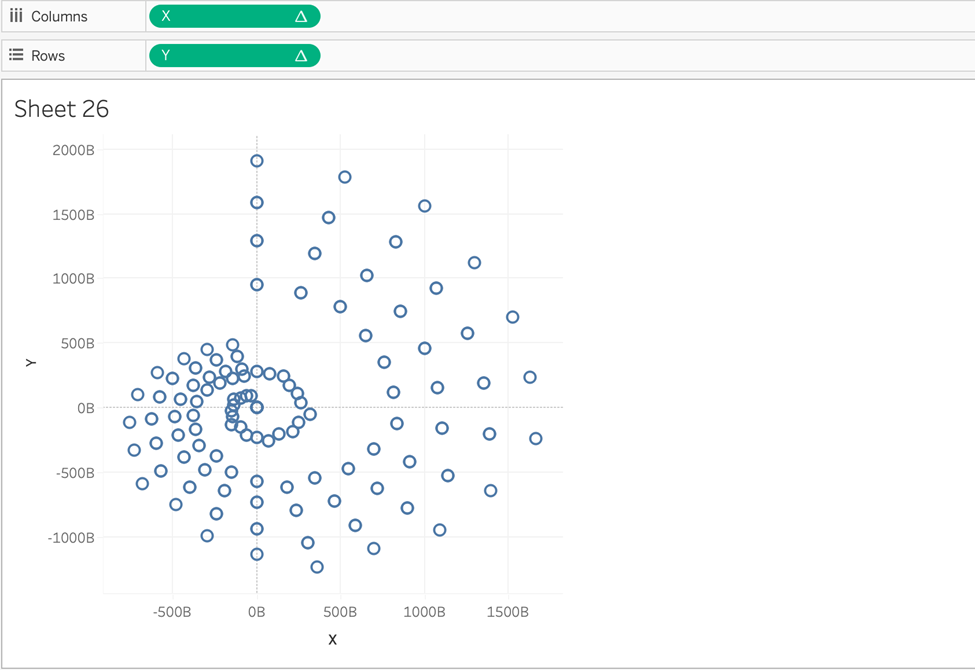
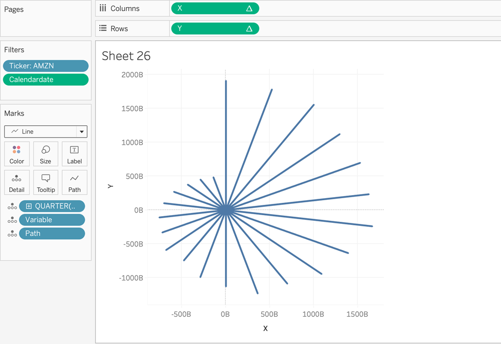
11. Change the chart type to Line (on the Marks card).
12. Drag the Variable to Color on the Marks card. 13. Drag the Stacked Bar Size to the Size on the Marks card. (Make sure to use MIN as an aggregation method)
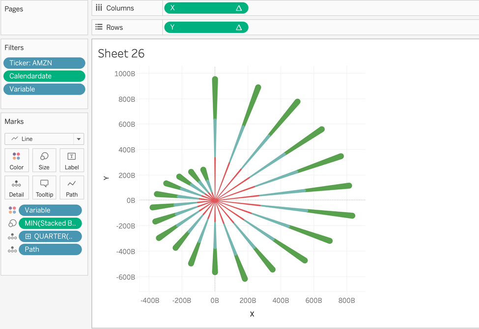
Technically… you now have a stacked Tableau radial bar chart! But let’s clean it up and make it more tidy.
Cleaning up Tableau Radial Charts
1. Add a – (negative) sign before the X pill so that the chart reverses direction. This will ensure that the direction of our dates runs clockwise rather than counterclockwise.
2. Format chart background color to #303030.
3. Remove all grid lines, axis rulers, column and row dividers, and zero lines.
4. Hide the X and Y axes so they don’t show.
5. Add an informative title.
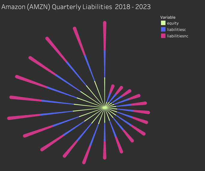
Wow, the effect of this radial bar chart appears like a firework — as if Amazon’s liabilities are exploding!
Now you can make Tableau Radial Charts!
Tableau Radial charts have become increasingly popular in the modern era. Their eye-catching look and compact form make them an excellent fit for designers tasked with creating smooth user interfaces.
We see them in nearly every mobile app, so audiences are increasingly capable of interpreting radial charts.
That said, radial charts are generally less welcome in more professional business reports. They don’t excel in presenting information in a way that is easy to compare, so use them wisely. For more tutorials on how to make various types of Tableau visualizations, visit our blog.


