This blog presents seven exemplary Tableau project management dashboards to inspire and inform project managers, executives, and data analysts.
These dashboards showcase how Tableau can transform complex project data into clear, actionable insights, enabling better decision-making and strategic planning. Explore these dashboard examples to discover innovative ways of using Tableau for project management, tracking, and analytics.
Table of Contents
Affiliate Disclosure: Some of the links on this blog are affiliate links, which means if you click on them and make a purchase, we may receive a commission at no extra cost to you. This helps support our blog and allows us to continue to create content for you. We only recommend products and services we genuinely believe in; all opinions expressed here are ours. Thank you for being so supportive!
These Tableau project management dashboards were curated from Tableau public ; we do not take credit for their creation.
#1 Project Management Dashboard
This Tableau project management dashboard provides a comprehensive overview of project metrics and key performance indicators, offering valuable insights for project managers, executives, and team members. It visualizes crucial data about ongoing projects, budget allocations, expenses, and project health, making it an indispensable tool for effective project management and decision-making.
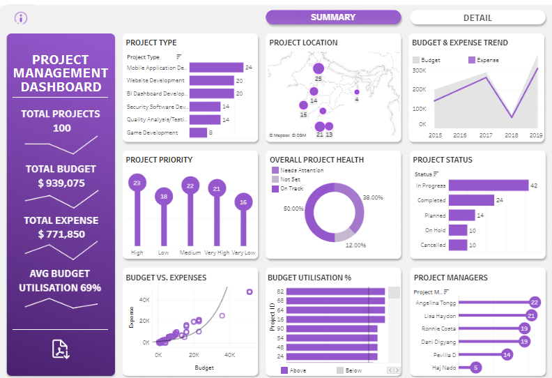
Components and Charts:
- Project Summary: The left sidebar displays the total number of projects (100), total budget ($939,075), total expense ($771,850), and average budget utilization (69%). This summary offers a quick snapshot of overall project financials.
- Project Type: A bar chart categorizes projects by type: Mobile Application Development, Website Development, BI Dashboard Development, Security Software Development, Quality Analysis/Testing, and Game Development. This chart helps in understanding the distribution of projects across different categories.
- Project Location: A bubble map shows the geographical distribution of projects, with bubbles indicating the number of projects in various locations. This visualization aids in identifying regional project concentrations.
- Budget & Expense Trend: A line chart tracks the trend of budget and expenses from 2015 to 2019, highlighting the financial trajectory and helping to forecast future budget needs.
- Project Priority: A lollipop chart displays project priorities categorized as High, Medium, Low, and Very Low, allowing managers to assess which projects need immediate attention quickly.
- Overall Project Health: A doughnut chart illustrates project health, segmented into Needs Attention, Not Set, and On Track. This chart provides a clear visual of project status distribution.
- Project Status: A horizontal bar chart shows the status of projects (In Progress, Completed, Planned, On Hold, Cancelled), offering insights into each project’s current phase.
- Budget vs. Expenses: A scatter plot compares budget versus expenses for each project, helping to identify over or under-budget projects.
- Budget Utilization %: A horizontal bar chart presents the percentage of budget utilization for each project, distinguishing between projects above and below the average budget utilization.
- Project Managers: A bar chart lists project managers and the number of projects they handle, providing a clear view of project distribution among managers.
Target Audience:
This Tableau project management dashboard is ideal for the following:
- Project Managers: To monitor project progress, financials, and health.
- Executives: To gain insights into project performance and make informed decisions.
- Team Members: To understand the status and priority of their projects.
- Financial Analysts: To track budget and expenses for better financial planning.
This dashboard facilitates effective project management by providing a detailed, visual representation of key project metrics. It enables stakeholders to make data-driven decisions and optimize project outcomes. This is a prime example of using Tableau for project management, showcasing how project management analytics can be leveraged for better results.
#2 PMO – Project Management Dashboard
Project Management Dashboard
This project management Tableau dashboard provides a comprehensive overview of various metrics, offering valuable insights for project managers, executives, and team members. It includes detailed views on total projects, budget allocations, expenses, project progress, and risk assessments, making it an essential tool for effective project management and decision-making.

Components and Charts:
- Main Dashboard Overview:
- The main dashboard summarises total projects, categorized by priority (high, medium, low) with corresponding risk levels. It includes vital financial metrics such as total budget, total consumed budget, and budget utilization percentage. This overview helps quickly assess the overall project portfolio.
- Project Lists and Details:
- The right side of the main dashboard lists all projects with details like project name, category, risk level, budget, budget utilization, progress percentage, and days left. This section allows for a quick comparison and status check of all ongoing projects.
- Project Progress and Budget Details: The section provides an in-depth view of individual project progress and budget consumption. It features progress bars for project completion percentage and budget consumed, clearly visualizing the current status.
- Progress Evolution Bar Chart: A bar chart shows the selected project’s monthly progress evolution, highlighting milestones and comparing planned versus actual progress. This chart helps track the project’s trajectory over time.
- Budget Evolution Bar Chart: Another bar chart depicts the budget evolution, showing the monthly expenditure and remaining budget. This visualization assists in monitoring financial health and ensuring the project stays within budget.
- Interactive Filters and Selection: The dashboard includes interactive filters that allow users to select different projects, categories, and risk levels. Users can drill down into specific projects to get detailed information and insights, making it a highly customizable tool for project management.

#3 Project Management Dashboard
Project Management Dashboard
This project management Tableau dashboard provides an in-depth overview of various project metrics, offering valuable insights for project managers, executives, and team members. It includes detailed views on project schedules, budgets, payments, RFIs (Requests for Information), and weather impacts on project timelines. This comprehensive tool is essential for effective project management and decision-making.

Components and Charts:
- Project Activity Schedule: The main section displays a Gantt chart outlining the project phases, milestones, and activities. It includes detailed timelines for planning, design, construction, and close-out phases, helping managers track progress and adherence to the schedule.
- Budget and Payments: Line and bar charts show the total payments and payments by period on the right side. These charts clearly visualise budget allocation, forecast, and actual expenditures, allowing for effective financial management.
- Financials by Phase: A detailed table presents the financial breakdown by project phase, including budget, forecast, variance, and actual costs. This table is crucial for identifying any budget overruns or savings.
- RFIs Over Time: The second dashboard features a bar chart illustrating the number of RFIs opened over time, categorized by their status (submitted, returned, rejected, withdrawn, approved). This visualization helps understand the volume and resolution of RFIs during the project.
- RFI Details: A detailed table lists all RFIs with information such as document description, trade, priority level, document status, and days open. This section provides a comprehensive view of all outstanding and resolved RFIs.
- Weather Analysis: The third dashboard includes a line chart showing weather data (temperature and precipitation) over time. This chart helps analyse how weather conditions have impacted project timelines and activities.
- RFIs/Submittals/Bulletins by Date Range: Additional bar charts show the average number of RFIs, submittals, and bulletins opened monthly, providing insights into document flow and project communication efficiency.
- Interactive Filters and Selection: The dashboards include interactive filters that allow users to select different sites, projects, document types, priority levels, and document statuses. Users can also adjust date ranges to focus on specific periods, making it a highly customizable tool for project management analytics.

#4 Project Management Dashboard | Material Design
Project Management Dashboard
This Tableau project management dashboard provides a comprehensive overview of various metrics, offering valuable insights for project managers, executives, and team members. It includes detailed views on total projects, budget allocations, expenses, project progress, and risk assessments, making it an essential tool for effective project management and decision-making.

Components and Charts
The main dashboard offers a summary of the total projects (83), expenses ($545,500), budget ($856,220), and budget utilization (64%). This overview helps quickly assess the overall project portfolio and financial health.
The bar chart categorizes projects by type: Facilities, Security Services, Performance Management, Network Services, Client Service, and Research Support. This chart helps in understanding the distribution of projects across different categories.
The bubble map shows the geographical distribution of projects, with bubbles indicating the number of projects in various locations. This visualization aids in identifying regional project concentrations.
The line chart tracks the trend of budget and expenses over time, highlighting the financial trajectory and helping to forecast future budget needs.
The lollipop chart displays project priorities categorized as Very Low, Low, Medium, High, and Very High, allowing managers to assess which projects need immediate attention quickly.
The doughnut chart illustrates project health, segmented into Not Set, On Track, and Needs Attention. This chart provides a clear visual of project status distribution.
The horizontal bar chart shows the status of projects (In Progress, Completed, Planned, On Hold, Cancelled), offering insights into each project’s current phase.

The scatter plot compares budget versus expenses for each project, helping to identify projects that are over or under budget.
The horizontal bar chart presents the percentage of budget utilization for each project, distinguishing between projects above and below the average budget utilization.
The bar chart lists project managers and the number of projects they are handling, providing a clear view of project distribution among managers.
Project Details Dashboard
A detailed table lists all projects with information such as project name, type, location, manager, priority, start and end dates, expense, budget, budget utilization percentage, and status. This table provides a comprehensive overview of each project’s specifics and current status.
The dashboard includes interactive filters for project details, type, location, timeline, and manager, allowing users to focus on specific projects and analyze details efficiently.
This Tableau project management dashboard is ideal for project managers, executives, team members, and financial analysts looking to monitor and optimize project performance, budget allocation, and overall project health.
#5 Project Tracking Dashboard POC
Project Status Board
This Tableau project management dashboard provides a detailed overview of project statuses, focusing on activities in progress and their respective stages. It is a vital tool for project managers, team leaders, and executives who need to monitor the status of multiple projects and ensure timely completion.

Components and Charts
Active Projects Summary:
The top section of the dashboard displays a summary of active projects categorized by priority (A, B, C). It includes key metrics such as the number of projects on pace, off pace, past due, and delayed. This summary provides a quick snapshot of the overall project performance, highlighting areas that may require immediate attention.
Project List:
The main section lists detailed information for each project, including Project ID, Priority, Project Manager, Change Type, Planning Code, Planned Code, and Percentage Completion. This table allows users to track specific details and progress for each project, facilitating better management and oversight.
Activity Status:
A detailed breakdown of activity statuses is provided to the right of the project list. Each project’s activities are tracked across various stages, such as High-Level System Design, Subsystem Specification, Design & Code Review, Testing, and others. The status of each activity is indicated using different symbols:
- Green Checkmark: Completed
- Gray Circle: In Progress
- Yellow Triangle: Delayed
- Empty Circle: In Queue
This visual representation allows project managers to quickly assess the status of each activity and identify any delays or bottlenecks that need to be addressed.
Interactive Features:
The dashboard includes interactive filters allowing users to sort and filter projects by criteria such as priority, project manager, and change type. This functionality lets users focus on specific projects or activities and analyze details efficiently.
#6 IT Project Dashboard
Project Oversight Dashboard
This Tableau project management dashboard offers a detailed overview of IT projects under oversight, focusing on planned spending, project timelines, and overall health assessments. It is a crucial tool for project managers, executives, and stakeholders who must monitor project status, budget allocations, and performance metrics.

Components and Charts
Total Planned Spend:
At the top of the dashboard, key metrics such as Total Planned Spend ($2,567,182,548), Number of Agencies (35), and Number of IT Projects (81) are displayed. These figures provide a high-level summary of the financial and administrative scope of the projects under oversight.
Total Planned Spend by Agency:
A horizontal bar chart breaks down the total planned spending by the agency. It highlights the top agencies with the highest planned expenditures, such as Washington Technology Solutions and the Office of Financial Management. This chart helps identify which agencies are allocating the most resources to their IT projects.
Total Planned Spend by IT Project:
Another horizontal bar chart details the planned spending by individual IT projects. Projects like the One Washington Program and the Enterprise Foundational HR and Payroll Systems are prominently featured, indicating significant financial investments. This chart allows users to see which projects are the most financially intensive.
Project Timeline:
A Gantt chart visualizes the timeline for each project, indicating their start and end dates along with their current status (Green, Yellow, Red, Pending). This timeline clearly shows project durations and progress, helping track milestones and deadlines.
Project Phase:
A stacked bar chart shows the number of projects in different phases, such as Planning, Procurement, Implementation, and Closeout. This chart helps understand the distribution of projects across various stages of development and execution.
WaTech Overall Health Assessment:
A bar chart presents the overall health assessment of the projects, categorized into Green (on track), Yellow (at risk), Red (off track), and Pending. This chart is crucial for quickly assessing all projects’ health status and identifying those requiring attention.
Interactive Filters:
The dashboard includes interactive filters for project status, biennium start and end dates, agency, and project name. These filters allow users to customize the view and focus on specific projects or periods, enhancing the dashboard’s usability for detailed analysis.
This Tableau project management dashboard is designed to provide comprehensive insights into the status, financials, and health of IT projects, making it an essential tool for effective project management and strategic decision-making.
#7 Project Management Dashboard
Project Management Dashboard
This Tableau project management dashboard offers a detailed overview of various project metrics, providing valuable insights for project managers, executives, and team members. It includes comprehensive views on open projects, budget consumption, progress by department, and risk assessments. This tool is essential for effective project management and strategic decision-making.

Components and Charts
Open Projects Summary:
A summary at the top of the dashboard indicates the number of open projects (15) and the percentage of the consumed budget (60% of the total budget). This summary offers a quick snapshot of the overall project portfolio and budget utilization.
Departmental Progress:
Four panels display progress by department: Digital Intelligence, Human Resources, Information Technology, and Production & Quality. Each panel includes a progress bar and visual indicators to show the percentage of project completion within each department. This helps identify which departments are on track and which require attention.
Time Spent on Open Projects:
A bar chart illustrates the percentage of time spent on open projects for each department. This visualization helps us understand how time is allocated across different projects and departments.
List of Open Projects:
A detailed table lists all open projects, including project name, percentage of consumed budget, priority, progress percentage, end date, and risk level. This table allows users to track specific details and progress for each project, facilitating better management and oversight.
Budget Consumption by Priority:
A horizontal bar chart shows the percentage of the total budget consumed by high, medium, and low-priority projects. This chart helps explain how the budget is allocated according to project priority levels.
Interactive Filters:
On the right side, the dashboard includes interactive filters for project category, manager, priority, and risk. These filters allow users to customize the view and focus on specific projects or categories, enhancing the dashboard’s usability for detailed analysis.
This Tableau project management dashboard is ideal for project managers, executives, team members, and financial analysts. It provides a detailed, visual representation of key project metrics, enabling stakeholders to make data-driven decisions and optimize project outcomes.
Elevate Your Project Management with Tableau
Incorporating Tableau project management dashboards can revolutionize how you oversee projects, providing clear, actionable insights at every stage. These seven examples illustrate the power of using Tableau for project management, showcasing its ability to transform complex data into intuitive visualizations. Whether you’re an executive, project manager, or data analyst, leveraging a Tableau project tracking dashboard will enhance your strategic planning and decision-making processes. Dive into these Tableau project management dashboard examples and unlock the full potential of project management analytics to drive your projects to success.