This blog post is a comprehensive guide to Tableau period comparison. Tableau data analysis offers a powerful lens for comparing current performance against historical benchmarks. It provides deep insights into trends, progress, and focal points. Our review of compelling Tableau visualizations reveals the best strategies for period comparison.
Table of Contents
Current and Previous Tableau Period Comparison
When scrutinizing immediate data in Tableau, focus on the actual figures. Utilize the third option to spotlight the contributors in the ongoing period.
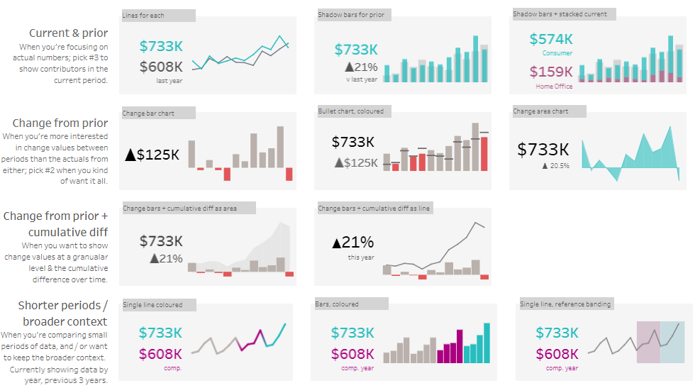
Lines for Each (Current & Prior)
Tableau’s line chart compares two periods, with one line for the current and another for the previous period, which is ideal for tracking trends and comparing recent performance directly against past data.
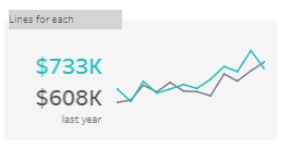
Shadow Bars for Prior (Shorter Periods / Broader Context)
This chart overlays transparent bars, representing the prior period over the solid bars of the current period in Tableau, facilitating a direct period comparison within the same visual frame.
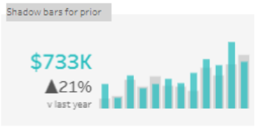
Shadow Bars + Stacked Current (Segmented Data)
A composite chart in Tableau where current data is stacked atop shadow bars of the prior period, allowing for a segmented and detailed period comparison.
Variation from Previous Period
If your interest lies more in how the numbers have shifted than the exact figures from either period, option #2 is your go-to for a comprehensive view.
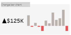
Change Bar Chart (Change from Prior)
Tableau’s vertical bars represent the shift in values from one period to the next, with bar length indicating the change magnitude, spotlighting the most significant period shifts.
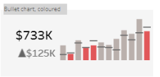
Bullet Chart, Colored
A Tableau bullet chart presents performance data against a goal. It specifies a primary metric and a change indicator, with colours differentiating historical from recent data points.
Change Area Chart
Tableau’s change area chart graphically represents time fluctuations. It displays a current value with a change percentage, marking growth or variation from a previous point.
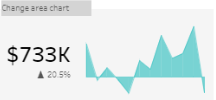
Tableau Period Comparison – Progression Plus Accumulated Change
Combining change values with a running total difference is the ideal approach for those who need to illustrate the detailed fluctuations and the overall progression over time.
Current & Prior: Line Charts for Clarity
Tableau’s dual-line chart delineates current data against historical figures, emphasizing the current period’s contributors and providing a performance trajectory.

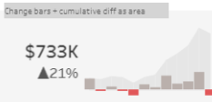
Change Bars + Cumulative Diff as Area (Change from Prior + Cumulative Diff)
In Tableau, this chart type merges bar and area graphs, highlighting period changes and a cumulative trend line, indicating a year’s overall upward progression.
Condensed Timeframes within a Larger Scope
When comparing shorter data sets while maintaining an awareness of the more comprehensive timeline, opt for a view that juxtaposes the current period with a more extended past, such as the current year, against the three previous years.
Shorter Periods: Mixed Charts for Context
Tableau’s mixed chart combines single lines for current and comparative periods with colour-coded bars, offering visual distinction for short-term performance within a broader context.
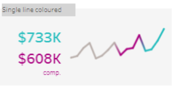
Single Line Coloured (Shorter Periods / Broader Context)
This simple line chart uses a single line, color-highlighted to distinguish between the current and the comparison periods. It’s a straightforward way to visualize data over a short time span.
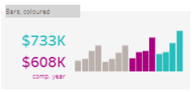
Bars, Coloured, Comp. Year (Shorter Periods / Broader Context)
Here, coloured bars represent different periods (for example, the current year versus the comparison year) side by side. This is useful for comparing specific points in time between two distinct periods.
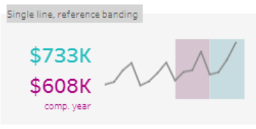
Single Line, Reference Banding (Shorter Periods / Broader Context)
A line chart that includes shaded bands to indicate reference ranges or targets. The line represents the data points, and the bands provide a visual benchmark for assessing the data against expected performance levels.
Wrapping Up Tableau Compare Two Periods
Crafting a narrative with Tableau’s visualization tools for current versus historical data is nuanced. By choosing suitable chart types and elements, you transform data into compelling narratives that inform decision-making. Always customize your Tableau visualization to your audience and goals, ensuring insights are actionable and clear.