This blog post highlights seven standout Tableau Olympics dashboards that offer unique insights into the Games, including medal distributions, athlete performance, historical trends, and country-specific achievements. Whether you’re a sports analyst, data enthusiast, or an Olympics fan, these dashboards showcase how Tableau can transform complex Olympic data into compelling, interactive visual stories.
Each example demonstrates different aspects of Tableau’s capabilities, inspiring anyone interested in exploring Olympic data or creating their own sports analytics dashboards.
Table of Contents
1. Best Countries at the Olympic Games
Olympic Games Performance Dashboard
This visually striking Tableau Olympics dashboard offers an in-depth analysis of various countries’ performance at the Olympic Games. The central theme focuses on the distribution and total number of medals won by the top 25 countries since the Olympics’ inception in 1896. The dashboard is an essential tool for sports analysts, enthusiasts, and anyone interested in understanding the historical success of different nations in the Olympic Games.
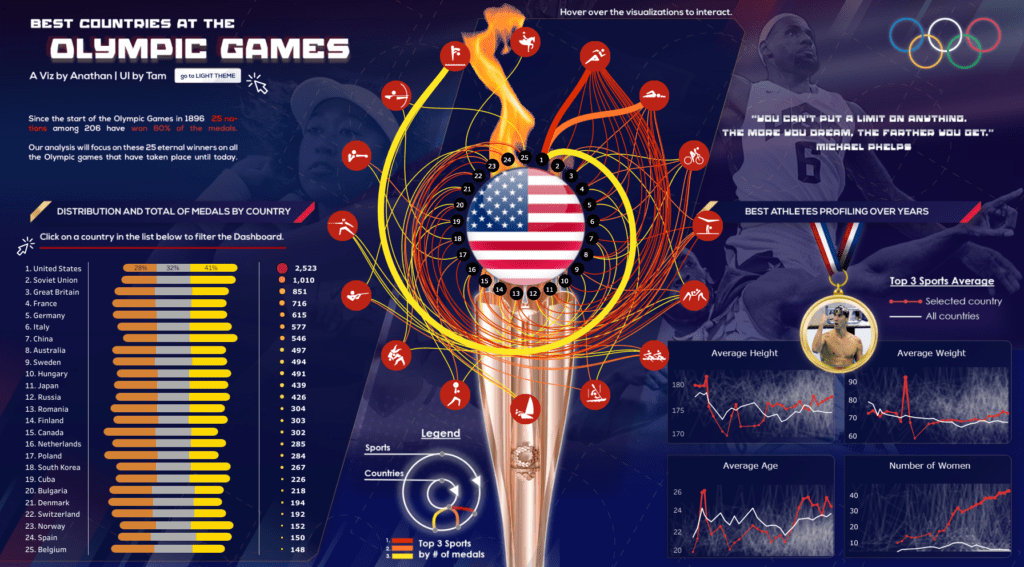
Components and Charts
Medal Distribution by Country:
A horizontal bar chart on the left side of the Tableau Olympics dashboard ranks the top 25 countries by the number of medals won. The chart is colour-coded to represent the proportion of gold, silver, and bronze medals, clearly comparing each country’s achievements. The United States, Soviet Union, and Great Britain lead the chart, showcasing their dominance in the Olympics.
Interactive Medal Flow Visualization:
At the centre of the Tableau Olympics, analytics is a dynamic and interactive flow visualization that links top-performing countries to the sports where they have won the most medals. The visualization uses coloured lines to connect countries to their most robust sports, illustrating the relationships between nations and their Olympic success. This feature allows users to explore which sports have contributed most significantly to each country’s medal count.
Athlete Profiling Over the Years:
In the bottom right section of this Tableau Olympics dashboard, line charts depict various athlete metrics, including average height, weight, age, and the number of female participants over the years. The red line represents the selected country, while the white line indicates the global average across all countries. These charts provide insights into the physical attributes of Olympic athletes and how they have evolved.
Top 3 Sports Averages:
A highlighted section compares the selected country’s performance across its top three sports with the global average. This comparison allows users to gauge a nation’s relative strength in specific sports categories.
This Tableau Olympics dashboard combines various data visualization techniques to present a comprehensive and interactive historical performance analysis. It is a valuable resource for anyone interested in Tableau Olympics analytics.
2. 120 Years of Olympics
120 Years of Olympics Dashboard
This Tableau Olympics dashboard provides a comprehensive overview of the Olympic Games, covering over 120 years of history. The dashboard is an invaluable resource for sports analysts, historians, and enthusiasts who want to explore the evolution of the Olympics, the performance of different countries, and athletes’ physical characteristics over time.
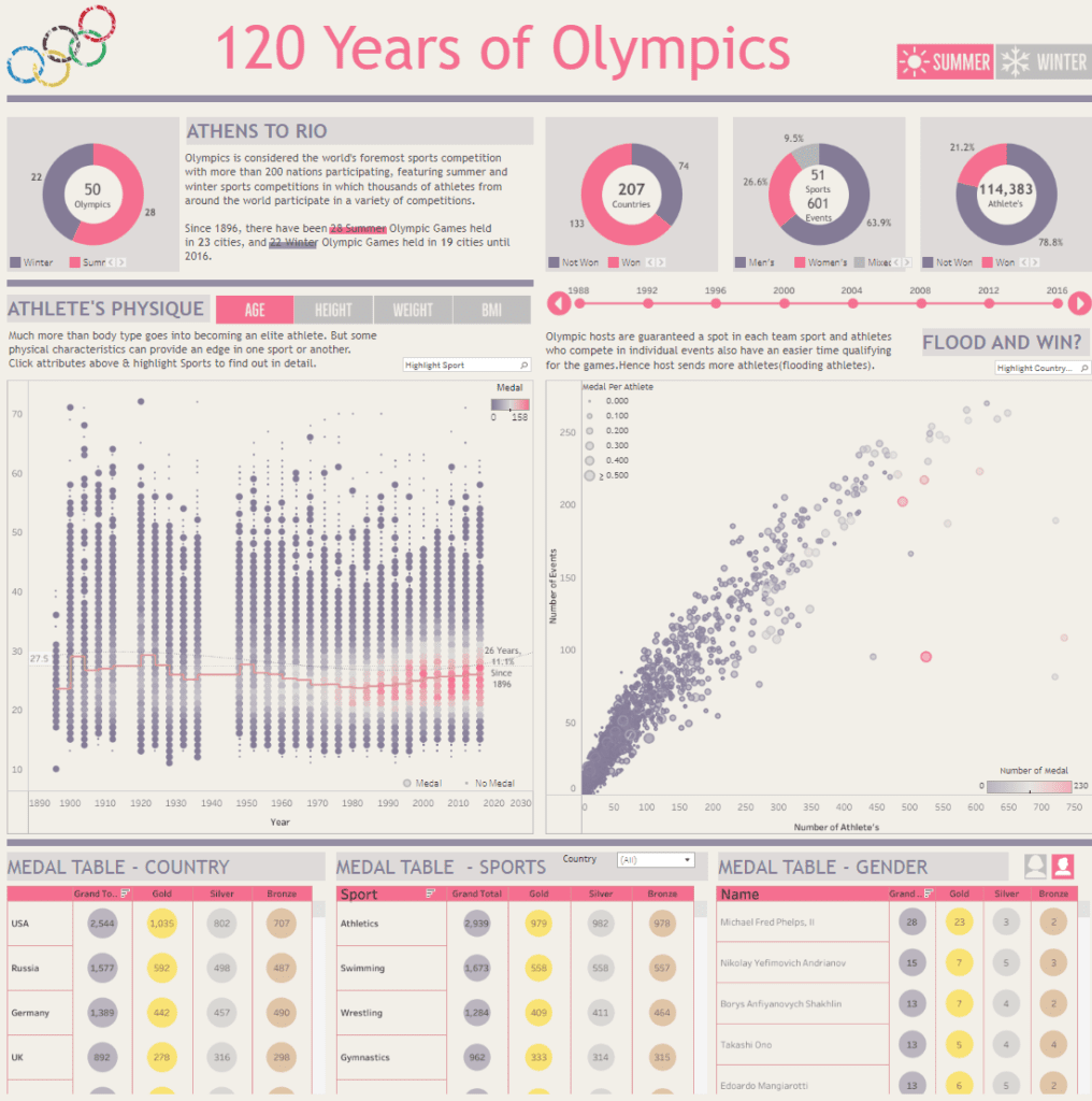
Components and Charts
Top Section Overview:
The top section of the Tableau Olympics dashboard features critical metrics such as the number of Olympic Games held (50), the number of participating countries (207), and the total number of athletes (114,383). Doughnut charts effectively highlight the global scale and growth of the Olympics over the years.
Athlete’s Physique Analysis:
A scatter plot in the dashboard’s centre examines the physical attributes of Olympic athletes, including age, height, weight, and BMI. The chart shows how these attributes have evolved, with athletes grouped by whether they won a medal or not. This analysis offers insights into the ideal physical profiles associated with Olympic success.
Medal Distribution Over Time:
A timeline chart tracks the number of medals won by athletes over the years, illustrating the relationship between the number of athletes a country sends to the Olympics and the number of medals they win. This Tableau Olympics analytics feature allows users to explore the impact of sending larger teams, often called “flooding.”
Medal Tables:
The bottom section of the dashboard includes three medal tables, breaking down medal counts by country, sport, and gender. The tables allow users to compare the success of different nations, sports, and individual athletes and provide a detailed analysis of Olympic performance.
Overall, this Tableau Olympics dashboard leverages various data visualization techniques to deliver a deep, interactive analysis of the Olympic Games. It is an essential tool for those interested in Tableau Olympics analytics and sports history.
3. Women In Olympics
Women in Olympics Dashboard
This Tableau Olympics dashboard offers a focused analysis of female participation in the Olympic Games, highlighting the progress toward gender equality in sports. It serves as an essential tool for sports analysts, gender equality advocates, and enthusiasts interested in the evolution of women’s representation in the Olympics over time.
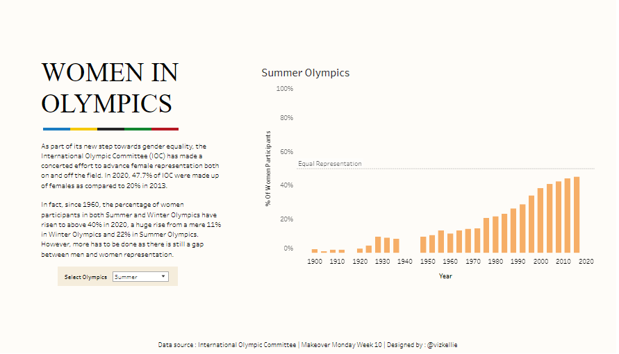
Components and Charts
Narrative Section:
The left side of the dashboard features a detailed narrative that provides context about the International Olympic Committee’s (IOC) efforts to promote gender equality. It highlights vital statistics, such as the percentage of women in the IOC and increased female participation in the Summer and Winter Olympics since 1950. The narrative underscores the strides made in gender equality while acknowledging the ongoing gap between male and female representation in the Games.
Bar Chart – Summer Olympics:
The primary visual element of this Tableau Olympics dashboard is a bar chart on the right, which tracks the percentage of women participants in the Summer Olympics from 1900 to 2020. Each bar represents a specific Olympic year, illustrating a steady increase in female participation. The chart communicates the significant progress toward gender equality, with noticeable growth in the percentage of women athletes in recent decades.
Interactive Dropdown:
Beneath the narrative, an interactive dropdown menu allows users to toggle between the Summer and Winter Olympics. This feature enables a comparative analysis of female representation across different Olympic seasons, providing a broader understanding of the strides made toward gender equality in both events.
Overall, this Tableau Olympics analytics dashboard effectively uses data visualization to showcase the evolution of female participation in the Olympic Games, making it a valuable resource for analyzing the impact of gender equality initiatives in sports.
4. Summer Olympics History
History of the Summer Olympics Dashboard
This Tableau Olympics dashboard offers a comprehensive visual representation of the evolution of sports and disciplines in the Summer Olympic Games from 1896 to 2008. It is an essential tool for sports historians, enthusiasts, and analysts interested in exploring the history and development of Olympic events over time.
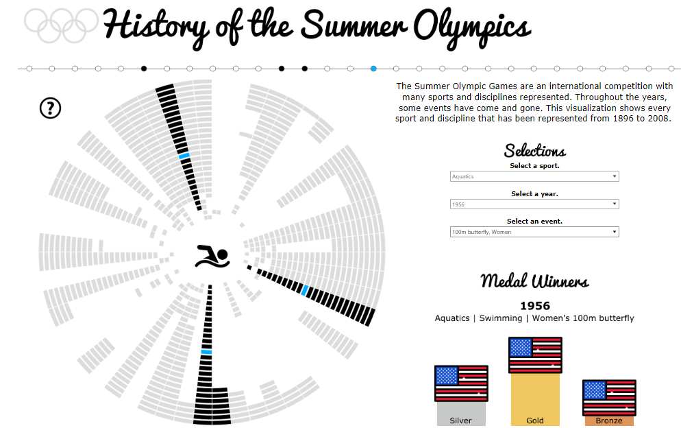
Components and Charts
Radial Timeline Visualization:
The dashboard’s central feature is a distinctive radial timeline that showcases the history of every sport and discipline represented in the Summer Olympics. Each spoke of the radial chart corresponding to a different sport, with segments extending outward to indicate the years that sport was included. This chart effectively illustrates the continuity or discontinuity of events, making it easy to identify which sports have been consistently present and which have been introduced or discontinued over the years.
Interactive Selections:
To the right of the radial chart, users can interact with dropdown menus to select a specific sport, year, and event. This interactivity allows users to focus on particular areas of interest and delve into detailed information about the chosen sport or event. The radial chart dynamically reflects the selections, highlighting the relevant segments and providing a customized data view.
Medal Winners Section:
Below the interactive selections, the dashboard features a medal winners section that displays the results for the selected event. This section shows the countries that won gold, silver, and bronze medals in the chosen event, along with their flags. This clear visualization makes it easy to identify the top-performing countries in each Olympic discipline.
Narrative Context:
The dashboard includes a narrative on the right side, explaining the significance of the visualizations and providing context about the Summer Olympic Games. This narrative helps users understand the dashboard’s purpose and how to interpret the presented data.
Overall, this Tableau Olympics dashboard skillfully combines a creative radial timeline with interactive features and medal data to offer an engaging exploration of the history of the Summer Olympic Games, making it a valuable resource for those interested in the evolution of Olympic sports.
5. Men’s Javelin Throw – Olympics
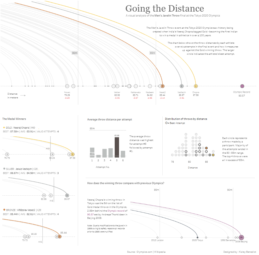
Going the Distance: Javelin Throw Analysis Dashboard
This Tableau Olympics dashboard comprehensively analyses the Men’s Javelin Throw final at the Tokyo 2020 Olympic Games. It meticulously breaks down each athlete’s performance, focusing on throw distances across their attempts and comparing them to the Olympic record and the gold-winning throw. This dashboard is a valuable resource for sports analysts, coaches, and enthusiasts interested in the detailed aspects of athletic performance in javelin throw events.
Components and Charts
Throw Distances Visualization:
The dashboard’s main feature is a curve plot that charts the throw distances achieved by each athlete in their final event attempts. Larger circles mark the best throws of each athlete, with Neeraj Chopra’s gold-winning throw prominently displayed. This visualization clearly shows the range and consistency of each competitor’s performance.
Medal Winners Comparison:
In the bottom left, line charts focus on the best throws of the gold, silver, and bronze medalists. These charts provide a detailed comparison, highlighting the precision and distance the top three athletes achieved.
Average Throw Distance per Attempt:
A bar chart in the dashboard’s centre displays the average throw distance per attempt. The chart indicates that the longest throws typically occurred on the first or last attempts, offering insights into athletes’ performance strategies.
Distribution of Throws by Distance:
A dot plot showcases the distribution of all throw attempts by distance, emphasising the best throws. Most throws fall within the 80-85m range, with a few surpassing 85m, providing a clear view of how distances were distributed across all attempts.
Comparison with Previous Olympics:
A line chart at the bottom compares Chopra’s winning throw to those from previous Olympic Games, showing that his throw was among the top performances in recent history, just shy of the Olympic record.
Overall, this Tableau Olympics dashboard uses various data visualization techniques to deliver an in-depth analysis of the Men’s Javelin Throw final. It is an essential tool for understanding elite athletic performance in this event.
6. Stripped Olympic medals
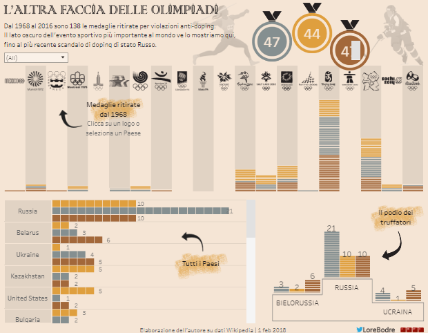
The Dark Side of the Olympics Dashboard
This Tableau Olympics dashboard delves into the controversial aspects of the Olympic Games, focusing on the withdrawal of medals due to anti-doping violations. From 1968 to 2016, this dashboard visually highlights the 138 medals retracted due to doping scandals. It is a crucial resource for sports historians, analysts, and anyone interested in the ethical challenges surrounding the world’s most prestigious sporting event.
Components and Charts
Medals Stripped Over Time:
At the top, a timeline displays the number of medals withdrawn from each Olympic Games since 1968. This timeline is represented by a series of bar charts, where each bar corresponds to a specific year and shows the number of medals retracted. The bars are colour-coded to indicate the type of medals (gold, silver, bronze) stripped, providing a clear and chronological view of doping incidents throughout the years.
Medals by Country:
The left side of the dashboard features an interactive section where users can select a country by clicking on its national Olympic icon. This interaction triggers a detailed breakdown of how many medals each country has lost due to doping violations. The horizontal bar charts show that Russia leads in the tally, followed by Belarus and Ukraine, highlighting the geographical distribution of these infractions.
Country Comparisons:
On the right side, the dashboard focuses on specific countries—Russia, Belarus, and Ukraine—showing the distribution of stripped medals by type (gold, silver, bronze). This bar chart offers a detailed comparison of the countries most affected by doping scandals.
Summary Statistics:
A summary section above the charts shows the total number of gold, silver, and bronze medals retracted globally. The medals are visually represented, giving users an immediate sense of the overall impact doping has had on the Olympic Games.
This Tableau Olympics dashboard combines bar charts, timelines, and interactive elements to analyse anti-doping measures in Olympic history comprehensively. It is a powerful reminder of the ongoing battle for fairness and integrity in sports.
7. Running for Olympic Gold
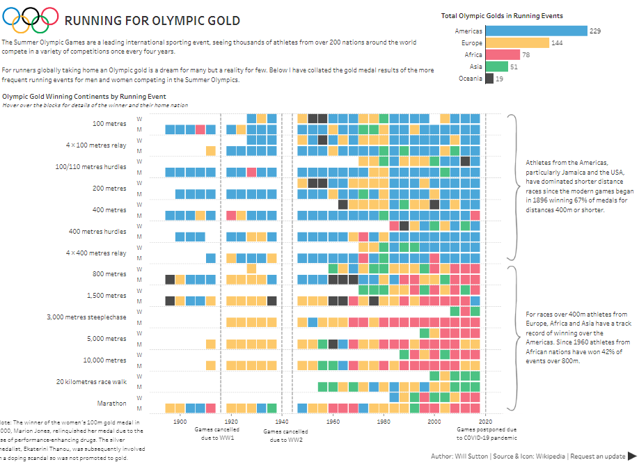
Running for Olympic Gold Dashboard
This Tableau Olympics dashboard delivers an insightful visual analysis of Olympic gold medal distribution in running events across various continents, tracing the modern Games’ inception in 1896 to the present day. It is an essential resource for sports analysts, historians, and enthusiasts keen on understanding geographical dominance in Olympic track and field events.
Components and Charts
Gold Medal Distribution by Continent:
At the top right, a bar chart summarizes the total gold medals won by athletes from different continents in running events. The chart underscores the dominance of athletes from the Americas, particularly from the United States and Jamaica, with 229 gold medals. Europe follows with 144 golds, and Africa holds 78 golds. This visual offers a quick snapshot of the global distribution of Olympic excellence in running.
Event-by-Event Medal Analysis:
The dashboard’s central feature is a detailed analysis of gold medal winners in various running events, from the 100-meter sprint to the marathon. This analysis is presented in a grid of small squares, where each row represents a different running event, and each column corresponds to a specific Olympic year. The squares are colour-coded by continent, allowing users to discern which continent dominated each event during each year quickly.
Gender and Event Breakdown:
The grid also divides events by gender, comparing performances between men’s and women’s events straightforwardly. The visualization tracks the progression of gold medal wins over time, showing patterns of continental dominance in various events. For example, the Americas’ stronghold in short-distance races and Africa’s growing success in middle and long-distance events are depicted.
Contextual Annotations:
To the right, annotations provide contextual insights into the observed data patterns. These notes highlight the dominance of American and Jamaican athletes in shorter-distance races and the strong showing of African athletes in longer-distance events since 1950.
This Tableau Olympics dashboard effectively combines bar charts, grids, and contextual annotations to analyse Olympic running events comprehensively. It is a valuable tool for understanding historical trends and athletic, continental dominance.
7 of the Best Tableau Olympics Dashboards
These seven Tableau Olympics dashboards clearly show how combining historical Olympic data and modern data visualization techniques can reveal new insights and narratives. Tableau’s versatility and power enable us to explore the Games’ history from multiple angles, whether by analyzing medal counts, tracking athlete performance, or uncovering the broader trends that have shaped the Olympics over time.
These examples serve as analytical tools and sources of inspiration for how data can narrate the story of the world’s most prestigious sporting event. By harnessing Tableau’s potential, we can continue to explore and share the rich legacy of the Olympics in innovative ways, making the data both accessible and engaging for a broad audience. Whether you’re a data professional or a passionate sports fan, these dashboards offer a glimpse into the immense possibilities of Tableau Olympics analytics.