In the fast-paced world of professional football, understanding and leveraging data has become a key component for teams, analysts, and fans. The NFL is awash with data, from player statistics and game outcomes to historical trends and financial details.
Table of Contents
With the rise of advanced analytics and data visualization tools like Tableau, making sense of this wealth of information is easier. Tableau NFL dashboards provide a powerful means to visualize NFL stats, offering insights into player performance, team strategies, and financial trends. In this blog, we’ll explore eight compelling examples of Tableau dashboards that illuminate various aspects of NFL data, showcasing the power of analytics in the NFL.
Affiliate Disclosure: Some of the links on this blog are affiliate links, which means if you click on them and make a purchase, we may receive a commission at no extra cost to you. This helps support our blog and allows us to continue to create content for you. We only recommend products and services we genuinely believe in; all opinions expressed here are our own. Thank you for being so supportive!
These great Tableau NFL dashboards have been curated from Tableau public, we do not take credit for their creation.
#1 The History of the NFL
This Tableau NFL dashboard, titled The History of the NFL, offers a detailed visual representation of NFL team performances from 1966 to 2020. It focuses on whether each team had seasons above or below a .500 winning percentage, with particular highlights for Super Bowl victories indicated by gold-coloured bars.
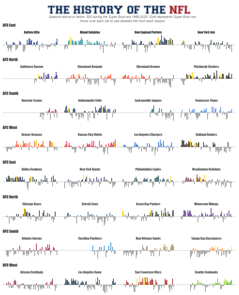
Dashboard Description
The NFL Tableau dashboard is neatly categorized by NFL divisions: AFC East, AFC North, AFC South, AFC West, NFC East, NFC North, NFC South, and NFC West. Within each division, horizontal bar charts represent each team’s annual performance. The bars extend upwards for seasons with a winning percentage above .500 and downwards for seasons below .500. Different colours distinguish between teams, making the visualization clear and easy to interpret. Gold bars denote seasons in which the team won the Super Bowl, adding a layer of significant achievements to the analysis of NFL football statistics.
Who Might Find It Interesting
- NFL Fans and Historians: This dashboard is a treasure trove for fans and historians, providing a clear view of team performances over decades and allowing for easy identification of historical trends in football stats NFL and significant periods.
- Sports Analysts and Commentators: Analysts and commentators can use this tool to quickly reference historical data, enhancing their commentary with precise NFL analytics insights.
- Coaches and Team Managers: By examining past performance trends, coaches and managers can glean insights from NFL data that may inform their strategic planning and decision-making.
- Data Analysts: Those in data analytics can appreciate the dashboard’s effective use of data visualization techniques in NFL analytics, serving as a model for similar analytical projects in NFL data.
Charts in the Dashboard
The primary chart type used in this Tableau NFL dashboard is the horizontal bar chart. Each bar represents a season, with its length indicating the degree of success or failure (above or below a .500 winning percentage). Using colour coding and gold highlights for Super Bowl wins makes the data visually engaging and easy to interpret, providing valuable insights into football stats in the NFL.
#2 The Rarity of an NFL Tie
This Tableau NFL dashboard, titled The Rarity of an NFL Tie, provides an in-depth analysis of the infrequent occurrence of ties in the NFL. It explores various aspects such as the timeline of ties, teams that have never experienced a tie, and the most recent tied games.

Dashboard Description
The dashboard features several sections to present the NFL data comprehensively. At the top, a timeline graph displays the number of tied games per season from 1956 to 2018, highlighting significant changes in NFL rules, such as the introduction of sudden-death overtime in 1974 and modifications in 2012 and 2017. A summary notes that before 1974, there were 258 ties, but only 24 ties since then.
Another section lists ten teams that have not played to a tie since 1974, represented by their helmets. The Green Bay Packers are highlighted as the team with the most ties (six) since 1974. A dot matrix chart at the bottom right visualizes the frequency of overtime games and the proportion of those that ended in a tie.
The second image features a bar chart showing the distribution of ties across the NFL season’s weeks, indicating that most ties occur in weeks 1, 7, and 10. Below this, the last five tied games are detailed with logos, dates, final scores, and performance graphs for each quarter, accompanied by notable highlights.

Who Might Find It Interesting
- NFL Fans and Historians: This Tableau NFL dashboard provides a detailed historical perspective on ties, appealing to fans and historians interested in unique football stats in the NFL.
- Sports Analysts and Commentators: Analysts and commentators can use the NFL stats to provide context and insights during discussions about the rarity and impact of ties in NFL games.
- Coaches and Team Managers: Understanding the conditions under which ties occur can be helpful for coaches and managers when strategizing for close games using NFL football statistics.
- Data Analysts: This NFL analytics dashboard serves as an excellent example of how Tableau can visualize complex NFL data, showcasing the application of data visualization in NFL football statistics.
Charts in the Dashboard
The primary charts in this NFL Tableau dashboard include a timeline graph, bar charts, a dot matrix chart, and performance line graphs. The timeline graph traces the occurrence of tied games over the years, while the bar chart illustrates the weekly distribution of ties. The dot matrix chart visualizes the frequency and outcome of overtime games, and the line graphs provide a detailed view of the performance in recent tied games, making NFL data visually engaging and informative.
#3 NFL Receiver Routes
This Tableau NFL dashboard, titled A Standardized Look at the Routes Run by the NFL’s Top Receivers, provides an insightful visualization of the routes taken by the league’s leading receivers. The data covers the first seven games of the 2017 season, highlighting completions and incompletions.

Dashboard Description
The dashboard presents individual scatter plots for each featured receiver: Antonio Brown, Brandin Cooks, Mike Evans, Odell Beckham, Doug Baldwin, Davante Adams, DeAndre Hopkins, Julio Jones, and Michael Thomas. Each scatter plot maps out the receiver’s routes from their initial lineup positions, displaying yards from the line of scrimmage horizontally and vertically.
Who Might Find It Interesting
- NFL Fans and Historians: This NFL Tableau dashboard appeals to fans and historians interested in NFL stats, providing a detailed analysis of the routes run by top receivers.
- Coaches and Team Managers: Coaches and managers can utilize these football stats NFL to analyze the effectiveness of different routes and strategize future plays using NFL football statistics.
- Sports Analysts and Commentators: Analysts can use NFL data to enhance their commentary, offering insights into the performance and strategies of elite receivers through NFL analytics.
- Data Analysts: Those focused on analytics in the NFL will find this dashboard a valuable example of using Tableau to visualize complex sports data, showcasing receivers’ routes and success rates.
Charts in the Dashboard
The primary charts in this NFL Tableau dashboard are scatter plots. Each plot details the receiver’s route, with dots representing the points along their paths. Blue dots indicate completed passes, while red dots signify incompletions. The axes measure the yards from the initial lineup position and the line of scrimmage, providing a standardized view of each route. This visualization of NFL football statistics allows for a clear comparison of performance and route effectiveness among the league’s top receivers, making NFL data visually accessible and informative.
#4 NFL Super Bowl Climatology Dashboard
This Tableau NFL dashboard, titled NFL Super Bowl Climatology, provides a comprehensive overview of the weather conditions at Super Bowl venues from 1967 to the present. It includes data on kickoff temperatures, precipitation, and other relevant climatic factors.

Dashboard Description
The dashboard is divided into several sections, each offering valuable insights into the climatology of Super Bowl events. The central feature is a map of the United States, with bubbles indicating the location of each Super Bowl venue. The size of each bubble represents the number of times a venue has hosted the event. At the same time, the colour gradient reflects the average outdoor kickoff temperature, ranging from blue (cooler temperatures) to red (warmer temperatures).
To the right of the map, a bar chart displays precipitation data, including rainfall and snowfall, for each Super Bowl. This chart helps understand the weather variability and the impact of precipitation on the game. A detailed table below the map and bar chart lists each Super Bowl, including the date, venue, stadium type (indoor or outdoor), state, winning team, losing team, final score, and high temperature.
Who Might Find It Interesting
- NFL Fans and Historians: This NFL Tableau dashboard is a treasure trove for fans and historians interested in NFL stats and the impact of weather on football stats NFL during Super Bowl events.
- Sports Analysts and Commentators: Analysts can utilize this NFL data to provide context and enhance their commentary, discussing how weather conditions have influenced past Super Bowls.
- Event Planners and Managers: Understanding the climatology of past Super Bowls can assist in planning future events, ensuring better preparation and contingency planning for varying weather conditions.
- Data Analysts: This dashboard serves as a prime example of using NFL analytics in Tableau to visualize complex NFL football statistics and derive meaningful insights.
Charts in the Dashboard
The primary charts in this NFL Tableau dashboard include:
- Map with Bubble Overlay: Displays Super Bowl venues with bubble sizes representing the number of times hosted and colours indicating average kickoff temperatures.
- Bar Chart: Shows the sum of rainfall and snowfall for each Super Bowl, highlighting weather patterns over the years.
- Detailed Table: Lists Super Bowl specifics such as venue, stadium type, winning and losing teams, final score, and high temperature, providing a comprehensive look at NFL data related to each event.
This visualization of NFL analytics makes the complex data on Super Bowl climatology both accessible and informative, offering valuable insights into the relationship between weather conditions and NFL football statistics.
#5 NFL Concussions by Collision Source
This Tableau NFL dashboard, titled “What Collisions Cause the Most Concussions in the NFL?”, visualizes the sources of concussions during the NFL regular seasons from 2012 to 2015. It provides a detailed breakdown of concussion causes, emphasizing head collisions with another helmet.

Dashboard Description
The dashboard features two main sections. A stacked bar chart on the left illustrates the percentage of total concussions by collision source. The chart breaks down the data into categories: collisions with another helmet, shoulder, forearm/elbow, knee, playing surface, thigh, and foot. The dominant category is collisions with another helmet, accounting for the highest percentage of concussions.
On the right, a human silhouette identifies the body parts involved in these collisions, visually representing the data. Each body part is labelled, correlating with the data presented in the bar chart.
Below these visualizations, a line chart shows the 4-year trend in concussions caused by head collisions with another helmet. The chart tracks the number of concussions annually, highlighting fluctuations over the four years.
Who Might Find It Interesting
- NFL Fans and Historians: This NFL Tableau dashboard offers detailed insights into NFL stats related to player safety, making it valuable for fans and historians interested in the evolution of football safety measures.
- Sports Analysts and Commentators: Analysts can use this NFL data to discuss trends in player injuries and the impact of collisions, providing context during game commentary.
- Coaches and Team Managers: Understanding the familiar sources of concussions can help coaches and managers devise strategies to mitigate risks and protect players, utilizing NFL analytics.
- Medical Professionals and Researchers: This dashboard is crucial for those studying NFL football statistics related to player health, offering data for research on injury prevention.
- Data Analysts: The dashboard exemplifies how Tableau can visualize complex sports data, making NFL data more accessible and understandable through NFL analytics.
Charts in the Dashboard
The primary charts in this NFL Tableau dashboard include:
- Stacked Bar Chart: Displays the percentage of total concussions by collision source, with a clear visual emphasis on the most common causes.
- Human Silhouette Diagram: This diagram provides a visual breakdown of the body parts involved in concussions, enhancing the understanding of collision impacts.
- Line Chart: Shows the 4-year trend of concussions caused by head collisions with another helmet, highlighting changes over time.
This visualization of NFL football statistics effectively communicates the sources and trends of concussions in the NFL, offering valuable insights into player safety and the impact of collisions.
#6 NFL Quarterbacks
This Tableau NFL dashboard, “The Key to Success: A Good Quarterback,” analyzes the performance metrics of top quarterbacks to determine what makes them successful and who might be the next Tom Brady. It includes various NFL stats, focusing on wins, touchdowns, completions, and fourth-quarter comebacks.

Dashboard Description
The dashboard is divided into multiple sections, each highlighting different aspects of quarterback performance using NFL data:
- Measuring Greatness by Wins: A bar chart showing wins and losses for prominent quarterbacks. Tom Brady leads with the highest number of wins, emphasizing the correlation between quarterback performance and team success.
- Top Quadrant Quarterbacks: This section features a scatter plot comparing touchdowns to completed passes. Users can select a quarterback to see detailed NFL analytics, such as win percentage and QBR, showcasing the NFL’s analytics.
- 4th Quarter Comebacks: A bar chart that ranks quarterbacks based on their ability to perform under pressure, measured by 4th quarter comebacks and win percentages.
- Wins vs. Losses Under 28: Focusing on younger quarterbacks, this bar chart evaluates the win-loss records of quarterbacks under 28, highlighting prospects in NFL football statistics.
- Top Quadrant Quarterbacks Under 28: A scatter plot that mirrors the comparison of previous touchdowns vs. completions, specifically for quarterbacks under 28.
- 4th Quarter Comebacks Under 28: A bar chart similar to the overall comebacks chart but focused on younger quarterbacks, providing insights into emerging talents.
- The Ones To Watch: Profiles of notable young quarterbacks like Jared Goff, Lamar Jackson, Deshaun Watson, and others, detailing their career highlights and potential for future success.

Who Might Find It Interesting
- NFL Fans and Historians: This NFL Tableau dashboard provides deep insights into quarterback performance, appealing to those interested in detailed football stats in the NFL.
- Sports Analysts and Commentators: Analysts can use these NFL stats to enhance their commentary and provide context during games.
- Coaches and Team Managers: Understanding what makes successful quarterbacks can help in player development and strategic planning, utilizing NFL analytics.
- Data Analysts: This dashboard is an excellent example of using Tableau for NFL analytics, demonstrating how to effectively visualize complex NFL football statistics.
Charts in the Dashboard
The primary charts in this NFL Tableau dashboard include:
- Bar Charts: Displaying wins and losses and 4th quarter comebacks, overall and for quarterbacks under 28.
- Scatter Plots: Comparing touchdowns vs. completed passes, highlighting top quadrant quarterbacks.
- Player Profiles: Detailed sections on notable quarterbacks, providing career insights and potential future impacts.
This comprehensive visualization of NFL data through Tableau provides valuable insights into the metrics that define successful quarterbacks, making complex NFL football statistics accessible and informative.
#7 NFL Salaries
This Tableau NFL dashboard, titled The Highest Paid Positions in the NFL, visualizes the salaries of the top 10 highest-paid players at each position. It provides insights into the NFL’s financial landscape and showcases how player salaries vary across different positions.

Dashboard Description
The dashboard features a dot plot representing the minimum, average, and maximum salaries (in millions) for the top 10 highest-paid players at each position. The positions are listed on the left, including Quarterback, Defensive Tackle, Wide Receiver, Defensive End, Linebacker, Left Tackle, Cornerback, Running Back, Tight End, Guard, Center, Safety, Right Tackle, Kicker, Punter, Fullback, and Long Snapper.
Each position’s salary range is depicted with three distinct dots:
- Red Dot: Indicates the minimum salary.
- Blue Dot: Represents the average salary.
- Dark Blue Dot: Denotes the maximum wage.
Horizontal lines connect the dots for each position, clearly illustrating the range of salaries. On the right side, sorting options allow users to sort by maximum, average, or minimum wage in ascending or descending order. Additionally, checkboxes enable filtering by team categories: All, Defense, Offense, and Special Teams.
Who Might Find It Interesting
- NFL Fans and Historians: This NFL Tableau dashboard provides a comprehensive look at NFL stats related to player salaries, making it appealing to fans and historians interested in football stats, NFL and financial trends in the league.
- Sports Analysts and Commentators: Analysts can use this NFL data to provide context and enhance discussions about player contracts and team salary cap strategies.
- Team Managers and Agents: Understanding the salary landscape can help managers and agents negotiate contracts and make informed decisions regarding player acquisitions and salary cap management.
- Data Analysts: This dashboard showcases the application of NFL analytics in visualizing complex NFL football statistics related to player salaries, making it a valuable example for those in the field.
Charts in the Dashboard
The primary chart in this NFL Tableau dashboard is a dot plot. It effectively visualizes the salary ranges for each position, with distinct colours representing minimum, average, and maximum salaries. This visualization of NFL analytics allows users to easily compare salaries across positions, providing a clear and detailed view of NFL data related to player compensation.
#8 NFL Win-Loss Margins
This Tableau NFL dashboard, titled NFL Win/Loss Margins, explores NFL teams’ win/loss margins for every game in the Super Bowl era. It provides a detailed visualization of each team’s performance, helping users understand the historical context of NFL football statistics.

Dashboard Description
The dashboard features a series of half-circle visualizations for each NFL team, divided by division. These visualizations represent the number of wins and losses, with wins in one colour and losses in another. Each half-circle is labelled with the total wins and losses, providing a clear snapshot of each team’s performance.
Who Might Find It Interesting
- NFL Fans and Historians: This NFL Tableau dashboard offers a comprehensive view of NFL stats, making it appealing to fans and historians interested in the historical performance of their favourite teams.
- Sports Analysts and Commentators: Analysts can use this NFL data to provide context and enhance discussions about team performance and historical trends in the league.
- Team Managers and Coaches: Understanding win/loss margins can help managers and coaches analyze past performance and strategize for future games, utilizing NFL analytics.
- Data Analysts: This dashboard showcases the application of analytics in the NFL and demonstrates how to visualize complex NFL data effectively.

Charts in the Dashboard
The primary charts in this NFL Tableau dashboard are half-circle visualizations for each team. These charts display the win/loss margins using different colours for wins and losses, creating a visually engaging representation of NFL football statistics. The teams are organized by division (NFC East, NFC North, NFC South, NFC West, AFC East, AFC North, AFC South, and AFC West), making comparing performance across different groups easy.
This visualization of NFL analytics makes complex data on team performance accessible and informative, offering valuable insights into NFL teams’ historical win/loss records.
Tableau NFL Analytics
The integration of Tableau into NFL analytics has revolutionized how teams, analysts, and fans interact with football stats in the NFL. The eight examples highlighted in this blog demonstrate the diverse applications of NFL Tableau dashboards, from analyzing win/loss margins and player salaries to understanding concussion trends and quarterback performance. These dashboards provide a clearer picture of NFL football statistics, empower users to make data-driven decisions, and deepen their understanding of the game. As analytics in the NFL continue to evolve, tools like Tableau will play an increasingly crucial role in shaping the future of football, making the game more transparent, strategic, and engaging for everyone involved.