Exploring the dynamic world of NBA analytics, this blog showcases 16 compelling examples of dashboards designed to provide deep insights into various aspects of the game. Utilizing the powerful capabilities of Tableau NBA, these dashboards offer advanced NBA analytics, highlighting everything from player performance and team strategies to financial management and game schedules.
Each example demonstrates how analytics in the NBA can transform raw data into actionable intelligence, enabling coaches, analysts, and fans to understand the game’s intricacies better. Dive into these NBA Tableau dashboards to see how data visualization can elevate your appreciation and understanding of basketball.
Table of Contents
Affiliate Disclosure: Some of the links on this blog are affiliate links, which means if you click on them and make a purchase, we may receive a commission at no extra cost to you. This helps support our blog and allows us to continue to create content for you. We only recommend products and services we genuinely believe in; all opinions expressed here are our own. Thank you for being so supportive!
These great NBA Tableau dashboards have been curated from Tableau public, we do not take credit for their creation.
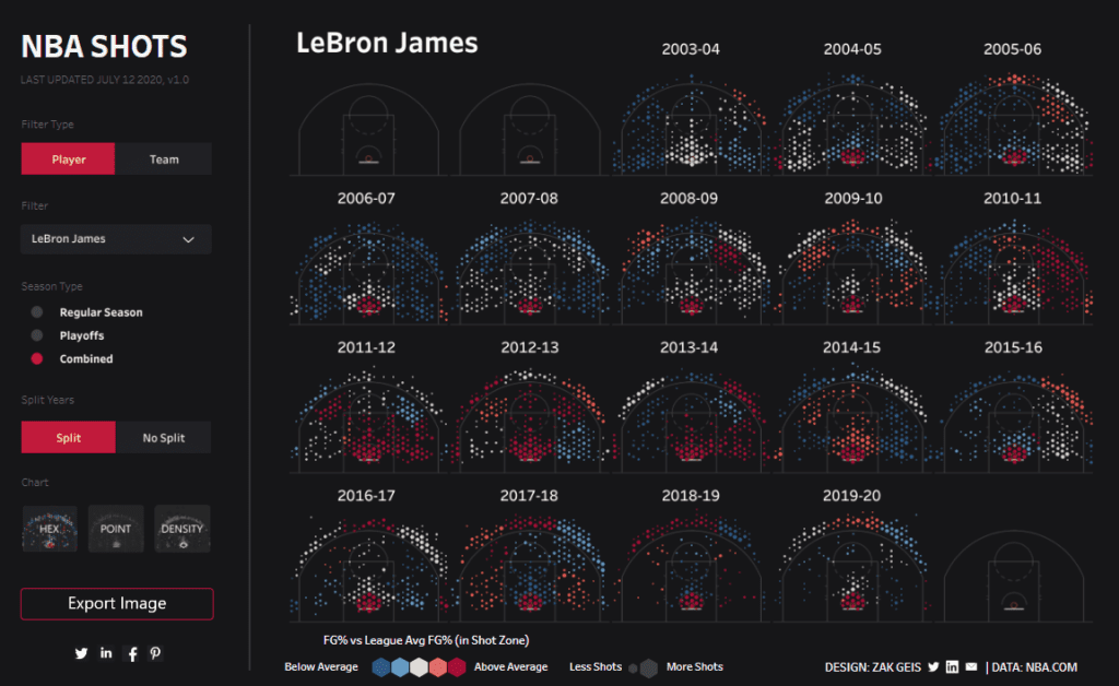
#1 NBA Shots
This Tableau NBA Shots Dashboard offers a comprehensive visual analysis of LeBron James’ shooting performance over multiple seasons, from 2003-04 to 2019-20. The dashboard is designed to display shot data for each season, highlighting shooting efficiency and frequency across different court zones. Using colour-coded hexagons, the dashboard differentiates between shots taken during the regular season and playoffs, with combined data also available for a holistic view.
Who Might Find It Interesting?
- Sports Analysts: Gain deep insights into player performance, identifying patterns and trends in shooting efficiency.
- Coaches and Team Strategists: Utilize the data to develop game strategies, focusing on player strengths and weaknesses.
- Fans and Enthusiasts: Enjoy a detailed visual representation of a favourite player’s performance over the years.
- Journalists and Commentators: Access detailed NBA analytics stats to enrich commentary and sports articles with precise data points.
Chart Types in the Dashboard
- Hexbin Charts: Represent shot locations and frequencies using hexagonal bins, colour-coded to indicate shooting efficiency relative to the league average.
- Point Charts: Provide detailed point-specific shooting data, highlighting precise shot locations.
- Density Charts: Visualize the density of shots taken from various positions on the court.
How Tableau Can Be Useful in NBA Analytics
NBA Tableau dashboards offer a powerful tool for visualizing and analyzing complex sports data. In this NBA Shots Dashboard, Tableau’s capabilities are showcased through:
- Interactive Filters: Allow users to switch between seasons, players, and data views (regular season vs. playoffs).
- Visual Clarity: Enhanced data visualization techniques make understanding shooting patterns and performance metrics easier.
- Data-Driven Decisions: Coaches and analysts can make informed decisions by leveraging detailed shot analytics to optimize player training and game strategies.
- Engagement: Fans and media can engage with the sport on a deeper level, accessing comprehensive visual data to enhance their understanding and enjoyment.
Tableau’s advanced visualization and interactive features make it an invaluable tool in advanced NBA analytics. It offers detailed insights to drive performance improvements and strategic planning in professional sports.
#2 Depth Perception: Are NBA Players Shooting Better in The Bubble
The Depth Perception Dashboard offers an in-depth analysis of player performance within the NBA Bubble Games. With a focus on shooting metrics, this dashboard highlights whether players have improved their shooting accuracy and points per game in the controlled environment of the NBA Bubble. The dashboard compares these metrics to past regular seasons, offering a comprehensive view of player performance trends.

Chart Types in the Dashboard
- Bar Charts: Illustrate the overall trends in points per game over the years, including a significant comparison with the NBA Bubble period.
- Line Charts: Show individual player performance trends in points per game, clearly visualising performance improvements or declines.
- Scatter Plots: Display shooting accuracy percentage trends, providing a granular view of shooting efficiency across players and periods.
#3 Salaries of the NBA
The Salaries of the NBA Dashboard offers a comprehensive view of historical NBA team and player salaries from 1990 to 2018. This Tableau NBA dashboard provides detailed insights into team spending over nearly three decades, displaying salary growth trends and the salary cap’s impact. The dashboard utilizes line charts to track annual salary data for each team in the Eastern and Western Conferences, with options to view data in inflated or non-inflated values.

Chart Types in the Dashboard
- Line Charts: Track the annual salaries of each NBA team, illustrating trends over time and highlighting key financial milestones with advanced NBA analytics.
- Bar Charts: Complement the line charts by providing a clear view of the data, such as the percentage of the season spent over or under the salary cap.
- Interactive Filters: This allows users to switch between inflated and non-inflated salary values, providing multiple perspectives on the financial data using NBA analytics.
#4 NBA Triple Doubles
The NBA Triple Doubles Dashboard offers a comprehensive analysis of triple-double performances throughout NBA history. A triple-double occurs when a player records double-digit totals in three statistical categories, typically points, rebounds, and assists, in a single game. This Tableau NBA dashboard visualizes the frequency and distribution of triple-doubles among players, highlighting the top achievers and providing detailed insights into their performances.

Chart Types in the Dashboard
- Ternary Plot: The central feature of the dashboard is that this chart displays all-time triple-doubles across points, rebounds, and assists. It uses hexagonal bins to show the frequency of triple-doubles and helps identify patterns in player performance.
- Bar Chart: This chart highlights the top 20 players with the most triple-doubles, clearly comparing their achievements in NBA history.
- Detailed Player Profiles: Individual sections for the top 6 triple-double leaders showcasing their unique styles and contributions to the game with relevant NBA analytics.
#5 PTS in Paint – NBA
The NBA Paint Game Dashboard comprehensively analyses team points in the paint per game from 2004 to 2019. This Tableau NBA dashboard is designed to visualize how teams have performed in scoring points close to the basket, highlighting trends over 15 years. Each team’s performance is depicted in individual area charts, showing the total points per game and the percentage of points scored in the paint.
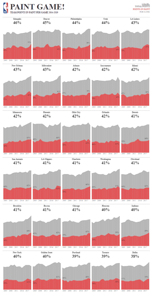
Chart Types in the Dashboard
- Area Charts: The primary visualization tool in this dashboard, area charts show each team’s total points per game (in grey) and points scored in the paint (in red). This dual-colour representation allows for easy comparison and trend analysis.
- Percentage Labels: Each chart includes a percentage label, indicating the proportion of points scored in the paint relative to total points, offering a clear snapshot of team strategies.
- Time-Series Data: The charts display data over 15 years, providing a historical perspective on how team scoring patterns have evolved.
#6 NBA 2019-20 Most ‘Valuable’ Players | A Clustering Analysis
The NBA’s Most ‘Valuable’ Players Dashboard offers a sophisticated clustering analysis to evaluate the correlation between player salaries and their performance metrics. This Tableau NBA dashboard categorizes players based on wages, age, and performance ratings. The goal is identifying which high-paid players deliver the most value, a crucial aspect of advanced NBA analytics.

Chart Types in the Dashboard
- Scatter Plots: The primary visualization tool in this dashboard, scatter plots show the relationship between player salaries and performance ratings. Players are clustered into quadrants based on cost and upside potential.
- Bar Charts: Highlight the highest-paid players by position, clearly comparing salary distribution across different roles.
- Interactive Tools: Allow users to select different metrics for the X and Y axes, such as points, assists, turnovers, and salary, making the data more customizable and actionable.
The NBA Gems Dashboard analyses player performance across the offence, defence, and strategy metrics. This Tableau NBA dashboard uses a unique combination of ternary plots and density maps to visualize how top players perform in various aspects of the game. Each player’s chart highlights their contributions in scoring, defensive actions, and strategic plays, categorized by their free throw percentages during the 2021-2022 season for both regular and playoff games.

Chart Types in the Dashboard
- Ternary Plots: These triangular charts display a player’s performance balance in three key areas: offence, defence, and strategy—the density of points within the plot highlights where players excel most.
- Density Maps: Overlaid on the ternary plots, these maps use colour gradients to show the concentration of performance metrics, making it easy to identify strengths and weaknesses.
- Bar Charts: Complementary visualizations show the highest-paid players by position, offering clear comparisons across different roles.
#8 NBA Shot Charts
The NBA Shot Charts Dashboard provides a detailed visual analysis of player shot attempts during the regular season of 2018-19, focusing on James Harden. This Tableau NBA dashboard is designed to offer insights into shooting patterns and efficiency across different court zones. The dashboard features a colour-coded shot chart highlighting the locations and effectiveness of Harden’s shots to indicate efficiency relative to the league average.

Chart Types in the Dashboard
- Hexbin Shot Chart: The primary visualization tool in this dashboard, the hex bin chart, displays shot locations with hexagonal bins. These bins are colour-coded to indicate shooting efficiency relative to the league average, with blue representing below average and red representing above average.
- Bar Chart: This chart displays the top 25 players by shot attempts, providing a clear comparison of shooting volume across different players. Users can click on a player’s name to see their individual shot chart.
- Interactive Filters: Enable users to switch between players, making the data more customizable and relevant for specific analysis needs.
#9 NBA Team Four Factors
The NBA Team Four Factors Dashboard, comprehensively analyses the key elements determining basketball success: shooting efficiency, taking care of the ball, offensive rebounding, and getting to the foul line. This Tableau NBA dashboard visualizes these factors for each team during the 2018-19 regular season. Each team’s performance is depicted using a segmented circular chart, with different colours representing each factor. Higher saturation indicates better performance on offence, while lower saturation shows defensive metrics.

Chart Types in the Dashboard
- Circular Segmented Charts: This dashboard’s primary visualization tool displays the four factors for each team. Each segment represents a factor, and the colour and saturation indicate performance levels.
- Interactive Legends and Filters: These allow users to understand the different factors represented by the colours and potentially filter the data for specific insights.
#10 NBA Player Movement
The NBA Player Movement Dashboard offers a detailed visualization of player transitions within NBA teams for the 2019 season. This Tableau NBA dashboard showcases each team’s roster composition by highlighting returning players, new players, rookies, and those who have left the team. Each player’s contribution in terms of points per game (ppg) from the previous season is displayed, providing a comprehensive view of team dynamics and changes.

Chart Types in the Dashboard
- Bar Charts: The primary visualization tool in this dashboard, bar charts display the points per game for players categorized into returning players, new players, rookies, and leaving players. This clear segmentation helps in understanding each player’s impact on the team’s performance.
- Player Profiles: Each team section includes a list of players with their respective point contributions, highlighting significant additions and losses to provide context on the team’s overall changes.
#11 NBA Playoffs 2018
The 2017-18 NBA Playoffs Dashboard offers a comprehensive visual representation of every scoring play from every game throughout the playoffs. This Tableau NBA dashboard showcases each team’s progression in a unique and engaging manner. The visualization uses a combination of flow and area charts to depict each playoff game’s scoring dynamics, highlighting the matches’ intensity and scoring patterns.

Chart Types in the Dashboard
- Flow Charts: These charts depict the progression of each game, with lines representing the flow of the game from start to finish. The thickness and colour intensity of the lines indicate the scoring intensity and momentum shifts throughout the game.
- Area Charts: These charts highlight scoring runs and droughts. They clearly show how points were accumulated over time and which team had the upper hand during different game periods.
- Interactive Elements: Users can hover over specific points to see detailed information about each scoring play, making the data more accessible and actionable.
#12 Ticket Sales Dashboard
The NBA Team Ticket Sales Dashboard provides a comprehensive visualization of ticket sales, stadium capacity usage, and revenue generation for NBA games during the 2018-2019 season. This Tableau NBA dashboard offers detailed insights into various aspects of game attendance and financial performance, making it a valuable tool for analyzing fan engagement and operational efficiency.

Chart Types in the Dashboard
- Heat Map: The primary visualization tool in this dashboard, the heat map, shows the stadium’s seating arrangement, with colour coding to represent the capacity used. This allows for easy identification of the most and least occupied sections.
- Line Chart: Displays the trend of ticket sales over time, providing a clear visualization of how sales fluctuate across different games and dates.
- Bar Chart: This chart shows the total number of tickets sold, the percentage of stadium capacity used, and the revenue generated, offering a concise summary of key metrics.
- Interactive Elements: Users can select different games and seasons, hover over stadium sections for more detailed information, and filter the data for specific insights.
#13 Kobe Career Scoring Radial
The Kobe Bryant Career Points Dashboard offers an intricate visual representation of Kobe Bryant’s scoring achievements throughout his illustrious NBA career. This Tableau NBA dashboard captures the journey of one of the greatest basketball players, showcasing his scoring milestones and highlighting key seasons and games. The circular design visualizes each point scored, categorizes them by the number of points per game, and includes unique markers for significant achievements such as NBA championships, MVP awards, and scoring titles.

Chart Types in the Dashboard
- Circular Dot Plot: The primary visualization tool in this dashboard is the circular dot plot, which displays each point scored by Kobe Bryant throughout his career. Different colours represent the points scored per game, providing a clear and comprehensive view of his scoring achievements.
- Bar Chart: Highlights the number of games in which Kobe scored within specific point ranges (e.g., 50+ points, 30-49 points), offering a clear comparison of his high-scoring games.
- Legend and Markers: Special markers for NBA championships, MVP awards, and scoring titles are included to signify significant milestones in his career.
#14 The Globalization of the NBA
The Globalization of the NBA Dashboard provides an insightful visual analysis of the international representation and influence of the NBA. This Tableau NBA dashboard chronicles the rise of global players from the league’s inception in 1946 to the present day. It highlights the growth of international representation, key international superstars, and projections for future global impact. The dashboard offers a detailed look at player statistics and the evolution of the league’s diversity.

Chart Types in the Dashboard
- Line Chart: This chart displays the growth of international player representation over the years, providing a clear timeline of the league’s increasing diversity.
- Map Visualization: This visualization highlights the countries contributing international players to the NBA, showcasing the global reach and distribution of talent.
- Player Career Trend Lines: This section illustrates key performance metrics (points, assists, rebounds) of notable international players like Hakeem Olajuwon, Tim Duncan, and Dirk Nowitzki, providing a detailed view of their career trajectories.
- Scatter Plots: Used to show shooting efficiency and shot distribution, these charts visually compare player performance metrics over time.
- Bar Charts: Compare career statistics of current international stars, such as Giannis Antetokounmpo and Nikola Jokić, highlighting their achievements and potential.
#15 NBA Salary Cap
The NBA Salary Cap Dashboard provides a comprehensive visual representation of team salary distributions across the NBA from 1990 to 2018. This Tableau NBA dashboard illustrates how teams have managed their salary caps, showcasing which teams have stayed within and exceeded the cap. The dashboard features two primary charts: a bar chart that displays the total salary per year and a heatmap that shows the salary cap status of each team annually.

Chart Types in the Dashboard
- Bar Chart: This chart displays the total salary for all NBA teams each year, highlighting the overall growth in team salaries and the frequency of teams exceeding the salary cap. The bars are colour-coded to distinguish between years when most teams were over the cap (in red) and under the cap (in blue).
- Heatmap: The heatmap provides a year-by-year view of each team’s salary cap status. Each cell represents a team’s salary cap status for a particular year, colour-coded to indicate whether the team was over (in red) or under (in blue) the cap. This visual allows for easy identification of trends and patterns in team spending.
#16 2023-24 NBA Schedule
The NBA Schedule Dashboard comprehensively visualises the Denver Nuggets’ game schedule for the 2023-2024 season. This Tableau NBA dashboard offers a detailed month-by-month breakdown of the team’s home and away games, including key events such as the All-Star Game (ASG) and special pre-season and post-season games. It provides a quick and accessible view of game dates, opponents, and times, helping fans and analysts keep track of the season’s events.

Chart Types in the Dashboard
- Calendar Heat Map: The primary visualization tool in this dashboard is the calendar heat map, which displays each game on the schedule, color-coded by home (blue) and away (grey) games. This allows for easy identification of game locations and patterns throughout the season.
- Interactive Filters: Enable users to select different teams and time zones, providing a customizable and relevant schedule view based on specific needs.
- Time Series Line Chart: This chart displays ticket sales trends and stadium capacity usage, clearly visualizing attendance data across different games and dates.
These 16 examples of Tableau NBA dashboards illustrate the transformative power of advanced NBA analytics in enhancing our understanding of the game. From player performance to team strategies and financial management, each dashboard provides valuable insights derived from NBA analytics stats. By leveraging the capabilities of NBA Tableau, coaches, analysts, and fans can make data-driven decisions and gain a deeper appreciation for the intricacies of basketball. Explore these dashboards to see how analytics in the NBA can elevate your experience and knowledge, ultimately revolutionizing how we engage with the sport.