What is a Tableau Marimekko Chart?
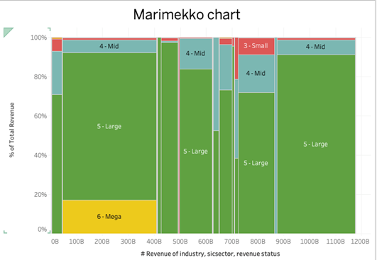
A Marimekko chart, also known as a Mekko chart or market map, is a type of visualization used primarily to display categorical data across two dimensions. In Tableau, a Marimekko chart combines aspects of a stacked bar chart and a 100% stacked bar chart but differs by varying both the width and height of each segment within the bars to convey two types of quantitative data.
In this tutorial, we will explore how to create a Marimekko chart in Tableau. This unique and powerful visualization tool combines elements of stacked and 100% stacked bar charts, allowing for an in-depth comparison across two dimensions of data. We’ll walk through the step-by-step process of transforming standard categorical data into a comprehensive Marimekko chart, demonstrating how to effectively represent different market segments and their contributions to the total. By the end of this tutorial, you’ll be equipped with the skills to visualize complex data relationships and make more informed decisions based on your data’s insights.
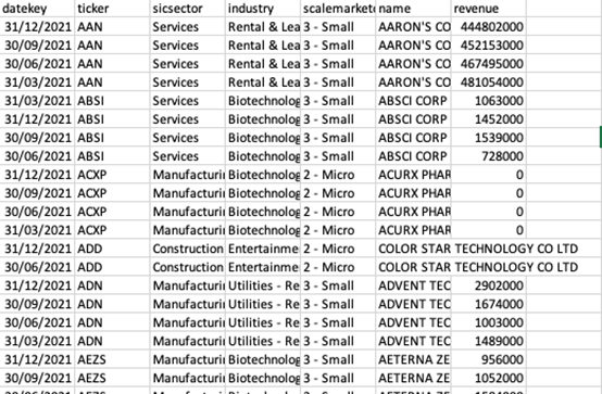
We will use the following data for creating the chart.
Steps to Build A Tableau Marimekko Chart
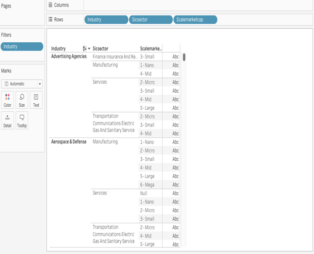
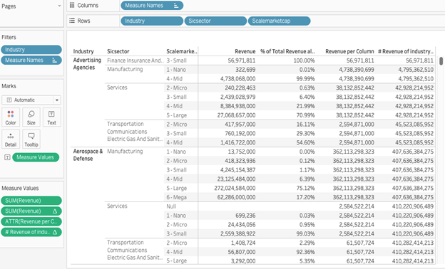
- Start with a cross-tab to help validate values. Place the x-axis dimension(s) that will drive the level of detail as discrete pills on rows. Then add to its right the discrete pill that will be used for the Colour shelf:
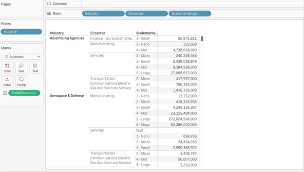
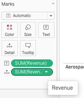
2. Add the initial measure of interest, SUM(Revenue) to the Text shelf.
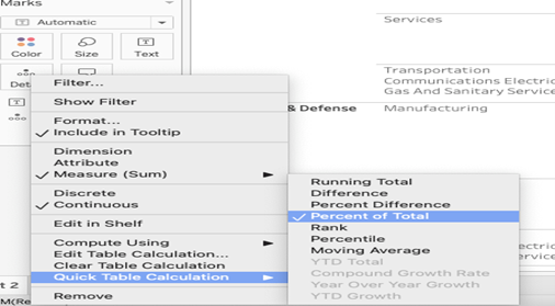
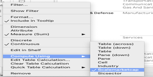
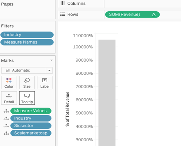
Create the y-axis measure using the percentage-of-total quick table calculation. In this case, we’re using the Revenue measure with the compute-using option on Scalemarketcap.
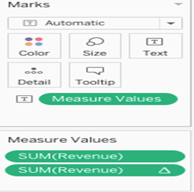
4. Double-click on Measure values in the Measures window. Tableau will create a Measure names/values cross-tab and show the Measure values card.
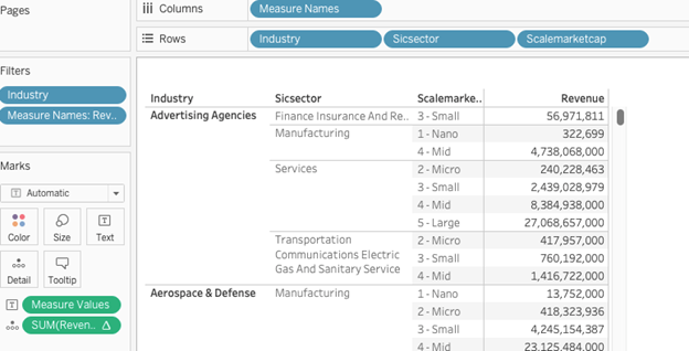
5. Drag the initial measure of interest (Revenue in this case) from the Measures window to the Measure values card.
6. Now we’ll generate the size (width) of each Marimekko column. In this case, we’ll use make a calculated field using a level of detail (LOD) expression, because it saves us from the complications of table calculations.
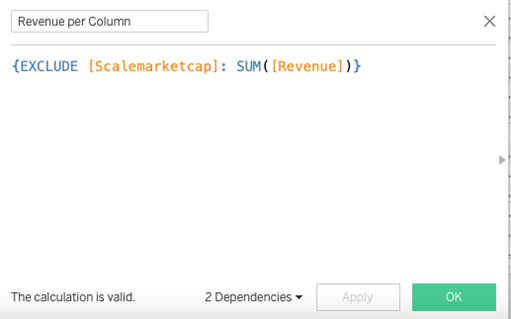
This way, it will sum up all the revenue for each combination of industry and sicsector, and the result will be the column width that we need. Drag this to the Measure values card.
7. Now we need to create the x-axis position of each column. To do so, we need to answer two questions.
First, are we going to have this measure determine the left or right edge of the column? In this case, we’ll use the right edge because it’s easier to calculate.
Second, how do we get the same value for each mark (created by the Scalemarketcap dimension) in each column (created by the Industry and Sicsector dimensions)? Now, it would seem that all we need to do is generate a running total of the revenue per column measure.
However, for Tableau’s running-total quick table calculation, there’s no compute-using setting that will work reliably no matter the data structure (particularly when it comes to sparse data). So we have to build our own.
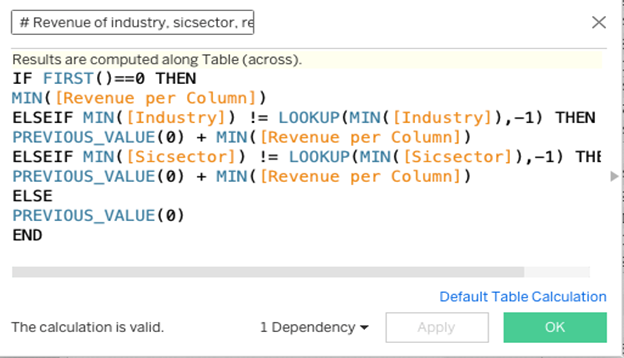
There are a few ways we could do this. I think the following calculation is the easiest to use since it gets the desired results in a single calculation. Here’s the number-of-revenue formula. The calculation has a compute-using on specific dimensions: Industry, Sicsector, and Scalemarketcap (in that order):
Here’s how it looks in the workout view:
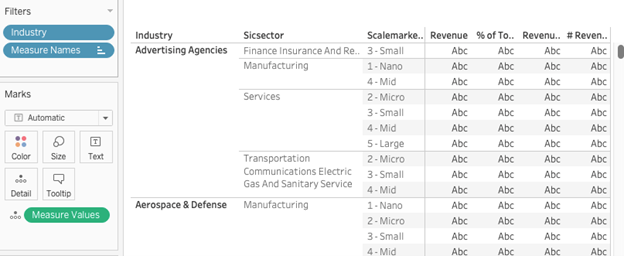
9. Change Measure values from Text to the Level of detail shelf. The values in the view will be replaced by ABCs.
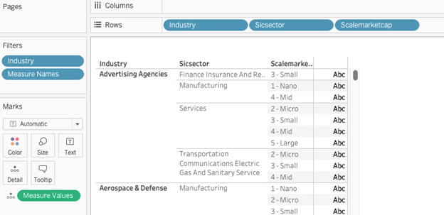
10. Remove Measure names from Columns. Tableau will now draw overprinted ABCs.
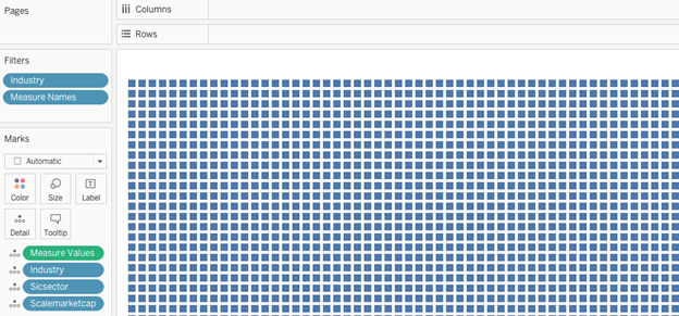
11. Move Industry, Sicsector, and Scalemarketcap to the Level of detail shelf (in that order). Tableau will change the view to show a set of square marks.
12. Move the SUM(Revenue) percentage-of-total quick table calculation pill from Measure values to Rows. The view will now have a single stacked bar.
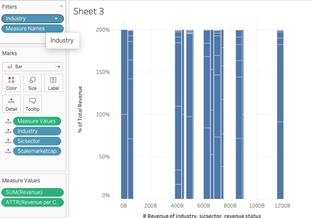
13. Move the # of Revenue measures from Measure values to Columns. Tableau will create a scatter plot.
14. Change the Marks type to Bar. You will now have lots of bars:
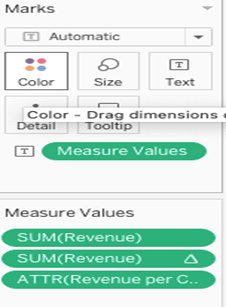
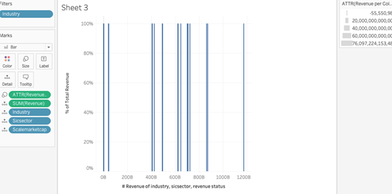
15. Move the ATTR(Revenue per Column) measure from Measure Values to the Size shelf. Besides applying the size and creating a legend, Tableau will automatically remove Measure values and put the SUM(Revenue) measure on the level of detail.
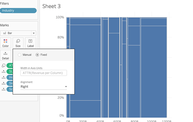
16. Click on the Size shelf and change the setting to “fixed”, with alignment set to right.
17. Set Scalemarketcap Status to be on the Colour shelf and label.
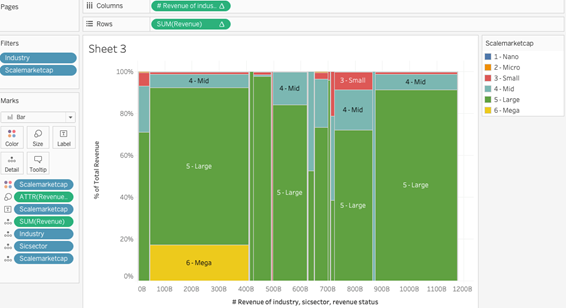
Congratulations! You’ve completed your Tableau Marimekko Chart!
Well done on completing your Tableau Marimekko Chart in record time! Hopefully, you can add this to your Tableau visualisation tools in the future.
For more on learning about how to create in Tableau, head over to our blog. For more on Tableau consulting to help your company deliver successful Tableau and data projects for finance, marketing and sales head over to our website.