The Tableau Lollipop Chart is a new and refreshing visualization tool with a fun-sounding name. Here is a quick and easy guide to making a Tableau Lollipop Chart in 5 minutes. At a glance, one will reveal the reason for this name — The Lollipop Chart is made of a circle and a bar joined together, giving the appearance of a lollipop.
What makes Tableau Lollipop charts different?
Tableau Lollipop Charts is a custom chart, but probably the simplest of all custom charts that can be made in Tableau. This is because it uses readily available marks such as bar and
circle. There’s no need for any particular calculations!
Why is a Tableau Lollipop Charts a Great Refreshment?
Regular bar charts are found everywhere. Looking forever and interacting with you and your clients can be tedious. Even if you take a vacation to a place far, far away from bar charts… bar charts will still manage to find you. If you use many bars in your visualization presentation, you may need a new look to engage clients and present the data in a different way.
Tableau Lollipop Charts are a perfect way to do that — The circle at the end is just enough of an
adjustment for a new look, but the chart still maintains high interpretability.
How to Build Tableau Lollipop Charts
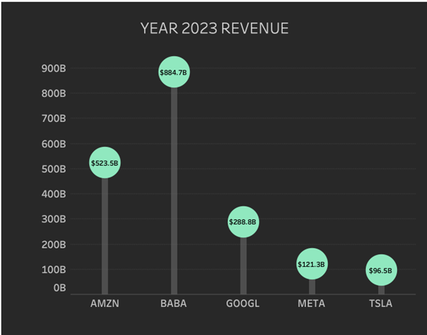
In this tutorial, we will visualize the Year 2023 revenue for a selection of companies:
Amazon, Alibaba, Alphabet, Meta, and Tesla. Wonderfully, no calculated fields are
necessary!
Follow these steps:
- Drag Ticker to Filters. Select the Ticker for the companies named above.
- Drag YEAR(Calendar Date) to Filters. Select Year 2023.
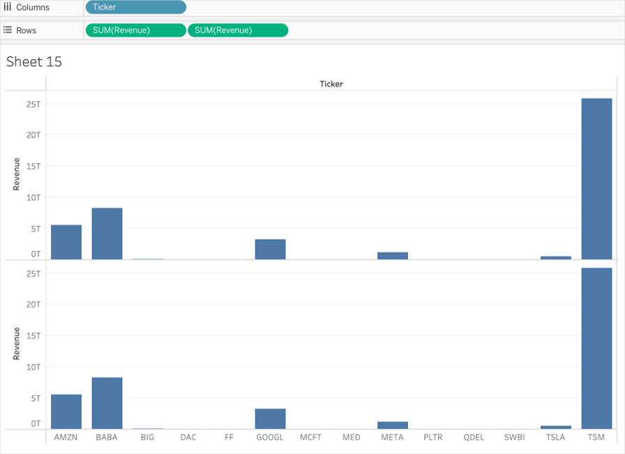
- Drag Ticker to Columns.
- Drag SUM(Revenue) to rows.
- Do it again: Drag SUM(Revenue) to rows in the second position.
Here is what you should have so far:
- Hover over the second Revenue pill, click the dropdown arrow, and select “Dual Axis”.
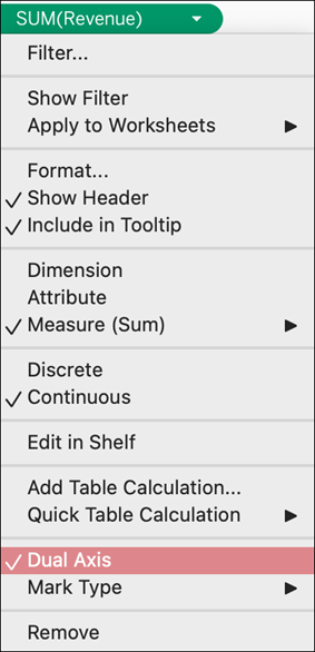
- Select the first green pill for Revenue. Convert the mark type to a bar on the marks
card. - Select the second green pill for Revenue. Convert the mark type to a circle on the
marks card.
Here is what you should have:
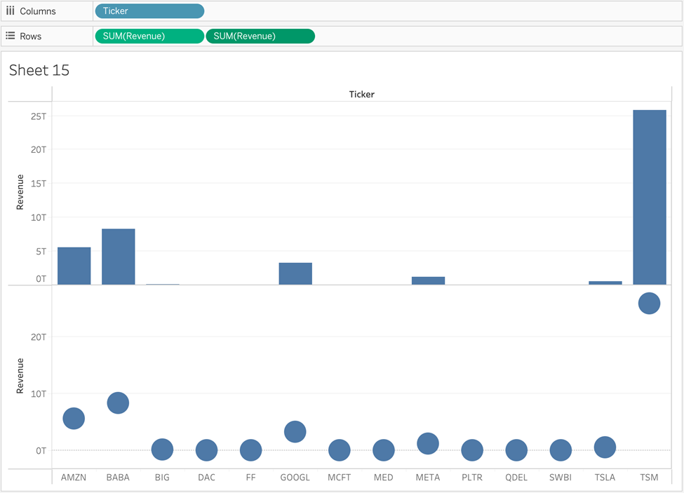
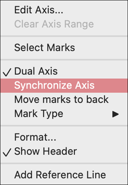
- Right-click on either axis and select “Synchronize Axis”.
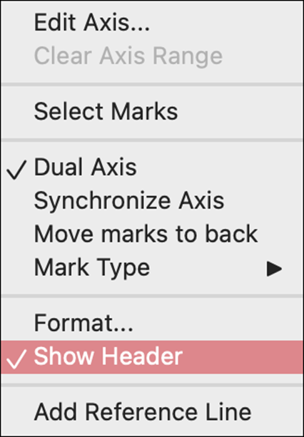
- Right-click again on the
right axis and deselect “Show Header”.
- Decrease the size of the bar as desired, and also increase the size of the circle as
desired. - For the circle mark, click the Label box on the Marks card, and select “Show mark
labels”. Set the label to Size 9, Black, Tableau Book, Bold.
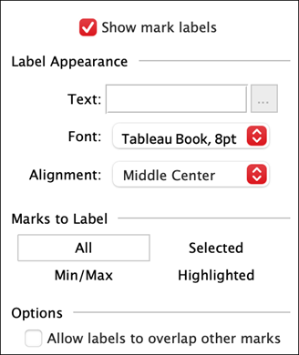
Chart Formatting for Tableau Lollipop charts
- Bars are colored #898989, using an opacity of 60%.
- Circles are colored #90E8BF.
- Chart background is #282828.
- Chart row gridlines are dashed #3B3B3B
- Axis rulers are set to none.
- Zero lines on rows are set to solid #555555.
Your chart should now look similar to the black one in this tutorial. Please free to
experiment with your chart styling and consider making an alternative version!
Congratulations on making Tableau Lollipop Charts
Now you can see how easy creating is; you might want always to make Tableau Lollipop charts. They are a great alternative to a bar chart if you need a bit of a fresher look. They can be dynamic and change up the dry chart world. A word of caution, however, on an end note. Be careful not to use Tableau Lollipop charts excessively, as too much of a good thing becomes tiresome in itself.