This blog looks at 8 KPI dashboard examples from the Tableau public. Navigating the complex world of data visualization, Tableau has emerged as a front-runner, providing accessible tools for businesses and individuals alike.
This blog dives deep into the realm of KPI dashboards,, offering insights, analysis, and guidance. Whether you’re a seasoned analyst or a newbie looking to understand the nuances of these dashboards, we’ll unravel the intricacies of Tableau’s offerings.
(These KPI dashboards are curated from Tableau Public; while we do not claim ownership of these dashboards, our goal is to delve into various applications for KPI dashboards within Tableau.)
Disclosure: This post may contain affiliate links, meaning I get a commission if you decide to make a purchase through my links, at no cost to you.
If you want to see other posts in this series, we have Tableau dashboards for marketing, finance and healthcare.
Table of Contents
#1 KPI Dashboard Examples – Executive Yearly Summary Dashboard – Tableau KPI Dashboard Examples
Key Metrics of Tableau KPI Dashboard Examples
Sales: A visual representation that offers insights into monthly sales trends, a prominent feature of the sales KPI dashboard Tableau.
Profit: An annual indicator of the company’s yearly profitability showcased through Tableau KPI examples.
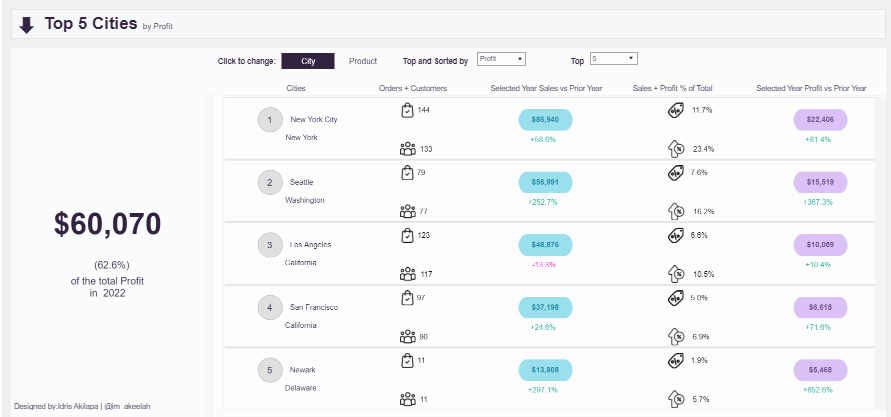
Quantity: Reflects product demand by showing the total items sold, essential in KPI Tableau dashboard examples.
Returns: A crucial metric within Tableau KPI dashboards that can highlight customer satisfaction levels.
Deep Dive: Sub-Category Breakdown: This Tableau KPI dashboard provides granular insights into product sub-categories, enabling businesses to understand their diverse product lines better.
Sales vs. Prior Year: Gauges the sales growth or decline for individual products, a significant aspect of Tableau KPI dashboards.
Profit vs. Prior Year: Measures the profitability of each sub-category within the Tableau KPI example.
Quantity vs. Prior Year: Indicates popularity in units sold, a key feature of Tableau KPI dashboard examples.
Returns vs. Prior Year: A metric within the Tableau KPI examples to identify potential product issues or areas of customer dissatisfaction.
Utility and Impact: This dashboard, representative of Tableau KPI dashboard examples, is a cornerstone for strategic decision-making, enabling executives to identify growth areas potential challenges, and optimize resource allocation for maximum profitability.
#2 KPI Dashboard Examples – Construction Executive Score Card
These KPI dashboard examples provide a comprehensive scorecard offering an in-depth view of vital performance indicators relevant to the construction industry. It’s segmented into several key Tableau KPI dashboard areas: financials, safety, business development, corporate risks, and stakeholder engagement.
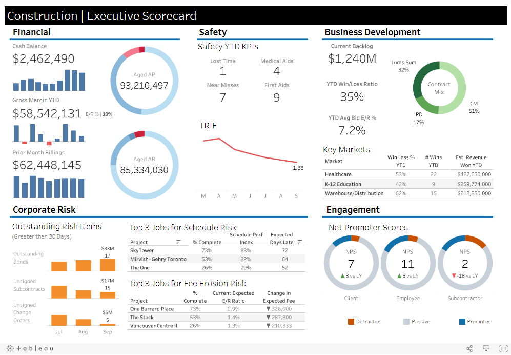
Detailed Breakdown
Financial: This Tableau KPI example covers the company’s current cash balance, outstanding payments (both owed and receivable), year-to-date gross margins, and the previous month’s billings. Such financial insights are paramount for CFOs and analysts using Tableau KPI dashboards.
Safety KPIs: This part of the sales KPI dashboard Tableau reflects the company’s emphasis on safety by noting incidents such as lost time, medical aids, first aid, and near misses. The safety trend (TRIF) showcased over several months offers a quick visual of improvements or deteriorations. Safety officers and site managers would find these Tableau KPI dashboard examples particularly invaluable.
Business Development: Presents the current project backlog, a breakdown of contract types, the year-to-date win/loss ratio, and critical market performance in a Tableau KPI examples format. Such data is essential for business development teams and strategic planners reviewing KPI Tableau dashboard examples.
Corporate Risk: This section of the Tableau KPI dashboards details potential hazards like outstanding bonds, unsigned subcontracts, and jobs at risk due to scheduling or financial concerns. Project managers and risk management teams would find this information critical.
Engagement: Measures the company’s rapport with stakeholders through the Tableau KPI example of Net Promoter Scores (NPS). It distinguishes between clients, employees, and subcontractors, making it vital for HR and client relationship teams.
Utility & Target Audience of Tableau KPI Dashboard Examples
This KPI dashboard Tableau serves as a primary tool for high-ranking decision-makers in the construction industry. Transforming intricate data into digestible Tableau KPI dashboard examples empowers these experts to make enlightened choices, manage risks, and guide the company towards sustained growth and profitability.
#3 KPI Dashboard Examples – KPI Score Card
Businesses often use KPI dashboard examples for guidance. The presented Tableau KPI example scorecard showcases vital business metrics, facilitating easy data comprehension and effective tracking and assessment over time.
Detailed Breakdown:
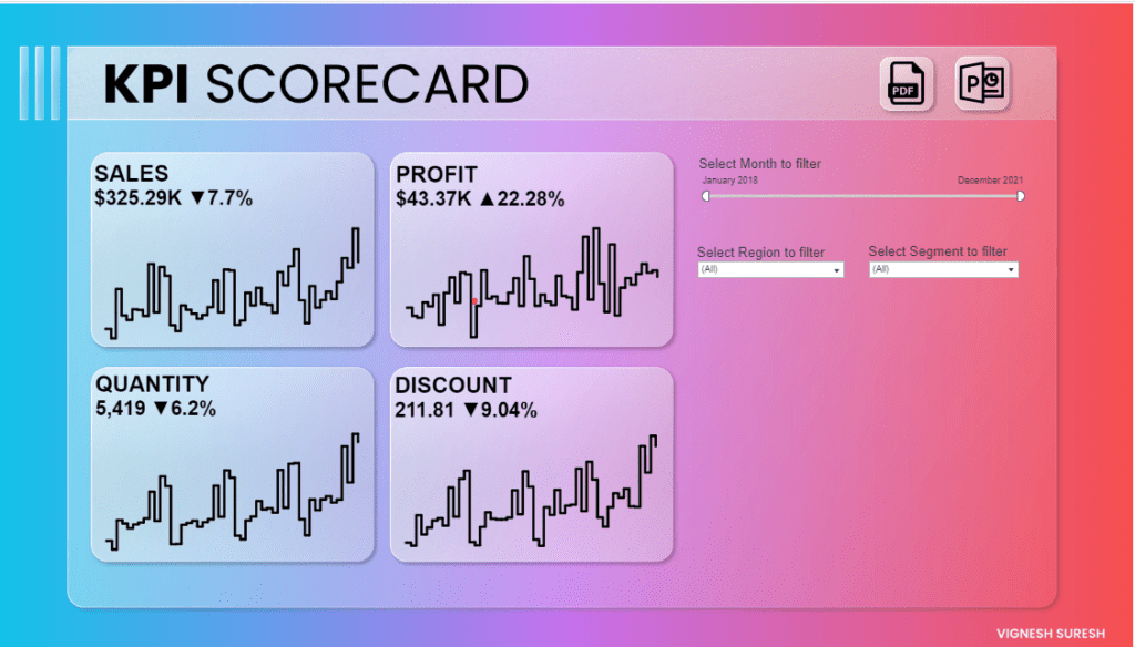
Sales: Depicting a Tableau KPI example, it indicates total sales figures at $325.29K, up by 7.7%. An accompanying chart provides a historical view, illustrating sales KPI dashboard Tableau trends.
Profit: The profit, highlighted as one of the Tableau KPI examples, stands at $43.37K, having risen by 22.28%. Its graphical layout offers a snapshot of profit variations.
Quantity: This metric highlights the volume of items sold, totalling 5,419 with a 6.2% increase, offering insights into sales dynamics.
Discount: At 211.81, the total discounts have surged by 9.04%. This can be crucial for understanding the impact of promotions or loyalty initiatives.
To the right, KPI Tableau dashboard examples can be seen as filter options, allowing a tailored view of metrics by month, region, and more.
Utility & Application for Business of Tableau KPI Dashboard Examples
Harnessing Tableau KPI dashboards, businesses can adopt data-driven decision-making. For example, if sales dip, but profit rises, it might hint at successful cost management or high-margin sales.
Trend Analysis: Historical data visuals on the Tableau KPI dashboard allow trend spotting, predicting future performance, and thus facilitating strategy shifts.
Targeted Strategy: With segment filters, businesses can customize strategies for distinct demographics.
Performance Audits: Such scorecards, reminiscent of Tableau KPI dashboards, can be vital during performance evaluations.
Cost Insights: Watching discounts can aid in reshaping pricing approaches.
Export Abilities: Options to export the scorecard amplify its utility during presentations or discussions.
A KPI dashboard is indispensable for businesses keen on monitoring performance, ensuring growth, and maximizing profitability. It’s a boon for analysts, sales teams, and top leadership to stay updated on company metrics.
#4 KPI Dashboard Examples – Health and Safety Environment Scorecard
The KPI dashboard examples are pivotal for organizations, especially in the health and safety sector. The Health Safety and Environment (HSE) Scoreboard is a KPI example that offers an overview of various safety metrics within an organization. Its design boasts visual and percentage-based progress bars:
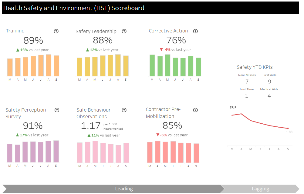
Training (89%): Demonstrating Tableau KPI examples, this metric reveals a 15% boost from last year, highlighting the effectiveness of safety training initiatives.
Safety Leadership (88%): A growth of 12% since last year suggests a strengthening commitment to safety leadership.
Corrective Action (76%): As showcased in some Tableau KPI dashboards, there’s a 4% decline, indicating areas for potential enhancement.
Safety Perception Survey (91%): Echoing the findings from other tableau KPI dashboard examples, this 17% rise implies that employees respond positively to safety protocols.
Safe Behavior Observations (1.17 per 1,000 hours worked): This metric has surged by 11%, signifying safer work practices.
Contractor Pre-Mobilization (85%): Contrary to the trends in some KPI tableau dashboard examples, there’s a 5% drop, pointing towards possible lapses in contractor preparedness.
Furthermore, the sales KPI dashboard Tableau format outlines Safety YTD KPIs: Near Misses (7), First Aids (9), Lost Time (1), and Medical Aids (4). The TRIF chart in this Tableau KPI example indicates a declining trend, emphasizing enhanced safety measures over time.
Leveraging such Tableau KPI dashboards, organizations can accurately measure the effectiveness of their safety protocols. This allows them to fine-tune practices, minimize incidents, achieve compliance, and cultivate a safer workspace.
#5 KPI Dashboard Examples – Revenue & Profit KPI Dashboard – Tableau KPI Dashboard Examples
The Tableau KPI dashboard examples offer businesses an in-depth financial performance overview, highlighting profit metrics across varying timelines and dimensions. The Tableau KPI dashboards illustrate the monthly and category-wise breakdowns.
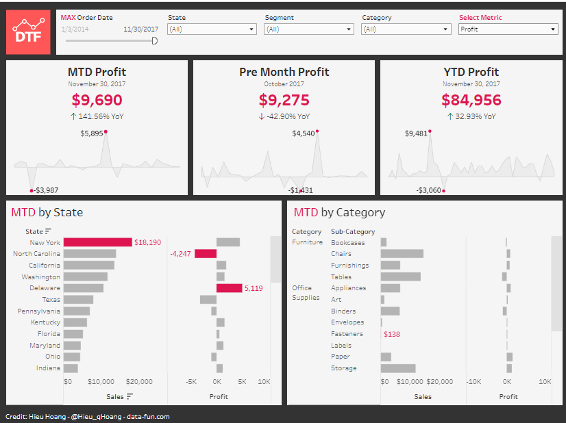
MTD Profit (Month-To-Date): As of November 30, 2017, profit insights reflect $9,690, a significant YoY increase of 141.56%. The Tableau KPI examples in the form of graphs depict profit fluctuations.
Pre-Month Profit: October’s Tableau KPI example indicates a profit of $9,275, marking a decline of 42.90% YoY. The KPI Tableau dashboard examples trace this trajectory.
YTD Profit (Year-To-Date): The Sales KPI dashboard T
MTD by State: A clear depiction of state-wise profits, with New York’s impressive figures and North Carolina’s losses.
MTD by Category: Distinct categories like Furniture, especially Chairs, boost profit margins while Office Supplies lag.
This dashboard’s utility is evident as it showcases the financial landscape, informing business strategies. The provided Tableau KPI examples and their YoY comparisons help businesses assess growth and areas needing attention.
#6 KPI Dashboard Examples – State of Ohio Covid-19 Key Indicators
This dashboard provides a comprehensive view of the COVID-19 situation in Ohio, focusing on key health indicators.
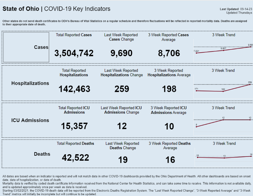
- Cases: There have been 3,504,742 reported cases of COVID-19 in Ohio. The recent change over the last week is an increase of 9,690 cases. The three-week average is 8,706 cases, with a trend chart visualizing the fluctuations over this period.
- Hospitalizations: Ohio has witnessed 142,463 total hospitalizations due to COVID-19. In the last week alone, 259 new hospitalizations were reported. The three-week hospitalization average is 198, and its upward trend is visualized.
- ICU Admissions: Total ICU admissions in the state amount to 15,357. There were 12 new ICU admissions in the past week, with a three-week average of 10 admissions. A trend chart for the same is provided.
- Deaths: Sadly, 42,522 deaths in Ohio are attributed to COVID-19. The past week saw 19 new reported deaths, with a three-week average of 16 deaths. The trend of these figures is depicted in the corresponding chart.
The dashboard is invaluable for multiple reasons:
- Decision Making: Public health authorities can deploy resources based on these metrics.
- Public Awareness: Residents can grasp the severity and trend of the virus, influencing behaviour.
- Tracking & Monitoring: Enables timely interventions, adjusting policies or measures as needed.
Overall, it fosters an informed response to the pandemic.
#7 KPI Dashboard Examples – Contact Centre Scorecard – Tableau KPI Dashboard Examples
This dashboard, titled “Contact Centre Scorecard,” evaluates the performance of four contact centres across three key metrics: Utilization, Occupancy, and Average handling time. The performance is measured Year-To-Date (YTD) and compared against the prior year (PY) percentages, providing an apparent percentage change.
Each metric and center is accompanied by a trend graph, showcasing the fluctuations over time. Moreover, a normalized score from 0-100 indicates the overall performance, with colour indicators (Bad, Okay, Good) to assess the situation quickly.
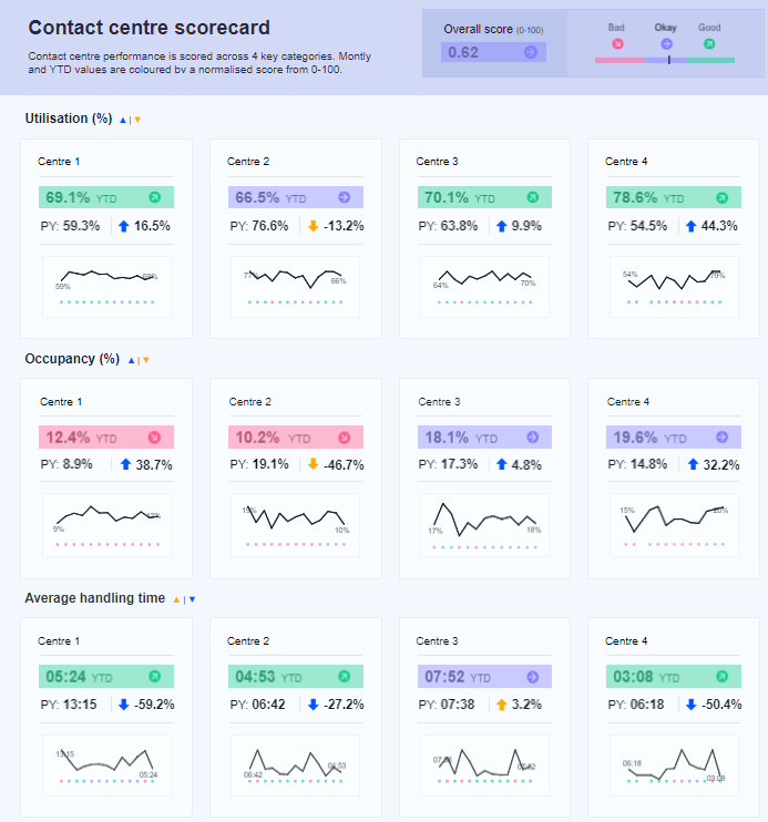
- Utilisation: Measures the percentage of time agents spend handling calls or performing after-call work against the available time. Higher utilisation generally means better efficiency.
- Occupancy: This represents the time agents are on calls or completing after-call work compared to their total logged-in time. High occupancy can indicate a heavy workload, affecting agent morale or call quality.
- Average handling time: This metric indicates the average time to resolve customer queries. A significant drop might imply improved efficiency, but a meagre time could tell unresolved issues.
This dashboard is invaluable for:
- Performance Analysis: It allows managers to quickly identify areas of improvement or concern.
- Operational Efficiency: Tracking these metrics ensures optimal staffing, better resource allocation, and efficient call handling.
- Strategic Planning: Trends and year-on-year comparisons provide insights for future planning and training needs.
It fosters proactive management, ensuring high customer satisfaction and operational effectiveness.
#8 KPI Dashboard Examples – Executive KPI Dashboard
The “2020 SuperStore Executive KPI Dashboard” provides a brief overview of key performance indicators (KPIs) for the SuperStore for the year 2020. It tracks six vital metrics:
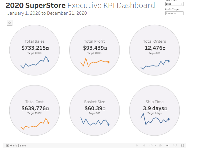
- Total Sales: Sales amounting to $733,215, surpassing the set target of $700K.
- Total Profit: A profit of $93,439, slightly below the targeted $100K.
- Total Orders: The store completed 12,476 orders, exceeding the 12K target.
- Total Cost: Costs reached $639,776, overshooting the desired $550K.
- Basket Size: The average transaction value is $60.39, surpassing the target of $60.
- Ship Time: Orders were shipped in an average of 3.9 days, bettering the 4-day target.
Each KPI is visualized with a trend graph and a target comparison, offering a quick visual assessment of performance relative to set goals.
This dashboard is instrumental for several reasons:
- Performance Monitoring: It allows stakeholders to gauge the store’s success concerning its yearly objectives.
- Decision-making: By identifying areas where targets were not met, such as Total Profit and Total Cost, management can make informed decisions to rectify these shortfalls.
- Trend Analysis: The visual graphs provide insights into yearly performance trends.
- Efficiency: Consolidating key metrics into one dashboard facilitates a holistic view, saving time and fostering clarity.
Essentially, this dashboard aids in strategic planning and continuous improvement and ensures stakeholders are well-informed.
In summary, the effectiveness and adaptability of Tableau KPI dashboards are truly remarkable. Our review of diverse examples demonstrated their ability to meet various performance analysis requirements, from tracking real-time metrics to utilizing predictive analytics for strategic decision-making. Tableau’s powerful customization options enable teams to dissect key performance indicators meticulously, ensuring swift adaptation to market trends and enhancing operational efficiency.