
Table of Contents

Data Set for Tableau Jitter Chart
If you want to follow this tutorial, here is the dataset.
What is a Tableau Jitter Chart?
A Tableau Jitter chart is used to visually differentiate between marks that would otherwise be overplotted (overlapping entirely or in part) with other marks on the visualization. Over-plotting frequently happens when the data set has many individual data points that share similar x or y coordinates.
Using a RANDOM() function on one or both axes allows you to displace the marks to spread them out randomly. The displacement is done without negatively altering the integrity or user interpretation of the analysis.
When to use a Tableau Jitter Chart
Tableau Jitter charts are most useful in situations when the natural placement of the marks sees them aligned along one axis. The random function is applied to the other axis to add the displacement for visual effect.
Sometimes, the jitter is applied to only one axis, and the other axis maintains its positional significance. Sometimes, the order of the marks within a category has no relevance on either the x or the y axis so the random displacement can be applied to both axes to spread out the marks in 2 directions.
For example, survey responses make up a total population who responded similarly to the same question. The displacement in scenarios like this allows you to add contextual tooltips to each respondent to show extra detail.
Let’s create a Tableau Jitter Chart.
- Connect to your data source and locate the dimensions and measures needed to build your base visualization.
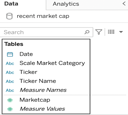
In this case, we will build a jitter plot to show market cap values for tickers within several different market scale categories. We will need:
- The Ticker dimension.
- The Scale Market Category dimension.
- The Marketcap measure.
- First, build out the base visualization. We want to look at market cap grouped by scale market category with the ticket as the level of detail.Drop the Scale Market Category onto columns.
- Drop the Marketcap measure onto rows.
- Drop the ticker dimension onto the detail.
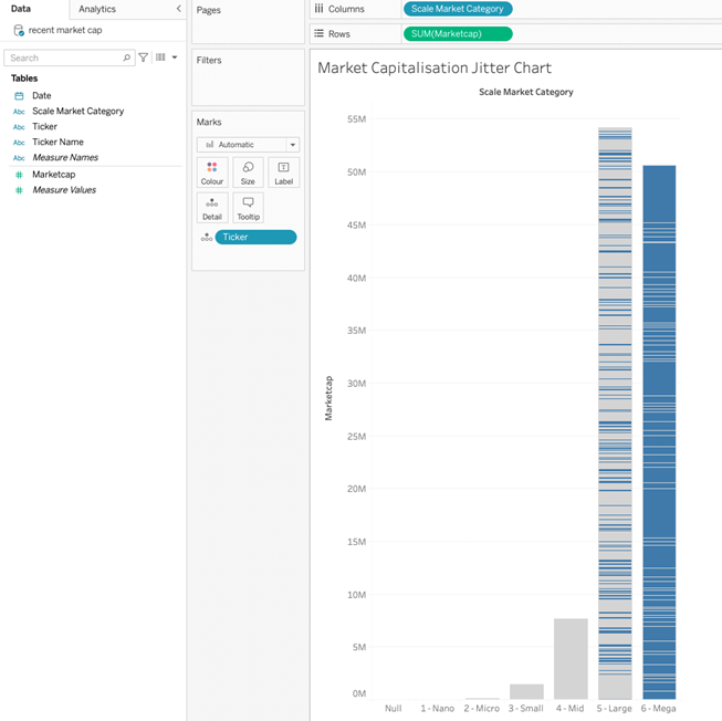
This will create a bar chart with separate bars per Scale Market category, each with a horizontal separator to segregate the category by ticket. The height of the bar is the sum of the Marketcap measure.
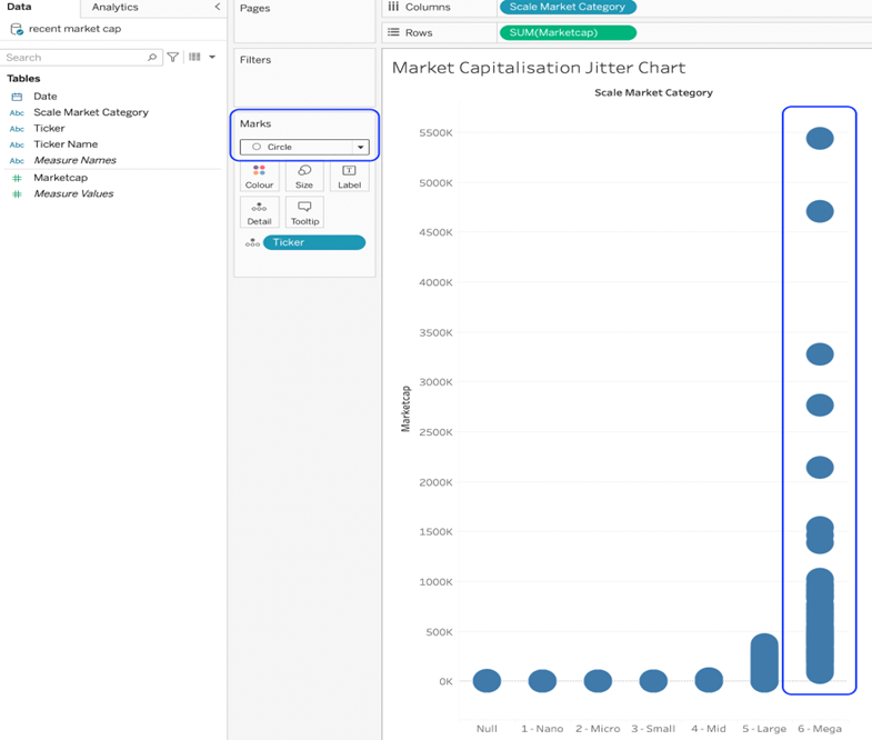
- Change the mark type to circle. This will separate the tickets on the vertical axis and plot one circle mark for each. Notice the overplotting towards the bottom of the range.
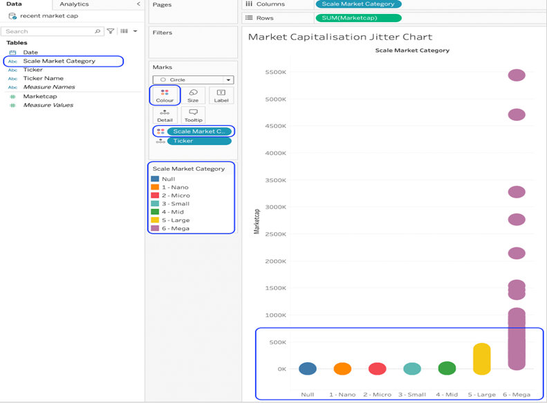
- Drop the Scale Market Category dimension on colour. This will help to visually separate the tickers in one category from those in another.
Dropping onto colour will place a pill on the marks card, create a legend card and change the colour of the circles on the chart. The colours can be changed by clicking the colour card on the marks card.
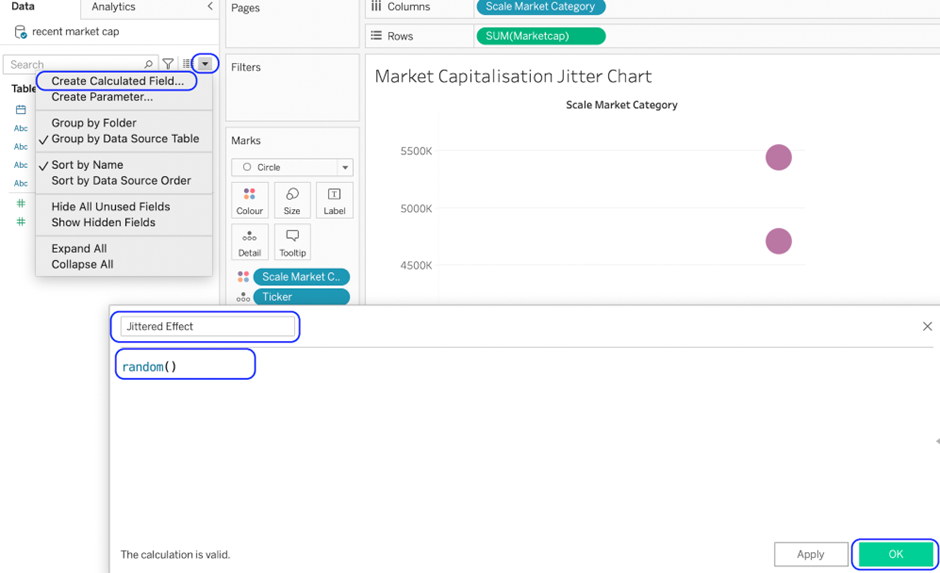
Create a calculated field using the Random() function. This is the field that will introduce the jitter.
6. We want the jitter effect along the horizontal axis to drop the newly calculated fields onto columns.
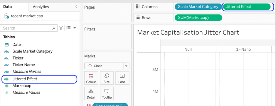
7. Change the newly dropped pill into a dimension.
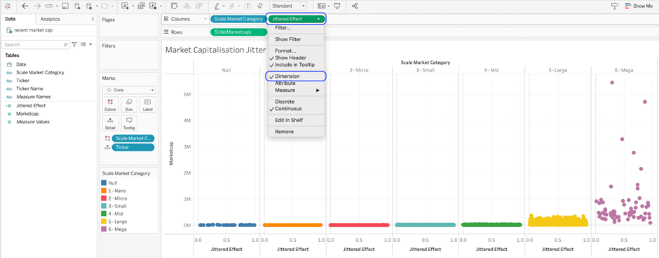
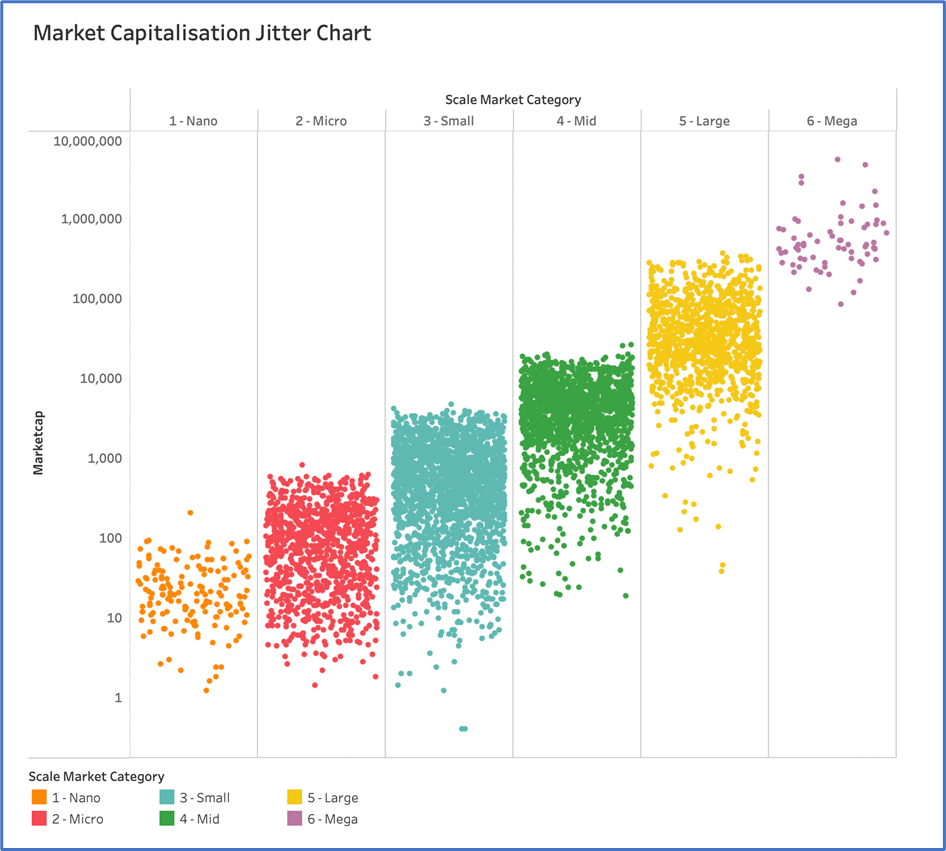
You should now have the visualisation matching the above screenshot. The tickers are now scattered along the X axis, making them more visible and discrete.
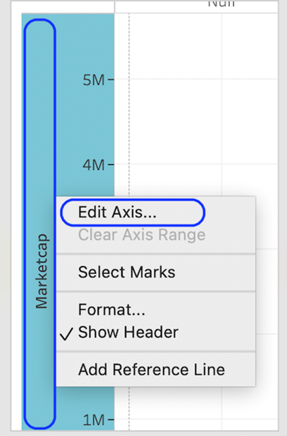
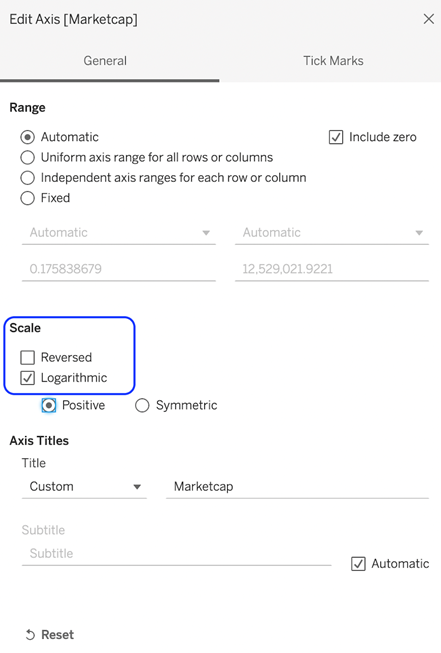
8. Next, we need to use a logarithmic scale for this dataset. Right-click on the market cap axis and select Edit Axis.
9. Finally, format the visualisation for your Tableau Jitter Chart as desired in the areas listed here.
- Hide jitter axis.
- Change the font of the headers.
- Make the marks slightly smaller.
- Add any tooltips.
- Add any labels.
- Hide gridlines and dividers.
Your final Tableau Jitter chart output should look like this with a light background.
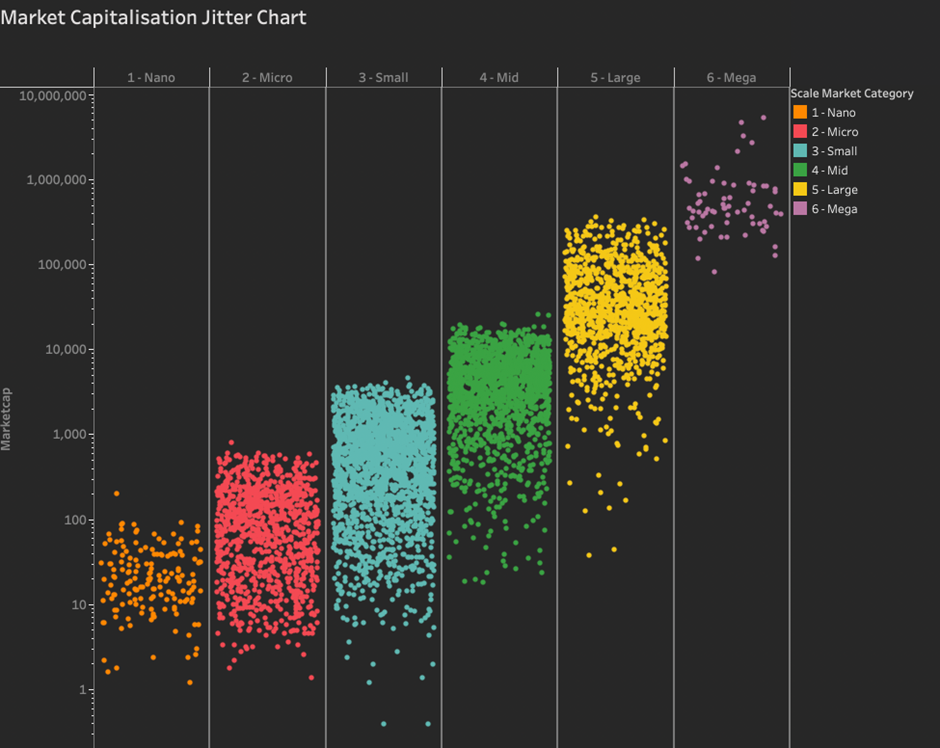
Here is the final Tableau Jitter Chart with a dark background.
Congratulations! You’ve made a Tableau Jitter Chart!
For more on how-to Tableau charts, head to our blog or website at Quatize Analytics.


