Welcome to our detailed exploration of the latest advancements in insurance dashboards. This blog highlights seven outstanding Tableau insurance dashboard examples that are revolutionizing the way the insurance industry utilizes data analytics in the insurance industry to streamline workflows and enhance decision-making processes.
Covering everything from underwriting and insurance claims analytics to customer service and risk management, these insurance dashboard Tableau examples showcase the integration of sophisticated insurance data analytics into daily operations. Ideal for stakeholders aiming to boost operational efficiency and data analysts eager to leverage insurance analytics, these insurance dashboard examples offer vital insights into the effective use of dashboard technology in managing insurance operations. Discover how each uniquely crafted dashboard meets specific industry requirements, promoting efficiency and innovation in the insurance sector.
These insurance dashboards are curated from Tableau public, we do not take credit for the outstanding work in these dashboards.
Affiliate Disclosure: Some of the links on this blog are affiliate links, which means if you click on them and make a purchase, we may receive a commission at no extra cost to you. This helps support our blog and allows us to continue to create content for you. We only recommend products and services that we genuinely believe in, and all opinions expressed here are our own. Thank you for your support!
Table of Contents
1 Tableau Insurance Dashboards – Insurance Dashboard
The insurance dashboard displayed a comprehensive dashboard system for Battani Insurance, specifically tailored to optimize operations and provide deep insights into insurance management. These Tableau insurance dashboard examples are invaluable tools for companies enhancing operational efficiency and customer service through detailed insurance data analytics.
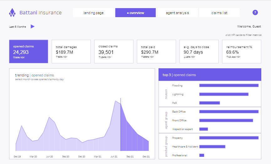
Purpose and Usage
The insurance dashboard Tableau is utilized across various roles within the insurance industry:
- Claims Adjusters leverage insurance claims analytics to track and manage open and closed claims efficiently, identifying trends and bottlenecks in the claims handling process.
- Risk Managers utilize it to evaluate risk exposure and monitor claim frequencies and severities across different lines of insurance, employing insurance analytics to guide decisions.
- Underwriters use data analytics in the insurance industry to assess data on claims and policies and adjust policy terms or pricing to match the risk profile better.
- Customer Service Representatives benefit from quick access to customer claims history, which facilitates informed customer interactions and service and enhances customer relationships through an insurance dashboard Tableau.
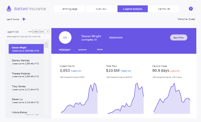
Chart Types and Layout
This multifaceted Tableau insurance analytics dashboard includes the following:
- Area Charts: Illustrate trends in opened and closed claims, helping identify seasonal patterns or anomalies.
- Bar Charts: compare claims by reason or agent performance, providing clear, comparative insights across various parameters.
- Tables: Offer detailed lists of claims, including status, associated agent, timeline, cause, and financial impact, offering a granular view of operations.
- Line Graphs: Track key performance indicators, such as average days to close claims, to help understand process efficiency.
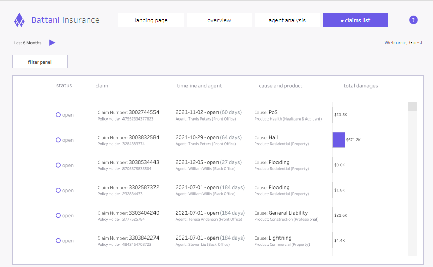
Positive Aspects
The dashboard’s structured layout and various visualization tools aid in quick data assessment and decision-making. Its interactivity allows users to drill down into specifics, enhancing the ability to respond proactively to emerging issues.
Negative Aspects
However, the dashboard’s complexity and data density might overwhelm users unfamiliar with data analysis. Additionally, the sheer volume of information presented could slow down data retrieval and interpretation without proper customisation.
Conclusion
This insurance dashboard system is a crucial technological advancement for managing and operating within the insurance sector. It leverages detailed data presentation and analysis capabilities to support strategic decision-making and operational improvements. Enhancements in user interface simplicity and data filtering could further increase its effectiveness for insurance professionals’ daily use.
2 Tableau Insurance Dashboards – Insurance, Underwriting
The insurance dashboard displayed is a detailed underwriting performance dashboard tailored for the insurance industry, designed with Tableau to provide a clear visualization of key performance indicators essential for practical risk assessment and underwriting.

Purpose and Usage
This Tableau insurance dashboard is indispensable for various professionals within the insurance sector:
- Underwriters utilize it to evaluate loss ratios by state and tier, enabling them to align policy terms and pricing with actual risk levels.
- Risk Managers gain insights into significant paid losses and those exceeding $50K, which assists in pinpointing high-risk profiles and policy areas.
- Senior Executives depend on this dashboard to oversee underwriting performance and make data-driven strategic decisions.
- Actuaries use the data to refine risk models and project future liabilities based on current trends and patterns.
Chart Types and Layout
The dashboard incorporates multiple types of visualizations to convey data effectively:
- Grid Matrix: Provides a comparative overview of loss ratios by state and tier, illustrating regional performance.
- Bar Charts: Display significant paid losses by policy number, linking claim costs directly to premiums.
- Histograms: Show how the book is distributed by deductible, offering insights into the correlation between risk and premium income.
- Scatter Plots: Highlight significant losses over $50K against earned premiums to identify trends and outliers in significant claim incidents.
Positive Aspects
This insurance data analytics tool excels in presenting complex data through a structured layout and diverse chart types, facilitating quick and informed decision-making. Its interactive features allow for deep dives into specific data points, enhancing the dashboard’s analytical depth.
Negative Aspects
The dashboard’s complexity and the richness of data might overwhelm those unfamiliar with advanced data analytics in the insurance industry. Using similar colours and dense data presentation could also complicate quick data interpretation, suggesting a need for more apparent visual differentiation.
Summary
Overall, this Tableau insurance dashboard example is a vital resource for insurance professionals, combining detailed data presentation with functional design to support effective decision-making and operational efficiency in managing risk. Enhancements in user interface and data presentation clarity could improve its effectiveness for daily operational use.
3 Tableau Insurance Dashboards – Insurance Claims
The insurance dashboard showcase an Executive Summary dashboard meticulously designed in Tableau for the insurance sector. These Tableau insurance dashboard examples illustrate a powerful tool for tracking and analyzing key metrics for evaluating underwriting and claims management performance within the insurance industry.

Purpose and Usage
- Underwriters and Claims Adjusters utilize this insurance dashboard Tableau to monitor the average cost per claim, loss ratio, and days to settle claims. This aids in refining claims handling and enhancing underwriting precision.
- Senior Executives rely on the dashboard to evaluate critical performance indicators like retention rates and satisfaction scores, which are pivotal for strategic decisions to boost customer retention and satisfaction.
- Risk Managers leverage insurance claims analytics within the dashboard to scrutinize risk exposure by analyzing loss ratios and claims costs, thus effectively managing financial risks.
- Data Analysts employ insurance data analytics to detect trends, project future outcomes, and generate actionable insights through comprehensive data analysis.
Chart Types and Layout
- Bar Charts: Illustrate trends in average costs per claim over time and compare year-over-year loss ratios.
- Line Graphs: Monitor shifts in crucial performance metrics over time.
- Dot Plots: Visualize days to settle claims against targets and exhibit retention rates and satisfaction scores by region, pinpointing focus areas.
- Histograms: Display the distribution of claims or cost variances, offering insights into financial deviations.
Positive Aspects
The dashboard’s intuitive layout and segmented visualization facilitate straightforward analysis of complex datasets, enabling stakeholders to glean insights quickly. Its interactivity enhances the analysis by allowing detailed exploration of specific data points.
Negative Aspects
The dashboard’s complexity and the multitude of advanced chart types might overwhelm those unfamiliar with detailed data analysis. Additionally, using similar visual styles across different metrics might confuse, calling for more distinct colour coding or labelling to improve clarity.
Summary
This insurance dashboard Tableau is a vital analytical tool in the insurance sector, effectively converting extensive operational data into actionable insights. While it delivers comprehensive visualization capabilities, further enhancements in visual clarity and user interaction could amplify its utility for professionals across the insurance industry.
4 Tableau Insurance Dashboards – Car Insurance Policies Dashboard
The insurance dashboard showcases a comprehensive Car Insurance Policies Dashboard, meticulously designed to give insurance companies a holistic view of various policy and claim metrics. Developed using Tableau, this dashboard displays data related to car insurance policies, making it an indispensable tool for strategic decision-making within the insurance industry.
Purpose and Usage
This dashboard is integral for multiple roles within an insurance organization:
- Product Managers evaluate insurance product performance by brand and model to tailor offerings based on consumer preference and claim history.
- Claims Adjusters oversee claim frequencies and average claim amounts, aiding in identifying patterns for process improvement.
- Marketing Teams analyze demographic data such as age, gender, marital status, and education level to craft targeted marketing strategies.
- Senior Executives review business metrics like total insurance count, commercial versus private use, and household income levels to make informed decisions.

Chart Types and Layout
The dashboard employs various chart types to communicate data effectively:
- Bar Charts: Present the insurance count and average claim amounts by brand and model, providing a precise comparative analysis.
- Donut Charts: Show policy distribution by gender, simplifying demographic analysis.
- Histograms: Depict age and education level distributions among policyholders, offering insights into customer demographics.
Positive Aspects
The dashboard excels with its clean, organized layout that simplifies the interpretation of complex datasets and facilitates quick access to crucial data points. Its comprehensive coverage of relevant metrics enhances thorough analysis and strategic planning.
Negative Aspects
If interactivity is not enabled, the dashboard’s static nature may limit in-depth exploratory analysis. Similar colour schemes across different charts could also lead to visual confusion, potentially hindering quick data assimilation.
Summary
Overall, this Car Insurance Policies Dashboard is an effective analytical tool for insurance companies, providing essential insights into policy distributions, claim details, and demographic statistics. Enhancements in interactivity and visual distinction would further amplify its utility, making it an indispensable asset for industry professionals aiming to optimize insurance offerings and improve operational efficiency.
5 Tableau Insurance Dashboards – Demo Insurance Dashboards – Broker Portfolio
The insurance dashboard showcases a sophisticated Broker Portfolio Dashboard for Q3 2019, ingeniously developed using Tableau to bolster insurance analytics. This Tableau insurance dashboard provides an exhaustive analysis of broker performance, emphasizing key metrics such as Gross Written Premium (GWP), policy counts, and brokerage efficiency, which are indispensable for fostering strategic and operational enhancements within insurance firms.
Purpose and Usage
This insurance dashboard Tableau is engineered for pivotal roles within an insurance organization:
- Insurance Executives scrutinize broker performance, tracking GWP growth and policy count variations to steer strategic decisions.
- Sales Managers evaluate broker achievements, distinguishing high and low performers to refine sales tactics and training.
- Risk Managers probe into brokers’ portfolio risks by delving into metrics like Net Income Loss Ratio (NILR) and Renewal Retention Rate (RRV), which are crucial for managing risks and boosting profitability.
- Operational Analysts leverage this rich dataset to streamline operations and augment efficiency, particularly in claims management and policy servicing.

Chart Types and Layout
This insurance data analytics tool incorporates multiple chart types to convey complex information succinctly:
- Bar Charts: Predominantly used to juxtapose brokers across various performance metrics like GWP, NILR, and policy counts.
- Heat Maps: Visualize performance indicators such as RRV and brokerage rates, highlighting performance highs and lows.
- Dot Plots: Essential for depicting brokers’ performance against set benchmarks, offering clarity in target achievement.
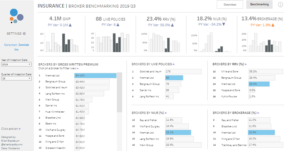
Positive Aspects
The dashboard’s structured layout and visualization tools enable stakeholders to assimilate complex data sets, fostering prompt strategic decision-making rapidly. Its interactivity enhances the granularity of the data examined.
Negative Aspects
Nevertheless, the dashboard’s intricate displays may daunt users unaccustomed to dense analytical platforms, possibly necessitating more streamlined navigation aids. Moreover, the uniform visual treatment across diverse data could obscure quick differentiation.
Summary
These Tableau insurance dashboard examples are crucial analytical tools within the insurance sector. They meld comprehensive data visualization with functional design to support informed decision-making and operational improvements. Enhancements to the user interface and visual distinction would amplify their value, solidifying their status as an essential tool for insurance professionals focused on optimizing brokerage management and operational efficacy.
6 Tableau Insurance Dashboards – Demo Insurance Dashboards – Underwriter Performance
The insurance dashboard displays a sophisticated Underwriter Performance Dashboard for Q3 2019, meticulously engineered for the insurance sector. These Tableau insurance dashboard examples provide comprehensive insurance data analytics, enabling companies to assess individual underwriters’ performance with precision. Thus, they serve as indispensable tools for strategic management and operational oversight in the insurance industry.

Purpose and Usage
This insurance dashboard Tableau is crucial for multiple roles within an insurance company:
- Underwriting Managers utilize this dashboard to monitor and evaluate underwriters, focusing on key metrics such as Gross Written Premium (GWP), Number of Policies, Cost per Policy, and Net Income Loss Ratio (NILR).
- Senior Executives use it to review underwriting health and performance trends to inform decisions on resource allocation, training, and incentives.
- Risk Analysts examine the NILR to gauge risk exposure and pinpoint underwriting practices that optimize profitability and minimize losses.
- HR and Performance Management Teams leverage the insights to conduct performance evaluations and pinpoint areas for professional enhancement.
Chart Types and Layout
The insurance dashboard Tableau incorporates a variety of visual tools:
- Scatter Plots: Employed to compare each underwriter’s performance across multiple metrics, providing precise visual assessments.
- Bar Charts: Utilized to display GWP and policy counts, facilitating a direct comparative analysis of essential performance indicators.
- Line Graphs: Trace policy and cost metric trends over time, aiding in identifying performance patterns.
- Summary Metrics: These metrics offer quick insights into year-over-year performance, emphasizing deviations and trends in areas such as policy cost and NILR.
Positive Aspects
The dashboard’s comprehensive and interactive visualizations provide an easy-to-understand format that enhances decision-making, allowing detailed metric analysis and quick comparisons across performance indicators.
Negative Aspects
However, the dashboard’s complexity and the dense presentation of data may overwhelm users unfamiliar with advanced data visualizations, potentially necessitating targeted training. Additionally, the visual congestion could be streamlined to highlight critical data points better.
Summary
Overall, these Tableau insurance dashboard examples represent a critical analytical resource in the insurance industry. They synthesize complex data into actionable insights that enhance strategic decision-making and operational efficiency. Further enhancements in user interface and data presentation could amplify their value to insurance professionals.
7 Tableau Insurance Dashboards – Demo insurance dashboards – Renewal progress analysis
The insurance dashboard highlights a Renewal Progress Analysis Dashboard designed for the insurance sector, showcasing how data analytics can optimize policy management in the industry. Developed using Tableau insurance analytics, this dashboard provides a detailed view of Gross Written Premium (GWP) for policies nearing renewal, supporting sustained revenue and customer retention for insurance firms.

Purpose and Usage
This insurance dashboard Tableau is vital for various insurance company roles:
- Account Managers utilize it to track expiring policies, focusing on customer retention.
- Underwriting Managers evaluate risks and adjust terms pre-renewal.
- Financial Analysts oversee the economic impact of renewals, particularly tracking GWP at risk from non-renewals.
- Customer Service Representatives proactively engage with clients to encourage policy renewal, addressing any concerns to prevent churn.
Chart Types and Layout
This Tableau insurance dashboard examples employ diverse visualizations:
- Area Chart: Visual timeline of policy renewals by GWP.
- Bar Charts: Illustrate total GWP and the percentage expiring soon, aiding prioritization.
- Tabular Format: This format details individual policies, showing Policy ID, Expiry Date, Underwriter, GWP, and Status for in-depth tracking.
Positive Aspects
The dashboard’s structured design provides easy access to essential metrics, supporting quick decision-making. Interactive features allow a deep dive into specific data points, boosting efficiency and engagement.
Negative Aspects
The data’s complexity might overwhelm those unfamiliar with advanced dashboards. Also, using a single dashboard for multiple user functions may cause information overload, suggesting a need for more tailored features to effectively meet various departmental needs.
Summary
This Renewal Progress Analysis Dashboard is an indispensable analytics tool in the insurance industry. It effectively blends insurance data analytics with practical usability to support strategic decision-making and enhance operational practices. Streamlining its design to enhance user interaction could further leverage its value for industry professionals.
7 Great Tableau Insurance Dashboards – Conclusion
The seven great examples featured in this blog demonstrate the transformative impact of Tableau insurance analytics within the insurance sector. These insurance dashboards simplify complex datasets by incorporating advanced insurance data analytics, enhancing decision-making and operational efficiency. Each example highlights the effectiveness of insurance dashboards in refining various aspects of insurance operations, including claims processing, customer interaction, and risk management. As the industry evolves, these sophisticated analytical tools will be crucial for maintaining competitiveness and responsiveness in a data-centric environment. This review highlights the pivotal role of Tableau insurance dashboard examples in advancing the future of insurance analytics.