Creating effective HR analytics dashboards in Tableau is essential for any organization looking to leverage data-driven decision-making in their human resources department. A well-designed Tableau human resources dashboard can provide comprehensive insights into workforce metrics, helping HR professionals, managers, and executives monitor and improve various aspects of employee management, from recruitment and retention to performance and satisfaction.
However, starting from scratch can be daunting. That’s why looking at great examples of HR analytics dashboards in Tableau is crucial before beginning your own project. Studying these examples inspires and highlights best practices in data visualization, ensuring that your HR Tableau dashboard is informative and visually engaging.
This blog will showcase eight exemplary HR analytics dashboards created using Tableau, each demonstrating different ways to visualize and analyze HR data effectively. These examples will serve as a valuable resource as you build your own HR analytics dashboard Tableau, equipping you with the insights needed to create impactful and actionable visualizations.
Table of Contents
Affiliate Disclosure: Some of the links on this blog are affiliate links, which means if you click on them and make a purchase, we may receive a commission at no extra cost to you. This helps support our blog and allows us to continue to create content for you. We only recommend products and services we genuinely believe in; all opinions expressed here are our own. Thank you for being so supportive!
These great dashboards have been curated from Tableau public, we do not take credit for their creation.
#1 HR Attrition Dashboard
The HR Attrition Dashboard for Tableau is a powerful tool designed to provide comprehensive insights into employee attrition. This Tableau human resources dashboard is essential for HR professionals, managers, executives, and data analysts who need to monitor, analyze, and mitigate employee turnover. The HR Tableau dashboard provides a clear visualization of various attrition metrics and aids in data-driven decision-making and strategic planning.
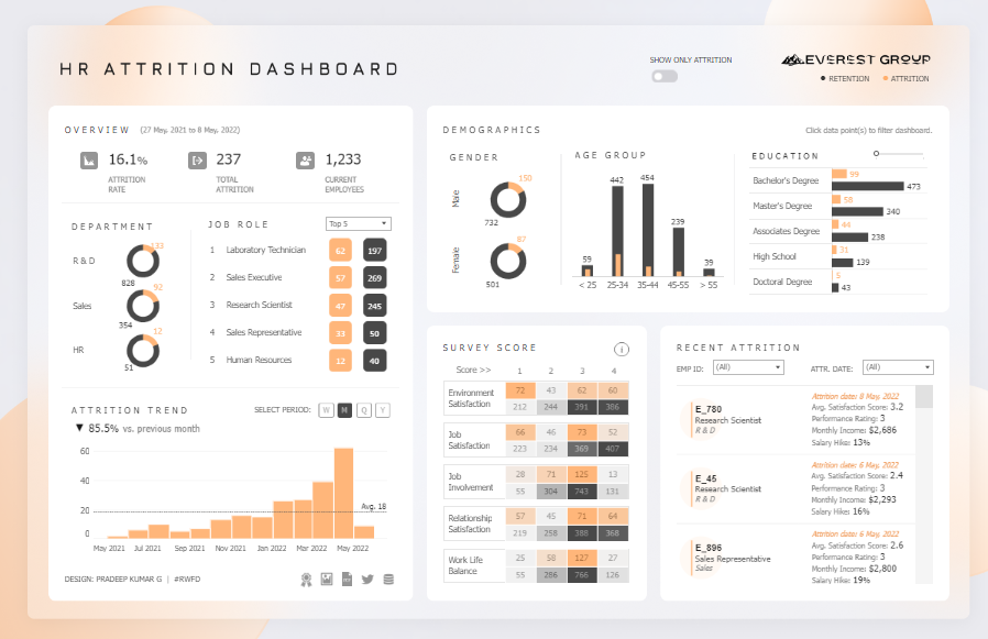
Purpose and Usage
This HR analytics dashboard for Tableau is primarily used to track and analyze employee attrition rates and trends over time. It provides a detailed overview of the attrition rate, total attrition, and current employee count. Breaking down the data by department, job role, demographics, education level, and survey scores helps identify patterns and factors contributing to employee turnover. This information is crucial for developing targeted retention strategies, improving employee satisfaction, and reducing attrition rates.
Key Users
- HR Professionals: Utilize Tableau’s HR dashboard to monitor attrition trends, identify high-risk groups, and develop retention strategies.
- Managers: Gain insights into team dynamics, understand reasons for employee turnover, and take proactive measures to improve job satisfaction.
- Executives: Review high-level attrition metrics to inform strategic decisions and allocate resources effectively.
- Data Analysts: Analyze attrition data to uncover patterns, correlations, and predictive insights that can drive HR initiatives.
Chart Types and Layout
The HR Attrition Dashboard employs a variety of chart types to present data effectively:
- Bar Charts: These are used to display attrition rates by department, job role, age group, and education level. These charts allow for easy comparison and identification of trends.
- Pie Charts: Represent the gender distribution of attrition, providing a quick visual breakdown of male and female attrition rates.
- Line Chart: Illustrates the attrition trend over time, showing monthly attrition rates and highlighting significant changes.
- Heatmap: This displays survey scores across various dimensions, such as environment satisfaction, job satisfaction, job involvement, relationship satisfaction, and work-life balance. It helps pinpoint areas needing improvement.
- Table: Lists recent attrition details, including employee ID, attrition date, department, and survey scores. This provides granular data for deeper analysis.
Positive Aspects
The HR Tableau dashboard offers several positive aspects:
- Comprehensive Insights: Provides a holistic view of attrition metrics, allowing users to understand the multifaceted nature of employee turnover.
- Interactive Elements: Users can filter data points to drill down into specific segments, making the analysis more relevant and actionable.
- Visual Clarity: Various chart types enhance data visualization, making complex information easily understandable.
- Actionable Data: The dashboard empowers HR teams to implement targeted interventions by highlighting high-risk areas and providing detailed breakdowns.
- Real-Time Updates: The dashboard can be connected to live data sources, ensuring the information is always up-to-date.
Benefits of a DataCamp Tutorial on HR Analytics for Tableau
Completing a DataCamp tutorial on HR analytics for Tableau can significantly benefit analysts aiming to create similar visualizations. These tutorials provide:
- Structured Learning: Step-by-step guidance on building Tableau human resources dashboards, covering everything from data preparation to advanced visualization techniques.
- Hands-On Practice: Interactive exercises that reinforce learning by allowing users to apply concepts in real time.
- Best Practices: Insights into best practices for data visualization, ensuring that the dashboards are both practical and aesthetically pleasing.
- Advanced Techniques: Exposure to advanced Tableau features and functions, enabling analysts to create more sophisticated and insightful dashboards.
- Practical Application: Real-world examples and case studies demonstrating how to apply Tableau HR concepts to business scenarios.

In conclusion, the HR Attrition Dashboard for Tableau is an invaluable tool for organizations seeking to understand and mitigate employee turnover. By leveraging the Tableau human resources dashboard’s comprehensive insights and interactive features, HR professionals, managers, executives, and data analysts can make informed decisions that enhance employee retention and satisfaction. A DataCamp tutorial on HR analytics for Tableau can equip analysts with the skills and knowledge to create impactful visualizations, driving data-driven decision-making in their organizations.
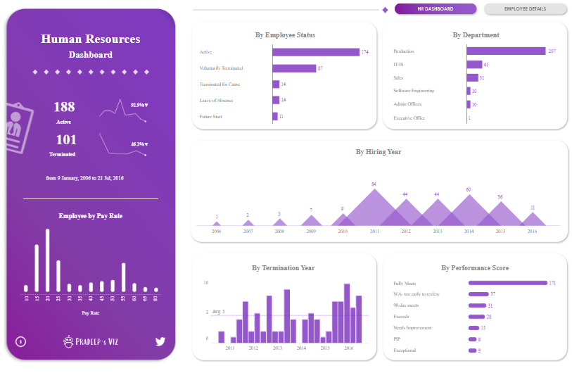
#2 Human Resources Dashboard
The RWFD Human Resources Dashboard is a comprehensive tool designed to provide an in-depth overview of key HR metrics within an organization. This Tableau human resources dashboard is essential for human resources professionals, managers, executives, and data analysts who need to monitor various aspects of workforce management, including hiring trends, employee demographics, and departmental distributions. The RWFD Human Resources Dashboard facilitates data-driven decision-making and strategic planning by clearly and concisely visualizing crucial HR data.

Purpose and Usage
This Tableau human resources dashboard is primarily used to track and analyze various HR metrics to gain insights into workforce composition and trends. It provides a detailed overview of the number of hired and terminated employees, average age and tenure, and the number of departments within the organization. By breaking down data by department, state, age, gender, and race, the Tableau human resources dashboard helps identify patterns and trends that inform HR strategies and initiatives. This information is crucial for workforce planning, diversity and inclusion efforts, and identifying areas requiring additional resources or support.
Key Users
- HR Professionals: Utilize the Tableau human resources dashboard to monitor workforce trends, analyze employee demographics, and develop strategies for recruitment, retention, and diversity.
- Managers: Use Tableau for HR to gain insights into team composition, understand hiring and termination trends, and make informed decisions about staffing and resource allocation.
- Executives: Review high-level HR metrics to inform strategic decisions and ensure the organization meets its workforce goals and objectives.
- Data Analysts: Analyze HR data to uncover patterns, correlations, and predictive insights that can drive HR initiatives and support data-driven decision-making with an HR analytics dashboard Tableau.
Chart Types and Layout
The RWFD Human Resources Dashboard employs a variety of chart types to present data effectively:
- Bar Charts: Used to display the number of employees by department, job title, state, and age group. These charts allow for easy comparison and identification of trends.
- Donut Chart: This chart represents the gender distribution of employees, providing a quick visual breakdown of male, female, and non-conforming employees.
- Line Chart: Illustrates hiring trends by month over several years, showing patterns and fluctuations in hiring activity.
- Stacked Bar Charts: Display diversity by race and gender, highlighting the composition of the workforce across different demographic categories.
- Summary Cards: These cards present vital metrics such as the number of hired and terminated employees, average age and tenure, and the total number of departments. They provide a quick snapshot of essential HR statistics.
Positive Aspects
The RWFD Human Resources Dashboard offers several positive aspects:
- Comprehensive Insights: Provides a holistic view of key HR metrics, allowing users to understand various aspects of workforce composition and trends.
- Interactive Elements: Users can filter data points to drill down into specific segments, making the analysis more relevant and actionable.
- Visual Clarity: Various chart types enhance data visualization, making complex information easily understandable.
- Actionable Data: The HR Tableau dashboard empowers HR teams to implement targeted interventions and strategies by highlighting key metrics and providing detailed breakdowns.
- Real-Time Updates: The HR Tableau dashboard can be connected to live data sources, ensuring the information is always up-to-date.
Benefits of HR Analytics Dashboard Tableau
An HR analytics dashboard Tableau can significantly benefit organizations by providing structured and actionable insights into workforce management. By utilizing Tableau for HR, organizations can:
- Improve Decision-Making: Access to real-time and comprehensive HR data allows for more informed decision-making and strategic planning.
- Enhance Employee Experience: By identifying trends and areas for improvement, HR professionals can develop initiatives to enhance employee satisfaction and retention.
- Support Diversity and Inclusion: Detailed demographic data helps organizations effectively track and promote diversity and inclusion efforts.
- Optimize Resource Allocation: Insights into workforce composition and trends enable better resource allocation and staffing decisions.
- Drive Performance: By monitoring key HR metrics, organizations can identify performance gaps and develop strategies to address them, ultimately driving better business outcomes.
The RWFD Human Resources Dashboard is invaluable for organizations seeking to understand and optimize their workforce. By leveraging the Tableau HR dashboard’s comprehensive insights and interactive features, HR professionals, managers, executives, and data analysts can make informed decisions that enhance workforce management and drive organizational success.
#3 Human Resources | Executive Summary
The Human Resources Executive Summary Dashboard is a comprehensive Tableau human resources dashboard that provides an in-depth overview of key HR metrics within an organization. This dashboard is a vital tool for human resources professionals, managers, executives, and data analysts who need to monitor and analyze various aspects of workforce management. By visualizing critical HR data, the dashboard aids in data-driven decision-making and strategic planning.

Purpose and Usage
This HR Tableau dashboard tracks and analyses several HR metrics to gain insights into workforce composition and trends. It provides a detailed overview of current headcount, cumulative hires and terms, HQ versus remote distribution, location summaries, and headcount by department, race, and gender. Additionally, it shows hires and terms in the current period, along with gender and age summaries. This information is crucial for workforce planning, diversity and inclusion efforts, and identifying areas requiring additional resources or support.
Key Users
- HR Professionals: Utilize the Tableau HR dashboard to monitor workforce trends, analyze employee demographics, and develop strategies for recruitment, retention, and diversity.
- Managers: Use Tableau for HR to gain insights into team composition, understand hiring and termination trends, and make informed decisions about staffing and resource allocation.
- Executives: Review high-level HR metrics to inform strategic decisions and ensure the organization meets its workforce goals and objectives.
- Data Analysts: Analyze HR data to uncover patterns, correlations, and predictive insights that can drive HR initiatives and support data-driven decision-making with an HR analytics dashboard Tableau.
Chart Types and Layout
The Human Resources Executive Summary Dashboard employs a variety of chart types to present data effectively:
- Bar Charts: Display headcount by department, headcount by race, and the distribution of HQ versus remote employees. These charts facilitate easy comparison and identification of trends.
- Donut Chart: This chart represents the gender distribution of employees, providing a quick visual breakdown of male, female, and non-binary employees.
- Line Charts: Illustrate hires and terms in the current period, showing trends over time and helping to identify fluctuations in hiring and termination activities.
- Maps: Used to show the location summary, highlighting the distribution of employees across different states and cities.
- Heatmap: Displays the headcount by gender and age mix, allowing for a detailed analysis of workforce demographics.
- Summary Cards: These cards present key metrics such as current headcount, cumulative hires and terms, and the percentage of HQ versus remote employees. They provide a quick snapshot of essential HR statistics.
Positive Aspects
The Human Resources Executive Summary Dashboard offers several positive aspects:
- Comprehensive Insights: This tool provides a holistic view of key HR metrics, allowing users to understand various aspects of workforce composition and trends.
- Interactive Elements: Users can filter data points to drill down into specific segments, making the analysis more relevant and actionable.
- Visual Clarity: Various chart types enhance data visualization, making complex information understandable.
- Actionable Data: The HR Tableau dashboard empowers HR teams to implement targeted interventions and strategies by highlighting key metrics and providing detailed breakdowns.
- Real-Time Updates: The HR Tableau dashboard can be connected to live data sources, ensuring the information is always up-to-date.
Benefits of HR Analytics Dashboard Tableau
An HR analytics dashboard Tableau can significantly benefit organizations by providing structured and actionable insights into workforce management. By utilizing Tableau for HR, organizations can:
- Improve Decision-Making: Access to real-time and comprehensive HR data allows for more informed decision-making and strategic planning.
- Enhance Employee Experience: By identifying trends and areas for improvement, HR professionals can develop initiatives to enhance employee satisfaction and retention.
- Support Diversity and Inclusion: Detailed demographic data helps organizations effectively track and promote diversity and inclusion efforts.
- Optimize Resource Allocation: Insights into workforce composition and trends enable better resource allocation and staffing decisions.
- Drive Performance: By monitoring key HR metrics, organizations can identify performance gaps and develop strategies to address them, ultimately driving better business outcomes.
The Human Resources Executive Summary Dashboard is invaluable for organizations seeking to understand and optimize their workforce. By leveraging the Tableau HR dashboard’s comprehensive insights and interactive features, HR professionals, managers, executives, and data analysts can make informed decisions that enhance workforce management and drive organizational success.
#4 Human Resources Dashboard
The Human Resources Dashboard is a comprehensive Tableau human resources dashboard designed to provide in-depth insights into various HR metrics within an organization. This tool is essential for human resources professionals, managers, executives, and data analysts who must monitor, analyze, and manage workforce data effectively. By visualizing critical HR data, the dashboard aids in data-driven decision-making and strategic planning.
Purpose and Usage
This HR Tableau dashboard tracks and analyzes multiple HR metrics to gain insights into workforce composition and trends. It offers a detailed overview of employee status, departmental distribution, hiring and termination trends, performance scores, and pay rates. Additionally, it provides detailed employee information, including gender distribution, citizenship status, age distribution, and location. This information is crucial for workforce planning, diversity and inclusion efforts, and identifying areas that require additional resources or support.
Key Users
- HR Professionals: Utilize the Tableau HR dashboard to monitor workforce trends, analyze employee demographics, and develop strategies for recruitment, retention, and diversity.
- Managers: Use Tableau for HR to gain insights into team composition, understand hiring and termination trends, and make informed decisions about staffing and resource allocation.
- Executives: Review high-level HR metrics to inform strategic decisions and ensure the organization meets its workforce goals and objectives.
- Data Analysts: Analyze HR data to uncover patterns, correlations, and predictive insights that can drive HR initiatives and support data-driven decision-making with an HR analytics dashboard Tableau.
Chart Types and Layout
The Human Resources Dashboard employs a variety of chart types to present data effectively:
- Bar Charts: Used extensively across the dashboard, bar charts display employee status by department, hiring and termination trends by year, performance scores, and headcount by race. These charts facilitate easy comparison and identification of trends.
- Donut Chart: This chart represents the citizenship status of employees, providing a quick visual breakdown of the proportions of US citizens, non-citizens, and eligible non-citizens.
- Scatter Plot: This plot shows the relationship between age and pay rate, offering insights into pay distribution across different age groups.
- Line Charts: Illustrate hiring and termination trends over time, helping to identify patterns and fluctuations in hiring and termination activities.
- Maps: Used to show the location summary, highlighting the distribution of employees across different states and cities.
- Summary Cards: Present vital metrics such as current headcount, cumulative hires and terms, and the percentage of employees active versus terminated. These cards provide a quick snapshot of essential HR statistics.
- Tables: Display detailed employee information, including employee number, name, status, department, position, citizenship, manager name, and pay rate. This table format allows for granular analysis and easy access to individual employee data.

Positive Aspects
The Human Resources Dashboard offers several positive aspects:
- Comprehensive Insights: Provides a holistic view of key HR metrics, allowing users to understand various aspects of workforce composition and trends.
- Interactive Elements: Users can filter data points to drill down into specific segments, making the analysis more relevant and actionable.
- Visual Clarity: Various chart types enhance data visualization, making complex information easily understandable.
- Actionable Data: The HR Tableau dashboard empowers HR teams to implement targeted interventions and strategies by highlighting key metrics and providing detailed breakdowns.
- Real-Time Updates: The HR Tableau dashboard can be connected to live data sources, ensuring the information is always up-to-date.
The Human Resources Dashboard is invaluable for organizations seeking to understand and optimize their workforce. By leveraging the Tableau HR dashboard’s comprehensive insights and interactive features, HR professionals, managers, executives, and data analysts can make informed decisions that enhance workforce management and drive organizational success. The diverse chart types and detailed data visualizations provided by the Tableau analytics dashboard ensure that users can understand their workforce dynamics deeply, leading to more effective and strategic HR practices.
#5 HR Dashboard
The People Dashboard is a comprehensive tool designed to provide detailed insights into various organizational human resources metrics. This Tableau HR dashboard is essential for human resources professionals, managers, executives, and data analysts who must monitor and analyze workforce data effectively. By visualizing critical HR data, the dashboard aids in data-driven decision-making and strategic planning.

Purpose and Usage
This Tableau human resources dashboard is designed to track and analyze multiple HR metrics to gain insights into workforce composition and trends. It offers a detailed overview of labour turnover, new hires, performance scores, and absence rates. Additionally, it provides insights into employee engagement, well-being, inclusion, headcount growth, gender pay gaps, and length of service. This information is crucial for workforce planning, diversity and inclusion efforts, and identifying areas that require additional resources or support.
Key Users
- HR Professionals: Utilize the Tableau HR dashboard to monitor workforce trends, analyze employee demographics, and develop strategies for recruitment, retention, and diversity.
- Managers: Use Tableau for HR to gain insights into team composition, understand hiring and termination trends, and make informed decisions about staffing and resource allocation.
- Executives: Review high-level HR metrics to inform strategic decisions and ensure the organization meets its workforce goals and objectives.
- Data Analysts: Analyze HR data to uncover patterns, correlations, and predictive insights that can drive HR initiatives and support data-driven decision-making with an HR analytics dashboard Tableau.
Chart Types and Layout
The People Dashboard employs a variety of chart types to present data effectively:
- Bar Charts: Display metrics such as labour turnover, performance scores, engagement levels, and headcount by the department. These charts facilitate easy comparison and identification of trends.
- Donut Chart: Represents the headcount distribution, showing the percentage of male and female employees.
- Maps: Highlight the geographical distribution of employees across different states and cities, providing a visual representation of regional workforce distribution.
- Stacked Bar Charts: Display detailed breakdowns of demographics such as gender, race, and age groups, offering insights into diversity within the organization.
- Bullet Charts display metrics like performance scores, indicating the organization’s performance in various skill areas.
- Scatter Plots: Show the gender pay gap, illustrating the median salary distribution by gender.
- Line Charts: Track metrics such as the number of new hires and labour turnover over time, highlighting trends and fluctuations.
- Column Charts: Display length of service, indicating the distribution of employees’ tenure within the organization.

Positive Aspects
The People Dashboard offers several positive aspects:
- Comprehensive Insights: Provides a holistic view of key HR metrics, allowing users to understand various aspects of workforce composition and trends.
- Interactive Elements: Users can filter data points to drill down into specific segments, making the analysis more relevant and actionable.
- Visual Clarity: Various chart types enhance data visualization, making complex information easily understandable.
- Actionable Data: The HR Tableau dashboard empowers HR teams to implement targeted interventions and strategies by highlighting key metrics and providing detailed breakdowns.
- Real-Time Updates: The HR Tableau dashboard can be connected to live data sources, ensuring the information is always up-to-date.
- Diversity Insights: The dashboard provides detailed insights into diversity metrics, including gender, race, and age distribution, supporting diversity and inclusion initiatives.
- Performance Metrics: It includes performance score breakdowns, allowing managers and executives to monitor and improve employee performance effectively.
The People Dashboard is invaluable for organizations seeking to understand and optimize their workforce. By leveraging the Tableau HR dashboard’s comprehensive insights and interactive features, HR professionals, managers, executives, and data analysts can make informed decisions that enhance workforce management and drive organizational success. The diverse chart types and detailed data visualizations provided by the Tableau analytics dashboard ensure that users can understand their workforce dynamics deeply, leading to more effective and strategic HR practices.
#6 Human Resources Dashboard
The Human Resources Dashboard from Vizlab Research is an advanced Tableau human resources dashboard that provides detailed insights into various HR metrics. This dashboard is essential for human resources professionals, managers, executives, and data analysts who must monitor and analyze workforce data effectively. By visualizing critical HR data, the dashboard aids in data-driven decision-making and strategic planning.

Purpose and Usage
This Tableau HR dashboard tracks and analyses multiple HR metrics to gain insights into workforce composition and trends. It offers a detailed overview of employee demographics, satisfaction levels, income insights, and overall headcount and payroll information. Specifically, it includes metrics on employee age, years since promotion, and years with the company. This information is crucial for workforce planning, identifying areas that require additional resources or support, and ensuring employee satisfaction and retention.
Key Users
- HR Professionals: Utilize the Tableau HR dashboard to monitor workforce trends, analyze employee demographics, and develop strategies for recruitment, retention, and diversity.
- Managers: Use Tableau for HR to gain insights into team composition, understand hiring and promotion trends, and make informed decisions about staffing and resource allocation.
- Executives: Review high-level HR metrics to inform strategic decisions and ensure the organization meets its workforce goals and objectives.
- Data Analysts: Analyze HR data to uncover patterns, correlations, and predictive insights that can drive HR initiatives and support data-driven decision-making with an HR analytics dashboard Tableau.
Chart Types and Layout
The Human Resources Dashboard employs a variety of chart types to present data effectively:
- Donut Chart: This chart represents the distribution of employees by gender, providing a quick visual breakdown of male and female employees.
- Bar Charts: These display metrics such as employee age distribution, years since promotion, and years with the company. These charts facilitate easy comparison and identification of trends.
- Stacked Bar Charts: Display detailed breakdowns of environment and relationship satisfaction across different job roles. These charts highlight the satisfaction levels in various categories, allowing for targeted interventions.
- Bullet Charts: Show income insights, illustrating the average income across different education levels and comparing male and female earnings.
- Summary Cards: These cards present key metrics such as total monthly payroll, average monthly rate, and total number of employees. They provide a quick snapshot of essential HR statistics.
Positive Aspects
The Human Resources Dashboard offers several positive aspects:
- Comprehensive Insights: Provides a holistic view of key HR metrics, allowing users to understand various aspects of workforce composition and trends.
- Interactive Elements: Users can filter data points to drill down into specific segments, making the analysis more relevant and actionable.
- Visual Clarity: Various chart types enhance data visualization, making complex information easily understandable.
- Actionable Data: The HR Tableau dashboard empowers HR teams to implement targeted interventions and strategies by highlighting key metrics and providing detailed breakdowns.
- Real-Time Updates: The HR Tableau dashboard can be connected to live data sources, ensuring the information is always up-to-date.
- Employee Satisfaction Metrics: The dashboard provides detailed insights into environment and relationship satisfaction, supporting initiatives to improve employee morale and productivity.
- Income Insights: It includes a breakdown of income by education level and gender, highlighting potential pay disparities and areas for improvement.
The Human Resources Dashboard is invaluable for organizations seeking to understand and optimize their workforce. By leveraging the Tableau HR dashboard’s comprehensive insights and interactive features, HR professionals, managers, executives, and data analysts can make informed decisions that enhance workforce management and drive organizational success. The diverse chart types and detailed data visualizations provided by the Tableau analytics dashboard ensure that users can understand their workforce dynamics deeply, leading to more effective and strategic HR practices. This dashboard supports efficient management of current workforce data and helps plan for future workforce needs, ensuring sustained organizational growth and employee satisfaction.
#7 Diversity Score Card
The RWFD Inc. Diversity Scorecard is an advanced Tableau human resources dashboard designed to provide an organisation with a comprehensive view of diversity metrics. This dashboard is essential for human resources professionals, managers, executives, and data analysts who must monitor and analyze diversity data effectively. By visualizing critical HR data, the dashboard aids in data-driven decision-making and strategic planning.

Purpose and Usage
This Tableau HR dashboard is designed to track and analyze multiple diversity metrics to gain insights into workforce composition and trends. It offers a detailed overview of gender and race diversity progress, departments with the highest gender imbalance, and the company’s steps to promote diversity. Additionally, it provides insights into the diversity distribution across the firm, including metrics such as gender diversity by department, years with the firm, age, and location. This information is crucial for workforce planning, identifying areas requiring additional resources or support, and ensuring meeting diversity and inclusion goals.
Key Users
- HR Professionals: Utilize the Tableau HR dashboard to monitor diversity trends, analyze employee demographics, and develop strategies for recruitment, retention, and diversity.
- Managers: Use Tableau for HR to gain insights into team composition, understand diversity trends, and make informed decisions about staffing and resource allocation.
- Executives: Review high-level diversity metrics to inform strategic decisions and ensure the organization meets its diversity and inclusion goals.
- Data Analysts: Analyze diversity data to uncover patterns, correlations, and predictive insights that can drive HR initiatives and support data-driven decision-making with an HR analytics dashboard Tableau.
Chart Types and Layout
The RWFD Inc. Diversity Scorecard employs a variety of chart types to present data effectively:
- Donut Chart: This chart represents the overall diversity percentage within the organization, providing a quick visual summary of the current diversity status.
- Bar Charts: These are used to display gender diversity progress, race diversity progress, and the percentage of male staff by department, years with the firm, age, and location. These charts facilitate easy comparison and identification of trends.
- Stacked Bar Charts Highlight departments with the highest gender and race imbalance, allowing for targeted interventions.
- Line Chart: Tracks changes in diversity thresholds over time, helping to identify patterns and progress.
- Summary Cards: Present vital metrics such as the percentage of diversity and the steps taken to improve diversity. These cards provide a quick snapshot of essential diversity statistics.
Positive Aspects
The RWFD Inc. Diversity Scorecard offers several positive aspects:
- Comprehensive Insights: Provides a holistic view of crucial diversity metrics, allowing users to understand various aspects of workforce composition and trends.
- Interactive Elements: Users can filter data points to drill down into specific segments, making the analysis more relevant and actionable.
- Visual Clarity: Various chart types enhance data visualization, making complex information easily understandable.
- Actionable Data: The HR Tableau dashboard empowers HR teams to implement targeted interventions and strategies by highlighting key metrics and providing detailed breakdowns.
- Real-Time Updates: The HR Tableau dashboard can be connected to live data sources, ensuring the information is always up-to-date.
- Diversity Focus: The dashboard provides detailed insights into gender and race diversity, supporting initiatives to improve diversity and inclusion within the organization.
- Progress Tracking: It includes progress metrics that help track the effectiveness of diversity initiatives over time.
Benefits of a DataCamp Tutorial on HR Analytics for Tableau
Completing a DataCamp tutorial on HR analytics for Tableau can significantly benefit analysts aiming to create similar visualizations. These tutorials provide:
- Structured Learning: Step-by-step guidance on building HR analytics dashboards, covering everything from data preparation to advanced visualization techniques.
- Hands-On Practice: Interactive exercises that reinforce learning by allowing users to apply concepts in real time.
- Best Practices: Insights into best practices for data visualization, ensuring that the dashboards are both practical and aesthetically pleasing.
- Advanced Techniques: Exposure to advanced Tableau features and functions, enabling analysts to create more sophisticated and insightful dashboards.
- Practical Application: Real-world examples and case studies demonstrating how to apply HR analytics concepts to business scenarios.

The RWFD Inc. Diversity Scorecard is invaluable for organizations seeking to understand and optimize their diversity efforts. By leveraging the Tableau HR dashboard’s comprehensive insights and interactive features, HR professionals, managers, executives, and data analysts can make informed decisions that enhance diversity and inclusion within the workforce. The diverse chart types and detailed data visualizations provided by Tableau’s HR analytics dashboard ensure that users can understand their diversity dynamics deeply, leading to more effective and strategic HR practices. A DataCamp tutorial on HR analytics for Tableau equips analysts with the skills and knowledge to create impactful visualizations, driving data-driven decision-making in their organizations.
#8 Talent Acquisition Score Card
The Talent Acquisition Dashboard is a comprehensive Tableau human resources dashboard designed to provide detailed insights into various recruitment metrics within an organization. This dashboard is essential for human resources professionals, managers, executives, and data analysts who must monitor and analyze recruitment data effectively. By visualizing critical HR data, the dashboard aids in data-driven decision-making and strategic planning.

Purpose and Usage
This Tableau HR dashboard is designed to track and analyze multiple recruitment metrics to gain insights into the efficiency and effectiveness of the hiring process. It offers a detailed overview of time to fill, time to hire, and cost per hire, along with insights into candidate sources, recruitment funnel, candidate rejection reasons, candidate experience, and open roles per job title. This information is crucial for optimizing recruitment strategies, improving candidate experience, and reducing hiring costs.
Key Users
- HR Professionals: Utilize the Tableau HR dashboard to monitor recruitment trends, analyze candidate sources, and develop strategies for improving the hiring process.
- Managers: Use Tableau for HR to gain insights into the efficiency of the hiring process, understand reasons for candidate rejection, and make informed decisions about staffing and resource allocation.
- Executives: Review high-level recruitment metrics to inform strategic decisions and ensure the organization meets its hiring goals and objectives.
- Data Analysts: Analyze recruitment data to uncover patterns, correlations, and predictive insights that can drive HR initiatives and support data-driven decision-making with an HR analytics dashboard, such as Tableau.
Chart Types and Layout
The Talent Acquisition Dashboard employs a variety of chart types to present data effectively:
- Bar Charts: Display metrics such as candidates per source of application, candidate rejection reasons, and opened roles per job title. These charts facilitate easy comparison and identification of trends.
- Gauges: Represent candidate experience, providing a quick visual indicator of how candidates rate their experience with the hiring process.
- Funnel Chart: This illustration of the recruitment funnel shows the number of applicants at each stage of the hiring process, from application to hire. It helps identify drop-off points and areas for improvement.
- Summary Cards: These cards present key metrics such as time to fill, time to hire, and cost per hire, providing a quick snapshot of essential recruitment statistics.
Positive Aspects
The Talent Acquisition Dashboard offers several positive aspects:
- Comprehensive Insights: Provides a holistic view of key recruitment metrics, allowing users to understand various aspects of the hiring process and trends.
- Interactive Elements: Users can filter data points to drill down into specific segments, making the analysis more relevant and actionable.
- Visual Clarity: Various chart types enhance data visualization, making complex information easily understandable.
- Actionable Data: The HR Tableau dashboard empowers HR teams to implement targeted interventions and strategies by highlighting key metrics and providing detailed breakdowns.
- Real-Time Updates: The HR Tableau dashboard can be connected to live data sources, ensuring the information is always up-to-date.
- Candidate Experience Metrics: The dashboard provides detailed insights into candidate experience, supporting initiatives to improve the recruitment process and candidate satisfaction.
- Efficiency Tracking: Metrics such as time to fill and time to hire help organizations track the efficiency of their recruitment process and identify areas for improvement.
The Talent Acquisition Dashboard is invaluable for organizations seeking to understand and optimize their recruitment process. By leveraging the Tableau HR dashboard’s comprehensive insights and interactive features, HR professionals, managers, executives, and data analysts can make informed decisions that enhance workforce management and drive organizational success. The diverse chart types and detailed data visualizations provided by the Tableau analytics dashboard ensure that users can understand their recruitment dynamics deeply, leading to more effective and strategic HR practices. This dashboard supports efficient management of current recruitment activities and helps plan for future hiring needs, ensuring sustained organizational growth and candidate satisfaction.
Conclusion
Exploring examples of HR analytics dashboards in Tableau is an invaluable step before embarking on your project. These examples provide inspiration and practical insights into best practices for data visualization and analysis. By examining how other organizations have successfully used Tableau for HR, you can gain a deeper understanding of how to structure your own HR Tableau dashboard to communicate key metrics and drive data-driven decision-making effectively.
A well-designed Tableau human resources dashboard can transform how HR professionals, managers, and executives interact with their data, offering clear and actionable insights into workforce trends, performance, and satisfaction. Whether you are focusing on recruitment metrics, employee retention, performance evaluations, or diversity and inclusion, having a comprehensive and visually engaging HR analytics dashboard Tableau is essential.
In summary, the examples showcased in this blog illustrate the diverse possibilities for visualizing HR data with Tableau. As you move forward in creating your own HR Tableau dashboard, let these examples guide you in developing dashboards that are not only informative and insightful but also aesthetically pleasing and user-friendly. With the right approach, your Tableau human resources dashboard can become a powerful tool for enhancing organizational efficiency and achieving strategic HR goals.