What is a Tableau Half Circle Timeline?
A Tableau Half Circle timeline chart allows you to plot a measure along an axis using half circles to represent a measure. The flattened edge of the circle makes it easier to compare the relative value of one half-circle vs the relative value of another.
Related posts:
- Building an Amazing Tableau Diverging Bar Chart in 5 Minutes
- Tableau Candlestick Charts in an Easy 7 Minutes
- 10 Minute Tutorial For a Great Tableau Shape Chart
- Create a Fantastic Tableau Radar Chart in 5 Minutes!
- How to make a Radical Tableau Radial Time Series Chart
- How to Make an Amazing Tableau Marimekko Chart
What is a Tableau Half Circle Timeline used for?
A Tableau Half Circle Timeline can be used for multiple visual attributes to highlight additional measures. For example, the size of the half-circle can represent the main measure and the colour of the half-circle can represent a second measure. The shape of the Tableau Half Circle Timeline doesn’t necessarily have to be a circle either. You can use any symbol or shape. It’s better to use a symmetrical shape for charts where the shape is partially obscured below the axis line.
Tableau Half Circle Timeline Workbook Examples


Let’s create our Tableau Half Circle Timeline
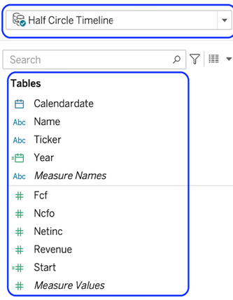
We should start by connecting to your data source and locating the dimensions and measures that are needed to build your base visualisation like so.
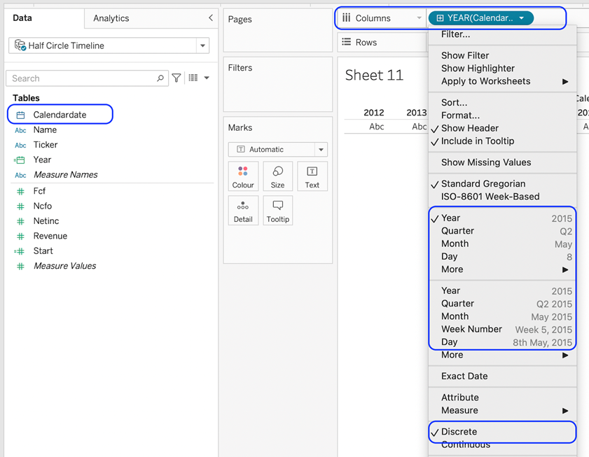
Next, we will create the date axis. Here we want to use the year of the calendar date to plot the axis labels. Follow these steps;
- Locate the dimension that you want to use as the time series.
- Add it to the columns shelf.
- Select the date granularity.
- Make the pill discrete.
For the next part of making our Tableau Half Circle Timeline, we will create the circles along the date axis. We want to use the revenue measure to control the size of the circles. Follow these steps;
- Change the mark type to circle.
- Drag the measure to the size card.
- Click the size card to make the circles bigger if desired.
- Expand the vertical space on the chart to enlarge the canvas.

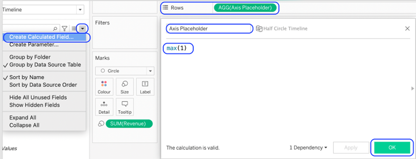
Now create a Y axis to control visibility of the portion of the circle.
- Create a calculated field. Call it Axis Placeholder. The calculation is max (1)
- Place the calculated field on the rows shelf.
Let’s add some context to aid understanding of the marks for our Tableau Half Circle Timeline and give it a worksheet title.

Hide the date axis title.

Add the measured value to the label card to create a label.
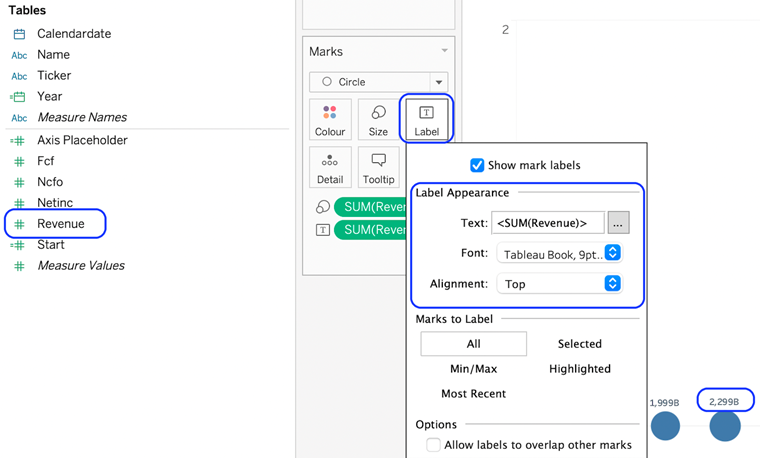
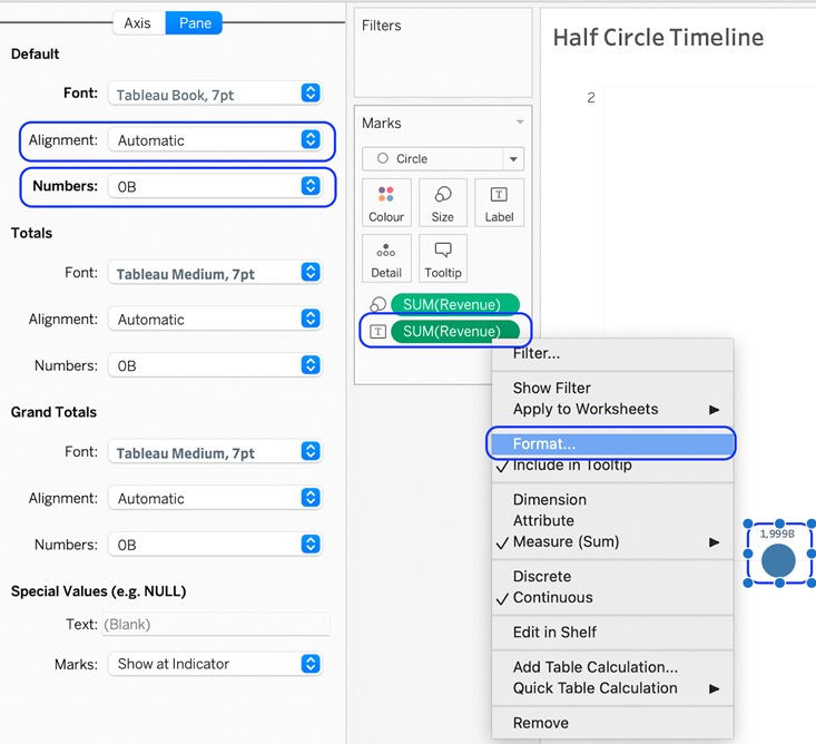
If you need to further format the labels, for example, to set the number of decimal places, or change the alignment use the format option:
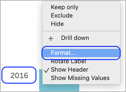
Format the dates on the axis to make them more visible (or as desired)
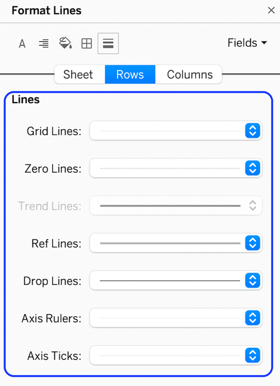
Remove the grid lines.
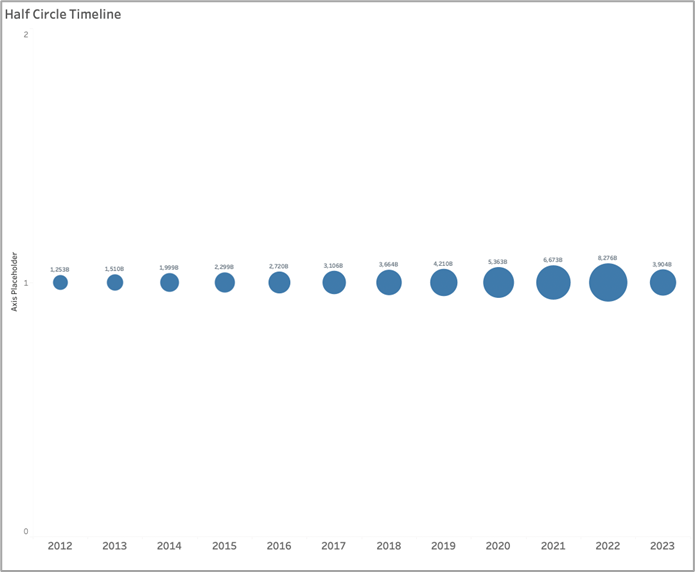
Your visualisation for the Tableau Half Circle Timeline should look like this!
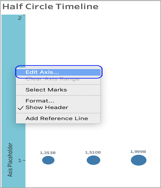
Now to the final touches of the Tableau Half Circle Timeline, we need to make the bottom half of the circle hidden from view to get the end visualisation. We do this by editing the axis like so;
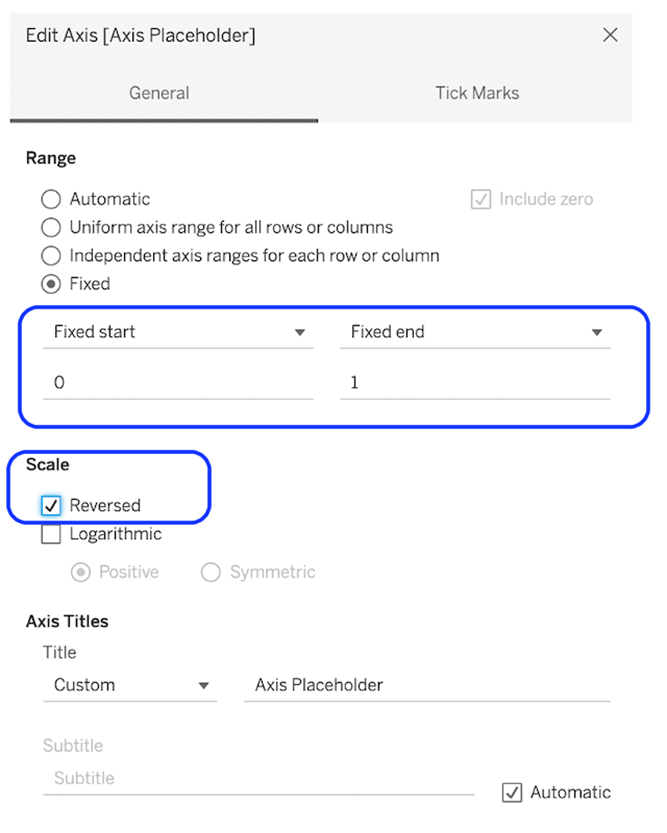
Now moving on, we can make the axis start and end points fixed and then reverse these axes.
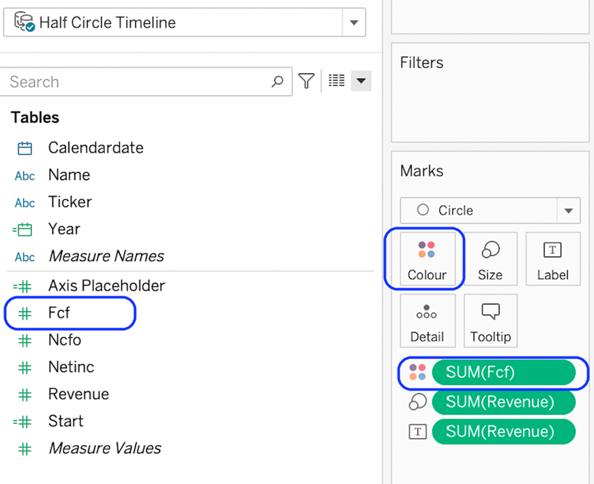
To add more dimension and make your visualisation for a Tableau Half Circle Timeline more dynamic, you should add a second measure to colour if needed.
Now to finish your Tableau Half Circle Timeline, add the sheet to a dashboard and format more as desired.

Congratulations! You’ve completed your Tableau Half Circle Timeline!
Well done on completing your Tableau Half Circle Timeline in record time! Hopefully, you can add this to your Tableau visualisation tools in the future.
For more on learning about how to create in Tableau, head over to our blog. For more on Tableau consulting to help your company deliver successful Tableau and data projects for finance, marketing and sales head over to our website.


