What is a Tableau Gradient Area Chart?
If you only have one line for your time series chart, converting it to a Tableau Gradient Area chart is a great way to visualize your data because the fill will help balance out the excessive white space.
A Tableau Gradient Area chart is so easy to make using the Show Me panel. So how can you take it one step further? Look no further than this tutorial — We will shade the area chart so that it becomes a Tableau Gradient Area chart!
Affiliate Disclosure: Some of the links on this blog are affiliate links, which means if you click on them and make a purchase, we may receive a commission at no extra cost to you. This helps support our blog and allows us to continue to create content for you. We only recommend products and services that we genuinely believe in, and all opinions expressed here are our own. Thank you for your support!
Table of Contents
3 Examples of Inspiration for Tableau Gradient Area Chart
These examples have been curated from Tableau public, we do not take credit for this great work!
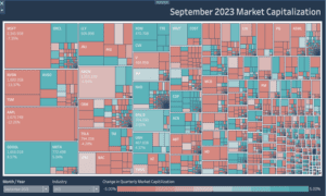
1 Curved Gradient Area Chart
The Tableau Gradient Area Chart displayed on this dashboard is a visually striking way to represent data. The gradient fill adds depth and dimension, making the gradient area chart more engaging and interpretable.
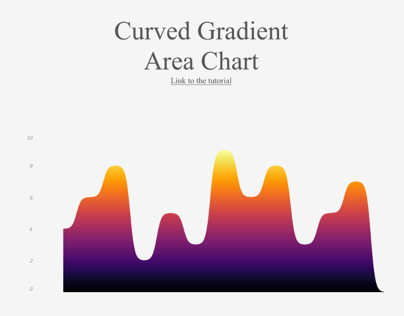
This type of chart is beneficial for showing trends over time, as the gradient helps to highlight the peaks and troughs more clearly. The use of a curved gradient area enhances the visual appeal by creating a smooth, flowing, aesthetically pleasing and professional look. By utilizing gradient colours, the shaded area chart effectively balances visual interest with clarity, making complex data more accessible and understandable. For those interested, numerous gradient area chart tutorials are available to help create a gradient area chart in Tableau.
2 Forex Trading
The dashboard showcasing Forex Trading Statistics effectively utilizes a Tableau Gradient Area Chart to present data visually appealingly. The tableau gradient area highlights total income and average percentage per month, making it easy to grasp critical metrics at a glance. The shaded area chart adds depth, enhancing the visual hierarchy and drawing attention to significant trends.

The use of gradient colors makes the chart aesthetically pleasing but also aids in distinguishing different data points. This gradient area chart tutorial demonstrates creating a compelling and informative dashboard that balances visual appeal with clear data representation.
3 Gradient Area Chart
This dashboard features a Tableau Gradient Area Chart, effectively showcasing data trends over time. The gradient area chart in Tableau adds a visually appealing element by using color gradients to represent varying data values, enhancing both readability and aesthetics.

The shaded area chart highlights the peaks and troughs of the data, making it easier to identify significant changes at a glance. This approach makes the data visually engaging and ensures that complex information is communicated clearly. This design’s gradient area chart tutorial demonstrates how to create informative and attractive visualizations, balancing visual appeal with clarity.
Tableau Gradient Area Chart Tutorial
Data to Follow Along with Tutorial
The data to build the gradient area chart in Tableau can be found here
Let’s make a Tableau Gradient Area Chart!
The basic idea is that we will use a gradient as a background. We will build an area chart that fills the area above the curve instead of under it, leaving the area below the curve as space so the gradient shines through.
The Calculated Fields We Need for a Tableau Gradient Area Chart
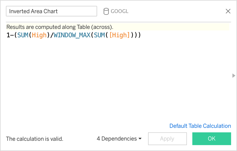
Inverted Area Chart
Divide the metric by its max to put it on a scale 0-1. Subtracting it from 1 will create
the inverted effect, which will shade everything above the curve. (The gradient image
will require fixed coordinates, which is why we need to standardize them here.)
Steps:
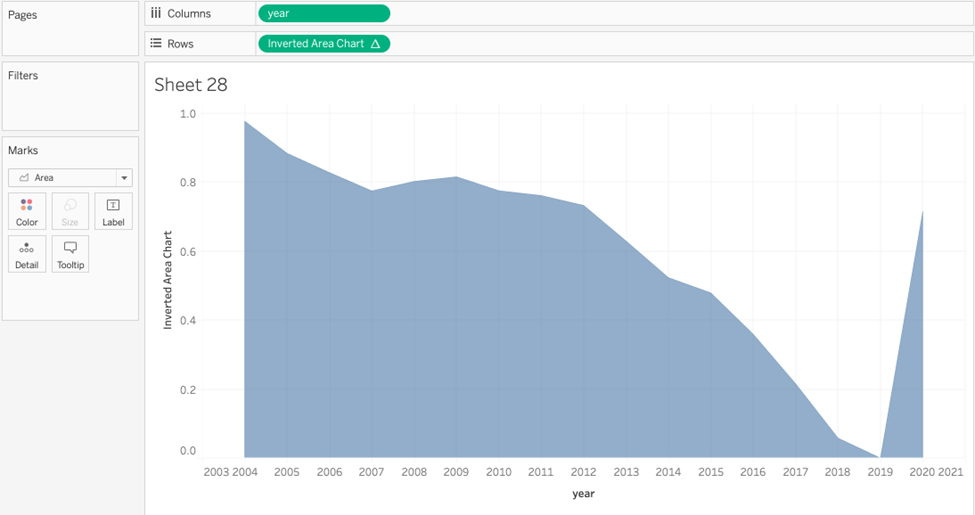
Drag year to Columns. Make sure it is a Dimension, not an aggregate such as SUM.
Drag the Inverted Area Chart to Rows. Calculate according to years or table across.
You will have a view that looks like this:
Edit the color and opacity of the Area chart. Make it 100% opacity. Color it a solid
colour that will match the background of your dashboard. We chose #1B1B1B. Set Halo
to None.
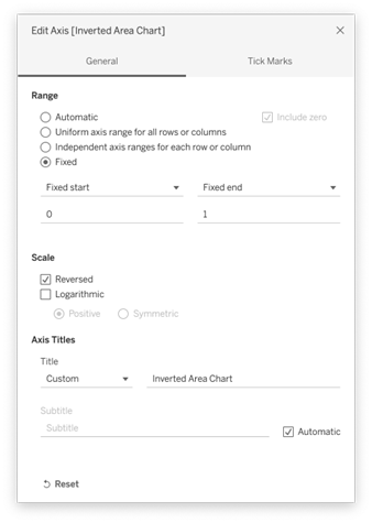
Edit the Y axis, and convert it to reversed. Make the range from 0 to 1.
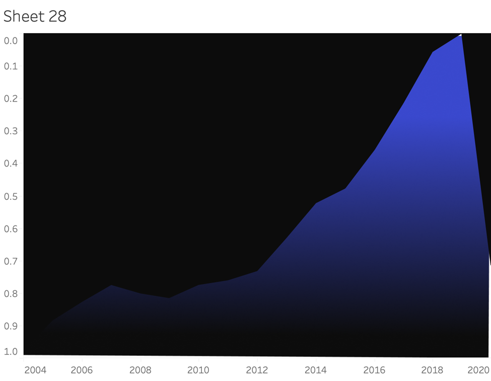
You will now have a view that looks like this:
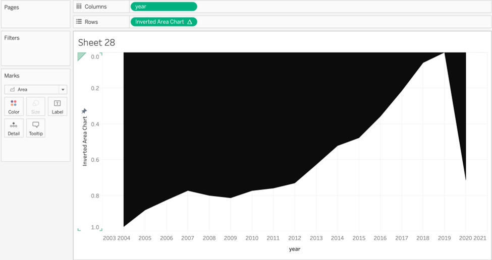
Interesting – Notice that the top half of the chart is blocked out as we stated earlier!
All that is left is to add a background gradient and adjust the chart formatting. Here we
will use either of these gradients:


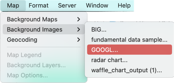
At the top toolbar, select Map >> Background Images >> your data source
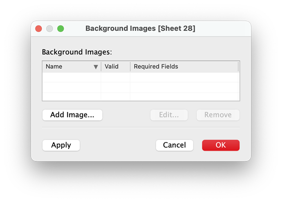
In this box, select “Add Image” Find your gradient image and select it.
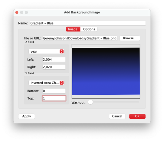
Fill out the appropriate ranges for your x and y variables as such:
You should now have a Tableau Gradient Area chart!
But let’s polish it by adding the finishing touches.
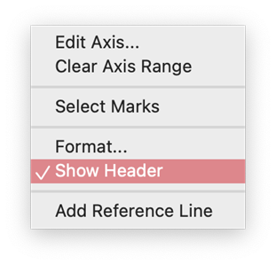
Hide the y-axis by deselecting “Show Header”.
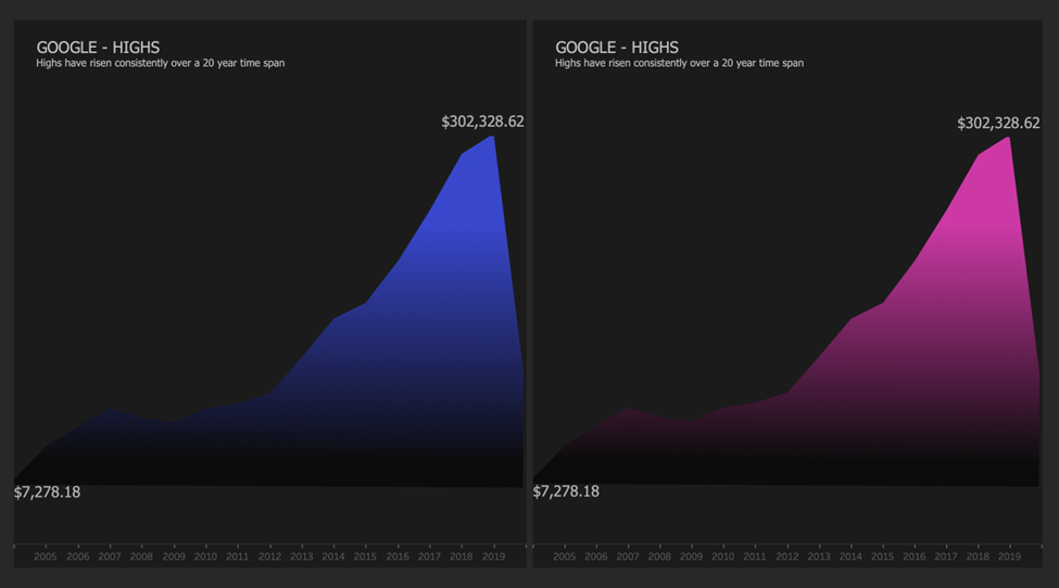
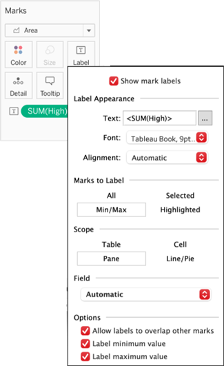
Drag SUM(High) to label. Select Min/Max. Format the label to #B4B4B4, Tahoma, size
Also, format the label to Currency Standard.
- Add an informative title and subtitle. Set a color to #B4B4B4.
- Change the background of the worksheet to match the fill color of the area chart.
Here we chose #1B1B1B - Hide all divider lines, axis rulers, grid lines, and zero lines.
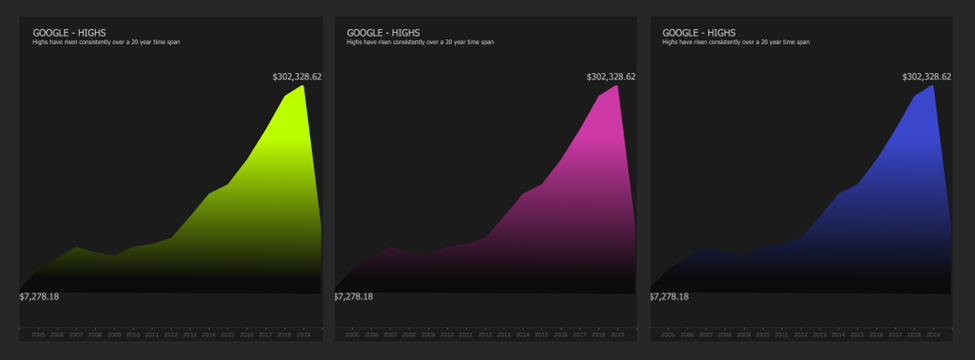
You now have a beautiful gradient area chart!
Closing Words
This technique only worked because we knew the range of our x and y-axis variables. But many times for the y-axis, this can be a problem as we seldom know the values our metric will take as the data updates. Therefore we had to standardize our y-axis to a range of 0 and 1, then hide the axis.
If you already work with percentages, this technique will be a natural fit. Otherwise, you’ll likely have to standardize your metric.
Finally, it is highly recommended that you experiment with different gradients, labelling techniques, adding a dual axis, or using another sheet to replicate the y-axis so that it isn’t reversed.
For more tutorials on Tableau charts, please head over to our blog site at Quantize Analytics. There is plenty to learn to add to your skills or reconsolidate your knowledge.
Conclusion
In conclusion, mastering the Tableau Gradient Area Chart opens up new possibilities for visually engaging and informative data presentations. By following this gradient area chart tutorial, you have learned how to effectively use gradient colors to highlight trends and patterns, making your charts not only more appealing but also easier to interpret. The ability to create a shaded area chart in Tableau enhances your data visualization toolkit, allowing you to convey complex information with clarity and style. Continue exploring the features of Tableau gradient area to further enhance your data storytelling capabilities and create compelling visualizations that captivate your audience.