Tableau for survey data is an essential tool that enables organizations to transform raw feedback into meaningful insights. Whether you’re conducting survey data analysis on customer satisfaction, employee engagement, or market research, Tableau survey dashboards provide a dynamic way to visualize and interpret responses.
In this blog post, we’ll explore five exemplary Tableau survey dashboard examples that showcase how you can effectively present Tableau survey data. These dashboards highlight various techniques in Tableau survey analysis, helping you uncover trends, identify areas for improvement, and make data-driven decisions that can significantly impact your organization.
Table of Contents
1. Visualizing the Survey Data
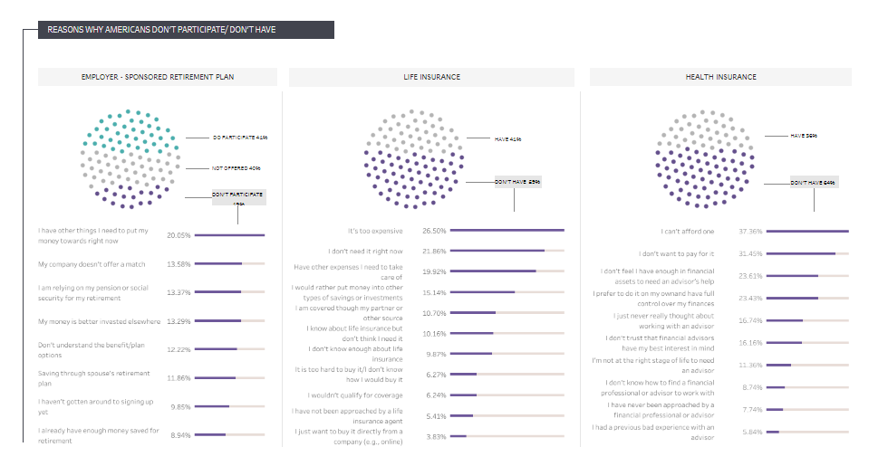
This Tableau survey dashboard visualizes the results of a Financial Wellness Survey conducted by the U.S. Consumer Financial Protection Bureau. It offers a comprehensive overview of Americans’ financial well-being, capturing insights into their financial goals, confidence levels, and reasons for not participating in financial products like employer-sponsored retirement plans, life insurance, and health insurance.
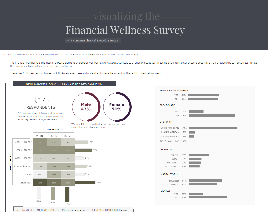
The Tableau survey data dashboard effectively communicates the survey data analysis using various types of charts. Pie charts display the demographic breakdown of respondents by gender, while bar charts highlight state performance, marital status, and ethnic distribution. Stacked bar charts illustrate the importance of different financial goals and Americans’ confidence levels in achieving them. Additionally, dot plots represent why Americans do not participate in specific financial products.
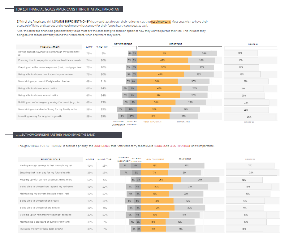
This Tableau survey data dashboard would be handy for financial planners, policymakers, and organizations focused on improving financial literacy and wellness. They can leverage Tableau for survey data better to understand financial priorities and concerns across demographic groups, tailoring advice and programs accordingly. This example of Tableau survey data visualizations is a powerful tool for enhancing financial well-being and addressing the challenges Americans face in achieving financial security.
2. Visualising Survey Data | Likert Chart & NPS
This Tableau survey dashboard analyses customer feedback from a Net Promoter Score (NPS) survey conducted across hotels in five different countries. Covering ten key questions, each scored on a scale of 1 to 5, this Tableau survey data dashboard aggregates the data to provide insights into customer satisfaction and areas needing improvement.
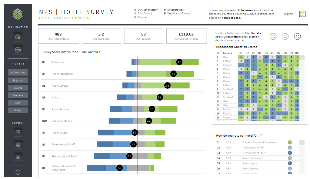
The Tableau survey data visualizations include a bar chart that displays the survey scores for each question, helping users quickly identify which aspects of the hotel experience, such as amenities, room cleanliness, and check-in/check-out experience, received the highest and lowest ratings. A heatmap visualizes respondent scores across all questions, offering an at-a-glance overview of how each respondent rated different aspects of their stay. This is useful for identifying patterns and outliers in customer feedback.
Key metrics, such as the total number of respondents, average score, average age, and average cost per night, are prominently displayed at the top of the dashboard, providing a quick summary of the survey’s scope and overall performance. Filters allow users to narrow down the Tableau survey data by country, making comparing customer feedback across different regions easier.
This Tableau survey dashboard would be handy for hotel managers, customer experience teams, and franchise owners. By leveraging Tableau for survey data, they can identify strengths and weaknesses, tailor improvements to specific areas, and monitor customer satisfaction trends. This is an exemplary case of Tableau survey dashboard examples, showcasing how Tableau survey visualization can enhance guest experiences and drive higher satisfaction rates.
3. Survey Data Dashboard
This Tableau survey dashboard is designed to analyze feedback from airline passengers, offering insights into their overall experience with both flight and ground operations. The Tableau survey data dashboard provides a comprehensive overview of customer satisfaction, breaking down the survey data by class, flight distance, customer type, and reason for travel. The primary metric displayed is an overall satisfaction score, rated on a scale of 1 to 5, with a significant percentage of respondents rating the service 2.7 or below, indicating areas for improvement.
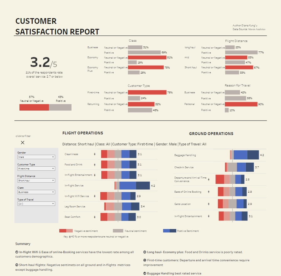
The Tableau survey visualization utilizes several charts to analyze the survey data effectively. Stacked bar charts display the distribution of positive, neutral, and negative sentiments across different categories, such as class of service (Business, Economy, Economy Plus), flight distance (long haul, mid, short-haul), and reason for travel (business, personal). Heatmaps show satisfaction levels in flight and ground operations, including cleanliness, in-flight entertainment, baggage handling, and check-in services. These Tableau survey data visualizations allow users to quickly identify areas where customer sentiment is more positive or negative.
This Tableau survey dashboard would be handy for airline executives, customer experience teams, and operations managers. By leveraging Tableau for survey data, they can identify their service offerings’ strengths and weaknesses, prioritise improvement areas, and tailor their strategies to enhance overall customer satisfaction. The detailed breakdowns by demographic and travel specifics also enable more targeted interventions, making this dashboard an invaluable example of Tableau survey data analysis for improving customer service within the airline industry.
4. Visualizing Survey Data & Customer Satisfaction
This Tableau survey dashboard showcases a variety of visualizations designed to analyze and present satisfaction survey data. The Tableau survey data dashboard features eight charts, each offering a unique way to interpret survey responses, particularly those collected on a Likert scale. It is an excellent resource for anyone involved in survey data analysis seeking innovative ways to visualize their findings.
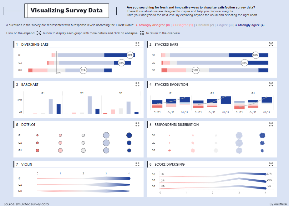
The Tableau survey dashboard examples include:
- Diverging Bars – This chart displays the distribution of responses across different levels of agreement or disagreement, allowing for a clear comparison of sentiment across multiple questions.
- Stacked Bars – Similar to diverging bars, stacked bars present the same data in a cumulative format, showing the total response distribution for each question.
- Barchart – A traditional bar chart displays the percentage of respondents selecting each response option, making it easy to compare the popularity of each choice.
- Stacked Evolution – This chart tracks changes in response distributions over time, providing insight into trends and shifts in sentiment.
- Dotplot – The dot plot shows the frequency of each response simply and directly, with dots representing the concentration of responses.
- Respondents Distribution – This chart highlights the spread of responses across all questions, giving a quick visual indication of how responses vary.
- Violin – Violin plots offer a nuanced view of data distribution, combining the density of responses with their overall distribution.
- Score Diverging – This chart illustrates the divergence in response scores, making it easy to see which options were most or least favoured.
This Tableau survey visualization would be handy for data analysts, researchers, and anyone involved in customer satisfaction or employee engagement surveys. It offers a comprehensive set of Tableau survey data visualizations that can inspire new approaches to presenting and interpreting survey data, uncover actionable insights, and drive decision-making.
5. Employees Survey Results
This Tableau survey dashboard is designed to analyze and present employee feedback across various company departments. It offers valuable insights into employee satisfaction with workplace management, perceptions of workplace toxicity, satisfaction with salary and benefits, and views on the company’s direction and future. The dashboard serves as a comprehensive tool for understanding employee sentiment, identifying areas for improvement, and driving organizational change.
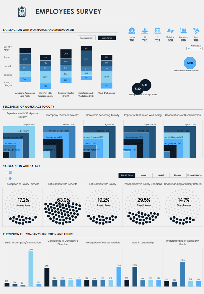
The Tableau survey data dashboard utilizes several types of charts to visualize the survey data effectively. Stacked bar charts display the distribution of responses across satisfaction levels such as Strongly Agree, Agree, Neutral, Disagree, and Strongly Disagree. These charts highlight employees’ feelings about access to resources, work-life balance, and growth opportunities.
Dot plots illustrate satisfaction with salary components, including benefits, transparency in salary decisions, and understanding salary criteria, providing a clear visual representation of employee sentiment. Additionally, bar charts capture employee perceptions of the company’s innovation, market position, leadership, and understanding of company goals.
This Tableau survey dashboard would be handy for HR professionals, company executives, and department managers. By leveraging Tableau for survey data, they can better understand employee morale, identify potential workplace issues, and take informed actions to enhance satisfaction and retention. The detailed Tableau survey data visualizations offer actionable insights to help shape strategies for improving the overall work environment and aligning the workforce with the company’s goals.
Tableau for Survey Data Examples
Incorporating Tableau survey data dashboards into your survey data analysis allows you to gain deeper insights and communicate findings more effectively. The five Tableau survey dashboard examples we’ve explored demonstrate the versatility of Tableau survey visualizations in presenting complex data in an accessible, actionable format. Whether you’re looking to improve employee satisfaction, understand customer needs, or refine your product offerings, these Tableau survey data visualizations can guide your efforts. By leveraging the power of Tableau survey analysis, you can make informed decisions that drive meaningful change and enhance overall outcomes.