Welcome to our comprehensive guide showcasing 13 exceptional Tableau football dashboards. Whether you’re a football data analyst, coach, sports enthusiast, or someone interested in soccer analytics, this blog is designed to inspire and provide insights into how Tableau can be utilized for football analysis.
From player performance metrics to team rankings and match statistics, these dashboards highlight the power of data visualization in enhancing our understanding of the beautiful game. Dive in to explore innovative ways to leverage Tableau football dashboards and elevate your analytical skills to the next level.
Table of Contents
Affiliate Disclosure: Some of the links on this blog are affiliate links, which means if you click on them and make a purchase, we may receive a commission at no extra cost to you. This helps support our blog and allows us to continue to create content for you. We only recommend products and services we genuinely believe in; all opinions expressed here are our own. Thank you for being so supportive!
These great Tableau football dashboards have been curated from Tableau public, we do not take credit for their creation.
#1 Soccer Power Index
The Soccer Power Index Dashboard provides an insightful analysis of team strength across various soccer leagues globally. This Tableau football dashboard visualizes the offensive and defensive ratings of teams, offering a comprehensive overview of their overall strength. The Soccer Power Index (SPI) ratings are FiveThirtyEight’s best estimate of a team’s capabilities, with offensive ratings indicating the number of goals a team is expected to score and defensive ratings showing the number of goals they are expected to concede.
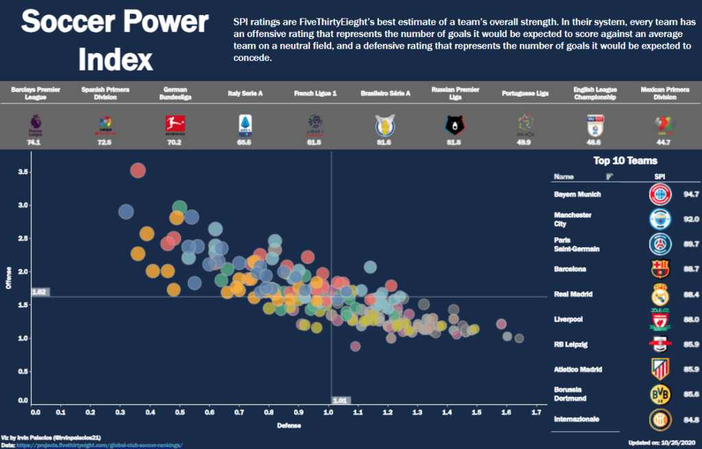
Who Might Find It Interesting?
- Sports Analysts: Use Tableau football analytics to gain detailed insights into team performance across different leagues. This enables in-depth football analysis and comparison of team strengths.
- Coaches and Team Strategists: Utilize the data to develop game strategies by understanding the offensive and defensive capabilities of their own team and their opponents through soccer analytics.
- Soccer Enthusiasts and Fans: Enjoy an engaging visual representation of team rankings and strengths, deepening their understanding of the game dynamics with data analytics in soccer.
- Journalists and Commentators: Access precise data points to enrich their commentary and articles with comprehensive analysis of team performance metrics using soccer analytics data.
Chart Types in the Dashboard
- Scatter Plot: The primary visualization tool in this Tableau football analytics dashboard, the scatter plot displays the offensive and defensive ratings of various teams. Each dot represents a team, with its position on the horizontal axis indicating defensive strength and the vertical axis indicating offensive strength. This allows for easy identification of teams with strong offensive or defensive capabilities.
- Bar Chart: Featured alongside the scatter plot, this chart lists the top 10 teams based on their SPI ratings. It provides a quick snapshot of the leading teams’ overall strength.
- League Average Indicators: Horizontal and vertical lines indicate the average offensive and defensive ratings across different leagues, providing context for the scatter plot data.
- Icons and Labels: Team logos and names are used to enhance readability and quick identification of teams within the charts.
What we like
This Tableau soccer dashboard is highly interactive and visually appealing, making it easy for users to navigate and understand complex data. The scatter plot effectively displays the relationship between offensive and defensive strengths, allowing for quick team comparisons. Integrating team logos and clear labels enhances user experience by providing immediate recognition and context. Additionally, the inclusion of league average indicators helps in understanding how teams perform relative to the average, adding depth to the analysis.
#2 Soccer Tables
The Points Per Game (PPG) Dashboard provides an in-depth analysis of Major League Soccer (MLS) teams’ performance, specifically focusing on their PPG metrics and the PPG required in remaining fixtures to secure a playoff spot. This Tableau soccer dashboard effectively visualizes the current standings and what each team needs to do to reach the playoffs, making it an invaluable tool for fans, analysts, and team strategists.

Who Might Find It Interesting?
- Sports Analysts: Gain detailed insights into team performance, allowing for comprehensive analysis and comparison of teams’ chances to make the playoffs using football analytics and football analysis.
- Coaches and Team Strategists: Utilize the data to develop game strategies by understanding how many points are needed in remaining games to secure a playoff spot, leveraging football data analysis and advanced soccer analytics.
- Soccer Enthusiasts and Fans: Enjoy an engaging visual representation of their favourite teams’ playoff prospects, deepening their understanding of the competition dynamics through soccer analytics.
- Journalists and Commentators can use soccer data analytics to access precise data points and enrich their commentary and articles with a comprehensive analysis of team performance metrics and playoff chances.
Chart Types in the Dashboard
- Bar Chart: The primary visualization tool in this dashboard displays the PPG for each team alongside the PPG needed in the remaining fixtures to compete for a playoff spot. Each bar represents a team, with its length indicating the PPG and the additional markers showing the required PPG, providing insights into data analytics soccer and data analytics football.
- Icons and Labels: Team logos and names enhance readability and quick identification of teams within the chart, making it easier for users to understand the data at a glance and showcasing Tableau football and Tableau football analytics.
What we like
This Points Per Game Dashboard is highly interactive and visually appealing, making it easy for users to navigate and understand complex data. The bar chart effectively displays the relationship between current performance and required performance, allowing for quick comparison between teams. Integrating team logos and clear labels enhances user experience by providing immediate recognition and context. Additionally, the focus on PPG metrics offers a clear and straightforward way to assess each team’s playoff prospects, adding depth to the analysis.
In conclusion, this Tableau soccer dashboard is an excellent example of how data visualization can transform raw data into actionable insights. It is a valuable tool for anyone involved in soccer analysis, providing detailed performance metrics that drive strategic decisions and enhance the overall understanding of the game.
#3 Player Monthly Performance Report
The Player Performance Dashboard provides a comprehensive analysis of a player’s physical and training metrics, offering detailed insights into their monthly performance. This Tableau football dashboard is meticulously designed to track various Key Performance Indicators (KPIs) such as total distance, sprint distance, match and training availability, and more. It is an invaluable tool for coaches, sports analysts, and fitness trainers who aim to optimize player performance through data-driven strategies.

Who Might Find It Interesting?
- Coaches and Team Strategists: Gain in-depth insights into player performance metrics to devise effective training programs and game strategies.
- Sports Analysts: Conduct thorough soccer data analytics to identify trends, strengths, and areas needing improvement, enhancing overall team performance.
- Fitness Trainers: Utilize detailed physical KPIs to monitor player fitness levels and tailor conditioning programs to maintain peak performance.
- Player Development Managers: Track individual players’ progress and development to ensure their growth and readiness for competitive matches.
Chart Types in the Dashboard
- Bar Charts Display daily metrics for total distance, sprint distance, and match-high-intensity (MHI) events, providing a clear visualization of performance trends over the month. These charts help identify consistency and variations in player activity.
- Calendar Heatmap: This heatmap illustrates the month breakdown with icons representing different types of sessions (e.g., regular training, recovery, gym sessions, competitive games, and days off). The color coding for Rate of Perceived Exertion (RPE) levels adds another layer of detail, highlighting days of higher exertion.
- Donut Charts Show key statistics such as match time, starting XI appearances, training availability, and days lost to injury. They provide a quick, at-a-glance summary of critical performance indicators.
- Session Breakdown Slider: A dynamic element categorising different training and recovery sessions, offering a detailed view of the player’s schedule and workload distribution.
What we like
This Tableau football analytics dashboard is highly interactive and user-friendly, making it easy for stakeholders to navigate and comprehend complex data. Integrating various chart types ensures a holistic view of player performance, allowing for quick identification of trends and actionable insights. The clear and visually appealing design enhances user experience, ensuring that even intricate data is presented in an easily digestible format.
The Player Performance Dashboard is an exemplary tool for anyone involved in soccer analytics. It provides detailed insights that drive strategic decisions and enhance overall understanding of player performance. By leveraging this dashboard, coaches, analysts, and trainers can make informed decisions that contribute to the success and development of the players and the team.
#4 2014 FIFA World Cup Brazil Dashboard
The 2014 FIFA World Cup Brazil Dashboard provides a comprehensive visualization of historical and current World Cup data, offering detailed insights into team statistics, match outcomes, and player performances. This Tableau football dashboard is designed to cater to a wide range of users, including sports analysts, coaches, journalists, and football enthusiasts, facilitating data-driven decisions and an enriched understanding of the tournament.

Who Might Find It Interesting?
- Sports Analysts: Utilize soccer data analytics to conduct in-depth analyses of team performances, match statistics, and player contributions.
- Coaches and Team Strategists: Leverage football analytics to develop game strategies based on historical performance data and current match statistics.
- Football Enthusiasts and Fans: Enjoy a visually engaging representation of World Cup history and current tournament data, enhancing their appreciation and knowledge of the sport.
- Journalists and Commentators: Access detailed data points and visualizations to enrich their commentary and articles with comprehensive football analysis.
Chart Types in the Dashboard
- Map Visualization: Displays the hosting countries for past World Cup tournaments, providing a geographical context to the event’s history.
- Tables: Present detailed team statistics, including games played, wins, draws, losses, goals scored, and goals against. This helps in comparing team performances across different tournaments.
- Scatter Plot: This visualization of the World Cup 2014, probably based on historical records, shows the likelihood of teams’ success in terms of win and draw percentages. The scatter plot provides a clear comparison of team strengths and weaknesses.
- Match Statistics Table: Lists the outcomes of World Cup 2014 matches, including dates, stages, and scores, offering a detailed view of the tournament’s progression.
- Player Profiles: This section features images and names of players who have scored in World Cup finals, adding a personal touch to the statistical data.
What we like
This Tableau football analytics dashboard is highly interactive and visually appealing, making it easy for users to navigate and understand complex soccer analytics data. The integration of various chart types ensures a holistic view of the World Cup tournament, allowing users to quickly identify trends, strengths, and areas for improvement. The clear and visually appealing design enhances the user experience by presenting intricate data in an easily digestible format.
The 2014 FIFA World Cup Brazil Dashboard is an exemplary tool for anyone involved in soccer analytics. It provides detailed insights that drive strategic decisions and enhance the overall understanding of the game. By leveraging this dashboard, analysts, coaches, and fans can make informed decisions that contribute to the success and enjoyment of the tournament.
#5 Club Soccer League Comparison and Rankings
The Club Soccer Compare Dashboard provides a comprehensive analysis of team performances across various soccer leagues, offering detailed insights into offensive and defensive capabilities. This Tableau football dashboard allows users to compare teams from different leagues, making it a valuable tool for sports analysts, coaches, and soccer enthusiasts who seek to understand team dynamics and league strengths through data analytics in soccer.

Who Might Find It Interesting?
- Sports Analysts: Utilize soccer analytics to conduct in-depth analyses of team performances across different leagues, enabling detailed comparisons and insights into team strengths and weaknesses.
- Coaches and Team Strategists: Leverage football data analysis to develop game strategies based on comparative performance metrics of their own team and their competitors.
- Soccer Enthusiasts and Fans: Enjoy a visually engaging representation of team rankings and league comparisons, enhancing their understanding and appreciation of the sport.
- Journalists and Commentators: Access detailed data points and visualizations to enrich their commentary and articles with comprehensive football analysis.
Chart Types in the Dashboard
- Scatter Plot: The primary visualization tool in this dashboard, the scatter plot displays the offensive and defensive ratings of various teams. Each dot represents a team, with its position on the horizontal axis indicating defensive strength and the vertical axis indicating offensive strength. Selected leagues are highlighted in different colours, making it easy to compare teams from different leagues.
- Dropdown Filters: Allow users to select specific leagues and teams for comparison, providing a customizable and interactive experience. These filters enable users to focus on particular leagues or clubs and analyze their performance in detail.
- Icons and Labels: Team logos and names are used to enhance readability and quick identification of teams within the chart. This feature helps users to quickly locate and compare their teams of interest.
What we like
This Tableau football analytics dashboard is highly interactive and visually appealing, making it easy for users to navigate and understand complex soccer analytics data. The scatter plot effectively displays the relationship between offensive and defensive strengths, allowing quick comparisons between teams and leagues. Integrating team logos and clear labels enhances user experience by providing immediate recognition and context. Additionally, the use of dropdown filters adds a layer of interactivity, enabling users to tailor the analysis to their specific needs.
The Club Soccer Compare Dashboard is an exemplary tool for anyone involved in soccer advanced analytics, providing detailed insights that drive strategic decisions and enhance overall understanding of team performances across different leagues. By leveraging this dashboard, analysts, coaches, and fans can make informed decisions that contribute to the success and enjoyment of the sport.
#6 Football Storm
The Football Storm Dashboard provides a visually striking analysis of passing patterns in 890 football matches. This Tableau football dashboard showcases the directions and lengths of all passes, aggregated to reveal comprehensive insights into team play styles and strategies. Designed for football data analysts, coaches, and enthusiasts, this dashboard offers an in-depth look at passing dynamics through advanced data analytics in soccer.

Who Might Find It Interesting?
- Football Data Analysts: Utilize soccer analytics data to conduct detailed analyses of passing patterns, aiding in understanding team strategies and player behaviours.
- Coaches and Team Strategists: Leverage data analytics in soccer to develop training programs and game plans based on observed passing trends and tendencies.
- Soccer Enthusiasts and Fans: Enjoy a visually engaging representation of passing patterns, enhancing their appreciation of the strategic elements of the game.
- Journalists and Commentators: Access detailed data points and visualizations to enrich their commentary and articles with comprehensive football analysis.
Chart Types in the Dashboard
- Heatmap: This dashboard’s primary visualization tool, the heatmap, displays the density and direction of passes across the pitch. The colour gradient from purple to yellow indicates the frequency of passes, with yellow areas representing higher pass counts.
- Filters: Users can customize the analysis by selecting specific pass types, pass heights, and distances from the goal. These filters provide a tailored view of the passing data, enabling focused analysis of particular aspects of the game.
- Directional Lines: Represent individual passes, with their length and direction illustrating the trajectory and distance of each pass. This helps identify common passing routes and areas of high activity on the field.
What we like
This Tableau football analytics dashboard is highly interactive and visually captivating, making it easy for users to navigate and interpret complex soccer analytics data. The heatmap effectively displays the concentration and direction of passes, allowing for quick identification of key passing zones and patterns. The integration of filters adds a layer of interactivity, enabling users to focus on specific types of passes and customize their analysis according to their needs.
#7 World Cup Penalty Shootouts
The World Cup Penalty Shootouts Dashboard provides an in-depth visualization of penalty shootout data from various World Cup matches. This Tableau football dashboard offers comprehensive insights into the outcomes of penalty kicks, showcasing trends and patterns in scoring, saving, and missing penalties. It is an invaluable tool for football data analysts, coaches, sports journalists, and football enthusiasts looking to understand the dynamics of penalty shootouts through soccer data analytics.

Who Might Find It Interesting?
- Football Data Analysts: Utilize soccer analytics data to conduct detailed analyses of penalty shootouts, helping to identify trends and patterns that can inform strategic decisions.
- Coaches and Team Strategists: Leverage data analytics in soccer to develop training programs and game plans based on historical penalty shootout performance.
- Soccer Enthusiasts and Fans: Enjoy a visually engaging representation of penalty shootout data, enhancing their appreciation of the strategic elements of the game.
- Journalists and Commentators: Access detailed data points and visualizations to enrich their commentary and articles with comprehensive football analysis.
Chart Types in the Dashboard
- Line Chart: Displays the percentage of penalties scored, saved, and missed over time, providing a historical view of penalty shootout outcomes from 1982 to 2022. This helps identify trends and changes in penalty performance over the years.
- Goal Heatmap: This chart illustrates the distribution of penalties scored, saved, and missed by the area targeted in the goal. It uses colour coding to indicate the success rate in different areas, offering insights into common target zones.
- Circle Chart: This chart shows the probability of winning if the team shoots first in the penalty shootout, emphasizing the strategic importance of the shooting order.
- Penalty Target Visualizations: This visualization displays individual match penalty outcomes for various World Cup games. Each goal is divided into zones showing where penalties were aimed and whether they were scored, saved, or missed. The colour-coded dots represent these outcomes, providing a detailed view of each shootout.
What we like
This Tableau football analytics dashboard is highly interactive and visually appealing, making it easy for users to navigate and understand complex soccer analytics data. The integration of various chart types ensures a holistic view of penalty shootouts, allowing users to quickly identify trends, strengths, and areas for improvement. The clear and visually appealing design enhances the user experience by presenting intricate data in an easily digestible format.
#8 2018 FIFA World Cup Ratings
The 2018 FIFA World Cup Ratings Dashboard provides a comprehensive analysis of player ratings and values, combining FIFA 18 player ratings with the 2018 World Cup rosters. This Tableau football dashboard offers detailed insights into player performance, making it a valuable tool for football data analysts, coaches, and enthusiasts interested in soccer analytics and data analytics in soccer.

Who Might Find It Interesting?
- Football Data Analysts: Utilize soccer analytics data to conduct detailed analyses of player ratings and values, helping to understand player performance and market value.
- Coaches and Team Strategists: Leverage football data analysis to develop game strategies based on player ratings and value comparisons, optimizing team formations and player selections.
- Soccer Enthusiasts and Fans: Enjoy a visually engaging representation of player ratings and values, enhancing their appreciation of player performance and team dynamics.
- Journalists and Commentators: Access detailed data points and visualizations to enrich their commentary and articles with comprehensive football analysis.
Chart Types in the Dashboard
- Formation Chart: This chart displays various team formations with labelled positions, allowing users to select and view different team setups. This visual representation helps users understand player roles and positions on the field.
- Scatter Plot: This plot shows the relationship between player ratings (overall) and market value (€). Each dot represents a player, with its position on the horizontal axis indicating the overall rating and the vertical axis indicating market value. This chart helps identify high-value players and compare player performances across teams.
- Dot Plot: Compares how players from different countries perform in each position. Users can select a country to see their best player at each position compared to others. The dot plot provides a clear visual comparison of player ratings across different positions.
What we like
This Tableau football analytics dashboard is highly interactive and visually appealing, making it easy for users to navigate and interpret complex soccer analytics data. The integration of various chart types ensures a holistic view of player ratings and values, allowing users to quickly identify trends, strengths, and areas for improvement. The clear and visually appealing design enhances the user experience by presenting intricate data in an easily digestible format.
#9 FIFA rankings vs World Cup Finals
The FIFA Rankings vs World Cup Finals Dashboard provides a detailed visualization of national team performances over time, showcasing their FIFA rankings alongside their achievements in World Cup finals from 1998 to 2022. This Tableau football dashboard is an invaluable resource for football data analysts, coaches, sports enthusiasts, and journalists, offering comprehensive insights into the correlation between FIFA rankings and World Cup success through soccer data analytics.

Who Might Find It Interesting?
- Football Data Analysts: Utilize soccer analytics data to perform in-depth analyses of team performances over the years, exploring the relationship between FIFA rankings and World Cup outcomes.
- Coaches and Team Strategists: Leverage football data analysis to develop strategies based on historical performance trends, optimizing team preparations for future tournaments.
- Soccer Enthusiasts and Fans: Enjoy a visually engaging representation of team performances, enhancing their appreciation of historical trends and team dynamics.
- Journalists and Commentators: Access detailed data points and visualizations to enrich their commentary and articles with comprehensive football analysis.
Chart Types in the Dashboard
- Line Chart: The primary visualization tool, the line chart displays the FIFA rankings of various national teams over time. Each line represents a team, showing fluctuations in rankings from 1998 to 2022.
- Flag Icons: Represent the countries and highlight their positions in World Cup finals, providing an easy reference for identifying teams and their achievements.
- Dot Plot: The right side of the dashboard shows the total average rank of each country. This helps understand the overall consistency and performance of teams over the years.
- Annotations: Include key milestones, such as the years when the World Cup was held, enhancing the contextual understanding of the data.
What we like
This Tableau football analytics dashboard is highly interactive and visually appealing, making it easy for users to navigate and interpret complex soccer analytics data. Integrating various chart types ensures a holistic view of team performances and FIFA rankings, allowing users to quickly identify trends, strengths, and areas for improvement. The clear and visually appealing design enhances the user experience by presenting intricate data in an easily digestible format.
#10 World Cup Effect
The World Cup Effect on Mobile Usage Dashboard provides an insightful analysis of mobile usage patterns during the 2018 FIFA World Cup. This Tableau football dashboard highlights how the event influenced mobile application usage and sports site visits, offering valuable data analytics for football data analysts, marketers, and football enthusiasts.

Who Might Find It Interesting?
- Football Data Analysts: Utilize soccer analytics data to understand how major sports events impact mobile usage patterns, providing insights into user behaviour and engagement.
- Marketers and Advertisers: Leverage data analytics in soccer to develop targeted campaigns during major events, optimizing reach and engagement based on user behaviour data.
- App Developers and Publishers: Analyze app usage trends to enhance user experience and increase engagement during peak events like the World Cup.
- Football Enthusiasts and Fans: Enjoy a detailed visualization of how the World Cup influences mobile engagement, offering a deeper understanding of fan interaction with digital platforms.
Chart Types in the Dashboard
- Bar Charts Illustrate the change in the number of sports fans during the World Cup by age and gender. These charts help understand demographic shifts in mobile usage during the event.
- Geographic Evolution Bar Chart: This chart shows the change in the number of sports fans by country, highlighting how different regions experienced growth in football fans during the World Cup.
- Line Chart: This chart displays the evolution of app downloads over time, showing peaks in activity during the World Cup period. It helps identify the most popular apps and the timing of peak usage.
- Stacked Bar Charts: Present the best app and site visits during the World Cup, offering insights into user preferences and engagement with different digital platforms.
- Percentage Increase Indicators: Highlight the overall increase in football fans during the World Cup, providing a clear view of the event’s impact on mobile usage.

What We Like
This Tableau football analytics dashboard is highly interactive and visually appealing, making it easy for users to navigate and interpret complex soccer analytics data. The integration of various chart types ensures a comprehensive view of mobile usage trends, allowing users to quickly identify key patterns and insights. The clear and visually appealing design enhances the user experience by presenting intricate data in an easily digestible format.
The World Cup Effect on Mobile Usage Dashboard is an exemplary tool for anyone involved in data analytics soccer. It provides detailed insights that drive strategic decisions and enhance the overall understanding of user behaviour during major sporting events. By leveraging this dashboard, analysts, marketers, and fans can make informed decisions that contribute to the success and engagement of digital platforms during such events.
#11 Top FIFA 19 Players
Description of the FIFA 19 Player Ratings Dashboard
The FIFA 19 Player Ratings Dashboard provides an in-depth comparison of the top football players’ attributes, showcasing their overall ratings and specific skill sets. This Tableau football dashboard offers valuable insights into player performance, making it a crucial tool for football data analysts, coaches, sports enthusiasts, and gamers interested in soccer analytics and data analytics soccer.

Who Might Find It Interesting?
- Football Data Analysts: Utilize soccer analytics data to conduct detailed analyses of player ratings, aiding in understanding player strengths and market value.
- Coaches and Team Strategists: Leverage football data analysis to develop game strategies based on player ratings and skill comparisons, optimizing team formations and player selections.
- Soccer Enthusiasts and Fans: Enjoy a visually engaging representation of player attributes, enhancing their appreciation of player performance and team dynamics.
- Gamers and FIFA Players: Access detailed player ratings and attributes to enhance their gaming experience and make informed decisions in their FIFA Ultimate Team selections.
- Journalists and Commentators: Access detailed data points and visualizations to enrich their commentary and articles with comprehensive football analysis.
Chart Types in the Dashboard
- Radar Charts: The primary visualization tool, radar charts display each player’s attributes across various skills such as acceleration, vision, ball control, strength, and finishing. Each axis represents a different skill, allowing for a comprehensive comparison of player strengths.
- Player Comparison Panels: Feature key details about each player, including age, height, nationality, club, overall rating, and market value. These panels provide a quick overview of each player’s profile.
- Skill Comparison Selector: This interactive element allows users to select a specific skill and compare the top three players for that ability. It helps users understand which players excel in particular areas.
- Overall Rating Gauges: Visualize the overall rating of each player, providing a clear indication of their performance level.
What We Like
This Tableau football analytics dashboard is highly interactive and visually appealing, making it easy for users to navigate and interpret complex soccer analytics data. The integration of radar charts ensures a holistic view of player attributes, allowing users to quickly identify strengths and weaknesses. The clear and visually appealing design enhances the user experience by presenting intricate data in an easily digestible format.
The FIFA 19 Player Ratings Dashboard is an exemplary tool for anyone involved in soccer advanced analytics. It provides detailed insights that drive strategic decisions and enhance the overall understanding of player performance in football. By leveraging this dashboard, analysts, coaches, gamers, and fans can make informed decisions that contribute to the success and enjoyment of the sport.
#12 FIFA Player Ratings
The FIFA 23 Premier League Player & Team Ratings Dashboard provides an extensive analysis of player and team ratings for the Premier League. This Tableau football dashboard is designed to offer detailed insights into individual player performance as well as overall team strength, making it a valuable resource for football data analysts, coaches, sports enthusiasts, and gamers interested in soccer analytics and data analytics football.
Who Might Find It Interesting?
- Football Data Analysts: Utilize soccer analytics data to conduct detailed analyses of player and team ratings, helping to understand player performance and team dynamics.
- Coaches and Team Strategists: Leverage football data analysis to develop game strategies based on player ratings and team strengths, optimizing formations and player selections.
- Soccer Enthusiasts and Fans: Enjoy a visually engaging representation of player and team ratings, enhancing their appreciation of individual performances and overall team dynamics.
- Gamers and FIFA Players: Access detailed player and team ratings to enhance their gaming experience and make informed decisions in their FIFA Ultimate Team selections.
- Journalists and Commentators: Access detailed data points and visualizations to enrich their commentary and articles with comprehensive football analysis.

Chart Types in the Dashboard
- Dot Plots: The primary visualization tool, dot plots display the overall ratings of players for each Premier League team. Each dot represents a player, plotting their rating along a horizontal axis. This allows for a comprehensive comparison of player ratings within and across teams.
- Team Rating Circles: Feature the overall team ratings for defence, midfield, and attack. These circles provide a quick overview of the strengths and weaknesses of each team in different areas.
- Player Profiles: Highlight key players with standout ratings, providing insights into individual performances and contributions to the team.
- Average Rating Indicators: These indicate the average ratings for English players on each team, offering a clear view of local talent distribution and performance.
What We Like
This Tableau football analytics dashboard is highly interactive and visually appealing, making it easy for users to navigate and interpret complex soccer analytics data. The integration of various chart types ensures a holistic view of player and team ratings, allowing users to quickly identify trends, strengths, and areas for improvement. The clear and visually appealing design enhances the user experience by presenting intricate data in an easily digestible format.
The FIFA 23 Premier League Player & Team Ratings Dashboard is an exemplary tool for anyone involved in soccer advanced analytics. It provides detailed insights that drive strategic decisions and enhance the overall understanding of player and team performance in football. By leveraging this dashboard, analysts, coaches, gamers, and fans can make informed decisions that contribute to the success and enjoyment of the sport.
#13 The FIFA Landscape
The FIFA Landscape Dashboard offers a unique and comprehensive visualization of 836 matches played in Football World Cups since 1930. This Tableau football dashboard uses hills to represent matches, showcasing the difference in goals and the stage of the tournament. It is an invaluable tool for football data analysts, coaches, sports enthusiasts, and historians interested in soccer analytics and data analytics soccer.

Who Might Find It Interesting?
- Football Data Analysts: Utilize soccer analytics data to conduct detailed analyses of historical World Cup matches, exploring patterns and trends over the years.
- Coaches and Team Strategists: Leverage football data analysis to study past World Cup performances and develop strategies based on historical data.
- Soccer Enthusiasts and Fans: Enjoy a visually engaging representation of World Cup history, enhancing their appreciation of the tournament’s rich legacy.
- Historians and Researchers: Access detailed visualizations to study the evolution of football World Cups, offering insights into the sport’s development.
- Journalists and Commentators: Access comprehensive data points to enrich their commentary and articles with historical football analysis.
Chart Types in the Dashboard
- Hills Chart: The primary visualization tool, each hill represents a match, with its height indicating the number of goals scored and its width showing the goal difference. This allows for a comprehensive comparison of match outcomes across different World Cups.
- Colour Coding: Matches are colour-coded by the winning team, providing an easy reference for identifying which team won each match.
- Interactive Hover Feature: Users can hover over each hill to see detailed match information, including the scoreline and teams involved. This interactive element enhances the depth of analysis.
- Highlight Feature: This feature allows users to highlight winning teams, offering a focused view on specific teams’ performances across different tournaments.
What We Like
This Tableau football analytics dashboard is highly interactive and visually captivating, making it easy for users to navigate and interpret complex soccer analytics data. The hills chart effectively displays match outcomes, allowing for quick identification of key patterns and historical trends. The integration of colour coding and interactive features adds layers of interactivity, enabling users to delve deeper into specific matches and teams.
Well that was inspiring!
These 13 Tableau football dashboards offer a wealth of insights and inspiration for anyone involved in football analytics. By harnessing the power of Tableau, you can transform complex soccer data into clear, actionable insights that enhance your understanding of player performance, team dynamics, and match outcomes.
Whether you’re a football data analyst, coach, or enthusiast, these examples demonstrate how advanced data analytics in soccer can drive better decision-making and a deeper appreciation of the game. Explore these dashboards, and take your Tableau football analytics to new heights.