When embarking on a new eCommerce analytics project, there’s no need to reinvent the wheel. Drawing inspiration from existing dashboards can streamline the process and enhance your insights. In this blog, we showcase eight exemplary Tableau eCommerce dashboard examples that highlight various aspects of eCommerce analytics. From sales performance and customer behavior to marketing effectiveness and product trends, these dashboards demonstrate the power of Tableau for eCommerce.
By examining these real-world examples, you can gather ideas and best practices to create your effective and visually engaging eCommerce Tableau dashboard, driving data-driven decisions and optimizing your business strategy.
Table of Contents
Affiliate Disclosure: Some of the links on this blog are affiliate links, which means if you click on them and make a purchase, we may receive a commission at no extra cost to you. This helps support our blog and allows us to continue to create content for you. We only recommend products and services we genuinely believe in; all opinions expressed here are our own. Thank you for being so supportive!
These great Tableau ecommerce dashboards have been curated from Tableau public, we do not take credit for their creation.
#1 eCommerce – Sales Overview
The eCommerce Sales Overview Dashboard provides a comprehensive visual analysis of sales performance for an eCommerce business. This Tableau eCommerce dashboard is designed to give detailed insights into various aspects of revenue, product performance, and cost management, making it an invaluable tool for understanding and optimizing eCommerce operations.
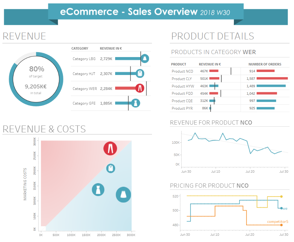
Who Might Find It Interesting?
- E-commerce Managers: Gain detailed insights into sales performance across product categories and individual products, enabling data-driven decision-making and strategic planning.
- Marketing Analysts: Understand the relationship between marketing costs and revenue generation, allowing for the optimization of marketing spend and campaign effectiveness.
- Business Executives: Get a high-level overview of the company’s sales performance, revenue targets, and product success, facilitating informed business decisions.
- Product Managers: Analyze specific product performance in revenue and order numbers, helping to identify top-performing products and those needing attention.
Chart Types in the Dashboard
- Gauge Chart: This chart displays the percentage of revenue target achieved, providing a quick visual indicator of performance against goals.
- Bar Charts: Used extensively to show revenue by category and product details, highlighting revenue and the number of orders for each product within a category.
- Scatter Plot: This plot illustrates the relationship between marketing costs and revenue across different product categories, helping to identify areas where marketing efforts are most effective.
- Line Chart: Tracks the revenue trend for a specific product over time, showing how revenue changes daily and identifying any trends or patterns.
- Dual-Axis Line Chart: Compares the pricing trends of a specific product with competitors over time, providing insights into competitive pricing strategies.

#2 Website Customer Journey
The Website Customer Journey Dashboard offers a detailed analysis of the forgotten password process, tracking data from January 2022 to July 2022. This Tableau eCommerce dashboard provides insights into user interactions across various stages, highlighting success rates, conversion metrics, and visitor volumes. It helps identify potential bottlenecks and areas for improvement in the user journey.

Who Might Find It Interesting?
- Website Managers: Gain insights into user behaviour and identify stages where users struggle, enabling targeted improvements.
- UX Designers: Analyze user interaction data to refine the design and functionality of the password recovery process.
- Marketing Analysts: Understand how different user segments engage with the process, optimizing marketing strategies to enhance user retention.
- Product Managers: Monitor the effectiveness of the forgotten password process, ensuring it meets user needs and supports overall product goals.
Chart Types in the Dashboard
- Bar Charts: Highlight success rates and conversion metrics for each step of the customer journey, providing a clear visual representation of user progress and drop-off points.
- Gauge Chart: This chart shows the overall success rate, offering a quick snapshot of how well the process is performing against set targets.
- Line Charts: Display trends in conversion rates and login success over time, helping to identify patterns and seasonal variations.
- Segmented Bar Charts: Compare performance across different browsers, revealing how user experience varies by platform.
- Volume Charts: Illustrate the number of unique visitors at each step, indicating user engagement and identifying stages with potential issues.
#3 Website Activity
The Website Activity Dashboard comprehensively visualises a website’s user engagement and traffic metrics. This Tableau eCommerce dashboard is designed to offer detailed insights into page views, visitor counts, and time spent on the site, comparing these metrics to the previous year to highlight trends and performance changes. The dashboard features various charts to present data clearly and effectively.

Who Might Find It Interesting?
- Website Managers: Gain insights into user engagement and traffic patterns, helping identify improvement areas and optimize the site’s performance.
- Marketing Analysts: Analyze the effectiveness of marketing campaigns by tracking changes in page views and visitor engagement, aiding in strategic planning and resource allocation.
- Content Creators: Understand which content areas drive the most traffic and engagement, allowing for more targeted content creation.
- Business Executives: Get a high-level overview of the website’s performance, enabling informed decision-making regarding marketing strategies and resource investments.
Chart Types in the Dashboard
- Bar Charts: Display weekly page views, visitors, and time spent compared to the previous year. This helps identify trends and seasonal variations in user engagement.
- Heat Map: This shows peak times for page views throughout the week, indicating when the site receives the most traffic. It can help in scheduling content updates and marketing efforts for maximum impact.
- Line Charts: Present page views by content area, allowing users to filter and see detailed trends for specific website sections.
- Map Visualization: Illustrates audience engagement by geographic location, showing which areas generate the most traffic. This can help target regional marketing campaigns more effectively.
What we like about it
This Tableau eCommerce dashboard is highly interactive and user-friendly, making it easy for stakeholders to navigate and understand complex data. Combining different chart types provides a holistic view of website activity, helping users quickly identify trends and patterns. The dashboard’s clear visualizations facilitate data-driven decision-making, ensuring that all changes and strategies are based on solid insights. This comprehensive approach makes the dashboard a valuable tool for anyone managing and optimizing website performance.
#4 Website User Conversion: Donut Funnel
The Website User Conversion Dashboard clearly visualizes user engagement and conversion rates through different stages of a website’s user journey. This Tableau eCommerce dashboard is designed to track users’ progression from their initial site visit to the final product purchase, offering valuable insights into where users are most likely to drop off and where they successfully convert.

Who Might Find It Interesting?
- E-commerce Managers: Use Tableau eCommerce to gain insights into the user journey and conversion rates. This will help identify improvement areas and optimize the site’s performance.
- Marketing Analysts: Using a Tableau eCommerce dashboard, they analyze user behaviour at different funnel stages to better understand the effectiveness of marketing campaigns and strategies.
- Product Managers: Understand user engagement with different website features and identify opportunities to enhance the user experience with an eCommerce Tableau dashboard.
- Business Executives: Get a high-level overview of the conversion funnel, facilitating informed decision-making regarding marketing strategies and resource investments with a Tableau eCommerce dashboard.
Chart Types in the Dashboard
- Donut Charts: Display the number of users at each funnel stage, from site visits to product purchases. Donut charts allow for a clear comparison of the relative sizes of each segment.
- Funnel Visualization: The stages are connected by funnels, indicating the drop-off rate between each step. This helps identify which stages have the highest attrition and need attention.
- Percentage Labels: These labels display the conversion rate between each stage, providing a quick visual indicator of performance and areas for improvement.
What we like about it
This Tableau eCommerce dashboard is highly interactive and user-friendly, making it easy for stakeholders to navigate and understand complex data. Combining different chart types provides a holistic view of the user conversion journey, helping users quickly identify trends and patterns. The dashboard’s clear visualizations facilitate data-driven decision-making, ensuring that all changes and strategies are based on solid insights. This comprehensive approach makes the dashboard a valuable tool for anyone managing and optimizing website performance.
#5 Marketing Funnel
The ACME Corporation December 2017 Marketing KPIs Dashboard offers a comprehensive overview of key performance indicators related to the company’s marketing efforts. This Tableau eCommerce dashboard provides detailed insights into user engagement through the visitor funnel, the effectiveness of nurture campaigns, and key email metrics. Designed for marketing professionals and business executives, this eCommerce Tableau dashboard aids in evaluating and optimizing marketing strategies.

Who Might Find It Interesting?
- Marketing Managers: Gain detailed insights into the effectiveness of various marketing campaigns and strategies. Understand user behaviour throughout the conversion funnel to identify areas for improvement.
- Business Executives: Get a high-level overview of the company’s marketing performance, enabling informed decision-making regarding resource allocation and strategic planning.
- Data Analysts: Analyze detailed marketing data to uncover trends and patterns, helping to refine future marketing campaigns and strategies.
Chart Types in the Dashboard
- Funnel Chart: This visualizes the drop-off rates at different stages of the user registration process. It helps identify critical points where potential customers are lost.
- KPI Metrics: This section showcases key statistics such as the number of emails delivered, open rate, and click-thru rate for the nurture campaign. These metrics provide a quick snapshot of the campaign’s performance for the current month and year-to-date (YTD).
- Percentage Change Indicators: These indicators highlight changes in user behavior and campaign effectiveness over time. They are useful for quickly assessing the impact of recent marketing efforts.
What we like about it
This Tableau eCommerce dashboard is highly effective in presenting complex data in an easily understandable format. Using a funnel chart allows for a clear visualization of the user journey and highlights significant drop-off points, which can be crucial for optimizing conversion rates.
#6 eCommerce Cohort Analysis
The Summary and Cohort Analysis Dashboards provide comprehensive visual insights into sales performance, product order values, and customer data over a given period. These dashboards, designed using Tableau for eCommerce, offer detailed views into various aspects of sales and customer behavior, making them invaluable tools for optimizing business strategies.

Who Might Find It Interesting?
- Sales Managers: Gain insights into total products sold, sales value, and average price, which will help you track sales targets and performance.
- Marketing Analysts: Analyze trends in order of value and product popularity to optimize marketing campaigns and promotional strategies.
- Business Executives: Get a high-level overview of sales metrics, enabling informed decision-making regarding business operations and strategy.
- Product Managers: Understand which products are driving sales and identify trends in customer preferences to improve product offerings.
Chart Types in the Summary Dashboard
- Line Charts: Display Year-over-Year (YoY) order value trends and order value by product, providing a clear visualization of sales performance over time. This helps identify peak sales periods and product performance.
- Donut Chart: Shows the breakdown of order value by type, helping to identify which product categories are performing well and which need attention.
- Key Performance Indicators (KPIs): Highlight total products sold, total sales value, average price, unique customers, and total orders. These metrics provide a concise summary of overall performance.

Chart Types in the Cohort Analysis Dashboard
- Heatmap/Table: Displays customer purchasing behaviour over time, showing the value generated by cohorts of customers who made their first purchase each month. This helps understand retention rates and the value of repeat customers.
- Bar Charts: Highlight the total order value for each cohort over subsequent months, providing insights into customer loyalty and repeat purchasing patterns.
What we like about it
These Tableau eCommerce dashboards are highly interactive and user-friendly, making it easy for stakeholders to navigate and understand complex data. Combining different chart types provides a holistic view of sales performance and customer behaviour, helping users quickly identify patterns and insights. The dashboards’ clear visualizations facilitate data-driven decision-making, ensuring that strategies are based on solid insights.
#7 e-commerce Portal – Sales Overview Dashboard
The ECOM Sales Overview Dashboard offers a comprehensive visualization of sales performance, customer behavior, and operational metrics for an eCommerce business. This Tableau eCommerce dashboard is meticulously designed to provide detailed insights into various facets of the business, from product performance to payment modes and logistic efficiency.

Who Might Find It Interesting?
- Sales Managers: Track key metrics such as Gross Merchandise Value (GMV), return rates, and average purchase per customer to monitor and enhance sales performance.
- Marketing Analysts: Analyze customer behavior, repeat purchase rates, and channel performance to fine-tune marketing strategies and boost customer retention.
- Business Executives: Get an overarching view of crucial business metrics to inform strategic decisions and drive overall growth.
- Product Managers: Understand the performance of various product categories and identify opportunities for improvement or expansion.
Chart Types in the Dashboard
- Bar Charts: Display the performance of each product category, highlighting the top-performing segments and those needing attention.
- Donut Charts: Illustrate the distribution of repeat versus one-time customers, modes of payment, and logistic partner performance. These charts offer a clear, at-a-glance understanding of key distribution metrics.
- Line Chart: Tracks the time of day when orders are placed most frequently, providing insights into peak shopping times and enabling better resource allocation.
- Key Performance Indicators (KPIs): Summarize critical metrics such as GMV, return rate, number of customers, vendors, and delivery time. These KPIs provide a quick snapshot of business health.
What we like about it
This Tableau eCommerce dashboard is highly interactive and user-friendly, making it easy for stakeholders to navigate and interpret complex data. The integration of various chart types ensures a comprehensive view of business performance, allowing users to quickly identify trends and make data-driven decisions. The clear and visually appealing design helps in presenting intricate data in an easily digestible format, facilitating better communication across teams.
#8 Shopify Customer Journey
Description of the Shopify Customer Journey Dashboard
The Shopify Customer Journey Dashboard provides a comprehensive overview of key performance metrics and customer insights for an eCommerce business. This Tableau eCommerce dashboard is designed to offer a detailed analysis of sales performance, customer behaviour, and purchasing patterns, making it a valuable tool for optimizing business strategies and enhancing customer engagement.

Who Might Find It Interesting?
- Sales Managers: Gain insights into total sales, average order value, and purchase frequency, which will help you track sales targets and performance.
- Marketing Analysts: Analyze trends in sales per month and customer segmentation to optimize marketing campaigns and promotional strategies.
- Business Executives: Get a high-level overview of sales metrics and customer behaviour, enabling informed decision-making regarding business operations and strategy.
- Product Managers: Understand which products are driving sales and identify trends in customer preferences to improve product offerings.
Chart Types in the Dashboard
- Key Performance Indicators (KPIs): Highlight total sales, total orders, average order value, total customers, one-time customers, repeat customers, lifetime value, repeat rate, and purchase frequency. These metrics provide a concise summary of overall performance.
- Line Chart: This displays total sales per month, providing a clear visualization of sales performance over time. It helps identify peak sales periods and understand seasonal trends.
- Map Visualization: This illustrates total sales by province and shows the geographic distribution of sales. This can help in more effectively targeting regional marketing campaigns.
- Bar Chart: Shows the first product ordered in the purchase analysis, helping to identify the most popular products and understand customer buying behaviour.
What we like about it
This eCommerce Tableau dashboard is highly interactive and user-friendly, making it easy for stakeholders to navigate and understand complex data. Combining different chart types provides a holistic view of sales performance and customer behavior, helping users quickly identify patterns and insights. The dashboard’s clear visualizations facilitate data-driven decision-making, ensuring that strategies are based on solid insights.
Exploring these 8 Tableau eCommerce dashboard examples demonstrates that you don’t need to start from scratch when tackling eCommerce analytics projects. By leveraging proven designs and ideas, you can quickly build effective dashboards that provide valuable insights into sales performance, customer behavior, and marketing effectiveness. These examples highlight the versatility and power of Tableau for eCommerce, offering inspiration and best practices to enhance your own dashboards. Embrace these examples to drive data-driven decisions, optimize your strategies, and achieve better business outcomes, proving that sometimes the best innovation comes from building on existing success.