Here is your solution to build an easy Tableau Donut chart in ten minutes! Chances are you’ve seen a Pie chart somewhere. In this post, we will talk about a close relative —the Tableau Donut chart. Think of a Donut chart as the superior version of a Pie chart.
What is a Tableau Donut Chart?
Unlike a Pie chart, a Tableau Donut chart is hollow in the middle. The white space
before, do a quick search for Edward Tufte. From a design perspective, white space is also important — by providing visual balance.
How to make a Tableau Donut chart!
In Tableau, table calculations can be used to make a Donut chart, but we will show the most simple way, which is feasible 99% of the time.
The simplest way is to use a dual-axis approach, combining a Pie chart with a white circle that will lay on top, giving the appearance of a hollow donut.
Note: Our data is structured in a nested format, with variables in one column and values in another. If your data are separated across columns, you will need to adapt the table calculation for the percentage. Like so:

Calculated Fields for a Tableau Donut chart
Value Parameterized

Values are parameterized according to a date of interest so that the chart can be dynamic.
Value Percentage Parameterized
Calculate the value as a percentage. If your data are not nested in a single column, you can do this without a table calculation.

Building the Tableau Donut Chart
1. Add a field MIN(0) to the Columns shelf.
2. Add a field MIN(0) to Rows shelf.
3. Drag Name to Filters. Select Alphabet Inc.
4. Change Mark type to Pie on Marks card.
5. Drag Variable to Color on Marks card.
At this point, we have a super small pie chart that isn’t quite complete:

Let’s finish the Pie with these steps:
6. Drag SUM(Value Parameterized) to Angle.
7. Add a field MIN(1) to Size. Drag the Size slider to increase the size of the pie.
8. Drag Value Percentage Parameterized to Label. Select the dropdown and Compute using Variable.

9. Format the percentage by selecting the dropdown on the Value Percentage Parameterized Pill and selecting “Format”. Format to Percentage with one decimal place.

Now we can begin ‘erasing’ the middle to make it hollow.
10. Drag MIN(0) to the second position on the Columns OR Rows shelf.
11. Click on the pill again to update the Marks card to this measure.
Change the chart type to Circle.
12. Remove all pills from the marks card so they are blank. Nothing should be assigned to Color or Size.
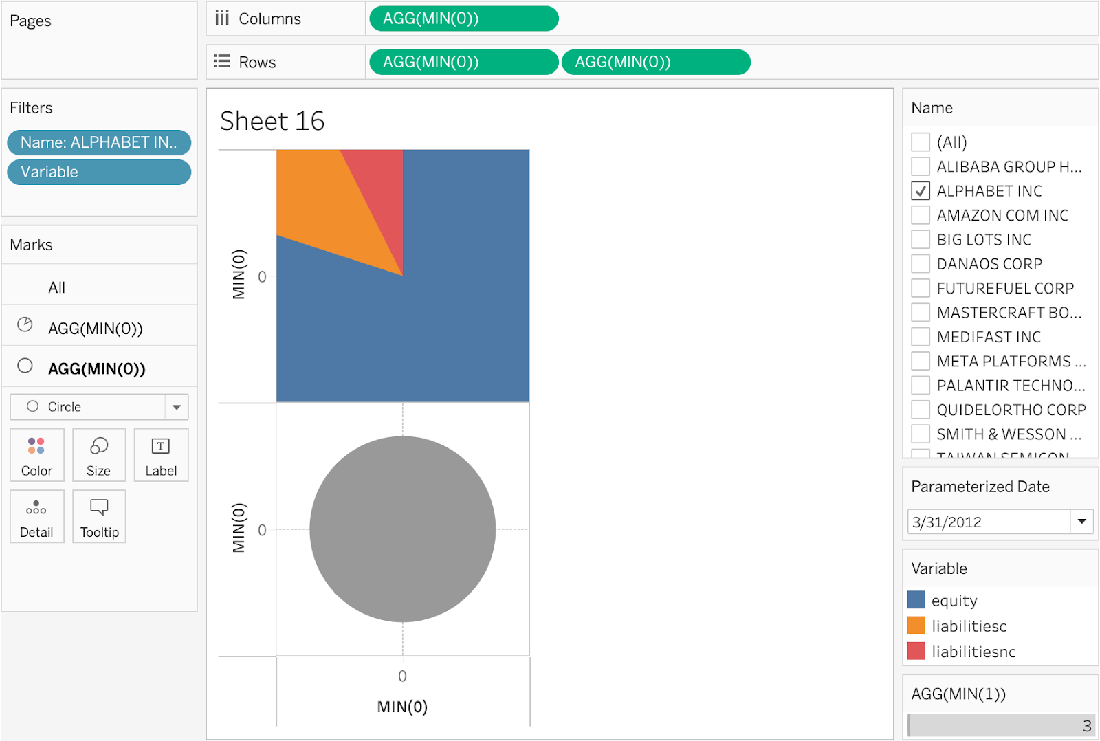
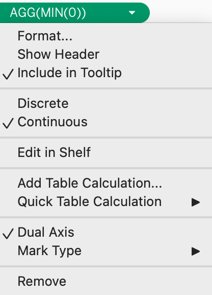
13. Select the dropdown for the second pill, and select Dual Axis.
14. Select the circle mark, and change color to white.
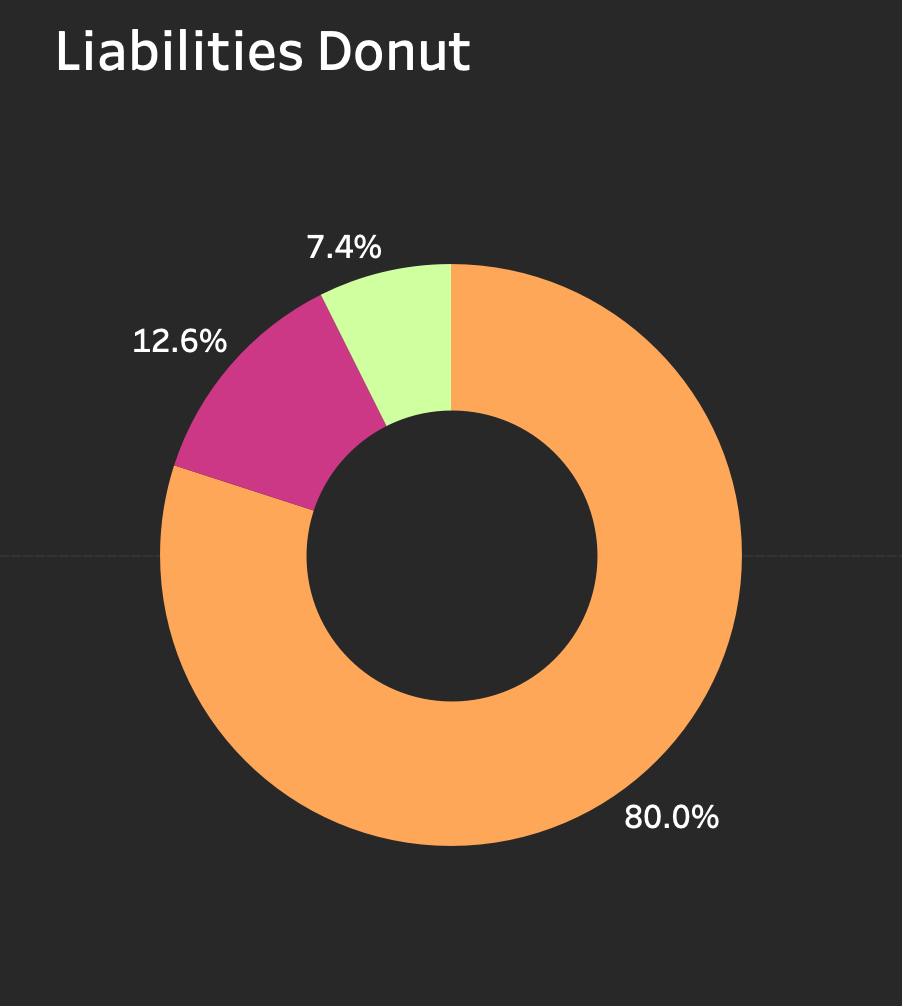
Now, we have a Tableau Donut chart!

15. Right-click on either axis and deselect “Show Header” to hide the axes.

Format your Donut:
1. Remove all grid lines, row lines, and axis rulers.
2. Change the background colour to #282828.
3. Change the circle mark colour to #282828 to match the background.
4. Change the font of percentage labels to Tableau Book, White, 12, and Bold.

Well it is done!
Congratulations, you’ve made a beautiful, quick and easy ten-minute Tableau Donut chart! Add it to your arsenal of charts to use as a Tableau consultant for clients or your business. It’s easy to read, understand, and slightly different from a Pie chart to shake up the visuals.