Our recent article on the Tableau dashboard style guide discussed design principles for creating branded Tableau dashboards. Now, let’s delve deeper into charts.

Table of Contents
Why is a Tableau Dashboard Style Guide Indispensable for Charts?
A Tableau dashboard style guide is crucial for several reasons:
- Clarifying Styles: The guide sets clear rules for dashboard design, like title placement, size, font, and colour, addressing the common query: “How do I make my Tableau dashboard look nice?” This ensures that your dashboard charts are attractive and adhere to Tableau dashboard best practices for style.
- Aiding in Branding: For individuals unfamiliar with styling and branding, the style guide Tableau provides an easy reference to select appropriate colours and fonts for graphs, facilitating the creation of branded Tableau dashboards. Having predefined styles incorporated into tools simplifies graph creation, making dashboards more visually appealing without extra effort.
- Setting Expectations: The guide underscores the significance of visual consistency in data visualizations to align with the company’s branding, providing tableau style guide examples. It’s essential to note that the style applicable to charts may differ from that used for logos.
For those working with data, a personalized style guide is invaluable. It ensures consistency in your work, addressing how to beautify a dashboard and make it stand out. With fundamental style decisions predetermined, you can concentrate on other vital aspects of crafting data visualizations, following the tableau dashboard design best practices.
Tableau Charts Style Guide
Chart Types & Dashboard Elements: The Tableau dashboard style guide should encompass all potential dashboard elements, including tables, charts, filters, and KPIs. It must prescribe rules for styling and positioning each component, considering their various states (selected, deselected, empty).
Crafting Dashboard Templates: Once all elements are outlined, it’s time to prepare sample dashboards. Construct example templates adhering to the Tableau dashboard style guide, utilizing features in varied ways. This approach offers practical Tableau style guide examples and assists users in understanding how to develop functional and aesthetically pleasing dashboards, demonstrating the best practices for Tableau dashboards.
Our Tableau Chart Style Guide
View our style guide below for:
- KPIS
- Table
- Line Chart
- Bar Chart
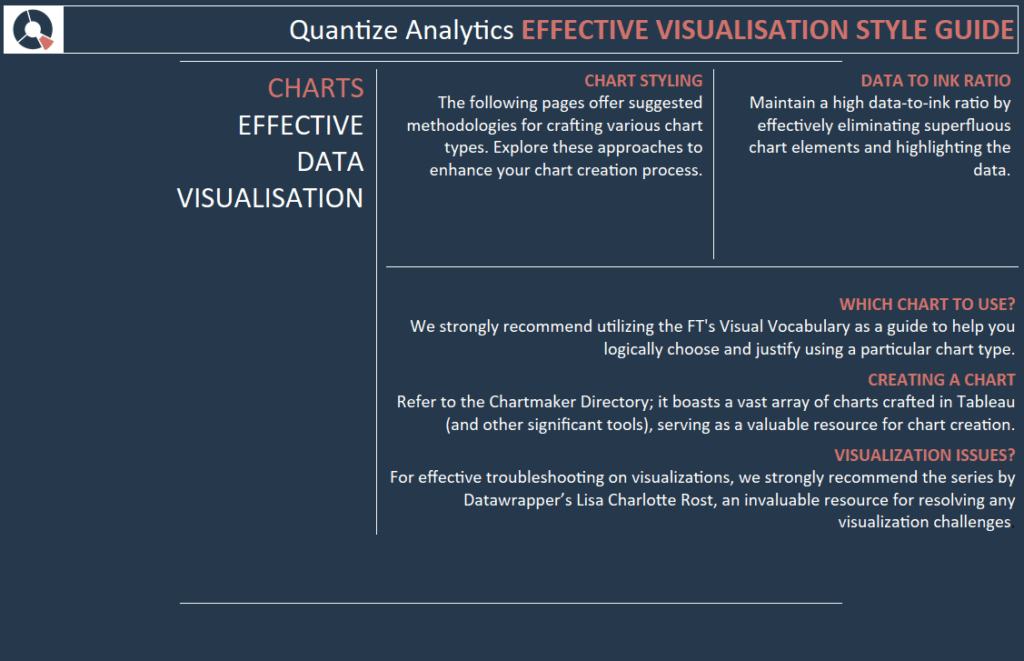
CHART STYLING
The following pages offer suggested methodologies for crafting various chart types. Explore these approaches to enhance your chart creation process.
DATA TO INK RATIO
Maintain a high data-to-ink ratio by eliminating superfluous chart elements and highlighting the data.
WHICH CHART TO USE?
We strongly recommend utilizing the Financial Times Visual Vocabulary as a guide to help you logically choose and justify using a particular chart type.
CREATING A CHART
Refer to the Chartmaker Directory; it boasts a vast array of charts crafted in Tableau (and other significant tools), serving as a valuable resource for chart creation.
VISUALIZATION ISSUES?
For effective troubleshooting on visualizations, we strongly recommend the series by Datawrapper’s Lisa Charlotte Rost, an invaluable resource for resolving any visualization challenges.
KPI Style Guide
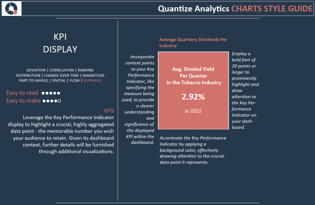
Leverage the Key Performance Indicator display to highlight a crucial, highly aggregated data point – the memorable number you wish your audience to retain. Given its dashboard context, further details will be furnished through additional visualizations.
Incorporate context points to your Key Performance Indicator, like specifying the measure being used, to provide a clearer understanding and significance of the displayed KPI within the dashboard.
Employ a bold font of 20 points to prominently highlight and draw attention to the Key Performance Indicator on your dashboard.
Accentuate the Key Performance Indicator by applying a background colour, drawing attention to the crucial data point it represents.
Table Style Guide
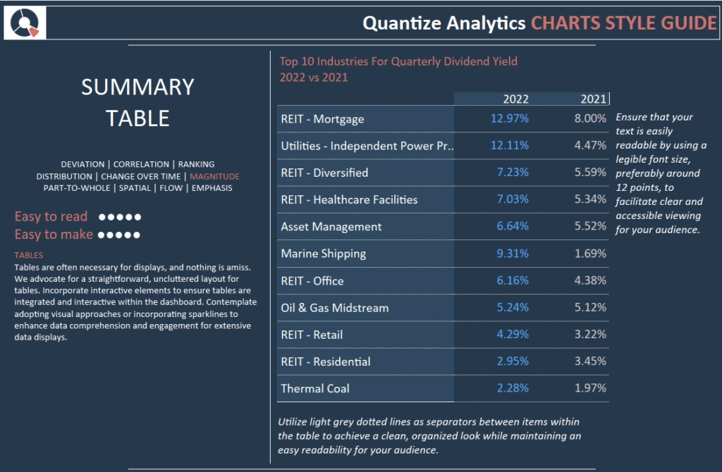
Tables are often necessary for displays, and nothing is amiss. We advocate for a straightforward, uncluttered layout for tables. Incorporate interactive elements to ensure tables are integrated and interactive within the dashboard. Contemplate adopting visual approaches or incorporating sparklines to enhance data comprehension and engagement for extensive data displays.
Ensure that your text is easily readable by using a legible font size, preferably around 12 points, to facilitate clear and accessible viewing for your audience.
Utilize light grey dotted lines as separators between items within the table to achieve a clean, organized look while maintaining readability for your audience.
Line Chart Style Guide
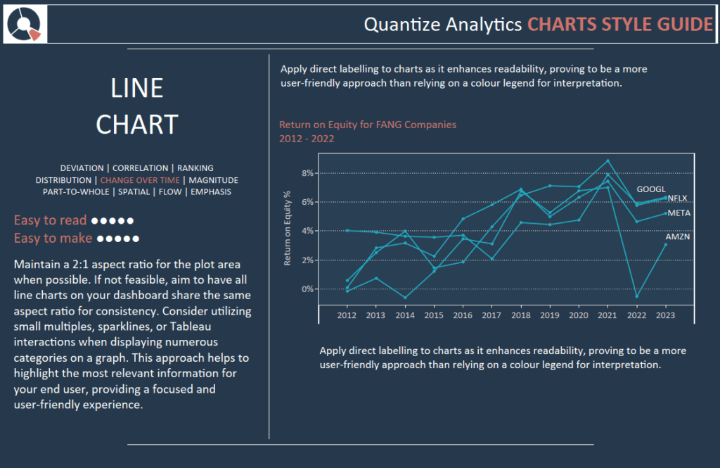
Maintain a 2:1 aspect ratio for the plot area when possible. If not feasible, aim to have all line charts on your dashboard share the same aspect ratio for consistency. Consider utilizing small multiples, sparklines, or Tableau interactions when displaying numerous categories on a graph. This approach helps to highlight the most relevant information for your end user, providing a focused and user-friendly experience.
Apply direct labelling to charts as it enhances readability, proving to be a more user-friendly approach than relying on a colour legend for interpretation.
Apply direct labelling to charts as it enhances readability, proving to be a more user-friendly approach than relying on a colour legend for interpretation.
Bar Chart Style Guide
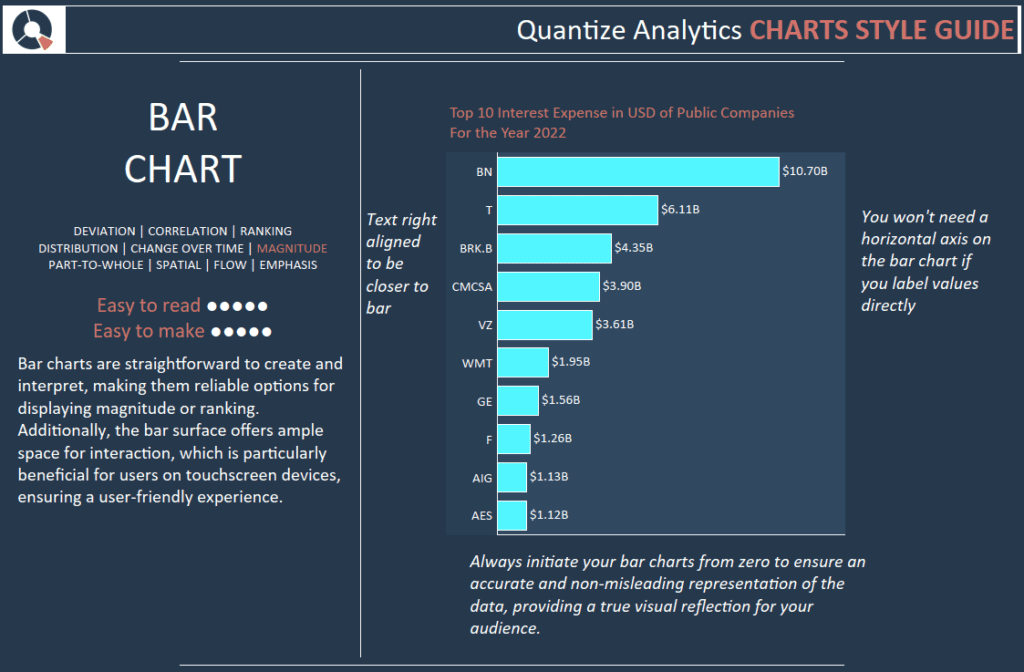
Bar charts are straightforward to create and interpret, making them reliable options for displaying magnitude or ranking. Additionally, the bar surface offers ample space for interaction, which is particularly beneficial for users on touchscreen devices, ensuring a user-friendly experience.
You won’t need a horizontal axis on the bar chart if you label values directly.
Always initiate your bar charts from zero to ensure an accurate and non-misleading representation of the data, providing a true visual reflection for your audience.
Text right aligned to be closer to the bar.
Conclusion
This post explores the advantages of a Tableau dashboard style guide and delves into four chart types: KPIs, tables, line charts, and bar charts. Stay tuned for more Tableau-style guide blogs!


