What is a Tableau Curved Line Chart?
A Tableau Curved Line Chart is a variation of standard line charts. They look more interesting but the shape of the line can bit misleading as it suggests that the movement between the 2 points being plott
Related posts:
- Building an Amazing Tableau Diverging Bar Chart in 5 Minutes
- Tableau Candlestick Charts in an Easy 7 Minutes
- 10 Minute Tutorial For a Great Tableau Shape Chart
- Create a Fantastic Tableau Radar Chart in 5 Minutes!
- How to make a Radical Tableau Radial Time Series Chart
- How to Make an Amazing Tableau Marimekko Chart
Let’s Create Our Tableau Curved Line Chart!
Firstly, connect to your data source and locate the dimensions and measures that are needed to build your base visualisation for out Tableau Curved Line Chart.
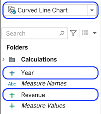
We’re using a year for the X-axis and a measure called revenue for the measure.
We need to use a technique called data densification to create extra data points for the radial chart. It’s a simple process, this time, involving adding a new table to the data source that we can union to our main table to create a duplicate row.
- Right-click the data source and select Edit Data Source
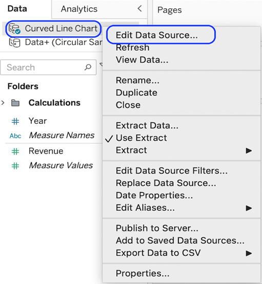
You need to be in the physical layer rather than the logical layer. Locate the logical layer and select open.
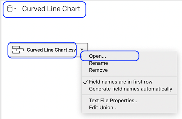
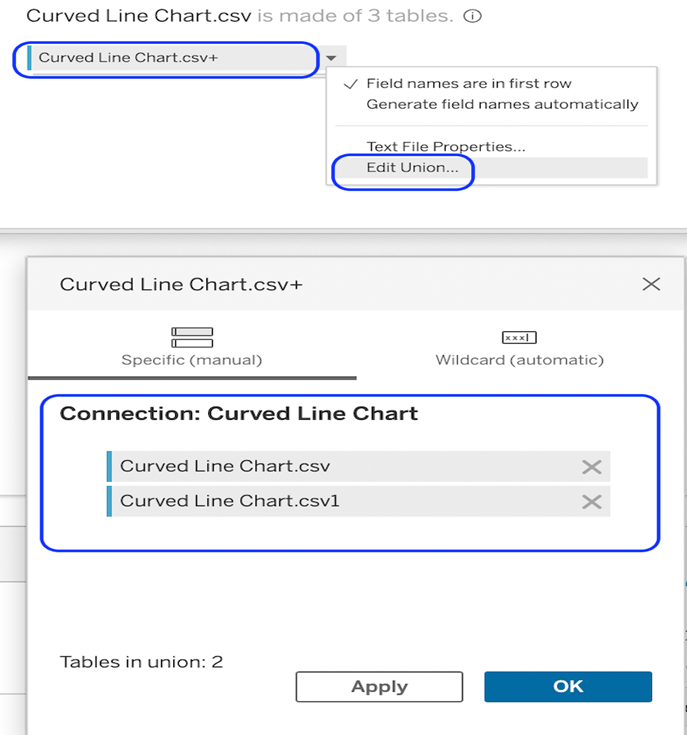
With the physical layer open, locate the file on the left-hand side and drag it over the top of your table in the data pane. This should present a ‘Drag table to union’. Drop the table on the prompt
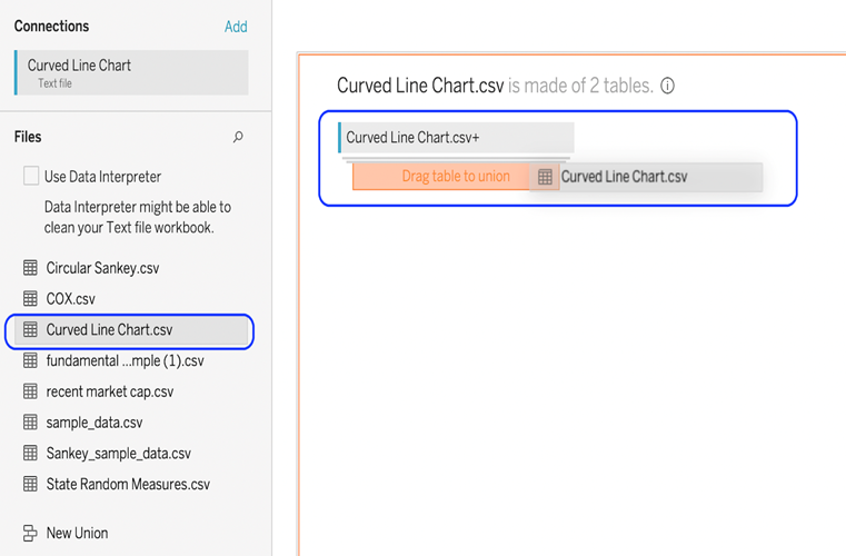
If you edit the union, you will see that we have stacked another copy of the table on top of the first to double the rows.
- Once our data source is set up, we need to create a few calculations to make our viz operate.
We will create these calculations one by one.
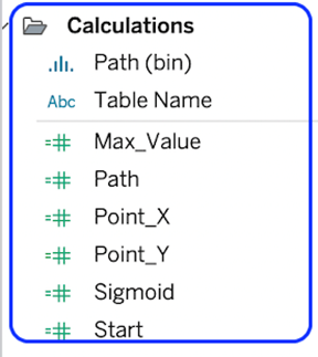
Path * Use the table name that you have brought into the union.
if [Table Name] = ‘Curved Line Chart.csv’ then 1 else 49 end
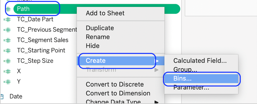
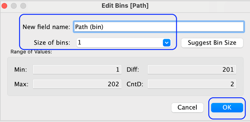
Path (Bin)
Right-click on the path object and select Create bin.
Set the bin size to 1
Max_Value.
WINDOW_MAX(max([Revenue ]))
Point_X
(index()-1)/4-6
Start
RUNNING_SUM([Max_Value])-[Max_Value]
Point_Y
[Start]+[Sigmoid]*[Max_Value]
Sigmoid
1/(1+exp(-[Point_X]))
- Now we can build the chart. There are several steps before the curved line starts to appear.
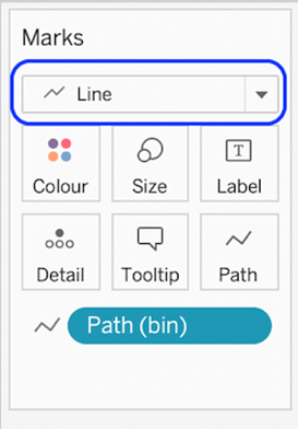
- Change mark type to line.
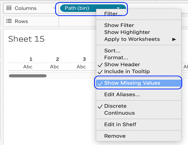
Drag the path (bin) to the rows shelf and show missing values.
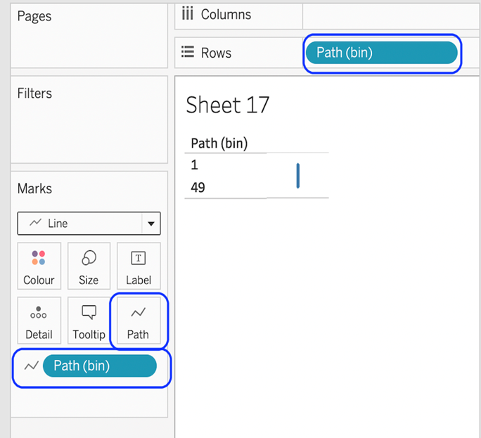
Drag the path to the path card.
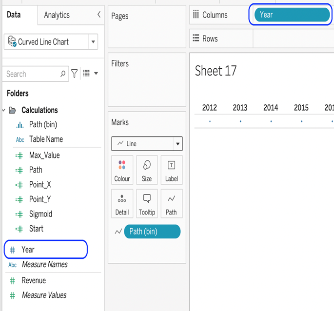
Add the Year object to columns.
- Add the Point_X and Point_Y objects to the column and row shelf and compute both objects to use Path (bin).
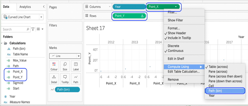
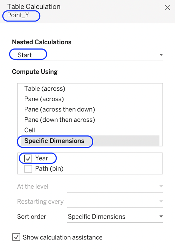
Edit the table calculation for the object Point_Y. Select the nested table calculation for the object Start and use the setting below.
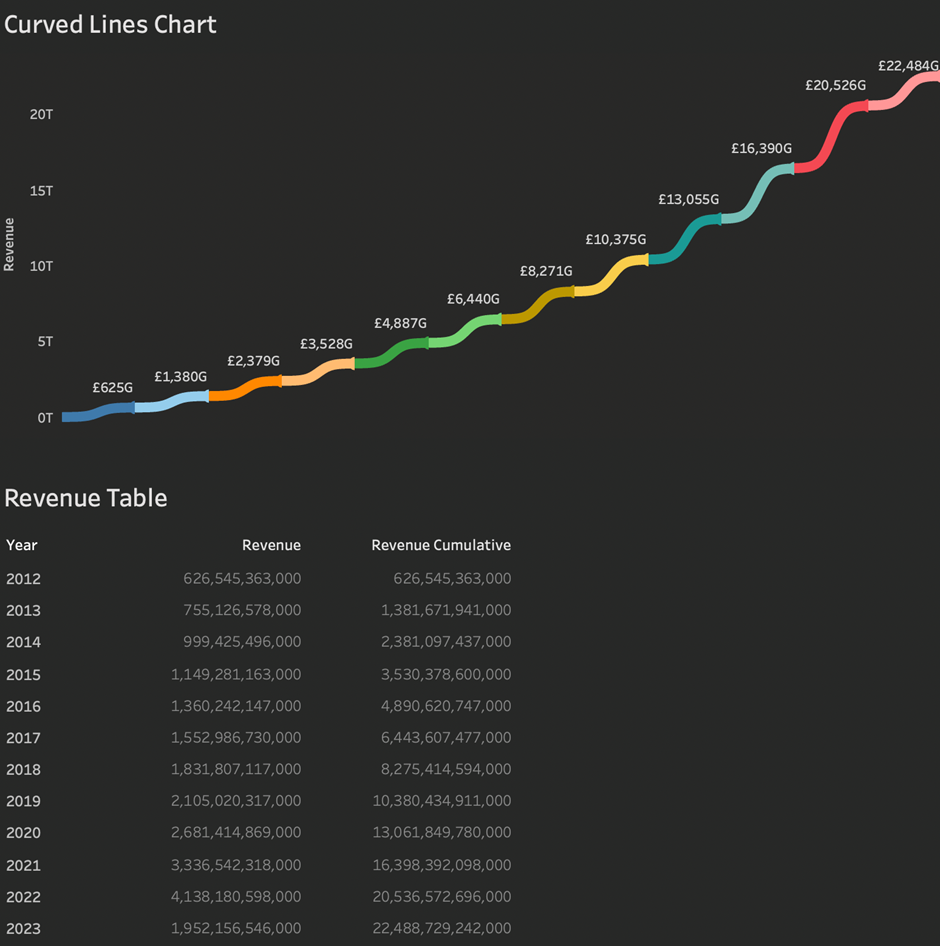
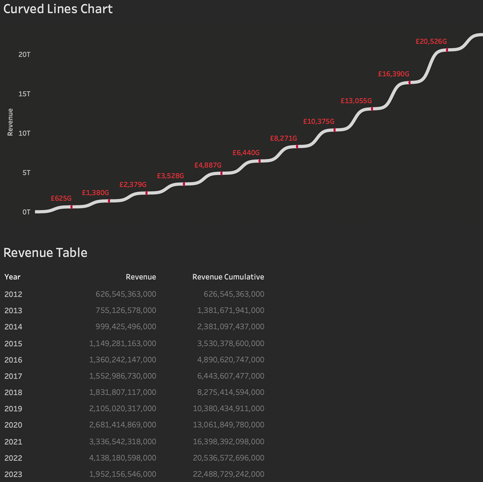
You should now see the curved lines starting to emerge and your viz should look something like this.

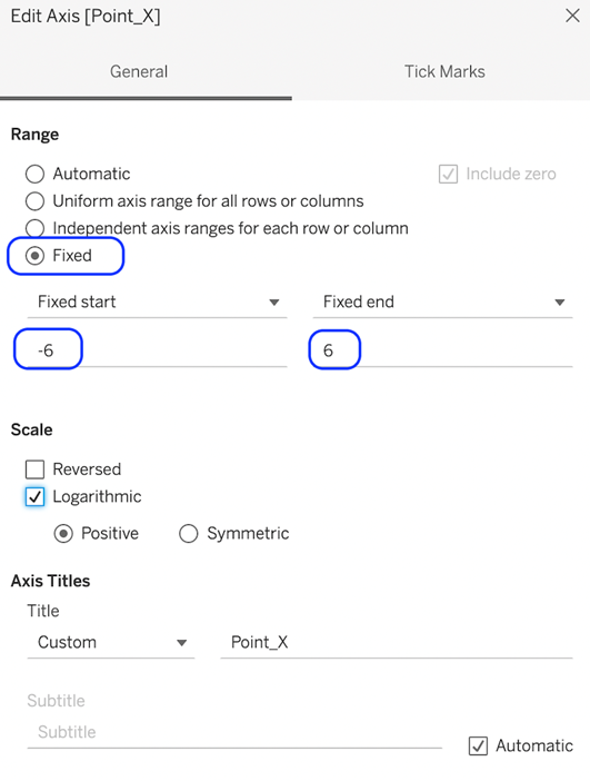
Edit the X-axis to fix the start and end points to -6 and 6 respectively. This will close the gap between the ends of the lines between the years.
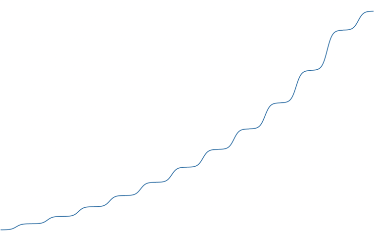
Hide the axes & headers, remove lines and borders, and remove the row and column dividers. You will now see a connected, curved line.
Finally, apply any desired formatting and markups. To get the viz to match the viz at the top of this document, I have done the following.
- Add the year object to colour to give each year a discrete colour.
- Change the background colour to dark grey.
- Add a title.
- Add the revenue object to the label and format it to show billions.
- Add a more meaningful tooltip.
Congratulations! You’ve completed your Tableau Curved Line Chart!
Well done on completing your Tableau Curved Line Chart in record time! Hopefully, you can add this to your Tableau visualisation tools in the future.
For more on learning about how to create in Tableau, head over to our blog. For more on Tableau consulting to help your company deliver successful Tableau and data projects for finance, marketing and sales head over to our website.


