
What is a Tableau Coxcomb Polar Area Chart?
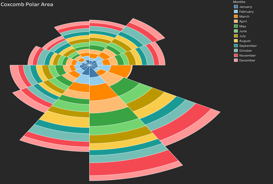
A Tableau Coxcomb Polar Area chart is a way of visually representing quantitative values across different dimensional segments. It is similar to a pie chart, but the Coxcomb indicates frequency by relative area, but it differs in its use of fixed angles and variable radii.
The Tableau Coxcomb Polar Area chart is radial and is segregated into multiple slices. Each slice represents a category. Each slice can be further divided into sub-slices. You can use a single measure across all slices, sub-slices or multiple measures.
What is a Tableau Coxcomb Polar Area chart used for?
Tableau Coxcomb Polar Area Charts can be used to visualise on top of just a regular pie chart when other information can be displayed in addition such as multiple years or timelines. It just adds to the richness of information being displayed.
Unlike other kinds of radial charts (e.g. a pie chart), each slice has an equal angle. In this example, each radial segment is a year. We have 10 years in the set, so the angle of each slice is 360/10=36 degrees. The area of each slice is variable based on the quantitative value which is why some slices protrude more than others.
Let’s make a Tableau Coxcomb Polar Area Chart!
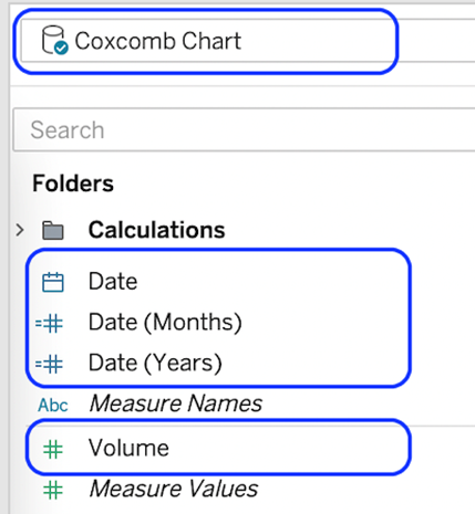
To start building your Tableau Coxcomb Polar Area Chart, connect to your data source and locate the dimensions and measures needed to build your base visualisation.
We’re using a date (month and year) for the slices and a measure called volume for the measure.
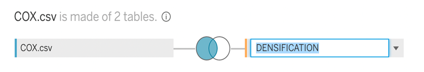
We need to use a technique called data densification to create extra data points for the radial chart. It’s a simple process involving adding a new table to the data source that we can join using a cartesian join which will duplicate the rows in our original dataset.
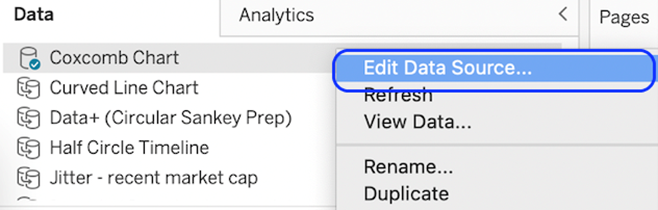
- Right-click the data source and select Edit Data Source
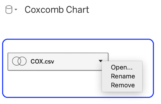
You need to be in the physical layer rather than the logical layer. Locate the logical layer and select open.
Paste in the following.
Path
1
202
The paste will generate another table in the data source. Start by giving it a new name. I’ve used ‘Densification’. Double-click the original name to change it
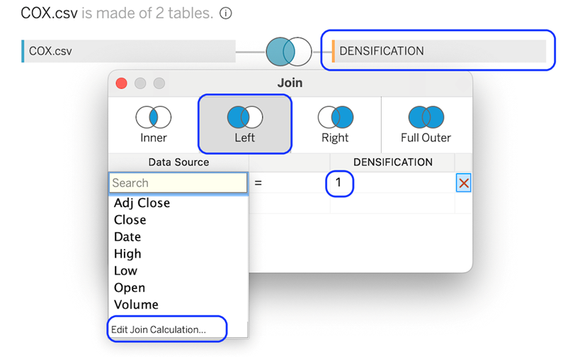
We need to create a joint relationship between the original data source and the densification table. We want every row of the main table to join with every row of the densification table. To do this use a join calculation with the number 1. Do this for both sides of the join.
Once our data source is set up for our Tableau Coxcomb Polar Area Chart, we need to create a few calculations to make our viz operate.
We will create these calculations one by one.
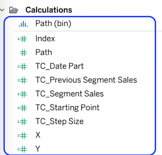
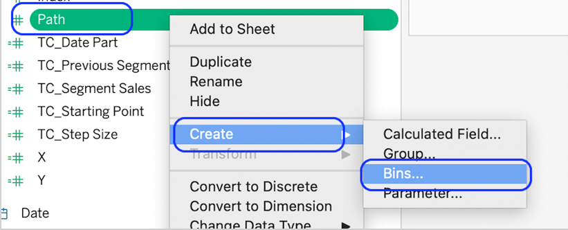
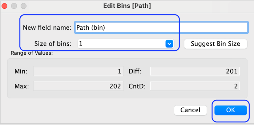
Path (Bin)
Right-click on the path object and select Create bin.
Set the bin size to 1
Create the rest of the calculations in the calculation editor.
Index
INDEX()-1
TC_Date Part ** The ‘Month’ can be replaced with another data part for the outer radial slices.
WINDOW_MAX(MAX(DATEPART(‘month’, [Order Date])))-1
TC_Segment Sales ** swop out sales with your measure (volume)
WINDOW_SUM(SUM([Sales]))/2
TC_Step Size
3.6/12
TC_Previous Segment SalesRUNNING_SUM([TC_Segment Sales])-[TC_Segment Sales]
TC_Starting Point[TC_Date Part]*[TC_Step Size]*100
X
IF [Index] <= 100 THEN SIN(RADIANS(([Index]*[TC_Step Size])+[TC_Starting Point]))*([TC_Previous Segment Sales])ELSE SIN(RADIANS(((201-[Index])*[TC_Step Size])+[TC_Starting Point]))*([TC_Segment Sales]+[TC_Previous Segment Sales])END
Y
IF [Index] <= 100 THEN COS(RADIANS(([Index]*[TC_Step Size])+[TC_Starting Point]))*([TC_Previous Segment Sales])ELSE COS(RADIANS(((201-[Index])*[TC_Step Size])+[TC_Starting Point]))*([TC_Segment Sales]+[TC_Previous Segment Sales])END
Now we have built the data source and created the calculations, we can build our workbook.
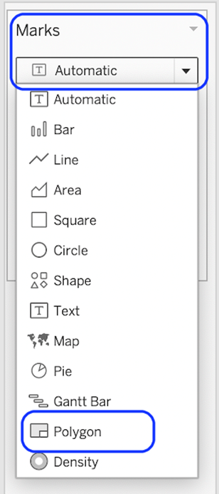
- Change mark type to polygon.
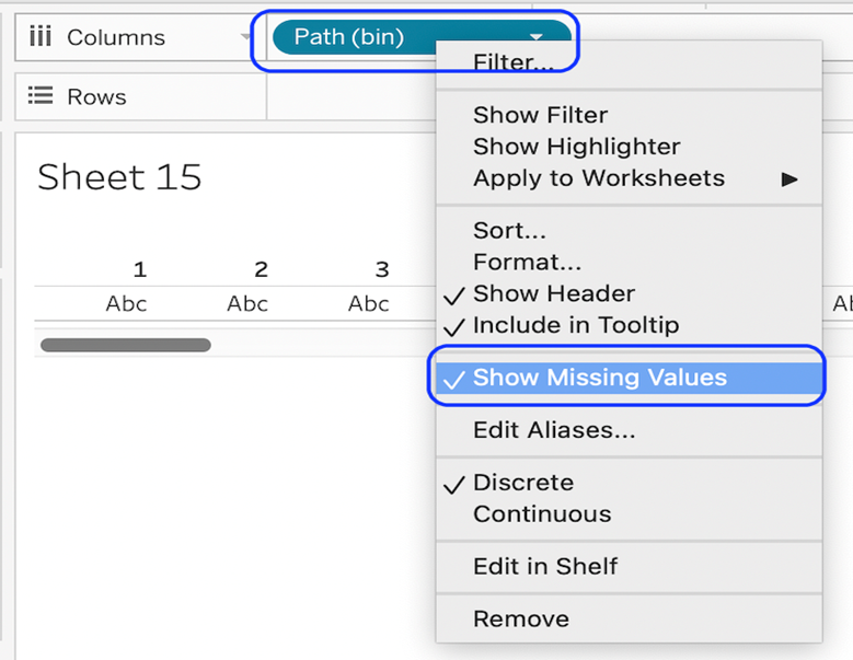
- Drag the path (bin) to the rows shelf and show missing values
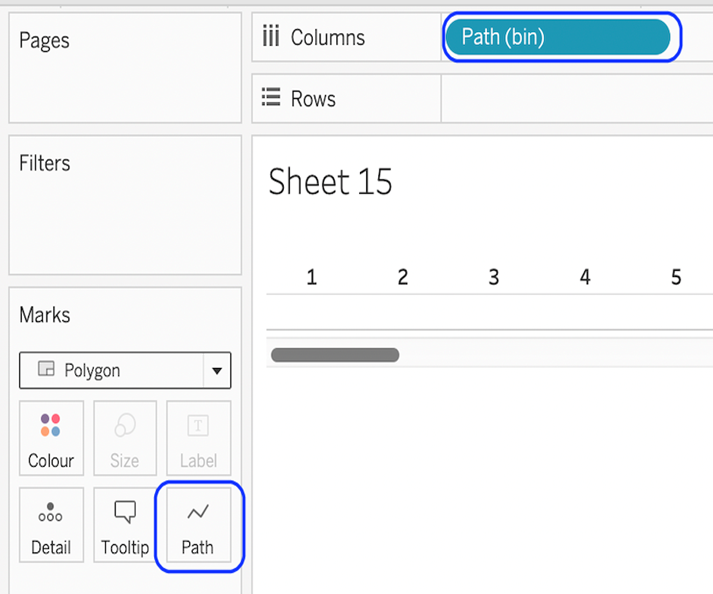
Drag the path to the path card.
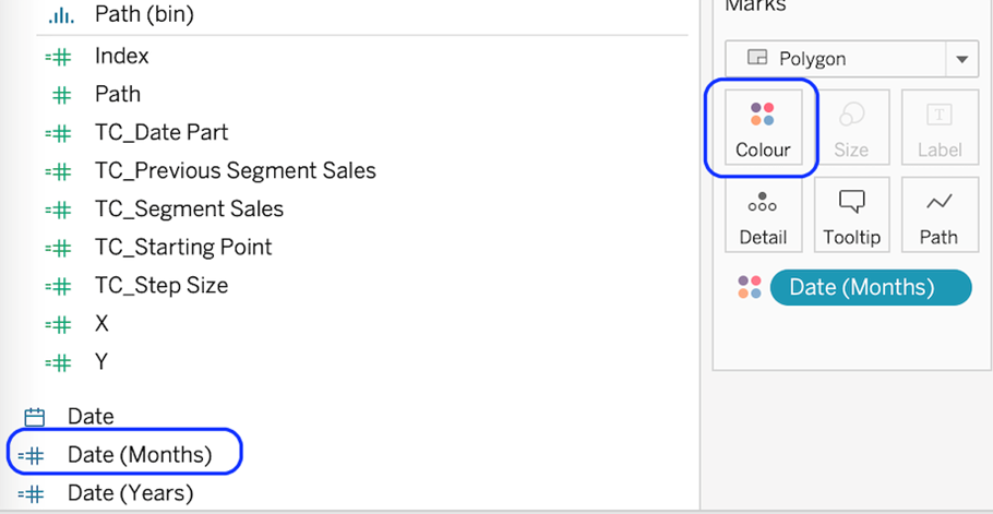
Drag the object you want to use as the sub-slices on to colour. Here I am using Month so that each month sub-slice gets a different colour.
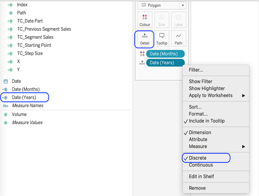
Drag the field you want to use to create the outer slices onto detail. I am using year to plot my 10 years as 10 slices. Make sure the field is set to discrete.
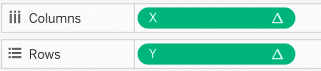
Add X to the columns shelf and Y to the rows shelf.
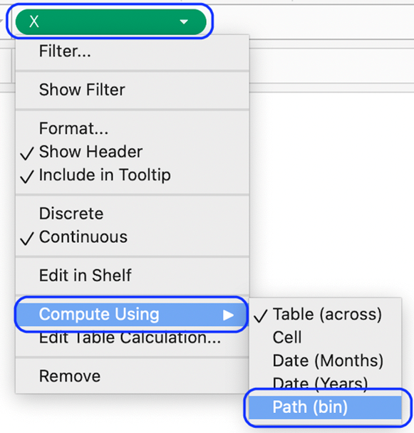
Compute Y and X to use the Path(bin)
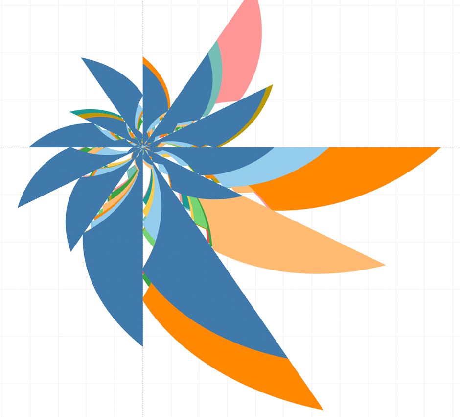
You’ll see a strange shape at this point. Something like this;
We need to change some table calculations to make it work correctly.
- Right-click on X and go to Edit Table Calculations…
In Nested Calculations select TC_Segment Sales
In Compute Using select Specific Dimensions, ensure that Date(Months) and Path (bin) are checked and that Date(Months) is on top.
Set At the Level to Deepest, and Restarting every to Date(Months).
In Nested Calculations select TC_Previous Segment Sales.
In Compute Using select Specific Dimensions, ensure that only Date(Months) is selected.
- Right-click on Y and go to Edit Table Calculations…
In Nested Calculations select TC_Segment Sales
In Compute Using select Specific Dimensions, ensure that Date(Months) and Path (bin) are checked and that Date(Months) is on top.
Set At the Level to Deepest, and Restarting every to Date(Months).
In Nested Calculations select TC_Previous Segment Sales.
In Compute Using select Specific Dimensions, ensure that only Date(Months) is selected.
- Finally, we can clean up the chart by
- Hide the Axis Headers.
- Hide the Zero Lines.
- Hide the Gridlines.
- Add Tooltips.
Add a White Border.
Congratulations! You’ve completed your Tableau Coxcomb Polar Area Chart!
Well done on completing your Tableau Coxcomb Polar Area Chart in record time! Hopefully, you can add this to your Tableau visualisation tools in the future.
For more on learning about how to create in Tableau, head over to our blog. For more on Tableau consulting to help your company deliver successful Tableau and data projects for finance, marketing and sales head over to our website.


