This blog presents seven exemplary Tableau dashboards that showcase the power of coronavirus analytics. Each dashboard provides unique insights into global COVID cases, infection trends, and the impact of the virus on various regions and demographics.
These examples are designed to inspire public health officials, data analysts, and researchers by demonstrating how Tableau can transform complex COVID stats into clear, actionable insights. Explore these dashboards to see how effective data visualization can drive better decision-making and public health strategies.
Table of Contents
Affiliate Disclosure: Some of the links on this blog are affiliate links, which means if you click on them and make a purchase, we may receive a commission at no extra cost to you. This helps support our blog and allows us to continue to create content for you. We only recommend products and services we genuinely believe in; all opinions expressed here are ours. Thank you for being so supportive!
These Tableau Covid dashboards were curated from Tableau public ; we do not take credit for their creation.
#1 Coronavirus (COVID-19) Cases
Global COVID-19 Tracker Dashboard
This Global COVID-19 Tracker dashboard provides an in-depth analysis of the spread of COVID-19 from January 21, 2020, to April 29, 2022. Utilizing Tableau COVID analytics, it offers a comprehensive overview of new positive cases and deaths worldwide, making it an essential tool for public health officials, researchers, and concerned citizens.
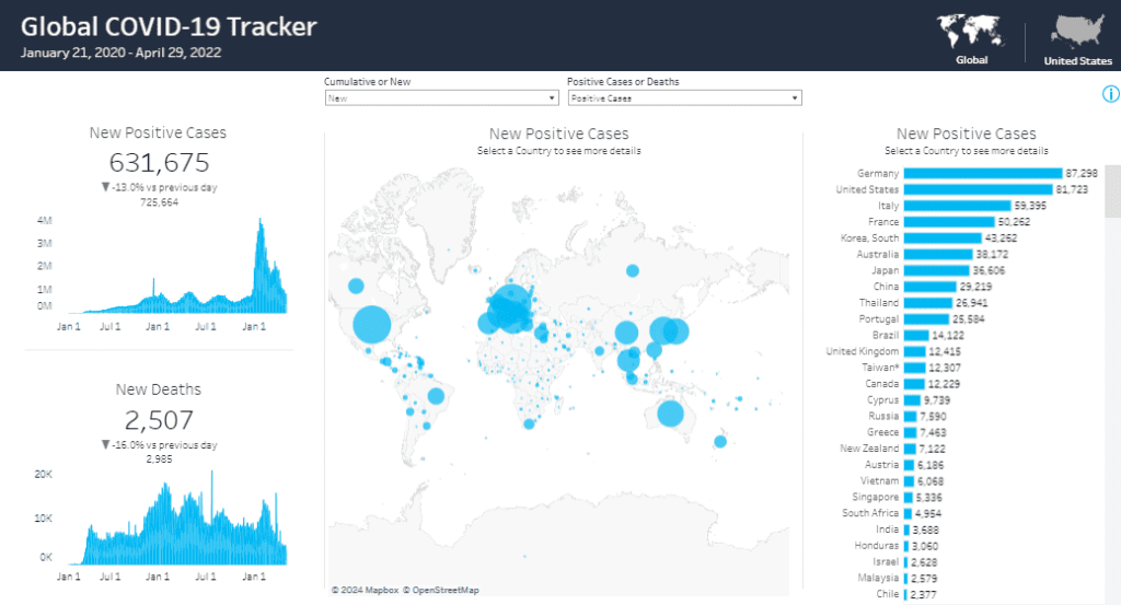
Components and Charts:
- New Positive Cases:
- The top-left section of the dashboard displays the total number of new positive cases (631,675) with a line chart showing the trend over time. This chart helps users understand the rise and fall of global COVID cases, providing context for current figures.
- New Deaths:
- The new positive cases section below shows the total number of new deaths (2,507) with a corresponding line chart. The chart visually represents the death toll trend over the same period, highlighting critical peaks and declines.
- World Map of New Positive Cases:
- The central part of the dashboard features a world map with bubbles representing the number of new positive cases in each country. The size of the bubbles correlates with the number of cases, allowing users to quickly identify hotspots and regions with higher case numbers using coronavirus Tableau analytics.
- New Positive Cases by Country:
- On the right side, a bar chart ranks countries by the number of new positive cases, with Germany and the United States leading. This chart compares countries, emphasizing regions most affected by the virus and providing crucial coronavirus stats.
- Interactive Filters:
- The dashboard includes interactive filters that allow users to switch between cumulative and new data and between positive cases and deaths. This feature enables users to tailor the data visualization to their specific needs, enhancing the utility of the COVID Tableau analytics.
Target Audience:
This Tableau coronavirus dashboard is perfect for:
- Public Health Officials: Individuals who need to monitor and respond to the spread of COVID-19 in real time.
- Researchers and Scientists: Professionals analyzing trends and patterns in the virus’s spread and impact with COVID stats.
- Government Agencies: Entities responsible for making informed decisions regarding public health policies and interventions.
- General Public: Citizens seeking reliable and up-to-date information on the status of COVID-19 globally.
#2 COVID-19 at the White House – Contact Tracking
COVID-19 at The White House – Public Reports Dashboard
This comprehensive Tableau COVID dashboard provides detailed insights into the COVID-19 test results and symptoms among individuals connected to the White House. The dashboard is essential for journalists, researchers, and public health officials who require detailed COVID-19 analytics and coronavirus statistics to understand the spread and impact of the virus within this high-profile group.
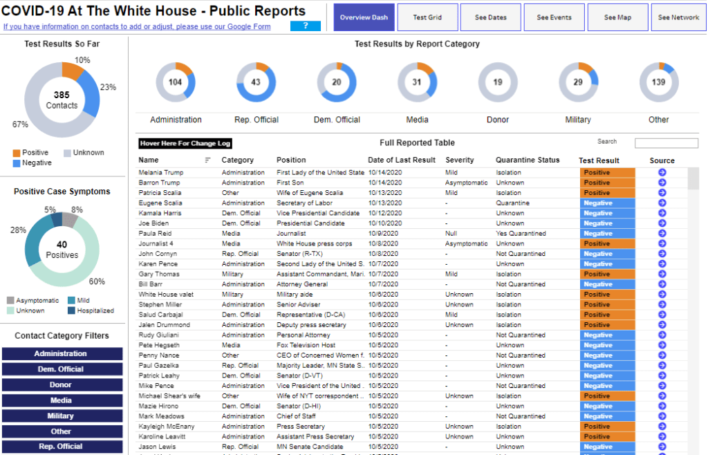
Components and Charts:
- Test Results Overview:
- The top-left section features a donut chart displaying the test results so far. It shows the total number of contacts (385) and the distribution of positive (10%), negative (67%), and unknown (23%) test results. This chart provides a quick summary of the overall testing outcomes.
- Positive Case Symptoms:
- Below the test results, another donut chart illustrates the symptoms among the 40 positive cases. It categorizes cases into asymptomatic (60%), mild (28%), hospitalized (5%), and unknown (8%), offering insights into their severity.
- Test Results by Report Category:
- The top row of the dashboard presents a series of donut charts showing the distribution of test results by different report categories such as Administration, Rep. Official, Dem. Official, Media, Donor, Military, and Other. This visualization helps users quickly identify which groups have the most positive, negative, or unknown results.
- Contact Category Filters:
- Users can filter the data by different contact categories like Administration and Dem. Official, Donor, Media, Military, and Rep. Official. This interactive element allows a more detailed exploration of specific groups.
- Full Reported Table:
- The central section of the dashboard is a detailed table listing individuals, their category, position, date of the last result, severity of symptoms, quarantine status, test result, and source. This table provides a comprehensive overview of each case, enabling in-depth analysis.
- Change Log Hover Feature:
- The hover feature over the change log provides additional context and updates on individual cases, enhancing the depth of information available.
This Tableau COVID analytics tool is an invaluable resource for anyone seeking detailed insights into the COVID-19 situation at the White House. It provides clear and interactive visualizations of critical data.
#3 COVID19
COVID-19 Trend Tracker Dashboard
This Tableau COVID dashboard comprehensively analyses COVID-19 trends across multiple countries, offering a detailed view of total cases, new cases, and deaths. It is an essential tool for public health officials, researchers, and data analysts interested in coronavirus analytics and global COVID cases.
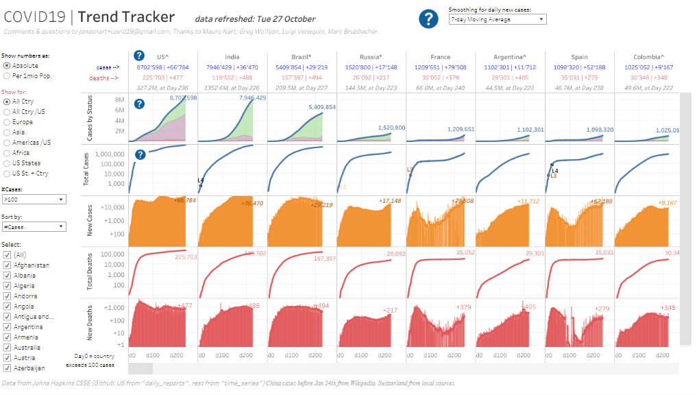
Components and Charts:
- Total Cases by Status:
- The top section features line charts displaying COVID-19 cases for selected countries, including the USA, India, Brazil, Russia, France, Argentina, Spain, and Colombia. These charts show the cumulative number of cases over time, providing a clear picture of the pandemic’s progression in each country.
- New Cases:
- The dashboard presents area charts for new daily COVID-19 cases directly below the total cases. The charts use a 7-day moving average to smooth out daily fluctuations, helping users more accurately identify trends and spikes in new infections.
- Total Deaths:
- The bottom section includes line charts depicting the total number of COVID-19 deaths in each country. Similar to the total cases charts, these visuals show the cumulative death toll over time, highlighting critical points where fatalities surged.
- Interactive Filters:
- Users can interact with various filters on the left side to customize the data view. Filters include options to show numbers as absolute or per million population, display data for all countries or specific regions, and sort countries by the number of cases. Users can also select particular countries to focus on.
- Dynamic Comparison:
- The dashboard allows for dynamic comparison across different metrics and countries, making it easy to analyze how various nations have managed the pandemic. Users can see which countries have had the most significant increases in cases and deaths and how their trends compare to others.
#4 Coronavirus COVID-19 Cases by Location
COVID-19 Cases by Location Dashboard
This Tableau COVID dashboard offers a detailed analysis of COVID-19 cases by location, providing a comprehensive overview of confirmed, active, recovered, and death cases globally. It is a valuable resource for public health officials, researchers, and data analysts who require in-depth COVID stats and coronavirus analytics.
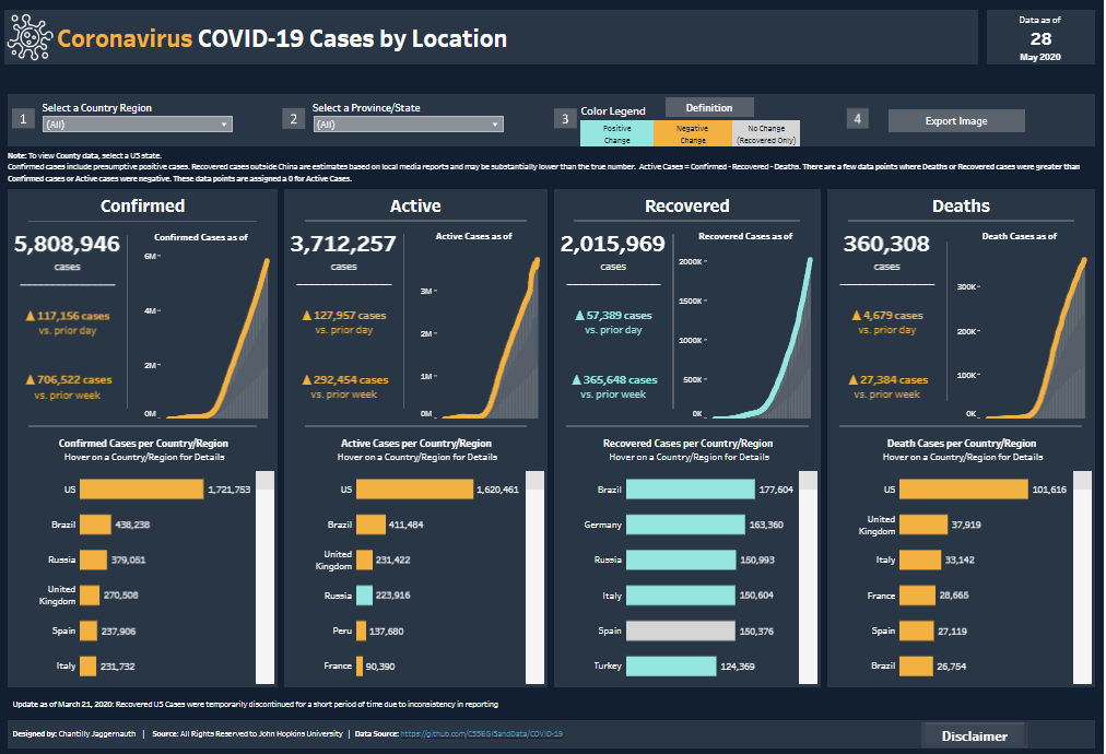
Components and Charts:
- Confirmed Cases:
- The top left section of the dashboard presents the total number of confirmed COVID-19 cases (5,808,946). It features a line chart showing the growth of confirmed cases over time, alongside daily and weekly changes. Below this, a bar chart ranks countries by the number of confirmed cases, highlighting the most affected regions.
- Active Cases:
- Adjacent to the confirmed cases, the active cases section shows a similar layout with 3,712,257 active cases. The line chart tracks the rise of active instances, while the bar chart below lists countries with the highest number of active infections, allowing for easy comparison.
- Recovered Cases:
- The recovered cases section, located in the centre, displays 2,015,969 recoveries. A line chart illustrates the increase in recovered cases over time, and a bar chart ranks countries by the number of recoveries, providing insights into regions with successful recovery rates.
- Deaths:
- The rightmost section shows the death toll, with 360,308 deaths reported. The line chart depicts the upward trend in fatalities, and the bar chart below lists countries with the highest death tolls, emphasizing regions severely impacted by the pandemic.
- Interactive Filters:
- The dashboard includes dropdown menus at the top for selecting specific countries or provinces/states. Users can also toggle between positive, negative, and no-change cases using the color legend and export images for reporting purposes.
- Hover Details:
- Interactive hover features provide additional context and details for each data point, enhancing the user’s ability to analyze specific aspects of the data.
This COVID Tableau analytics tool provides a clear and interactive way to track the global impact of COVID-19, making it a valuable resource for experts and the general public.
#5 COVID impact on Travel – Passenger Year over Year growth
COVID Impact on Air Passenger Dashboard
This Tableau COVID dashboard offers a detailed analysis of the impact of COVID-19 on air passenger traffic to and from Europe. It provides a comprehensive overview of passenger growth trends over the years and visualizes the dramatic changes caused by the pandemic. This dashboard is essential for aviation industry professionals, analysts, and policymakers who need to understand the effects of global events on air travel.
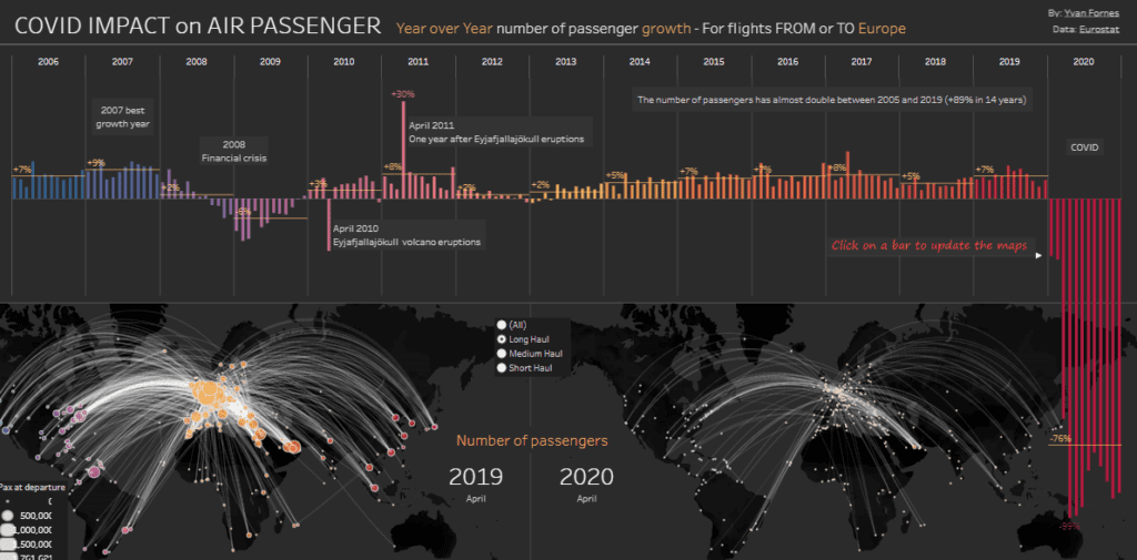
Components and Charts:
- Year-over-Year Passenger Growth Bar Chart:
- The top section features a bar chart illustrating the year-over-year growth in the number of air passengers from 2005 to 2020. Key events affecting passenger numbers, such as the 2008 financial crisis and the 2010 Eyjafjallajökull volcanic eruptions, are annotated. The chart highlights the decline in 2020 due to COVID-19, showing a dramatic -76% drop in passenger numbers.
- World Map of Passenger Routes (2019 vs. 2020):
- The bottom section presents two world maps comparing the number of passengers and routes for April 2019 and April 2020. The maps use colour-coded arcs to represent long, medium, and short-haul flights. The dots’ size indicates the passengers’ volume at departure points, allowing users to see the reduced air traffic visually.
- Interactive Features:
- Users can interact with the bar chart to update the maps, providing a dynamic way to explore how specific years’ events impacted air travel. This feature lets users focus on particular periods and observe the corresponding changes in passenger routes and numbers.
Target Audience:
This dashboard is perfect for:
- Aviation Industry Professionals: Airline executives, airport managers, and aviation consultants who need to understand the trends and impacts of air travel.
- Analysts and Researchers: Data analysts and researchers studying the effects of global events on transportation and travel patterns.
- Policymakers and Regulators: Government officials and regulatory bodies responsible for making informed decisions about air travel policies and regulations.
- General Public: Individuals interested in the broader impacts of COVID-19 and other significant events on global travel.
This COVID Tableau dashboard clearly and interactively analyzes the global impact of the pandemic on air travel, offering valuable insights for both industry professionals and the general public.
#6 COVID-19 – Neighborhood Map
COVID-19 Neighbourhood Cases and Rates Dashboard
This Tableau COVID dashboard provides a detailed analysis of COVID-19 cases and rates across different neighbourhoods, focusing on Toronto and its surrounding areas. It offers an insightful view into the geographic distribution of global COVID cases and the socio-demographic factors contributing to infection rates. This dashboard is invaluable for public health officials, community planners, and researchers who must delve into localized COVID stats and coronavirus analytics.
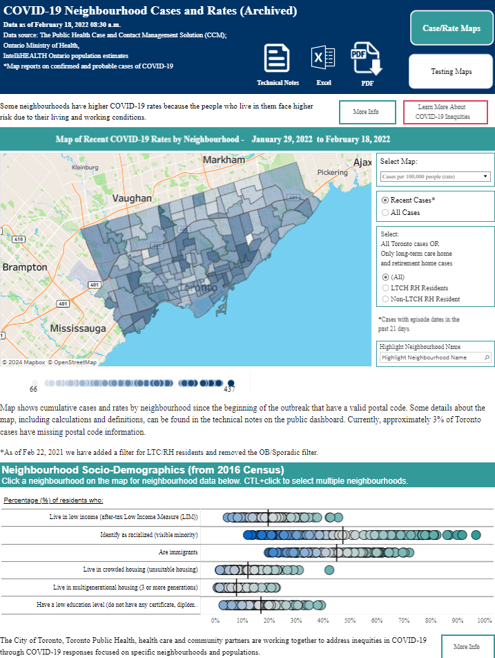
Components and Charts:
- Map of Recent COVID-19 Rates by Neighbourhood:
- The central feature is a choropleth map that visualizes COVID-19 case rates per 100,000 people across various neighbourhoods. The map highlights areas with higher infection rates, providing a geographic representation of the pandemic’s impact. Users can switch between viewing recent or all cases and filtering by specific populations, such as long-term care home residents.
- Neighbourhood Socio-Demographics:
- Below the map, a series of bar charts display socio-demographic data from the 2016 Census. These charts show the percentage of residents in each neighbourhood who live in low-income households, identify as racialized minorities, are immigrants, live in crowded housing, live in multigenerational homes, or have a low education level. This data helps to contextualize the COVID-19 rates by showing potential contributing factors.
- Interactive Filters and Highlighting:
- The dashboard includes interactive filters that allow users to select specific maps, such as cases per 100,000 people or all cases. Users can also highlight particular neighbourhoods to get more detailed information. This functionality makes it easy to focus on specific areas of interest and understand the local dynamics of the pandemic.
- Technical Notes and Export Options:
- Additional buttons provide access to technical notes, Excel data, and PDF export options, enabling users to explore the data further and share findings. This feature is handy for those needing to report or present the data to different stakeholders.
#7 Corona Virus 2020
Wuhan Coronavirus Outbreak Dashboard
This Tableau COVID dashboard provides a comprehensive overview of the early stages of the Wuhan coronavirus outbreak, illustrating the spread of COVID-19 from its origin in Wuhan, China, to various countries worldwide. This dashboard is essential for public health officials, researchers, and policymakers who require detailed coronavirus stats and analytics to understand the initial global impact of the virus.
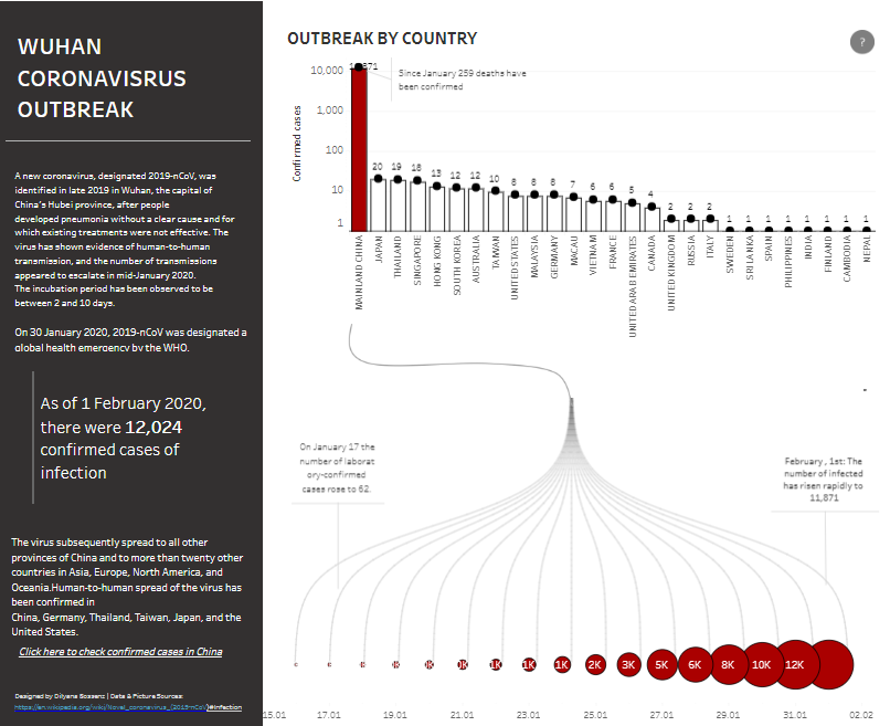
Components and Charts:
- Outbreak by Country Bar Chart:
- The main visual element is a bar chart displaying the number of confirmed COVID-19 cases by country as of February 1, 2020. The chart highlights China as having the highest number of cases (11,871) and includes other countries such as Japan, Thailand, Singapore, and the United States. This chart helps users quickly identify the countries most affected by the outbreak.
- Cumulative Growth Timeline:
- Below the bar chart, a timeline visualizes the cumulative growth of confirmed COVID-19 cases from January 15, 2020, to February 1, 2020. The timeline features expanding circles representing the rising number of cases, from a few dozen to over 12,000 in just a few weeks. This chart effectively communicates the rapid escalation of the outbreak.
- Textual Summary:
- The left side of the dashboard includes a detailed textual summary of the Wuhan coronavirus outbreak. It describes the virus’s origin, the timeline of its spread, and the number of confirmed cases as of February 1, 2020. This summary provides context and background information, enhancing the understanding of the data visualizations.
- Highlighted Statistics:
- Key statistics are prominently displayed, such as confirmed cases (12,024) and deaths since January (259). These figures are crucial for grasping the outbreak’s severity at that time.
- Data Source and References:
- At the bottom, the dashboard provides information about the data sources, including Wikipedia and other references. This ensures the reliability and credibility of the presented information.
This Tableau coronavirus dashboard offers a clear and interactive way to explore the early spread of COVID-19, providing valuable insights into the rapid escalation of the pandemic.
Conclusion
These seven Tableau COVID dashboards highlight the critical role of data visualization in understanding and combating the pandemic. By transforming complex coronavirus stats into clear, actionable insights, these dashboards provide valuable tools for public health officials, researchers, and data analysts. They demonstrate how effective coronavirus analytics can inform decision-making, track global COVID cases, and identify trends. Whether you’re analyzing infection rates, demographic impacts, or regional differences, these Tableau dashboards offer inspiration and practical examples of leveraging data visualization for better public health strategies and outcomes.