With a diverse range of Tableau chart types, Tableau offers flexibility in presenting data, making it easier to identify trends, relationships, and patterns. Selecting the right Tableau graph type is crucial for effectively conveying your data’s story. Different charts offer solutions for each scenario, whether you’re looking to display proportions, track change over time, examine geographic patterns, or highlight deviations.
Related posts:
- Building an Amazing Tableau Diverging Bar Chart in 5 Minutes
- Tableau Candlestick Charts in an Easy 7 Minutes
- 10 Minute Tutorial For a Great Tableau Shape Chart
- Create a Fantastic Tableau Radar Chart in 5 Minutes!
- How to make a Radical Tableau Radial Time Series Chart
- How To Make A Tableau Curved Line Chart in 10 Minutes
In this blog post, we’ll explore Tableau’s charts, covering categories such as Deviation, Correlation, Ranking, Distribution, Change Over Time, Part-to-Whole, Magnitude, Spatial, and Flow. Understanding the purpose and strengths of each type of Tableau chart will help you make data-driven decisions with clarity and impact.
Table of Contents
#1 Tableau Chart Types – A Visual Vocabulary
The Visual Vocabulary chart provides a guide for selecting the best Tableau chart types based on data relationships. It categorizes types of Tableau charts into nine main types: Deviation, Correlation, Ranking, Distribution, Change over Time, Part-to-Whole, Magnitude, Spatial, and Flow.
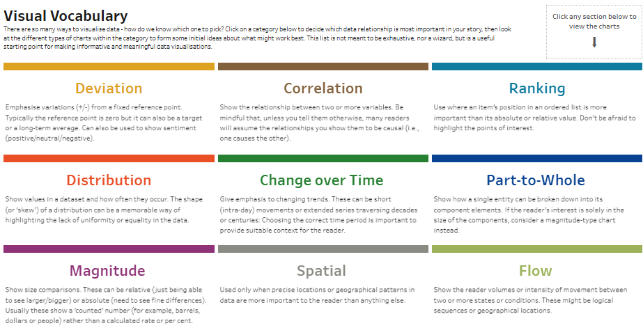
- Deviation visualizes variations from a reference point, often zero, and can show positive/negative sentiment.
- Correlation focuses on relationships between two or more variables, suggesting causation if not otherwise stated.
- Ranking emphasizes the position of items in an ordered list, highlighting significant points.
- Distribution represents how values in a dataset occur and reveals uniformity or disparity.
- Change over Time tracks trends over short or extended periods, contextualizing shifts for readers.
- Part-to-whole shows how a whole is divided into components, emphasizing each part’s size.
- Magnitude compares size differences, whether absolute or relative, for data such as dollars or people.
- Spatial maps precise locations or geographic patterns.
- Flow displays movement between states or conditions, valid for sequences or geographic movement.
This guide helps users choose the appropriate charts in Tableau to effectively communicate specific data insights by leveraging different charts Tableau offers.
#2 Tableau Chart Types – Deviation
This visualization showcases four Tableau chart types under the Deviation category, each designed to emphasize variations from a reference point, whether zero, a target, or an average. Here’s a description of these types of charts in Tableau:
- Diverging Bar: This standard bar chart displays negative and positive values, illustrating deviations from a central point. In this example, various items are listed with their profit ratios extending to the central zero line’s left (negative) and right (positive), allowing for a quick visual performance comparison. This is one of Tableau’s different charts that effectively shows contrasting values.
- Diverging Stacked Bar: Ideal among Tableau graph types for showing survey responses with sentiment scales, such as agree/disagree or positive/neutral/negative. Each bar represents a different statement or item, with segmented portions colour-coded to indicate response distribution across a sentiment scale. The length of each section highlights the strength of sentiment, and the chart also includes average scores for each item.
- Spine Chart: This chart splits a single value into two contrasting components, such as male and female responses. This example visualizes the response rate for different countries, each with two contrasting bars extending from the centre in opposite directions. This type of chart in Tableau effectively highlights the balance or contrast in responses between two categories.
- Surplus/Deficit Filled Line: This line chart emphasizes variations above and below a baseline, filling areas between the line and baseline to show surpluses (positive values) and deficits (negative values). The shaded regions visually distinguish positive and negative deviations, making it useful for tracking financial performance, stock levels, or other metrics over time.
These charts in Tableau offer insights by showing how values or responses diverge from a specific reference, making them suitable for various types of data analysis.
#3 Tableau Chart Types – Correlation
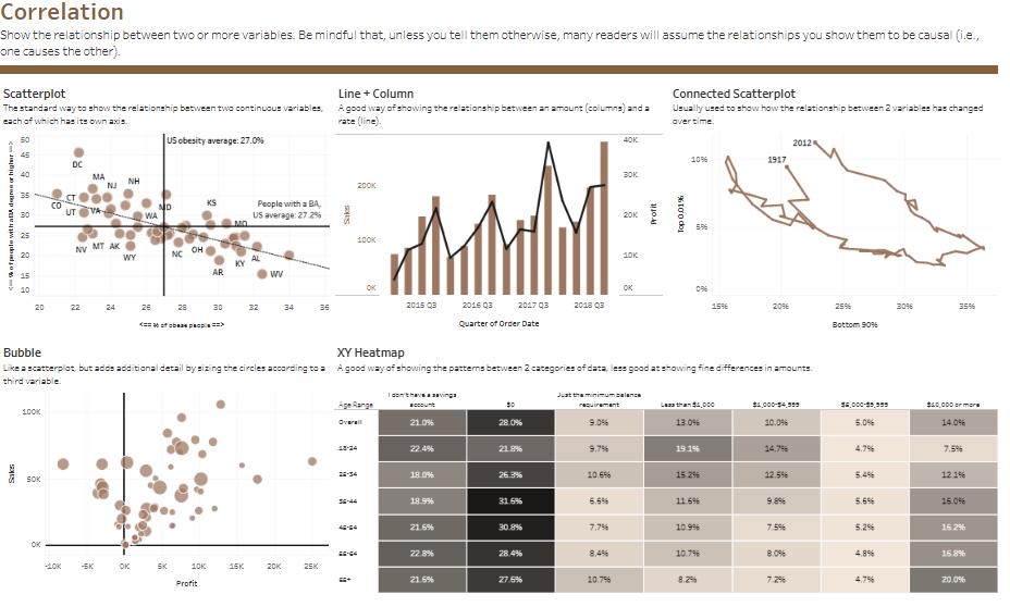
This visualization demonstrates five Tableau chart types under the Correlation category, each designed to show relationships between two or more variables. Here’s a breakdown of these different types of charts in Tableau:

- Scatterplot: A classic option among Tableau graph types for illustrating relationships between two continuous variables, with each point representing a state in this example. The x-axis and y-axis represent different variables (e.g., percentage of people with a BA vs. obesity rate), and a trend line shows the correlation, helping identify patterns like the variation in obesity rates with education levels.
- Line + Column: This combined chart type in Tableau uses columns to represent an amount (e.g., sales) and a line to show a rate (e.g., profit) over time. It tracks these variables by quarter, making it easy to see how profit rates and sales values shift together. The dual-axis format emphasizes the relationship between these metrics, adding depth to data analysis.
- Connected Scatterplot: This type of Tableau chart is effective for visualizing how the relationship between two variables has evolved over time. By connecting data points chronologically, it shows shifts in the top 1% of income versus the bottom 90%’s different charts; it allows users to visualize multiple correlations in a single chart and quickly spot standout data points.
- XY Heatmap: A matrix-like chart often used to display patterns between two categories, with this example dividing age ranges and income levels. Each cell is shaded to indicate the percentage of individuals meeting specific criteria. It helps highlight correlations in categorical data, such as where the highest or lowest values occur in the grid.
These charts in Tableau enable users to explore patterns and relationships in diverse datasets, making them valuable tools for correlation analysis.
#4 Tableau Chart Types – Ranking
This visualization showcases six Tableau chart types under the category of Ranking, each designed to emphasize an item’s position in an ordered list. Here’s a description of these different types of charts in Tableau:
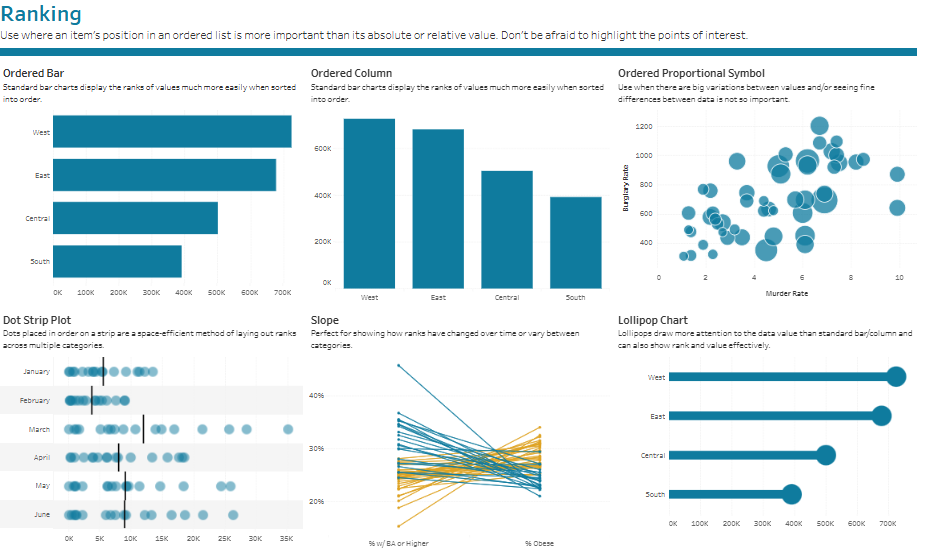
- Ordered Bar: A horizontal bar chart that displays values in descending or ascending order, allowing viewers to see the rank of each category. In this example, regions like West, East, Central, and South are compared in terms of total values, such as sales or revenue, with longer bars indicating higher ranks, making it one of the common Tableau chart types.
- Ordered Column: Similar to the ordered bar but in a vertical format, this type of chart in Tableau presents values in sorted order. The categories (e.g., regions) are displayed along the x-axis, enabling a straightforward visual comparison of ranks from left to right.
- Ordered Proportional Symbol: T’s different charts, the slope chart is ideal for illustrating changes in rank over time or between categories. Lines connect data points from one period or category to another, showing upward or downward shifts. It compares educational attainment (% with BA or higher) and obesity rates across categories.
- Lollipop Chart: A variation of a bar chart that combines a line with a circular marker at the end, drawing attention to the data value. It ranks regions in order, with circles marking the end of each line, making it visually appealing and practical for showing rank, a versatile option among Tableau charts.
These Tableau different charts provide flexible options for presenting ranked data and emphasize relative positions, offering valuable tools for ranking analysis.
#5 Tableau Chart Types – Distribution
This visualization displays various Tableau chart types under the Distribution category, each emphasizing how values in a dataset are spread or distributed. Here’s a description of these different types of charts in Tableau:
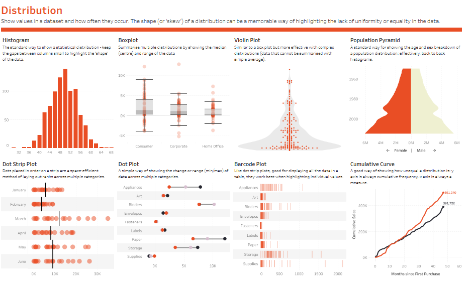
- Histogram: This standard option among Tableau graph types visualises statistical distributions. It groups data into bins along the x-axis to show frequency, making it easy to see the shape or skew in the data distribution.
- Boxplot: A compact Tableau chart type for comparing distributions, it shows the median and range (interquartile range) for categories like Consumer, Corporate, and Home Office. Outliers are represented as dots, effectively spotting variability in different groups.
- Violin Plot: Similar to a boxplot but with added detail, it shows data density across a range of values, useful for complex distributions. This type of chart in Tableau provides an overall shape to identify concentration and spread within the data.
- Population Pyramid: A back-to-back histogram, this chart displays population distribution by age and sex, with one side representing males and the other females, enabling easy demographic comparisons.
- Dot Strip Plot: Dots are arranged along a single axis to show value distribution across multiple categories, such as months. This space-efficient Tableau graph type is ideal for displaying rank or distribution patterns across categories.
- Dot Plot: This type of Tableau chart uses individual dots on a single axis, typically to show changes or ranges (min/max) across multiple categories. It’s an effective way to compare specific values for each item.
- Barcode Plot: Similar to the dot plot, this Tableau chart type arranges lines or dots along an axis to highlight individual data values across categories. It’s practical for presenting data points in a table format.
- Cumulative Curve: This line chart type in Tableau displays cumulative frequency over time, with the x-axis as a time measure and the y-axis showing cumulative totals, useful for tracking distribution changes, trends, and growth.
These Tableau different charts provide versatile options for visualizing distributions, helping users understand how data is spread across categories.
#6 Tableau Chart Types – Change over time
This visualization presents various Tableau chart types under the “Change over Time” category, each highlighting trends across periods. Here’s a description of each chart:
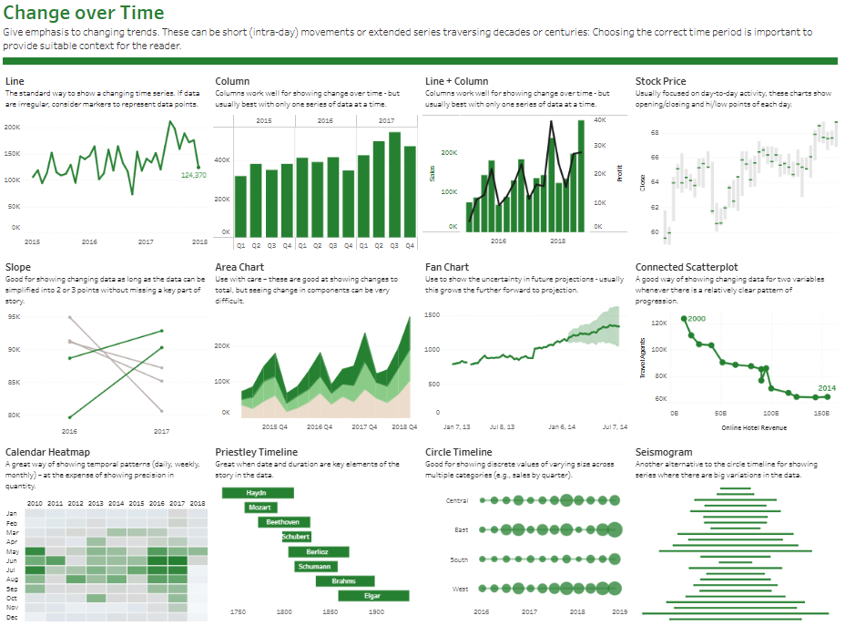
- Line: A standard chart type in Tableau for showing time series data, ideal for continuous data. It emphasizes trends and fluctuations, which is useful when data points are evenly spaced.
- Column: Columns display changes over time. They are suitable for showing individual periods side by side, like quarterly or yearly data, emphasizing comparisons.
- Line + Column: This combination of line and column elements shows two measures, such as sales and profit, over time, giving context to their relationship.
- Stock Price: Used for day-to-day activity, this chart shows opening/closing prices and highs/lows, which are common in financial analysis to track stock trends.
- Slope: Highlights changes between two or three-time points, making it ideal for quick comparisons when data changes can be simplified.
- Area Chart: This type of Tableau chart shows cumulative totals over time. Although it may obscure individual components, it’s effective for showing volume and total growth.
- Fan Chart: This chart is useful for displaying uncertainty in future projections. The shaded area widens to indicate the range of potential outcomes.
- Connected Scatterplot: Shows changes between two variables over time, with a line connecting points chronologically, highlighting patterns and progression.
- Calendar Heatmap: This displays data patterns across daily, weekly, or monthly time intervals, using colour to represent quantity. It is ideal for observing temporal patterns.
- Priestley Timeline: This tool is good for visualizing data when date and duration are key. It shows events over an extended timeline, like historical events.
- Circle Timeline: This tool visualizes discrete events over time, which is helpful for tracking occurrences at specific intervals, such as quarterly sales.
- Seismogram: Similar to the circle timeline but arranged vertically, this chart highlights data variations, often used for large fluctuations across time.
These different charts in Tableau provide diverse options for visualizing time-based data, helping users understand trends, growth, and changes over various periods.
#7 Tableau Chart Types – Part-to-Whole
This visualization displays various Tableau chart types under the Part-to-Whole category, each focusing on how a single entity is divided into its components. Here’s a description of these types of charts Tableau provides:
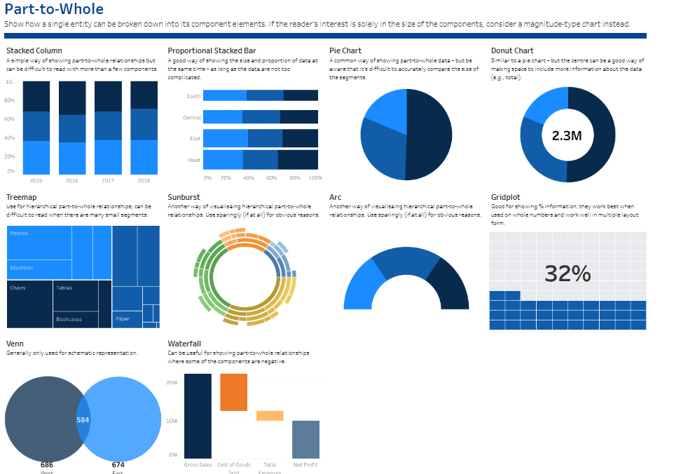
- Stacked Column: This type of chart in Tableau shows part-to-whole relationships over time by stacking segments within a single bar for each year. It’s useful for comparing proportions within a total across multiple years, though it can be challenging to interpret with many components.
- Proportional Stacked Bar: Similar to a stacked column but horizontal, this Tableau chart type displays the size and proportion of each part within the whole. It effectively shows superficial part-to-whole relationships across categories like regions (e.g., South, Central, East, West).
- Pie Chart: A commonly used option among Tableau graph types for displaying part-to-whole data by dividing a circle into segments. It visually represents proportions but can make value comparisons difficult with many segments.
- Donut Chart: Similar to a pie chart but with a central hole, this Tableau chart emphasizes total values and provides space to display additional information, like total counts or percentages.
- Treemap: This Tableau graph type is useful for hierarchical part-to-whole relationships with multiple segments. It divides space into nested rectangles sized proportionally to each segment’s value, such as different categories of items.
- Sunburst: Another way to visualize hierarchical data is by using a radial chart that shows layers of components radiating outward from the centre. It effectively represents part-to-whole relationships across multiple levels.
- Arc: A minimalistic Tableau chart type for hierarchical relationships, using arcs around a central point. It’s best used sparingly due to its complexity and limited clarity in large datasets.
- Gridplot: This chart type in Tableau shows percentage information with filled squares, visually representing a part-to-whole ratio. It works well with whole numbers and in multi-tile layouts.
- Venn Diagram: This type of Tableau chart shows overlap between two or more categories and is typically used to visualize intersections in part-to-whole relationships.
- Waterfall: This Tableau chart type visualizes changes in a value, highlighting how each component contributes to the total. It’s often applied in financial contexts, such as showing gross sales, costs, and net profit.
These Tableau different charts provide users with options to break down and analyze part-to-whole data, offering insights into how each component contributes to the whole.
#8 Tableau Chart Types – Magnitude
This visualization displays various Tableau chart types under the Magnitude category, each designed to compare sizes in relative or absolute terms. Here’s a description of these types of charts Tableau offers:
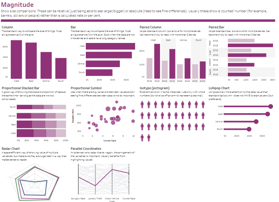
- Column: A standard type of chart in Tableau for comparing values by size, with bars extending vertically from zero on the axis. It’s useful for straightforward comparisons across categories like regions.
- Bar: This chart is similar to the column chart but with horizontal bars, making it easier to read long category names. It also starts at zero on the axis, which is ideal for comparing values across categories like regions (e.g., West, East, Central, South).
- Paired Column: A variation of the column chart that allows for multiple series comparisons. This Tableau graph type helps compare values over time across various categories but can become cluttered with too many series.
- Paired Bar: Similar to the paired column but with horizontal bars, this Tableau chart type allows side-by-side comparisons for multiple series across categories, such as comparing yearly data.
- Proportional Stacked Bar: A type of stacked bar chart showing the size and proportion of data simultaneously, making it practical to display part-to-whole relationships while comparing absolute sizes.
- Proportional Symbol: This chart type in Tableau uses different-sized symbols (often circles) to represent varying values. It’s helpful when precise differences are less significant than general variation in data points, such as crime rates.
- Isotype (Pictogram): This Tableau graph type uses icons to represent values and is particularly effective for whole numbers. It provides a clear visual by displaying repeated icons, ideal for simpler, counted data.
- Lollipop Chart: A variation of the bar chart with a circle marker at the end of each bar. It highlights values more distinctly and doesn’t necessarily need to start at zero, making it a visually appealing choice.
- Radar Chart: This chart displays multiple variables in a circular format, showing data in a compact, web-like shape. It’s best when variables are organized logically, allowing for quick comparisons of relative sizes.
- Parallel Coordinates: An alternative to the radar chart, this type of chart in Tableau arranges variables in a linear format. Each line represents a category, showing connections across multiple metrics.
These Tableau different charts offer diverse options for visualizing magnitude and comparing absolute or relative values across various categories.
#9 Tableau Chart Types – Spatial
This visualization presents various Tableau chart types under the “Spatial” category; each used when precise locations or geographic patterns in data are essential. Here’s a description of each type of chart in Tableau:
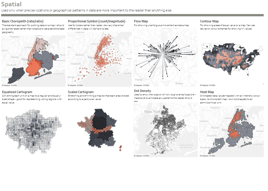
- Basic Choropleth (Rate/Ratio): This map displays data by shading regions based on rates or ratios, such as population density. It effectively shows how values vary by area on a defined geographic boundary.
- Proportional Symbol (Count/Magnitude): This Tableau chart type uses symbols (often circles) sized according to data values. It’s suitable for comparing quantities at specific locations, allowing clear visual differentiation in higher-value areas.
- Flow Map: Ideal for displaying movement patterns, this chart shows unambiguous flows or paths, such as migration or traffic patterns. Lines or arrows represent the direction and magnitude of movement across a map.
- Contour Map: This map type in Tableau uses colour shading to display areas of equal value, similar to topographical maps. It helps show gradients across a region, such as temperature or elevation.
- Equalized Cartogram: This chart converts each unit on a map to a regular, equal-sized shape. It’s often used to represent areas with equal weight, like voting regions, to eliminate size distortion based on geography.
- Scaled Cartogram: This map type stretches and shrinks areas based on data values, visually emphasizing regions with higher values. It’s commonly used to show population sizes or economic metrics where traditional geographic boundaries would misrepresent data.
- Dot Density: This Tableau graph type displays the frequency of events or locations using dots, where each dot represents a specific number or event. It helps identify spatial patterns and density, especially in urban or high-activity areas.
- Heat Map: This map represents data intensity with colour gradients, highlighting areas with higher or lower values. Unlike choropleth maps, it’s not tied to political or administrative boundaries, making it ideal for general density patterns.
These charts in Tableau enable users to visualize spatial relationships and geographic data, providing insights into how data points are distributed across specific locations.
#10 Tableau Chart Types – Flow
This visualization presents various Tableau chart types under the Flow category, each designed to show the volume or intensity of movement between two or more states or conditions. Here’s a description of these different types of charts in Tableau:
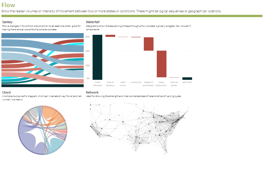
- Sankey: This chart type in Tableau displays flow between categories using ribbons that vary in width according to data volume. It’s ideal for illustrating changes in flow from one condition to another, effectively tracking data distribution through complex processes.
- Waterfall: A Tableau chart type used to demonstrate the sequential flow of data through various stages, often in financial contexts. It shows positive and negative contributions to an outcome, such as revenue and expenses leading to net profit, with each component influencing the total.
- Chord: This complex Tableau graph type illustrates two-way flows or connections between multiple categories, represented as arcs. It effectively shows reciprocal relationships and the intensity of connections within a matrix.
- Network: A type of chart in Tableau that depicts the strength and interconnectedness of relationships. It maps nodes and lines to represent entities and their connections, making it useful for visualizing social networks or data with complex relational structures.
These Tableau different charts help users understand the dynamics of flow and movement within data, providing insights into processes and relationships between categories.
The power of Tableau lies not only in its ability to manage large datasets but also in its broad selection of chart types designed to meet diverse analytical needs. Choosing the right Tableau graph type can amplify the impact of your data, making complex information accessible and engaging for your audience. From Sankey diagrams that illustrate flows and connections to choropleth maps that highlight spatial data, each type of chart in Tableau serves a specific purpose. Mastering these different types of charts in Tableau allows you to craft compelling data stories, uncover hidden patterns, and derive insights that support informed decision-making. As you delve into Tableau’s capabilities, remember that selecting the right visual is critical to enhancing data comprehension, making it an invaluable asset in your analytical toolkit.


