In this blog post, we delve into the importance of having consistent style guides, mainly when dealing with various chart types like scatter charts, connected scatter plots, sparklines, and small multiples in Tableau. For the first two posts, click here – Part 1, Part 2

Table of Contents
Why Are We Bothering with Tableau Chart Style Guides Anyway?
A consistent Tableau chart style guide ensures clarity, uniformity, and ease of interpretation across various data visualizations. It mandates adherence to standardized colours, fonts, and formats, improving the readability and understanding of reports and dashboards. Not only does it reinforce your company’s brand identity, but it also facilitates quick data insight derivation and decision-making for stakeholders due to the consistent data presentation. Such a guide simplifies communication and collaboration, aids in smooth new employee onboarding, and minimizes data misinterpretation risks, leading to informed business strategies and decisions. That sounds good to me!
Tableau Chart Style Guide – Scatter Chart
A scatter chart or scatter plot shows the relationship between two variables, serving as a potent tool for instantly visualizing and understanding trends and relationships.
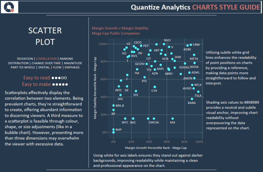
Scatterplots effectively display the correlation between two elements. Being prevalent charts, they’re straightforward to create, offering abundant information to discerning viewers. A third measure to a scatterplot is feasible through colour, shape, or size adjustments (like in a bubble chart). However, presenting more than three dimensions may overwhelm the viewer with excessive data.
Utilizing subtle white grid lines enhances the readability of point positions on charts by providing a reference, making data points more straightforward to follow and interpret.
Shading axis values to #898989 provides a neutral and subtle visual anchor, improving chart readability without overpowering the data represented on the chart.
Using white for axis labels ensures they stand out against darker backgrounds, improving readability while maintaining a clean and professional appearance on the chart.
Tableau Chart Style Guide – Connected Scatter Plot
Illustrating the progression of numeric variables, connected scatter plots use dots and lines to highlight trends over time, functioning like line plots but with emphasized individual observations.
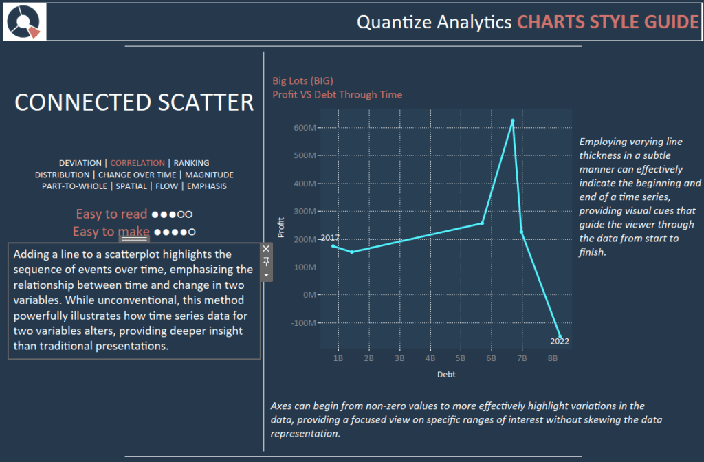
Adding a line to a scatterplot highlights the sequence of events over time, emphasizing the relationship between time and change in two variables. While unconventional, this method powerfully illustrates how time series data for two variables alters, providing deeper insight than traditional presentations.
Subtly employing varying line thickness can effectively indicate the beginning and end of a time series, providing visual cues that guide the viewer through the data from start to finish.
Axes can begin from non-zero values to highlight variations in the data more effectively, providing a focused view of specific interest ranges without skewing the data representation.
Tableau Chart Style Guide – Sparklines
Diminutive yet powerful, Sparklines offer visual representations of data trends in a compact format, ideal for showcasing seasonal variations of economic cycles or highlighting value extremes within a dataset.
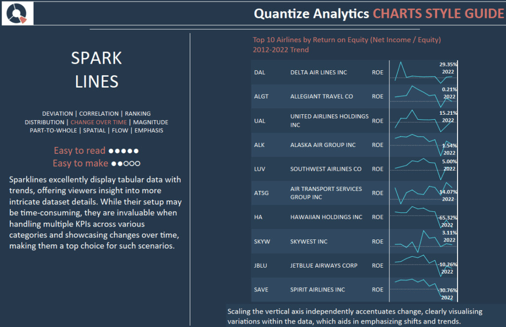
Sparklines excellently display tabular data with trends, offering viewers insight into more intricate dataset details. While their setup may be time-consuming, they are invaluable when handling multiple KPIs across various categories and showcasing changes over time, making them a top choice for such scenarios.
Scaling the vertical axis independently accentuates change, clearly visualising variations within the data, which aids in emphasizing shifts and trends.
Tableau Chart Style Guide – Small Multiples
Small multiples, also known as a trellis, lattice, grid, or panel charts, display similar graphs or charts for easy comparison, using the same scale and axes to represent different dataset partitions. Each view in small multiples helps to draw comparisons and contrasts between other data partitions effectively.
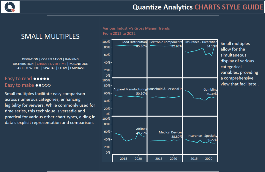
Small multiples facilitate easy comparison across numerous categories, enhancing legibility for viewers. While commonly used for time series, this technique is versatile and practical for various other chart types, aiding in data’s explicit representation and comparison.
Small multiples allow for the simultaneous display of various categorical variables, providing a comprehensive view that facilitates easier data comparison and analysis.
Wrapping Up Part 3 Of Our Tableau Chart Style Guide
Integrating consistent Tableau chart style guides when utilizing various Tableau chart types, like scatter charts, connected scatter plots, sparklines, and small multiples, is crucial for any organization aiming for effective data visualization and communication.
With a well-defined style guide, you ensure that each chart speaks with clarity and precision and resonates with the organizational brand and visual language, fostering an environment where data is easily interpreted, compared, and analyzed.
Such consistency in style enhances the viewer’s experience, accelerates the decision-making process, and ultimately drives the success of your data-driven initiatives.
Whether you’re a seasoned data analyst or a business professional relying on data visualizations, adhering to a unified style guide is a practice that promises efficiency, accuracy, and a streamlined approach to extracting valuable insights from your data. So, create or refine your style guide today and watch how it transforms your Tableau data visualization into more coherent, understandable, and impactful narratives.