Tableau has transformed how businesses analyze and visualize data, turning complex information into actionable insights. Whether managing sales, monitoring customer service, or optimizing financial performance, a Tableau business dashboard provides a powerful tool to enhance business operations. In this blog post, we’ll explore nine outstanding Tableau business dashboard examples that showcase the versatility and effectiveness of this platform.
These dashboards span various business functions, demonstrating how Tableau for business can be customized to meet specific needs—from eCommerce sales and talent acquisition to pricing optimization and beyond. Each example underscores different aspects of Tableau’s capabilities, inspiring anyone seeking to leverage data visualization to make better business decisions.
Table of Contents
1. Supply Chain Dashboard
Executive Dashboard Description
This Tableau business dashboard provides a comprehensive overview of key business metrics for a specific week, offering valuable insights for executives, sales managers, and operations teams. Designed to track and evaluate the performance of various business aspects, this dashboard allows decision-makers to quickly assess business health and identify areas that require attention.
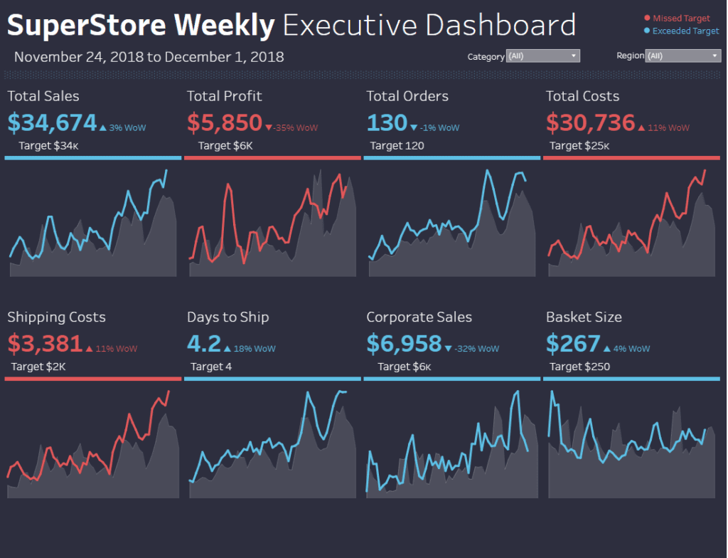
Components and Charts
Line Charts:
The primary visual elements in this Tableau business dashboard are line charts, displaying trends over time for metrics such as Total Sales, Total Profit, Total Orders, Total Costs, Shipping Costs, Days to Ship, Corporate Sales, and Basket Size. These charts visually represent week-over-week (WoW) changes, comparing metrics against their targets. The use of colour coding (blue for metrics that exceeded targets and red for those that missed) helps quickly highlight areas of success or concern.
Key Metrics:
The top section of the dashboard highlights vital financial metrics, including Total Sales, Total Profit, and Total Costs. Each metric is compared against its target, with percentage changes from the previous week also displayed, providing a clear snapshot of financial performance.
Operational Metrics:
In addition to financial data, the dashboard includes operational metrics such as Shipping Costs, Days to Ship, and Basket Size. These metrics help operations teams monitor efficiency and customer satisfaction, making it easier to identify bottlenecks or opportunities for improvement.
Usefulness for Businesses
This Tableau business dashboard is handy for senior management and department heads, who must monitor financial and operational performance weekly. Sales teams can use this data to track progress toward revenue targets, while operations teams can identify inefficiencies in shipping and handling. These Tableau business dashboard examples demonstrate how Tableau can be used for business analytics, helping all stakeholders make informed, data-driven decisions to optimize operations and improve profitability.
2. Human Resources Dashboard
Human Resources Dashboard Description
This Tableau business dashboard provides a comprehensive overview of key HR metrics, offering valuable insights for HR professionals, department heads, and business executives. Designed to monitor and analyze workforce data, this dashboard is essential for understanding employee dynamics, optimizing HR strategies, and making informed decisions.
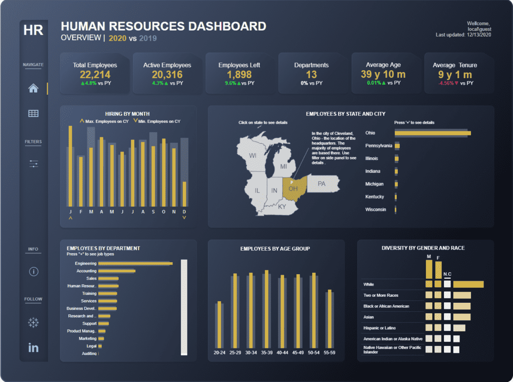
Components and Charts
Key Metrics Overview:
Critical HR metrics are displayed at the top of the dashboard, including Total Employees, Active Employees, Employees Left, Departments, Average Age, and Average Tenure. These metrics are compared against the previous year (PY), providing a quick snapshot of year-over-year performance and trends crucial for business dashboards.
Hiring by Month:
A vertical bar chart illustrates the number of employees hired each month, showing the maximum and minimum number of hires within the current year (CY). This chart helps HR teams track hiring trends and identify peak hiring periods, a common feature in Tableau business dashboard examples.
Employees by State and City:
A map chart highlights the distribution of employees across different states, focusing on Ohio, where the company’s headquarters are located. Accompanying the map is a bar chart that provides a detailed breakdown of employee numbers by state and city, allowing HR to analyze geographical workforce distribution.
Employees by Department:
A horizontal bar chart lists the number of employees in each department, with the ability to drill down into specific job types. This chart helps HR professionals and department heads assess staffing levels across various functions, demonstrating the effectiveness of Tableau for business.
Employees by Age Group:
Another vertical bar chart categorizes employees by age group, providing insights into the workforce’s age distribution. This information is valuable for planning initiatives related to employee engagement, retention, and succession.
Diversity by Gender and Race:
A matrix chart displays diversity metrics, showing the gender and racial composition of the workforce. This chart is critical for HR teams focused on diversity and inclusion, helping to ensure that the organization meets its diversity goals.
Usefulness for Businesses
This Tableau business dashboard is handy for HR departments. It provides them with the tools to monitor workforce trends, track hiring and turnover rates, analyze employee demographics, and ensure organisational diversity and inclusion. Business executives and department heads can also leverage this data to make strategic decisions regarding staffing, resource allocation, and long-term workforce planning. By visualizing complex HR data, this dashboard enables more effective human capital management and contributes to overall business success.
3. Corporate Finance Dashboard
Budget Controlling Dashboard Description
This Tableau business dashboard provides a real-time overview of an organization’s financial performance against budgetary targets, making it an essential tool for financial managers, executives, and department heads. Designed for effective monitoring and decision-making, the dashboard offers a clear visual representation of critical financial metrics.
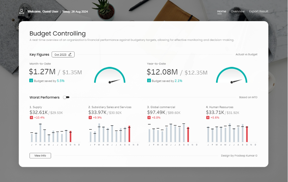
Components and Charts
Key Figures Overview:
At the top, the dashboard presents critical financial metrics for the current month (Month-to-Date) and the year (Year-to-Date). It displays actual spending versus budget, highlighting variances to indicate whether the budget has been saved or exceeded. A gauge chart offers a quick visual indicator of how closely spending aligns with the budget target, helping users assess financial performance quickly.
Worst Performers:
The lower section highlights the worst-performing areas within the organization, segmented into four key categories: Supply, Subsidiary Sales and Services, Global Commercial, and Human Resources. Each category includes a vertical bar chart that tracks monthly spending against the yearly budget. The colour-coded bars, red indicating budget overruns, make identifying trends and areas needing attention easy.
Usefulness for Businesses
This Tableau business dashboard is handy for financial departments, enabling them to monitor spending, identify budget overruns, and implement corrective actions. Department heads can leverage this data to manage budgets more effectively, ensuring they remain within their limits. Executives can use financial performance data to make strategic decisions about resource allocation and cost management, contributing to the organization’s economic health.
This dashboard is a prime example of Tableau for business, showcasing how business dashboards can transform complex financial data into actionable insights, enhancing financial management across the organization.
4. Social Media Dashboard
Social Media Analysis Dashboard Description
This Tableau business dashboard provides a comprehensive overview of critical social media engagement metrics for August 2020, offering valuable insights for social media managers, marketing teams, and business executives. The dashboard is designed to track performance across multiple engagement metrics, allowing businesses to assess the effectiveness of their social media strategies and identify areas for improvement.
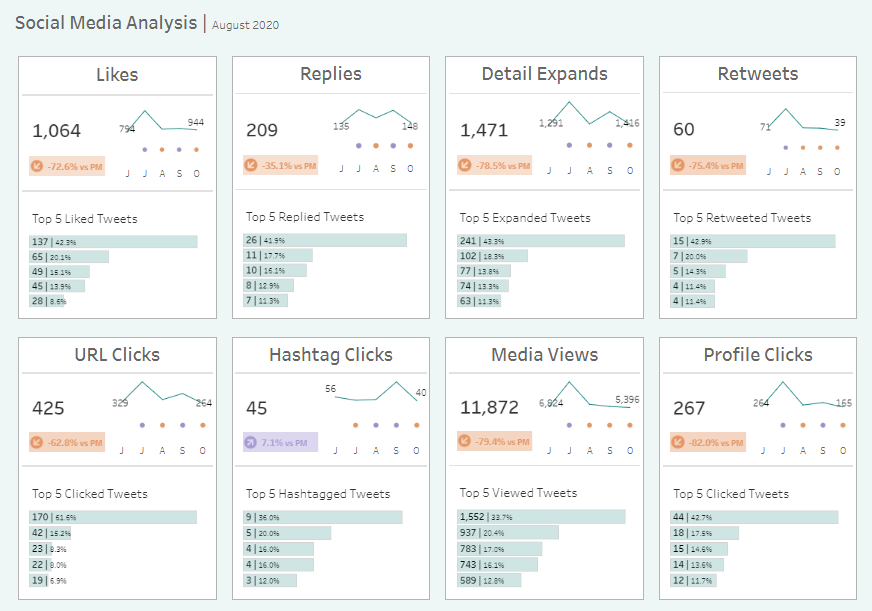
Components and Charts
The dashboard is organized into eight sections, each focusing on a specific social media metric: Likes, Replies, Detail Expands, Retweets, URL Clicks, Hashtag Clicks, Media Views, and Profile Clicks.
Key Metric Summary:
At the top of each section, the key metric (e.g., total Likes, Replies, etc.) is prominently displayed. A percentage change compared to the previous month (PM) is indicated alongside the total, highlighting whether the metric has improved or declined.
Trend Line Chart:
Below the critical metric, a slight trend line chart shows its performance over the past five months (July to October). This chart allows users to identify trends and engagement fluctuations over time quickly.
Top 5 Performers:
A bar chart at the bottom of each section lists the top five performing tweets for that particular metric. This chart helps users pinpoint the content that generated the most engagement, providing actionable insights for future content strategy.
Usefulness for Businesses
This Tableau business dashboard is handy for marketing and social media teams. By tracking key social media metrics, these teams can assess campaign effectiveness, identify content that resonates most with their audience, and adjust strategies accordingly. Business executives can also use this data to make informed decisions about marketing investments and understand the overall impact of social media efforts on brand visibility and engagement. This dashboard exemplifies how Tableau for business can transform complex social media data into actionable insights, supporting data-driven decision-making across the organization.
5. Marketing Campaign Performance Dashboard
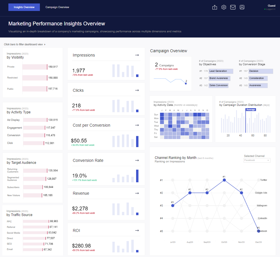
Marketing Performance Insights Dashboard Description
This Marketing Performance Insights Overview dashboard offers a detailed view of a company’s marketing campaign performance across various metrics and dimensions. It is designed to provide insights into critical aspects such as visibility, engagement, conversion rates, and the overall effectiveness of marketing strategies. This Tableau business dashboard is particularly valuable for marketing teams, campaign managers, and business executives looking to assess and optimize their marketing efforts.
Components and Charts
Visibility and Impressions:
The left side of the dashboard displays a breakdown of impressions by various categories, including visibility (private, restricted, public), activity type, target audience, and traffic source. These metrics are visualized through bar charts, making comparing performance across different segments easy. The central Impressions section includes a summary metric with a trend line highlighting weekly performance changes.
Campaign Overview:
This section features a line chart that tracks the number of campaigns over time, focusing on recent declines. Additional visual elements include bar charts that break down campaigns by objectives, conversion stage, and campaign duration distribution. These charts help users understand the broader context of their marketing campaigns and identify areas for improvement.
Key Metrics:
The dashboard is centrally focused on key performance indicators (KPIs) such as Impressions, Clicks, Cost per Conversion, Conversion Rate, Revenue, and ROI. Each KPI is paired with a trend line chart that visualizes weekly changes, offering a quick snapshot of marketing performance.
Activity Date and Channel Ranking:
A heat map shows impressions by activity date, highlighting peak engagement periods. The Channel Ranking by Month line chart ranks social media and advertising channels based on impressions over the last six months, spotlighting top-performing platforms like Twitter, Google Ads, and Instagram.
Usefulness for Businesses
This Tableau business dashboard is essential for marketing departments and business executives who need to track and optimize their marketing campaign performance. By providing detailed insights into key metrics and campaign effectiveness, this dashboard facilitates data-driven decision-making and helps businesses refine their marketing strategies for better outcomes. It exemplifies how Tableau for business can convert complex marketing data into actionable insights, driving more effective campaign management and higher ROI.
6. Help Desk | Weekly Analysis
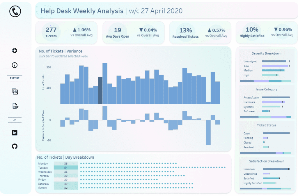
Help Desk Weekly Analysis Dashboard Description
This Help Desk Weekly Analysis Dashboard offers a detailed overview of the performance and efficiency of a help desk team for the week of April 27, 2020. It is an essential tool for IT managers, customer service supervisors, and business executives who need to monitor and optimize support operations. This Tableau business dashboard tracks critical metrics related to ticket management, resolution times, customer satisfaction, and issue categories, providing a clear and actionable view of the help desk’s effectiveness.
Components and Charts
Key Metrics Overview:
The top section displays key performance indicators (KPIs), including the total number of tickets (277), average days open (19), percentage of resolved tickets (13%), and customer satisfaction rate (10% highly satisfied). Each KPI is compared to the overall average, offering a quick assessment of weekly performance against long-term trends.
Ticket Volume and Variance:
A central bar chart illustrates the number of tickets received each week, accompanied by a variance chart showing differences between the selected week and previous weeks. This visualization helps managers understand fluctuations in ticket volume and how current performance compares to past periods.
Severity, Issue Category, and Ticket Status Breakdown:
On the right, horizontal bar charts break down tickets by severity (unassigned, low, medium, high), issue category (access/login, hardware, systems, software), and ticket status (open, pending, closed, resolved). These charts allow for a detailed analysis of issue types and ticket resolution progress, enabling more effective resource allocation and prioritization.
Satisfaction Breakdown:
Another bar chart provides insights into customer satisfaction levels, from highly satisfied to unsatisfied, helping identify areas where service quality can be improved.
Daily Ticket Breakdown:
At the bottom, a dot matrix chart presents a day-by-day breakdown of ticket volume, highlighting peak days and helping managers allocate resources more efficiently.
Usefulness for Businesses
This Tableau business dashboard is particularly valuable for IT support teams, customer service departments, and business leaders who need to ensure efficient handling of customer issues. By offering detailed insights into ticket trends, issue types, and satisfaction rates, this dashboard supports data-driven decision-making, helping businesses optimize support processes and enhance customer satisfaction. It stands as one of the compelling Tableau business dashboard examples, demonstrating how Tableau for business can transform complex operational data into clear, actionable insights.
7. Talent Acquisition
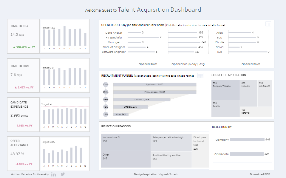
Talent Acquisition Dashboard Description
This Talent Acquisition Dashboard provides a comprehensive overview of the recruitment process, offering critical insights into essential metrics for HR teams, recruiters, and business executives. This Tableau business dashboard is designed to help organizations monitor the effectiveness of their talent acquisition strategies, track performance against targets, and identify areas for improvement in recruitment.
Components and Charts
Key Metrics Overview:
On the left side, the dashboard displays crucial recruitment metrics, including Time to Fill, Time to Hire, Candidate Experience, and Offer Acceptance Rate. Each metric is compared to the previous year (PY), with bar charts showing trends over time. These metrics help HR teams gauge the efficiency of filling roles and assess candidate perceptions of the recruitment process.
Opened Roles:
The top right section lists open roles by job title and recruiter name, using horizontal bar charts to indicate the number of roles opened and the average number of days they have been open. This visualization helps managers and recruiters monitor workload distribution and pinpoint bottlenecks in the hiring process.
Recruitment Funnel:
A funnel chart illustrates the recruitment process, from the total number of applicants to the final hires. This chart highlights the attrition rate at each stage, helping recruiters identify where candidates drop out and optimize the process accordingly.
Source of Application:
A tree map visualizes various application sources, such as company websites, LinkedIn, job boards, and referrals. This chart allows HR teams to evaluate the effectiveness of different channels for attracting candidates.
Rejection Reasons and Rejection by:
The bottom section includes horizontal bar charts that break down reasons for candidate rejections and whether the company or the candidate made the decision. This analysis helps refine hiring criteria and improve overall recruitment strategies.
Usefulness for Businesses
This Tableau business dashboard is invaluable for HR departments, recruitment teams, and business leaders focused on optimizing talent acquisition. Detailed insights into crucial recruitment metrics support data-driven decision-making, leading to more efficient hiring, better candidate experiences, and a more robust workforce. As one of the standout Tableau business dashboard examples, it demonstrates how Tableau for business can transform complex recruitment data into actionable insights, aligning with the organization’s strategic goals.
8. Pricing Optimization Dashboard
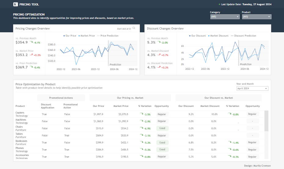
Pricing Optimization Dashboard Description
This Pricing Optimization Dashboard is a powerful tool designed to help businesses identify opportunities for improving prices and discounts based on market trends. It benefits pricing analysts, product managers, and business executives who must make data-driven decisions to optimize pricing strategies and stay competitive.
Components and Charts
Pricing Changes Overview:
On the left side of the dashboard, the Pricing Changes Overview section displays critical metrics such as the average price compared to the previous month, market price, and price prediction. A line chart visualizes the fluctuations in pricing over time, including a predictive trend line that forecasts future pricing based on historical data. This chart lets users quickly assess how their pricing compares to market standards and anticipate future trends.
Discount Changes Overview:
The right side features the Discount Changes Overview, which mirrors the structure of the Pricing Changes Overview. It shows metrics like the current discount percentage, market discount, and discount predictions. The accompanying line chart tracks the evolution of discount rates over time, providing insights into how current discounts align with market trends and future predictions.
Price Optimization by Product:
The lower section of the dashboard presents a detailed table that breaks down price optimization opportunities by product. This table includes columns for product categories, whether a discount or promotional action is applied, current pricing versus market pricing, and variations in discount percentages. The table also highlights opportunities for optimization, with suggestions like “Regular” or “Good” indicating potential areas for adjustment.
Usefulness for Businesses
This Tableau business dashboard is particularly valuable for pricing analysts, product managers, and marketing teams. It allows them to monitor pricing and discount trends in real time, compare their strategies with market standards, and identify actionable opportunities for optimization. By providing a clear view of price and discount dynamics, this dashboard supports strategic decision-making, helping businesses enhance their competitiveness and profitability. It’s an excellent example of how Tableau for business can transform complex pricing data into actionable insights, driving more effective pricing strategies and better market positioning.
9. eCommerce – Sales Overview
eCommerce Sales Overview Dashboard Description
This eCommerce Sales Overview Dashboard offers a comprehensive view of an online business’s sales performance, focusing on revenue, product details, and cost analysis. It is an invaluable tool for eCommerce managers, sales teams, and business executives who need to monitor sales trends, optimize pricing strategies, and manage marketing expenses effectively.
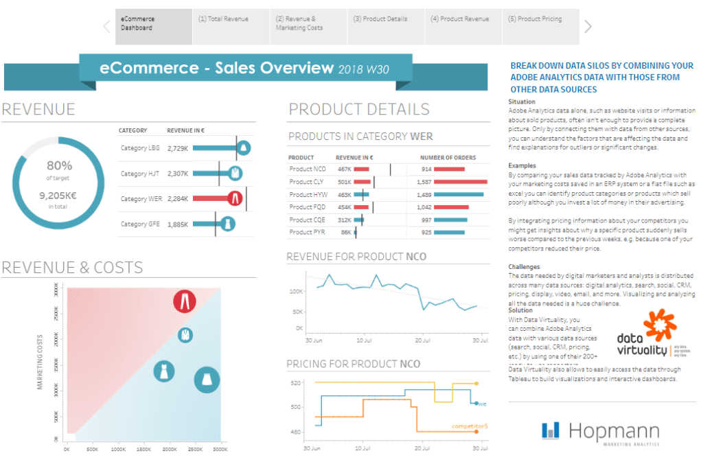
Components and Charts
Revenue Overview:
On the left side of the dashboard, a circular gauge chart indicates the percentage of revenue achieved against the target. It shows that 80% of the target has been met, with a total revenue of €9,205K. This visual quickly assesses how close the business is to its sales goals.
Revenue by Category:
A horizontal bar chart breaks down revenue by product category (e.g., LBG, HJT, WER, GFE), highlighting the contribution of each category to the overall revenue. This helps users identify which product categories drive sales and which may require additional focus.
Revenue & Costs:
A scatter plot in the lower left corner compares revenue and marketing costs. This chart is essential for understanding marketing efforts’ return on investment (ROI), allowing managers to balance spending with revenue generated.
Product Details:
The top right section features a table listing products within a specific category (WER), displaying revenue and the number of orders for each product. This detailed view helps identify high-performing products and those that may need pricing or promotional adjustments.
Revenue and Pricing for Product NCO:
Two line charts track revenue and pricing trends for a specific product (NCO). The revenue chart shows sales trends over time, while the pricing chart compares the business’s pricing strategy against competitors. These charts are crucial for understanding market positioning and making informed pricing decisions.
Usefulness for Businesses
This Tableau business dashboard is handy for eCommerce managers and sales teams. It enables them to monitor sales performance, track product success, and evaluate the effectiveness of marketing campaigns. By providing a detailed breakdown of revenue, costs, and pricing strategies, this dashboard supports data-driven decision-making, helping businesses optimize their sales operations and achieve their financial targets. This dashboard exemplifies how Tableau for business can be leveraged to transform complex sales data into actionable insights, enhancing overall business performance.
9 Powerful Tableau Business Dashboard Examples That Will Transform Your Business Insights
These nine Tableau business dashboard examples highlight the immense potential of data visualization in improving business intelligence. By transforming raw data into visually compelling business dashboards, Tableau enables decision-makers to quickly grasp key insights, monitor performance, and make informed decisions. Whether your goal is to boost sales, streamline HR processes, or optimize pricing strategies, these dashboards are powerful tools to support your business objectives. The adaptability of Tableau for business makes it a crucial resource across various industries and functions, helping businesses to unlock new levels of efficiency, profitability, and strategic insight, ultimately driving your success forward.