Want to create a Tableau bar in bar chart, but don’t know where to start? Here’s a fast and easy way to get there in 5 minutes. A Tableau bar in bar chart, or a bar in bar graph, is an excellent way to compare metrics against two or more set targets or against previous values of that metric.
What is a Tableau Bar in Bar Bar Chart used for?
A classic example may be in a KPI where a company wants to show its quarterly profit against a goal it wants to reach by the end of the quarter. Or perhaps whether spending on an initiative is within the budgeted amount.
Another example is to use a Tableau bar in bar chart to compare a metric’s value against its performance from a previous point in time, say, Q1 from one year to Q1 of a year prior.
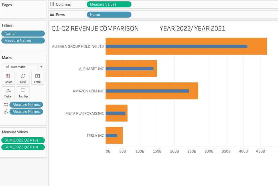
Using our financial data set, we will compare revenue for a handful of companies in 2022-Q2 with their revenue in 2023-Q2. The 2022 Q2 revenue will form the backdrop of our comparison, and we want to see how Year 2023 stacks up.
Here’s an example of the tableau bar-in-bar chart that we will create.

What does this chart show? For these companies, Q2 revenue in 2023 was higher than Q2 of the previous year!
Let’s create a Tableau bar in bar chart!
Without further ado, let’s begin.
Step 1: Create Calculated Fields
When comparing a current value vs. a previous one, you will likely have to use table calculations such as the LOOKUP function. That would entail one single calculation.
However, Our approach here is to compare only a quarter between two different years — so two simple calculated fields will help us grab those values.
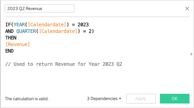
1. Create a calculation for the Year 2023 Q2 Revenue.
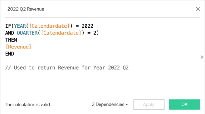
2. Create a calculation for the Year 2022 Q2 Revenue.
These are the only calculations we will need.
Step 2: Create the View
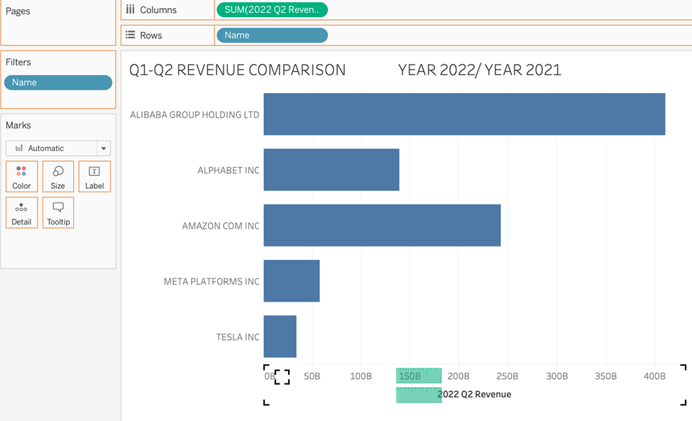
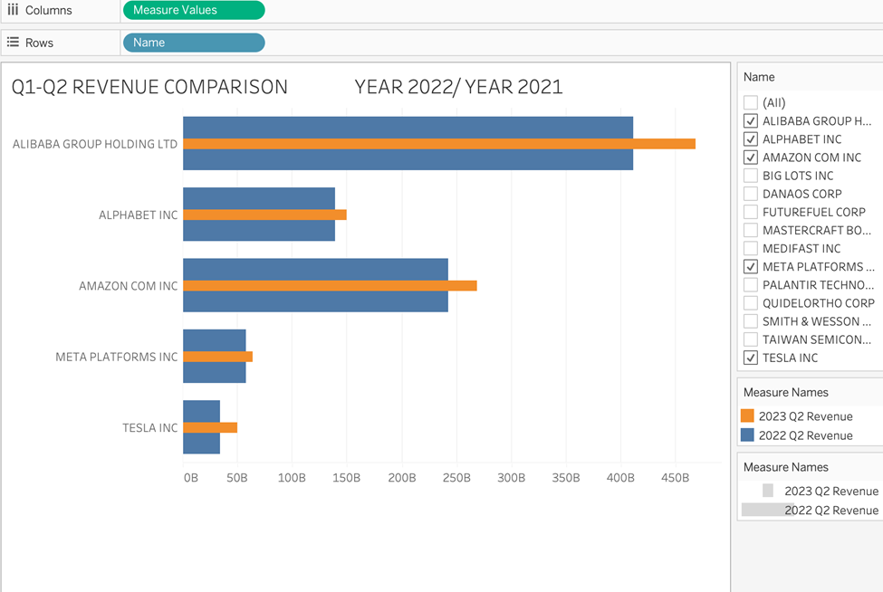
- Drag Name to Filter. We are interested in these companies: Alibaba Group, Alphabet, Amazon, Meta, and Tesla.
- Drag Name to Rows.
- Drag our first calculated field, SUM(2022 Q2 Revenue), to Columns.
- Drag SUM(2023 Q2 Revenue) by hovering it over the x-axis and dropping it when the green rulers appear as such:
Warning: It will automatically add Measure Names to the Rows as such:
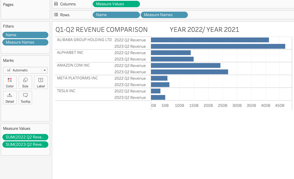
5. REMOVE Measure Names, which has appeared on the Rows shelf, drag it over to the Marks card, and drop it on Color instead.
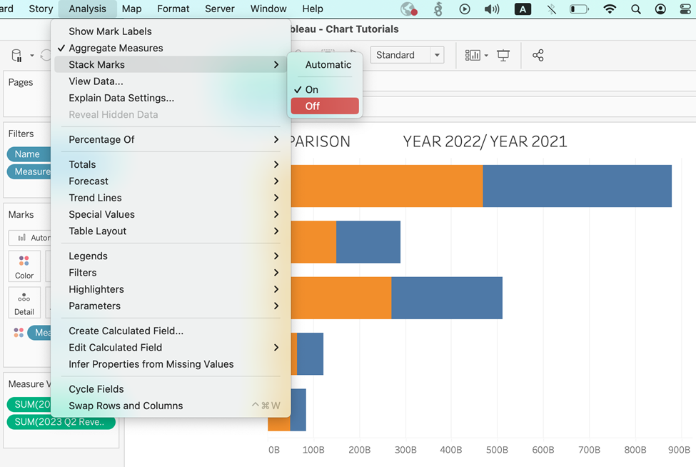
6. In the resulting view, ensure the bars are not stacked. Do this by turning stacked marks off by choosing Analysis >> Stack Marks >> Off
7. We already use Measure Names on Color but drag a copy of Measure Names to Size. You may do this by dragging Measure Names over from the data pane on the left or duplicating the one already on Color by holding down the command on a Mac and dropping it onto Size.
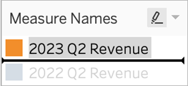
8. Almost there — Notice that our recent metric is currently the thicker orange bar, but we need it to be the thin blue one on top. Simply find the legend and reorder the metrics by dragging 2023 so that it is in the first slot.
We now have a Tableau bar in bar chart!
We could directly use this in a dashboard. But, like always, it can be tidied up.
For a Cleaner Look…
Here are some hints to get that cleaner aesthetic!
Add an informative title.
Color the bars so that the 2022 metric is #3B3B3B and the 2023 metric is #E651E8.
Format the background color to be #282828.
Format column grid lines to be #3B3B3B single dotted.
Format axis rulers to #666666 single solid.
Format all text on the left header and the x-axis as colour #F5F5F5.
You should now have something similar to this:
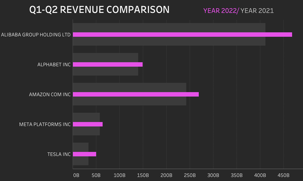
Tableau bar in bar charts to finish
The ease of interpretation of bar in bar speaks for itself, but avoid using them for metrics that may take both negative and positive values.
Be mindful that bar in bar charts work best when showing positive values, where the current one is being compared to a previous one.
Other Resources
How to build a Tableau bar-in-bar chart