Welcome to our blog, which showcases inspirational examples for Tableau bar charts. Tableau bar charts are among the most versatile and widely used tools in data visualization. They transform raw data into clear, actionable insights, making complex information easily digestible for stakeholders at all levels. This blog will explore a variety of Tableau bar charts, each tailored to specific use cases, demonstrating how different styles can enhance data storytelling.
Table of Contents
Using different bar charts for different scenarios offers numerous benefits. A standard bar chart in Tableau provides straightforward comparisons, which are ideal for financial summaries and performance metrics. On the other hand, a Tableau stacked bar chart is perfect for illustrating parts of a whole, such as sales distribution across regions. Differentiated bar charts highlight variances effectively for more detailed analyses, while bullet graphs compare performance against targets.
Whether you’re a data analyst looking to present complex datasets, a project manager tracking milestones, a marketing specialist analyzing campaign performance, or a business executive reviewing financial metrics, the right Tableau bar graph can make all the difference. Join us as we delve into these examples, offering inspiration and insights on creating a bar chart in Tableau that best suits your data visualization needs.
These dashboards and charts are curated from Tableau public, we do not take credit for the work.
Affiliate Disclosure: Some of the links on this blog are affiliate links, which means if you click on them and make a purchase, we may receive a commission at no extra cost to you. This helps support our blog and allows us to continue to create content for you. We only recommend products and services that we genuinely believe in, and all opinions expressed here are our own. Thank you for your support!
# 1 Tableau Bar Charts Inspiration – Bar Hopping
The dashboard showcases an array of Tableau bar charts to illustrate different data representation methods for comparative analysis. This tool is essential in corporate environments where visual data presentation is crucial for quick decision-making and trend analysis across various departments.
Users of this dashboard could include:
- Data Analysts who rely on clear and concise visualizations to interpret complex datasets and convey findings.
- Project Managers must monitor project metrics like budget allocations or task completion rates across different teams or regions.
- Marketing Specialists analyze consumer behavior and campaign performance to adjust strategies accordingly.
Chart types featured in the dashboard include:
- Tableau bar graphs provide a straightforward view of data comparison across categories.
- Rounded Ends Bar Charts and Outline Bar Charts offer a stylistic variation on the traditional bar chart in Tableau, potentially enhancing readability and viewer engagement.
- The Tableau stacked bar chart and its variants visually represent progress towards goals, useful for tracking project stages or sales targets.
- Lollipop Charts emphasize specific data points on a minimalistic stem, highlighting critical values.
- Cleveland Dot Plots focuses on precise value placement for detailed comparison.
This range of chart types is precious in visual analytics. It allows users to create a bar chart in Tableau based on their specific data sets and presentation goals. The diverse visual options facilitate tailored reporting and can significantly enhance the interpretative clarity of presented data.
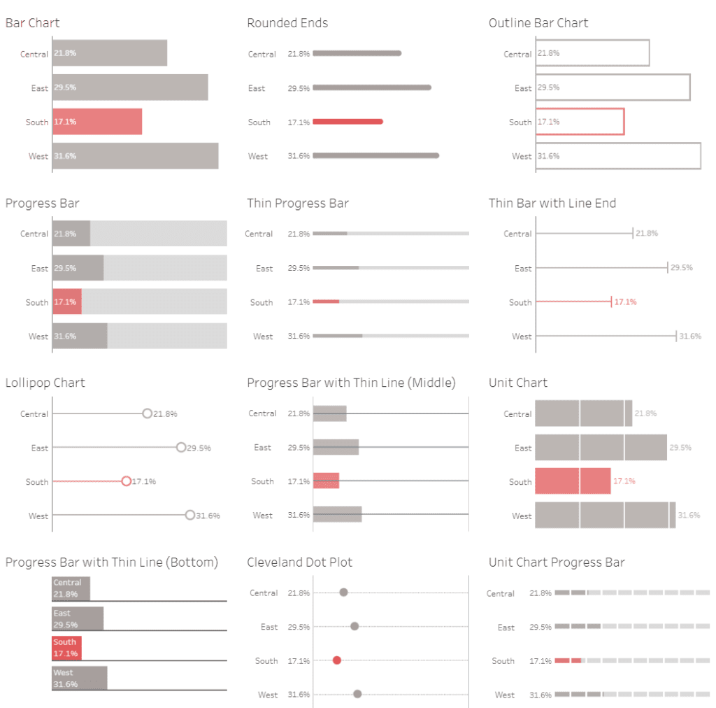
Bar Chart
The bar chart displayed offers a concise breakdown of data across four geographical regions: Central, East, South, and West. It visually compares critical metrics such as performance percentages, sales distribution, or other regional data, indicated by varying bar lengths. In this chart, the East region leads 29.5%, followed closely by the West at 31.6%. The Central region shows a moderate figure at 21.8%, while the South is the lowest at 17.1%, highlighted in red to draw attention to its distinctiveness from other regions. This visual setup helps quickly identify areas of strength and opportunities for improvement within different regions.
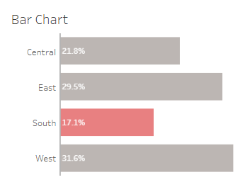
Rounded Ends
This part of the dashboard features a variation of the traditional bar chart, distinguished by bars with rounded ends. This design choice adds a sleek, modern look to the data presentation, making the chart aesthetically pleasing while providing essential information. The chart displays percentages for four regions: Central, East, South, and West. The East region has the highest value at 29.5%, followed by the West at 31.6%. The South, highlighted in red, shows the lowest percentage at 17.1%, indicating an area that may require attention or improvement relative to the others.
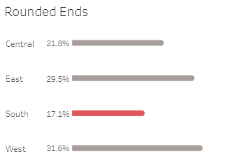
Outline Bar Chart
The “Outline Bar Chart” featured in this part of the dashboard offers a minimalist yet effective visual representation of data, using hollow bars to depict percentages across four regions: Central, East, South, and West. This stylistic choice emphasizes clarity and focuses on the comparative analysis without the visual weight of filled bars. It highlights the South region in red at 17.1%, indicating it as a critical area for attention compared to higher percentages in other regions, such as the West at 31.6% and East at 29.5%. This chart style is handy for presentations where a clean, uncluttered aesthetic is preferred.
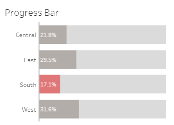
Progress Bar
The “Progress Bar” segment of the dashboard utilizes filled bars to represent progress towards a goal or benchmark across different regions: Central, East, South, and West. Each bar shows the percentage value, with the South region highlighted in red at 17.1%, indicating it is lagging compared to others such as the West at 31.6% and East at 29.5%. This chart style is particularly effective for visualizing progress, making it easy to see how close each region is to achieving its target. Using shaded bars helps differentiate between regions, facilitating quick comparison and assessment.
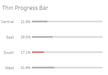
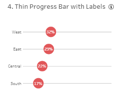
Thin Progress Bar
The “Thin Progress Bar” section of the dashboard employs slender bars to show progress percentages for different regions: Central, East, South, and West. The bars are streamlined and minimalist, making the data visually appealing and easy to interpret. The South region, highlighted in red at 17.1%, contrasts with the other areas, indicating its lower performance. Central, East, and West regions are represented in shades of grey, with West leading at 31.6%. This format is ideal for situations where space is limited, yet clarity and quick comparison are essential, effectively showcasing progress towards regional goals.
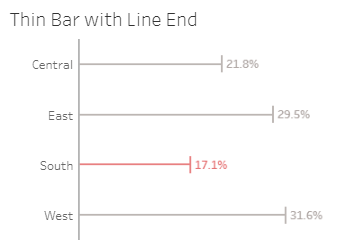
Thin Bar With Line End
The “Thin Bar with Line End” section of the dashboard provides a minimalist and precise representation of data across four regions: Central, East, South, and West. Each thin horizontal bar ends with a line marking the exact value, making it easy to compare performance at a glance. The South region, highlighted in red with a value of 17.1%, stands out against the neutral colours of the other areas, represented in shades of grey. This design emphasizes precision and simplicity, making it particularly useful for detailed comparative analysis where clarity and conciseness are crucial.
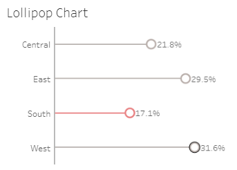
Lollipop Chart
The “Lollipop Chart” segment of the dashboard presents data for four regions: Central, East, South, and West, using a distinct and visually engaging format. Each lollipop has a thin line ending in a circle, marking the data value. The South region, highlighted in red with a value of 17.1%, stands out among the others. This chart style emphasizes individual data points while maintaining a clean and simple design. Using different colors and shapes helps quickly identify and compare the values across regions, making it an excellent tool for precise data visualization and analysis.
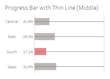
Progress Bar with Thin Line (Middle)
The “Progress Bar with Thin Line (Middle)” section of the dashboard offers a unique visual representation of data for the Central, East, South, and West regions. Each bar features a thin line in the middle, indicating the progress relative to a target or benchmark. The South region, marked in red with a value of 17.1%, provides a stark contrast against the neutral shades representing the other regions. This layout is handy for tracking progress towards goals, making it easy to compare performance across different areas at a glance. The design emphasizes clarity and simplicity, aiding in quick and effective data interpretation.
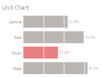
Unit Chart
The “Unit Chart” section of the dashboard provides a segmented visual representation of data for the Central, East, South, and West regions. Each region is represented by a series of blocks, with the number of blocks corresponding to the percentage value. The South region, highlighted in red with a value of 17.1%, contrasts sharply with the neutral colours of the other areas. This design allows for easy comparison of proportional data across different categories, making it particularly useful for displaying distribution and composition within a dataset. The unit chart’s clear and structured layout aids in straightforward data interpretation and analysis.
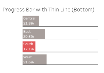
Progress Bar with Thin Line (Bottom)
The “Progress Bar with Thin Line (Bottom)” section of the dashboard offers a distinct and clean visual comparison of data for the Central, East, South, and West regions. Each bar is accompanied by a thin line at the bottom, indicating the progression towards a specific value. The South region, highlighted in red with a value of 17.1%, stands out against the neutral tones of the other areas. This design effectively highlights progress and target achievement, making it ideal for performance tracking and goal-setting analysis. The thin line at the bottom adds a subtle yet clear visual cue for easy comparison and interpretation of the data.
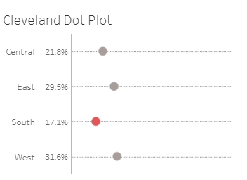
Cleveland Dot Plot
The “Cleveland Dot Plot” section of the dashboard provides a minimalist and precise representation of data for the Central, East, South, and West regions. Each dot represents a specific value, positioned along a horizontal axis, with the South region highlighted in red at 17.1%. This chart type is particularly effective for showcasing individual data points and comparing them. The simplicity of the dots and the use of neutral colours ensure that the critical data stands out without overwhelming the viewer, making it ideal for detailed analysis and presentations that require precise data interpretation.
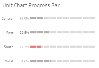
Unit Chart Progress Bar
The “Unit Chart Progress Bar” section of the dashboard provides a detailed visual breakdown of data for the Central, East, South, and West regions. Each unit represents a percentage of the total, with blocks shaded to indicate the proportion of each area. The South region, highlighted in red at 17.1%, contrasts with the neutral tones used for the other regions. This chart type effectively communicates progress towards a goal or a part-to-whole relationship, offering a clear, segmented view of the data. It is beneficial for tracking performance metrics and visualizing distribution straightforwardly and engagingly.
# 2 Tableau Bar Charts Inspiration – Bar Chart Menu
Bar Chart Menu Dashboard
The Bar Chart Menu dashboard is a comprehensive guide showcasing various styles and formats of bar charts, each designed to meet an organization’s different analytical and presentation needs. This dashboard is handy for data analysts, project managers, marketing specialists, and business executives who rely on visual data representation for decision-making, trend analysis, and reporting.

Purpose and Usage
- Data Analysts: Utilize the different chart styles to find the most effective way to communicate complex datasets.
- Project Managers: Monitor project metrics and resource allocation by choosing the appropriate chart type that best highlights the necessary information.
- Marketing Specialists: Analyze consumer behavior and campaign performance, selecting chart types that present demographic and performance data.
- Business Executives: Review business metrics, financial data, and performance indicators using charts that facilitate quick and informed decisions.
Chart Types and Layout
The dashboard features various bar chart styles, including:
- Default Format: Standard bar chart in Tableau for straightforward data comparison.
- Labels on the End: Shows exact values, removing grid lines for a clean look.
- Stacked with End/Left Labels: Tableau stacked bar chart that breaks down categories within bars, ideal for detailed analysis.
- Colour vs. Target: Highlights performance against set targets using color.
- Lollipop: Uses small lines and circles to highlight critical values without clutter.
- Underlined Labels: Provides a clear visual emphasis on bar labels without overcrowding.
- Metric and Variance Combo: Combines totals and variances to show comprehensive performance data.
- Rank Over Time: Displays ranking changes across different years, valid for performance tracking over time.
Positive Aspects
This dashboard offers a variety of Tableau bar chart options that cater to different visualization needs, enhancing clarity and engagement in data presentation. Its diverse styles ensure that users can select the most effective chart type for their specific data set and analytical goals.
Summary
The Bar Chart Menu dashboard is an invaluable tool for professionals seeking to leverage visual data analytics in their roles. Its extensive range of bar chart variations provides flexibility and precision in presenting data, making it an essential resource for effective communication and strategic decision-making.
Default Format
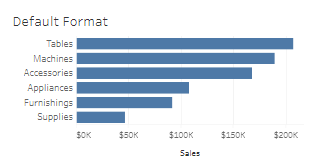
The “Default Format” section of the dashboard showcases a standard bar chart in Tableau. This chart provides a straightforward and transparent comparison of sales figures across different product categories: Tables, Machines, Accessories, Appliances, Furnishings, and Supplies. The horizontal bars effectively highlight the sales volume for each category, with Tables leading at approximately $200K and Supplies at the lower end with around $50K. This format is ideal for basic data comparisons, offering a quick and easy way to visualize performance metrics and make informed business decisions based on the visual representation of sales data.
Labels on the End
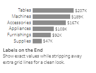
The “Labels on the End” section of the dashboard features a bar chart in Tableau where each bar ends with a label showing the exact value, enhancing readability and precision. This style strips away extra grid lines, creating a clean, uncluttered look. The chart compares sales across product categories: Tables, Machines, Accessories, Appliances, Furnishings, and Supplies. Tables lead with $207K, Machines at $189K, and Supplies trailing with $47K. This format is ideal for presenting exact data values clearly, making it easier for viewers to grasp the critical figures without distraction.
Labels on the Left
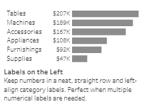
The “Labels on the Left” section of the dashboard features a Tableau bar chart where numerical labels are aligned to the left, ensuring a neat and organized presentation. This format is ideal when multiple numerical labels are needed, as it maintains a straight, precise alignment of category labels. The chart compares sales figures across different product categories: Tables, Machines, Accessories, Appliances, Furnishings, and Supplies. Tables lead with $207K in sales, Machines at $189K, and Supplies at the lowest with $47K. This layout enhances readability, making it easy for viewers to compare values at a glance.
Light Colored Background
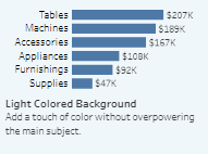
The “Light Colored Background” section of the dashboard features a Tableau bar chart with a soft, coloured backdrop. This design choice subtly enhances the visual appeal without overshadowing the main subject. The chart compares sales across various product categories: Tables ($207K), Machines ($189K), Accessories ($167K), Appliances ($108K), Furnishings ($92K), and Supplies ($47K). The light background helps to differentiate the bars clearly, ensuring that the data remains the focal point. This style is particularly effective for presentations, adding a touch of colour to make the chart more engaging and visually appealing.
Dark Background
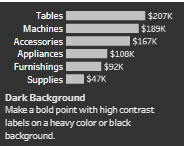
The “Dark Background” section of the dashboard showcases a Tableau bar chart with a bold, high-contrast design. This format uses a heavy or black background to make a strong visual statement, highlighting the data with striking clarity. The chart displays sales figures for various product categories: Tables ($207K), Machines ($189K), Accessories ($167K), Appliances ($108K), Furnishings ($92K), and Supplies ($47K). The high contrast between the dark background and the light-coloured bars and labels ensures that the data is easily readable and stands out prominently. This style is particularly effective for emphasizing key metrics in presentations and reports.
Stacked with End Labels
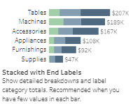
The “Stacked with End Labels” section of the dashboard features a Tableau stacked bar chart, offering a detailed breakdown of data within each category. Each bar represents total sales for product categories such as Tables ($207K), Machines ($189K), Accessories ($167K), Appliances ($108K), Furnishings ($92K), and Supplies ($47K). The stacked segments within each bar highlight different subcategories or components, providing a nuanced view of the data. End labels display the total value for each category, ensuring easy readability. This format is handy when a few values are present in each bar, enabling a comprehensive and clear presentation of detailed breakdowns and overall totals.
Stacked with Left Labels
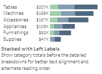
The “Stacked with Left Labels” section of the dashboard displays a Tableau stacked bar chart with labels aligned to the left. This format provides a clear view of total sales for each category: Tables ($207K), Machines ($189K), Accessories ($167K), Appliances ($108K), Furnishings ($92K), and Supplies ($47K). The stacked segments within each bar highlight detailed breakdowns of subcategories, ensuring better text alignment and alternate reading order. This approach improves readability and ensures that detailed insights are easily accessible. This format is handy for showing comprehensive data while maintaining precise, organized text alignment.
Colour vs. Target
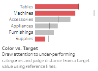
The “Color vs. Target” section of the dashboard highlights categories that are underperforming relative to set targets using a Tableau bar chart. Categories such as Tables, Machines, and Supplies are shown in red, indicating performance below target values, while Accessories, Appliances, and Furnishings are in grey. Using reference lines within each bar allows quick visual judgment of the distance from target values, drawing attention to areas needing improvement. This format is handy for performance reviews, enabling managers to focus on specific underperforming segments and take corrective actions.
Below Target Indicators
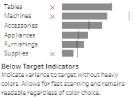
The “Below Target Indicators” section of the dashboard uses a bar chart in Tableau to show variance from target values without relying on heavy colors. Red X markers follow categories like Tables, Machines, and Supplies to indicate below-target performance. This subtle yet effective method allows quick scanning and remains readable regardless of color choice. It helps users identify underperforming areas efficiently while maintaining a clean and professional look. This chart type is ideal for executives and managers who need to assess performance gaps and address them promptly.
Diverging Colors
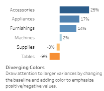
The “Diverging Colors” section of the dashboard uses a Tableau bar chart to highlight significant variances by changing the baseline and incorporating color to emphasize positive and negative values. Categories such as Accessories and Appliances show positive performance in shades of blue, while negative values like Supplies and Tables are marked with warmer hues. This visual approach draws immediate attention to more significant variances, making identifying areas of success and concern easier. Ideal for analysts and managers, this chart type enhances the clarity of performance data, allowing for quick interpretation and strategic adjustments based on visual cues.
Lollipop Chart
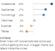
The “Lollipop Chart” section of the dashboard features a unique bar chart in Tableau design, where small lines with coloured dots emphasize key data points without overwhelming the viewer. This chart is particularly effective for showcasing performance metrics such as percentage changes in categories like Accessories, Appliances, and Furnishings. Using distinct colours for each dot helps highlight specific values. This chart type is ideal for presentations where clean and straightforward visualizations are necessary, making it easy for data analysts and business executives to interpret performance trends and make informed decisions swiftly.
Metric and Variance Combo
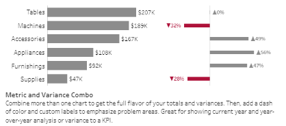
The “Metric and Variance Combo” section of the dashboard effectively combines bar charts with variance indicators to provide a comprehensive view of both totals and variances. This Tableau bar graph includes the central metric values for categories like Tables, Machines, and Accessories alongside their respective variances in red. This dual approach highlights overall performance and specific problem areas, making it great for year-over-year analysis or KPI tracking. The addition of colour-coded variance labels helps emphasize critical changes, aiding data analysts and business executives in quickly identifying and addressing issues in performance metrics.
Overlaid Category Labels
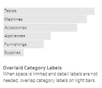
The “Overlaid Category Labels” section of the dashboard presents a streamlined bar chart in Tableau with labels directly overlaid on the light-coloured bars. This format is handy when space is limited and detailed labels are not required. The overlaid labels clearly and concisely represent categories such as Tables, Machines, Accessories, Appliances, Furnishings, and Supplies. This design choice enhances readability while maintaining the chart’s simplicity. It is ideal for quick, high-level overviews where the primary goal is to identify categories without the clutter of additional numerical details.
Underlined Labels
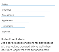
The “Underlined Labels” section of the dashboard features a unique bar chart in Tableau where each category label is underlined by a bar. This design is handy for tight spaces, ensuring the chart remains uncluttered and readable. The labels, such as Tables, Machines, Accessories, Appliances, Furnishings, and Supplies, extend beyond the length of the bar underneath, providing a neat and organized appearance. This approach works well when the labels are longer than the corresponding data bars, maintaining a clean visual presentation without sacrificing the clarity of information.
Rank Over Time
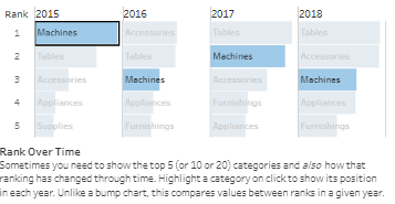
The “Rank Over Time” section of the dashboard showcases how various categories, such as Machines, Accessories, Tables, Appliances, and Furnishings, have ranked over different years from 2015 to 2018. This Tableau bar graph effectively highlights the top 5 categories, showing their positions and how their rankings have changed annually. Unlike a bump chart, this format directly compares the ranks within each year, making it easy to see shifts in performance. This visualization is handy for tracking progress and trends over time, providing a clear historical perspective on category performance.
Two Categories with Min & Max Labels
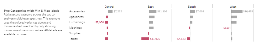
The “Two Categories with Min & Max Labels” section of the dashboard provides a nuanced view of performance across multiple perspectives. By adding a second category at the top, this Tableau bar chart allows for detailed comparative analysis. It displays minimum and maximum values for regions such as Central, East, South, and West, highlighting variances. For instance, it shows positive and negative deviations, like -$3,906 in Furnishings for the Central region and $11,025 in Accessories for the East. This layout effectively identifies significant discrepancies and trends across different categories and areas.
# 3 Tableau Bar Charts Inspiration – 8 Ways to Visualize Progress Bars in Tableau with Steps
This dashboard titled “8 Ways to Visualize Progress Bars in Tableau” is designed to showcase various methods of displaying progress bars, demonstrating the versatility and creativity available in data visualization using Tableau. This tool is precious for professionals in different organizational roles who rely on visual data representations for tracking progress, comparing performance, and making informed decisions.

Purpose and Usage
- Data Analysts: Use different Tableau bar chart styles to clearly convey progress and completion rates, enhancing data presentations.
- Project Managers: Monitor project milestones and task completions using visually distinct progress bars that highlight status effectively.
- Sales Teams: Track sales targets and achievements, comparing performance across regions or teams.
- Marketing Specialists: Assess campaign progress and results using clear visual indicators to track goals and milestones.
Chart Types and Layout
The dashboard includes the following types of progress bars:
- Normal Progress Chart: Standard Tableau bar chart showing percentage completion.
- Progress Chart with Context: Combines progress bars with additional contextual information for a comprehensive view.
- Thin Progress Bar: Minimalistic design for a clean and straightforward representation.
- Thin Progress Bar with Labels: Adds labels to the thin progress bars for clarity.
- Bar within Bar I: Displays progress within another bar, showing comparison or context.
- Bar within Bar II: Another variation of progress within a bar, emphasizing different aspects.
- Rounded Progress Bar: Uses rounded edges for a modern and smooth look.
- Rounded Progress Bar with Shading: Enhances the rounded progress bars with shading to add depth.
Positive Aspects
The dashboard offers various visualization options, allowing users to choose the most appropriate style for their data. This flexibility enhances the clarity and impact of data presentations, making it easier for stakeholders to grasp complex information quickly.
Summary
The “8 Ways to Visualize Progress Bars in Tableau” dashboard is an excellent resource for professionals seeking to create a bar chart in Tableau that is effective and visually appealing. Its diverse range of Tableau bar graph variations provides ample options for presenting progress and performance data clearly and engagingly.
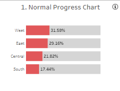
Normal Progress Chart
The “Normal Progress Chart” is a standard Tableau bar chart used to show percentage completion across different regions. This chart is handy for quick comparisons, as it visually represents progress with filled bars against a standard scale. In this example, the West region leads with 31.58% completion, followed by the East at 29.16%, Central at 21.82%, and South at 17.44%. The red shading highlights the completed portion of each bar, making it easy to see how each region performs relative to others. This straightforward format is ideal for tracking and comparing progress metrics in various business contexts.
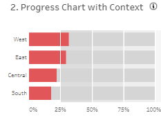
Progress Chart with Context
The “Progress Chart with Context” enhances the basic progress bar by adding background shading that provides additional context. This Tableau bar chart variation shows percentage completion with red bars indicating progress. The grey background bars extend to 100%, offering a clear visual comparison against the total target. The West region is slightly ahead of the East, Central, and South regions. This design effectively visualises progress within a broader scope, making it easy to see how far each region is from complete. It’s ideal for scenarios where understanding progress and remaining effort is crucial.
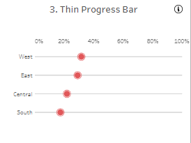
Thin Progress Bar
The “Thin Progress Bar” offers a minimalist design, displaying progress as small, red dots along a thin horizontal line. Each dot represents the percentage completion for different regions—West, East, Central, and South—against a 100% scale. This bar chart in Tableau is handy for presenting progress in a clean, uncluttered manner, making it easy to gauge performance quickly. The thin lines and dots minimize visual noise while still providing essential information. It’s an excellent choice for dashboards where simplicity and clarity are paramount, ensuring viewers can easily interpret progress metrics without distraction.
Thin Progress Bar with Labels
The “Thin Progress Bar with Labels” enhances the minimalist design by adding labels to the progress dots, indicating the exact percentage completion for each region—West, East, Central, and South. The red dots are placed along thin horizontal lines, with the percentage values displayed within the dots. This format combines simplicity with precise information, making it easy for viewers to understand progress metrics at a glance. The labels ensure that the data is visually appealing and informative, making this bar chart in Tableau ideal for dashboards where clarity and detail are equally important.
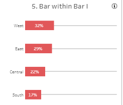
Bar within Bar I
The “Bar within Bar I” chart in this Tableau dashboard clearly and concisely compares progress across West, East, Central, and South regions. Each area is represented by a red bar indicating the percentage completion, with the exact percentage displayed within the bar. This inner bar is placed within a faint grey bar, providing context and making it easy to compare the progress across different regions at a glance. The design effectively highlights relative performance, making it a valuable tool for project managers and analysts who must monitor and compare key metrics quickly and efficiently.
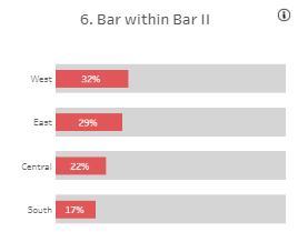
Bar within Bar II
The “Bar within Bar II” section of the Tableau dashboard provides a more robust comparison of progress across different regions: West, East, Central, and South. Each region’s progress is depicted by a red bar within a larger grey bar, representing the full context of potential completion. The red bars display the percentage completion prominently, with 32% for the West and 17% for the South. This format is highly effective for illustrating how each region stands relative to its full potential, making it an excellent choice for project managers and analysts who need a clear, comparative visualization of progress metrics.
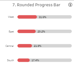
Rounded Progress Bar
The “Rounded Progress Bar” section of the dashboard offers a modern and sleek way to visualize progress. Each bar features rounded ends, providing a visually appealing representation of percentage completion across different regions: West (31.6%), East (29.2%), Central (21.8%), and South (17.4%). The rounded edges add a touch of sophistication and smoothness, making the data more straightforward to the eyes. This type of bar chart in Tableau is beneficial for presentations where aesthetics and clarity are essential, such as executive reports or client-facing documents. It effectively combines functionality with design to enhance data interpretation.
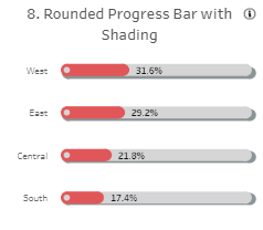
Rounded Progress Bar with Shading
The “Rounded Progress Bar with Shading” adds depth and visual interest to the standard rounded progress bar. Each bar not only features rounded ends but also incorporates shading, which enhances the three-dimensional effect and makes the progress visually pop. This chart type effectively represents the completion percentages for different regions: West (31.6%), East (29.2%), Central (21.8%), and South (17.4%). The shading provides a more dynamic and engaging way to display progress, making it particularly useful for presentations or reports where visual impact is crucial. This type of Tableau bar graph combines clarity with an appealing design.
# 4 Tableau Bar Charts Inspiration – 18 Ways to Visualize Bar Charts
The “18 Ways to Visualize Bar Charts” dashboard showcases a diverse array of Tableau bar charts, each designed to cater to different data visualization needs within an organization. This dashboard is particularly valuable for professionals who require clear and effective ways to present and analyze data, making it a versatile tool for data analysts, project managers, marketing specialists, and business executives.

Purpose and Usage
- Data Analysts: Utilize various bar chart styles to communicate complex datasets clearly and effectively.
- Project Managers: Monitor project metrics and resource allocation using appropriate chart types, highlighting necessary information.
- Marketing Specialists: Analyze consumer behaviour and campaign performance with charts that present demographic and performance data.
- Business Executives: Review business metrics, financial data, and performance indicators using charts that facilitate quick and informed decisions.
Chart Types and Layout
The dashboard includes a wide range of bar chart types, such as:
- Standard Bar Charts: Basic horizontal bars for straightforward data comparison.
- Outline Bar Charts: Bars with outlined edges for a clean, minimalistic look.
- Rounded Bar Charts: Bars with rounded ends for a modern aesthetic.
- Tableau Stacked Bar Chart: Bars are divided into segments to show parts of a whole.
- Divergent Bar Charts: Bars that diverge from a central point, helpful in showing variances.
- Lollipop Charts: Lines ending with dots to emphasize specific values.
- Bullet Graphs: Bars within a bar to compare performance against a target.
- Progress Bars: Different styles show progress towards goals.
- Butterfly Charts: Bars split in the middle, comparing two periods.
- Bar with Line End Charts: Bars with a line marking the exact value.
Positive Aspects
This dashboard provides various visualization options, enhancing the clarity and impact of data presentations. Users can select the most effective bar chart in Tableau for their specific data set and analytical goals, ensuring that complex information is conveyed clearly and engagingly.
Summary
The “18 Ways to Visualize Bar Charts” dashboard is an invaluable resource for professionals seeking to leverage visual data analytics in their roles. Its extensive range of bar chart variations offers flexibility and precision in presenting data, making it an essential tool for effective communication and strategic decision-making. Create a bar chart in Tableau to enhance your data presentation and drive informed decisions.
Bar Chart
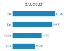
The “Bar Chart” section of the dashboard uses a standard Tableau bar graph to compare sales figures across different regions: West, East, Central, and South. This straightforward visualization allows users to grasp regional performance at a glance quickly. The West region leads with $740K in sales, the East with $692K, Central with $503K, and South with $392K. This format is ideal for data analysts, project managers, marketing specialists, and business executives who need a clear and concise method to compare data across multiple categories, aiding in strategic decision-making and performance tracking.
Outline Bar Chart
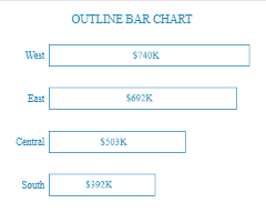
The “Outline Bar Chart” section of the dashboard uses a unique bar chart in Tableau format where bars are outlined instead of filled. This design provides a clean, minimalist look while conveying the same comparative data. The West region remains the highest at $740K, East at $692K, Central at $503K, and South at $392K. This style is ideal for presentations requiring a modern aesthetic without compromising data clarity. It helps data analysts and business executives quickly compare performance metrics across regions, enhancing visual appeal and interpretability.
Rounded Bar Chart
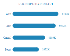
The “Rounded Bar Chart” part of the dashboard showcases a modern bar chart in Tableau with rounded ends, adding a sleek and contemporary look to the data visualization. This chart highlights the revenue performance across four regions: West ($740K), East ($692K), Central ($503K), and South ($392K). The rounded edges provide a softer visual appeal, making the data more accessible to the eyes and enhancing user engagement. This style is handy for marketing specialists and project managers who must present data visually appealingly while maintaining clarity and precision in their reports and presentations.
Stacked Bar Chart
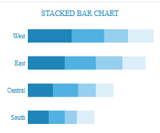
The “Stacked Bar Chart” part of the dashboard displays a Tableau stacked bar chart, effectively visualizing how different segments contribute to the total value within each region. The chart breaks down the data into multiple shaded sections, clearly comparing performance across the West, East, Central, and South regions. This Tableau stacked bar chart is handy for data analysts and business executives who need to understand data composition and identify patterns within various categories. Using different shades to represent segments provides a comprehensive view, making it easier to analyze the data at a granular level.
Stacked Bar Chart II
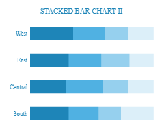
The “Stacked Bar Chart II” section presents another Tableau stacked bar chart variation. This chart visualizes how different segments contribute to the overall totals across the West, East, Central, and South regions. Each bar is divided into multiple segments with varying shades, illustrating the distribution within each region. This type of bar chart in Tableau is ideal for project managers and marketing specialists who need to dissect data into its constituent parts to gain insights into regional performance and category contributions. Precise segmentation helps identify trends and make informed decisions based on detailed data breakdowns.
Divergent Bar Chart
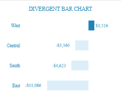
The “Divergent Bar Chart” section of the dashboard provides a clear visualization of variances across different regions. This chart helps compare positive and negative values in a single view. The bars diverge from a central axis, with positive values extending to the correct and negative values to the left. In this example, the West region shows a favourable variance of $1,516, while the East, South, and Central areas show negative variances of -$11,086, -$4,623, and -$3,560, respectively. This type of Tableau bar chart is ideal for financial analysts and project managers who need to assess gains and losses across multiple categories quickly.
Lollipop Chart
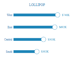
The “Lollipop Chart” section of the dashboard offers a unique visualization style, combining a bar with a circle at the end to emphasize specific data points. This chart helps highlight critical values while maintaining a clean and simple design. In this example, the West region leads with $740K, the East with $692K, Central with $503K, and South with $392K. Using lollipop charts in Tableau bar graphs allows for a clear and visually appealing representation of data, making it easier for data analysts and marketing specialists to quickly pinpoint significant figures and trends.
Butterfly Chart
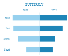
The “Butterfly Chart” section of the dashboard visualizes data comparisons between two different years, 2021 and 2022, across various regions. This chart style effectively shows the change in values side by side, with a central axis separating the two years. In this example, the West region shows substantial growth from 2021 to 2022, followed by the East and Central regions, while the South shows the slightest change. Butterfly charts in Tableau bar charts are handy for tracking year-over-year performance, making them ideal for business executives and project managers who need to efficiently assess and compare annual data trends.
Bar Chart with Line End
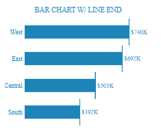
The “Bar Chart with Line End” section of the dashboard adds a distinct line at the end of each bar to mark the exact value, enhancing precision and readability. This chart effectively displays data for the West, East, Central, and South regions, with the West leading at $740K and the South at the lowest with $392K. The line-end feature helps users quickly identify and compare specific values across categories. This type of Tableau bar chart is ideal for data analysts and business executives who need clear and precise data visualization for making informed decisions and presenting detailed financial or performance data.
Bullet Graph
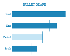
The “Bullet Graph” section of the dashboard is designed to compare performance against a target using a horizontal bar with an overlaying line indicating the target value. In this example, the West region reaches the target, with a value of $740K. The East region, at $692K, and the Central and South regions, at $503K and $392K respectively, fall short of their targets. The light blue shading in the Central bar indicates the progress towards the goal. This type of Tableau bar graph is ideal for performance tracking, making it useful for project managers and sales teams to efficiently monitor and compare actual performance against predefined targets.
Progress Bar
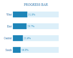
The “Progress Bar” section of the dashboard provides a visual representation of progress towards a goal. Each bar is divided into a dark blue section showing the progress and a light blue section representing the remaining amount needed to reach 100%. In this example, the West region has achieved 31.8%, the East region 29.7%, the Central region 21.6%, and the South region 16.8%. This type of Tableau bar chart is beneficial for project managers and team leaders to track the completion status of tasks or milestones, providing a clear and immediate understanding of progress and areas needing attention.
Progress Bar II
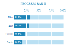
The “Progress Bar II” section of the dashboard enhances the traditional progress bar by segmenting the bar into smaller, equal parts to indicate incremental progress. This segmented style allows for a more detailed view of progress towards 100%. In this example, the West region shows 31.8% completion, the East 29.7%, the Central 21.6%, and the South 16.8%. This type of Tableau bar chart is beneficial for project managers and team leaders who need to track and report on progress more granularly, offering clear visibility into how far each region has progressed towards their respective goals.
Progress Thin Bar
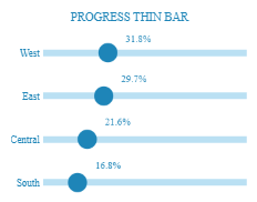
The “Progress Thin Bar” section of the dashboard provides a sleek and minimalist representation of progress data. Each thin bar represents progress towards a target, with a bold circle marking the percentage completed. In this example, the West region shows 31.8% progress, the East 29.7%, the Central 21.6%, and the South 16.8%. This style is ideal for presentations and reports where space is limited but clarity is essential. Project managers and team leaders can use this Tableau bar chart to quickly convey progress in a visually appealing and easily interpretable manner, enhancing communication and understanding among stakeholders.
Progress Area
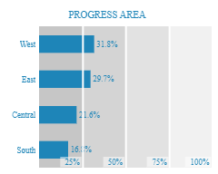
The “Progress Area” section of the dashboard offers a detailed view of progress towards specific targets, using shaded areas to represent different completion percentages. Each bar is segmented into distinct areas indicating 25%, 50%, 75%, and 100% completion levels. In this example, the West region shows 31.8% progress, East 29.7%, Central 21.6%, and South 16.8%. This Tableau bar chart is handy for project managers and team leaders who need to communicate progress clearly and effectively. The shaded areas help viewers quickly understand how much progress has been made relative to the total goal, enhancing the ability to make data-driven decisions.
Bar in Bar
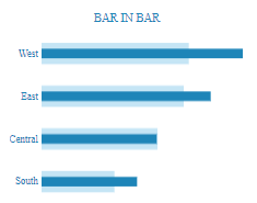
The “Bar in Bar” section of the dashboard visually represents comparative data within the same category. Each primary bar is overlaid with a secondary bar, clearly comparing two related metrics. In this example, the West, East, Central, and South regions are shown with overlaying bars to compare their performance. This Tableau bar graph is handy for financial analysts and project managers who must compare performance against targets or previous periods. This format simplifies the analysis and highlights significant differences or trends between the two metrics by providing a visual comparison within the same chart.
Side by Side Bars
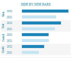
The “Side by Side Bars” section of the dashboard provides a comparative visualization of data across two different periods. Each category, represented by the regions West, East, Central, and South, displays two bars side by side for 2022 and 2021. This Tableau bar chart effectively illustrates changes in performance or metrics over time, making it an excellent tool for data analysts and business executives. Placing the bars next to each other allows for a straightforward comparison, highlighting increases or decreases between the years and facilitating easy trend analysis and decision-making.
Bar Chart & Candlestick
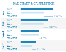
The “Bar Chart & Candlestick” section of the dashboard combines traditional bar charts with candlestick visuals to illustrate changes over time. Each region (West, East, Central, and South) shows bars for 2022 and 2021, with a candlestick indicating the percentage change. For instance, the West region shows a significant increase of +36.7%, while the Central region displays a slight decrease of -0.5%. This Tableau bar chart is handy for financial analysts and project managers who must assess year-over-year performance and identify trends. The combination of bar charts and candlesticks enhances the depth of analysis by providing both absolute values and relative changes.
Jittered Bar Chart
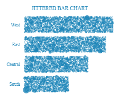
The “Jittered Bar Chart” section of the dashboard offers a unique visualization by scattering data points within the bar area, creating a jittered effect. This type of Tableau bar chart is beneficial for displaying distributions and identifying patterns within the data rather than just comparing aggregate values. The regions (West, East, Central, and South) are represented with dots filling the bar space, indicating the density and spread of the data points. The jittered effect can highlight variations and anomalies that might be missed in a traditional bar chart, making it valuable for data analysts who must delve deeper into data distributions and underlying trends.
# 5 Tableau Bar Charts Inspiration – Bar chart inspiration
The Bar Chart Inspiration dashboard showcases a diverse collection of Tableau bar charts, demonstrating the versatility and effectiveness of different bar graph styles in data visualization. This dashboard is designed for professionals who require precise and impactful ways to present and analyze data, such as data analysts, project managers, marketing specialists, and business executives.

Purpose and Usage
- Data Analysts: Utilize different Tableau bar chart styles to communicate complex datasets clearly and concisely.
- Project Managers: Monitor project metrics and resource allocation using Tableau stacked bar charts that highlight necessary information effectively.
- Marketing Specialists: Analyze consumer behaviour and campaign performance with visually distinct Tableau bar graphs that present demographic and performance data.
- Business Executives: Review business metrics, financial data, and performance indicators using bar charts in Tableau that facilitate quick and informed decision-making.
Chart Types and Layout
The dashboard includes several types of bar charts, such as:
- The Jittered: Displays more details inside the bars using a scatter of dots, helpful in showing data distribution and density.
- The Classical: A standard bar chart in Tableau is preferred in business dashboards for its simplicity and effectiveness in data comparison.
- The Rounded: Features bars with rounded edges for a modern aesthetic, adding a stylish touch to data visualization.
- The Lollipop: Combines bars with dots to emphasize specific values, providing a clear and engaging representation.
- The Curved: Uses curved bars for an artistic and unique visualization, suitable for aesthetic presentations.
Positive Aspects
This dashboard offers a variety of Tableau bar graph options, allowing users to select the most suitable style for their specific data presentation needs. The different visualizations enhance the clarity and impact of data, making it easier for stakeholders to grasp complex information quickly.
Negative Aspects
However, some chart styles, such as the curved bars, may prioritize aesthetics over functionality, potentially complicating data interpretation. Additionally, users unfamiliar with more unconventional chart types like the jittered or lollipop charts may require guidance to fully understand and utilize these visualizations effectively.
Summary
The Bar Chart Inspiration dashboard is an invaluable resource for professionals seeking to enhance their data visualization skills. Its extensive range of bar chart variations provides flexibility and precision in presenting data, making it an essential tool for effective communication and strategic decision-making. If you need to create a bar chart in Tableau, this dashboard offers numerous examples to inspire and guide you.
Jittered
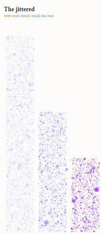
The “Jittered” section of the dashboard features a unique bar chart in Tableau that incorporates a scatter of dots within the bars. This visualization style is useful for displaying data distribution and density, providing more detailed insights into the data points that make up each bar. The jittered bars visually represent variations within each category, enhancing the overall depth of the data analysis. This chart type is precious for data analysts and researchers who must examine data variability and distribution patterns clearly and engagingly. Its detailed presentation helps in understanding the intricacies within the summarized data.
Classical
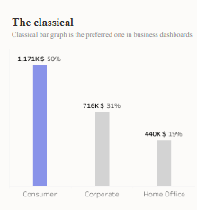
The “Classical” section of the dashboard showcases a standard bar chart in Tableau, which is highly favoured in business dashboards for its simplicity and effectiveness. This Tableau bar graph compares Consumer, Corporate, and Home Office categories. The Consumer category leads with 1,171K and 50%, Corporate with 716K and 31%, and Home Office with 440K and 19%. This straightforward presentation makes it easy to understand and interpret the data at a glance. Such bar charts are essential for business executives and managers to make quick, informed decisions based on clear and concise data comparisons.
The Rounded
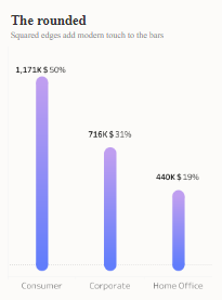
The “Rounded” section of the dashboard features a Tableau bar chart with rounded edges, adding a modern touch to the visualization. This chart compares the same categories as the classical version: Consumer, Corporate, and Home Office. The Consumer category again leads with 1,171K and 50%, followed by Corporate with 716K and 31%, and Home Office with 440K and 19%. The rounded edges enhance the aesthetic appeal and make the chart visually engaging. This style is beneficial for presentations and reports where visual appeal is crucial, helping to maintain audience interest while conveying important data insights effectively.
The Lollipop
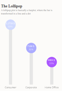
The “Lollipop” section of the dashboard transforms traditional bar charts into lollipop plots, where each bar is represented as a line with a dot at the end. This design highlights vital data points, making them more visually distinct. The Consumer category leads with 1,171K and 50%, Corporate with 716K and 31%, and Home Office with 440K and 19%. This style of Tableau bar chart is effective for drawing attention to specific values and providing a clear, engaging visual representation. It is instrumental in presentations and reports where emphasizing individual data points is crucial for the audience’s understanding.
The Curved
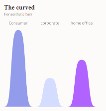
The “Curved” section of the dashboard features a unique and artistic representation of bar charts. Unlike traditional straight-edged bars, this design uses smooth, curved shapes to display data, adding an aesthetic element to the visualization. The Consumer category is the tallest, followed by the Home Office and Corporate. While this style may prioritize visual appeal over precise data comparison, it can effectively draw attention and engage viewers. The curved bar chart in Tableau is ideal for presentations that aim to captivate an audience while conveying essential data insights, balancing aesthetics with functionality.
That was 62 Amazing Tableau Bar Charts for Your Every Use Case!
Exploring the diverse range of Tableau bar charts can significantly enhance your data visualization capabilities. Selecting the exemplary bar chart in Tableau allows you to transform raw data into clear, actionable insights tailored to your needs. Whether using a standard bar chart for straightforward comparisons, a Tableau stacked bar chart for illustrating parts of a whole, or a divergent bar chart for highlighting variances, each type of Tableau bar graph serves a unique purpose.
These varied chart styles enable data analysts, project managers, marketing specialists, and business executives to communicate complex information effectively and drive informed decision-making. We hope this blog has provided you with valuable inspiration and practical guidance on creating a bar chart in Tableau that best suits your data visualization requirements. Embrace the power of Tableau bar charts to make your data storytelling more impactful and engaging.