A bank dashboard is crucial for banks as it provides a comprehensive, real-time view of key metrics, enabling informed decision-making and efficient management of operations. In the dynamic and highly regulated banking world, data-driven decision-making is crucial for maintaining competitiveness and compliance. Tableau, a leading data visualization tool, empowers banking professionals by transforming complex data sets into intuitive, actionable insights.
From financial performance to fraud detection, a banking Tableau dashboard offers a versatile and powerful way to monitor and analyze key metrics. This blog will explore six exemplary Tableau banking dashboard examples tailored for various banking functions. These dashboards illustrate Tableau’s versatility and demonstrate how banks can leverage visual analytics to enhance efficiency, improve customer satisfaction, and ensure regulatory compliance.
Table of Contents
Dashboards are curated from the site Tableau Public, and we do not take credit for the work on these dashboards.
Affiliate Disclosure: Some of the links on this blog are affiliate links, which means if you click on them and make a purchase, we may receive a commission at no extra cost to you. This helps support our blog and allows us to continue to create content for you. We only recommend products and services we genuinely believe in; all opinions expressed here are ours. I appreciate your support!
#1 Tableau Bank Dashboard Example: Bank Churn Dashboard
The displayed dashboard is a comprehensive banking dashboard titled “Bank Customer Churn,” meticulously designed in Tableau to monitor and analyze various demographic and financial metrics related to bank customers. This tool primarily aims to reduce customer attrition by identifying key characteristics of those who leave or stay, thus enabling targeted retention strategies.
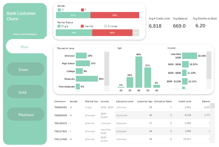
Purpose and Usage
This banking Tableau dashboard is an invaluable resource for several roles within a financial institution:
- Customer Relationship Managers utilize it to understand customer demographics and behaviors to tailor personalized banking solutions.
- Marketing Teams analyze segments to create focused campaigns to increase customer loyalty and reduce churn rates.
- Risk Analysts assess the financial profiles of different customer segments to adjust credit offerings and manage risk exposure effectively.
Chart Types and Layout
The dashboard incorporates a variety of visual elements to represent data:
- Bar Charts: Display the distribution of customers by gender, age, and income, allowing for quick demographic assessments.
- Tabular Data: This section lists individual customer data, including gender, marital status, income, education level, and other financial metrics, offering detailed insights at a glance.
- Segmentation Buttons: These buttons allow users to filter customer data based on card category (Blue, Silver, Gold, Platinum), facilitating targeted analysis.
Positive Aspects
The strengths of this banking KPI dashboard lie in its clear, organized layout, which promotes easy navigation and quick comprehension of complex datasets. Its interactive features, such as card category selection, enhance user experience by allowing dynamic data querying.
Negative Aspects
However, the dashboard may suffer from visual redundancy and color scheme issues—the color similarity across different charts could lead to confusion. Additionally, the dense packing of various data visualizations in a single screen might overwhelm users not well-versed in data analysis.
Summary
Overall, this Tableau banking dashboard example effectively synthesizes vital customer data into actionable insights, supporting strategic decisions to enhance customer retention and satisfaction. It is a powerful tool for banking professionals looking to decrease churn through informed, data-driven strategies. Improvements in visual differentiation among data presentations could further enhance its effectiveness and user-friendliness.
#2 Tableau Bank Dashboard Example: Banking – Credit Risk
The image displays a meticulously designed Credit Risk Overview dashboard, crafted in Tableau for financial institutions to monitor and analyze credit risk from January 2017 to December 2018. This banking Tableau dashboard is an essential tool for various professionals within a bank or financial organization, such as risk managers, financial analysts, and strategic decision-makers, enabling them to assess and manage credit risk associated with their customers effectively.
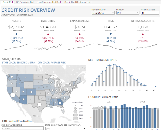
Purpose and Usage
These Tableau banking dashboard examples are utilized primarily for:
- Risk Managers: To monitor overall credit risk, analyze at-risk accounts, and implement risk mitigation strategies.
- Financial Analysts: To evaluate financial liabilities and asset details, helping in liquidity management and financial stability assessments.
- Executive Management: To gain an overview of the organization’s financial health, observe trends in expected losses, and make informed strategic decisions.
Chart Types and Layout
The banking dashboard Tableau incorporates several types of visualizations to represent complex data effectively:
- Geographical Maps: Color-coded to display average risk by state or city, offering a spatial analysis of risk distribution.
- Bar Charts Illustrate the liquidity ratio over time, providing insights into the institution’s financial health.
- Lollipop Charts: Track the debt-to-income ratio, highlighting changes and trends that could impact credit risk.
- Numerical Indicators: These indicators show vital metrics such as total assets, liabilities, expected loss, and risk scores, providing a snapshot of financial metrics at a glance.
Positive Aspects
The dashboard bank is highly beneficial due to its comprehensive and clear presentation of critical financial data, facilitating quick decision-making and strategic planning. Its interactive features allow users to drill down into specific data points, enhancing the usability for detailed analysis.
Negative Aspects
However, the complexity of data and the advanced analytical requirements might be challenging for users without a finance or risk analysis background. The dashboard also uses a dense array of charts and data points, which could be overwhelming and require a steep learning curve to navigate effectively.
Summary
Overall, this banking KPI dashboard effectively synthesizes crucial data on credit risk management into actionable insights. It is a vital tool for financial professionals, empowering them to manage risk proactively. Improvements in user interface design and perhaps simplifying the visual presentation could make it more accessible to a broader range of users within financial institutions.
#3 Tableau Bank Dashboard Example: Banking Loans Dashboard
The image showcases a sophisticated banking Tableau dashboard titled “Lending Bank,” designed specifically for financial institutions to analyze and manage various aspects of their lending operations. This bank dashboard integrates data analytics to provide a comprehensive overview of economic metrics such as total assets, loan quality, profitability ratios, and liquidity through dynamic and static visualizations.
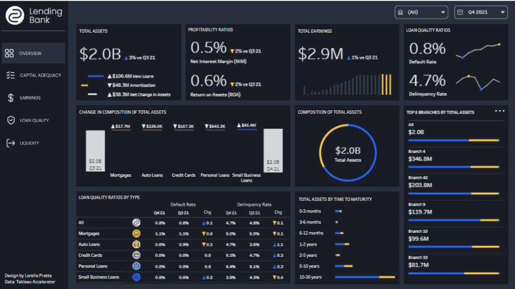
Purpose and Usage
This banking dashboard Tableau is crafted to serve multiple roles within a banking institution:
- Financial Executives: Utilize comprehensive financial data to gauge overall organizational health and make informed strategic decisions.
- Risk Managers: Analyze loan quality ratios and default rates across different loan types to effectively manage and mitigate associated risks.
- Loan Officers: Monitor the performance and composition of loan portfolios, assessing new loans, amortizations, and net asset changes.
- Branch Managers: Review data segmented by branch locations to evaluate local performance and optimize operations.
Chart Types and Layout
This Tableau banking dashboard examples employ several visualization types to convey financial data clearly and effectively:
- Bar Charts: Show changes in asset composition and are used to compare financial metrics across different loan categories.
- Line Graphs: Illustrate trends in profitability ratios like net interest margin and return on assets.
- Donut Charts: Display the composition of total assets and loan quality, providing a quick visual reference of financial distribution.
- Tabular Displays: List detailed metrics, including default and delinquency rates by loan type, facilitating detailed analysis.
Positive Aspects
The dashboard bank’s design is streamlined and user-friendly, offering easy access to complex data through well-organized charts and graphs. Its interactivity allows users to drill down into specific data points, enhancing the analysis capabilities for detailed insights.
Negative Aspects
However, the high information density and advanced financial metrics may challenge users without a deep understanding of banking analytics. The similar visual style across different sections could lead to confusion, requiring a more apparent distinction between various data sets to enhance readability.
Summary
Overall, this banking Tableau dashboard effectively synthesizes crucial data on financial management into actionable insights. It is a vital tool for financial professionals, empowering them to manage risk proactively. Improvements in user interface design and perhaps simplifying the visual presentation could make it more accessible to a broader range of users within financial institutions.
#4 Tableau Bank Dashboard Example: Wealth and Banking – Advisor Performance
The image showcases a sophisticated banking Tableau dashboard, meticulously designed in Tableau for financial institutions, aimed at monitoring and analyzing wealth management metrics. This dynamic dashboard provides a detailed look at financial advisors’ key performance indicators (KPIs), including assets under management, the number of assets, client metrics, and risk assessments—vital for enhancing financial advisory services.
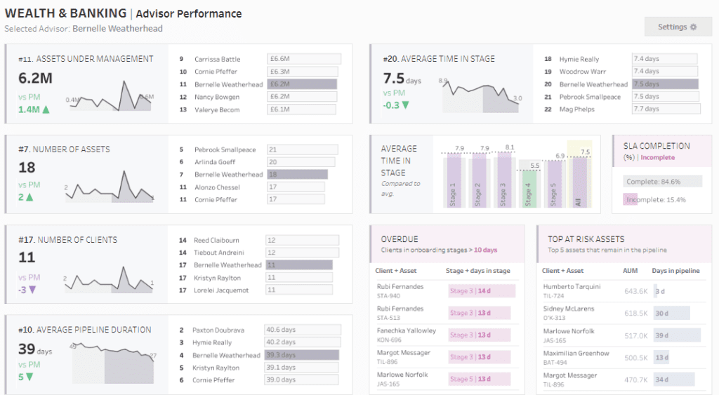
Purpose and Usage
This bank dashboard is instrumental for various stakeholders within a financial organization:
- Wealth Managers: Assess advisor performance, track assets under management, and understand asset composition.
- Compliance Officers: Monitor adherence to regulatory requirements and internal risk policies through SLA completion rates and tracking of overdue onboarding stages.
- Risk Managers: Evaluate the risks associated with specific assets and client engagements to manage and mitigate potential financial exposures effectively.
- Operational Managers: Use pipeline duration metrics and client onboarding stages to streamline operations and improve client service efficiency.
Chart Types and Layout
This banking KPI dashboard utilizes multiple visualization types to communicate complex data:
- Sparklines and Area Charts: Track changes in assets under management and the average duration of the pipeline.
- Bar Charts: Show the number of assets each advisor manages and provide breakdowns of risk assessments.
- Tables: Offer detailed listings of assets, client numbers, and performance metrics for individual advisors.
- Heat Maps and Conditional Formatting: Highlight critical areas such as overdue onboarding processes and at-risk assets, facilitating rapid issue identification and resolution.
Positive Aspects
The dashboard bank is renowned for its comprehensive visualization of essential data, facilitating straightforward understanding and strategic decision-making. Its interactive features allow for deep dives into specific data points, enhancing its utility for detailed analysis.
Negative Aspects
However, the complexity and volume of information in this banking dashboard Tableau might overwhelm users unfamiliar with financial analytics. Moreover, using similar visual styles across different sections could lead to confusion, necessitating a more apparent distinction between data sets.
Summary
Overall, this Tableau banking dashboard example is a powerful analytical tool for financial institutions, integrating detailed data presentation with functional design to support effective decision-making and risk management. Enhancements in visual differentiation among data presentations could further boost its usability and accessibility.
#5 Tableau Bank Dashboard Example: Banking – Customer Insights
The image displays a “Customer Insights” bank dashboard, meticulously designed in Tableau to furnish a comprehensive view of customer data for financial institutions. This sophisticated banking Tableau dashboard is tailored to optimize customer relationship management by identifying upsell and cross-sell opportunities, highlighting at-risk customers, and tracking significant life events that could influence banking needs.
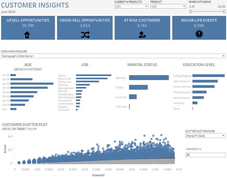
Purpose and Usage
This dashboard bank tool is indispensable for various roles within the financial sector:
- Marketing Teams leverage it to customize product offerings and campaigns based on detailed demographic insights.
- Sales Representatives use it to effectively pinpoint and act on upsell or cross-sell opportunities.
- Risk Managers evaluate the profiles of at-risk customers to mitigate potential losses.
- Customer Service Managers oversee major life events to provide timely and personalized service enhancements.
Chart Types and Layout
The banking Tableau dashboard utilizes a variety of chart types to convey complex data effectively:
- Bar Charts: Visualize demographic distributions such as age, job, marital status, and education level, enabling quick comparative analysis against targets.
- Scatter Plots: Depict customer value and behavior, helping to identify trends and outliers in customer profitability and engagement.
Positive Aspects
This banking KPI dashboard’s key strength is its comprehensive data visualization approach, facilitating rapid insights into customer behaviors and preferences. Integrating diverse metrics allows for a multi-dimensional customer base analysis, enhancing targeted marketing strategies and risk management. The dashboard’s interactive features enable users to delve into specific data points for a more detailed view, increasing its utility for strategic decision-making.
Negative Aspects
However, the dense clustering of various charts could lead to a cluttered view, potentially overwhelming users unfamiliar with intricate data platforms. Additionally, using similar color schemes across multiple charts may result in visual confusion, hindering the quick distinction between different datasets.
Summary
Overall, this Tableau banking dashboard example provides an essential analytical tool for financial institutions. It offers in-depth insights into customer demographics and behaviors, supporting strategic business decisions to enhance customer relationships and profitability. Enhancements in layout clarity and color differentiation could further increase its usability and effectiveness.
# 6 Tableau Bank Dashboard Example: Wealth and Banking – Advisor View
The image showcases the “Wealth & Banking | Advisor View” dashboard, meticulously designed within Tableau for wealth management at financial institutions. This banking Tableau dashboard provides a detailed snapshot of key metrics crucial to evaluating an advisor’s performance, including assets under management, number of clients, and various stages of client engagement.
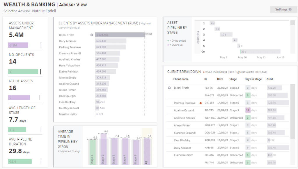
Purpose and Usage
This bank dashboard is designed for multiple roles within a financial organization:
- Wealth Advisors: Utilize it to monitor portfolio performance and client interactions and effectively distribute assets.
- Management Teams: Employ the dashboard to oversee advisor productivity, manage asset accumulation, and enhance client satisfaction across the organization.
- Risk Managers: Use it to evaluate risk across asset classes and client portfolios.
- Client Relationship Managers: To ensure efficient client service, track new client onboarding progress, and identify high-net-worth individuals for bespoke services.
Chart Types and Layout
The Tableau banking dashboard examples employ various visual representations to communicate complex information effectively:
- Bar Charts: Display demographic data such as age, job types, marital status, and education levels, allowing quick assessments.
- Line Graphs: Illustrate trends over time, especially in the average duration within pipeline stages.
- Tabular Listings: Offer detailed insights into client assets under management, showcasing significant investments or highlighting clients at risk due to incomplete service levels.
- Histograms: Present asset composition over time, shedding light on the liquidity and stability of managed assets.
Positive Aspects
The dashboard’s comprehensive approach thoroughly overviews an advisor’s clientele and asset management. Its interactive features allow for deep dives into specific metrics, proving essential for strategic planning and performance evaluation in wealth management.
Negative Aspects
However, its complexity might overwhelm those unfamiliar with financial analytics or novice Tableau users. The presentation’s data density might require a significant learning curve, and the similar color scheme across different charts could confuse users, making it hard to differentiate data sets quickly.
Summary
The banking industry thrives on precision, efficiency, and proactive management of financial activities and customer relationships. Tableau’s robust visualization capabilities make it an indispensable tool for banking professionals seeking to transform data into strategic insights. The six banking Tableau dashboard examples we’ve explored showcase how different aspects of banking—from financial performance to compliance—can be effectively monitored and managed. By integrating these dashboards into their operations, banks can enhance decision-making, optimize processes, and deliver superior customer value. As the banking landscape evolves, adopting advanced analytics and visualization tools like Tableau will be essential in driving innovation and maintaining a competitive edge.