A stock market dashboard offers a powerful way to monitor and visualize key market data, helping users make informed investment decisions with clarity and speed. Whether tracking personal portfolios, analyzing market trends, or comparing company performance, a stock market dashboard simplifies complex data through interactive visuals and intuitive layouts. In this blog post, we explore five compelling examples of a stock market dashboard, each designed to serve a unique purpose—from investment tracking to sector analysis—making them valuable tools for anyone involved in the stock market.
Table of Contents
# 1 Stock Market Dashboard Example – 2022 Big Tech Company Stock Performance
This stock market dashboard titled Big Tech Stock Performance in 2022 visually summarizes the 1-month, 6-month, and 1-year stock performance of 14 major technology companies as of December 29, 2022. Each row represents a different company, including well-known names like Apple, Microsoft, Tesla, and Netflix. For each timeframe, the stock market dashboard shows the percentage change in stock price (labeled ∆) and a trend chart visualizing the stock’s performance over time.
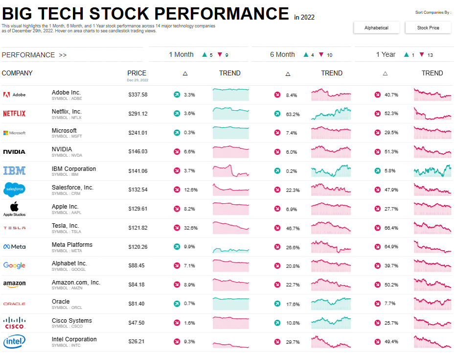
The charts used are mini area charts, which provide a quick visual snapshot of each stock’s upward or downward trend across the selected periods. These visuals are color-coded: green for gains and red for losses, helping users easily identify overall trends at a glance.
Additionally, the stock market dashboard includes sorting options by company name or stock price, and it marks companies with performance increases or declines using arrows and color-coded indicators.
This stock market dashboard is handy for investors, financial analysts, enthusiasts, and business journalists. It enables a quick comparison of stock trends across leading tech firms and supports informed decision-making regarding tech-sector investments or market sentiment analysis over the past year.
#2 Stock Market Dashboard Examples -Tech Giant’s Stock Performance (2020-2023)
This stock market dashboard titled Tech Giants’ Stock Performance: A Three-Year Review (2020–2023) provides a comprehensive overview of how leading technology companies have performed over the past three years. This stock market dashboard features major players like Apple, Google, Microsoft, Amazon, and Meta, displaying key metrics such as current stock price, price change compared to the previous year, high and low price points, trading volume, and volume trends.
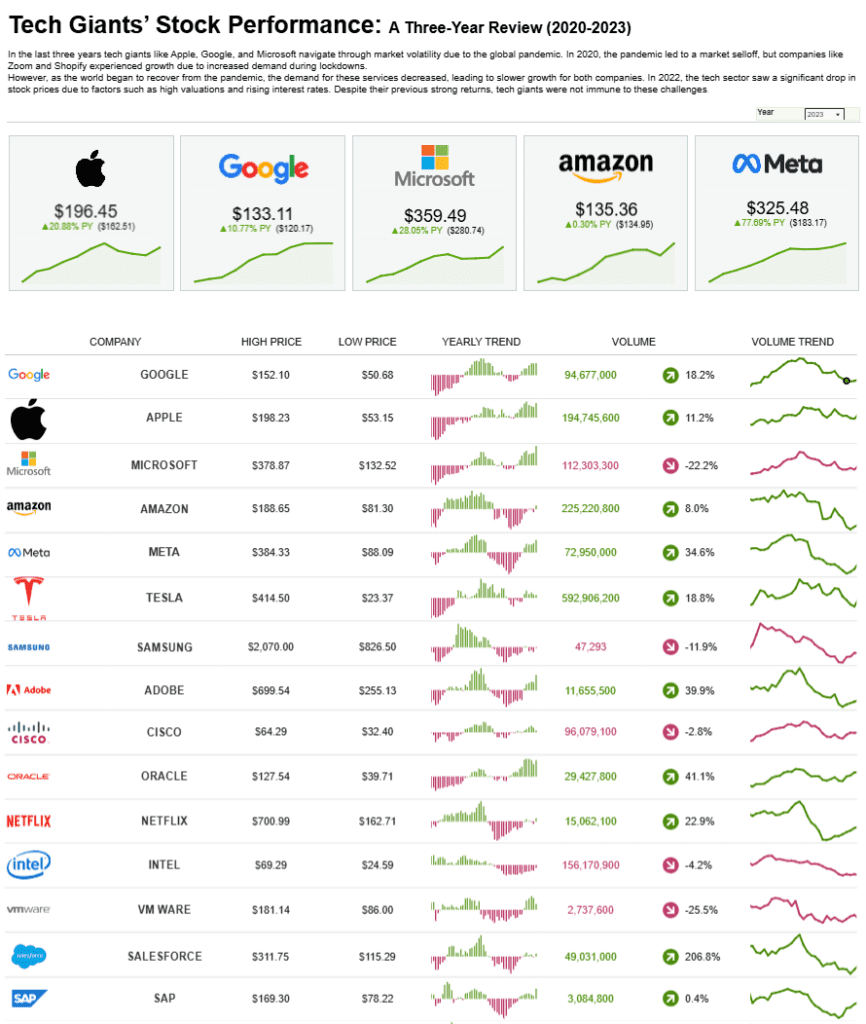
At the top, the stock market dashboard highlights five tech giants with large tiles showcasing their current prices and percentage growth or decline over the past year. Below, a detailed table lists each company’s high and low prices, yearly stock trends represented by mini bar charts, current trading volume, and a volume trend chart for visual context.
The mini bar charts provide insight into the yearly stock trend, using green and red to indicate gains and losses. To the right, volume trend line charts show how investor interest and activity have changed.
This stock market dashboard is helpful for investors, analysts, financial advisors, and journalists who need a straightforward and quick comparison of long-term stock performance among top tech companies. It helps assess market behavior, investor sentiment, and trading activity at a glance.
#3 Stock Market Dashboard Examples – Winners & Losers of the Coronavirus Stock Market
This stock market dashboard, “Winners & Losers of the Coronavirus Stock Market,” visually analyzes how the COVID-19 pandemic impacted various industries and companies from June 2019 to April 2020. It divides the data into key sectors—Travel, Web/Tech, Entertainment, and Food—highlighting the companies that suffered heavy losses and those that saw significant growth.
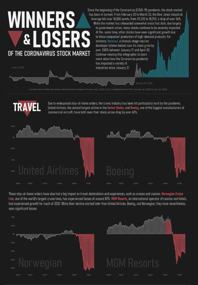
The stock market dashboard uses area charts to depict percentage price changes over time. Red areas show declines, while blue indicates gains. The timeline for each chart starts in mid-2019 and tracks the stock movement through the height of the pandemic. This makes it easy to visually assess the exact point at which each company experienced sharp changes in stock performance.
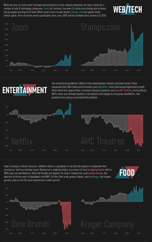
Sectors like Travel (e.g., United Airlines, Boeing, Norwegian, MGM Resorts) show steep declines, with some companies losing over 60%. In contrast, Web/Tech companies like Zoom experienced substantial gains. The entertainment sector has a mixed impact, with Netflix growing and AMC Theatres plummeting. Sit-down restaurants like Dine Brands suffered in the food industry, while grocery chains like Kroger saw modest growth.
This stock market dashboard is ideal for economists, analysts, investors, and business strategists seeking to understand the pandemic’s sector-specific impacts on market performance.
#4 Stock Market Dashboard Examples – Fortune Stock Picks 2019
This stock market dashboard showcases the performance of Fortune Magazine’s 2019 stock picks, tracking how selected stocks have performed since their recommendation in December 2018. The dashboard is divided into sectors: Financial, Tech, Biotech & Health Care, and Retail. It displays the current stock price and the percentage change from the original recommendation.
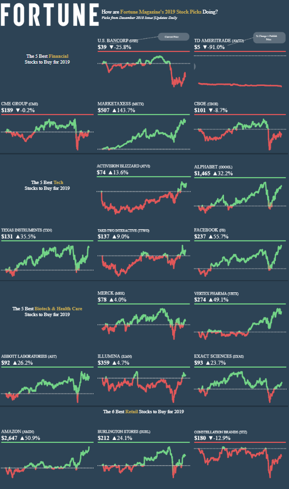
Each stock is represented by a line chart showing the price movement over time. Green segments indicate periods of growth, while red highlights declines. This visual approach lets users quickly assess which stocks outperformed or underperformed and observe each case’s volatility and long-term trends.
Top gainers include MarketAxess (+143.7%), Facebook (+55.7%), and Amazon (+50.9%), while significant losses are evident in TD Ameritrade (–91.0%) and Constellation Brands (–12.9%). Including winning and losing picks gives a balanced view of stock market performance based on expert recommendations.
This stock market dashboard is valuable for investors, portfolio managers, financial journalists, and market researchers who want to evaluate the accuracy of past stock recommendations and understand performance patterns across various sectors. It also serves as a reference point for assessing investment strategy outcomes over time.
#5 Stock Market Dashboard Examples – Investment Portfolio Dashboard
This stock market dashboard, Investment Portfolio Dashboard, presents a detailed snapshot of an investor’s portfolio performance as of July 23, 2021. It highlights the total investment, current portfolio value, and overall gain/loss in numerical and percentage terms. A time-series line chart at the center tracks the total gain/loss trend over 6 weeks.
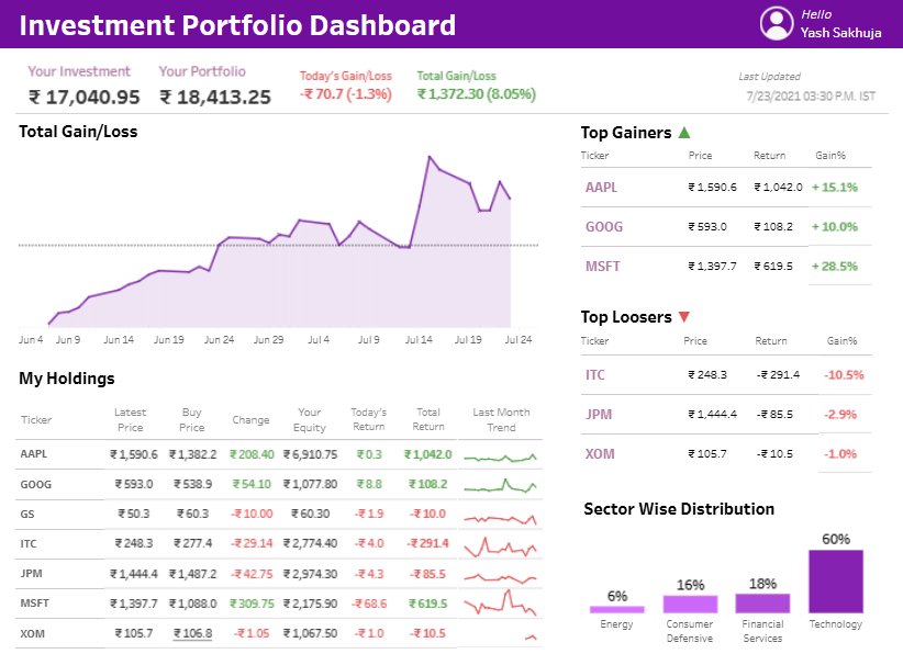
The stock market dashboard breaks down holdings in a table format, listing ticker symbols, latest and buy prices, price changes, equity value, daily returns, total returns, and a mini trend chart showing each stock’s one-month performance. The top gainers and losers are shown on the right, ranking stocks by gain percentages. For example, MSFT leads the gainers with a 28.5% increase, while ITC shows a loss of 10.5%.
At the bottom right, a bar chart displays the portfolio’s sector-wise distribution. Technology leads with a 60% allocation, followed by financial services, consumer defensive, and energy.
This stock market dashboard is handy for individual investors, financial advisors, and portfolio managers. It offers a clear view of investment performance across stocks and sectors, enabling informed decision-making and quick identification of high and low-performing assets.
The right stock market dashboard can transform how you analyze and respond to market activity. From comprehensive investment portfolios to sector-specific insights, the five examples featured in this post demonstrate how a stock market dashboard can be tailored for various financial goals and audiences. Whether you’re a seasoned trader or a casual investor, having the ability to visualize market data clearly and efficiently is a game-changer. As technology continues to evolve, so will the sophistication of each stock market dashboard—offering even greater accuracy, customization, and accessibility. Choosing the right one depends on your needs, but each is a step toward smarter, more strategic investing.