Whether it’s tracking vendor costs, procurement, or project expenses, a well-constructed spend dashboard offers real-time insights into where your money is going. These tools provide a clear visual representation of financial data, allowing for better decision-making, cost control, and optimized budget allocation.
With the right spend analytics, companies can reduce unnecessary costs and uncover valuable opportunities for financial efficiency. This post will showcase five spend analysis dashboards that offer unique features, helping businesses enhance their spend management strategies and improve overall economic performance.
Table of Contents
1. Spend Analytics Dashboard
The spend analytics dashboard is a comprehensive executive summary designed to provide a high-level overview of a company’s spending metrics, specifically comparing November 2020 to November 2019. Key metrics such as Total Spend, Spend per Vendor, Number of Active Vendors, and New Vendors are displayed at the top using simple numeric values and line graphs. These components reflect percentage changes from the previous year, allowing quick insight into trends.
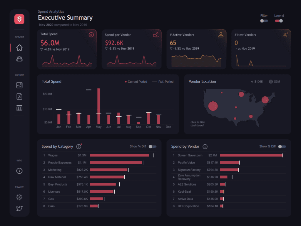
The central section features a bar chart visualizing Total Spending over the months of the current and reference periods, highlighting differences between the two. This type of spend analysis example helps identify spending peaks, such as the spike in May. To the right, a map shows vendor locations, with bubble sizes representing varying spending amounts across different regions.
In the lower half, two bar charts provide more granular details. The Spend by Category chart breaks down amounts across categories such as Wages, Marketing, and Raw Materials, alongside percentage differences from the prior period. This is a valuable aspect of spend analysis dashboards, which helps track department budget adjustments. Similarly, the Spend by Vendor chart lists the top vendors by spend, showing individual changes over time.
This spending dashboard is essential for decision-makers as it enables a clear understanding of key financial patterns. By visualizing vendor concentration, cost categories, and monthly fluctuations, the spend analytics dashboard helps companies manage expenses, refine procurement strategies, and optimize vendor relationships. The interactive elements, such as filtering options, make it a powerful tool for ongoing financial management.
2. Procurement Spend Analytics Dashboard
This spend analytics dashboard provides a comprehensive overview of a company’s financial metrics for December 2020 on a year-to-date basis. Critical metrics at the top include Total Spending ($98.8M), Active Vendors (124), New Vendors (1), and Spend per Vendor ($797K). These metrics, displayed through line graphs, help visualize year-over-year trends, making it easier to assess performance compared to the previous period.
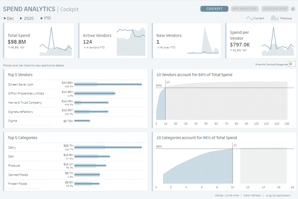
In the middle section, the spend dashboard highlights the Top 5 Vendors by total spend, with Screen http://Saver.com leading at $24.6M, followed by Sifton Properties Limited and Harvard Trust Company. These bar charts also illustrate percentage increases for each vendor, providing clear spend analysis examples by identifying where spending has grown the most. A cumulative line chart reveals that ten vendors account for 84% of total expenditure, offering insights into vendor concentration, a critical aspect of spend analysis dashboards.
The lower section breaks down the Top 5 Categories by spend, with Dairy leading at $25.7M. Percentage changes accompany each category’s total spending, and a cumulative line chart shows that 10 categories account for 96% of total expenditure. This visualizes how spending is distributed across categories in an easily digestible format.
This spend analytics dashboard is vital for companies to identify where most of their budget is allocated by vendor and category. Various charts provide actionable insights for optimizing vendor relationships, adjusting spending, and supporting data-driven procurement decisions, making it an essential tool for financial strategy planning.
3. AWS Cloud Spend Sample Dashboard
This AWS Cloud spend analytics dashboard offers a detailed view of cloud expenditure from January to September 2019, focusing on the current month’s spend, year-to-date totals, and service-specific breakdowns. The spend dashboard features various components to help decision-makers monitor and control cloud spending effectively.
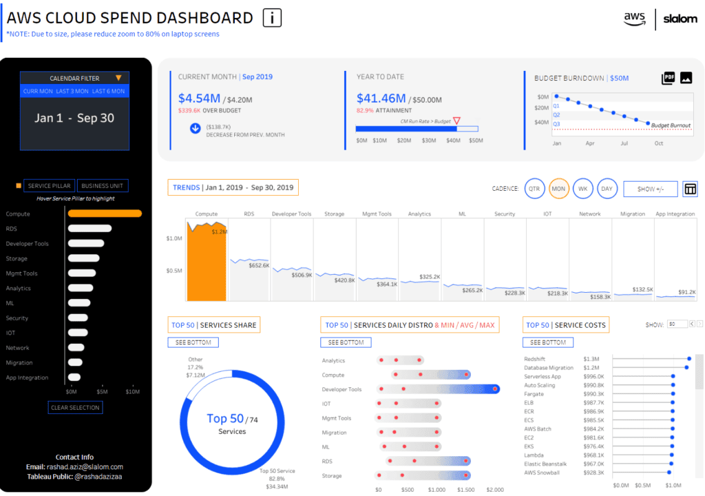
Key metrics are displayed prominently, with the current month’s cloud spend at $4.54M, slightly over budget by $339.6K. The year-to-date spend is $41.46M, representing 82.9% of the $50M budget. A Budget Burnout chart visualizes the spending trajectory over time, providing a clear example of how funds are consumed across quarters.
Several charts in this spend dashboard show spending breakdown by service pillars like Compute, RDS, and Developer Tools. These are displayed through line graphs and bar charts, offering examples of spending analysis by showing trends in spending across various services over time. For instance, the Trends section shows Compute leading with $1.2M in expenditures, followed by other services like RDS and Developer Tools.
A pie chart reveals the Top 50 Services Share, showing that the top 50 services account for 82.8% of total cloud spend, amounting to $34.34M. Additionally, a bar chart details the daily distribution of service costs, highlighting the minimum, average, and maximum expenditures for each service.
This spend analysis dashboard is crucial for companies managing cloud services. It allows them to monitor expenditures, identify cost-saving opportunities, and optimize resource allocation. Analyzing costs by service supports financial management within cloud infrastructures, ensuring companies stay within budget while maximizing operational efficiency.
4. Spend Analytics
This spend analytics dashboard provides a comprehensive executive summary of a company’s spending performance, comparing December 2017 to December 2016. The key metrics include Total Spend ($92.7M), Active Vendors (123), New Vendors (4), and Spend per Vendor ($753.9K). These top metrics are compared against the previous year’s performance, highlighting significant percentage increases and decreases.
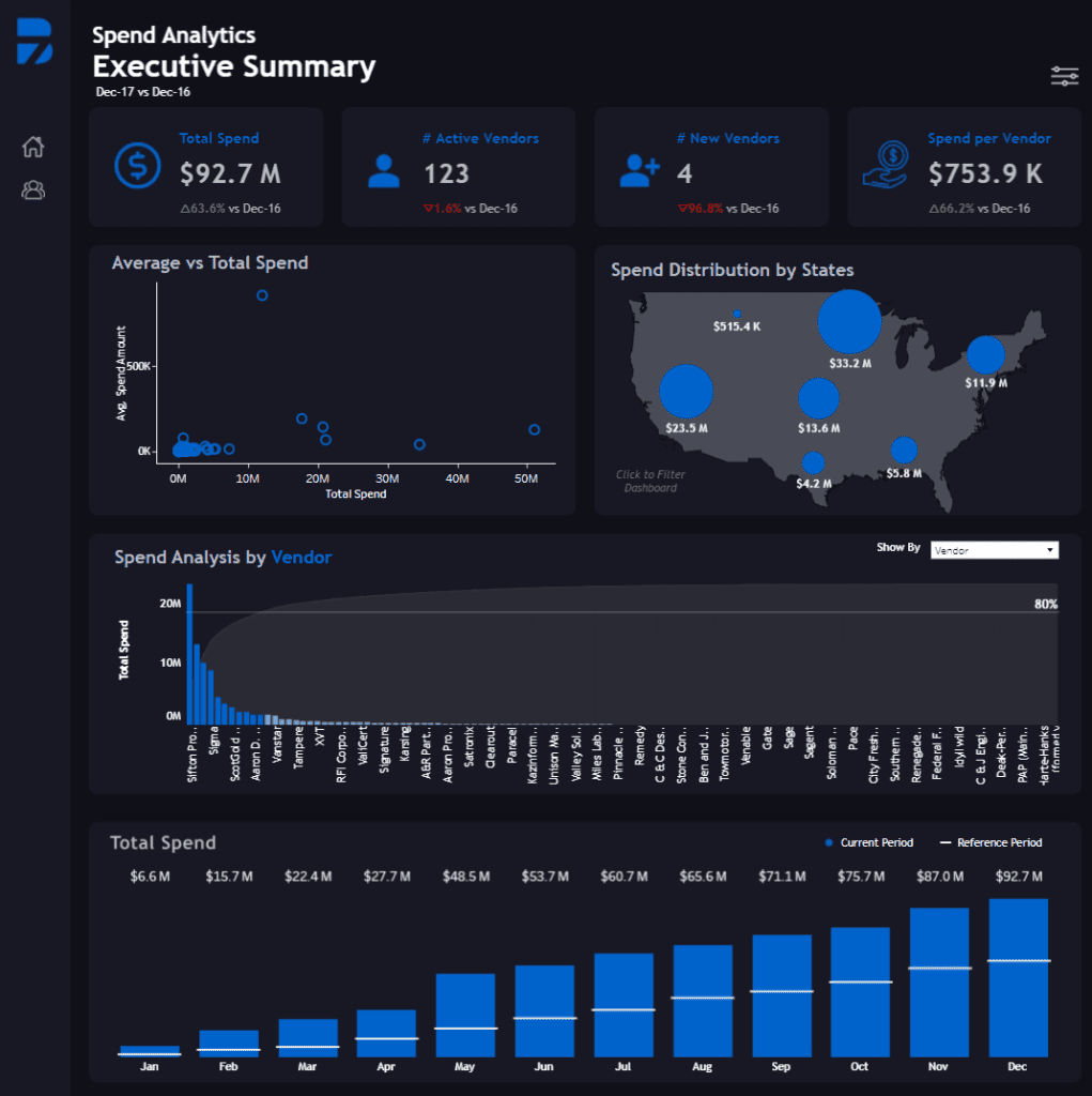
The dashboard uses a variety of charts to visualize data effectively. A scatter plot labelled “Average vs Total Spend” showcases how individual vendors contribute to the overall spending, plotting average spending against total spending for better vendor comparison. A geographical map highlights spending distribution by state, with bubbles sized according to the amount spent in each region. This helps visualize regional spending concentration, with states like California and New York receiving the highest allocations.
A “Spend Analysis by Vendor” chart employs a cumulative bar chart, showing the total spend across individual vendors. The chart effectively illustrates the distribution, with the most prominent vendors accounting for most of the total spending while smaller vendors contribute marginally. Finally, a bar chart at the bottom breaks down “Total Spend” month-by-month, comparing the current period to a reference period, making it easy to spot spending trends and growth across the year.
This spending dashboard is vital for a company as it offers a clear view of spending patterns, helping decision-makers track vendor performance, regional spending distribution, and monthly spending trends. With this spend analytics dashboard, companies can optimize their vendor relationships, control costs, and improve their overall financial strategy based on the data-driven insights provided.
5. Calgary Digital Transformation Spend
This spend analytics dashboard offers a comprehensive overview of Alberta’s digital transformation (DX) spending, highlighting its critical role in driving business growth across the province between 2021 and 2024. The spend dashboard prominently features a forecast projecting Alberta’s total DX spend to exceed $20 billion during this period, showcasing its importance in enhancing business resilience, remote work capabilities, and external digital engagement.
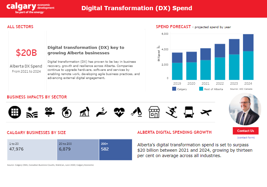
The primary chart is a stacked bar chart that provides clear spend analysis examples, breaking down DX spend by year (2019–2024) and region (Calgary vs. the rest of Alberta). This visualization helps users track growth trends and observe how spending is projected to rise significantly between 2022 and 2024.
Additionally, the spend analysis dashboard includes an infographic that represents business impacts by sector, using icons to illustrate industries such as energy, finance, healthcare, agriculture, transportation, and more. This highlights the diverse industries that benefit from digital transformation investments.
A table format displays the business size breakdown, detailing the number of businesses in Calgary by size category—small businesses (1-20 employees), medium businesses (20-200 employees), and large businesses (200+ employees). This segmentation in the spend analytics dashboard helps users understand how businesses of various sizes engage in digital transformation efforts.
This spend dashboard is crucial for companies and policymakers, providing actionable insights into Alberta’s digital transformation landscape. By showcasing spending trends, sector impacts, and business size data, it supports decision-makers in planning investments, developing digital strategies, and capitalizing on growth opportunities in a rapidly evolving economy.
Spend Dashboard Examples
Adopting a spend dashboard is essential in today’s business environment, as it offers the ability to track and analyze spending in real time. This gives companies a significant advantage by helping them identify cost-saving opportunities and improve resource allocation. By implementing the right spend analytics dashboard, organizations can turn financial data into actionable insights, ensuring smarter financial decisions and better outcomes. The spend analysis examples demonstrate how different dashboards can meet specific business needs, from managing vendor relationships to maintaining budget compliance. Whether for small businesses or large enterprises, integrating spend analysis dashboards is a crucial step towards achieving long-term financial success and sustainability.