A well-designed shipping dashboard has become indispensable for visualizing and analyzing complex data, providing actionable insights into shipment tracking, delivery performance, costs, and service levels. Whether managing global fleets, leveraging maritime analytics for international shipping, or monitoring SLA compliance, these dashboards empower decision-makers with real-time shipping analytics and performance metrics. This blog presents seven examples of innovative shipping dashboards that showcase diverse capabilities, including shipment tracking dashboards, cost optimization tools, and maritime analytics solutions.
Related posts:
- Best 12 Amazing Examples of Tableau Supply Chain Dashboards
- 8 Amazing Tableau eCommerce Dashboard Examples
- 9 Amazing Inventory Dashboards to Revolutionize Your Stock Management
- Check Out 13 Amazing Tableau Marketing Dashboard Examples
- 7 Amazing Help Desk Dashboard Examples
- Top 8 Procurement Dashboards for Amazing Purchasing Efficiency
These examples demonstrate how businesses can streamline operations, enhance customer satisfaction, and improve Shipping dashboards, which have revolutionized how businesses manage logistics, enabling real-time tracking of shipments, monitoring fleet performance, and optimizing shipping costs. The seven examples shared in this blog highlight the adaptability of shipping dashboards, addressing a wide range of business needs, from shipment tracking dashboards to advanced maritime analytics solutions.
Table of Contents
# 1 Shipping Dashboard Example – ABC Shipping Logistics
This shipping dashboard is designed to provide an overview of ABC Shipping Logistics, showcasing key performance metrics and shipment trends. It is beneficial for logistics managers, supply chain analysts, and operations teams who rely on shipping analytics to monitor shipment statuses and carrier performance effectively.
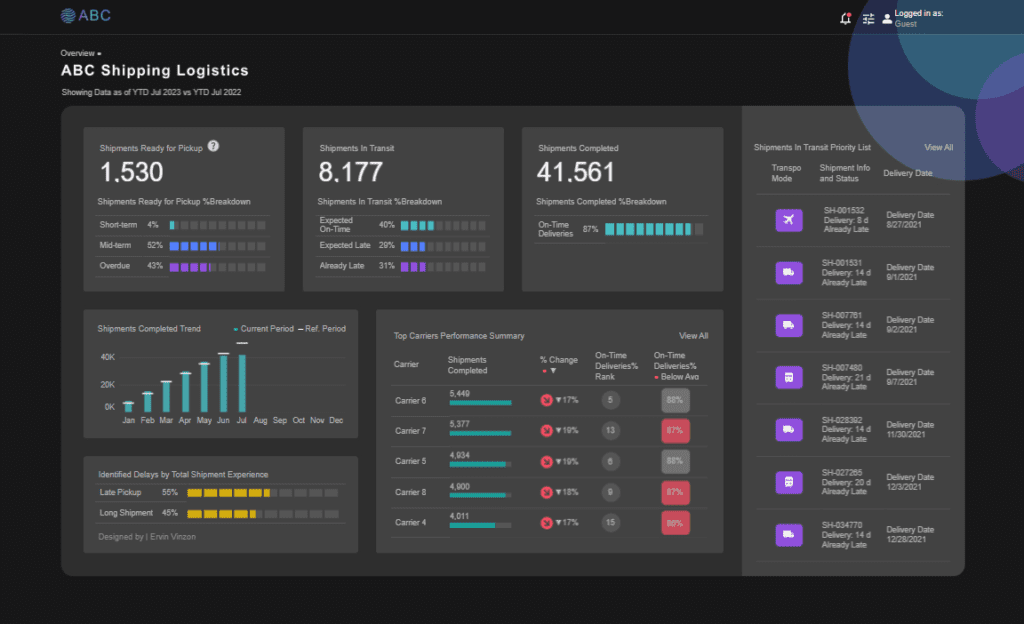
The shipment tracking dashboard includes several types of visualizations:
- Key Metric Cards: Large numerical indicators display crucial data points such as Shipments Ready for Pickup, Shipments In Transit, and Shipments Completed. These cards include percentage breakdowns visualized through bar charts highlighting short-term, mid-term, overdue, on-time, and late shipments.
- Trend Line Chart: A bar chart illustrates the monthly trend for completed shipments, comparing the current period with a reference period. This helps identify seasonal or monthly performance trends in shipping analytics.
- Stacked Bar Chart: The Identified Delays by Total Shipment Experience section uses a horizontal stacked bar chart to show the proportions of late pickups versus long shipment times.
- Performance Table: This summary table presents carrier performance, including completed shipments, percentage change, and on-time delivery rankings. Color-coded indicators highlight changes and below-average performance.
- List View: The Shipments In Transit Priority List section provides a detailed table of delayed shipments, delivery statuses, and modes of transport, offering maritime analytics insights.
This shipping dashboard is ideal for identifying delays, improving carrier performance, and ensuring timely delivery of shipments.
#2 Shipping Dashboard Example – Good to Go (G2G) Shipping Dashboard
This shipping dashboard provides a detailed overview of a shipment’s progress, tracking its journey from the origin to the destination. It is designed for real-time shipment tracking users, such as logistics managers, e-commerce businesses, or individual customers. The interface combines summary information and detailed tracking data, making it a valuable tool for shipping analytics.
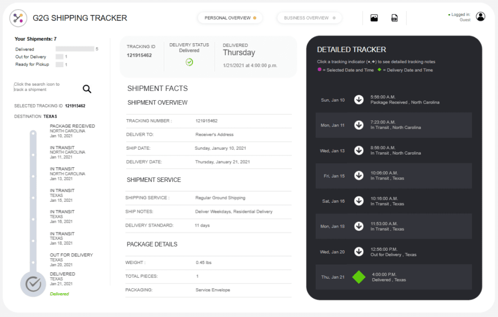
The shipment tracking dashboard incorporates the following elements:
- Timeline Chart: On the left side, a vertical timeline visually tracks the shipment’s milestones, such as package receipt, in-transit updates, and delivery completion. Each stage is marked with timestamps and status updates, ensuring users can monitor progress effectively.
- Critical Metric Section: A summary area highlights the delivery status, tracking ID, and destination. It includes a clear status indicator (“Delivered”) for quick reference.
- Detailed Table: On the right, a chronological table provides granular details, including timestamps and location updates, aligning with the visual timeline to enhance shipment tracking accuracy.
- Shipment Overview Section: This section displays essential shipment details, such as weight, shipping service, delivery date, and additional notes, offering insights relevant to maritime analytics and overall performance.
This shipping dashboard is ideal for tracking delivery timelines, analyzing shipping performance, and enhancing shipment visibility with shipping analytics.
#3 Shipping Dashboard Example – Shipping Logistics Dashboard
This shipping dashboard comprehensively overviews vital metrics and performance indicators for managing shipping operations. It is ideal for supply chain managers, logistics analysts, and decision-makers who require actionable insights through shipping analytics to optimize performance, costs, and efficiency.
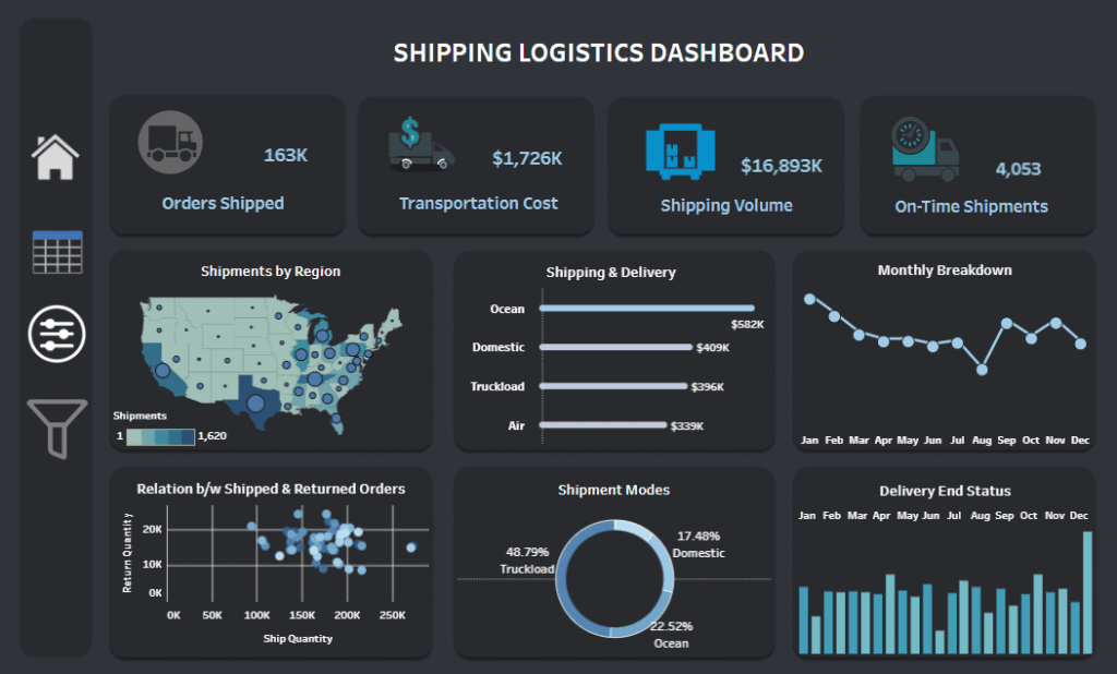
The shipment tracking dashboard uses a variety of visualizations to present data:
- KPI Cards: At the top, key performance indicators display vital metrics such as orders shipped, transportation costs, shipping volume, and on-time shipments. These metrics deliver a quick snapshot of operational performance.
- Heatmap Chart: The “Shipments by Region” section uses a geographical map to visualize shipment density across different regions, offering insights into regional demand and distribution patterns.
- Bar Charts: The “Shipping & Delivery” section employs horizontal bar charts to break down costs across shipping methods such as ocean freight, domestic transport, truckload, and air, which is relevant to maritime analytics.
- Line Chart: The “Monthly Breakdown” section presents trends over time, helping identify seasonal patterns in shipping volume.
- Scatter Plot: The “Relation Between Shipped & Returned Orders” section analyzes correlations between shipped quantities and returns.
- Pie Chart: The “Shipment Modes” section highlights the percentage breakdown of shipment methods.
- Bar Graph: The “Delivery End Status” section visualizes monthly delivery performance.
This shipping dashboard streamlines shipment monitoring and enhances operational insights.
#4 Shipping Dashboard Example – SLA Shipping Scorecard
This SLA shipping dashboard analyses order shipping performance and adherence to Service Level Agreements (SLAs). It is designed for operations managers, logistics teams, and supply chain analysts to leverage shipping analytics to monitor delivery times, identify SLA breaches, and improve shipping efficiency.
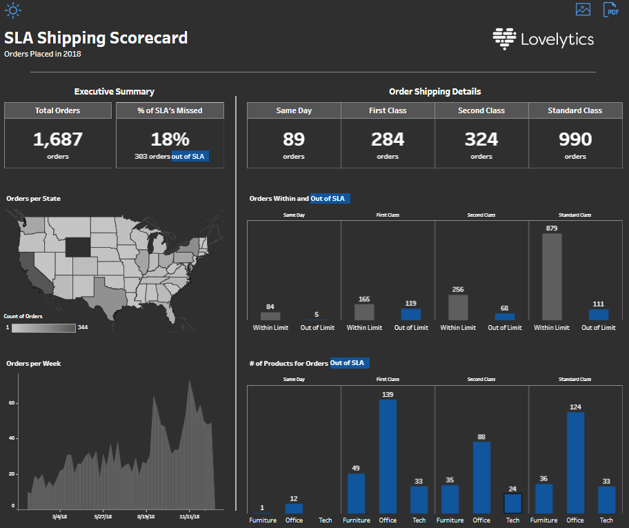
The shipment tracking dashboard employs several types of visualizations:
- KPI Cards: The Executive Summary highlights critical metrics such as total orders, percentage of missed SLAs, and orders out of SLA. These cards provide an at-a-glance overview of shipping performance.
- Choropleth Map: The “Orders per State” section uses a map to visualize the distribution of orders across states, with shading to indicate order volume, offering regional insights.
- Bar Charts:
- The “Orders Within and Out of SLA” section breaks down SLA compliance for shipping methods (Same Day, First Class, Second Class, Standard Class), showing how many orders met or missed SLA limits.
- The “Number of Products for Orders Out of SLA” section uses grouped bar charts to display late shipment categories.
- Line Chart: The “Orders per Week” section tracks order volume trends over time, helping to identify peaks and seasonal patterns.
This shipping dashboard is essential for shipment tracking and maritime analytics. It enables actionable insights to improve delivery timelines and reduce SLA breaches.
#5 Shipping Dashboard Example – Shipping Logistics
This shipping dashboard, titled Superstore Shipping Logistics, provides a comprehensive view of order volumes, SLA compliance, and delivery performance across multiple shipping methods. It is a valuable tool for supply chain managers, operations analysts, and logistics teams to leverage shipping analytics and enhance operational efficiency.

The shipment tracking dashboard uses the following visualizations:
- KPI Cards: The Executive Summary presents critical metrics, including the total count of orders, the percentage of SLAs beyond the limit, and the number of SLA breaches. These cards provide a high-level overview of performance.
- Choropleth Map: The “Orders Per State” section utilizes a geographic map to display the distribution of orders across the United States, with shaded regions reflecting order density.
- Bar Charts:
- The “Orders Within and Out of SLA Limit” section visualizes SLA compliance by shipping methods, such as Same Day, First Class, Second Class, and Standard Class.
- The “Products for Orders Out of SLA Limit” section categorizes late shipments by product types, including furniture, office supplies, and technology.
- Line Chart: The “Orders Per Week” section illustrates order trends over time, helping to uncover seasonal patterns and fluctuations.
This shipping dashboard is essential for tracking SLA performance and improving logistics operations. It also integrates insights relevant to maritime analytics when evaluating specific shipping modes.
#6 Shipping Dashboard Example – Logistics Shipping Dashboard
This comprehensive shipping dashboard provides detailed insights into shipment operations, costs, service levels, and performance metrics, making it an essential tool for supply chain managers, logistics analysts, and operations teams. Designed to enhance shipping analytics, it helps optimize costs, monitor on-time deliveries, and track shipment modes effectively.
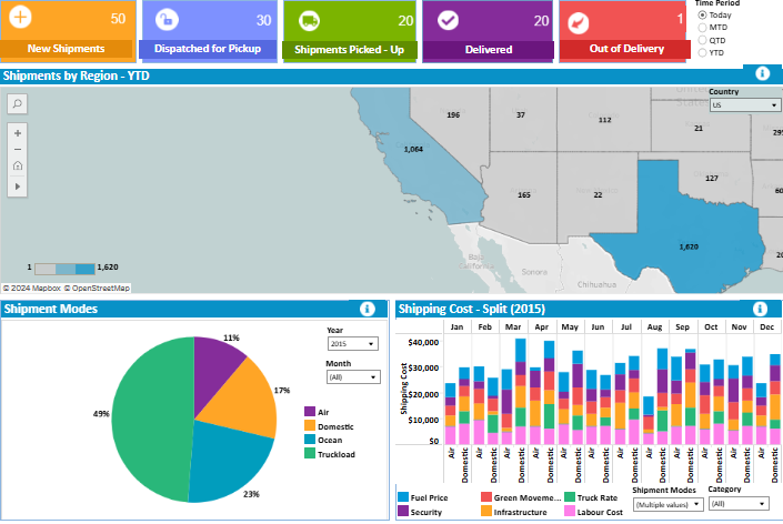
The shipment tracking dashboard features multiple visualizations:
- KPI Cards: Key metrics such as new shipments, shipments dispatched for pickup, delivered shipments, and out-of-delivery counts are displayed for real-time updates, ensuring users can quickly assess performance.
- Choropleth Map: The “Shipments by Region” section uses a geographic map to highlight shipment density across various regions, providing geographic insights critical for logistics planning.
- Pie Chart: The “Shipment Modes” section visualizes the distribution of shipments by mode (air, domestic, ocean, truckload), offering valuable maritime analytics insights for ocean-based shipping.
- Stacked Bar Chart: The “Shipping Cost – Split” section shows a detailed breakdown of monthly costs, including fuel, labour, and security.
- Bubble Chart: The “Revenue by Volume” chart displays shipment revenue trends, with bubble size representing volume and weight.
- Bar Chart: The “Shipments by Service Level” section tracks shipment counts by delivery timeframes (e.g., 1 Day, International).
- Donut Charts: The “Service Failure” and “On-Time Delivery” sections clearly show performance metrics, reasons for failures, and delivery punctuality.
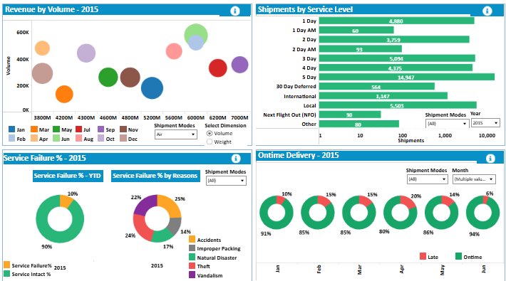
This shipping dashboard supports data-driven decisions and operational efficiency.
#7 Shipping Dashboard Example – Shipping
This shipping dashboard intuitively visualizes the top shipping companies and their fleet sizes, making it an essential tool for maritime analytics, supply chain strategists, and logistics managers. It highlights competitive data on fleet ownership, helping stakeholders analyze market share and shipping capacity across global maritime industry players.
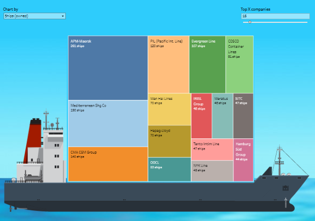
The dashboard uses the following visualizations:
- Treemap Chart: The primary visualization is a treemap, where each rectangle represents a shipping company. The size of each rectangle reflects the number of ships owned, offering a proportional comparison of fleet sizes. This visual format is ideal for quickly evaluating the relative capacities of major shipping companies.
- Interactive Features: The dashboard provides customizable options to filter data by fleet size or the number of top-ranking companies, enabling focused analysis and actionable insights.
The ship silhouette in the background enhances the maritime theme, creating a visually engaging interface while reinforcing the industry context.
This shipment tracking dashboard is valuable for stakeholders in the shipping and logistics industry who seek to leverage shipping analytics to assess market competition, analyze fleet capacity, and improve operational strategies in global maritime logistics.
Shipping dashboards have revolutionized how businesses manage logistics, enabling real-time tracking of shipments, monitoring fleet performance, and optimizing shipping costs. The seven examples shared in this blog highlight the adaptability of shipping dashboards, addressing a wide range of business needs, from shipment tracking dashboards to advanced maritime analytics solutions. By adopting these tools, organizations can achieve deeper visibility into their logistics operations, minimize inefficiencies, and drive data-driven decisions to enhance performance.
Whether focusing on regional distribution, global fleet management, or SLA compliance, these dashboards demonstrate how shipping analytics can transform supply chain strategies. Implementing the right shipping dashboard is an operational enhancement and a competitive advantage in today’s dynamic logistics environment.


