A scatter chart in Tableau is one of the most versatile and powerful tools in data visualization. It allows you to explore relationships between variables, identify patterns, and uncover trends in your data. This tutorial will explore creating a scatter plot in Tableau, a leading data visualization tool. Whether new to Tableau or looking to refine your skills, this guide will walk you through the essential steps to effectively build and customize scatter plots in Tableau.
We’ll cover everything from selecting the correct data, adjusting axes, and applying filters to enhancing your Tableau scatter chart with trend lines and custom formatting. By the end of this tutorial, you’ll have a solid understanding of leveraging a scatter plot chart in Tableau to make your data speak, providing clear and insightful visual stories that can drive better decision-making. Let’s get started on your journey to mastering Tableau scatter charts!
Table of Contents
Why use a scatter chart in Tableau
A data analyst would use a scatter chart in Tableau to visually explore and understand the relationship between two variables in a dataset. By plotting data points on a Tableau scatter chart, the analyst can quickly identify patterns, trends, and correlations that may not be immediately obvious in raw data. Scatter plots in Tableau are particularly useful for detecting outliers, understanding the distribution of data, and observing the strength and direction of relationships, whether linear or non-linear. This makes a scatter plot chart in Tableau an essential tool for hypothesis testing, predictive modelling, and data-driven decisions, as they provide clear and intuitive insights into complex data relationships.
Scatter Chart Examples
1 Scatter Plot Example
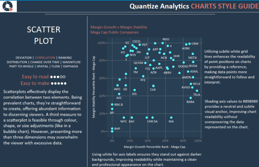
This dashboard is a style guide for creating a scatter chart in Tableau, focusing on best practices for visual clarity and data interpretation. It highlights the effectiveness of a Tableau scatter chart in displaying correlations between two variables, making them easy to read and create. The guide suggests enhancing readability by using subtle white grid lines, shading axis values with a neutral colour (#898989), and employing white axis labels for contrast against dark backgrounds. It also mentions that adding a third measure, such as size or colour, to scatter plots in Tableau can provide additional insights without overwhelming the viewer with excessive data.
2 Back2VizBasics
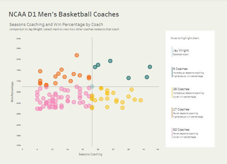
This scatter chart in Tableau visualizes the relationship between the number of seasons coached and the win percentage for NCAA D1 Men’s Basketball Coaches. Each dot on the Tableau scatter chart represents a coach, with the position on the chart indicating their coaching experience on the x-axis and their win percentage on the y-axis. The scatter plot chart in Tableau highlights specific comparisons to coach Jay Wright, using different colours to categorize other coaches based on their seasons coached and win percentage. This Tableau scatter chart allows users to easily compare coaches’ performance, identifying those with more or fewer seasons and higher or lower win percentages relative to Jay Wright.
3 Scatterplots_Quadrants
This image shows two scatter plots in Tableau demonstrating how to create equal-sized quadrants. The first scatter chart includes reference lines that divide the plot into four quadrants, with the x-axis representing sales and the y-axis representing quantity. The second Tableau scatter chart emulates a Magic Quadrant, with the x-axis labelled Vision and the y-axis as Ability to Execute. Different colours are used to categorize the data points by region, segment, and KPI, allowing for easy comparison across various categories within the quadrants and effectively highlighting performance distribution.
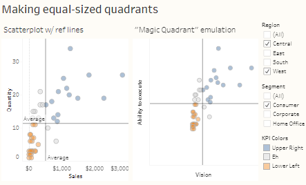
Tableau Scatter Chat Tutorial
A scatter chart in Tableau is a type of data visualization that uses dots to represent two numeric variables. Each dot on the scatter chart represents a single record from the dataset, with its position along the X and Y axes indicating the values of these two variables. Scatter charts are handy for identifying relationships or correlations between variables, spotting trends, and detecting outliers or unusual data points.
This tutorial will analyse market share and revenue totals across different date quarters. We’ll visually explore the relationship between these critical business metrics over time using Tableau scatter charts. This approach will allow us to identify trends, understand how market share impacts revenue within each quarter, and spot any outliers or exceptional cases that warrant further investigation. By the end of this tutorial, you should have a clearer understanding of how your market share fluctuations align with revenue changes across quarters, enabling you to make more informed strategic decisions.
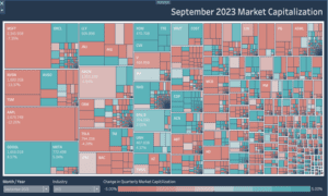
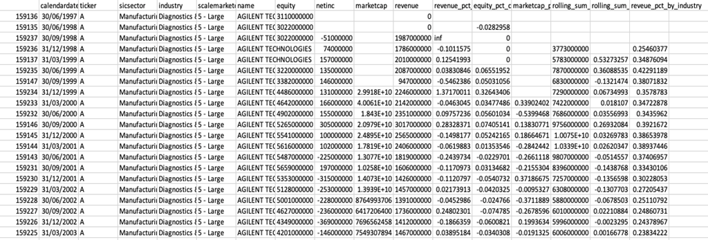
We will be using the following data for the scatter chart.
Step 1
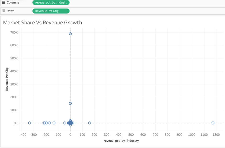
We must drag revenue-pct—by industry to the column and change the revenue-pct to rows. We must filter these to select all values and put them into columns and rows. Pct by industry needs to filter on non-null values.
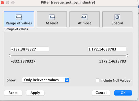
The filter will look like this after being put into columns and rows.
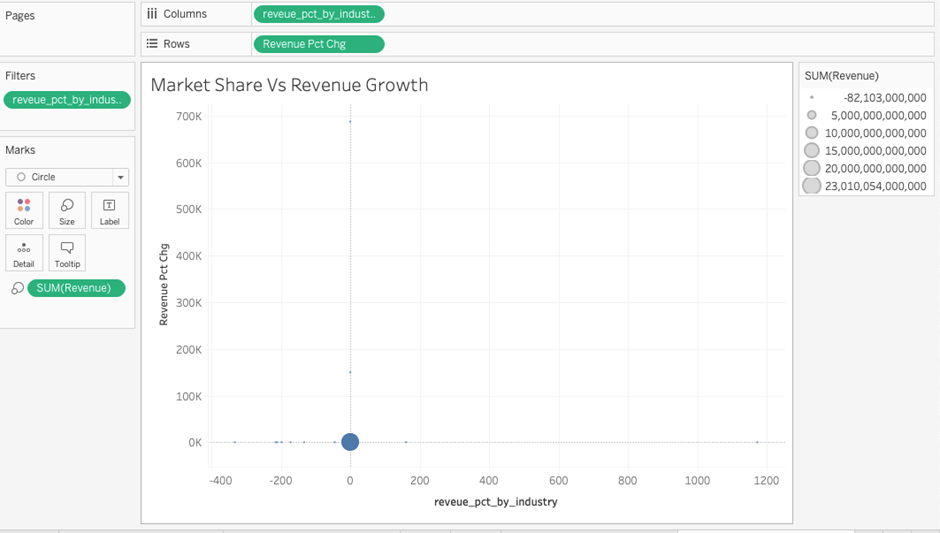
Step 2
Now, we need to convert revenue into size and change the marks to circles, which will look like this.
Step 3
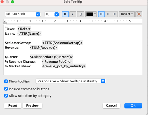
Now, we need to add the name and “scalarmarketcap” to the tooltip so that we can see the following specific details when we hover over them.
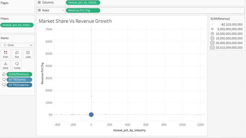
Setup the tooltip with the following data details
Step 4
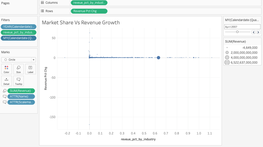
Now, we need to set the following filters. First, we need to create two exact dates from the calendar date for the month/year and quarters.
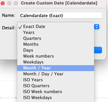
We need to select both to create two exact dates. We will add two dates, calendar date year and exact date month and year, to the filter and set the filter to the slider for month and year, which will look like this.
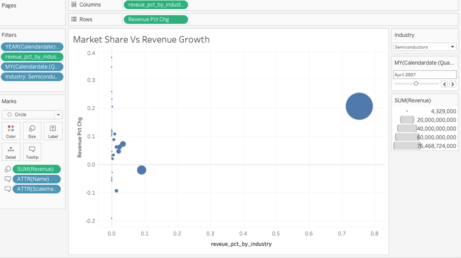
After that, we need the last industry filter and set it using a single value drop-down to select any specific industry, and it will look like this.
Step 5
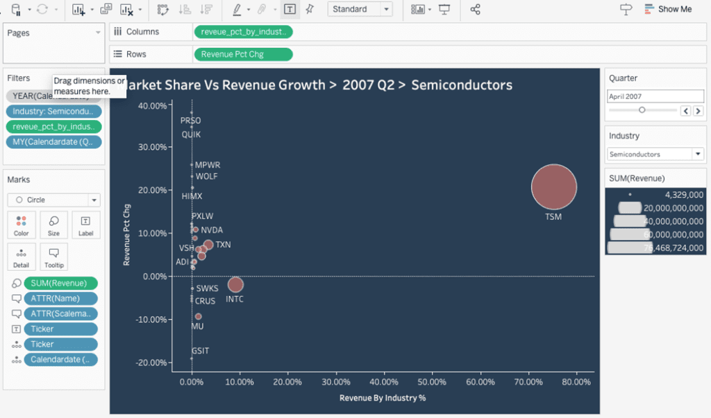
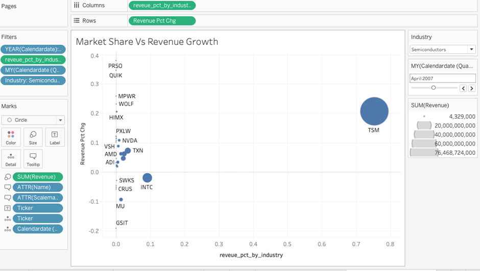
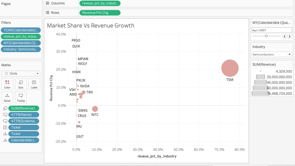
Now, we need to put a ticker and calendar date quarter, the exact date we created to detail the chart, and we also need to put a ticker to text to see the names on the circle. After this, the chart will look like this.
Step 6
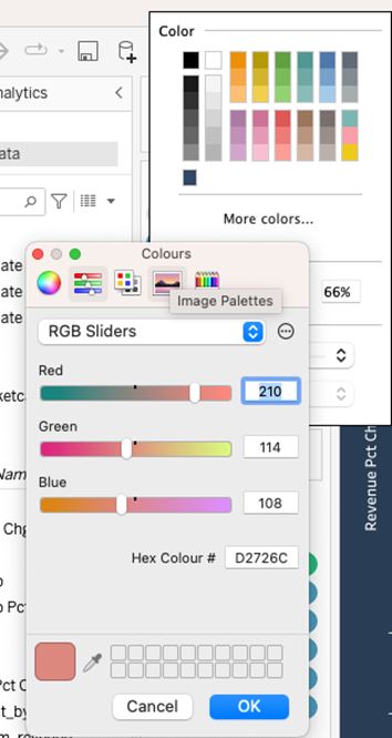
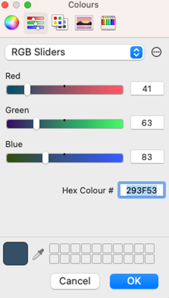
Select the custom colour for the following circle, which has an opacity of 66% and a slightly white border.
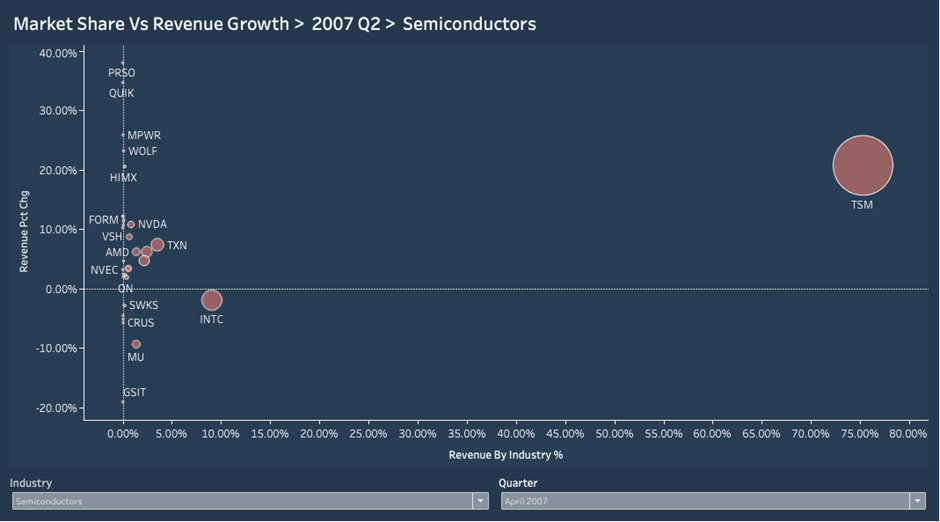
Also, format the worksheet and put both axis revenue pct by industry and revenue pct change to % by formatting, and it will look like this.
We must also set up a custom background colour, and our chart is ready.
With the following colour and some editing, our chart is ready and will look like this in the sheet.
After some formatting now, our chart is ready.

After putting it into the dashboard, it will look like this:
How to Create a Powerful Scatter Chart in Tableau
Mastering the scatter chart in Tableau is essential for any data analyst or business professional aiming to uncover meaningful insights from their data. A Tableau scatter chart provides a powerful way to visualize relationships between variables, identify trends, and detect outliers. Throughout this tutorial, we’ve covered creating a scatter plot in Tableau, customising it with colours, sizes, and reference lines, and interpreting the data to drive better decision-making.
By leveraging these features, you can transform raw data into explicit, actionable visual stories. Whether comparing performance metrics, exploring correlations, or segmenting data for deeper analysis, a well-crafted scatter plot chart in Tableau will significantly enhance your ability to communicate insights effectively. Keep practising with different datasets to refine your skills, and you’ll find that scatter plots Tableau has become an invaluable tool in your data visualization toolkit.