A well-designed risk dashboard provides straightforward, actionable insights into various risk areas—ranging from financial exposure and credit performance to operational threats and employee attrition. These visual tools help decision-makers quickly identify high-risk zones, track trends, and respond proactively. This blog will explore five compelling risk dashboard examples across different domains. Each example highlights how businesses can use data visualization to strengthen their risk management dashboard approach and make informed decisions that enhance resilience and performance.
Table of Contents
#1 Risk Dashboard – Banking – Credit Risk
This credit risk dashboard provides a comprehensive overview of key financial and risk indicators from January 2017 to December 2018. At the top, high-level metrics are summarized, including Assets ($2,396M), Liabilities ($1,426M), Expected Loss ($32M), Risk Score (0.4267), and At-Risk Accounts (1,868). Each metric includes a trend line and percentage change, giving insight into year-over-year performance and risk movement.
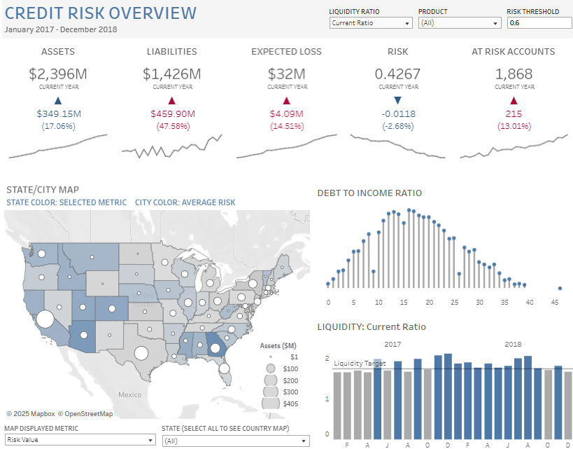
Several chart types are utilized in this risk management dashboard:
- KPI cards with trend lines for key metrics.
- A US map with colour-coded states based on selected metrics and bubble sizes representing asset amounts.
- A scatter/bar combo chart showing the Debt-to-Income Ratio distribution.
- A bar chart for Liquidity (Current Ratio) over time, benchmarked against a target.
Filters at the top allow users to adjust the liquidity ratio type, product category, and risk threshold, enabling dynamic exploration of risk scenarios.
This is one of the most effective risk dashboard examples for credit risk managers, financial analysts, and executives who need to monitor portfolio health, identify high-risk areas, and make data-driven decisions to mitigate risk. It also helps regional managers understand state-wise risk exposure and performance trends.
#2 Risk Dashboard – RISK ANALYSIS – OPERATIONAL RISK
This operational risk dashboard highlights the growing threat of theft and fraud in Indian banks, revealing a 65% increase in robbery and theft cases over the last five years. The risk dashboard uses multiple charts to provide insights into the scale, location, and trends of operational risk incidents across the banking sector.
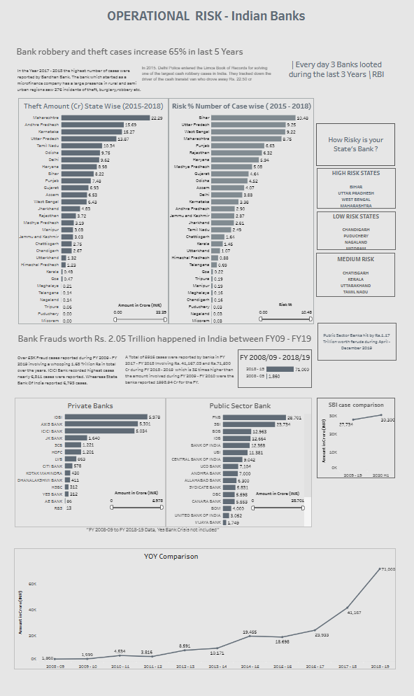
Bar charts display theft amounts and the number of theft cases by state (2015–2018), with Maharashtra and Bihar topping the list regarding the financial impact and case count, respectively. Based on these metrics, another section uses a risk heatmap to classify states into high, medium, or low risk. Separate bar charts show the amount of fraud by individual private and public sector banks, clearly illustrating that Punjab National Bank and State Bank of India have reported the highest amounts.
A line chart at the bottom presents a year-on-year (YOY) comparison of fraud cases from FY 2008–09 to FY 2018–19. It shows a dramatic increase in the value of frauds, peaking at ₹71,000 crore in FY19.
This risk management dashboard is essential for bank executives, compliance officers, auditors, and regulators. It is a strong contender among risk dashboard examples and supports data-driven strategies by identifying vulnerable regions and institutions.
#3 Risk Dashboard – RISK & COMPLIANCE – Risk Register
This risk dashboard provides a detailed executive summary and historical overview of risks within an organization as of 25 September 2023. It is a well-structured risk management dashboard that tracks high, medium, and low-level risks across various departments like operations, supply, quality assurance, financials, and contract administration.
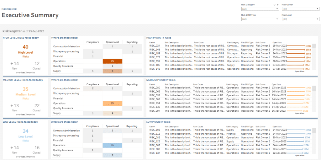
The executive summary view uses KPI tiles and heatmap-style tables to show the number of risks by severity level and where those risks are concentrated. Bar indicators display how long each risk has been open. The risk dashboard also includes detailed tables of individual risk items, showing their category, description, root cause, owner, and open date.
The historical risks view shows when risks were registered and closed using vertical bar charts, providing insight into trends. It highlights that 159 risks were opened and 50 were closed, with a notable spike of 62 new risks in August 2023. A table alongside the charts lists individual risks for full traceability.
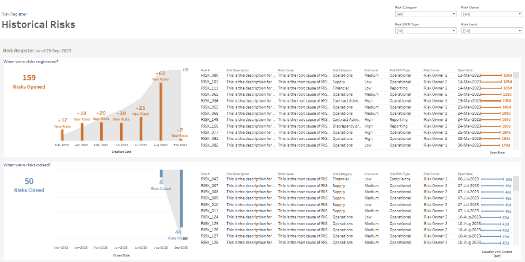
This is one of the most practical risk dashboard examples for project managers, compliance officers, risk owners, and executives who need to monitor risk exposure, address bottlenecks, and ensure timely resolution. This risk management dashboard supports better decision-making and strengthens enterprise-wide accountability.
#4 Risk Dashboard – RISK & COMPLIANCE
This credit risk dashboard provides an in-depth analysis of credit risk metrics for New York from January 2017 to December 2018. It offers a snapshot of key indicators such as Assets ($93.5M, +13%), Liabilities ($52.7M, +17%), Expected Loss ($1.1M, +11%), Risk Score (0.4088, -3%), and Accounts at Risk (60, +20%). Each KPI is supported by trend lines to show year-over-year changes, enabling quick performance assessment.
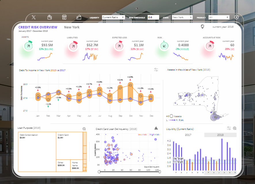
This risk management dashboard includes a range of visualizations:
- A line and dot plot comparing Debt-to-Income ratios between 2017 and 2018.
- A New York state map displaying asset concentration and risk levels across cities.
- A bar chart tracking liquidity trends over time benchmarked against the target ratio.
- A scatter plot illustrating credit card loan delinquencies by loan amount and days past due, color-coded by risk.
- A treemap outlining loan purposes, including credit card, debt consolidation, home, and other loan types.
This is one of the most valuable risk dashboard examples for credit risk analysts, bank managers, and finance leaders. The risk dashboard supports informed decisions by highlighting areas of concern and enhancing financial oversight.
#5 Risk Dashboard – Human Resources – Employee Flight Risk
This employee flight risk dashboard offers a visual overview of potential attrition signals by managers for November. The risk dashboard is designed to help HR professionals and department leaders identify employees at a higher risk of leaving the organization. It is a strong example of a risk management dashboard tailored to workforce retention.
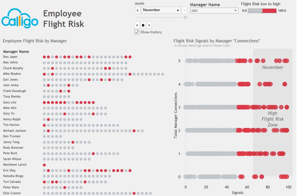
The left section displays a dot matrix under each manager’s name, where each dot represents an employee. Dots are colour-coded along a scale from grey to red, indicating flight risk from low to high. The denser and redder the line, the higher the concentration of at-risk employees under that manager.
On the right side, a scatter plot titled “Flight Risk Signals by Manager ‘Connections’” plots the number of in-person or phone call interactions against employee flight risk scores. Points within the “High Flight Risk Zone” (highlighted area) represent individuals with high-risk signals and fewer manager connections, a key indicator of disengagement.
This risk dashboard is handy for HR teams, people analytics specialists, and senior managers. As one of the most actionable employee-focused risk dashboard examples, it enables early intervention, promotes targeted engagement strategies, and supports talent retention by highlighting key behavioural patterns.
A risk dashboard is vital for organizations looking to manage uncertainty and maintain operational stability. The five risk dashboard examples featured in this blog show how different industries—from finance to human resources—can benefit from data-driven risk insights. A strong risk management dashboard enables leaders to act quickly and confidently by consolidating complex data into clear, interactive visuals. Whether addressing compliance, employee attrition, or financial risk, the right dashboard provides clarity and control. As risk environments grow more complex, adopting effective dashboards is not just beneficial; navigating future challenges is essential.