A well-designed revenue dashboard is essential for tracking financial performance, identifying trends, and making data-driven decisions. Businesses across industries rely on dashboards to monitor total revenue, profit margins, sales growth, and customer segments. The correct revenue KPI dashboard helps executives, finance teams, and analysts gain real-time insights into their financial health. In this blog, we’ll explore five revenue dashboard examples that showcase different approaches to revenue tracking, from eCommerce and SaaS to hospitality and retail. These revenue analysis dashboards provide powerful visualizations to help businesses optimize their financial performance and drive strategic growth.
Table of Contents
#1 Revenue Dashboard – Gaming Revenue
This revenue dashboard provides an overview of gaming industry revenue trends from 2012 to 2021, segmented into PC, Console, and Mobile games. The dashboard revenue visualization uses a dark-themed design with a combination of circular and flow-based visualizations to represent revenue distributions and trends.
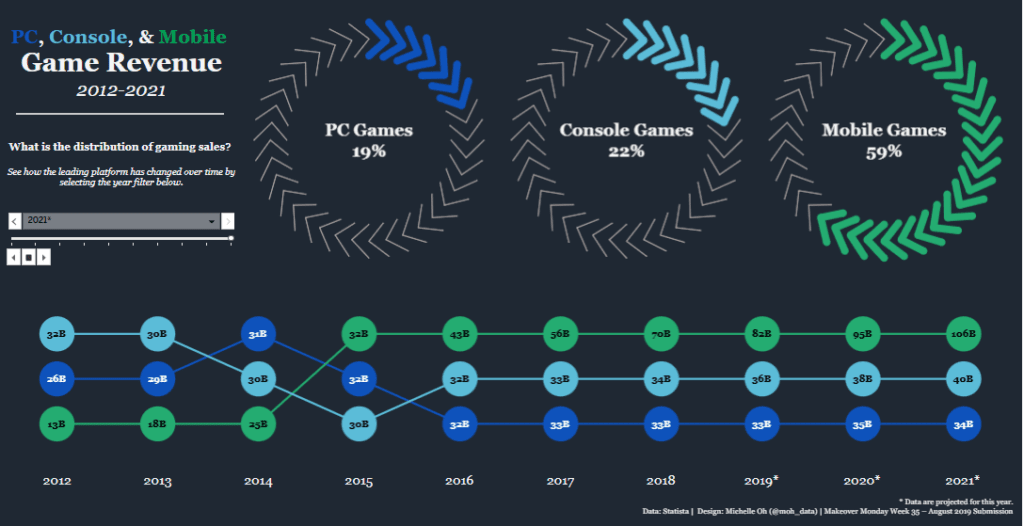
Charts and Visual Elements Used:
- Donut Charts—At the top, three circular doughnut charts display the market share of PC (19%), Console (22%), and Mobile (59%) games. These percentages highlight platform dominance, making this a strong revenue dashboard example for visualizing industry trends.
- Flow Diagram / Sankey-Style Timeline—The lower section features a time-based flow visualization. Different coloured nodes (representing revenue in billions) show the growth and shifts across platforms over the years, making it a robust revenue KPI dashboard tool.
- Dropdown Filter and Timeline Slider – An interactive dropdown allows users to select a specific year, enhancing revenue analysis dashboard capabilities by enabling focused data exploration.
Who Can Benefit from This Dashboard?
- Gaming Industry Analysts tracking revenue trends.
- Investors evaluating growth in mobile, console, and PC gaming.
- Game Developers & Publishers analyzing platform profitability.
- Marketers & Business Strategists identifying shifts in consumer spending.
This revenue dashboard presents a clear, data-driven perspective on the evolving gaming industry, highlighting the mobile sector’s rapid growth.
#2 Revenue Dashboard – Music Revenue
This revenue dashboard visualizes the evolution of music sales revenue from 1973 to 2019, showcasing the rise and fall of different music formats. The dashboard revenue trends highlight the dominance of vinyl records, 8-tracks, cassettes, compact discs, ringtones, downloads, and streaming, providing insights into shifts in consumer preferences over time.
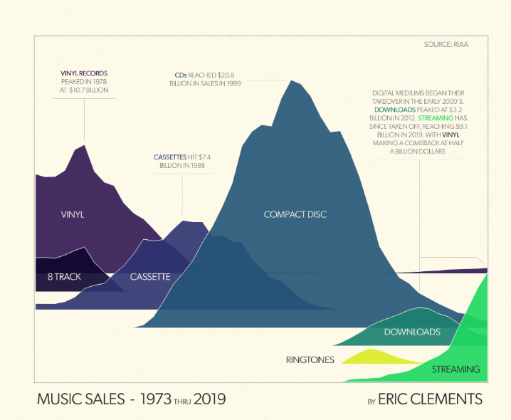
Charts and Visual Elements Used:
- Stacked Area Chart – This revenue dashboard example primarily uses a stacked area chart, representing each format as a coloured section. The height and width of each section indicate its revenue over time, making it a powerful revenue analysis dashboard tool.
- Annotated Peaks – Key revenue milestones, such as vinyl peaking in 1978 ($10.7 billion), CDs reaching $20.6 billion in 1999, and streaming hitting $9.1 billion in 2019, are highlighted with text annotations for better insights into market shifts.
- Colour-Coded Format Evolution – Different colours represent different formats, clearly visualizing the transition from physical to digital sales, a key feature in any revenue KPI dashboard.
Who Can Benefit from This Dashboard?
- Music Industry Analysts that are tracking revenue shifts.
- Investors & Record Labels identifying profitable trends.
- Streaming Platforms & Tech Companies understanding the decline of physical sales.
- Historians & Researchers studying the evolution of consumer behaviour.
This revenue dashboard effectively illustrates the dramatic industry transformation from physical media to digital streaming.
#3 Revenue Dashboard – NIKE Revenue
This revenue dashboard presents Nike’s consolidated operating revenue, breaking down sales performance across multiple categories for 2019 vs. 2018. It provides insights into dashboard revenue distribution by product type, sales type, customer type, and brand division, offering a comprehensive revenue analysis dashboard for business performance evaluation.
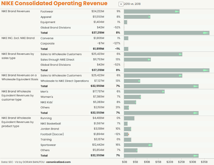
Charts and Visual Elements Used:
- Bar Charts with Growth Indicators—Each revenue category is visualized with horizontal bar charts that show absolute values and percentage growth or decline. Green arrows indicate positive development, while negative values are highlighted accordingly.
- Segmented Revenue Breakdown – This revenue dashboard example divides Nike’s revenue into key sections:
- Nike Brand Revenues (Footwear, Apparel, Equipment, Global Brand Divisions)
- Nike Inc. Excluding Nike Brand (Converse and Corporate)
- Sales Type (Wholesale vs. Direct)
- Wholesale Equivalent Revenues (Men’s, Women’s, Kids’, and Others)
- Product Type (Basketball, Running, Football, Jordan Brand, etc.)
Who Can Benefit from This Dashboard?
- Financial Analysts tracking revenue trends and market performance.
- Retail Executives monitoring product category growth.
- Investors assessing Nike’s business health across various segments.
- Business Strategists evaluating wholesale vs. direct sales strategies.
This revenue KPI dashboard provides a detailed look into Nike’s financial performance and key revenue-driving segments.
#4 Revenue Dashboard – Revenue & Profit KPI Dashboard
This revenue dashboard provides a comprehensive sales and profit analysis, offering key performance metrics for Month-to-Date (MTD), Year-to-Date (YTD), and previous month’s sales. It visualizes sales trends, regional performance, and category breakdowns, making it a powerful revenue analysis dashboard for business decision-making.
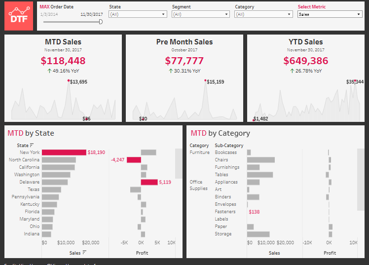
Charts and Visual Elements Used:
- KPI Metrics Cards—The top section displays MTD Sales ($118,448), Pre-Month Sales ($77,777), and YTD Sales ($649,386). These key figures include year-over-year (YoY) percentage changes, making this an essential revenue KPI dashboard for tracking business growth.
- Time Series Line Charts – The background of the KPI cards includes line charts showing sales trends over time and helping users identify dashboard revenue fluctuations.
- Bar Charts for MTD by State – A horizontal bar chart ranks states by revenue, highlighting New York as the top performer ($18,190) and identifying states with negative profit contributions.
- Bar Charts for MTD by Category – This section categorizes sales by Furniture, Office Supplies, and Technology, further broken down into sub-categories like tables, appliances, and labels.
- Filter Controls – Users can refine data by selecting order date, state, segment, and category, making it an interactive revenue dashboard example for in-depth financial insights.
Who Can Benefit from This Dashboard?
- Sales Managers tracking regional and category-wise performance.
- Finance Teams monitor revenue trends and profitability.
- Retail Business Owners making data-driven inventory decisions.
- Executives leveraging a revenue dashboard for strategic planning.
This dashboard revenue visualization enhances financial decision-making with clear insights.
#5 Revenue Dashboard – HOSPITALITY – Rooms Revenue
This revenue dashboard comprehensively analyses hotel room revenue performance for YTD Dec-21 compared to YTD Dec-20. It offers insights into total room revenue, occupancy rates, average daily rate (ADR), and revenue per available room (RevPAR) across multiple properties and locations.
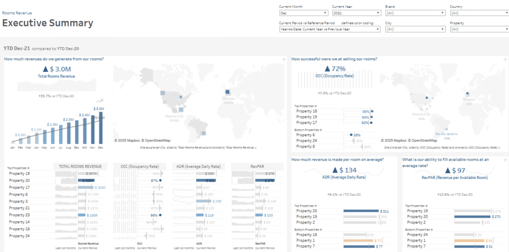
Charts and Visual Elements Used:
- KPI Metrics Cards – Displaying key performance indicators, including $3.0M in total rooms revenue (+35.7% YoY), 72% occupancy rate (+7.0% YoY), ADR of $134 (+6.1% YoY), and RevPAR of $97 (+13.6% YoY), making it a substantial revenue KPI dashboard for tracking financial performance.
- Time Series Bar Chart: This monthly revenue trend chart visualizes dashboard revenue growth from January to December, highlighting seasonal fluctuations.
- Geographical Heat Maps – Maps provide a regional revenue breakdown, helping users analyze revenue contributions by location.
- Horizontal Bar Charts—This insightful revenue analysis dashboard evaluates leading properties by revenue, occupancy, ADR, and RevPAR, simultaneously highlighting those that are underperforming.
- Filter Controls – Users can filter by month, year, brand, country, city, and property, ensuring a dynamic revenue dashboard example that allows for in-depth financial analysis.
Who Can Benefit from This Dashboard?
- Hotel Executives & Revenue Managers optimizing performance strategies.
- Financial Analysts leveraging a revenue KPI dashboard to track YoY trends.
- Hospitality Investors evaluating dashboard revenue at a property level.
- Marketing & Sales Teams adjusting pricing and occupancy strategies.
This revenue dashboard enhances financial decision-making in the hospitality industry, providing clear insights into revenue trends.
Choosing the right revenue dashboard example depends on the specific needs of your business. Whether you’re tracking dashboard revenue for retail sales, monitoring SaaS subscription trends, or analyzing hotel occupancy rates, a well-structured dashboard offers clarity and actionable insights. The best revenue analysis dashboard provides real-time data, interactive filters, and visually appealing layouts that simplify complex financial information. By leveraging these revenue KPI dashboards, businesses can make informed decisions, improve profitability, and stay ahead in competitive markets. Explore different designs and customize your revenue dashboard to align with your unique financial goals.