This blog highlights 13 examples of real estate dashboards that showcase the power of real estate data analytics in providing actionable insights. Whether you’re a property manager, investor, or real estate professional, these tools demonstrate how to monitor market trends, track performance metrics, and make informed decisions.
Related posts:
- Check Out 13 Amazing Tableau Marketing Dashboard Examples
- 10 Amazing Tableau Healthcare Dashboard Examples
- 6 Amazing Tableau Bank Dashboard Examples
- 7 Great Examples of Insurance Dashboards in Tableau
- 5 Amazing Hotel Dashboard Examples to Elevate Your Hospitality Operations
- 7 Amazing Shipping Dashboards That Will Revolutionize Your Logistics Game
From budget performance to rental yields and market overviews, these real estate data and analytics solutions simplify complex data, empowering professionals with clear, actionable insights for success.
Table of Contents
# 1 Real Estate Dashboard – Real Estate Property Analysis
This real estate dashboard offers a detailed overview of real estate data analytics to evaluate property performance across segments like Industrial, Multi-Family, Office, and Retail. It incorporates a geographical map to visualize property locations and segmentation by type. Key metrics, including Gross Asset Value, Net Asset Value, Net Over Gross percentage, Gross Fair Value, and Price Per Square Foot, are presented using bar charts for straightforward comparisons across categories.
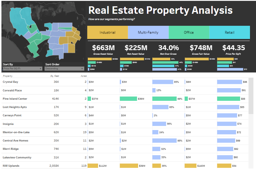
The bottom sortable table provides in-depth real estate data analysis, including square footage, acreage, gross and net asset values, and fair value percentages. Conditional formatting highlights top-performing properties, while sorting options based on metrics like price per square foot or acreage allows tailored insights.
Real estate data and analytics empower decision-makers to identify underperforming properties, optimize resources, prioritize investments, and monitor market trends. By leveraging property dashboards, stakeholders can evaluate which property types yield the best returns or analyze price per square foot to refine pricing strategies. This real estate analytics tool, with its visually enriched segmentation and performance metrics, aids in portfolio optimization and uncovers growth opportunities in lucrative markets.
# 2 Real Estate Dashboard – Real Estate Finance Dashboards
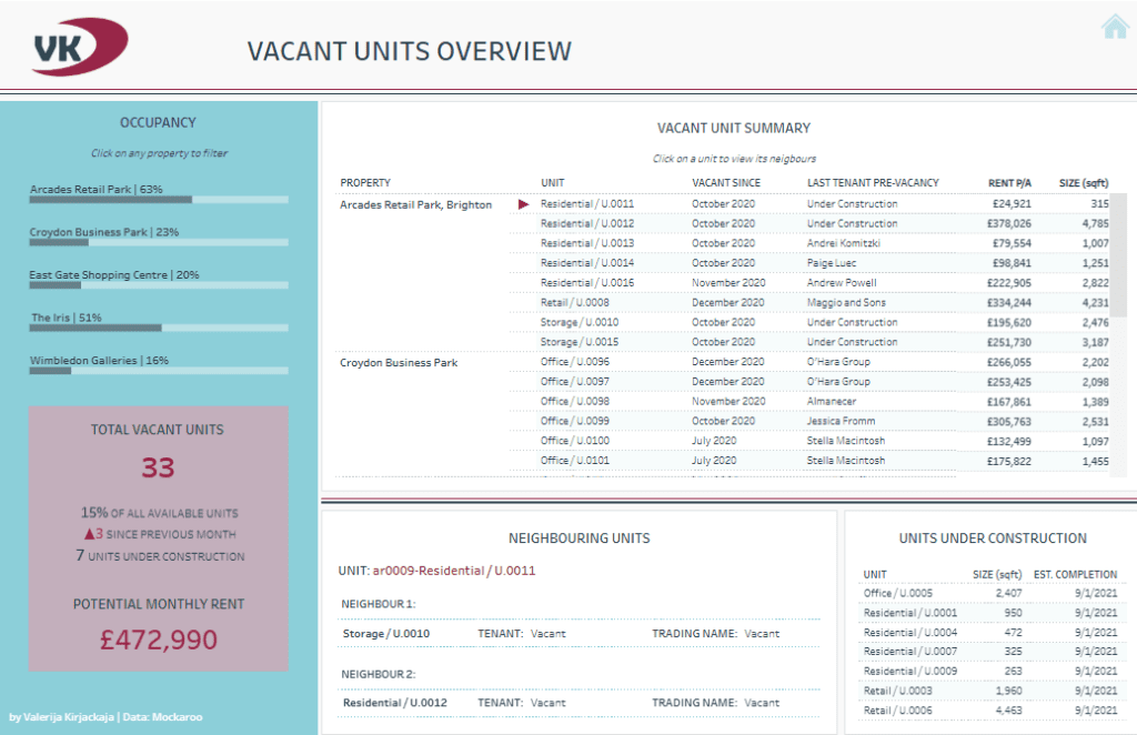
This comprehensive real estate dashboard provides key insights into rent collection, lease expirations, tenant payment statuses, and vacant units across multiple properties. It uses various visualizations, including doughnut charts, bar charts, and tables, to effectively present real estate data analysis to support informed decision-making.
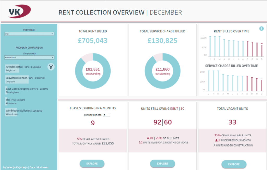
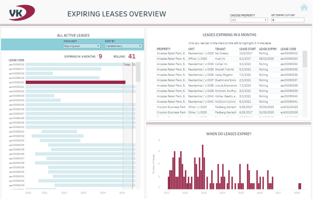
The rent collection section highlights total rent billed, outstanding amounts, and service charges, with visual real estate data analytics tracking these metrics over time. The lease expiring overview features a timeline of upcoming expirations and a detailed table of properties, tenants, and lease details, enabling stakeholders to plan proactive renewal strategies.
The “Who Has Not Paid Rent?” section identifies tenants with overdue payments, breaking down rent and service charge details per unit. Historical payment records offer transparency and help assess patterns, making them vital to real estate data and analytics. Additionally, the vacant units overview monitors unoccupied spaces, highlighting potential rental income and the status of neighbouring units or those under construction.
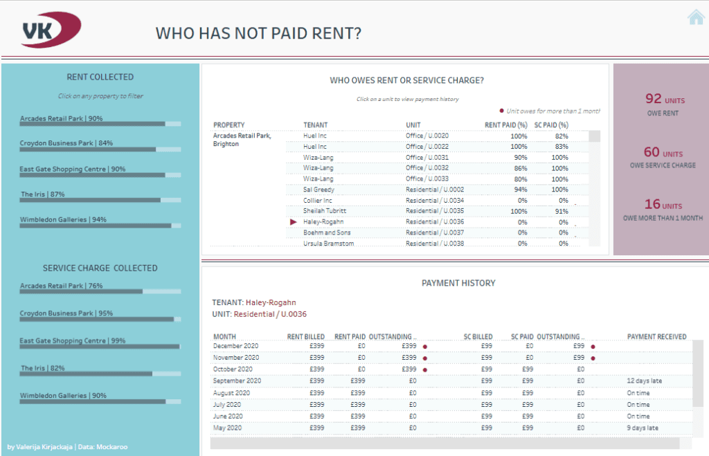
This real estate analytics tool empowers property managers to prioritize lease renewals, address overdue accounts, and reduce vacancies. By leveraging property dashboards like this, stakeholders can optimize revenue, improve tenant retention, and enhance operational efficiency through actionable real estate data and analytics.
# 3 Real Estate Dashboard – Real Estate – Asset Management
This real estate dashboard highlights asset management performance by analyzing occupancy rates, gross asset values, and property details across asset types such as Industrial, Office, and Retail. It incorporates bar charts, scatter plots, and detailed tables to deliver actionable real estate data analytics.
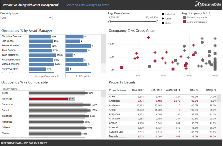
The “Occupancy % by Asset Manager” section uses bar charts to compare occupancy rates and the number of properties managed by each asset manager, offering a clear view of individual performance. The “Occupancy % vs. Gross Value” scatter plot integrates real estate data analysis by correlating occupancy rates with gross asset values, using colour-coded markers to distinguish properties above and below market comparables.
The “Occupancy % vs. Comparable” bar chart benchmarks individual property occupancy rates against market standards, empowering stakeholders to identify underperforming or outperforming assets. The detailed property table also provides real estate data and analytics such as gross leasable area (GLA), square footage, vacancy rates, and occupancy percentages for an in-depth understanding of property performance.
This real estate dashboard enables stakeholders to evaluate asset manager efficiency, address properties with low occupancy rates, and align asset strategies with organizational goals. Leveraging property dashboards like this enhances portfolio performance and maximizes the value of real estate analytics.
# 4 Real Estate Dashboard – 2017 Property Taxes by County
This real estate dashboard visualizes property tax rates across U.S. counties for 2017, providing insights into regional tax variations and political affiliations. It uses a choropleth map to display each county’s effective property tax rate, colour-coded on a gradient from low (blue) to high (orange). The map highlights geographical disparities in property taxes, enabling users to identify areas with the highest and lowest tax rates at a glance.
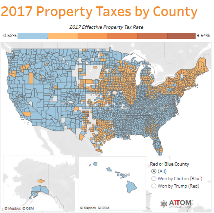
The dashboard also incorporates political data by categorizing counties as won by Clinton (blue) or Trump (red) in the 2016 election. This segmentation allows for analysing property tax trends related to political affiliations. Smaller maps for Alaska and Hawaii ensure comprehensive national coverage.
This real estate data analysis tool helps stakeholders understand how property tax burdens vary geographically and politically. It is valuable for property investors, developers, and policymakers seeking to identify tax-efficient regions, predict tax policy impacts, or assess market attractiveness. By leveraging real estate data and analytics, this dashboard supports informed decisions regarding investment strategies, resource allocation, and local market entry. Integrating property tax rates with political segmentation provides deeper contextual insights for targeted planning and analysis.
# 5 Real Estate Dashboard – Property Management Financial Summary Dashboard
This real estate dashboard, ” Budget vs. Actual,” comprehensively compares financial metrics for property management. It employs horizontal bar charts and tabular data to showcase performance across multiple months, providing actionable insights into actual and target financial results variances. Metrics include Capital Expense, Debt Service, Effective Gross Income, Gain to Lease, Gross Potential Rent, Net Operating Income, Operating Expenses, and Vacancy Costs.
The bar charts in the top section visually represent each metric’s monthly performance, making it easy to spot trends and identify deviations from targets. Variance markers enhance the clarity of real estate data analysis by pinpointing gaps between actual and budgeted values. The detailed table below complements the visualizations by presenting exact numerical data for each metric, including actual values, targets, and variances, ensuring precise real estate data and analytics.
This tool integrates real estate analytics with customizable filters for month, property, and metric groups, making it adaptable for different use cases. It empowers property managers and stakeholders to monitor budget performance, address cost overruns, and optimize revenue generation. By leveraging property dashboards like this, users can make data-driven decisions to meet financial goals and enhance property portfolio efficiency.
# 6 Real Estate Dashboard – RentViewer Real Estate Executive Dashboard
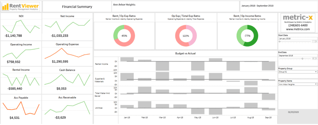
This real estate dashboard, ” Budget vs. Actual,” comprehensively compares financial metrics for property management. It employs horizontal bar charts and tabular data to showcase performance across multiple months, providing actionable insights into actual and target financial results variances. Metrics include Capital Expense, Debt Service, Effective Gross Income, Gain to Lease, Gross Potential Rent, Net Operating Income, Operating Expenses, and Vacancy Costs.
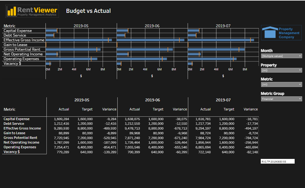
The bar charts in the top section visually represent each metric’s monthly performance, making it easy to spot trends and identify deviations from targets. Variance markers enhance the clarity of real estate data analysis by pinpointing gaps between actual and budgeted values. The detailed table below complements the visualizations by presenting exact numerical data for each metric, including actual values, targets, and variances, ensuring precise real estate data and analytics.
This tool integrates real estate analytics with customizable filters for month, property, and metric groups, making it adaptable for different use cases. It empowers property managers and stakeholders to monitor budget performance, address cost overruns, and optimize revenue generation. By leveraging property dashboards like this, users can make data-driven decisions to meet financial goals and enhance property portfolio efficiency.
# 7 Real Estate Dashboard – Rent vs Own
This real estate dashboard compares the costs of renting and owning over time. It utilizes a line chart to analyze average monthly rent and mortgage payment trends. The chart visualizes how these costs have evolved from April 2019 to April 2022, allowing users to assess whether renting or owning is the more financially advantageous.
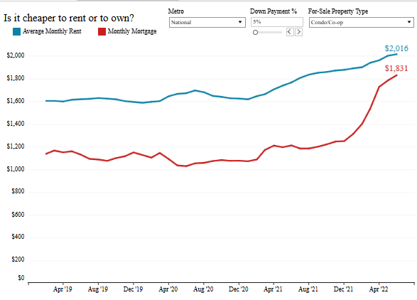
The dashboard incorporates filters for metro areas, down payment percentages, and property types (e.g., condo or co-op), providing flexibility in tailoring real estate data analytics to specific markets and scenarios. This level of customization ensures targeted and actionable insights.
The chart highlights that while rent and mortgage costs have risen over time, the gap between them has narrowed significantly. In some areas, monthly mortgage payments have become more competitive than rent. This real estate data analysis is particularly valuable for prospective homebuyers, renters, and real estate professionals who want to make informed financial decisions.
Leveraging this real estate dashboard, stakeholders can assess affordability, compare homeownership versus renting, and analyze market trends. By integrating real estate data and analytics, users can optimize housing decisions and create strategies that align with cost trends and financial objectives.
# 8 Real Estate Dashboard – Toughest Rental Markets
This real estate dashboard offers valuable insights into the most demanding markets for purchasing a starter home among the top 100 largest metro areas. Presented in a tabular format with colour-coded columns, it effectively highlights trends and challenges within each market. Key metrics include changes in inventory, median starter home prices, and the additional income percentage required to afford a home compared to previous years.
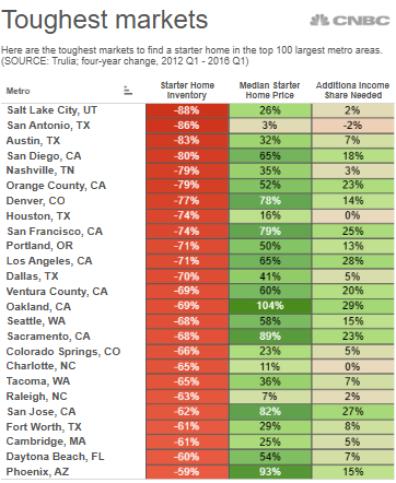
The starter home inventory column, highlighted in red, pinpoints the market experiencing significant decreases, reflecting a reduced availability of affordable homes. The median starter home price column, colour-coded in green and red, provides a clear view of pricing trends over four years, emphasizing affordability shifts. The additional income needed column calculates how much more buyers must earn to match housing cost increases.
This real estate data and analytics tool helps stakeholders identify areas with the most significant barriers to entry for first-time homebuyers. Real estate professionals, policymakers, and investors can address affordability issues, prioritize housing initiatives, and develop strategic market approaches by leveraging real estate data analytics. Property dashboards like this enable informed decision-making by presenting actionable insights through comprehensive real estate data analysis.
# 9 Real Estate Dashboard – Real Estate, Construction
This real estate dashboard delivers a comprehensive financial and project management overview for the Capitol Hill construction project. It highlights key metrics such as the projected final cost, remaining contingency, board-authorized budget, and buyout percentage, leveraging real estate data analytics to monitor budget performance and milestone progress.
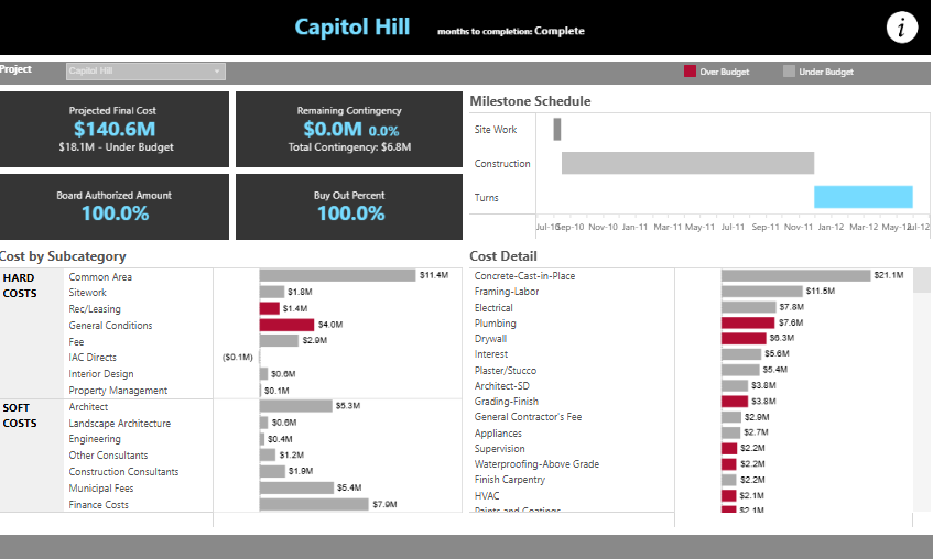
The top section presents an overview of the project’s financial health, showcasing the projected cost under budget and the fully authorized and allocated board budget. The milestone schedule, displayed as a bar chart, illustrates the timeline for site work, construction, and project turns, with clear distinctions between phases over and under budget for effective tracking.
The “Cost by Subcategory” section utilizes bar charts to break down complex and soft costs into categories such as site work, plumbing, electrical, and architectural services. The “Cost Detail” section provides detailed real estate data analysis of specific expenditures, with red bars indicating budget overruns and grey bars highlighting items within budget.
This real estate dashboard equips stakeholders with actionable insights to monitor budget allocation, pinpoint cost overruns, and evaluate spending across various categories. By leveraging property dashboards, real estate data, and analytics, project managers and financial teams can optimize resources, adjust schedules, and maintain fiscal control throughout the project lifecycle.
# 10 Real Estate Dashboard – Real Estate Investment
This real estate dashboard evaluates property performance by comparing net rental yield and occupancy rates across various property types, amenities, and bedroom counts. The scatter plot categorizes properties into four quadrants: high rental yield with low occupancy, high rental yield with high occupancy, low rental yield with low occupancy, and low rental yield with high occupancy. Each data point’s size reflects net revenue, adding depth to the real estate data analytics.
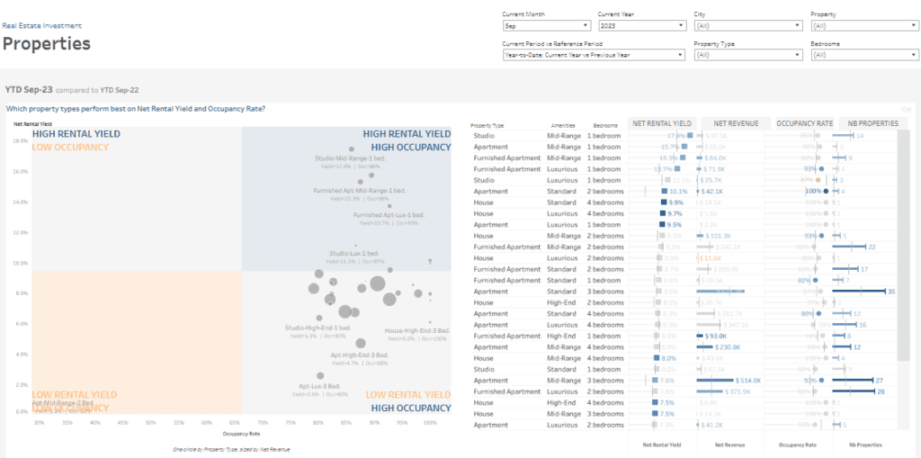
The table complements the visual analysis by providing detailed real estate data and analytics, including metrics such as net rental yield, net revenue, occupancy rate, and the number of properties in each category. These metrics are segmented by property type, amenities, and bedroom count, offering stakeholders a clear view of trends and performance indicators.
Customizable filters for month, year, city, property type, and bedroom count allow for tailored real estate data analysis, enabling users to focus on specific scenarios and markets.
This real estate dashboard helps property managers and investors pinpoint high-performing property types, optimize portfolios, and develop effective investment strategies. By leveraging real estate analytics, stakeholders can maximize rental yields, enhance occupancy rates, and address underperforming assets. Property dashboards like this facilitate data-driven decision-making for improved profitability.
# 11 Real Estate Dashboard – Real Estate of Mind
This real estate dashboard offers a detailed overview of Manhattan home sales over 12 months. It effectively presents real estate data and analytics through geographic mapping, bar charts, and detailed tables. The map pinpoints property sale locations, with density markers emphasizing high-sale regions. This enables users to identify market activity clusters quickly.
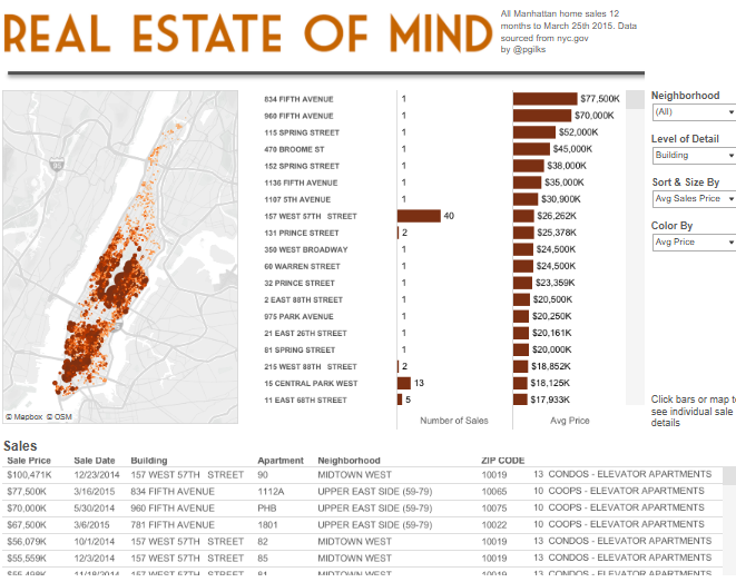
The bar chart ranks buildings by the number of sales and average sale price, providing insights into sales volume and pricing trends across different areas. Filters for the neighbourhood, level of detail, and sorting options, such as average sale price, enhance the real estate data analysis by tailoring the experience to specific user needs.
The detailed table complements the visual elements by listing individual property transactions, including sale price, date, building, apartment number, neighbourhood, zip code, and property type. This granular data facilitates a deeper examination of specific sales patterns and trends.
This real estate dashboard empowers professionals, investors, and analysts to make data-driven decisions. By leveraging real estate analytics and property dashboards, stakeholders can identify high-demand areas, assess property performance, and develop strategies for investments or sales to maximize returns.
# 12 Real Estate Dashboard – Sydney Property Growth
This real estate dashboard, titled “Sydney Property Growth Guide,” offers a detailed analysis of property market trends in Sydney. It utilizes a geographic heatmap, line charts, and bar graphs to present real estate data and analytics on property price growth, sales volume, and regional performance over time.
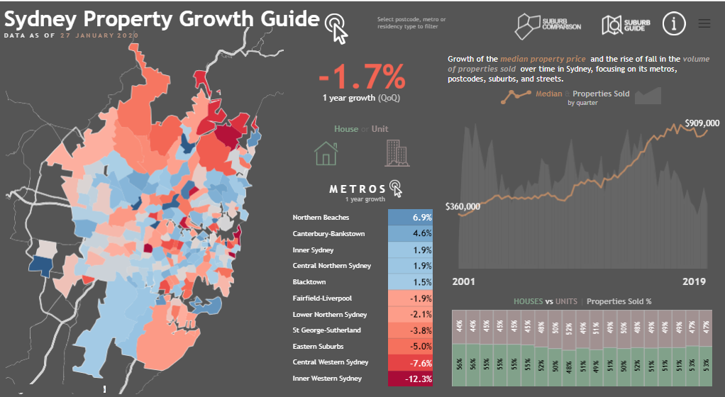
The heatmap visualizes property growth across Sydney’s suburbs. Its colour-coded areas indicate positive development and red highlights regions experiencing price declines. This allows users to identify high-performing and low-performing areas quickly.
The line chart illustrates the median property price from 2001 to 2019, providing insights into long-term trends and key milestones in Sydney’s real estate market. This bar graph compares sales percentages of houses versus units, showcasing market dynamics and preference shifts.
A table outlines one-year growth rates for different metro areas, offering a granular view of regional performance. Filters for postcode, metro, and property type enhance real estate data analysis, allowing for tailored insights.
This real estate dashboard uses analytics to empower investors and professionals to identify profitable markets, analyze trends, and make informed decisions. Property dashboards like this enable targeted strategies based on actionable real estate data and analytics.
# 13 Real Estate Dashboard – Toronto Real Estate Trends
This real estate dashboard provides a comprehensive view of market trends and performance in the overall market of the TREB (Toronto Real Estate Board). Using tables, pie charts, line graphs, and bar charts offers valuable insights into key metrics such as median prices, inventory levels, sales volume, and market activity.
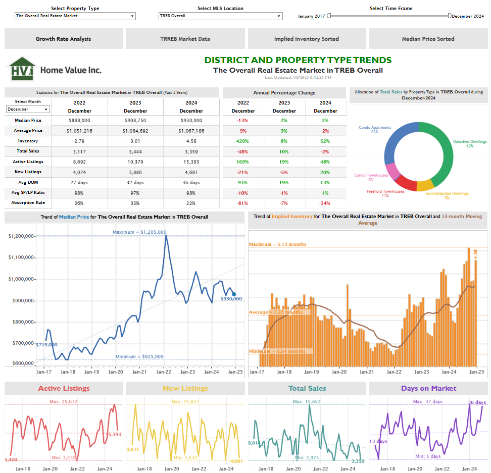
The summary table details three-year statistics, including median price, total sales, inventory levels, days on the market, and absorption rate. Annual percentage changes highlight year-over-year trends. The pie chart visualizes total sales allocation by property type, showcasing the distribution across condos, detached dwellings, semi-detached homes, and townhouses.
The line chart tracks the trend of median property prices over time, pinpointing highs and lows for more in-depth real estate data analysis. Another graph monitors implied inventory with a moving average, offering insights into supply trends. Additional line charts illustrate active listings, new listings, total sales, and days on the market, providing a granular view of market activity.
This real estate dashboard utilizes data and analytics to enable informed decision-making. By leveraging real estate analytics, stakeholders can evaluate pricing strategies, optimize inventory, and better understand market dynamics. Property dashboards like this give agents, buyers, and investors actionable insights.
The 13 real estate dashboards featured in this blog illustrate the transformative power of real estate data analysis in improving decision-making and market understanding. Each example highlights unique functionalities, from tracking property trends to managing portfolios efficiently. By leveraging real estate analytics and property dashboards, professionals can identify opportunities, overcome challenges, and maintain a competitive edge in a dynamic industry. Whether you’re an experienced professional or new to the field, these real estate data and analytics examples demonstrate how innovative tools can unlock success. Dive into these dashboards for inspiration and elevate your real estate strategies with data-driven insights.


