From tracking shipments in real time to analyzing transportation costs and warehouse efficiency, logistics dashboards provide the visual insights needed for better decision-making. In this article, we explore seven powerful examples of logistics dashboards covering various supply chain areas. Each dashboard highlights key performance indicators (KPIs) and visualization techniques tailored to specific logistics functions. Whether you’re a logistics manager, data analyst, or supply chain executive, these examples will inspire ways to streamline and enhance your operations.
Table of Contents
# 1 Logistics Dashboard – ABC Shipping Logistics
This logistics dashboard provides a comprehensive overview of ABC Shipping Logistics’ performance, comparing year-to-date (YTD) data for July 2023 against YTD data for July 2022. It uses a dark theme to highlight key metrics and trends across several critical logistics dashboard KPIs.
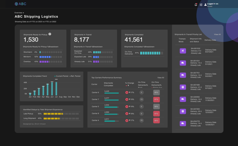
The logistics dashboard uses a variety of chart types:
- Bar charts to display shipment readiness (short-term, mid-term, overdue), transit status (expected on-time, expected late, already late), and completed shipments over time.
- Stacked horizontal bars to show performance breakdowns and delays due to shipment experience (late vs. long shipment).
- Column charts for monthly completed shipments and trends.
- Performance summary tables with KPIs such as shipments completed, % change, and on-time delivery rates for each carrier.
- This is a list format for shipments in transit, showing priority deliveries with transport mode icons, shipment IDs, status, and delivery dates.
This logistics dashboard would be handy for logistics managers, supply chain analysts, and operations executives. It enables real-time monitoring of shipment statuses, helps identify performance bottlenecks, and supports data-driven decisions to improve delivery times, manage carrier performance, and reduce delays. The clear visual breakdowns also make it suitable for presenting updates to senior management or clients.
#2 Logistics Dashboard – Logistics Shipping Dashboard
This logistics dashboard provides a detailed overview of shipment operations across the United States for 2015. It combines a range of interactive charts and maps to help logistics professionals monitor performance, costs, and service reliability.
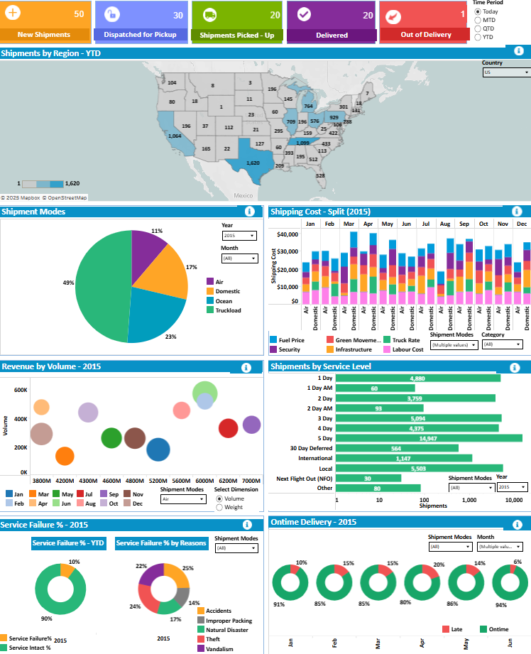
Key components of the logistics dashboard include a choropleth map showing shipment volume by region (YTD), allowing quick identification of high-traffic states. A pie chart displays shipment modes (Air, Domestic, Ocean, Truckload), while a stacked bar chart breaks down shipping costs monthly by cost type, such as fuel, labor, and infrastructure. A bubble chart visualizes revenue by volume across shipment dimensions, making it easy to compare profitability.
Horizontal bar charts highlight shipment volumes by service level (e.g., 1 Day, 5 Day, International), and donut charts track on-time delivery performance by month. Service failures are explored through donut charts and pie charts, which break down reasons like theft, improper packing, or accidents.
This logistics dashboard would be handy for supply chain analysts, logistics managers, and operations directors. It provides insights into cost distribution, regional shipment density, service level performance, and operational risks, empowering teams to make informed, data-driven decisions that improve efficiency and customer satisfaction.
#3 Logistics Dashboard – Logistics and Transportation Analysis
This logistics dashboard provides a real-time analysis of transportation performance across Europe. It presents key logistics dashboard metrics such as delayed shipments, incidents, and the percentage of perfect orders using gauge charts for quick visual feedback. These indicators help assess operational efficiency and service quality at a glance.
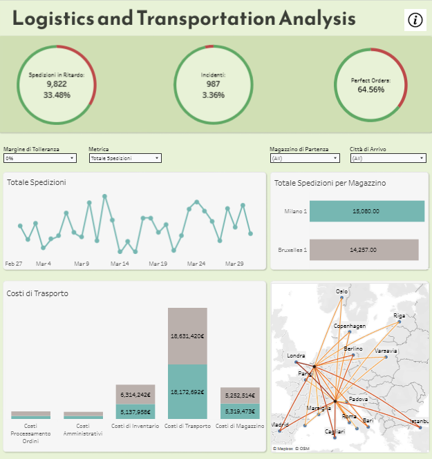
A line chart tracks daily shipment volume trends, offering insights into shipping activity and potential fluctuations. The bar chart displaying total shipments per warehouse—Milano and Brussels—enables a comparison of warehouse-level performance. A stacked bar chart breaks down transportation-related costs, including inventory, warehousing, processing, and administrative expenses, helping finance and operations teams evaluate cost drivers.
A flow map visualizes shipment routes across major European cities, clearly showing logistical connections and shipment density between locations. This geospatial view can support route optimization and network planning.
This logistics dashboard is handy for logistics coordinators, transportation managers, and supply chain analysts. It enables the continuous monitoring of key performance indicators, identifies cost inefficiencies, and provides data to support informed decisions. By combining operational, financial, and geographic insights, this logistics dashboard empowers logistics teams to streamline distribution, reduce delays, and improve order fulfillment across regional networks.
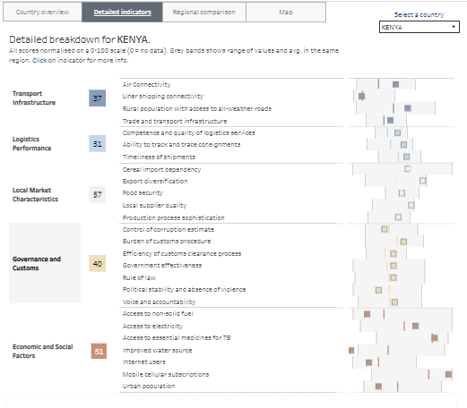
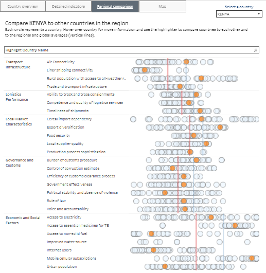
#4 Logistics Dashboard – Country Logistics Resilience Indicators
This logistics dashboard provides a comprehensive supply chain resilience analysis for countries, focusing on key logistics indicators. It allows users to assess a country’s performance across various categories, such as transport infrastructure, logistics performance, and economic and social factors.
The dashboard features several types of charts:
A radar chart shows a country’s performance across categories such as transport infrastructure, logistics performance, local market characteristics, governance, and economic factors. Each axis represents a specific category, clearly showing strengths and weaknesses.
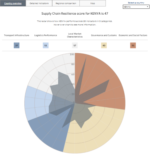
Detailed breakdown with bar charts showing scores for specific indicators within each category. These metrics provide a deeper understanding of the areas driving the overall score.
Regional comparison where users can compare a country’s performance against others in the region. Each country is represented by a circle, with the size indicating performance in each category.
Global map that visualizes supply chain resilience scores across different countries, allowing for easy comparison of global performance by category.
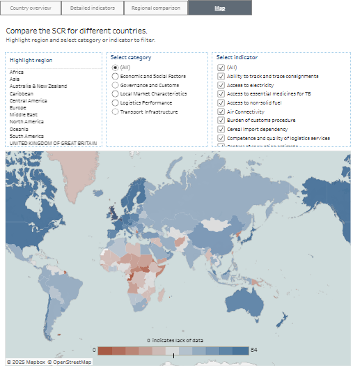
This logistics dashboard is handy for supply chain managers, logistics analysts, and policymakers. It helps identify areas for improvement, compare countries’ logistics capabilities, and support strategic decision-making for improving infrastructure and processes in logistics and transportation.
#5 Logistics Dashboard – Retail Logistics – KPI Dashboard
This logistics dashboard provides a high-level overview of retail logistics performance through key performance indicators (KPIs) for December 2020. It highlights crucial logistics metrics such as sales, profit, shipments, shipping times, costs, and delivery performance, offering logistics and operations teams actionable insights.
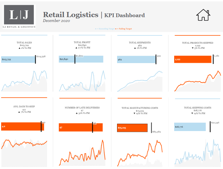
The dashboard uses line charts to visualize trends over time for each KPI, helping users track performance fluctuations. Each tile displays a current value, a target benchmark represented by a vertical line, and a comparison to the previous month (PM). Metrics exceeding targets are shown in blue, while underperforming ones are highlighted in orange, providing an intuitive, color-coded performance snapshot.
Key metrics include:
- Total Sales, Total Profit, Total Shipments: tracking business performance and logistics volume.
- Avg. Days to Ship and Number of Late Deliveries: measuring delivery efficiency and service reliability.
- Total Manufacturing and Shipping Costs: assessing logistics and production expenses.
This logistics dashboard is particularly valuable for retail logistics managers, supply chain analysts, and operations executives. It enables real-time monitoring of logistics KPIs, identifies areas requiring intervention, and supports decision-making to reduce delays, optimise shipping efficiency, and improve overall supply chain profitability.
#6 Logistics Dashboard – Shipping Logistics dashboard
This logistics dashboard offers a comprehensive snapshot of shipping operations, combining key metrics and visualizations to support performance monitoring and decision-making. It presents critical logistics data such as orders shipped, transportation cost, shipping volume, and on-time shipments, making it a valuable tool for logistics managers and supply chain analysts.
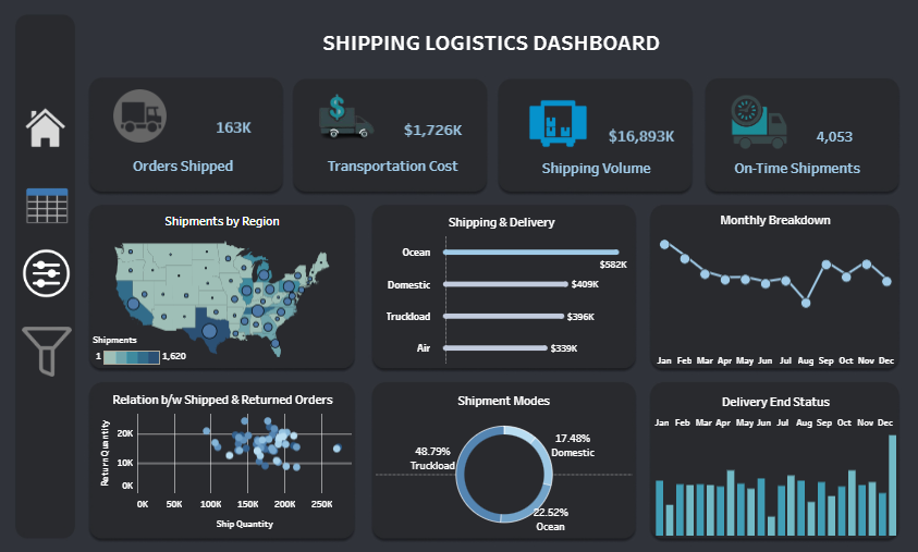
A map chart highlights shipments by region across the U.S., helping identify high-volume areas. Bar charts display shipping and delivery costs by mode (Ocean, Domestic, Truckload, Air) and track monthly performance, supporting cost analysis and trend identification. A scatter plot shows the relationship between shipped and returned orders, helping to detect patterns or issues in returns.
The donut chart breaks down shipment modes by percentage, with Truckloads accounting for nearly half of all shipments. Line and column charts provide monthly breakdowns and delivery end status insights, allowing users to track fluctuations in order processing and delivery completion.
This logistics dashboard is handy for operations directors, transportation coordinators, and supply chain professionals. It enables the efficient tracking of key shipping metrics, identification of cost drivers, and optimization of delivery performance, ultimately enhancing overall logistics efficiency and customer satisfaction.
#7 Logistics Dashboard – Asset-Logistics-Dashboard
This logistics dashboard provides an in-depth operational overview for SPARCARGO in October 2023. It consolidates key logistics data related to drivers, trucks, employees, loads, and haul types into a single interactive view, making it ideal for logistics coordinators and fleet managers.
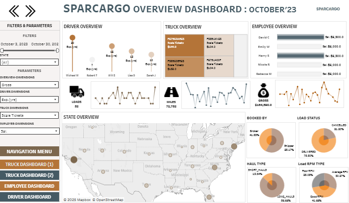
The bar charts show performance comparisons across drivers and employees, including ticket counts and earnings. Bubble charts represent individual performance at a glance, while line charts track trends in loads, miles, orders, and gross income over time. These visualizations help monitor operational consistency and identify any anomalies.
A map chart highlights state-level logistics activity, offering spatial context for delivery and booking patterns. Several donut charts break down important metrics: load status (e.g., delivered, cancelled), booking source (broker vs. carrier), haul type (short vs. long), and load RPM type (spot vs. contract). These allow quick insights into operational balance and contract performance.
Filters for date range, employee dimensions, truck dimensions, and more enable flexible, dynamic analysis. This logistics dashboard is handy for decision-makers who must evaluate team productivity, truck utilization, cost distribution, and overall shipment trends to optimize performance, reduce inefficiencies, and ensure on-time, cost-effective deliveries.
These seven logistics dashboard examples demonstrate the versatility and impact of data visualization in supply chain and transportation management. By leveraging well-designed dashboards, companies can gain real-time insights, reduce inefficiencies, improve delivery performance, and manage costs more effectively. Each example showcases how different metrics and visual tools can be tailored to meet specific operational needs. Adopting the proper logistics dashboard can transform how you monitor and manage logistics processes, whether your focus is on shipping, warehousing, fleet performance, or end-to-end supply chain visibility.