A job dashboard consolidates critical information into a single visual interface, enabling users to make informed decisions about hiring, salary benchmarking, job market trends, and career planning. Whether you’re analyzing salaries across industries, identifying skill premiums for specific roles, or understanding geographic trends in employment, dashboards provide a clear and actionable way to navigate complex datasets.
Related posts:
- Top 8 Tableau Human Resources Dashboards You Need to See for Ultimate Inspiration
- Our Amazing Tableau GDPR Compliance Guide
- Google Analytics with Tableau: 5 Great Examples
- 7 Amazing Help Desk Dashboard Examples
- Best 5 CRM Dashboard Examples to Boost Your Customer Strategy!
- Hotspots, Trends, and Patterns: 5 Mind Blowing UFO Sightings Maps
In this blog post, we’ll showcase five exceptional job dashboard examples highlighting how organizations and individuals can leverage data visualization to gain insights into the modern job market. From salary trends and job application processes to workforce demographics, these dashboards demonstrate the power of data to optimize decision-making in the recruitment and career planning landscape.
Table of Contents
#1 Job Dashboard Example – Decoding the Salary of Data Scientists
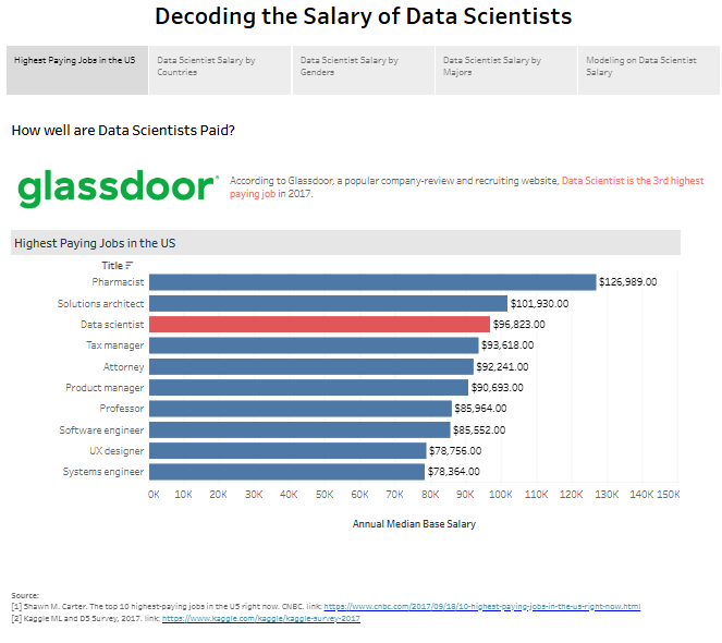
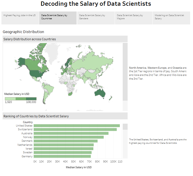
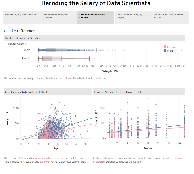
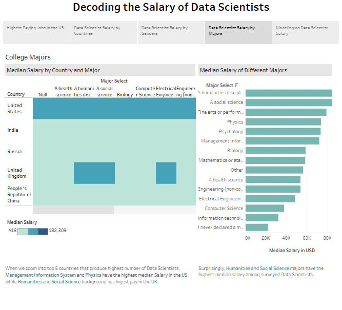
This job dashboard provides comprehensive insights into data scientist salaries and career trajectories, utilizing various metrics and demographics. It highlights salary trends, gender disparities, geographic differences, and educational impacts, employing predictive modelling to identify factors influencing compensation. Each section features distinct visualizations for effective data presentation.
Highest Paying Jobs in the US: A bar chart ranks data scientists as the third highest-paid profession in 2017, with a median salary of $95,823 annually.
Geographic Distribution: A map and bar chart compare median data scientist salaries globally, indicating that the US, Switzerland, and Australia are the highest-paying countries.
Gender Disparities: Box plots and scatter plots illustrate salary gaps between male and female professionals, with regression lines showing slower salary growth for women.
Educational Backgrounds: A bar chart examines salary variations by college majors, revealing that humanities and social science graduates earn higher median salaries in certain regions.
Regression Models: A decision tree model predicts wages based on age, employer type, and salary increases.
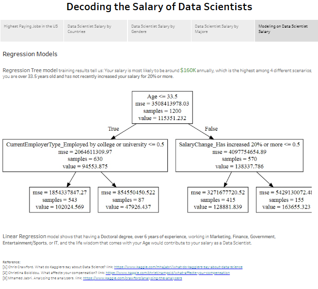
This job dashboard example is valuable for data scientists, HR professionals, and job seekers, offering actionable insights for salary negotiations, career planning, and addressing pay equity challenges in the tech industry.
#2 Job Dashboard Example – Skills Premiums for Data Scientists and Data Analysts
This job dashboard provides insights into the value of specific skills across different job titles and the premium associated with those skills. It highlights how skills impact compensation within job groups such as data analysts and data scientists. The dashboard is divided into two critical visualizations:
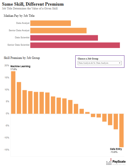
- Median Pay by Job Title: This bar chart compares the median salaries of roles such as Data Analyst, Senior Data Analyst, Data Scientist, and Senior Data Scientist. It shows how job titles influence earning potential, with senior-level positions earning significantly higher salaries.
- Skill Premium by Job Group: This bar chart visualizes the percentage premium or discount associated with specific skills within a selected job group. For example, in the “Data Analysis & Sr. Data Analysts” group, machine learning skills command a 17.6% premium, whereas data entry skills lead to a 13.8% discount. In the “Data Scientists & Sr. Data Scientists” group, natural language processing adds a 4.4% premium, while proficiency in Microsoft Excel is associated with a 14.3% discount.
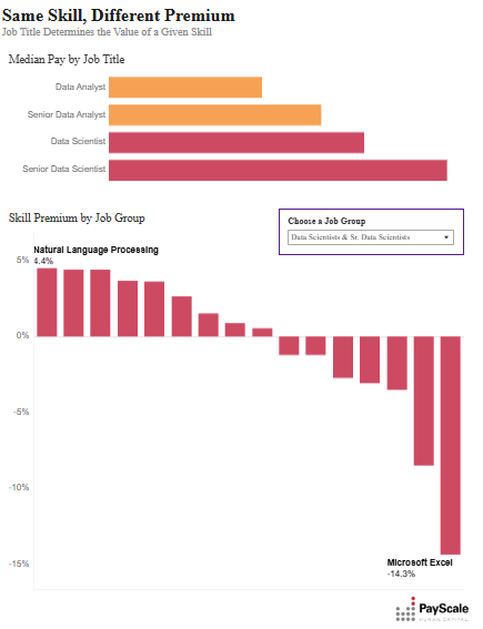
This job dashboard example is treasured by job seekers, career counsellors, and HR professionals. It provides actionable insights for skill development, compensation benchmarking, and strategic hiring decisions, helping individuals and organizations align skills with market demand.
#3 Job Dashboard Example – Job Application Process
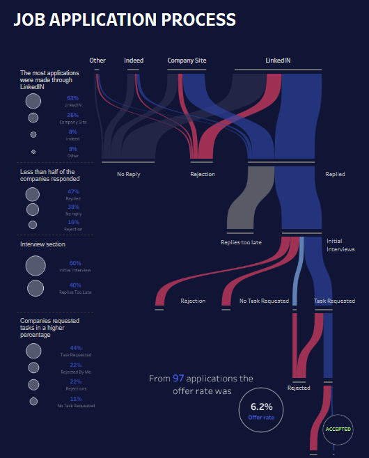
This job dashboard visualizes the application process, offering insights into application outcomes, response rates, and interview progression. It highlights data from 97 applications, showing that the overall offer rate was 6.2%. The dashboard uses a Sankey diagram to illustrate the flow of applications through various stages, including responses, rejections, interviews, and outcomes.
Key takeaways include:
- Application Sources: Most applications were submitted via LinkedIn (63%), followed by company websites (26%), Indeed (8%), and others (3%).
- Response Rates: Less than half of the companies responded to applications, with 47% providing no reply, 38% sending rejections, and only 16% replying with further steps.
- Interview Process: 60% of responses led to initial interviews, while 40% were rejected for delayed replies or other reasons.
- Task Requests: 44% of interviewees were assigned tasks, with outcomes split between rejections (22%) and those not requiring tasks (11%).
This job dashboard example is handy for job seekers, HR professionals, and career advisors. Job seekers can use it to analyze hiring trends and optimize their application strategies. HR professionals can identify process bottlenecks, while career advisors can leverage these insights to guide clients on practical application approaches.
#4 Job Dashboard Example – Data Analyst Survey Results
This job dashboard presents a comprehensive analysis of survey results from 287 participants, focusing on skills, demographics, and employment-related metrics. It combines various visualizations to highlight key insights about job seekers and professionals in data-related fields.
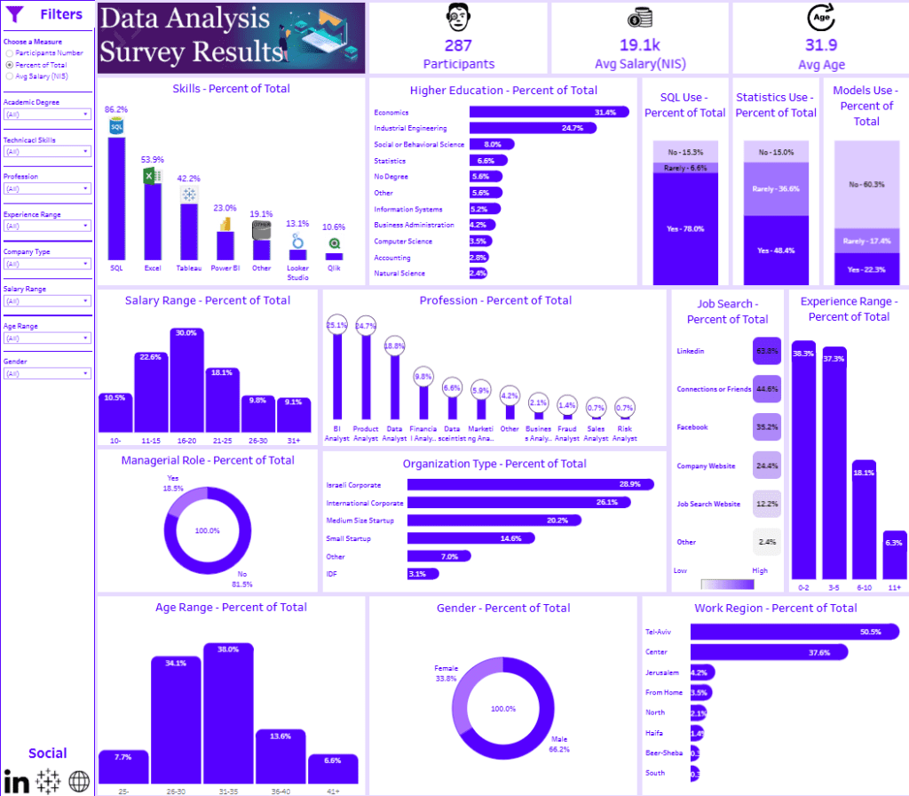
- Skills Proficiency: Bar charts reveal popular skills among participants, with SQL (86.2%) and Excel (53.9%) being the most common.
- Higher Education: Participants predominantly hold degrees in Economics (31.4%) and Industrial Engineering (24.7%).
- Job Search Insights: LinkedIn emerges as the primary job search platform (63%), followed by company websites (24.4%).
- Experience and Salary: Histograms show a distribution of experience, with 38.3% having 3–5 years of experience, and salary ranges, with 30% earning between 11–15k NIS.
- Demographics: The gender representation is 66.2% male and 33.8% female. The age distribution is concentrated in the 26–30 range (38%).
- Professional Roles and Sectors: BI Analysts dominate (6.8%), with most participants employed in Israeli corporate (28.9%) or international corporate (26.1%) settings.
This dashboard employs bar charts, pie charts, and histograms to clearly represent data.
This dashboard is valuable for HR professionals, hiring managers, and job seekers to analyze market trends, skill demands, and salary expectations, enabling informed career or recruitment strategies.
#5 Job Dashboard Example – Euro Cities for Data Scientists
This job dashboard provides a detailed comparison of key metrics across major European cities, offering insights into population, unemployment rates, job growth rates, and the average salary for data scientists. The dashboard is presented in a clean tabular format, making it easy to interpret and compare data across multiple cities.

- Population: Cities with the largest populations, such as London (8.1M) and Berlin (3.2M), reflect significant talent pools.
- Unemployment Rates: Zurich and Munich have the lowest unemployment rates (3.4% and 3.0%, respectively), while Madrid has the highest rate at 12.4%.
- Job Growth Rate: Amsterdam and Berlin report robust job growth rates of 4.9% and 4.4%, suggesting dynamic job markets.
- Average Data Scientist Salaries: Zurich offers the highest average salary for data scientists, $111,488, while Madrid has the lowest, $45,845.
This dashboard is handy for job seekers, recruiters, and business leaders evaluating opportunities or expanding operations in Europe. Job seekers can identify cities offering competitive salaries and job growth, while companies can assess talent availability and economic conditions to make strategic location decisions. The tabular presentation ensures clarity and comparability of the data, supporting well-informed decisions.
Job dashboards are indispensable tools for navigating today’s labour market complexities. The five job dashboard examples highlighted in this post illustrate how visualized data can unlock insights into salaries, job applications, employment trends, and required skills. Whether you’re an HR professional seeking to streamline recruitment strategies, a business leader aiming to benchmark market trends, or a job seeker identifying opportunities, these dashboards deliver data-driven clarity. By leveraging these dashboards’ insights, users can make informed decisions that align with organizational goals or personal career aspirations. In a world where data plays a pivotal role, adopting job dashboards ensures you remain competitive and efficient in an ever-evolving job


