Effective inventory management is crucial for businesses aiming to optimize operations and meet customer demands. An inventory dashboard is vital, offering real-time insights into stock levels, turnover rates, and other key performance indicators (KPIs). By consolidating data into a single, user-friendly interface, these dashboards enable informed decision-making and enhance supply chain efficiency.
Related posts:
- Best 12 Amazing Examples of Tableau Supply Chain Dashboards
- 7 Amazing Shipping Dashboards That Will Revolutionize Your Logistics Game
- Unlock the Power of Tableau Project Management: 7 Inspiring Dashboard Examples
- 7 Amazing Help Desk Dashboard Examples
- Top 5 Amazing Expense Dashboard Examples
- Top 8 Procurement Dashboards for Amazing Purchasing Efficiency
This blog post explores nine exemplary inventory dashboards, each showcasing unique features and visualizations catering to various business needs. These inventory dashboard examples demonstrate how tailored dashboards can streamline inventory processes, reduce costs, and improve overall operational performance.
Table of Contents
#1 Inventory Dashboard – Executive Summary
This inventory management dashboard offers a comprehensive overview of inventory metrics as of November 8, 2022, focusing on stock statuses, warehouse performance, and inventory value. Key indicators include stock-out (2 items), below-safety-stock (26 items), at-stock (14 items), and over-stock (14 items). The dashboard utilizes bar charts, area charts, and stacked bar visualizations to present these insights effectively.
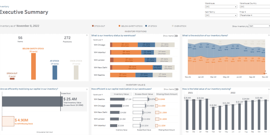
A bar chart illustrates inventory status by warehouse, comparing the number of items in stock-out, below-safety-stock, at-stock, and over-stock categories across locations such as Chicago, Istanbul, London, New Delhi, and Seattle. An area chart tracks the evolution of inventory over time, offering a historical perspective on stock levels by month. Additionally, the dashboard features a bar chart to analyze inventory value, excess stock, and missing stock for each warehouse, enabling users to assess how efficiently capital is mobilized in inventory.
This inventory KPI dashboard is valuable for supply chain managers, inventory planners, and warehouse supervisors. It allows them to monitor stock levels, avoid shortages, and minimize overstocking. Financial analysts can also use it to evaluate inventory costs and improve capital allocation. By providing detailed insights into stock positions and trends, the dashboard supports data-driven decision-making to enhance supply chain efficiency.
#2 Inventory Dashboard – Warehouses
This inventory management dashboard offers a comprehensive overview of inventory status and value across multiple warehouses as of November 8, 2022. It highlights vital metrics such as stock-out, below-safety-stock, at-stock, and over-stock positions for warehouses like Seattle, Chicago, New Delhi, London, and Istanbul. The dashboard also evaluates inventory value, excess stock value, and missing stock amounts to provide a holistic view of inventory performance.
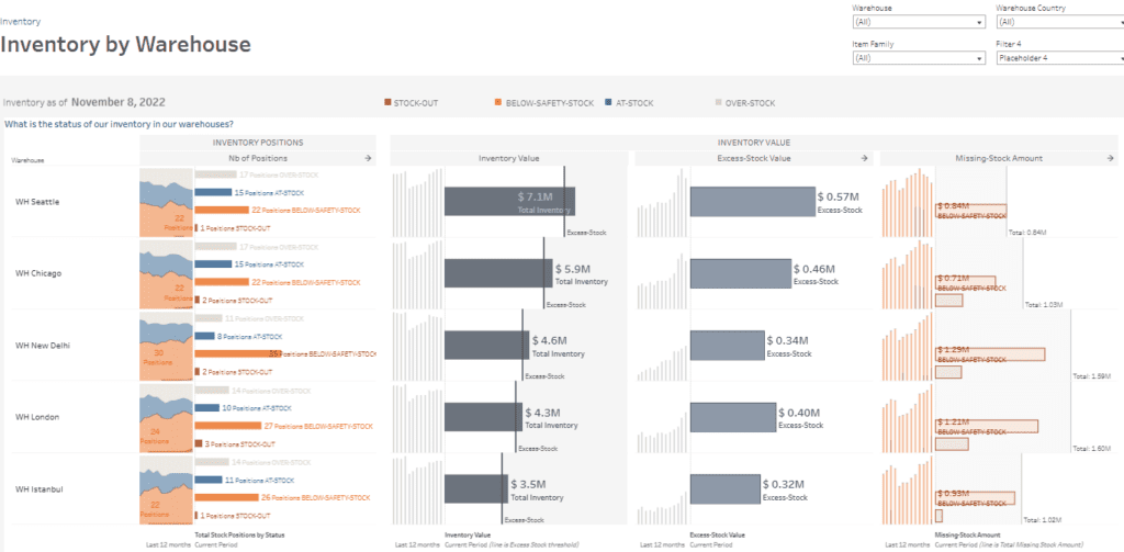
Stacked area charts display inventory positions, showing the distribution of stock levels within each warehouse over the past 12 months. Bar charts represent total inventory value, excess stock and missing stock amounts, making it easy to compare warehouse performance. For example, Seattle has the highest total inventory value at $7.1M, while New Delhi has the largest missing stock amount at $1.29M.
This inventory KPI dashboard is handy for supply chain managers, warehouse supervisors, and inventory planners. Supply chain managers can use it to identify inefficiencies in stock distribution, such as excess stock or safety stock shortages. Warehouse supervisors can monitor operational performance and prioritize replenishment. Inventory planners can use the data to optimize stock allocation, minimize stock-outs, and reduce excess inventory, ensuring efficient capital utilization across the supply chain.
#3 Inventory Dashboard – Availability
This inventory management dashboard offers a comprehensive view of item availability and stock forecasts as of November 8, 2022. It highlights key metrics, including total inventory value ($25.4M), missing stock amount ($4.9M), and excess stock value ($0.99M). Stock levels are categorized into stock-out, below-safety-stock, at-stock, and over-stock positions. Based on current usage and inbound supply, the dashboard also forecasts when specific items will be out of stock.
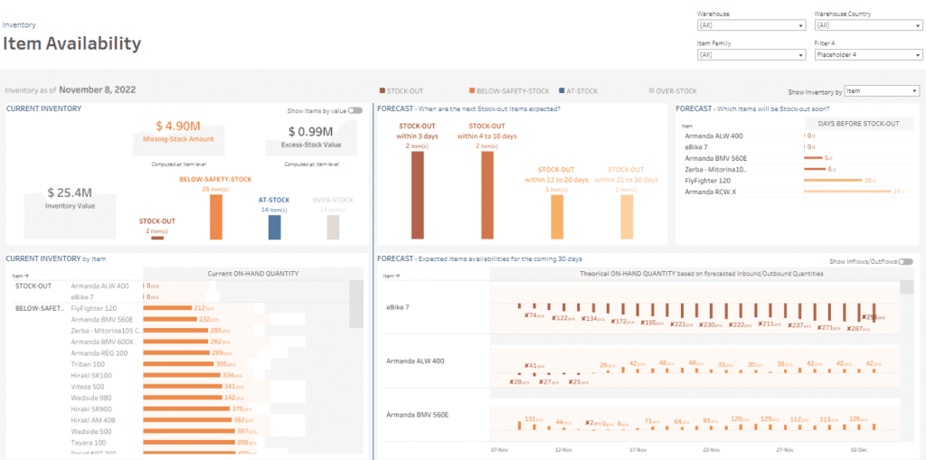
Stacked bar charts display stock levels across categories, while horizontal bar charts forecast the days until stock-out for critical items like the eBike 7 and Armanda ALW 400. Timeline-based bar charts track theoretical on-hand quantities for specific items over the next 30 days, incorporating inbound and outbound stock flows. For example, the Armanda BMV 560E shows decreasing inventory with a potential stock-out in five days.
This inventory KPI dashboard is helpful for supply chain managers, procurement teams, and inventory planners. Supply chain managers can monitor real-time stock availability and identify risks of stock-out. Procurement teams can use forecast data to prioritize restocking efforts, while inventory planners can analyze trends to optimize stock levels and maintain operational efficiency across the supply chain.
#4 Inventory Dashboard – Excess Stock
This inventory management dashboard provides detailed insights into excess stock, highlighting the percentage of overstocked items, their value, and trends over time. As of November 8, 2022, 25% of inventory items are overstocked, amounting to $0.99M, constituting 3.9% of the total inventory value.
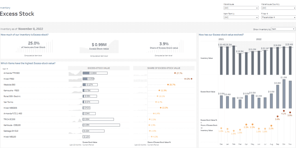
Critical visualizations include bar charts ranking items by excess stock value, with the Armanda TTR 900 contributing $285K and the Hiraki FR50 at $202K. Another chart displays each item’s total excess stock value share, with the top contributors accounting for 44.3% and 27.7%, respectively. Trendline bar charts track the evolution of inventory value, excess stock value, and the percentage share of excess stock relative to total inventory from 2021 to 2022, identifying periods of overstock spikes.
This inventory KPI dashboard is invaluable for supply chain managers, inventory planners, and financial analysts. Supply chain managers can identify overstock items, optimize stock levels, and reduce carrying costs. Inventory planners can analyze trends to avoid over-purchasing. Financial analysts can assess the economic impact of overstock and help develop strategies for efficient inventory utilization.
#5 Inventory Dashboard – Missing Stock
This inventory management dashboard comprehensively analyses missing stock as of November 8, 2022. Key metrics include 46.4% of items below safety stock levels, 3.6% out-of-stock, and a total missing stock value of $4.90M—comprising $3.99M for below-safety-stock items and $0.91M for stock-outs.
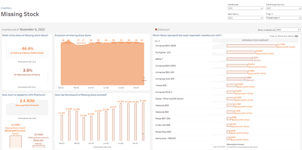
The dashboard employs various visualizations to deliver actionable insights. Area charts track the evolution of missing stock items over time, highlighting trends from December 2021 to October 2022. Bar charts showcase missing stock amounts for specific items, such as the Armanda BMV 560E ($1.075M) and FlyFighter 120 ($619K), enabling teams to identify high-priority replenishment targets. Another chart illustrates the month-over-month progression of missing stock amounts, offering a comprehensive historical perspective.
This inventory KPI dashboard is invaluable for supply chain managers, procurement teams, and inventory planners. Supply chain managers can monitor stock shortages and prioritize restocking high-impact items. Procurement teams can utilize the data to streamline purchase orders, while inventory planners can address gaps and prevent recurring shortages to optimize overall stock management.
#6 Inventory Dashboard – Historical Status
This inventory management dashboard offers a comprehensive historical analysis of inventory status from March 20, 2021, to November 8, 2022. Key metrics include 0.2% of items in out-of-stock positions, 53.6% below safety stock, 34.1% at stock, and 12.3% overstocked, highlighting overall inventory health and potential risks.
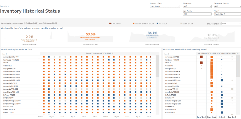
The dashboard utilizes heatmap-style charts to depict the evolution of stock positions—stock-out, below-safety-stock, at-stock, and over-stock—for specific items over time. This visualization enables users to monitor fluctuations in inventory status for products like the Armanda ALW 400, Kantouza CEB100, and eBike 7. Additionally, bar charts rank items by the frequency of each stock position during the period, providing a detailed breakdown of items facing significant inventory challenges.
This inventory KPI dashboard is particularly valuable for supply chain managers, inventory analysts, and operations teams. Supply chain managers can identify persistent issues, such as items falling below safety stock levels. Inventory analysts can leverage historical trends to forecast future stock requirements. Operations teams can use this data to streamline replenishment cycles and mitigate risks associated with overstocking or stock-outs.
#7 Inventory Dashboard – Stock Coverage
This inventory management dashboard offers a comprehensive analysis of stock coverage by utilizing the ABC-XYZ classification method. Products are categorized into combinations such as AX (high consumption, stable demand) and AY (high consumption, volatile demand), guiding strategies for replenishment, buffer stock, and inventory control.
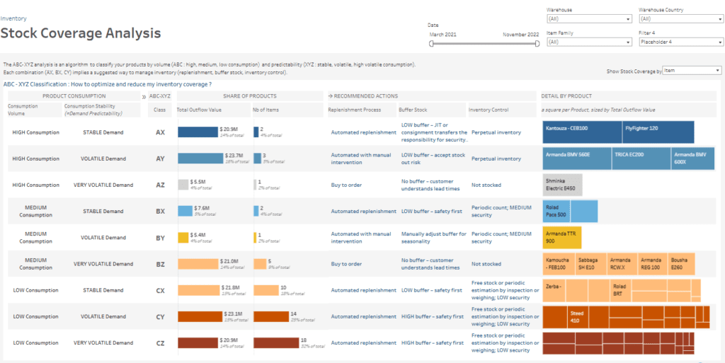
The dashboard employs various visualizations to provide actionable insights. Heatmap-style charts display products based on consumption patterns, highlighting total outflow value, item count, and percentage of the total. Detailed views offer product-specific recommendations, including automated replenishment, buffer stock levels, and strategies to mitigate stock-out risks. Individual product details are also presented using square charts scaled by total outflow value, emphasizing essential items like Kantouza CEB100 and FlyFighter 120.
This inventory KPI dashboard is invaluable for supply chain managers, procurement teams, and inventory planners. Supply chain managers can prioritize high-consumption products to maintain stable inventory levels. Procurement teams can optimize purchase orders based on demand predictability, while inventory planners can efficiently allocate buffer stock to minimize disruptions and align with business objectives. Overall, this stock management dashboard enables proactive stock management and cost control
#8 Inventory Dashboard – Item
This inventory dashboard offers a comprehensive view of the stock status of the Armanda BMV 560E, providing key metrics as of November 8, 2022. These include an on-hand quantity of 232 units across warehouses, a total inventory value of $780K, and a missing stock value of $1,092K. The item is classified as below safety stock, emphasizing the need for immediate action to prevent stockouts.
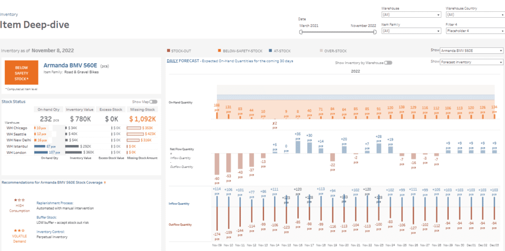
The inventory management dashboard employs bar charts and timeline-based visualizations to analyze inventory data effectively. A table outlines on-hand quantities, inventory value, excess stock, and missing stock across warehouses. Notably, Chicago and Seattle exhibit critical shortages, with only 10 and 12 units, respectively. Timeline-based bar charts provide a 30-day forecast of on-hand quantities, accounting for incoming and outgoing stock, while net flow charts detail stock movement trends.
This stock management dashboard is indispensable for supply chain managers, warehouse supervisors, and inventory planners. Supply chain managers can utilize the insights to prioritize urgent replenishment, ensuring stock levels align with demand. Warehouse supervisors can track stock dynamics in real time, while inventory planners benefit from forecasting data to maintain optimal buffer stock levels and reduce shortages. It is a prime example of adequate inventory KPI dashboards in action.
#9 Inventory Dashboard – Adhoc
This inventory management dashboard comprehensively analyses inventory value trends and distribution across various item families, providing valuable insights into inventory performance over time. The dashboard highlights overall inventory value trends for 2021 and 2022, with figures reaching $25.4 million in late 2022. It breaks down inventory value by item family, revealing that Road & Gravel Bikes account for the largest share at $7.54 million (30% of the total), followed by Electric Bikes at $5.36 million and Urban Bikes at $4.29 million. A Pareto analysis indicates that these top three categories contribute 79% of the total inventory value, underscoring their significance.
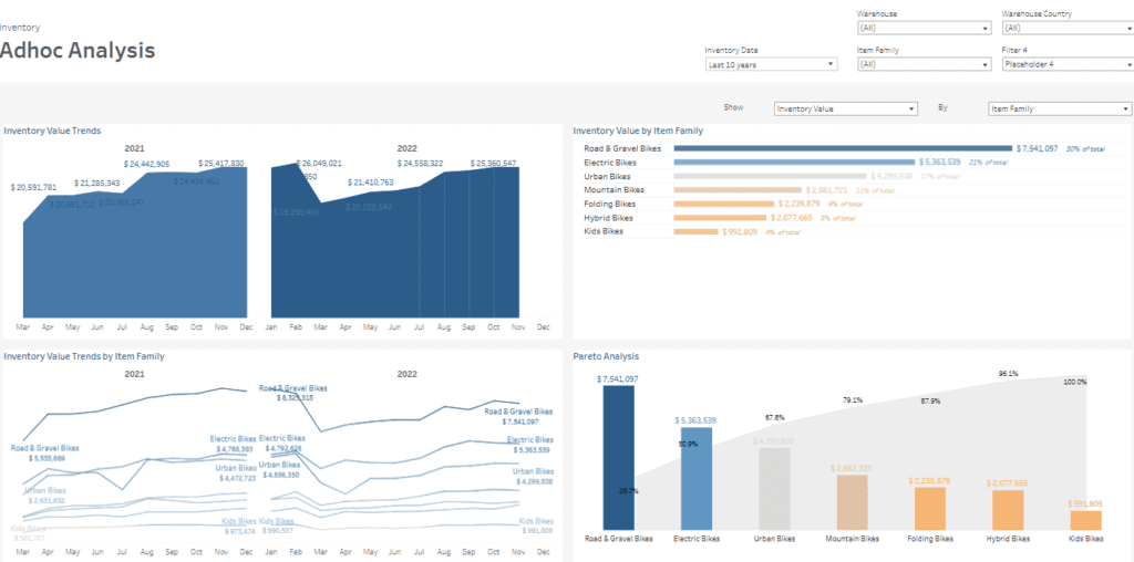
The dashboard employs various visualizations to present data effectively. Area charts display inventory value trends over time, offering a historical perspective on value fluctuations. Line charts track inventory value trends by item family, helping to pinpoint which categories drive changes. A bar chart ranks item families by inventory value, while a Pareto chart highlights the cumulative impact of the top contributors, visually prioritizing high-value categories.
This inventory KPI dashboard benefits supply chain managers, inventory analysts, and procurement teams. Supply chain managers can optimize inventory investments, analysts can identify critical contributors to inventory value, and procurement teams can focus on high-priority item families for strategic decision-making.
The nine inventory dashboard examples highlighted in this post underscore the importance of customized solutions and effective inventory management. By leveraging these dashboards, businesses can gain comprehensive visibility into their inventory metrics, facilitating proactive decision-making and strategic planning. Implementing a well-designed inventory management dashboard not only aids in maintaining optimal stock levels but also contributes to cost reduction and customer satisfaction. As the business landscape continues to evolve, adopting advanced inventory KPI dashboards will be instrumental in staying competitive and responsive to market demands


